

Sometimes one section needs to show two things in the same spot, like FAQs and a team grid, or monthly and yearly pricing. The Toggle Content widget in Master Addons for Elementor is a Pro widget that adds a small switch that flips between them. Each toggle option holds either plain text or a full saved Elementor template, and visitors tap a label to swap what shows.
You set the labels, optional icons, and what each one displays, then style the switch to match. It is a clean way to fit more into less space without sending people to another page. This guide covers every setting in the widget.
Prefer to watch first? This short tutorial walks through the Toggle Content widget end to end:
What the Toggle Content widget does #
The widget shows a toggle switch with two or more labels. Click a label and the area below swaps to that option’s content. Each option can be a block of text you type in or a saved section, page, or widget template from your library.
Because it can pull in templates, the toggle is not limited to short text. You can flip between an entire FAQ layout and a team section, both built elsewhere in Elementor and dropped into the toggle.
Before you start #
- WordPress with Elementor installed and active.
- Master Addons Pro installed with an active license, since Toggle Content is a Pro widget. New to the plugin? See the installation guide.
- If you plan to toggle templates, save them first in your Elementor template library.
How to add the Toggle Content widget #
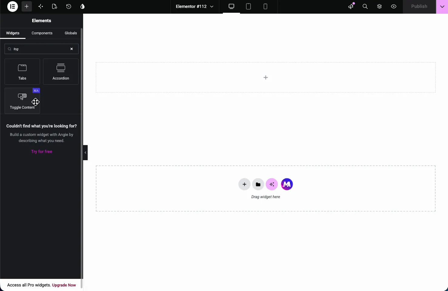
In the Elementor editor, open the Elements panel and search for Toggle Content, or scroll to the Master Addons section. Drag it onto your page. It loads with two sample toggle options so you can see the switch right away.
Set up the toggle options #
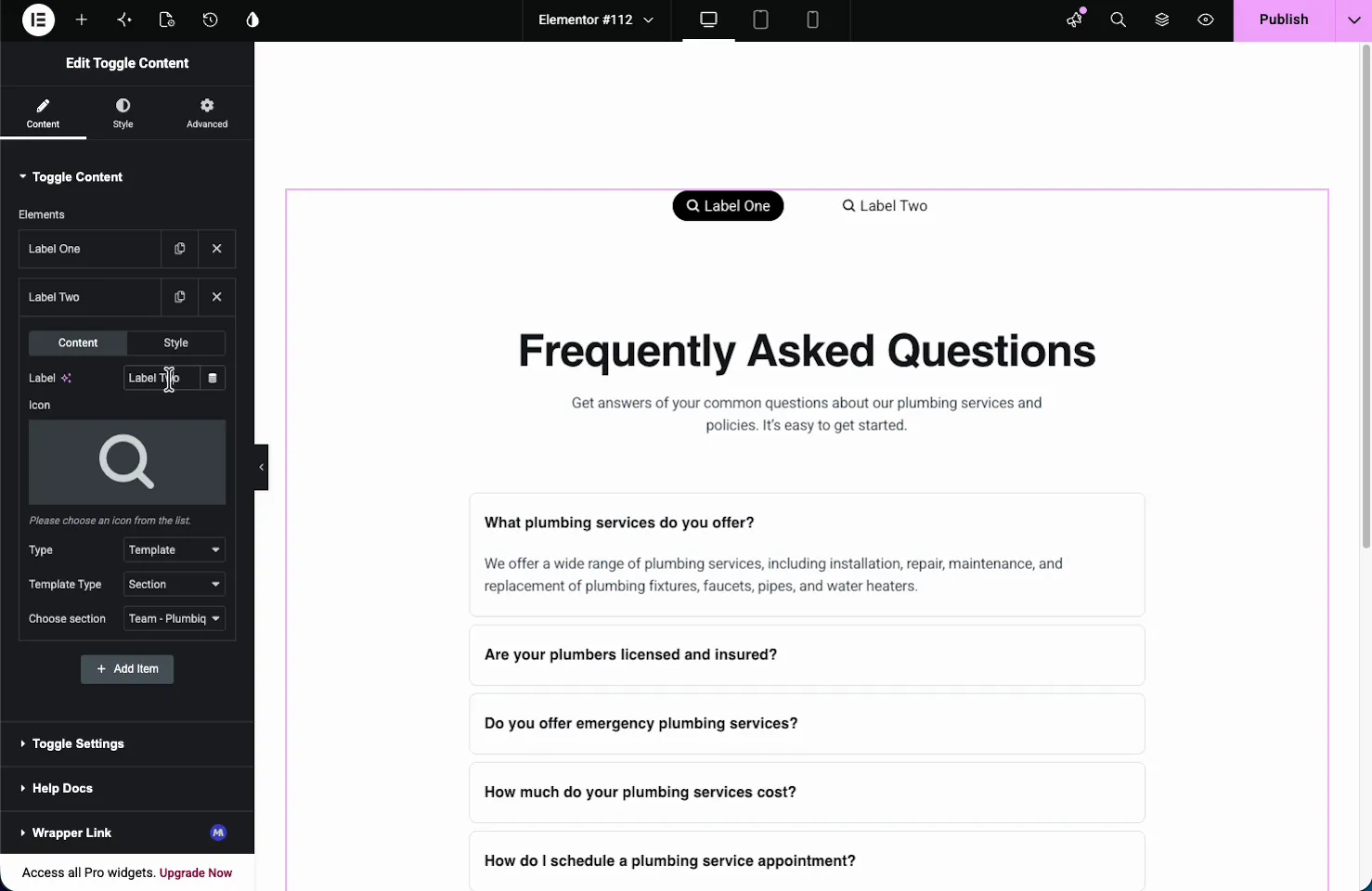
In the Content tab, the Toggle Content section holds an Elements repeater. Each item is one toggle option. The defaults are Label One and Label Two, and you add more with Add Item, duplicate with the copy icon, or remove with the X.
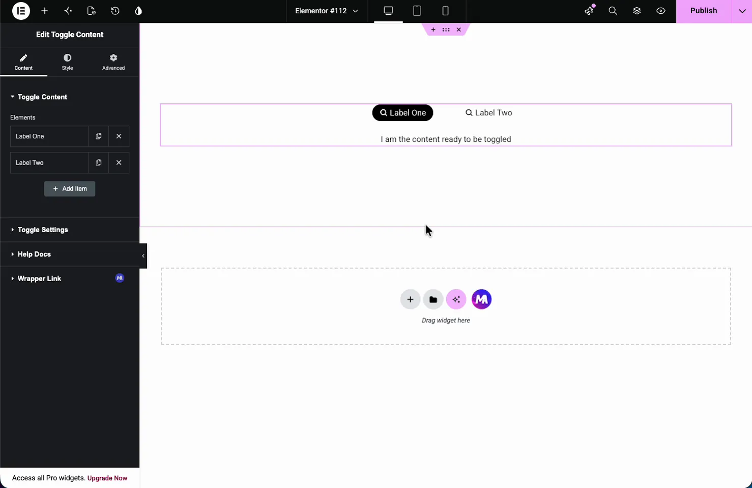
Click an item to open its settings, which have their own Content and Style sub-tabs.
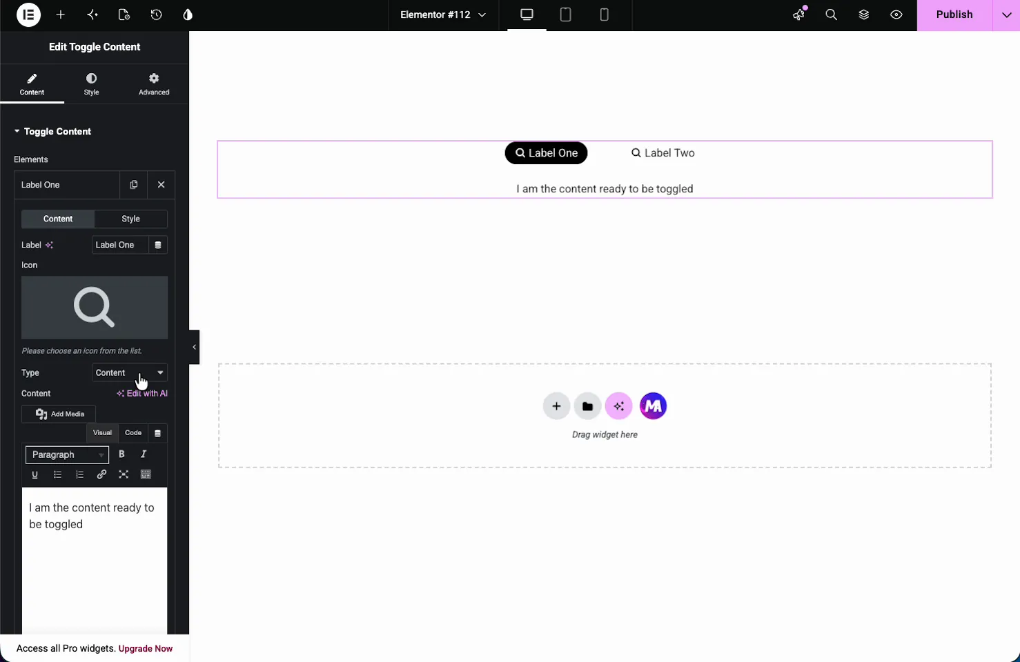
- Label: the text on the toggle button, like FAQ or Our Team. It supports dynamic tags.
- Icon: an optional icon, with Icon Position (Before or After the label) and Icon Spacing.
- Type: choose Content for typed text or Template to pull in a saved layout.
- Content: when Type is Content, a full text editor appears with media, formatting, and a code view.
Toggle a saved template instead of text #
Set Type to Template and two more controls appear: Template Type (Section, Page, or Widget) and Choose section, where you pick any saved template from your library. This is what lets a single toggle option display a whole pre-built layout.
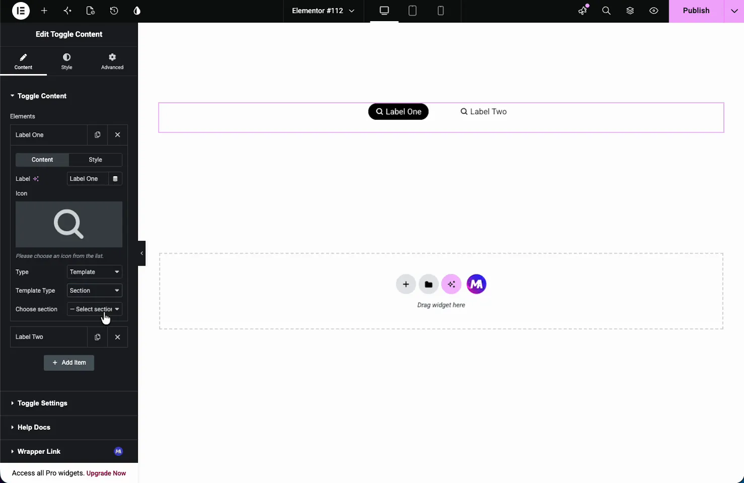
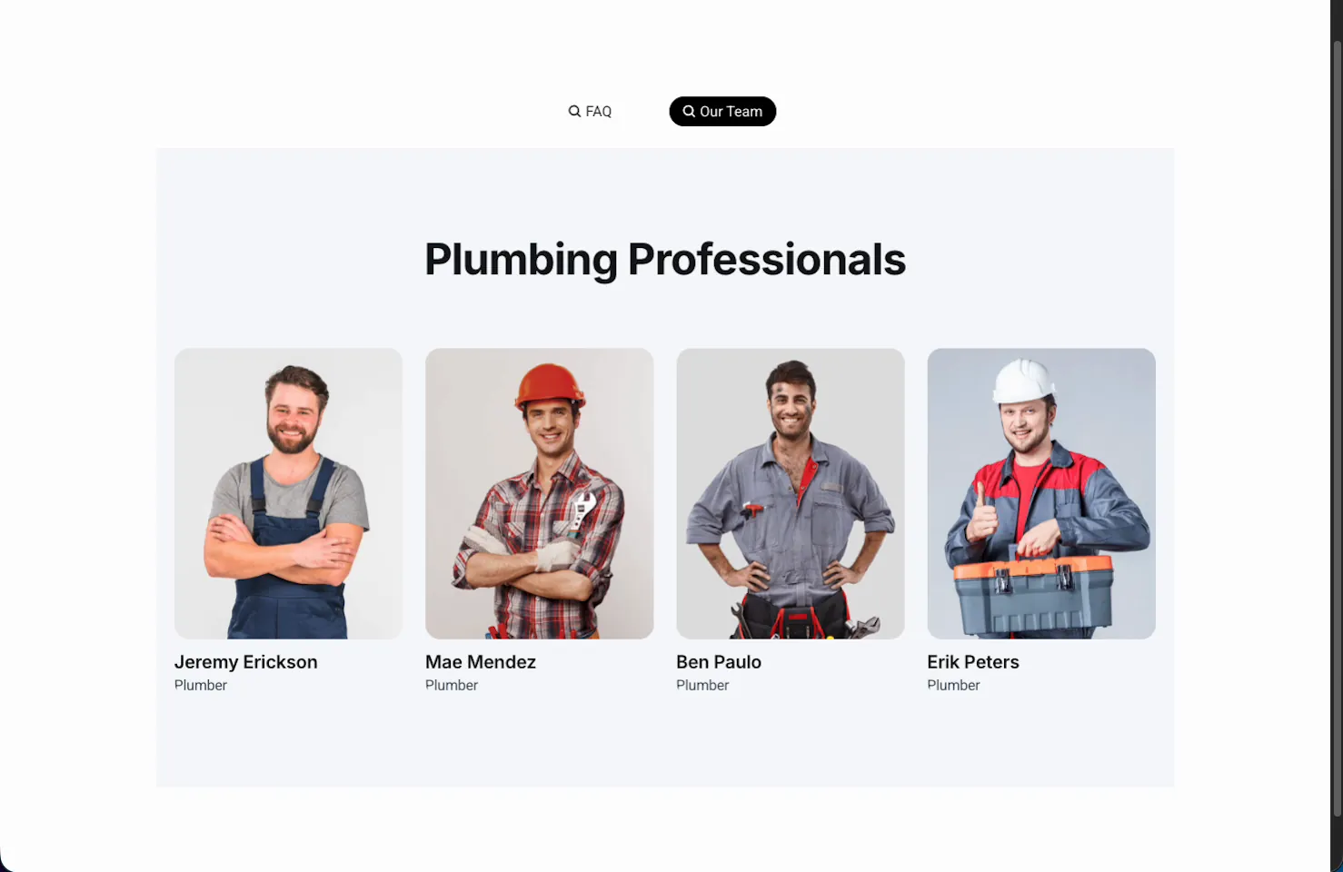
In the demo, one option points at a saved FAQ section and the other at a team section. Flip the toggle and the whole layout swaps.
Toggle Settings #
The Toggle Settings section controls how the switch behaves.
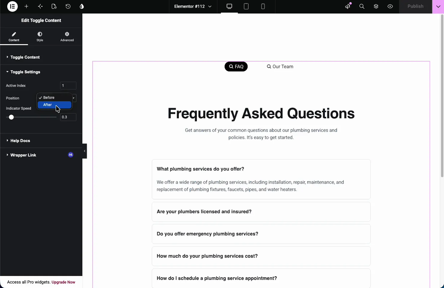
- Active Index: which option shows first when the page loads. Set it to 1 for the first option, 2 for the second, and so on.
- Position: show the switch Before (above) or After (below) the content.
- Indicator Speed: how long the active indicator takes to slide between options, in seconds (0.3 by default).
Style the toggle #
The Style tab is split into Toggler, Indicator, and Labels. The Toggler section controls the switch container itself.
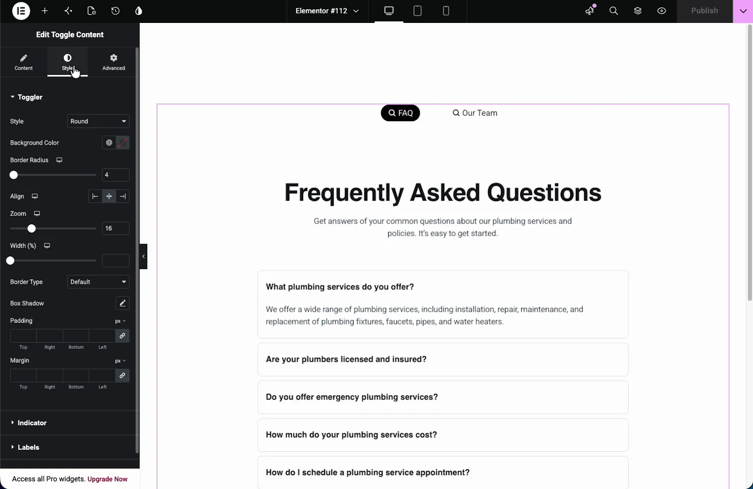
- Style: the shape of the toggle, such as Round.
- Background Color and Border Radius: the look of the switch track.
- Align, Zoom, and Width: position and scale the switch within its column.
- Border, Box Shadow, Padding, Margin: the usual framing controls.
The Indicator section styles the sliding highlight behind the active label, and the Labels section sets Stack On for mobile, alignment, typography, spacing, and colors for the Default, Hover, and Active states. A separate Content section styles the panel below the switch.
The result on the page #
Publish or preview and the toggle works live: visitors tap a label, the indicator slides to it, and the content below swaps. Here the toggle flips from the FAQ layout to the Our Team template, each one a full saved section.
Common use cases #
- Monthly vs yearly pricing toggled above a pricing table.
- FAQ and team sections sharing one slot on a service page.
- Description and specs on a product page.
- Before and after case study layouts.
- Two saved templates swapped without a second page or popup.
Tips for working with the Toggle Content widget #
- Build templates first. Save the sections you want to toggle in your library, then point each option at one.
- Keep labels short. One or two words fit the switch cleanly and read fast.
- Set the Active Index deliberately. Lead with the option most visitors want to see first.
- Match content heights where you can. Toggling between very different heights makes the page jump.
- Use icons for clarity. A small icon next to each label helps people tell the options apart.
Frequently Asked Questions #
What is the Toggle Content widget in Master Addons?
It is a Master Addons Pro widget for Elementor that adds a toggle switch to flip between two or more sets of content in the same spot. Each toggle option can hold typed text or a saved Elementor template, and visitors tap a label to swap what shows.
Can the toggle show a saved Elementor template?
Yes. In a toggle option, set Type to Template, choose the Template Type, then pick a saved section or page from your library. The toggle then displays that whole layout, so you can flip between full pre-built designs.
How do I set which option shows first?
Open the Toggle Settings section and set the Active Index. Use 1 for the first option, 2 for the second, and so on. That option is shown when the page loads, and visitors can switch to the others by tapping their labels.
Can I add icons to the toggle labels?
Yes. Each toggle option has an Icon field in its Content sub-tab. Set Icon Position in the same item to place it Before or After the label text.
How is Toggle Content different from Tabs?
Both switch content in place, but the toggle is a single compact switch built for two or a few options, often a binary choice like monthly and yearly. Tabs suit longer lists of sections. For collapsible FAQs, an accordion is the better fit.
Wrapping up #
The Toggle Content widget fits two layouts into one slot and lets visitors flip between them with a tap. Add your options, choose text or a saved template for each, set which one leads, and style the switch to match. For an overview and a comparison with accordions and tabs, see the Elementor content toggle widget page. For other ways to organize content, see the Advanced Tabs widget and the Advanced Accordion widget, browse the full Master Addons widgets and extensions, and check the pricing page for what each plan includes.


