Free Elementor Accordion Widget for FAQs and Toggles
Advanced Accordion is a free Master Addons widget for FAQ sections and collapsible content. Choose Accordion to keep one item open at a time or Toggle to let visitors open several. Each item has a title and answer, can start open, and can use its own expand and collapse icons. Style titles for Normal, Hover and Active states, then style the answers and icons. Master Addons Pro adds saved sections, saved widgets and page templates as item content, which is also how you nest one accordion inside another.

How to Create an FAQ Accordion in Elementor
You need Elementor and the free Master Addons plugin from WordPress.org.
- Check that Advanced Accordion is switched on under Master Addons, Widgets.
- In the Elementor editor, search for Advanced Accordion and drag it onto the page.
- Set Accordion Type to Accordion for a classic FAQ.
- Add one item per question, type the answer, and set your most asked question to Active as Default.
- Set Title HTML Tag to H3 so questions become headings.
- Style the titles, answers and icons in the Style tab.
About FAQ schema: this widget does not output FAQPage structured data. If you want FAQ rich results, turn on the FAQ Schema option in Elementor’s own Accordion widget, or add the questions with an SEO plugin FAQ block. Every setting is covered in the Advanced Accordion widget settings.
Accordion or Toggle Behavior
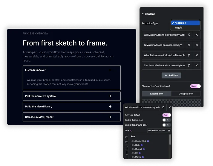
Accordion Type sets the behavior: Accordion closes the open item when another opens, and Toggle lets several stay open. For each item, add the Title and Content, turn on Active as Default to open it on load, and turn on Enable Custom Icon for its own icons. Content Type is plain content in the free plugin. Saved Section, Saved Widget and Saved Page Template, plus a per-item background color, need Pro.
- Toggle Speed in milliseconds for the open and close animation.
- Title HTML Tag from H1 to H6, div, span or a, so questions can be real headings.
- Nested accordions: save an accordion as a template and load it in an item with Pro.
State-Based Title Styling & Structure
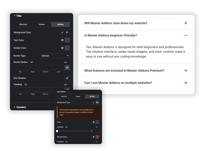
The title bar is what users click – make every visual state intentional. Style the Title separately for its Normal, Hover, and Active (open) states. For each state, define a unique Background Type (color, gradient), Text Color, and Typography. Control the Title Align, Padding, Border, Border Radius, and add a Box Shadow. This level of detail lets you create a clear visual journey: a neutral default, an inviting hover, and a distinct “open” state that confirms the user’s action.
- Triple-State Design: Apply distinct styles to Normal, Hover, and Active title bars.
- Advanced Backgrounds: Use solid colors or gradients for different states to create depth.
- Full Box Control: Adjust Padding, Borders, and Box Shadow to make each title bar a designed component.
Customizable Toggle Icons with Dual States
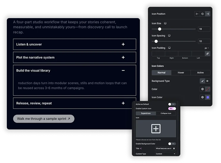
Move beyond the generic triangle icon. Enable Custom Icon to choose any icon from the library for both the Expand (closed state) and Collapse (open state) actions. Position the icon to the Left or Right. Then, style these icons independently for Normal, Hover, and Active states, changing their Color, Size, and Background. Adjust Icon Spacing and Padding around the icon for perfect alignment. This turns a functional indicator into a cohesive part of your design language.
- Dual Icons: Set different icons for the “plus” (expand) and “minus” (collapse) states.
- State-Specific Icon Styling: Change the icon’s color and background when the item is hovered or active.
- Alignment properly: Control icon Alignment, Position, and Spacing relative to the title text.
Content Area & Container Styling
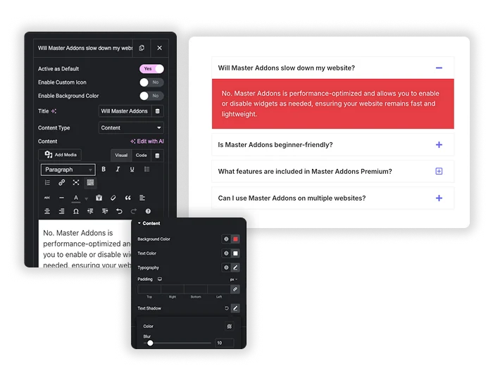
The content that slides down deserves its own design consideration. Style the Content area with its own Background Color, Text Color, Typography, and internal Padding. Add a Text Shadow for readability if needed. Then, style the overall Items container that holds all the accordion sections: set the Spacing between items, a global Border, Border Radius, and Box Shadow. This ensures the entire widget feels like a unified, polished component, and the opened content is easy and pleasant to read.
- Content Area Design: Style the background and text of the drop-down content for optimal readability.
- Container-Level Polish: Apply Border Radius and Box Shadow to the entire accordion group.
- Item Spacing: Control the Spacing (margin) between each accordion item for a clean, separated look.
Elementor Accordion vs Master Addons Advanced Accordion
Free Elementor now has its own Accordion widget. Here is how the two compare, so you can pick the right one.
| Feature | Elementor Accordion | Master Addons Advanced Accordion |
|---|---|---|
| Price | Free in Elementor | Free, with template content in Pro |
| FAQ schema | FAQ Schema option | No schema output |
| Nested content | Drop any widgets into each item, including another accordion | Text in free; saved sections, widgets or templates with Pro |
| Open behavior | Default state and max items expanded | Accordion or Toggle, plus Active as Default per item |
| Per-item icons | Shared icons | Custom expand and collapse icons per item |
| Title styling | Normal, Hover and Active | Normal, Hover and Active with background, border and shadow |
Choose Elementor’s Accordion when you need FAQ schema or widgets inside items for free. Choose Advanced Accordion for per-item icons and Toggle behavior with detailed styling. Related widgets: Toggle Content, Tabs and Table of Contents.
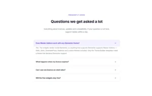
Frequently Asked Questions For Advanced Accordion
What’s the practical difference between “Accordion” and “Toggle” type?
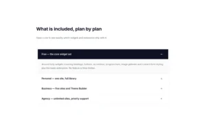
Accordion: Only one item can be open at a time. Opening a new item automatically closes the previous one. Best for FAQ pages or sequential instructions where you want to minimize scrolling and focus attention.
Toggle: Multiple items can be open simultaneously. Users can expand several items to compare or gather information. Best for feature checklists, product specification lists, or content where users need to see multiple sections at once.
Is the Advanced Accordion widget free?
Yes. The widget is free with Accordion and Toggle types, Active as Default, custom icons and full styling. Saved section, widget and template content and per-item background colors need Master Addons Pro.
What are Saved Section and Saved Page Template content types?
They are Master Addons Pro options that load something from your Elementor template library into an item, such as a contact form section or another accordion. That is how you build nested accordions with this widget.
Does the accordion add FAQ schema?
No. Advanced Accordion does not output FAQPage structured data. For FAQ rich results, use Elementor’s Accordion widget with its FAQ Schema option, or an SEO plugin FAQ block.
Can I control the opening and closing animation speed?
Yes. In the Content tab, you’ll find Toggle Speed (ms). The value is in milliseconds (e.g., 300). A lower number (like 200) makes it faster and snappier; a higher number (like 500) makes it slower and more deliberate.
How do I make one item open by default?
Open the item in the Content tab and turn on Active as Default. With the Accordion type, set it on one item only.
Trending Elementor Widgets & Extensions
Build sophisticated websites in less time.
Glassmorphism
Container Extras
Patterns
![Master Addons Post/Page Duplicator extension for Elementor: MA Duplicator row link in the WordPress Pages list creating a Landing Page - [Duplicated #128] draft](https://d1asvmc6qcowgk.cloudfront.net/wp-content/uploads/2026/09/15102930/post-page-duplicator-768x403.webp)
Post/Page Duplicator