

The Font field adds a font family dropdown to a custom widget you build with the Master Addons Widget Builder. Editors pick a system font or a Google Font in Elementor, and the widget applies it to the element you choose. It changes the typeface only. Size, weight and line height stay in your CSS.
Font is one of the fields you can use in the free version’s Widget Builder. The free plugin includes a limited Widget Builder, and the full set of fields comes with Master Addons Pro.
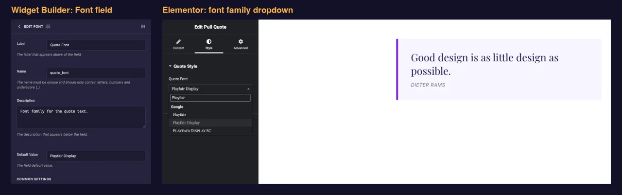
What the Font field does #
- Adds a searchable dropdown to your widget’s panel in Elementor. The list has a Default option, a System group (Arial, Tahoma and so on) and a Google group.
- Saves the family name as text, for example
Playfair Display. - Writes a
font-familyrule for the elements you list under CSS Selectors. When the pick is a Google Font, Elementor loads that font on the page for you. - Also gives you a token, like
{{ quote_font }}, that prints the family name.
New to the builder? Read the Widget Builder overview first, then come back with a widget open.
Before you start #
- WordPress with Elementor installed and active.
- Master Addons for Elementor installed and active. The installation guide covers setup.
- A widget open in the Widget Builder. The example in this guide is a “Pull Quote” widget: a Textarea named
quote_text, a Text field namedquote_author, and a Font field namedquote_fontthat sets the typeface of the quote.
How to add a Font field #
- Go to Master Addons > Widget Builder and open your widget.
- Click the Style tab and add a section, for example “Quote Style”.
- Type
fontin the field search box on the left. - Drag Font into the section. Click the pencil on the field to open its settings.
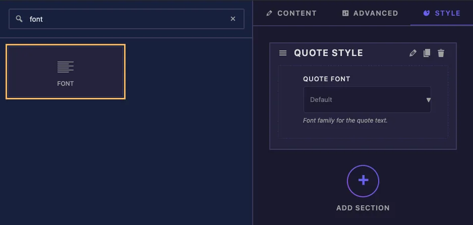
Style is where editors expect to find typeface options, but the field works in a Content or Advanced section too.
Font field options explained #
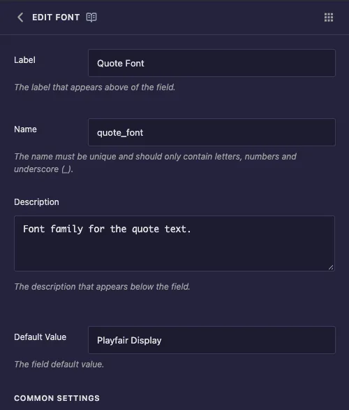
- Label: the text above the dropdown in Elementor, for example “Quote Font”.
- Name: the field’s unique ID and the name of its token. Use letters, numbers and underscores only, for example
quote_font. - Description: a hint shown under the dropdown in Elementor.
- Default Value: the family a new copy of the widget starts with. Type the name exactly as it appears in Elementor’s list, for example
Playfair Display.
Under Common Settings you’ll find Show Label, Label Block, Separator and Conditions, which work the same as on other fields. The setting that makes this field work is CSS Selectors.
Apply the font with CSS Selectors #
Scroll down to CSS Selectors and click Add Item. Each row has two boxes:
- CSS Selector: the element that gets the font. For the pull quote it’s
.pq-quote. You don’t need to type{{WRAPPER}}, because the builder adds it for you and keeps the rule inside this widget. - CSS Properties: the rule to write.
{{VALUE}}is replaced with the picked family.
font-family: "{{VALUE}}", Georgia, serif;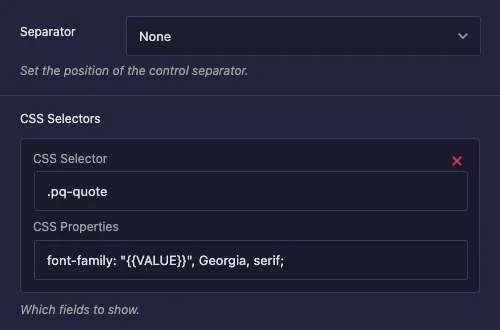
A new row comes filled with example text, .text-1, .text-2 and color: {{VALUE}};. Replace both. If you leave color in the properties box, the font name ends up as a color value and the typeface doesn’t change.
The quotes around {{VALUE}} keep names with spaces, like Playfair Display, working. Georgia, serif is the fallback while the font loads. To style more elements, click Add Item again and add another row.
Leave the plain Selector box at the bottom empty. In our tests it wrote color: Lora; for this field, which doesn’t set a font.
Click Save Settings when you’re done.
Why not put the token in the CSS panel? #
The token works there. font-family: "{{ quote_font }}", Georgia, serif; prints the right name. The problem is loading. In our tests, a Google Font used only through the token was not loaded on the front end, so visitors saw the fallback font. A CSS Selectors row gives Elementor the information it needs to load the font, and the same pick came through correctly.
Keep the token for places where you need the name as text, such as a class or a label in the HTML.
Use the Font control in Elementor #
Add the widget to a page, or reload the editor if the page was already open. Select the widget and open the Style tab. Click the dropdown under your label and start typing to filter the list. Each family name is drawn in its own typeface, which makes picking easier.
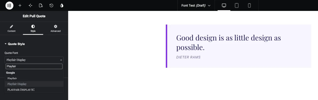
Pick a family and the preview updates. On the published page, Elementor loads the Google Font along with the widget’s styles.
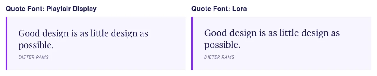
Choosing Default clears the pick. The widget then falls back to whatever font your CSS panel or theme sets for that element, so give the element a sensible font in the CSS panel.
Common use cases #
- Pull quotes and testimonials where only the quote text changes typeface.
- Display headings in hero or banner widgets, with body text left alone.
- Price numbers, badges or labels that use a brand display font.
- Client sites where editors should pick a font but not touch sizes and spacing.
Tips for working with the Font field #
- Use CSS Selectors rather than the token for styling. That’s what makes Google Fonts load.
- Always add a fallback stack after
{{VALUE}}, such asGeorgia, seriforArial, sans-serif. - Put size and weight in the CSS panel. The Font field only sets the family.
- Need size, weight and spacing controls too? The Typography field is a Pro field that bundles all of them.
- Each Google Font adds a download. Two or three families per page is a reasonable limit.
Frequently Asked Questions #
Is the Font field available in the free version?
Yes. Font is one of the fields you can use in the free version’s Widget Builder. The full set of Widget Builder fields comes with Master Addons Pro.
Why does my Google Font not show on the live page?
Check how the font is applied. If you only print the token in the CSS panel, the font file isn’t loaded. Add a CSS Selectors row with font-family: "{{VALUE}}" so Elementor loads it.
Why did picking a font change nothing?
The CSS Selectors row probably still has the example color: {{VALUE}}; property, or the selector doesn’t match your HTML. Change the property to font-family and check the class name.
Do I need to add {{WRAPPER}} to the selector?
No. The builder adds {{WRAPPER}} in front of your selector, so the font only applies inside this widget.
What’s the difference between Font and Typography?
Font sets the family only. Typography is a Pro field that adds size, weight, line height, letter spacing and more in one control.
Wrapping up #
Add the Font field to a Style section, set a default family, and add a CSS Selectors row that points font-family: "{{VALUE}}" at your element. Editors get a searchable font list in Elementor, and Google Fonts load on the page without extra code. For full text styling, see the Typography field, and check pricing for what each plan includes.


