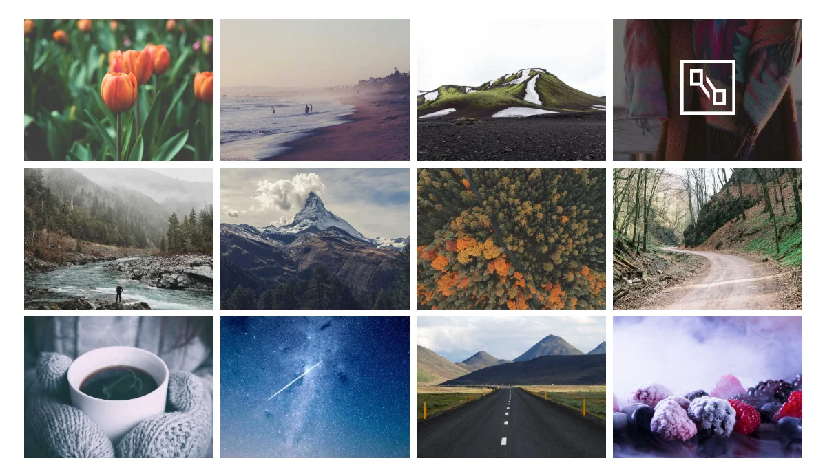
A plain image grid gives visitors no way to browse by topic. The Filterable Image Gallery widget in Master Addons for Elementor fixes that. It adds category filters, hover overlays, ribbons, and lightbox links to a standard gallery, so you can build a filterable portfolio or product showcase without writing any code.
Here’s how each tab and setting works, so you can set up an Elementor filterable gallery without guessing at what the toggles do.
What the Filterable Image Gallery widget does #
The widget displays a grid of images and lets visitors filter them by category. Each gallery item supports a title, subtitle, ribbon, hover icon, and two action buttons. Layout, spacing, overlay animation, and typography are all controlled from the Elementor panel, so the same widget works for portfolios, e-commerce lookbooks, travel galleries, and team photo walls.
Before you start #
- WordPress with Elementor installed and active.
- Master Addons for Elementor installed and active. Need help? See the installation guide.
- Images grouped into categories you want visitors to filter by.
How to add the Elementor Filterable Gallery widget #
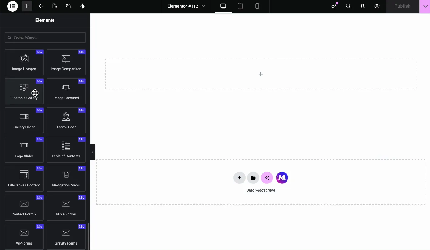
Open the Elementor editor and search for Filterable Gallery in the Elements panel, or scroll down to the Master Addons section. Drag the widget onto your page. It loads with placeholder gallery items, so you have something on screen to work with immediately.
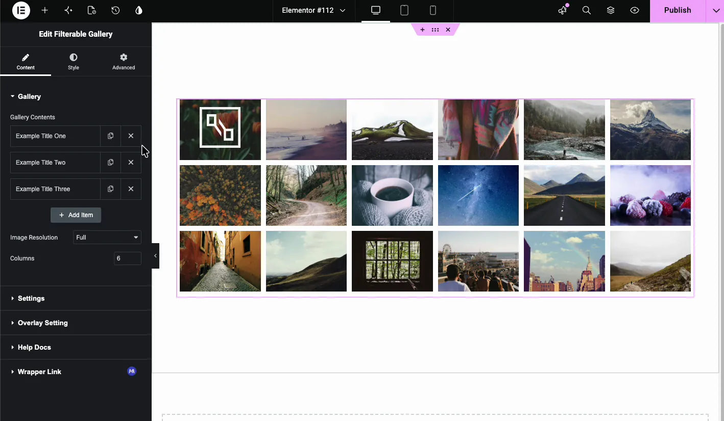
Build your gallery in the Content tab #
The Content tab is where you add images, assign filter categories, and set up ribbons and links.
Gallery Contents #
The Gallery Contents section is a repeater. Each item represents one image card. Click Add Item to create more cards, or use the duplicate and delete icons to manage them.
Every item has the same fields:
- Filter Label: the category visitors use to filter. Examples: Technology, Nature, Architecture.
- Images: click to open the media picker and select the images for this card. You can select several at once.
- Title: the main heading shown under or over the image.
- Subtitle: a smaller line beneath the title.
- Show Ribbon?: toggle to add a corner or inline badge.
- Ribbon: the badge text, such as Popular or New.
- Popup or Links?: choose whether the card opens a lightbox popup or links to a URL.
- Button One Text / URL: label and destination for the first action button.
- Button Two Text / URL: label and destination for the second action button.
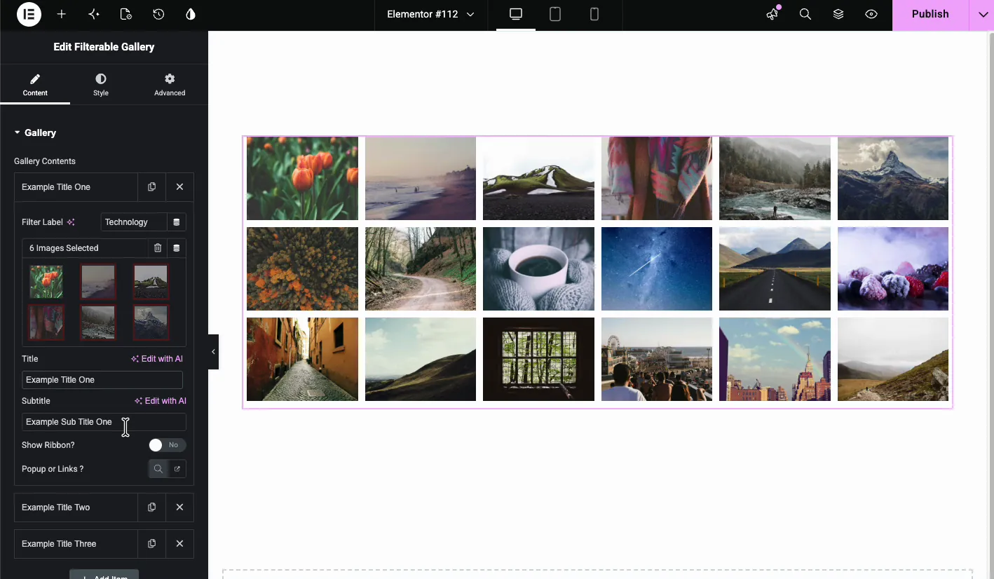
Image Resolution and Columns #
Below the repeater, set the Image Resolution WordPress should serve and the number of Columns. Six columns gives you small thumbnails; drop to three when you want larger cards with readable titles. Pick a resolution close to the actual display size, otherwise you’re loading full-size images into small cards and the page pays for it.
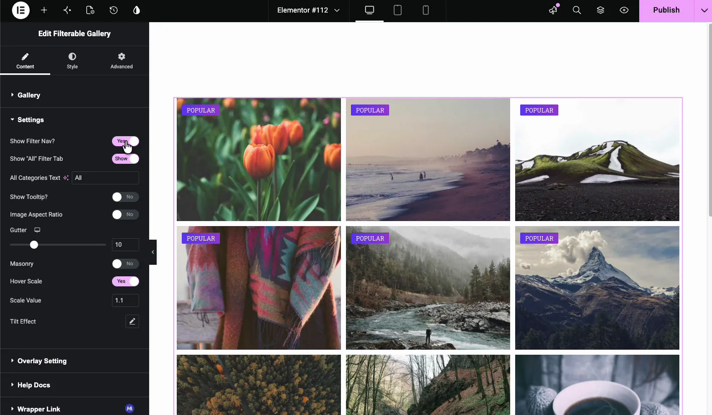
Settings #
The Settings section controls the overall gallery behavior.
- Show Filter Nav?: displays the category filter buttons above the grid.
- Show “All” Filter Tab: adds an All button so visitors can reset the filter.
- All Categories Text: the label for the reset button, usually All.
- Show Tooltip?: enables tooltips on filter buttons.
- Image Aspect Ratio: forces a consistent ratio across every image.
- Gutter: the space between grid items.
- Masonry: switches the grid to a masonry layout for uneven image heights.
- Hover Scale: zooms the image slightly on hover.
- Scale Value: how much the image zooms, such as 1.1.
- Tilt Effect: adds a 3D tilt that follows the cursor.
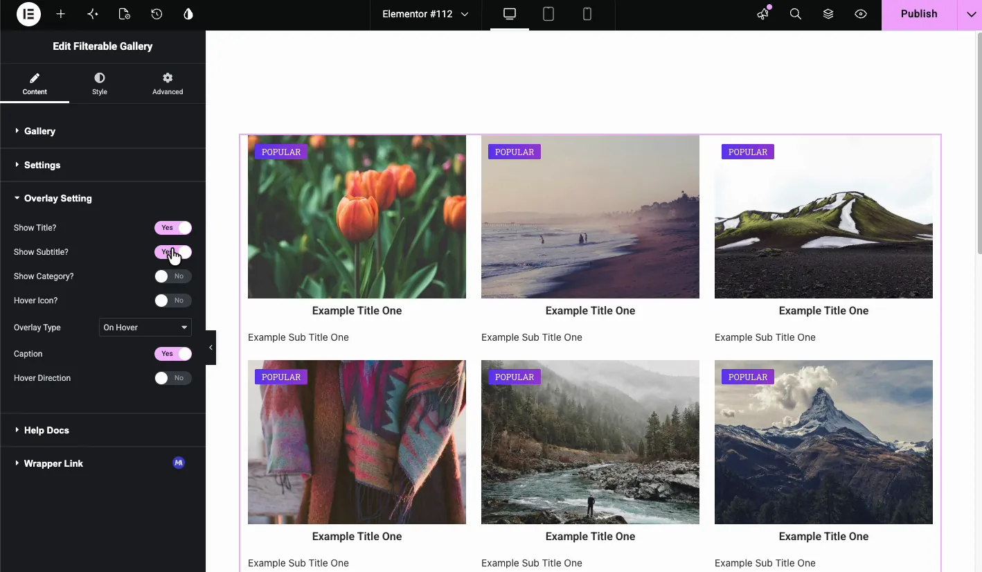
Overlay Setting #
The Overlay Setting section decides what appears when a visitor hovers over an item.
- Show Title?: display the item title on hover.
- Show Subtitle?: display the subtitle on hover.
- Show Category?: show the filter category label.
- Hover Icon?: add an icon that appears on hover, such as a magnifying glass or link symbol.
- Overlay Type: choose when the overlay appears. On Hover is the most common.
- Caption: toggle the caption area below the image.
- Hover Direction: enables directional hover effects.
Style the gallery in the Style tab #
The Style tab covers the card container, image, overlay, and buttons.
Item Style #
Item Style controls the card wrapper. Set padding, margin, border type, border width, border color, and border radius here. A thin border with a small radius is a quick way to separate cards from a light background.
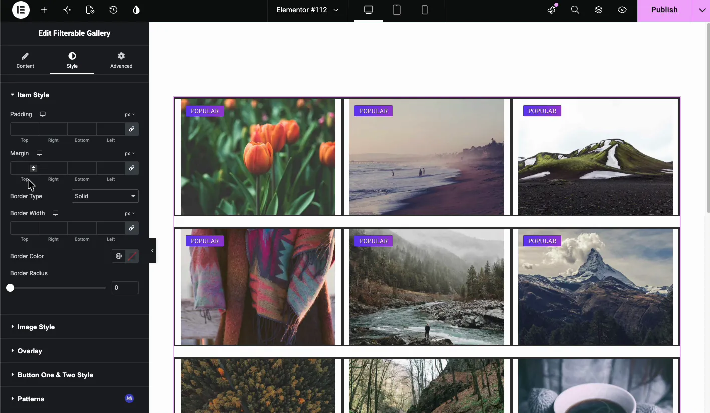
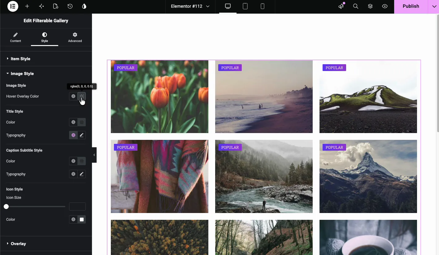
Image Style #
Image Style styles the picture itself and its hover state.
- Image Style: choose the default or a hover overlay look.
- Hover Overlay Color: the tint that covers the image on hover.
- Title Style: color and typography for the item title.
- Caption Subtitle Style: color and typography for the subtitle.
- Icon Style: icon size and color for the hover icon.
Overlay #
The Overlay section picks the hover animation. Options include Fade In, Slide From Left, Slide From Top, Mask From Bottom, Rotate In, Zoom In, and Scale Up. Fade In is the safe default; the slide and rotate variants draw more attention to themselves, which you may or may not want on a portfolio.
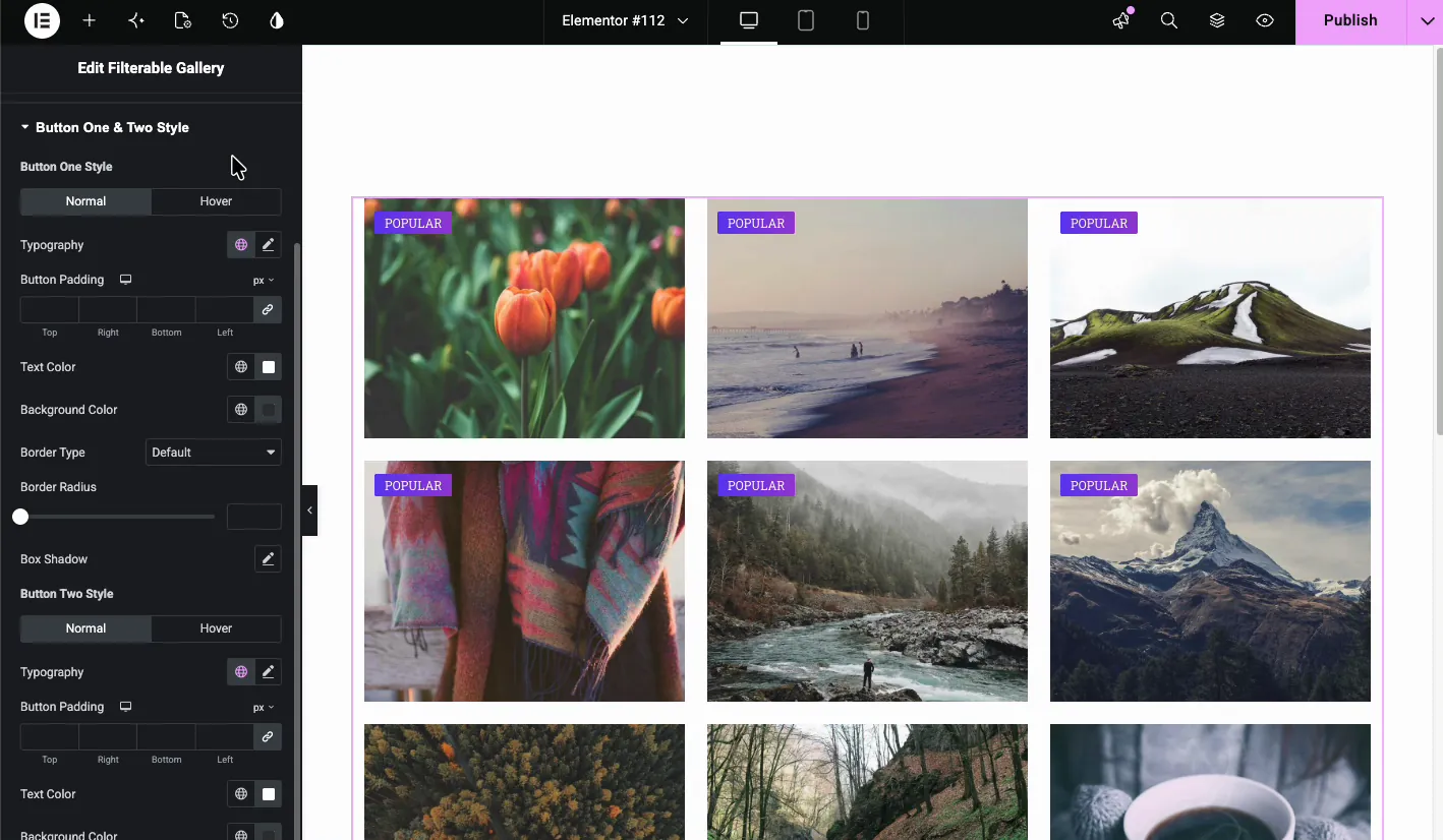
Button One and Two Style #
Style the action buttons separately. Each button has Normal and Hover states with controls for typography, padding, text color, background color, border, border radius, and box shadow.
See the live result #
Publish or preview the page to see the final gallery. Visitors can hover over an item to see the overlay, title, and icon, or click to open the lightbox or link. If you enabled the filter navigation, they can also click category buttons to show only matching images.
One thing to check: if the filter buttons don’t respond on the live page but work fine in the editor, your caching or optimization plugin is probably deferring or combining the gallery’s JavaScript. Exclude the Master Addons scripts from JS optimization and clear the cache.
Common use cases #
- Portfolio pages: let clients filter by branding, web design, or photography.
- Product catalogs: group items by category, color, or collection.
- Travel or real estate galleries: filter by location or property type.
- Team or event albums: organize photos by department or session.
Tips for a better filterable gallery #
- Use consistent image sizes. It keeps the grid neat, especially when masonry is off.
- Keep filter labels short. One or two words fit the filter bar best.
- Enable Image Aspect Ratio if your source images have different dimensions.
- Pick one strong hover effect instead of stacking scale, tilt, and a busy overlay.
- Compress images before upload. A gallery full of uncompressed photos is one of the most common causes of a slow page.
Video Tutorial #
If you’d like to see the Filterable Gallery widget in action, this video walks through the full setup, from adding gallery items to the filtered grid on the live page:
Frequently Asked Questions #
How do I create a filterable gallery in Elementor?
Install Master Addons for Elementor, add the Filterable Gallery widget, create gallery items, assign a Filter Label to each item, and enable Show Filter Nav in the Settings section. Visitors can then click category buttons to filter the grid.
Is the Master Addons Filterable Gallery free?
The free version of Master Addons includes a large set of widgets. Check the pricing page to see whether Filterable Gallery is in the free plan or needs Pro.
Can I add a lightbox to the gallery images?
Yes. Set the Popup or Links option to Popup for each gallery item. Visitors can then click an image to open it in a lightbox.
Does the widget support masonry layout?
Yes. Turn on the Masonry toggle in the Settings section to display images in a Pinterest-style layout with uneven heights.
Can I add a ribbon or badge to gallery items?
Yes. Turn on Show Ribbon in the gallery item and enter the ribbon text, such as Popular or Sale. The ribbon appears on the image card.
Wrapping up #
The Master Addons Filterable Image Gallery widget turns a static image grid into a category-based gallery visitors can actually browse. Filter navigation, hover overlays, ribbons, and lightbox support are all built in, so you won’t need a separate gallery plugin for most projects.
For more image tools, explore the Advanced Image widget, Image Carousel, and Gallery Slider. You can also read our roundup of Elementor filterable gallery plugins or browse the full Master Addons widgets and extensions collection.


