Almost every page ends up needing a row of small cards that pair an icon with a short headline and a line of text. Features, services, steps, contact details, all the same shape. The Info Box widget in Master Addons for Elementor builds that card. You pick an icon or image, type a title and description, choose one of four ready-made layouts, and style every part from the Elementor panel.
It is one of those widgets you end up reaching for constantly, since an icon, a heading, and a sentence cover so many sections of a site. Below is a walk through every setting, from the style presets down to the icon, title, and description controls.
What the Info Box widget does #
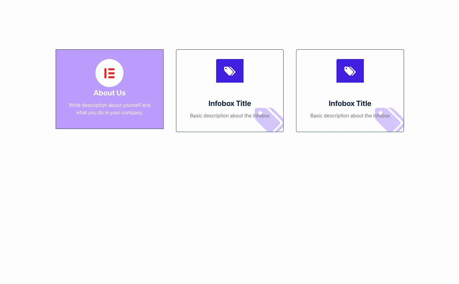
An info box stacks an icon or image on top of a title and a short description. The four style presets mean the same content can look like a filled card, a bordered card, or a clean centered block, and you can line several up side by side to make a feature row.
The title can link anywhere, the icon can be swapped for an uploaded image, and the card can carry its own background, border, and hover animation. There are three tabs: Content for the icon, title, and text, Style for colors and spacing, and Advanced for the usual Elementor options.
Before you start #
- WordPress with Elementor installed and active.
- Master Addons for Elementor installed and active. New to the plugin? See the installation guide.
- An icon in mind, or an image to upload, plus the title and description text.
How to add the Info Box widget #
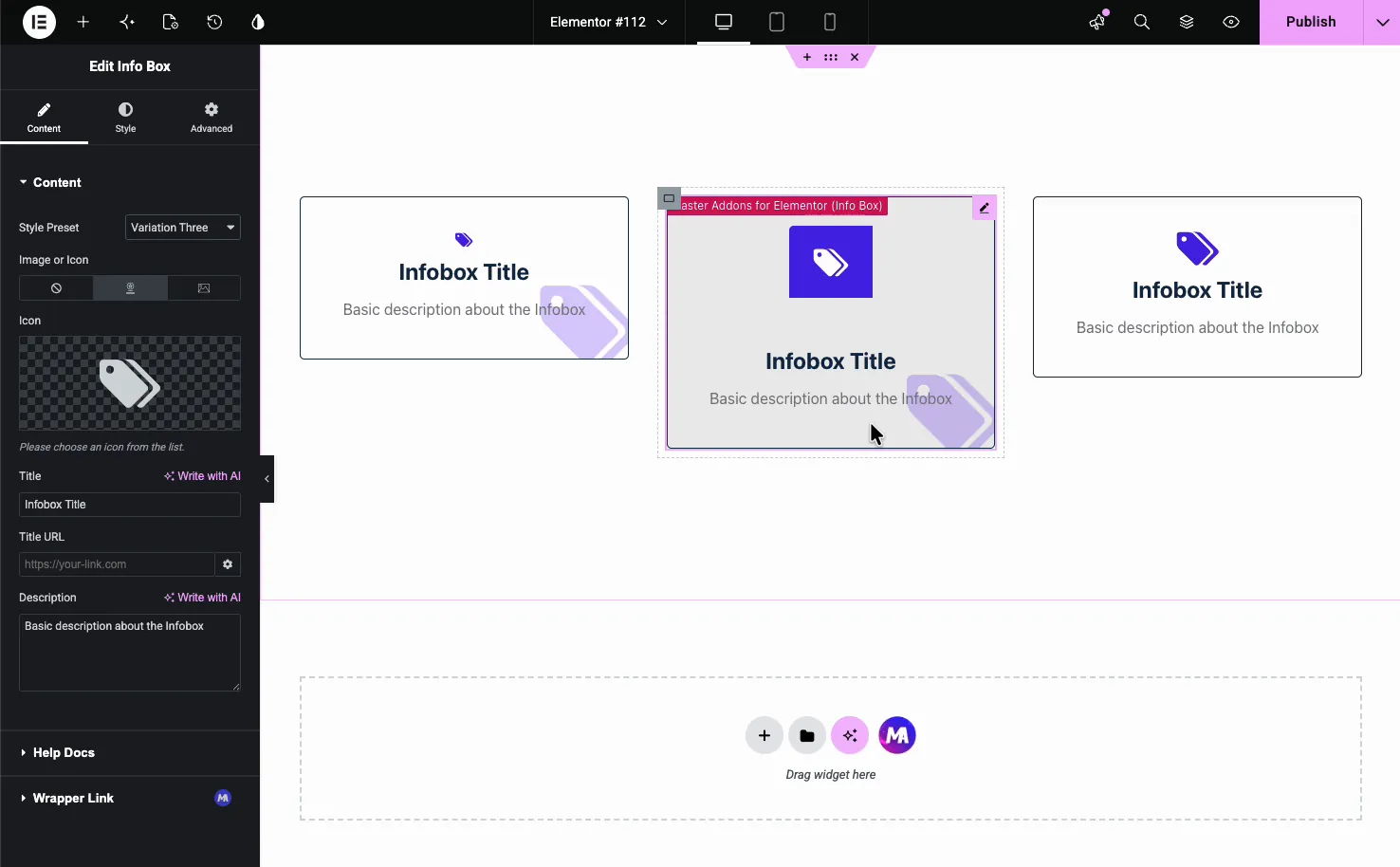
In the Elementor editor, open the Elements panel and search for Info Box, or scroll to the Master Addons section. Drag it onto your page. It loads with a sample icon, an “Infobox Title,” and a placeholder description, so you start from a working card instead of a blank one.
Set up the content #
Open the Content tab. The Content section holds everything the card shows, and it is where most of your editing happens.
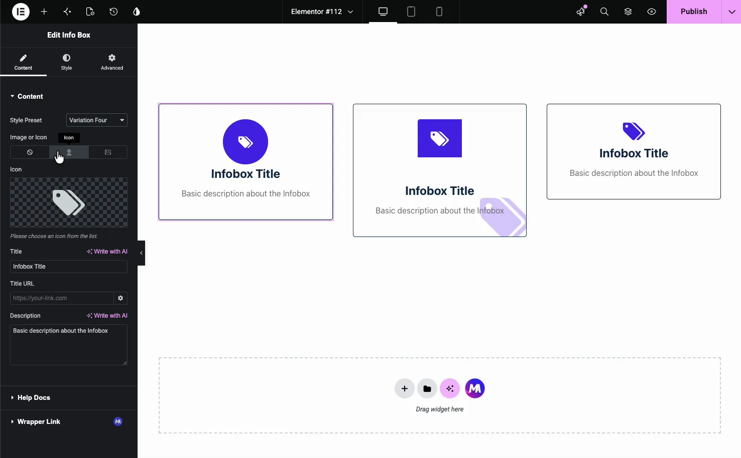
- Style Preset: pick Variation One through Four. Each lays out the icon, title, and description differently (more on these below).
- Image or Icon: a three-way toggle for None, Icon, or Image. Choose Icon to use the icon library, or Image to upload your own.
- Icon: when Icon is selected, pick any icon from the Font Awesome library or upload an SVG.
- Title: the headline text, with a Write with AI option next to it.
- Title URL: turn the title into a link to any page or external URL.
- Description: the line or two of text under the title, also with Write with AI.
Under those you will find a Help Docs link and a Wrapper Link option (a Pro feature) that makes the entire card clickable.
Choose a style preset #
The four presets change the whole look without touching your content, so switching between them is a quick way to find the layout that fits the section.
- Variation One: a centered card with the icon, title, and description stacked, often on a filled background.
- Variation Two: a bordered card with the icon left-aligned above the title.
- Variation Three: a card with the icon set in a colored square block above the heading.
- Variation Four: a centered layout with the icon inside a circular badge.
Use an image instead of an icon #
If a photo or logo fits better than an icon, set Image or Icon to Image and pick a file from the Media Library. The widget then shows your image in the icon slot, which works well for partner logos, product thumbnails, or illustrated feature cards. Set it back to None when you want a text-only box.
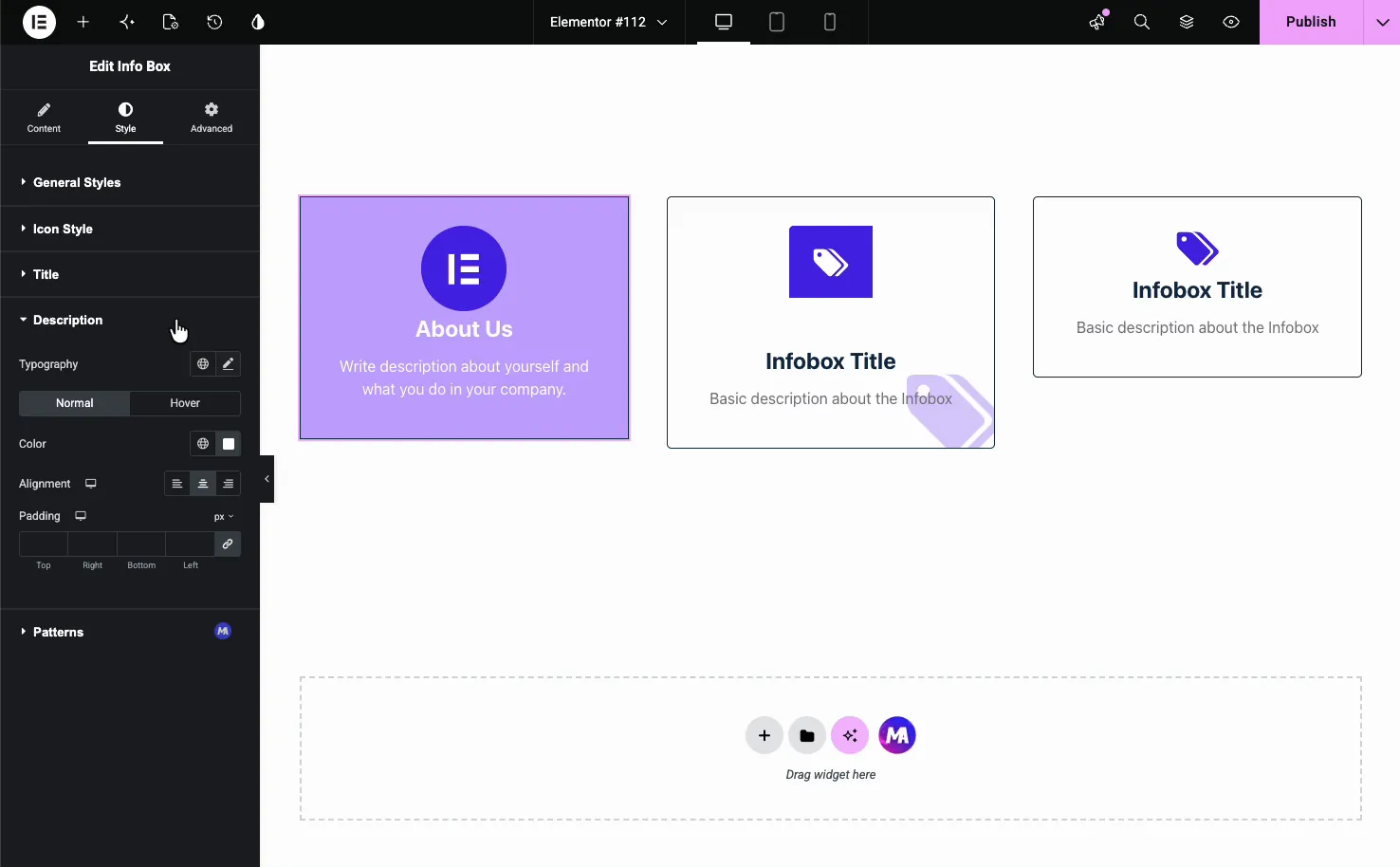
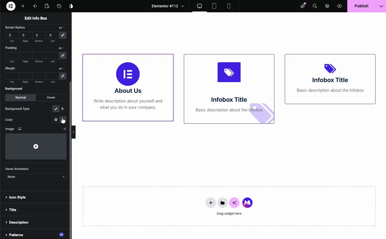
Style the box #
The Style tab is split into General Styles, Icon Style, Title, Description, and Patterns (a Pro option). General Styles controls the card container itself.
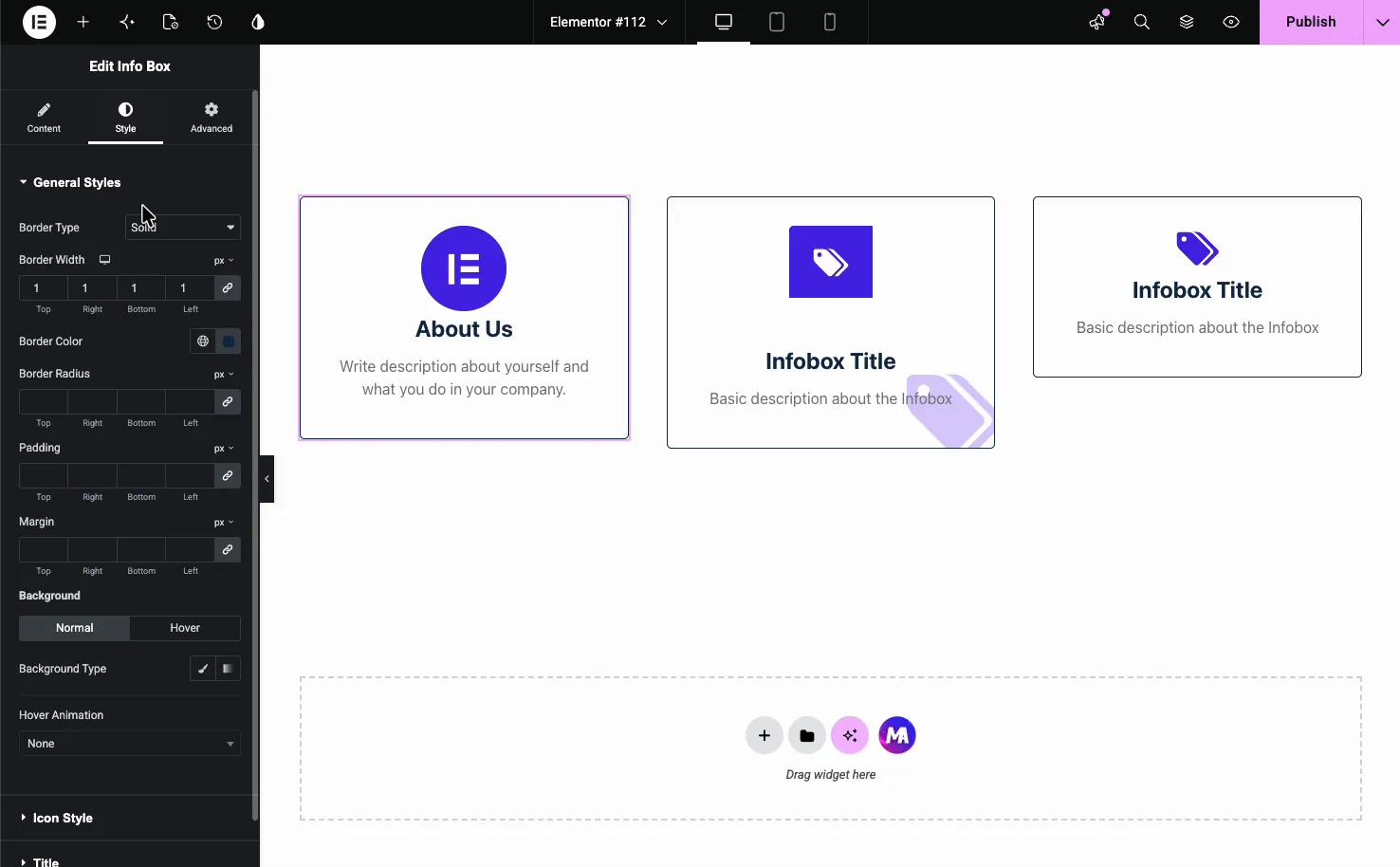
- Border Type, Width, and Color: the outline around the card.
- Border Radius: round the corners.
- Padding and Margin: spacing inside and around the box.
- Background: set a Normal and a Hover background, either a solid color or an image.
- Hover Animation: add a built-in motion effect like Bob or Grow when someone hovers the card.
Icon, title, and description styling #
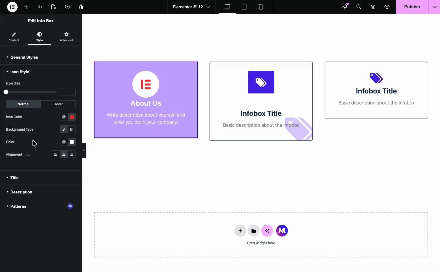
The Icon Style section sets the icon size, color, and background, with separate Normal and Hover states plus alignment.
The Title and Description sections handle typography, color, alignment, and spacing for the text. Each one has its own Normal and Hover states, so the card can shift as visitors move over it.
Background color and image options #
Back in General Styles, the Background control takes either a solid Color or an Image. A tinted background with white text, like the filled “About Us” card, is an easy way to make one box stand out in a row of plain ones.
The result on the page #
Publish or preview and the boxes render with your icons, titles, and descriptions in place. Here is a row of three info boxes, each on a different style preset, the kind of layout that fits a features or services section.
Common use cases #
- Feature highlights in a three or four column row under the hero.
- Services or offerings each with an icon and a one-line summary.
- How-it-works steps with a numbered or themed icon per step.
- Contact details like phone, email, and address as linked boxes.
- About or team callouts using the filled background preset to stand out.
Tips for working with the Info Box widget #
- Keep descriptions short. One or two lines read best and keep a row of cards even.
- Match icon sizes across a row. Set the same Icon Size on each box so they line up. This is the thing that usually looks off when cards don’t quite match.
- Use one preset per row. Mixing presets in the same row tends to look uneven; switch the background color instead when you want to highlight one.
- Link the title or the wrapper. Send people somewhere useful with the Title URL, or make the whole card clickable with Wrapper Link.
- Add a subtle hover animation. A small Bob or Grow on hover signals the card is interactive without getting in the way.
Frequently Asked Questions #
What is the Info Box widget in Master Addons?
It is an Elementor widget that combines an icon or image, a title, and a short description into one styled card. You get four style presets and control over colors, spacing, and hover effects, so you can build feature rows, service lists, and callouts straight from the panel.
How many style presets does the Info Box have?
Four. Variation One through Four each arrange the icon, title, and description differently, from a filled centered card to bordered layouts with the icon in a square or circular badge. You switch between them from the Style Preset dropdown without redoing your content.
Can I use an image instead of an icon?
Yes. In the Content tab, set Image or Icon to Image and pick a file from the Media Library. The widget shows your image in place of the icon, which works well for logos, product shots, or illustrated cards. Choose None for a text-only box.
Can I make the info box clickable?
You can link the title with the Title URL field in the Content tab. To make the entire card clickable, use the Wrapper Link option, which is a Pro feature. Both let visitors tap the box to reach another page or section.
Can I add a hover effect to the info box?
Yes. General Styles has a Hover Animation dropdown with built-in effects like Bob and Grow, and the Icon, Title, and Description sections each have their own Hover states for color and background. Together they let the card react when someone moves over it.
Wrapping up #
The Info Box widget turns an icon, a title, and a sentence into a clean card you can repeat across any section. Pick a preset, choose an icon or image, add your text and links, then style the box to match your page. For related layout tools, see the Flipbox widget and the Team Member widget, browse the full Master Addons widgets and extensions, and check the pricing page for what each plan includes.


