Elementor Flip Box Widget with Hover Flip Card Animations
Flipbox is a Master Addons flip box widget for Elementor, with no Elementor Pro needed. The front face shows an icon or image with a title and short text, and on hover the card turns to a back face with more detail and an action button. The widget comes with the Default and Front Icon designs and 6 animations: Flip Horizontal, Flip Vertical, Fade, Flip Box, Flip Box Fade and Fade Up. Master Addons Pro adds the Front Image and Diagonal designs and 16 more animations, including Cube, Rollover and 3D Flip, for 22 in total. Elementor itself only has a flip box in Elementor Pro.

Design Variations and Flip Animations
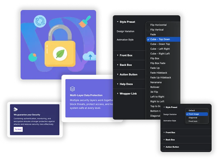
Design Variation sets the front layout: Default and Front Icon come with the widget, Front Image and Diagonal need Pro. Animation Style sets how the card turns. Included: Flip Horizontal, Flip Vertical, Fade, Flip Box, Flip Box Fade and Fade Up. Pro adds four Cube directions, Fade Hideback, Fade Up Hideback, four slide directions, two Diagonal slides, Fade In Out, Nananana, Rollover and 3D Flip, which has its own direction setting.
- 22 animations in total: 6 included and 16 with Pro.
- The flip runs on hover on desktop and on tap on touch screens.
- Use one animation per section so a row of cards feels consistent.
Dual-Side Content Builder
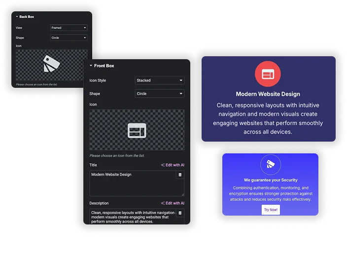
The Front Box and Back Box each have their own icon with Default, Stacked or Framed view and Circle or Square shape, a Title, a Description, Alignment and a heading tag. Keep the front short, like a service name, and use the back for the explanation. In the Style tab each face gets its own background, title and description colors, typography, icon colors and border.
- Separate content and styling for each face.
- Title HTML Tag on both faces, so a grid of cards keeps a clean heading order.
- A Flip Box Height setting in General keeps both faces the same size.
CTA Button with Hover
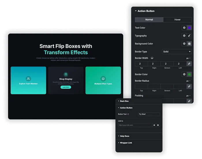
The Action Button shows on the back face with your Button Text and link. Style it for Normal and Hover with text color, background, border, border radius and padding, plus typography. The button is the only link inside the widget. To make the whole card clickable, add the Wrapper Link extension to the widget.
- Use a specific label such as “See Pricing” when that is where the link goes.
- Skip the button on purely informational cards.
- If you use Wrapper Link, point the button to the same page.
Flipbox at a glance
The table lists what the widget does today, read from the plugin source in version 3.2.6.
| Item | Flipbox |
|---|---|
| Design variations | 4: Default and Front Icon included; Front Image and Diagonal with Pro |
| Animations | 22: 6 included (Flip Horizontal, Flip Vertical, Fade, Flip Box, Flip Box Fade, Fade Up) and 16 with Pro (four Cube directions, two Hideback fades, four slides, two Diagonal slides, Fade In Out, Nananana, Rollover, 3D Flip) |
| Front and back content | Icon or image (image with the Pro Front Image design), title with its own HTML tag, description and alignment on each face |
| Icon style | Default, Stacked or Framed, with a Circle or Square shape |
| Trigger | Hover on desktop, first tap on touch screens. No click trigger |
| Whole-box link | No. The back button carries the link; the Wrapper Link extension makes the whole card clickable |
| Height control | Yes, Flip Box Height in Style, General |
| Carousel mode | No |
| 3D Flip direction | 4 directions on the Pro 3D Flip animation |
| Needs | Elementor and Master Addons. Pro for the two extra designs and the 16 extra animations |
Elementor Pro Flip Box vs Master Addons Flipbox
Elementor Pro has its own Flip Box widget. If you already pay for it, you may not need another one. Here is how the two compare.
| Feature | Elementor Pro Flip Box | Master Addons Flipbox |
|---|---|---|
| Price | Needs Elementor Pro | Master Addons; more designs and animations in Pro |
| Flip effects | Flip, Slide, Push, Zoom In, Zoom Out and Fade, with direction and 3D Depth | 6 included animations, 22 with Pro, including Cube, Rollover and 3D Flip |
| Trigger | Hover | Hover; first tap on touch screens |
| Front graphic | None, Image or Icon | Icon, or an image with the Pro Front Image design |
| Whole card link | Apply Link On: Whole Box or Button Only | Button only, or the whole card with the Wrapper Link extension |
| Button | Yes | Yes, with Normal and Hover styling |
Elementor Pro is simpler if you want a whole-box link built in. Master Addons works on Elementor without Pro and gives more animation choices with its own Pro. For a static card with nothing hidden, use the Info Box widget.
Flip card CSS or a flip box widget?
A flip card is the same thing as a flip box: a front face that rotates to a back face. You can hand-write one with about 40 lines of CSS using perspective, transform-style: preserve-3d and backface-visibility: hidden, and drop it into an HTML widget. That route is fine for one card on a page you control.
The CSS version has three recurring problems. Touch screens have no hover, so the card never flips unless you add a tap handler. Both faces need a fixed height or the card jumps as it turns. And every change to colour, text or icon means editing code again, often inside a Custom CSS field that needs Elementor Pro. The Flipbox widget handles the tap, the height and the styling from the editor panel, and it gives you a back-face button, 22 animations and a design variation per card without touching code.
Flip Box Ideas and Tips
A flip box keeps a grid clean while still carrying detail, because the description sits behind the card instead of under it. It works well for service grids, team cards with a photo on the front and a bio on the back, feature tiles and stat cards that flip to what a number means.
- Set Flip Box Height. Without it, a longer back face resizes the card as it turns and the row jumps.
- Make the faces look different. A tint on the front and your brand color on the back makes the flip obvious.
- Plan for phones. Touch screens have no hover, so the card flips on tap and the button needs a second tap. Test on a real phone.
- Keep essential details on the front. Prices, phone numbers and booking links should not live only on the back face.
- Limit the motion. One or two flip box rows per page reads better than six different animations.
Flip box examples
Each demo below is a live page built with the widget. The animation and design variation are named so you can rebuild any of them from the panel.
Flip Vertical
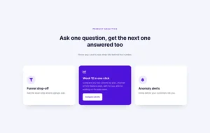
- SaaS analytics cards: Default design, three dark stat cards that turn to a plan description.
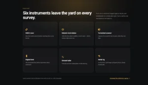
- Equipment card grid: Default design, six product tiles in a two-row grid.
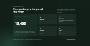
- Stat and species grid: Default design, a number on the front and the meaning on the back.
- Arch product cards: Default design with a rounded arch shape on the front face.
Flip Horizontal
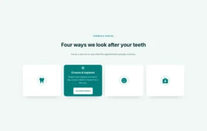
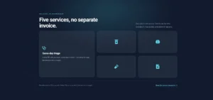
- Icon-only service tiles: Front Icon design, four framed icons that turn to a short service blurb.
- Bento service tiles: Mixed Default and Front Icon cards in a bento layout.
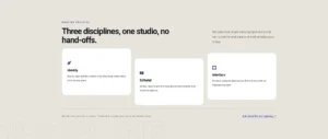
- Staggered discipline cards: Default design, three cards offset from each other.
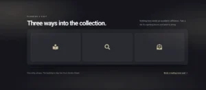
- Minimal icon tiles: Front Icon design, three dark tiles with one icon each.
Fade
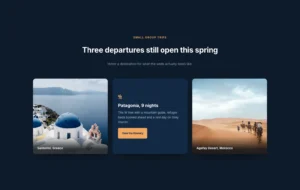
- Front image travel cards: Front Image design (Pro), a photo on the front and the trip details on the back.
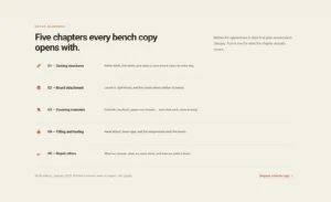
- Numbered chapter rows: Default design, wide rows that fade to a chapter summary.
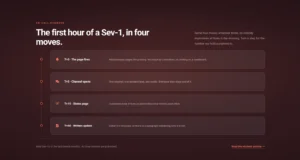
- Timeline runbook rows: Default design, step cards that fade to the instructions.
Flip Box and Cube
- Circular brand showcase: Flip Box animation on round cards.
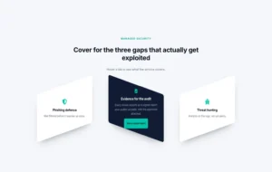
- Diagonal tiles: Diagonal design (Pro) with the Cube Left Right animation (Pro).
- Advanced transform effects: Flipbox cards combined with the Transforms extension.
3D Flip and slides
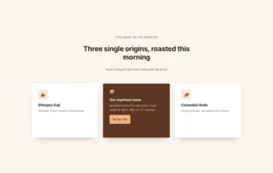
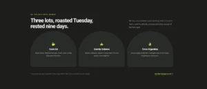
- Coffee product cards: 3D Flip animation (Pro), Slide Right to Left direction.
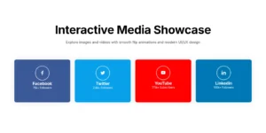
- Interactive media showcase: 3D Flip (Pro) with a different direction on each card.
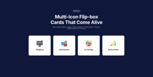
- Multi-icon cards: Left to Right, Right to Left and Top to Bottom slides (Pro) in one row.
Rollover, Diagonal and Fade In Out
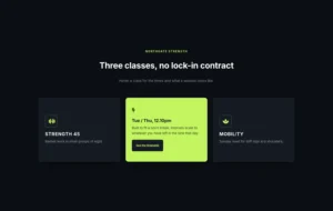
- Dark gym class cards: Rollover animation (Pro) on a dark theme.
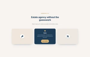
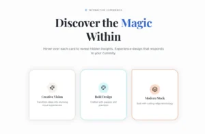
- Pastel icon tiles: Front Icon design with the Diagonal Bottom to Top animation (Pro).
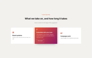
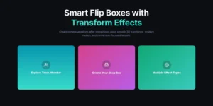
- Gradient back cards: Fade In Out animation (Pro) to a gradient back face.
How to Add a Flip Box in Elementor
You need Elementor and the Master Addons plugin from WordPress.org.
- Check that Flipbox is switched on under Master Addons, Widgets.
- In the Elementor editor, search for Flipbox and drag it into a container.
- Pick a Design Variation and an Animation Style, then hover the card to preview it.
- Fill in the Front Box and Back Box: icon, title, description and heading tag.
- Add the Action Button text and link.
- In Style, General, set Flip Box Height so the card does not resize mid-flip, then style each face.
For 3D effects, read How to Create 3D Elementor Flipbox Animations. Every setting is in the Flipbox widget settings.
Flipbox pairs with a few other Master Addons widgets: Info Box for a card that never flips, Creative Button for a styled call to action under a grid, Image Hover Effects for a photo that reveals a caption instead of a back face, Team Member for people cards with social links, and Toggle Content when the reveal has to happen on click rather than hover.
Frequently Asked Questions For Flipbox
How does the flip box work on phones?
Touch screens have no hover, so the card flips when tapped. The back face button needs its own tap after the flip. Keep must-see information on the front and test on a real device.
Can I use an image instead of an icon on the front?
Yes, with the Front Image design variation, which is a Master Addons Pro option. Otherwise, use an icon on the front or set a background image for the face in the Style tab.
Do I need Master Addons Pro for the Flipbox widget?
No. Flipbox comes with the Master Addons plugin with the Default and Front Icon designs and 6 animations. Master Addons Pro adds 2 more designs and 16 more animations.
Does the flip box flip on click?
No. The widget flips on hover, and on touch screens the first tap flips the card. There is no click trigger on desktop. For a panel that opens on click, use the Toggle Content widget or a Popup Builder popup.
Is a flip card the same as a flip box?
Yes. Flip card is the CSS tutorial name for the same effect: a front face that rotates to a back face. The Flipbox widget builds a flip card from the editor panel, with the height, the tap on touch screens and the back-face button handled for you.
Does Elementor have a flip box widget?
Only Elementor Pro has one. Elementor without Pro does not, so you need an addon such as this Flipbox widget.
Can I link the entire flipbox to a page without the separate button?
The widget links the button only. To make the whole card clickable, turn on the Wrapper Link extension and add the link to the Flipbox widget.
How many flip animations are there?
22 in total. Flip Horizontal, Flip Vertical, Fade, Flip Box, Flip Box Fade and Fade Up come with the widget. The other 16, including Cube, Rollover and 3D Flip, need Master Addons Pro.
Can I put flip boxes in a carousel?
Not with a built-in setting. The widget has no carousel mode. Save a flip box as a template and show it in the Image Carousel or a loop grid, or lay the cards out in a wrapping container instead.
What is the difference from the Elementor Pro Flip Box?
Elementor Pro has six effects with direction and 3D depth, a whole-box link option and needs an Elementor Pro plan. Flipbox works on Elementor without Pro, has 6 included animations and 22 with Master Addons Pro, two icon or image designs, and links the whole card through the Wrapper Link extension.
Trending Elementor Widgets & Extensions
Build sophisticated websites in less time.
Glassmorphism
Container Extras
Patterns
Post/Page Duplicator