Elementor Before After Image Slider: Free Comparison Widget
Image Comparison is a free Master Addons widget that stacks a before and an after image in one frame with a handle between them. Visitors drag or swipe the handle to reveal the change. Add a label to each side, choose Horizontal (left and right) or Vertical (top and bottom), set where the handle starts, and style the handle, labels and overlay. Neither free Elementor nor Elementor Pro has a before and after slider, so this widget fills that gap on free Elementor.

How to Add a Before After Slider in Elementor
You need Elementor and the free Master Addons plugin from WordPress.org.
- Check that Image Comparison is switched on under Master Addons, Widgets.
- In the Elementor editor, search for Image Comparison and drag it onto the page.
- On the Before tab choose the first image and label, then do the same on the After tab.
- In Settings, set the Visible Ratio and choose Horizontal or Vertical.
- Keep Move Handle on Mouse Drag/Swipe for phones, or use a Pro option on desktop-focused pages.
- Style the handle and labels in the Style tab, then test the slider on a phone.
For design tips and examples, read the before and after slider guide. Every setting is listed in the Image Comparison widget settings.
Drag and Swipe Before After Slider
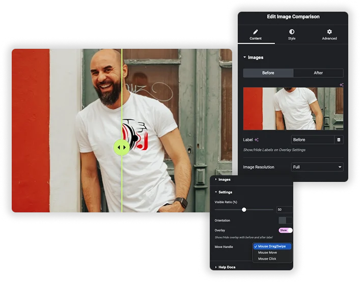
Upload the Before and After images, each with its own Label and Image Resolution. In Settings, Visible Ratio (%) sets where the handle starts, Orientation is Horizontal (the default) or Vertical, and Overlay shows or hides the labels. Move Handle is Mouse Drag/Swipe in the free plugin. Master Addons Pro adds Mouse Move, where the handle follows the cursor, and Mouse Click.
- Drag and swipe work on desktop and touch screens.
- Start the handle off-center to highlight the result.
- Use images with the same pixel dimensions so the two sides line up.
Customizable Overlay & Clear Labels
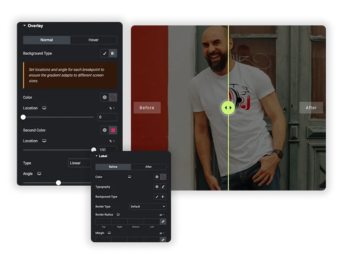
Turn on Overlay to show the Before and After labels on the images. The Overlay style section has Normal and Hover backgrounds. The Label section styles each side separately with color, typography, border, border radius, margin and padding, so you can change “Before” and “After” to “Old” and “New” or any other words.
- Custom label text in any language.
- Separate styles for the before and after labels.
- A different overlay background on hover.
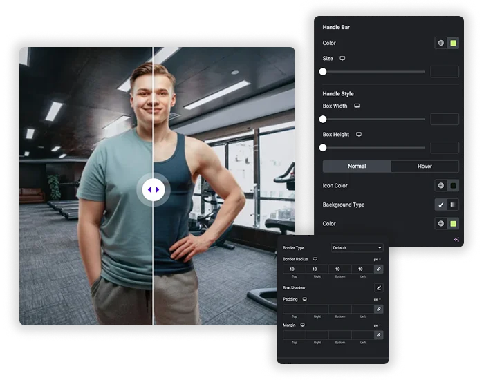
Professional Handle & Container Styling
The Handle section sets the handle bar color and size, the handle box width and height, and icon color, border and border radius for Normal and Hover. Layout Style adds a border, padding and margin around the whole slider. Border Radius and Box Shadow on the container are Master Addons Pro options.
- Match the handle color to your brand.
- A thin bar with a round handle box for a clean look.
- Rounded corners and a shadow on the container with Pro.
Image Comparison: Free vs Pro
Elementor has no before and after widget in its free or Pro plugin. Here is what the free Master Addons widget includes and what Pro adds.
| Feature | Free | Master Addons Pro |
|---|---|---|
| Before and after images with labels | Yes | Yes |
| Horizontal and Vertical orientation | Yes | Yes |
| Visible Ratio starting point | Yes | Yes |
| Mouse Drag/Swipe handle | Yes | Yes |
| Mouse Move and Mouse Click handles | No | Yes |
| Handle, label and overlay styling | Yes | Yes |
| Container Border Radius and Box Shadow | No | Yes |
For most before and after sliders the free version is enough. Pro makes sense when you want the handle to follow the cursor or need rounded corners and a shadow without custom CSS. To pin notes on one image instead, see Image Hotspot (Pro).
Frequently Asked Questions For Image Comparison
Is the Image Comparison widget free?
Yes. The widget is free with drag and swipe, labels, both orientations and handle styling. Master Addons Pro adds Mouse Move and Mouse Click handles and container border radius and box shadow.
Does it work on phones?
Yes, with the free Mouse Drag/Swipe handle. Visitors swipe to move the divider. The Pro Mouse Move option relies on hover, so it does not work on touch screens.
Does Elementor have a before and after slider?
No. Neither free Elementor nor Elementor Pro includes an image comparison or before and after widget, so you need an addon such as this one.
When should I use the Vertical orientation?
Use Vertical for tall images, such as full-length portraits, building facades or long screenshots. The before image sits on top and the after image below, with an up and down handle.
Will using two high-resolution images slow down my page?
It can, if the images are very large. Use the Image Resolution setting wisely (e.g., “Large” instead of ‘Full’) and always optimize your images for the web before uploading. The element itself is lightweight, but image file size is the main factor for performance.
Can I compare more than two images?
No. Each widget compares two images. For more pairs, add one widget per pair or show several images in the Image Carousel.
Trending Elementor Widgets & Extensions
Build sophisticated websites in less time.
Glassmorphism
Container Extras
Patterns
![Master Addons Post/Page Duplicator extension for Elementor: MA Duplicator row link in the WordPress Pages list creating a Landing Page - [Duplicated #128] draft](https://d1asvmc6qcowgk.cloudfront.net/wp-content/uploads/2026/09/15102930/post-page-duplicator-768x403.webp)
Post/Page Duplicator