

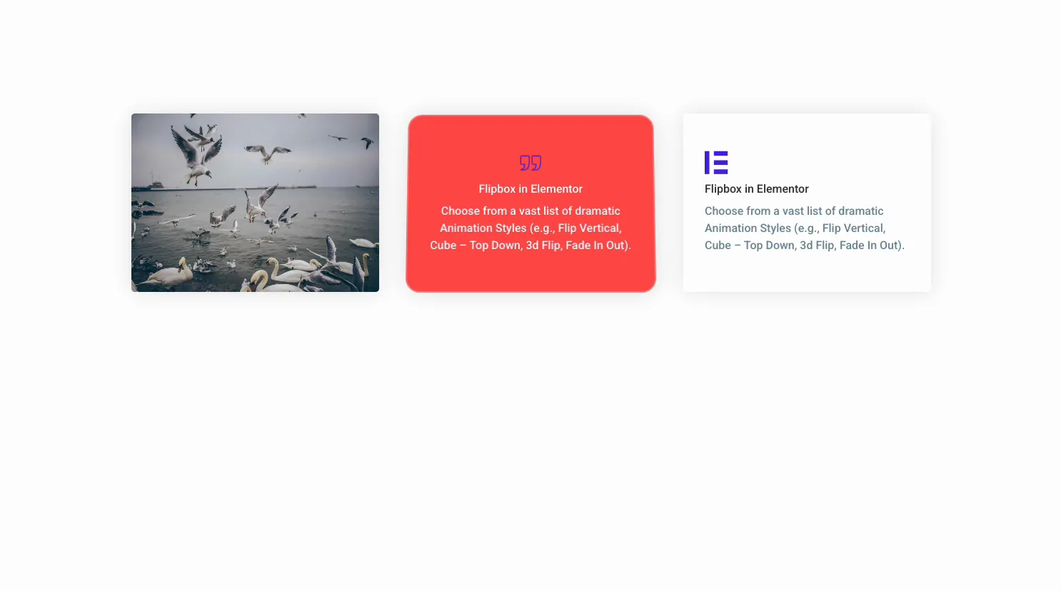
A card that flips over on hover shows twice the content in the same space. The free Flipbox widget in Master Addons for Elementor gives you a two-sided box: a front face with an icon, title, and description, and a back face that flips into view with its own text and a button.
You pick an animation, fill in both faces, add a button, then style each side. There are 22 flip effects: 6 in the free plugin and 16 more with Master Addons Pro, from a plain Fade to a 3D Cube. This guide walks through every setting in the widget.
What the Flipbox widget does #
The widget builds a flip card from two faces. The Front Box is what visitors see first: an icon or image, a title, and a description. Hover over it and the card flips to the Back Box, which has its own title, description, and a button that can link anywhere.
Three tabs run the whole thing. Content holds the animation, the front and back text, and the button. Style handles the box height, borders, colors, and typography for each face. Advanced is the usual Elementor spacing and visibility.
Before you start #
- WordPress with Elementor installed and active.
- Master Addons for Elementor installed and active. New to the plugin? See the installation guide.
- The text and icons for both faces, and the link for the back-side button.
How to add the Flipbox widget #
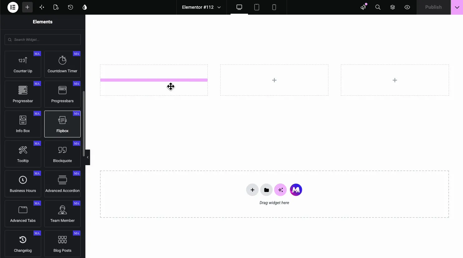
In the Elementor editor, open the Elements panel and search for Flipbox, or scroll to the Master Addons section (the widgets carry a purple MA badge). Drag it onto the page and it loads with a sample front and back you can edit.
Set the animation style #
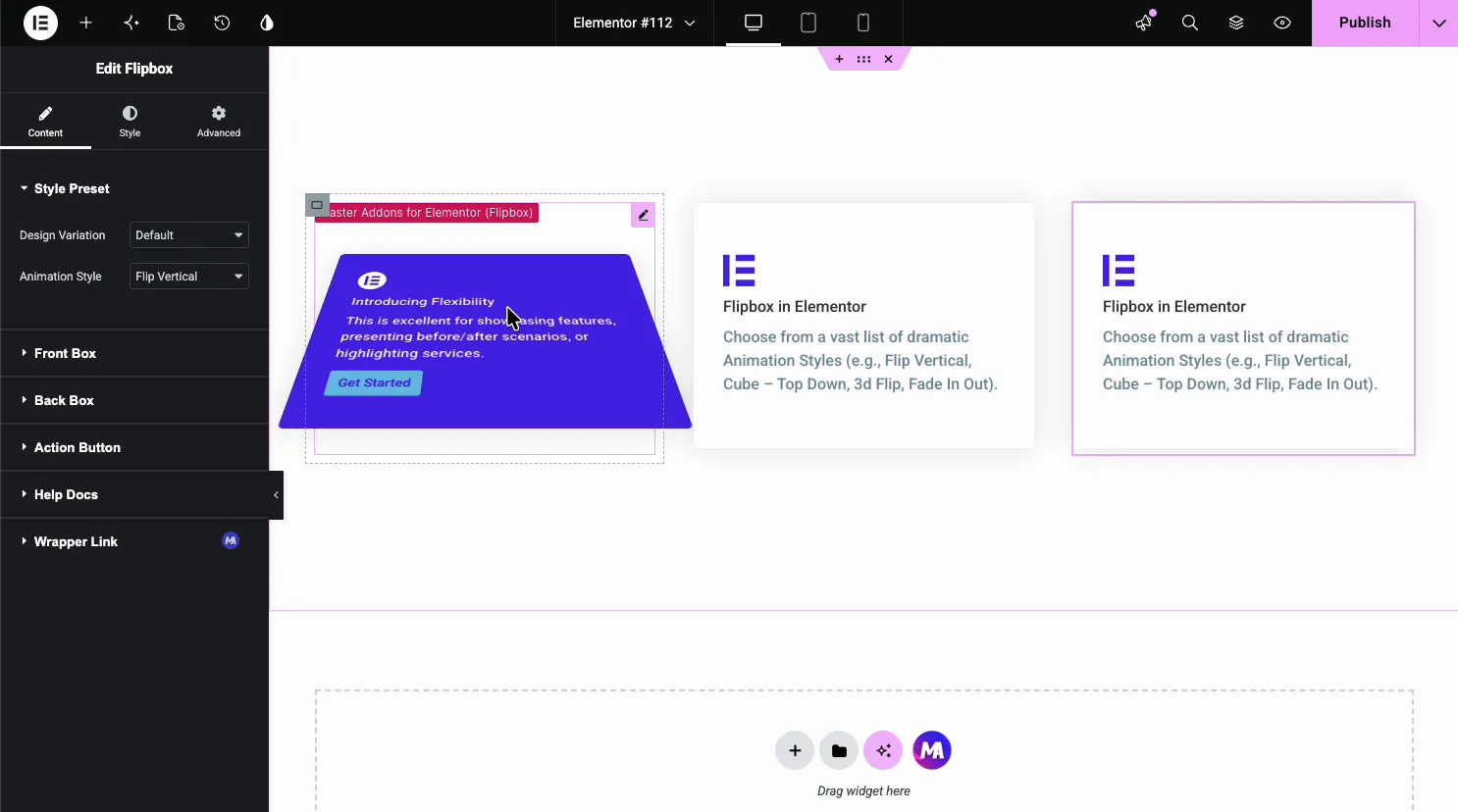
Open the Content tab. The Style Preset section holds the Design Variation and the Animation Style, and under it sit the Front Box, Back Box, and Action Button sections.
The Animation Style dropdown is the fun part. It carries 22 options, so the same card can flip, fade, slide, or cube its way to the back face. Flip Horizontal, Flip Vertical, Fade, Flip Box, Flip Box Fade and Fade Up are free; the rest need Pro.
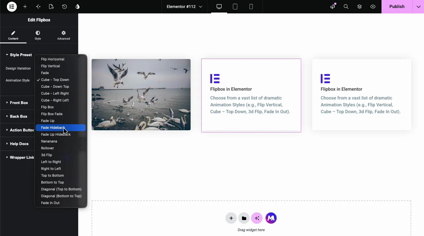
- Flip Horizontal and Flip Vertical: the classic card flip on each axis.
- Cube (Top Down, Down Top, Left Right, Right Left): a 3D cube rotation between faces (Pro).
- Fade and Fade Up (free), 3d Flip and Rollover (Pro): softer reveals when you want something subtle.
- Slide directions and Diagonal (Pro): push the back face in from a side or a corner.
Set up the front box #
Open the Front Box section. This is the face people see before they hover, so it has to earn the flip.
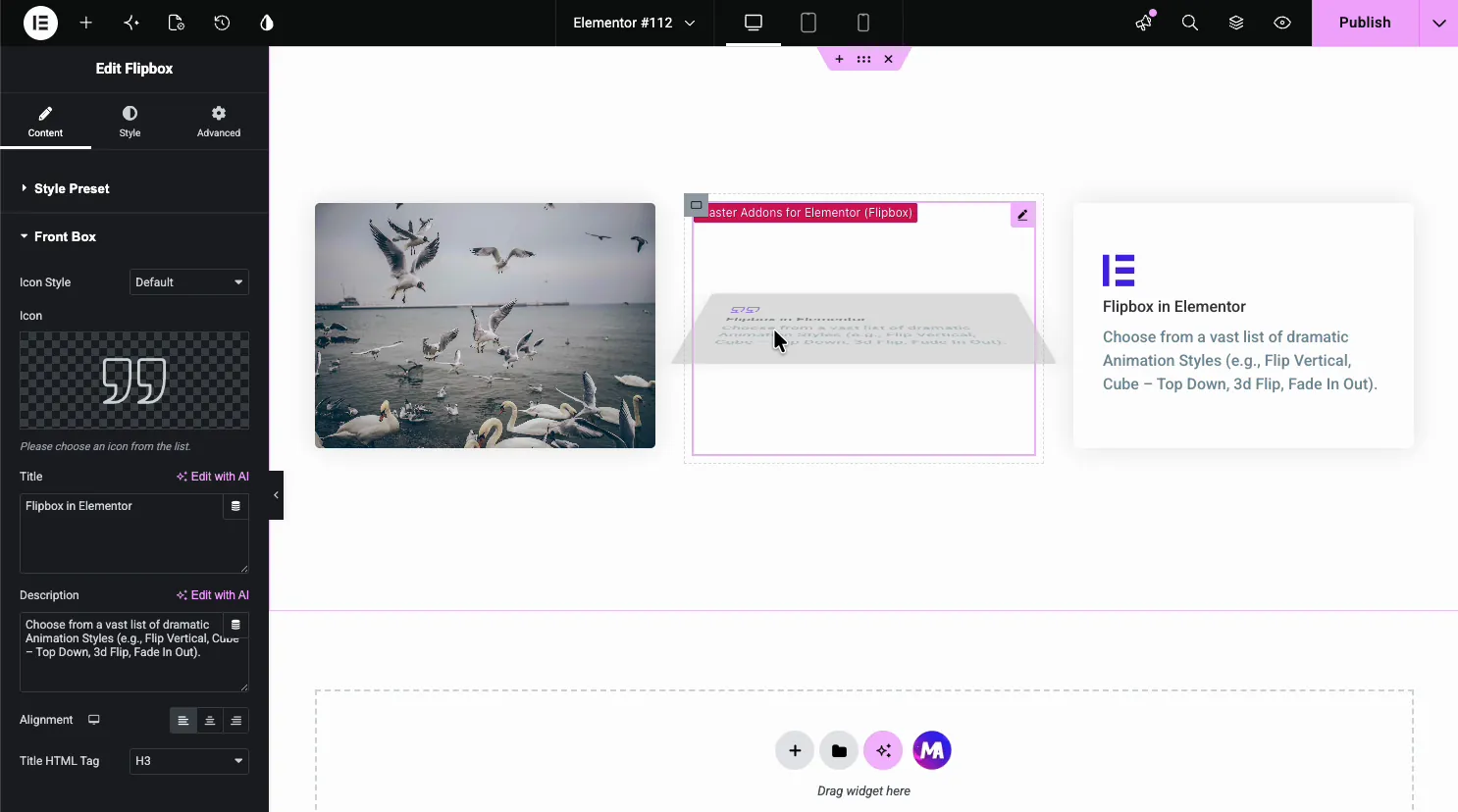
- Icon Style and Icon: pick an icon from the library. An image on the front comes with the Front Image design variation in Pro.
- Title and Description: the front heading and text, each with a Write with AI option.
- Alignment and Title HTML Tag: align the content and set the heading level (H1 to H6).
Set up the back box #
Open the Back Box section for the face that flips into view. It takes the same fields as the front, so a short teaser out front can lead to the real detail on the back.
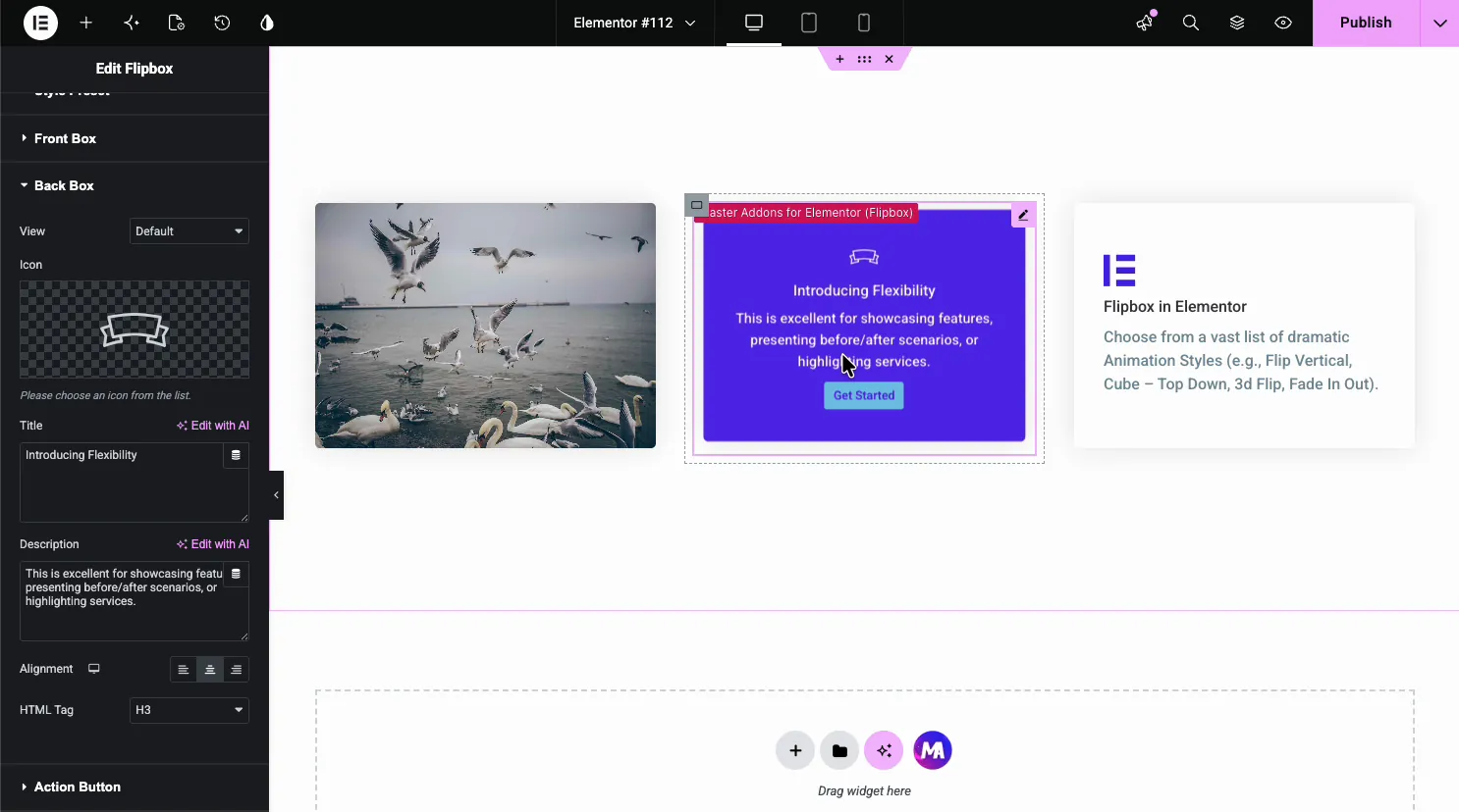
- Icon: a separate icon for the back face.
- Title and Description: the back-side heading and text.
- Alignment and HTML Tag: layout and heading level for the back.
Add the action button #
The Action Button section lives on the back face. Set the label and where it points, so a hover can lead straight to a product, a form, or another page.
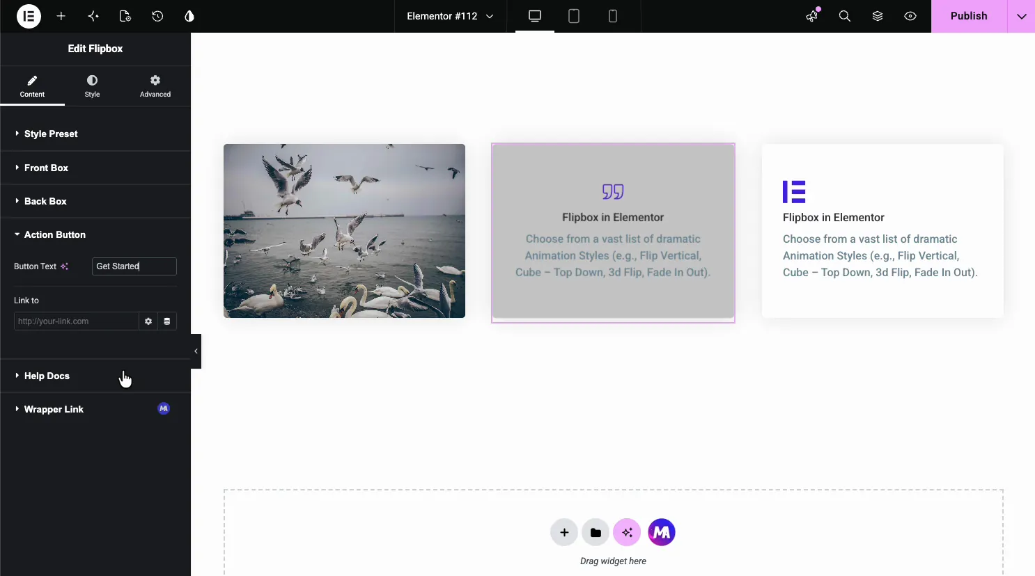
- Button Text: the label, like Get Started or Learn More.
- Link to: the URL the button opens, with the usual Elementor link options.
Style the flip card #
Open the Style tab. The General section sets the border and, the setting that matters most here, the Flip Box Height, which gives both faces one fixed size.
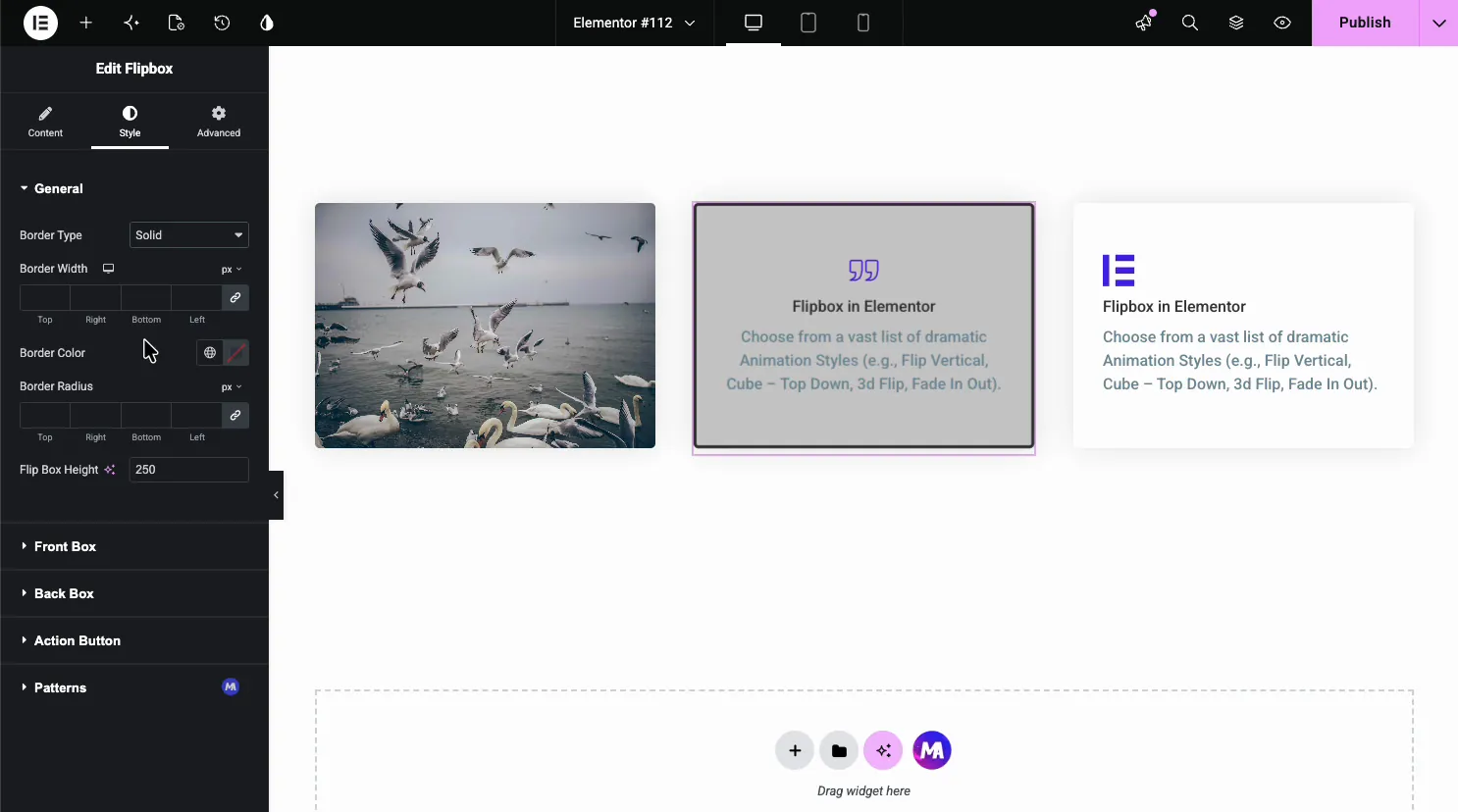
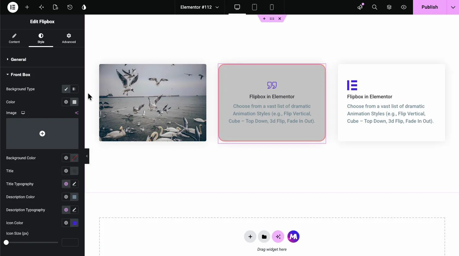
Under General you get separate Front Box and Back Box sections. Each has its own background color or image, title and description colors, typography, and icon color, so the two faces can look nothing alike if you want.
Common use cases #
- Service cards with an icon on the front and details plus a button on the back.
- Team members showing a photo on the front and a bio on the flip.
- Product highlights that reveal price and a Buy button on hover.
- Feature grids where each card flips to a short explanation.
- Portfolio tiles with a thumbnail front and a project link on the back.
Tips for working with the Flipbox widget #
- Set a fixed height. The Flip Box Height keeps both faces the same size, so the card does not jump when it flips. Leave it unset and a longer back face will resize the card mid-hover, which looks off.
- Keep back text short. The back flips in fast, so a tight line and a button read better than a full paragraph.
- Match the animation to the mood. Fade suits a calm page; 3D Flip and Cube suit a bold hero.
- Contrast the two faces. A different background color on the back makes the flip obvious at a glance.
- Always link the button. The back-side button is the payoff, so point it at the next step.
Watch the video tutorial #
Prefer to follow along on screen? The video tutorial below walks through the Flipbox element from start to finish, showing how the animation styles, front and back faces, and styling work in the Elementor editor.
Frequently Asked Questions #
What is the Flipbox widget in Master Addons?
It is an Elementor widget that builds a two-sided card. The front face shows an icon, title, and description, and on hover it flips to a back face with its own text and a button. Everything is set from the Elementor panel with no code.
How many flip animations does the Flipbox widget have?
The Animation Style dropdown includes 22 effects, 6 free and 16 with Pro, such as Flip Horizontal, Flip Vertical, Fade, Fade Up, Rollover, 3d Flip, the Cube variants, slide directions, and Diagonal. You pick one per card to control how the back face appears.
Can I add a button to the flip card?
Yes. The Action Button section in the Content tab sets the button label and its link. The button sits on the back face, so it shows when the card flips, which makes it a natural place to send visitors to a product or form.
Can I use an image instead of an icon on the front?
Yes. Use the Front Image design variation, a Master Addons Pro option, to put an image on the front. The Style tab also lets you set a background image for either face, so image-led flip cards are easy to build.
How do I keep both sides of the flip card the same size?
Set the Flip Box Height in the General section of the Style tab. It gives both faces one fixed height, so the card stays the same size before and after the flip instead of resizing to fit each side’s content.
Wrapping up #
The Flipbox widget turns a flat card into an interactive one: pick an animation, fill in the front and back faces, link the button, then style each side. For related widgets, see the Info Box widget and the Team Member widget, browse the full Master Addons widgets and extensions, and see the Flipbox widget page for demos and a comparison with the Elementor Pro Flip Box.


