Elementor doesn’t ship a search widget in its free version, so most sites end up stuck with whatever search box the theme provides. The Search widget in Master Addons for Elementor fills that gap. Drop it anywhere on a page or in a header, then pick a classic search form or an icon popup that expands on click. The input and button are styled from the Elementor panel, no CSS involved.
Here’s how both layouts of the Elementor search widget work, setting by setting, plus what visitors actually see on the live page.
What the Search widget does #
The widget outputs a WordPress search form as an Elementor element. Visitors type a query, press Enter or click the submit control, and land on your site’s standard search results page, so results come from WordPress itself and render through your theme. You choose how the form looks: a full input field with an icon or text button, or a lone search icon that expands into a popup search screen.
Before you start #
- WordPress with Elementor installed and active.
- Master Addons for Elementor installed and active. Need help? See the installation guide.
- The Search element enabled in the Master Addons dashboard if you’ve previously switched widgets off.
How to add the Elementor Search widget #
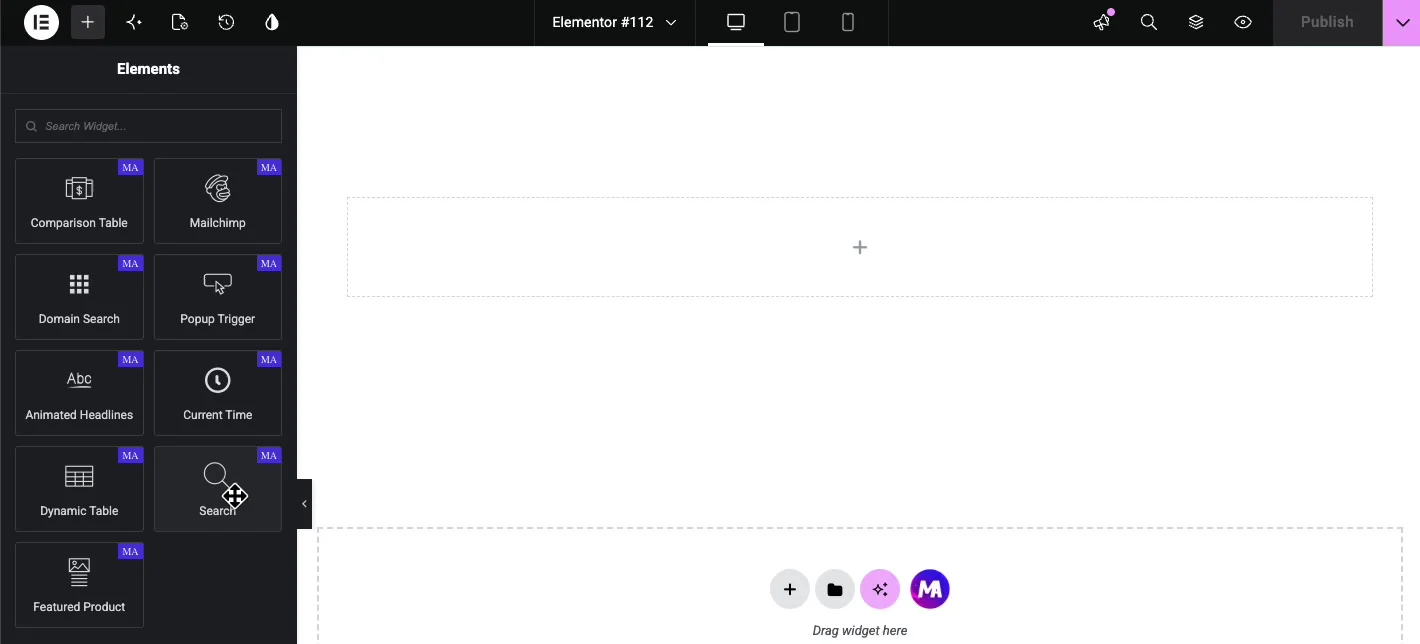
Open the Elementor editor and search for Search in the Elements panel, or scroll to the Master Addons section (look for the MA badge). Drag the widget onto your page. A working search form appears immediately with a magnifying glass icon as the submit control.
Set up the Content tab #
The Content tab holds one main decision plus a few fields that follow from it. The Type dropdown switches between the two layouts: Form and Icon Popup.
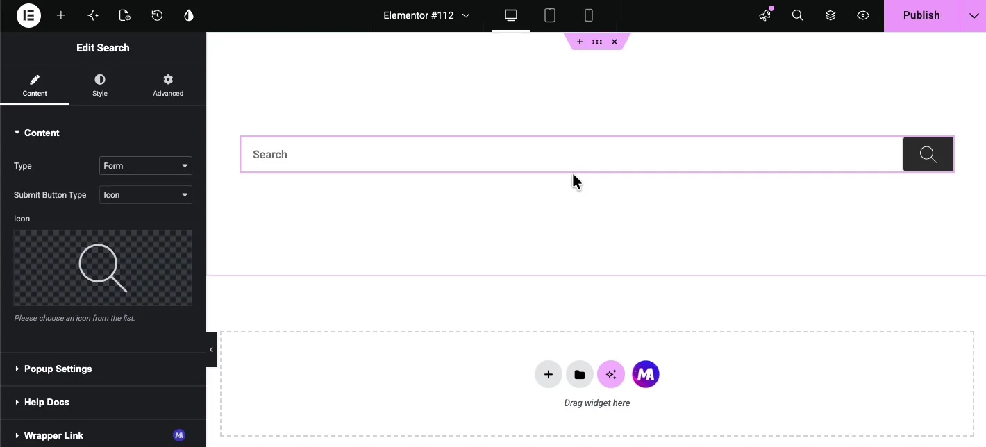
Type: Form #
Form is the classic layout, an input field with a submit control on the right. The Submit Button Type dropdown decides what that control is:
- Icon: shows an icon button. Pick the icon from the library below; the default magnifying glass works for almost every design.
- Button: shows a text button instead. A Button Text field appears where you type the label, such as Search or Hit Enter.
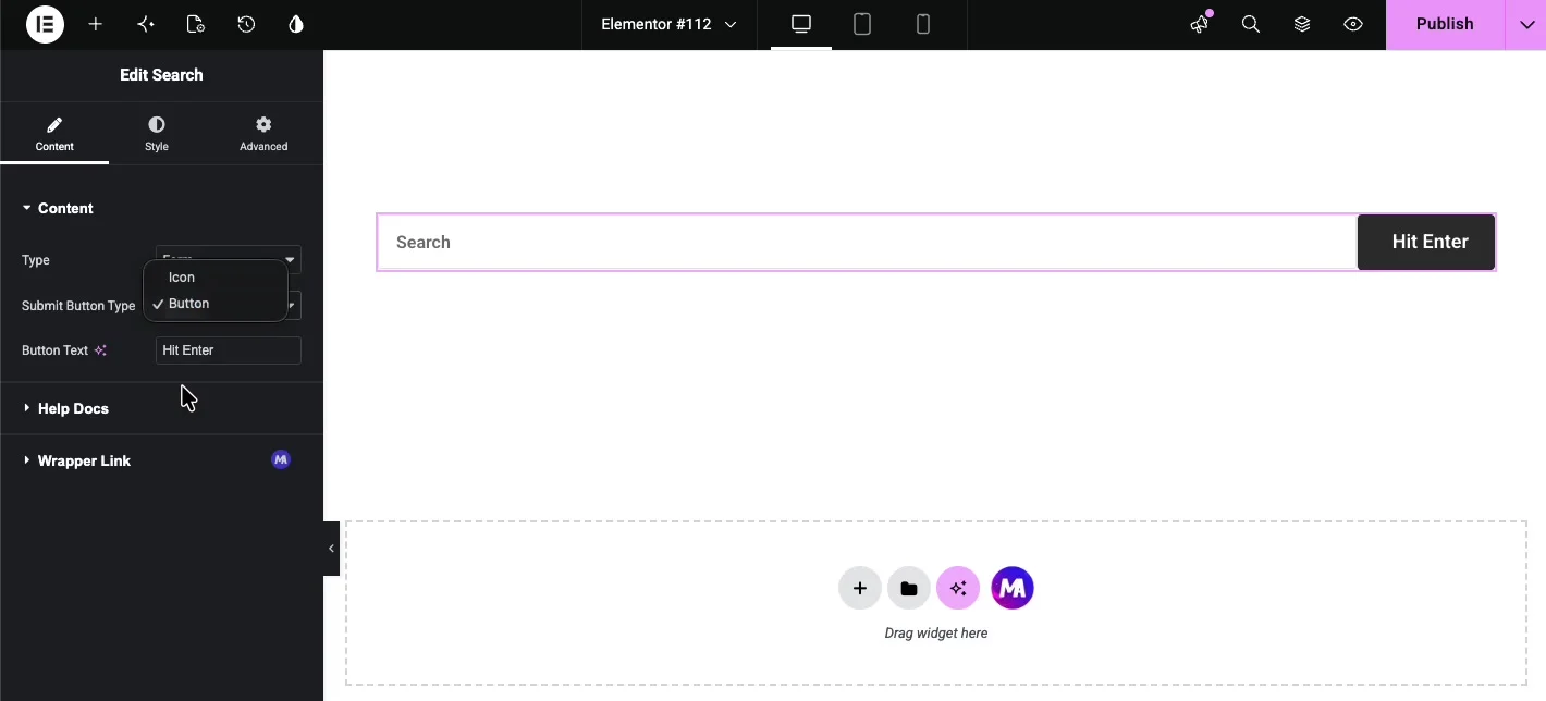
Type: Icon Popup #
Icon Popup renders only a search icon. When a visitor clicks it, a search screen opens over the page with a large input field and a close button. This is the layout to use in headers and navigation bars where a full search field would crowd the menu.
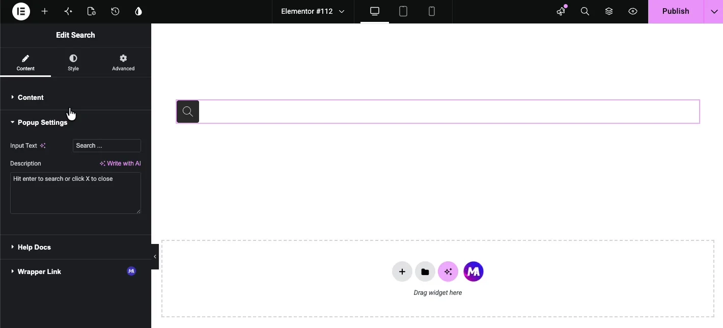
Choosing Icon Popup reveals the Popup Settings section with two fields:
- Input Text: the placeholder inside the popup’s search field, “Search …” by default.
- Description: a helper line under the field, such as “Hit enter to search or click X to close.”
Style the widget in the Style tab #
The Style tab has two sections: Form for the input area and Button for the submit control.
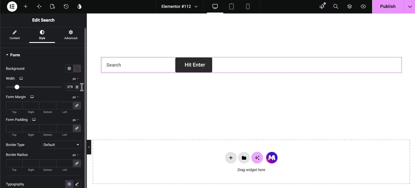
Form #
The Form section styles the wrapper and the input field:
- Background: a color or gradient behind the form.
- Width: the form’s width in pixels. Handy when the widget sits in a wide column and you want a tighter search box.
- Form Margin and Form Padding: spacing outside and inside the wrapper.
- Border Type and Border Radius: the frame around the form and how rounded its corners are.
- Typography and Color: the font and text color of the input.
- Form Input Color: the background color of the input field itself.
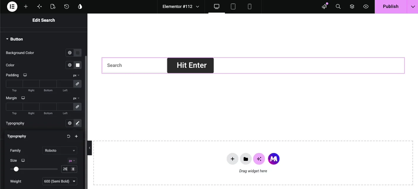
Button #
The Button section styles the submit control, whether it’s an icon or a text button:
- Background Color: the fill behind the button.
- Color: the icon or text color.
- Padding and Margin: the button’s inner and outer spacing.
- Typography: font family, size, and weight for the button text.
One sizing note: the button height follows the form, so if the button text looks cramped after a font size change, add a little vertical padding on the Form side rather than fighting the button padding alone.
See the live result #
Publish the page and try the form. Click into the field, type a query, and press Enter or hit the submit button.
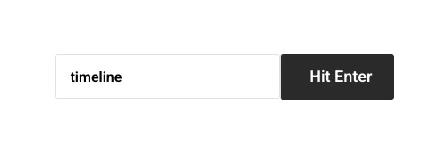
WordPress takes over from there and shows the matching posts and pages on your theme’s search results template:
Common use cases #
- Header search: use Icon Popup next to the navigation menu so search is one click away without eating menu space.
- Blog sidebar or archive pages: a Form-type search box helps readers dig through older posts.
- 404 pages: a search form is the most useful thing you can put on a page that says “not found.”
- Documentation and knowledge bases: put a wide search form front and center so users search before they scroll.
Tips for a better search bar #
- Match the button color to your theme’s accent color. A search button that looks like every other button on the site gets used more.
- Keep the placeholder short. “Search …” beats a full sentence that gets cut off on mobile.
- Use Icon Popup in tight layouts. A full search form squeezed into a header column tends to wrap awkwardly at tablet widths.
- Test the results page. The widget hands the query to WordPress, so check that your theme’s search results template looks presentable before you promote the search box.
Video Tutorial #
If you’d like to see the Search widget in action, this video walks through the full setup, from the first drag to the search results on the live page:
Frequently Asked Questions #
How do I add a search bar in Elementor?
Install Master Addons for Elementor, then drag the Search widget from the Elements panel onto your page. It renders a working WordPress search form right away, and you can switch between a full form and an icon popup from the Type dropdown in the Content tab.
Can I make the search open in a popup?
Yes. Set Type to Icon Popup in the Content tab. The widget then shows only a search icon, and clicking it opens a search screen with a large input field, a custom placeholder, and a description line you control from Popup Settings.
Can I change the search button text?
Yes. With Type set to Form, change Submit Button Type to Button and type your label in the Button Text field. You can also keep an icon instead by leaving Submit Button Type on Icon and picking any icon from the library.
Where do the search results come from?
The widget submits to the standard WordPress search, so results include your posts and pages and display on your theme’s search results template. No separate results page setup is needed.
Is the Master Addons Search widget free?
The free version of Master Addons includes a large set of widgets. Check the pricing page to see whether the Search widget is in the free plan or needs Pro.
Wrapping up #
The Master Addons Search widget gives Elementor the search bar it’s missing: a form or icon popup you can place anywhere and style to match the design, with results served by WordPress itself. It pairs well with the Off-Canvas Content widget when you’re building a custom header. Browse the full collection of Master Addons widgets and extensions for more.


