

Le conditions option décide quand un contrôle apparaît dans le panneau Élémenteur de votre widget Au lieu d'afficher chaque champ tout le temps, vous pouvez lier la visibilité d'un contrôle à la valeur d'un autre contrôle : afficher l'URL du bouton uniquement lorsque le bouton bascule est activé, ou révéler un champ d'image uniquement lorsque la liste déroulante de mise en page indique “With Image”.
Chaque champ dans les modules complémentaires principaux Constructeur de widgets porte cette option, à partir d'un simple Champ texte à un groupe Typographie complet Définissez-le une fois par contrôle et votre panneau reste court par défaut, avec des options supplémentaires apparaissant uniquement lorsqu'un choix les rend pertinentes C'est le même comportement que vous voyez dans les propres widgets d'Elementor.
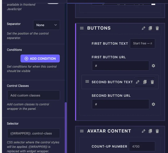
Ce que fait l'option Conditions #
Une condition est une petite règle avec trois parties : quel contrôle regarder, comment le comparer et à quelle valeur comparer Lorsque la règle passe, votre contrôle apparaît dans le panneau Lorsqu'il échoue, le contrôle reste caché.
Chaque carte de condition comporte trois paramètres :
- Nom du contrôle : le champ dont vous souhaitez regarder la valeur Il s'agit d'une liste déroulante répertoriant chaque contrôle de votre widget, regroupé par section, afin que vous choisissiez la cible au lieu de taper son nom.
- Égalité: comment comparer. Égale affiche le contrôle lorsque le champ regardé correspond à votre valeur. Pas égal le montre quand le champ tient autre chose.
- Valeur de contrôle : la valeur à comparer, saisie en texte brut, par exemple
yes,noou une valeur d'option de sélection commelayout-2.
Vous pouvez empiler autant de conditions que nécessaire avec le AJOUTER CONDITION bouton. Lorsqu'une commande a plus d'une condition, toutes doivent passer avant que la commande n'apparaisse. Il n'y a aucune limite quant au nombre de commandes pouvant regarder le même champ, donc un commutateur peut révéler cinq options associées à la fois.
Avant de commencer #
- wordpress avec Élémenteur installé et actif.
- Maître Addons Pro installé et actif, puisque le Widget Builder complet est une fonctionnalité Pro. Voir le guide d'installation si vous vous installez frais.
- Un widget personnalisé s'ouvre dans l'éditeur Widget Builder avec au moins deux commandes, une à regarder et une à afficher ou à masquer Nouveau au constructeur ? Lire le Aperçu du constructeur de widgets d'abord.
Où trouver l'option Conditions #
Sélectionnez n'importe quel contrôle dans le panneau d'options de votre widget, dans l'onglet Contenu, Style ou Avancé Les paramètres du champ s'ouvrent sur la gauche Faites défiler vers le bas les principales options comme Étiquette, Nom et Valeur par défaut, et vous trouverez le conditions boîte située juste au-dessus des classes de contrôle, avec un AJOUTER CONDITION button et la note “Set conditions pour quand ce contrôle doit être visible”.
La boîte commence vide, ce qui signifie que le contrôle est toujours visible C'est la valeur par défaut pour chaque champ.
Comment ajouter une condition #
La façon la plus claire de voir Conditions à l'œuvre est le modèle classique à bascule : un commutateur qui active et désactive un deuxième bouton Notre exemple de widget a une section Boutons avec un Champ de commutation nommé show_second_button, plus second_button_text et second_button_url champs qui ne doivent apparaître que lorsque le commutateur est activé.
Étape 1 : Sélectionnez le contrôle que vous souhaitez afficher ou masquer #
Cliquez sur le second_button_text champ dans le panneau d'option de votre widget Ses paramètres s'ouvrent sur la gauche La condition vit toujours sur la commande étant affichée ou cachée, pas sur le champ étant regardé.
Étape 2 : Cliquez sur AJOUTER UNE CONDITION #
Faites défiler vers la case Conditions et cliquez AJOUTER CONDITION. Une carte de condition apparaît avec les trois paramètres : Nom de contrôle, Égalité et Valeur de contrôle Le X rouge dans le coin supprime la carte si vous changez d'avis.
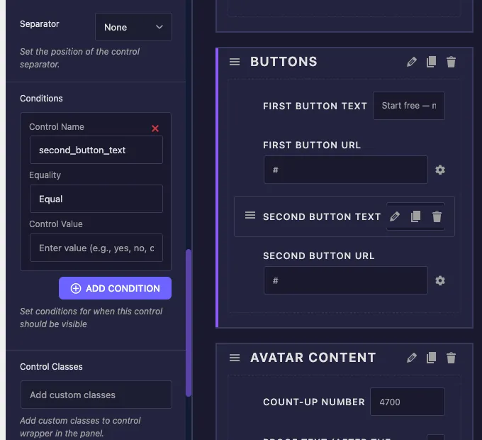
Étape 3 : Choisissez la commande à regarder #
Ouvrir le Nom du contrôle dropdown Chaque contrôle dans le widget y est répertorié, regroupé sous son titre de section, de sorte qu'un plus grand widget reste facile à naviguer Choisissez show_second_button. Le dépôt se pré-remplit avec le nom propre du champ actuel lorsque la carte est créée, alors assurez-vous de la basculer dans le champ que vous souhaitez réellement regarder.
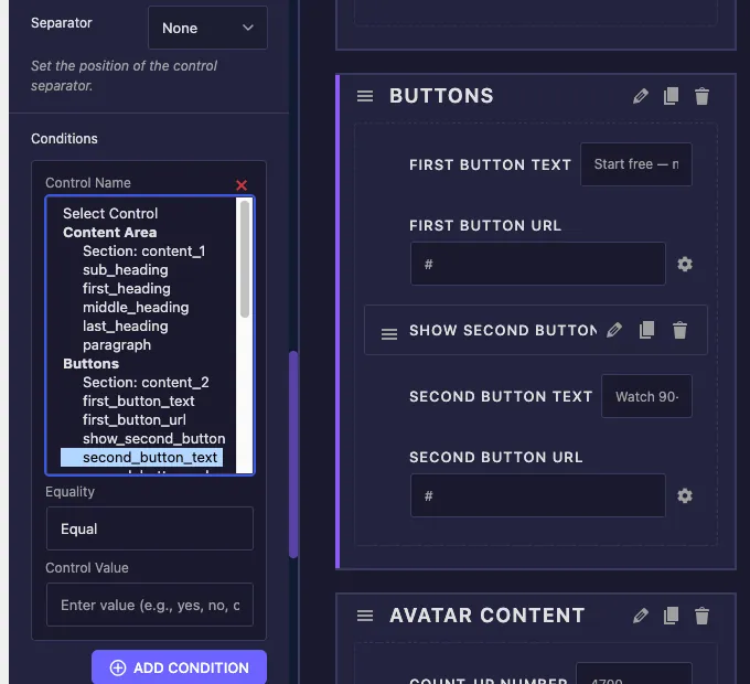
Étape 4 : Définissez la valeur d’égalité et de contrôle #
Partir Égalité sur Égale et type yes dans Valeur de contrôle, parce qu'un switcher stocke yes quand il est allumé et une valeur vide quand il est éteint La règle finie se lit comme suit : afficher ce contrôle quand show_second_button égale yes.
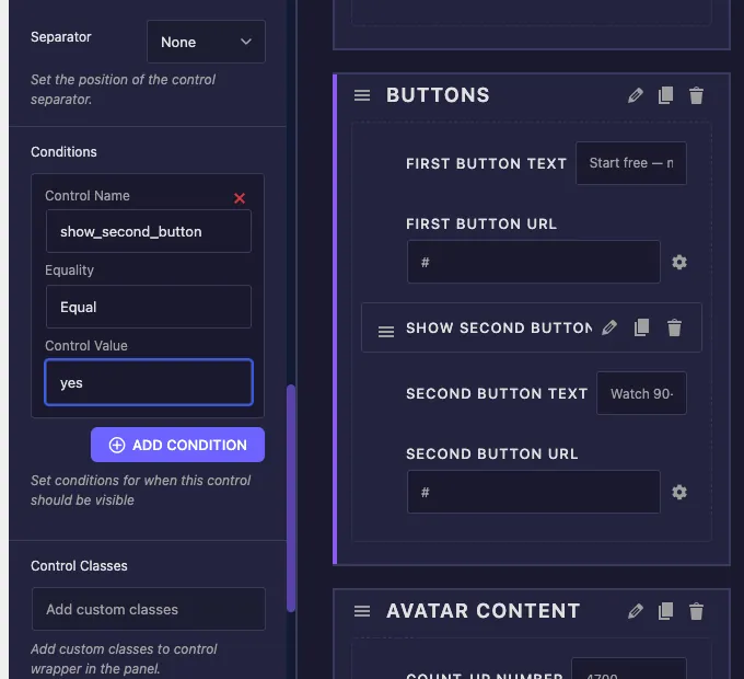
Étape 5 : Répétez et enregistrez #
Ajouter la même condition à second_button_url, puis cliquez sur Enregistrer Paramètres. Les deux champs suivent désormais le commutateur ensemble.
Testez-le dans Elementor #
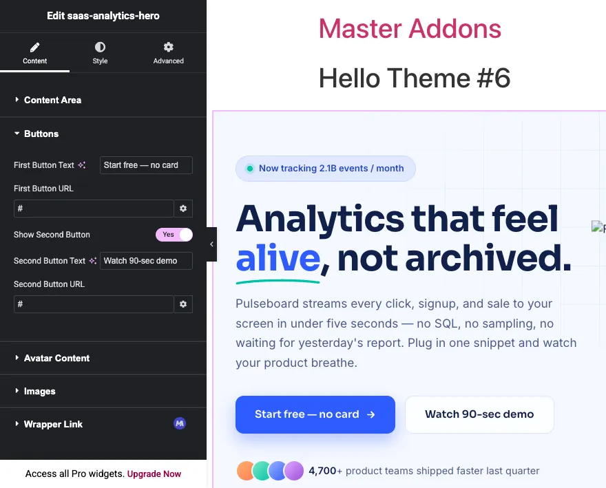
Ajoutez votre widget à une page dans Elementor, ou rechargez l'éditeur si la page était déjà ouverte Avec le sélecteur désactivé, les contrôles de texte du deuxième bouton et de l'URL du deuxième bouton ne sont nulle part dans le panneau La section semble courte et propre.
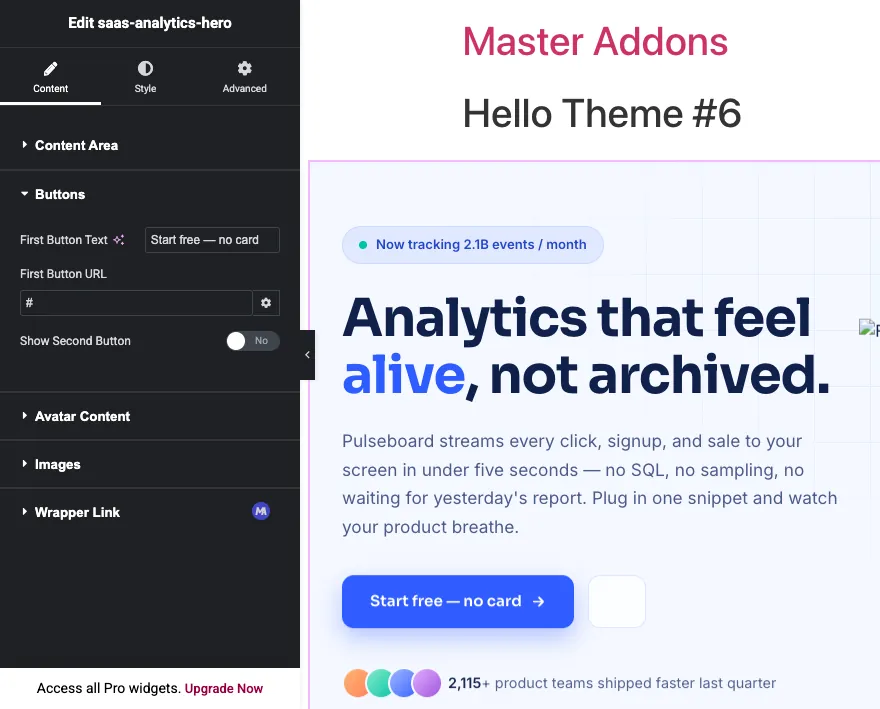
Allumez le commutateur et les deux commandes apparaissent juste en dessous. Pas de rechargement de page, pas d'enregistrement entre les deux. L'élémenteur vérifie les conditions en direct au fur et à mesure que l'utilisateur modifie.
Quelle valeur devez-vous saisir dans Control Value ? #
Le champ Valeur de contrôle prend la valeur stockée du contrôle regardé, qui n'est pas toujours l'étiquette que vous voyez dans le panneau Presque chaque condition d'“my ne fonctionne pas rapport de” se résume à cette inadéquation, donc voici ce que chaque type de champ stocke réellement :
- Commutateur : magasins
yesquand on. Utiliser égal +yespour afficher une commande pendant que la bascule est activée, ou Pas égal +yespour le montrer pendant que la bascule est éteinte. - Sélectionnez et sélectionnez2 : stocker l'option valeur[TRADUCTION], pas l'étiquette de l'option Si votre liste déroulante comporte une option intitulée“Layout Two” avec la valeur
layout-2: la condition doit être utiliséelayout-2. - Choisir: stocke la clé de l'option choisie, telle que
left,center; ouright. - Zone de texte : stockez exactement ce que l'utilisateur a tapé Les conditions sur les champs de texte libre nécessitent une correspondance exacte, elles fonctionnent donc mieux pour vérifier si un champ est égal à une valeur attendue spécifique.
- Numéro: stocke le nombre lui-même, comparé en valeur, donc
3correspond à une entrée de 3.
Les contrôles de style Dropdown constituent les sources de conditions les plus fiables car leurs valeurs proviennent d'une liste fixe. Si vous concevez un widget à partir de zéro, gérez vos conditions depuis Switcher, Sélectionner& Choisissez des champs et laissez les champs de texte être les contrôles affichés ou masqués.
Utilisation de plusieurs conditions #
Cliquez AJOUTER CONDITION encore une fois pour empiler une deuxième règle sur le même contrôle Chaque condition de la liste doit passer en même temps pour que le contrôle s'affiche Pensez-y comme une chaîne ET : condition un ET condition deux ET condition trois.
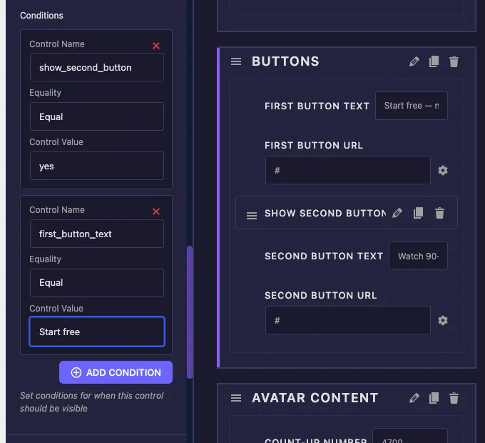
Un exemple pratique : un champ de couleur de badge qui doit apparaître uniquement lorsque les badges sont activés et que le style de badge est défini sur la coutume Deux cartes le gèrent :
show_badgeÉgaleyesbadge_styleÉgalecustom
Il n'y a pas de mode OU entre les cartes Si vous avez besoin de “afficher quand A ou B”, retournez la logique avec Pas égal si possible, ou restructurez le contrôle source pour qu'une valeur déroulante couvre le cas.
Les conditions fonctionnent sur les onglets #
Le contrôle regardé n'a pas à vivre dans la même section ou même le même onglet que le contrôle que vous cachez Un champ de couleur d'onglet Style peut dépendre d'un sélecteur d'onglets Contenu sans aucune configuration supplémentaire Le Widget Builder trouve le contrôle où qu'il se trouve, dans Content, Style, ou Advanced, et connecte la condition au bon endroit dans le widget généré.
C'est le motif derrière les panneaux comme le Champ frontalier(en), où les contrôles de largeur et de couleur n'apparaissent qu'une fois qu'un type de bordure est choisi Avec Conditions, vos propres widgets obtiennent le même comportement : des options de style qui ne font surface que lorsque la fonction de contenu correspondant est activée.
Cas d'utilisation courants #
- Éléments optionnels: un sélecteur pour un deuxième bouton, badge ou sous-titre qui révèle ses champs de texte, de lien et de style uniquement lorsqu'il est activé.
- Variantes de mise en page : un contrôle Select pour la mise en page qui affiche un champ d'image pour les mises en page d'images et le masque pour celles qui contiennent uniquement du texte.
- Branchement de style : une bascule de” de couleurs “Custom qui déverrouille un ensemble de sélecteurs de couleurs, gardant l'onglet Style court pour tout le monde utilisant des valeurs par défaut.
- Comportement de lien : URL et options cibles qui apparaissent uniquement lorsque les“Make this clickable” est activé.
- Paramètres avancés repliés : options supplémentaires cachées derrière un sélecteur de” d'options avancées “Enable afin que les utilisateurs occasionnels ne les défilent jamais.
Conseils pour travailler avec Conditions #
- Définissez délibérément la valeur par défaut du contrôle source. Si le commutateur se désactive par défaut, chaque contrôle dépendant commence caché lorsque le widget est déposé sur une page Décidez quelle première impression vous souhaitez.
- Vérifiez la valeur stockée, pas l'étiquette. Lorsqu'une condition ne se déclenche jamais, le coupable habituel est une valeur de contrôle qui correspond à l'étiquette de l'option au lieu de la valeur de l'option.
- Modifiez le nom du champ source avant de lui câbler les conditions. Les conditions font référence au contrôle par son nom, donc renommer un champ après plusieurs contrôles en dépend signifie revisiter ces cartes de condition.
- Caché rend toujours. Conditions visibilité du panneau de contrôle Si le jeton du contrôle est imprimé dans votre HTML, la valeur enregistrée s'affiche toujours sur le front-end Associez la condition à la logique de correspondance dans votre balisage lorsque l'élément lui-même devrait disparaître.
- Regrouper les champs dépendants dans une section. Lorsqu'un commutateur révèle trois champs, les garder ensemble juste en dessous du commutateur rend la cause et l'effet évidents pour celui qui modifie la page.
Foire aux questions #
Que fait l'option Conditions dans le Master Addons Widget Builder ?
Les conditions affichent ou masquent un contrôle dans le panneau Élémenteur en fonction de la valeur d'un autre contrôle Chaque règle nomme un contrôle à surveiller, une comparaison Égale ou Non Égale, et une valeur à faire correspondre Le contrôle n'apparaît que lorsque chaque règle dessus passe.
Pourquoi mon état ne fonctionne pas ?
Presque toujours, la valeur de contrôle ne correspond pas à la valeur stockée Les commutateurs stockent oui lorsqu'ils sont allumés, et les champs Sélectionner stockent la valeur de l'option plutôt que son étiquette Vérifiez les valeurs de l'option du champ regardé dans ses paramètres et copiez la valeur exacte dans la condition.
Un contrôle peut-il avoir plusieurs conditions ?
Oui. Cliquez sur AJOUTER CONDITION autant de fois que vous en avez besoin Toutes les conditions sur un contrôle doivent passer en même temps pour qu'il apparaisse, ce qui fonctionne comme une chaîne ET Pour supprimer une règle, cliquez sur le X rouge sur sa carte.
Une condition peut-elle regarder une commande dans un onglet différent ?
Oui. Un contrôle d'onglet Style peut dépendre d'un sélecteur d'onglets Contenu, et inversement. Le Widget Builder localise automatiquement le contrôle surveillé dans les onglets Contenu, Style et Avancé, donc aucune configuration supplémentaire n'est nécessaire.
Cacher un contrôle avec une condition supprime-t-il sa sortie de la page ?
Non. Les conditions ne cachent que le contrôle dans le panneau d'édition Si le jeton du champ est imprimé dans le HTML de votre widget, sa valeur enregistrée rend toujours Structurez votre HTML de sorte que l'élément caché dépend du même champ source quand il devrait disparaître du front-end aussi.
Envelopper #
Conditions transformez une liste plate de commandes en un panneau qui réagit à ses propres paramètres Choisissez la commande à regarder, choisissez Égale ou Non Égale, tapez la valeur et empilez des règles supplémentaires lorsqu'il n'en suffit pas Puisque chaque champ Widget Builder prend en charge l'option, le même motif couvre les boutons à bascule, les images dépendantes de la mise en page et les sections de style déverrouillables. Combinez-le avec le Commutateur et Sélectionner champs pour des sources fiables, parcourez le reste du Widgets et extensions Master Addons& voir le page de tarification pour ce que chaque plan comprend.


