

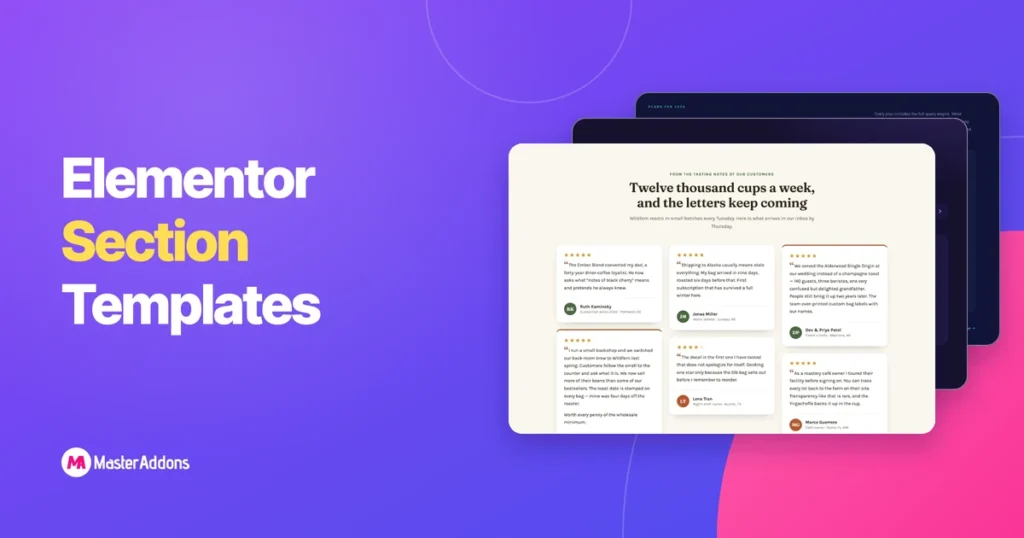
A section template is one band of a page: the pricing table, the FAQ, the row of logos, saved so you can drop it into a layout instead of building it again.
This page has two sets. The first is 32 sections we built by hand and packaged as JSON files you can download right here, import through the Master Addons Widget Builder, and edit from labelled fields instead of nested containers. The second is the Master Addons section library: 583 Elementor sections that install from inside the Elementor editor, 93 of them on the free plugin.
Jump to what you came for:
- 32 section templates to download as JSON: free files, imported with the Widget Builder
- Browse the 583-section library by type: hero, features, pricing, FAQ, team, contact and more
- How to import a section template: both routes, step by step
- Elementor landing page templates built from these sections
How to import an Elementor section template
Two routes, two separate systems. The 32 downloads on this page come in as widgets through the Widget Builder. The library sections install from inside the Elementor editor. Both end with the design on your page and everything still editable.
Route 1: import a JSON template file with the Widget Builder
- Download the zip for the template you want and unzip it. Inside is the widget JSON, a preview image, and the demo artwork where the design uses any.
- Go to Master Addons → Widget Builder → Import Widget in your WordPress admin and upload the
widget-*.jsonfile. - Open Elementor, search the widget’s name in the panel, and drag it onto the page.
- Fill in the Content tab. Colours are in the Style tab, usually four to six pickers that re-theme the whole section.
The Widget Builder is part of Master Addons Pro. The JSON files themselves cost nothing and stay yours once downloaded.
Several zips ship SVG artwork, and WordPress blocks SVG uploads by default. Convert them to PNG or WebP first, or enable SVG uploads. The widgets render without images too, because empty image slots hide themselves.
Route 2: install a section from the Template Library
- Install and activate Master Addons, then open any page with Elementor.
- Click the Master Addons template icon in the editor toolbar and switch to the Sections tab.
- Filter by category, then hover a design to preview it full size.
- Click Insert. The section drops in at your cursor position with its images, spacing and widget settings intact.
- Edit it like anything else you built: click a heading to retype it, open the Style tab to change colours.
Free sections insert straight away. Pro sections show a lock and need a licence key activated on the site. Nothing downloads to your computer on this route.
32 Elementor section templates you can download as JSON
These were built for this post: hand-written HTML, CSS and JavaScript, then converted into Widget Builder widgets. They are not in the plugin’s library, they download from here.
Importing them as widgets has one practical consequence: repeatable things are repeaters. Pricing plans, FAQ entries, testimonials, team members and logos are all repeater fields, so adding a fourth plan or a tenth question adjusts the layout, the animation stagger and the numbering on its own. Colours run through four to six base pickers. Animations respect reduced-motion settings. Nothing is welded to a container path that breaks when you move it.
Features & services section templates
Four ways to lay out what you sell: a card grid, alternating rows, a numbered process, and image-led showcase cards.
1. Icon card grid: Elementor features section template

A dark three-column grid of six feature cards, built around a cursor-follow glow: move your mouse and a soft radial light trails it across the cards. Cards are a repeater: icon (paste any SVG), title, text, and an optional arrow link per card. Six cards from a fictional analytics SaaS come pre-filled, and the staggered entrance animates whatever number of cards you end up with.
2. Alternating image rows: Elementor feature rows template
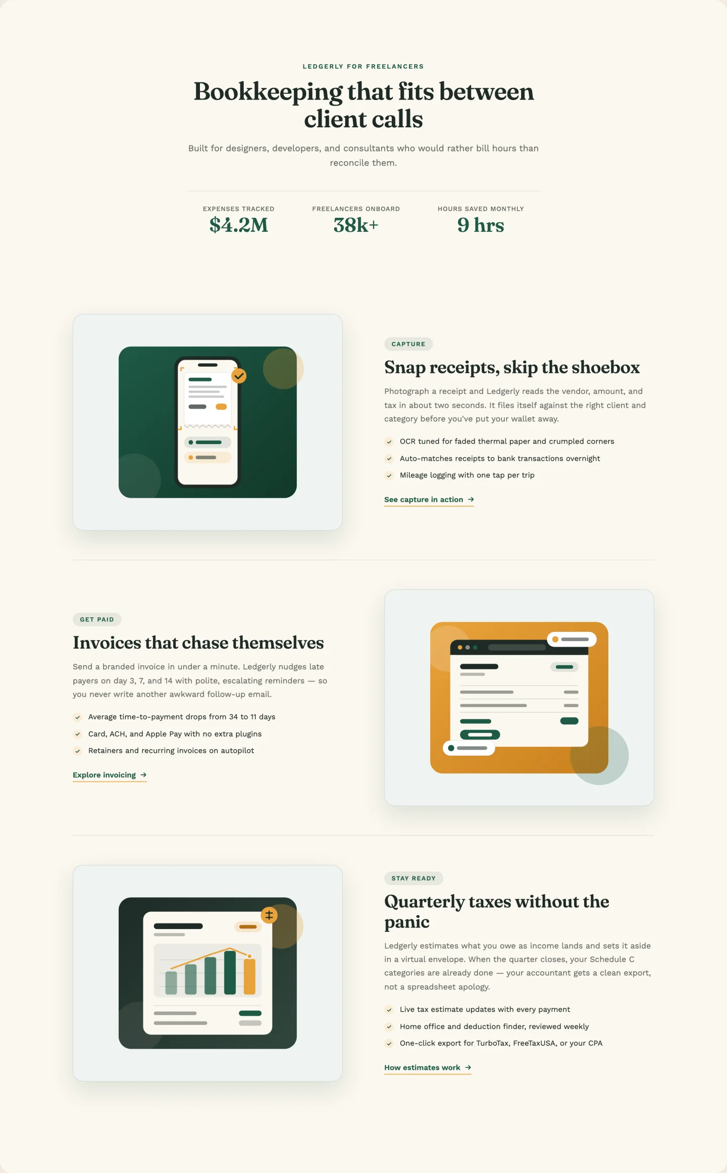
Classic image-left / image-right rows with a count-up stats strip under the header. The alternation is automatic. Rows flip sides based on position, so adding a fourth or fifth row through the repeater keeps the zigzag intact. Each row carries a kicker badge, three check bullets, and its own link control. Demo art for the three bookkeeping-app rows is in the zip.
3. Numbered process list: Elementor process steps template
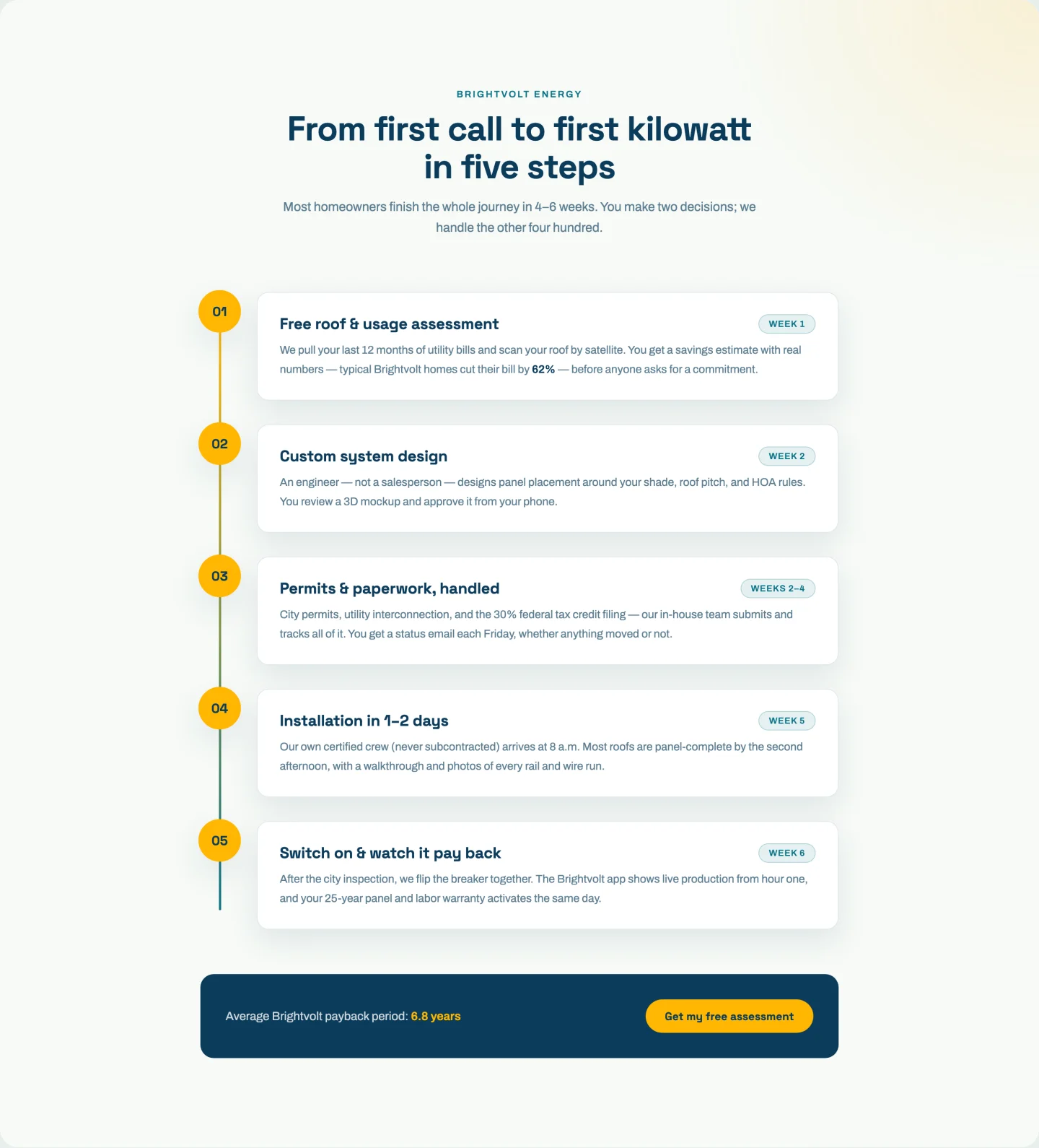
Five numbered steps on a vertical track, with a progress line that draws itself as you scroll and dots that light up when their step enters the viewport. Steps live in a repeater (number, title, chip label, text) and the progress math reads the step count at runtime. Three steps or eight, the line still lands on the last dot. There’s a toggleable CTA footer with a highlighted stat baked in.
4. Image showcase cards: Elementor feature cards template
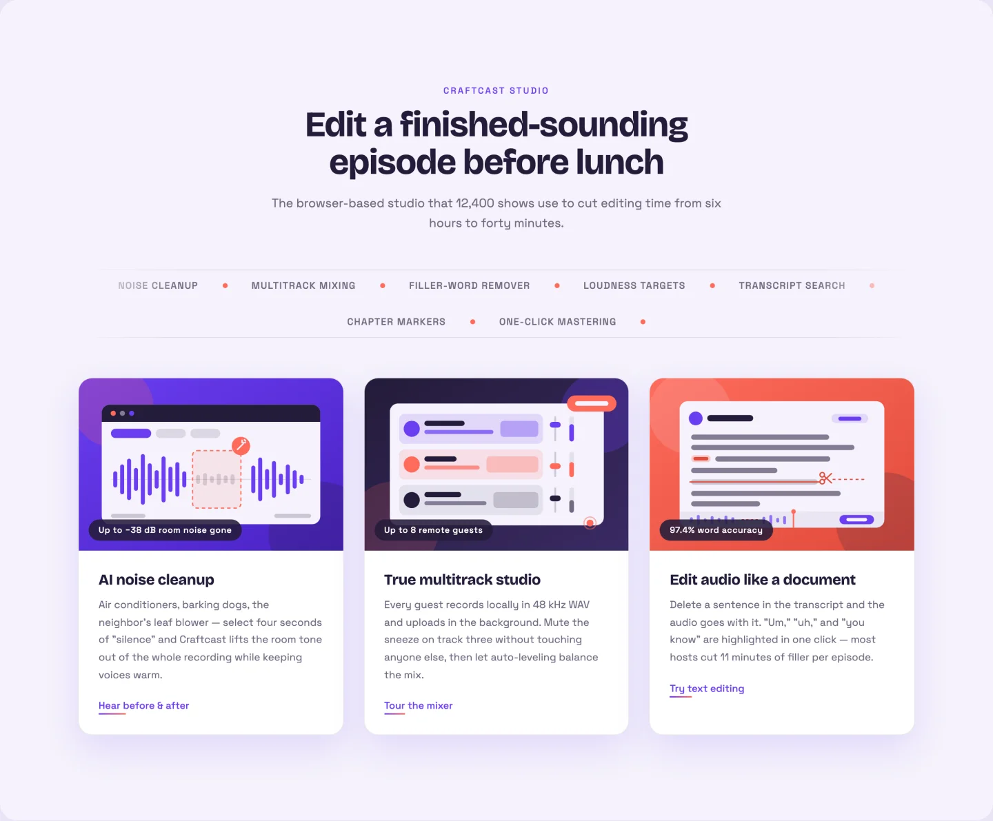
Three big image cards with a 3D tilt that follows the cursor, plus a scrolling keyword marquee between the header and the grid. You add each ticker keyword once. The seamless loop duplication happens in JavaScript, so the marquee never shows a seam. Cards take an image, badge, title, text, and link each; the three podcast-tool demo illustrations ship in the zip.
About us section templates
Image on the left, image on the right with a floating badge, and a mission statement with value cards.
5. Image left with story: Elementor about us section template
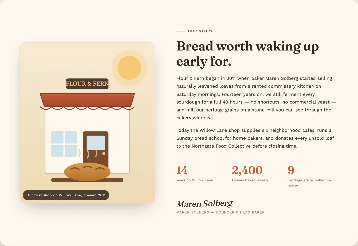
Photo on the left with a polaroid-style hover tilt, story copy on the right, three count-up stats, and a signature block. The stats repeater handles prefix, decimals, and thousands commas. The demo counts up to 2,400 wholesale partners without you touching code. Bakery demo scene included as SVG.
6. Image right with floating badge: Elementor about section template
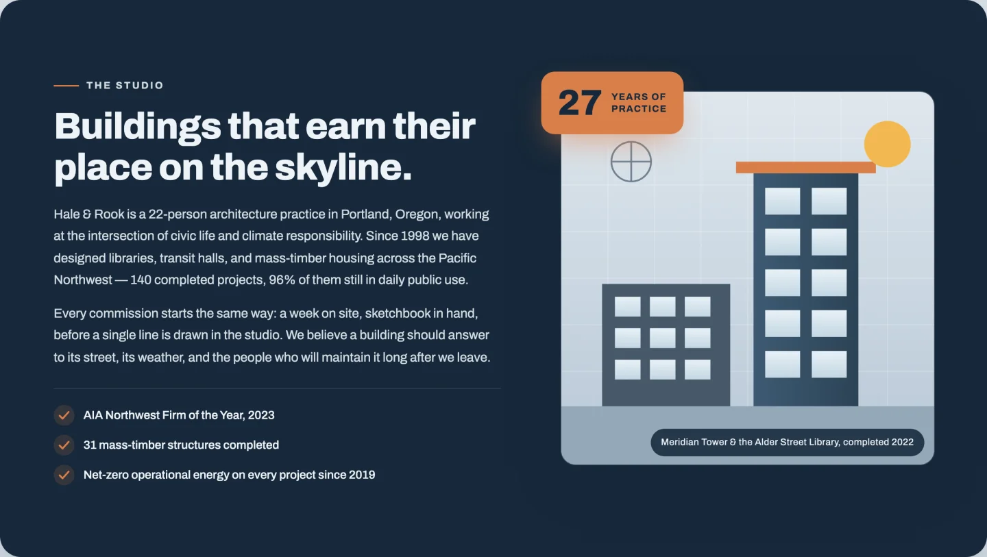
The mirror layout: text left, image right, with a floating “27 years” badge that counts up when it scrolls into view. The credential checklist is a repeater, the badge is toggleable, and both badge lines are editable. Use it for years in business, projects shipped, whatever your best number is.
7. Mission and values: Elementor mission and values section
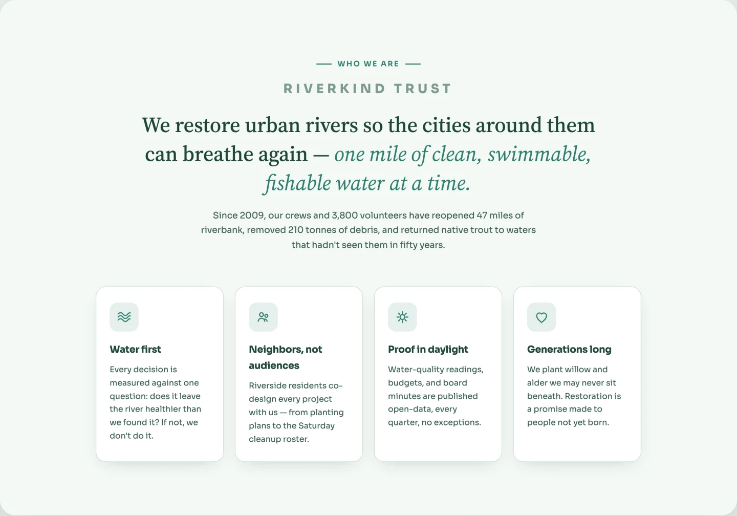
No photo needed. A big mission statement with an accent-colored phrase, then four value cards with line icons that rotate slightly on hover. Cards are a repeater with a keyword-based icon field (waves, community, sun, heart). The icons are CSS masks that inherit your accent color, so they recolor with the palette instead of clashing with it.
Stats and counter band templates
Two count-up bands, one light and one dark, for the numbers that prove scale.
8. Light stats band: Elementor counter section template
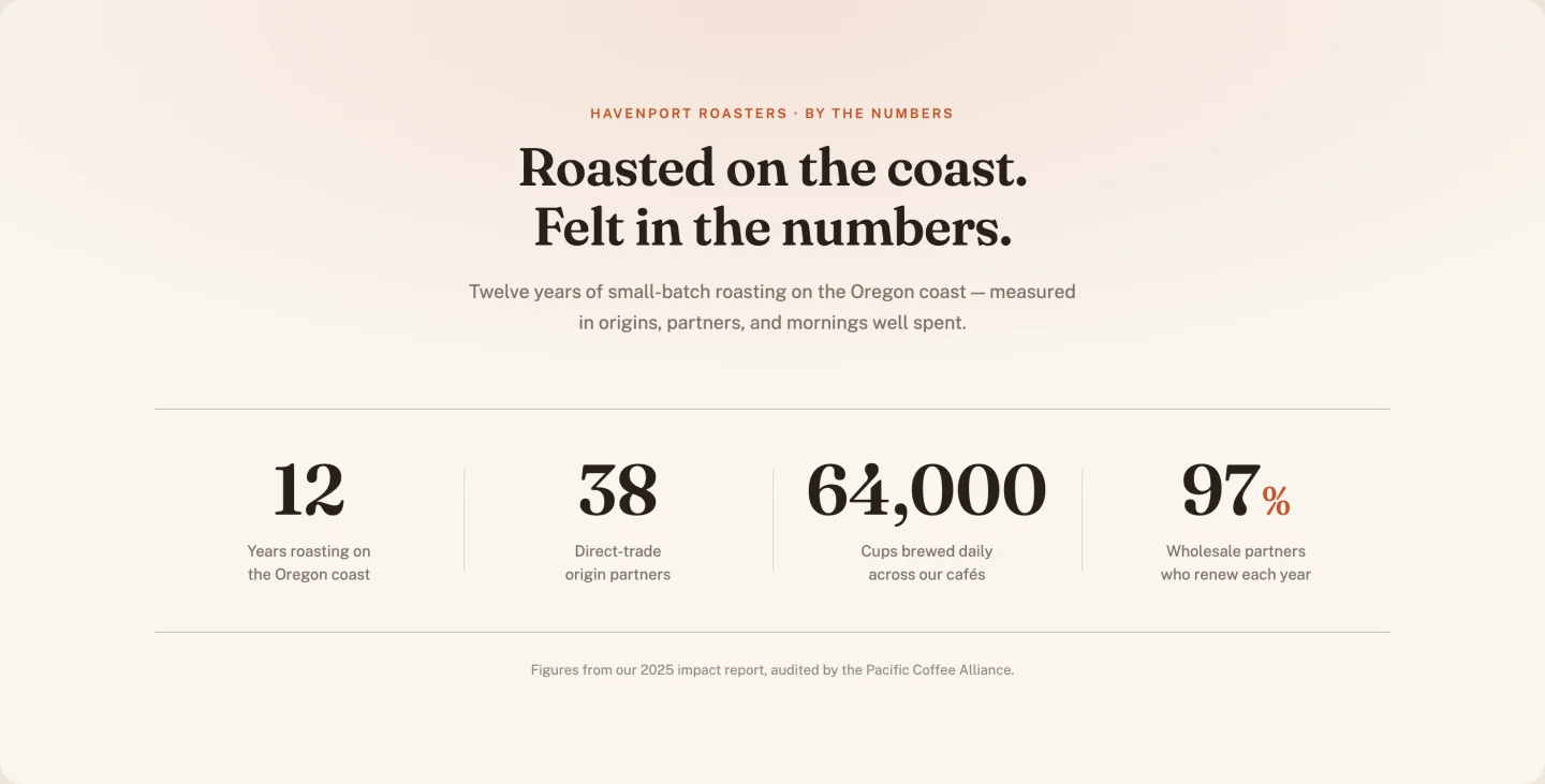
Four counters on paper-white, serif numerals, divider lines that draw in as the numbers climb. A columns slider reconfigures the desktop grid if you run three or five stats instead of four, and a single duration control tunes how fast everything counts.
9. Dark stats band: Elementor stats band template
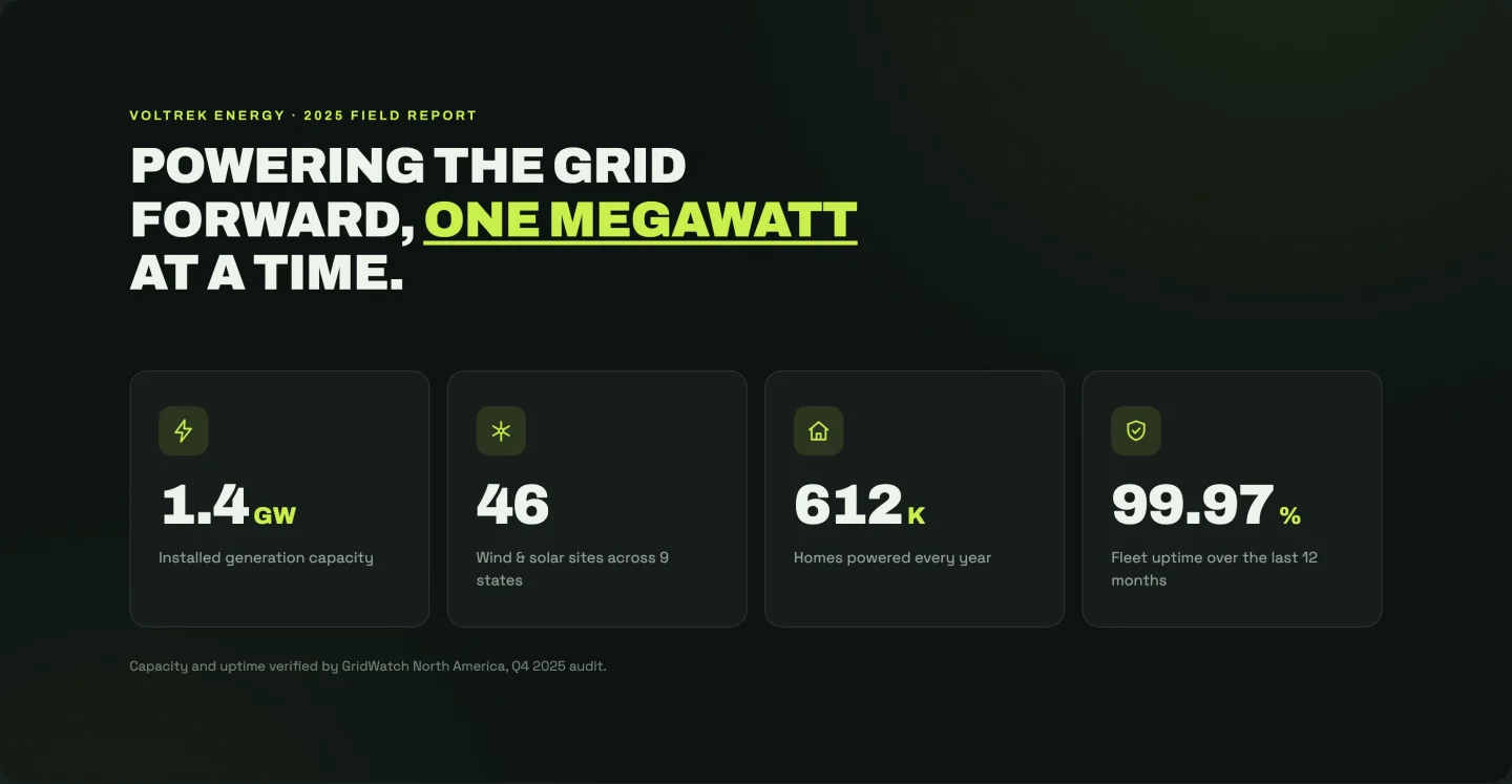
The high-contrast version: near-black background, lime accent, an icon above each counter with a glow pulse. Icons cycle automatically per card (bolt, turbine, home, shield) and each stat sets its own count-up duration, so the numbers land in sequence rather than all at once. Headline splits into three fields so the accent word sits wherever you want it.
Testimonial section templates
A carousel, a masonry grid, one large quote, and review cards with an aggregate score.
10. Testimonial carousel: Elementor testimonial carousel template
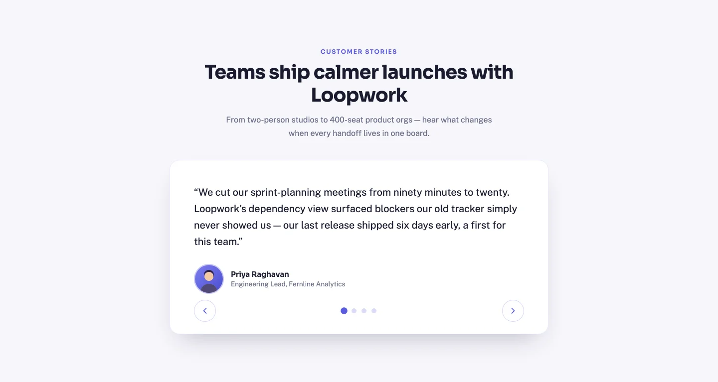
A proper slider: arrow buttons, clickable dots, keyboard navigation, and auto-height so short quotes don’t leave a tall empty card. Slides are a repeater (quote, name, role, avatar), and dots and the “N of total” labels rebuild themselves from however many you add. Four demo avatars ship in the zip.
11. Masonry grid: Elementor testimonial grid template
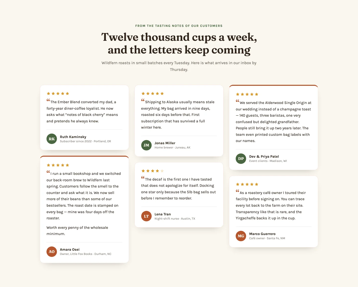
Six cards in CSS-columns masonry with staggered reveals. Each repeater row takes a quote (plus optional second paragraph for the tall cards), a 1–5 star rating, initials for the avatar circle, and a “featured” toggle that gives a card the accent treatment. Stars render from the rating value, so a 4-star review shows four filled stars, not whatever was hardcoded.
12. Single large quote: Elementor testimonial section template
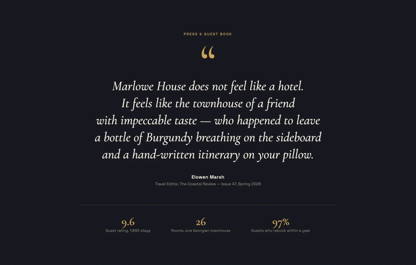
One quote, huge serif type, revealed line by line with a masked animation. You paste the quote as one paragraph; the JavaScript splits it into balanced lines and times the reveal, so a 15-word quote and a 40-word quote both animate correctly. A small meta strip underneath (rooms, rating, year) is a repeater you can empty entirely.
13. Rating cards with summary: Elementor review cards template
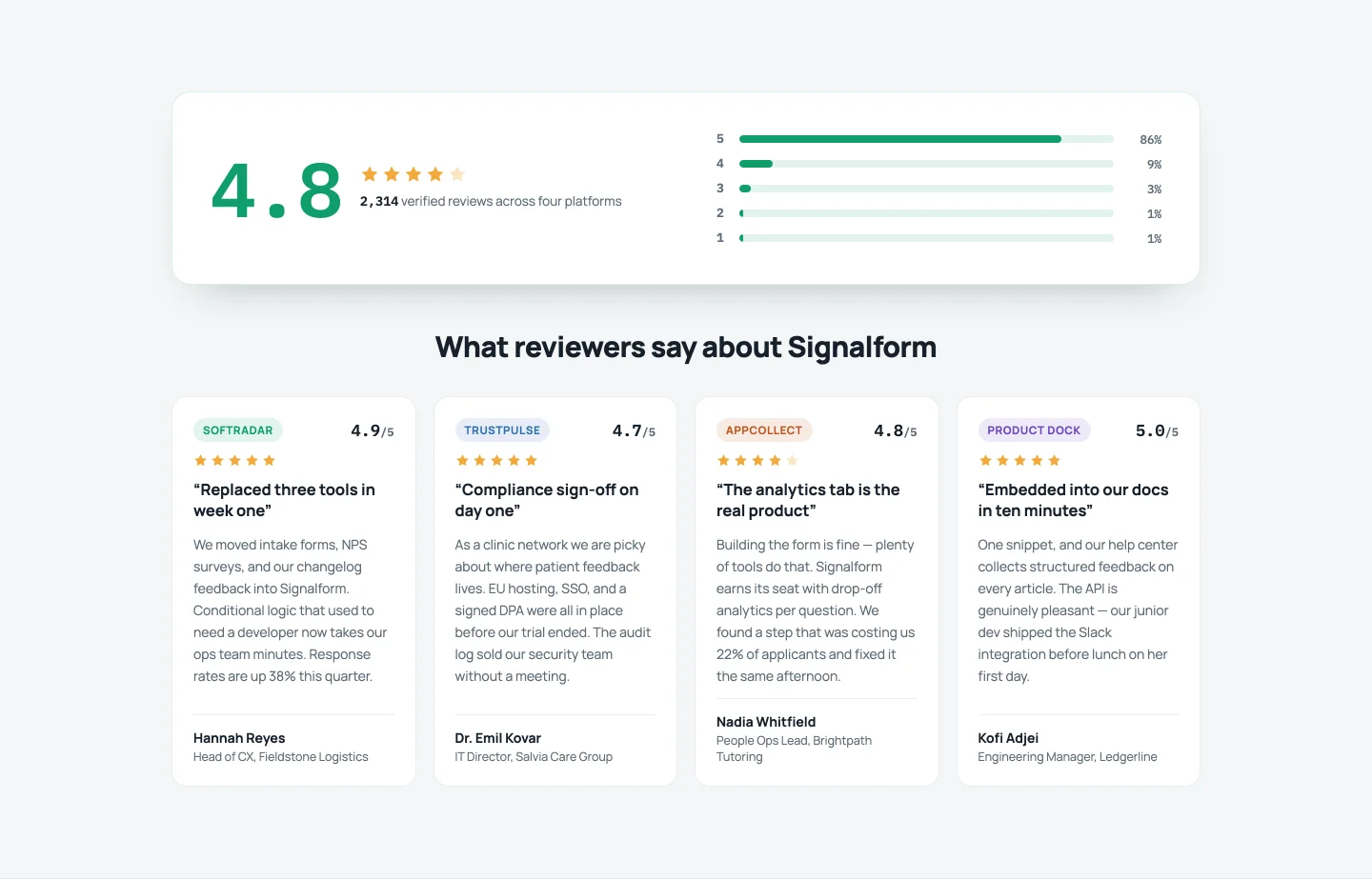
The review-aggregator look: a big count-up score, animated distribution bars (five stars: 84%, four: 11%…), then four review cards tagged by platform with per-card badge colors. Fractional ratings paint partial stars. This one has the most controls of the testimonial group, 24, because everything from the bar percentages to the caption under the score is editable.
Pricing table section templates
Three-tier, highlighted plan, a comparison matrix, and a monthly/annual toggle.
14. Classic three tier: Elementor pricing table template

Three cards, staggered entrance, prices that count up on scroll. Plans are a repeater. Features go in as one line per feature in a textarea, so plans can have five features or nine without empty slots. A per-plan “popular” toggle switches that card’s button from ghost to solid accent.
15. Highlighted plan: Elementor pricing section template

Same three-column bones, but the popular plan physically rises above its neighbors with a glow pulse and a ribbon. The highlight follows a toggle in each repeater row, so promoting a different plan next quarter is one switch, not a restyle. A footer stats row (uptime, data centers, support) can be switched off.
16. Comparison feature list: Elementor pricing comparison table
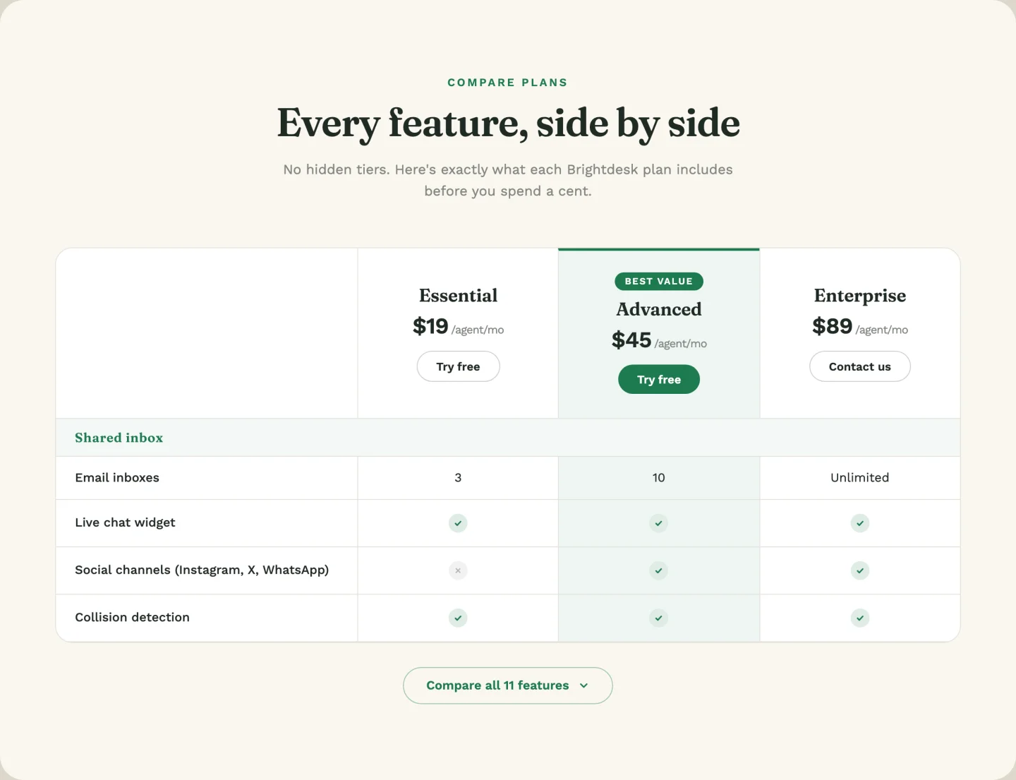
A real feature matrix: three plan columns, feature rows with yes/no/custom values (“5 users”, “Unlimited”), and an expandable block that reveals six more rows with a smooth height animation. Type yes or no in a cell and it renders as a check or cross; type anything else and it prints as text. Which plan gets the “Best value” column highlight is a dropdown. At 38 controls it’s the deepest template in the pack.
17. Monthly / annual toggle: Elementor pricing table with billing toggle
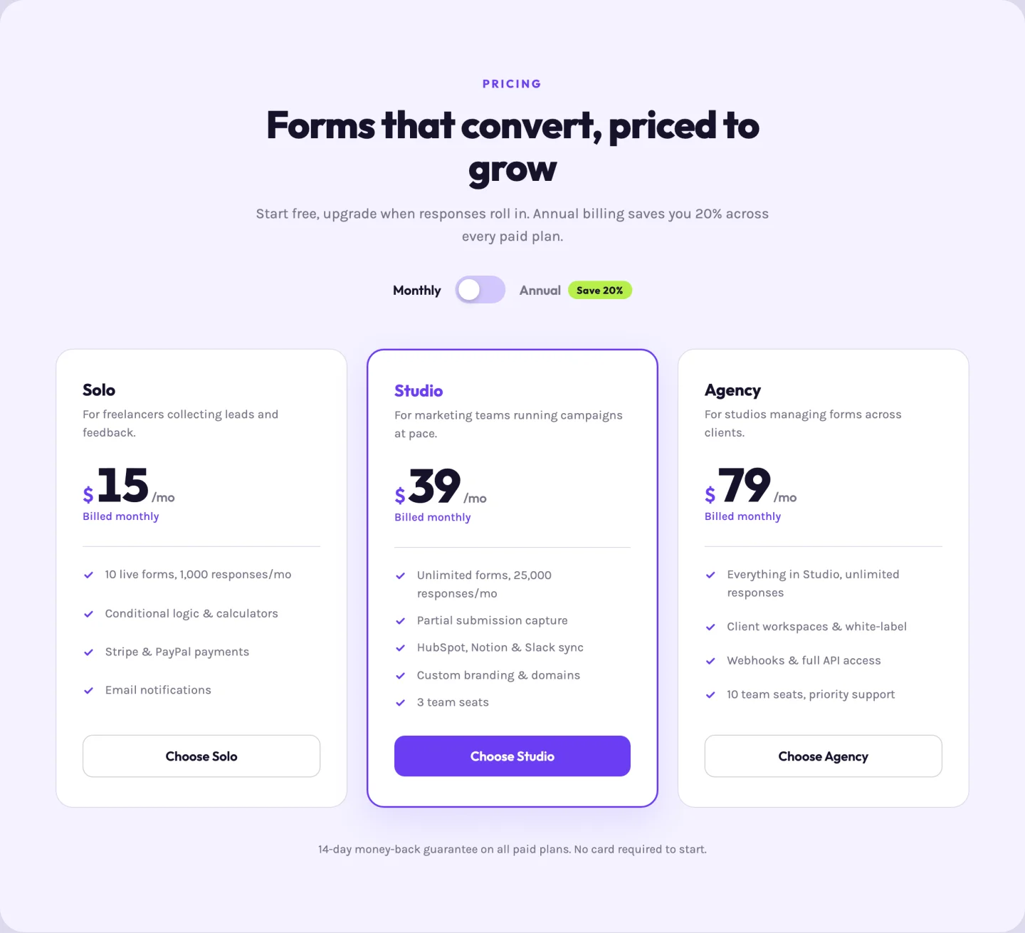
The SaaS standard. An accessible switch flips every card between monthly and annual pricing with a little price-flip animation; each plan carries both prices plus both “billed as” notes in its repeater row. The “Save 20%” badge text is a field, so changing the math changes the badge.
Team section templates
A photo grid, hover-reveal bios, and a slider with a bio panel. To add a hover effect to a single photo outside these templates, use the Image Hover Effects widget.
18. Photo card grid: Elementor team section template
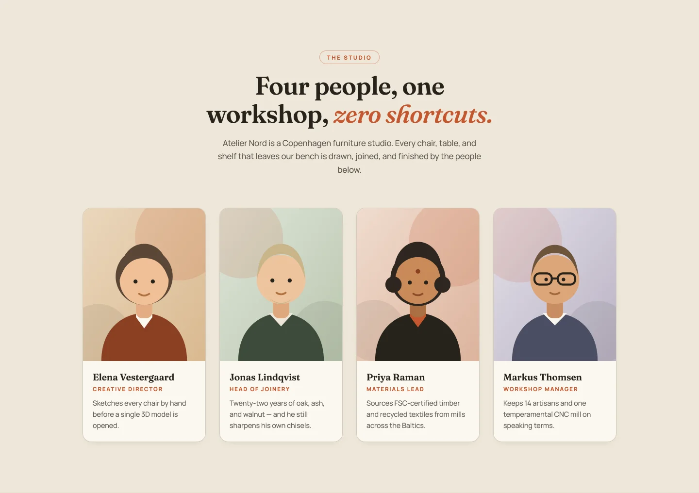
Four portrait cards with a zoom-and-border-sweep hover. Name, role, and a one-line bio per member; the entrance stagger recalculates for any member count. Four demo portrait illustrations come in the zip if you need placeholders while collecting real headshots.
19. Hover-reveal bios: Elementor team member cards template
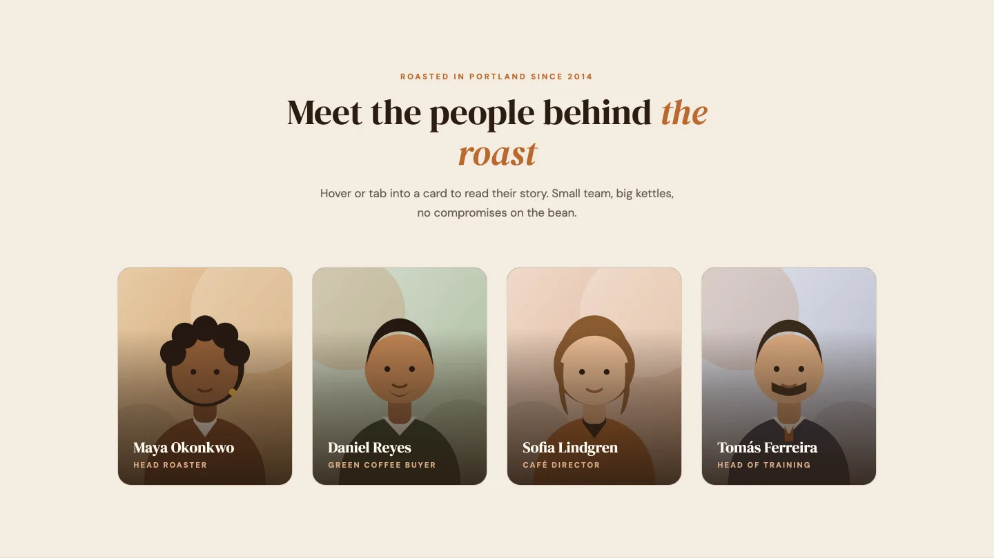
Portraits that slide up a bio panel on hover, focus, or tap, so it works with a keyboard and on phones as well as a mouse. Each member row carries LinkedIn, Instagram, and email link controls, and the whole social row can be switched off if your team would rather not.
20. Team slider: Elementor team slider template
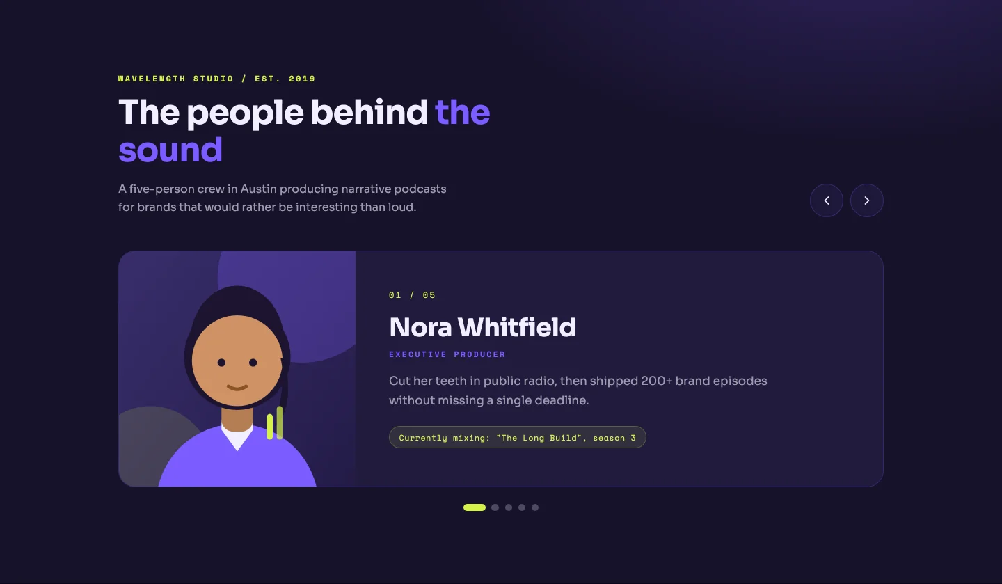
One member at a time: big photo, role tag, a fuller bio, and an “01 / 05” counter that rebuilds from your actual member count, same as the dots. Arrow keys work. Good for small teams where each person deserves more than a business card.
FAQ section templates
An accordion, a two-column Q&A, category tabs, and an accordion beside a support card.
21. Accordion: Elementor FAQ accordion template
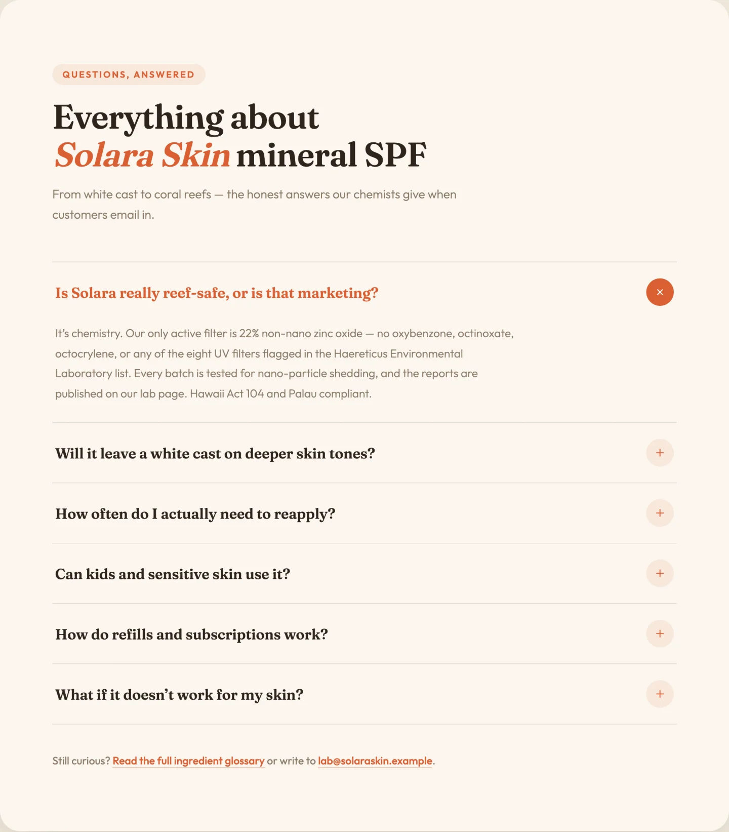
Single-open accordion with smooth height animation and rotating plus icons. Questions and answers are a repeater; whether the first item starts open is a toggle. The footer line (“Still stuck? Write to us”) has its own link and email fields, because that line always ends up hardcoded and forgotten otherwise.
22. Two-column Q&A: Elementor FAQ section template
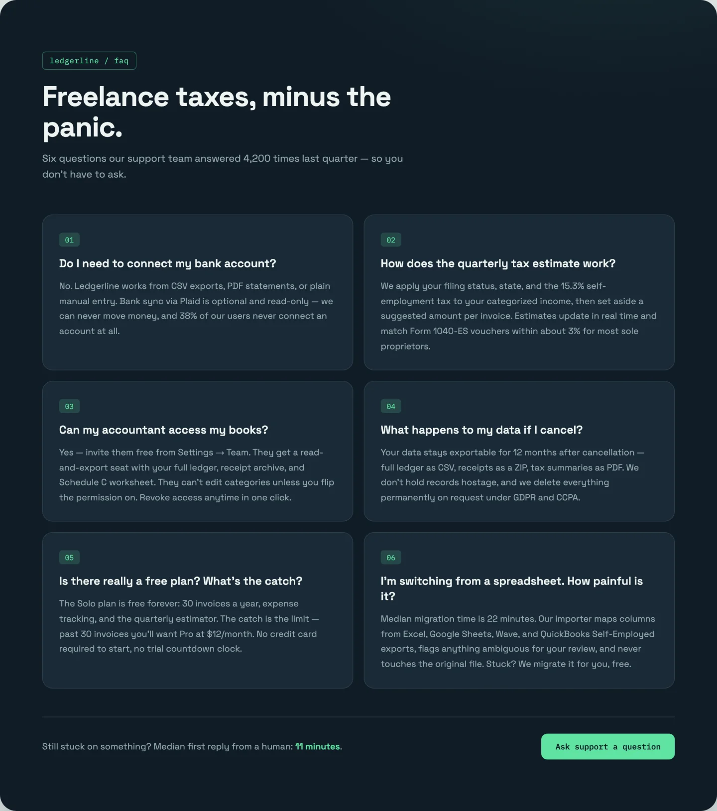
No clicking. All six answers stay visible in a numbered two-column grid with staggered reveals. The 01–06 numbering is CSS counters, so items renumber themselves when you add a seventh. Better than an accordion when your answers are short and you’d rather visitors actually read them.
23. Category tabs: Elementor FAQ tabs template
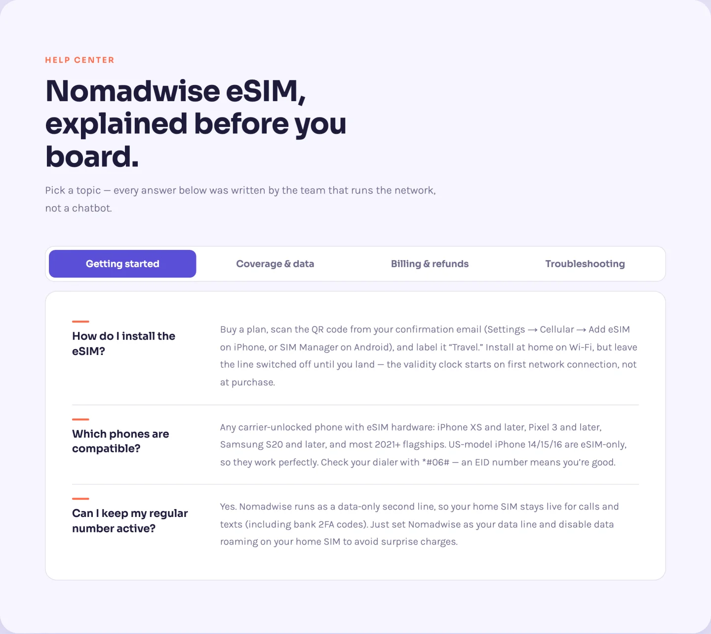
Twelve questions across four categories with a sliding pill tab bar. You don’t manage the tabs at all. Every question in the repeater has a category field, and the widget builds the tab buttons from the unique categories it finds. Rename a category on three questions and the tab renames itself. Full arrow-key tab navigation included.
24. FAQ with support card: Elementor FAQ section with support card
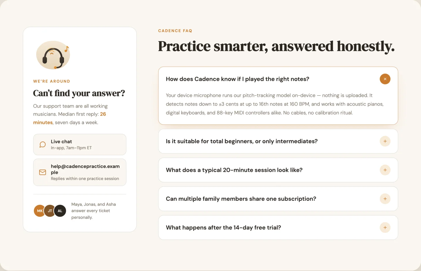
Accordion on the left (multi-open this time), a sticky support card on the right with an illustration, contact channels, and a team note with three avatar slots. Contact channels are a repeater with a chat/email/phone/clock icon picker per row. The card’s sticky offset is a slider, for when your site has a fat fixed header.
Call-to-action band templates
A bold gradient, a split with a product image, and a minimal centred band.
25. Bold gradient: Elementor call to action template
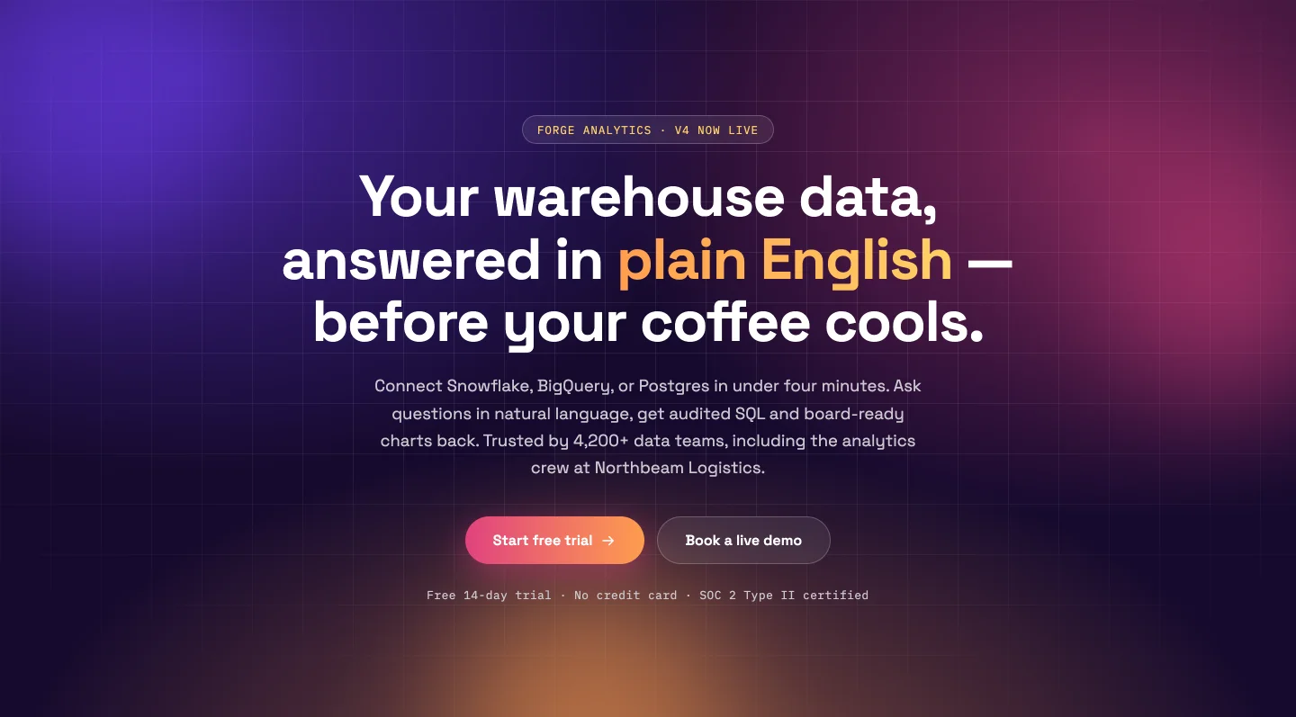
An animated three-color gradient wash with floating blobs that drift toward your pointer. The three gradient colors are separate pickers, so shifting the whole mood from violet to brand-orange takes three clicks. Primary and ghost buttons each have full link controls; the blobs switch off for minimalists (and switch themselves off for reduced-motion visitors).
26. Split with product image: Elementor CTA section template
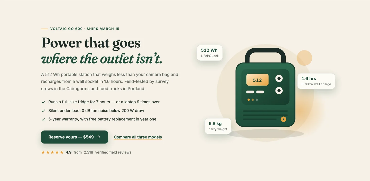
Copy and checklist on the left, product shot on the right with floating spec badges (capacity, charge time, weight) that reposition themselves however many you add. The star rating counts up to 4.8 from 2,318 reviews in the demo, and both numbers are fields. Built for a physical product but works for anything with specs worth bragging about.
27. Minimal centered: Elementor call to action band
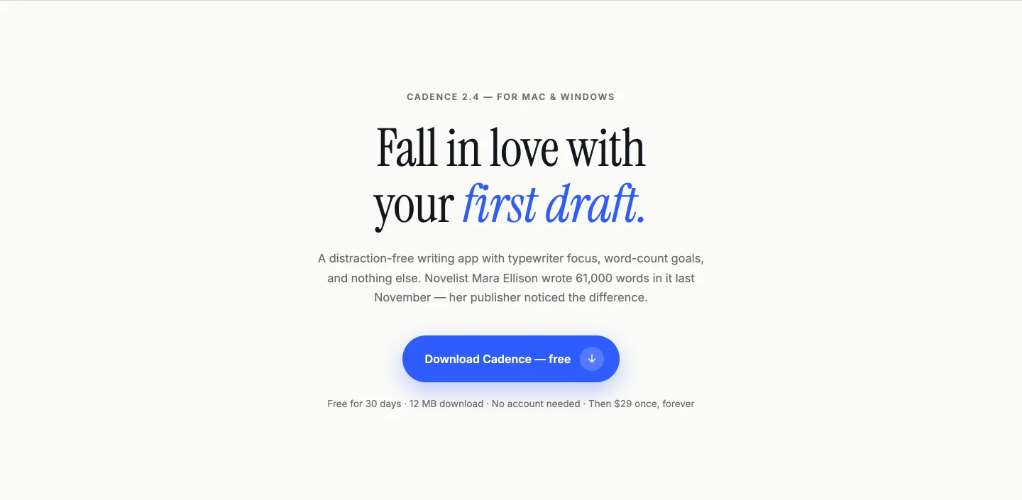
Cream background, one headline, one button, thin rules above and below. The headline reveals word by word, and because the split happens at runtime, your rewritten headline animates exactly the same. When every other section on the page is shouting, this one closes the deal by lowering its voice.
Contact form section templates
Form with contact details, form with an animated map, and a centred card.
28. Form with contact info: Elementor contact form template
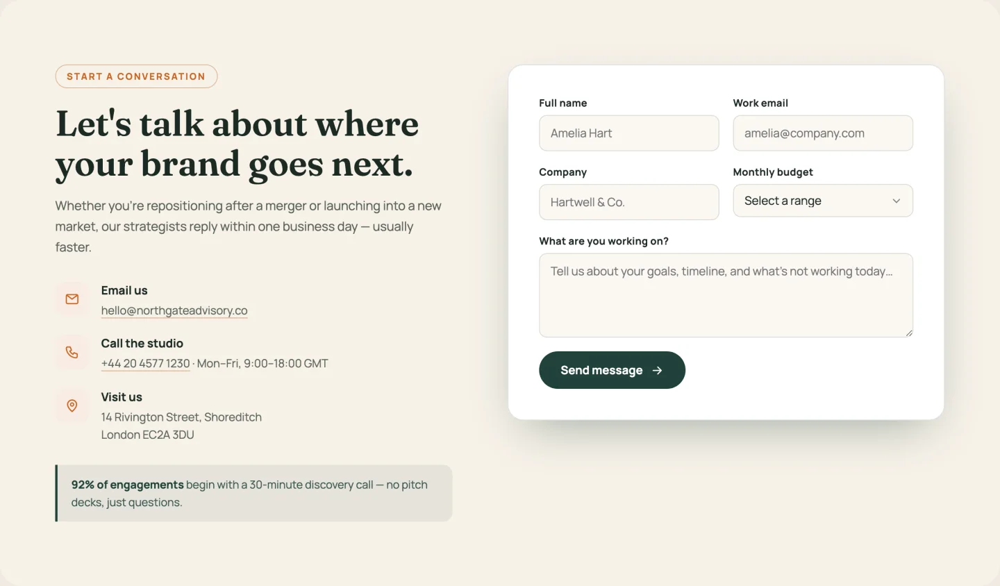
Info column (email, phone, office, as a repeater with cycling icons) next to a form with name, email, company, a budget dropdown, and a message field. Budget ranges are their own repeater. Every label and placeholder is editable, which matters the day you translate the site.
29. Form with map: Elementor contact form with map
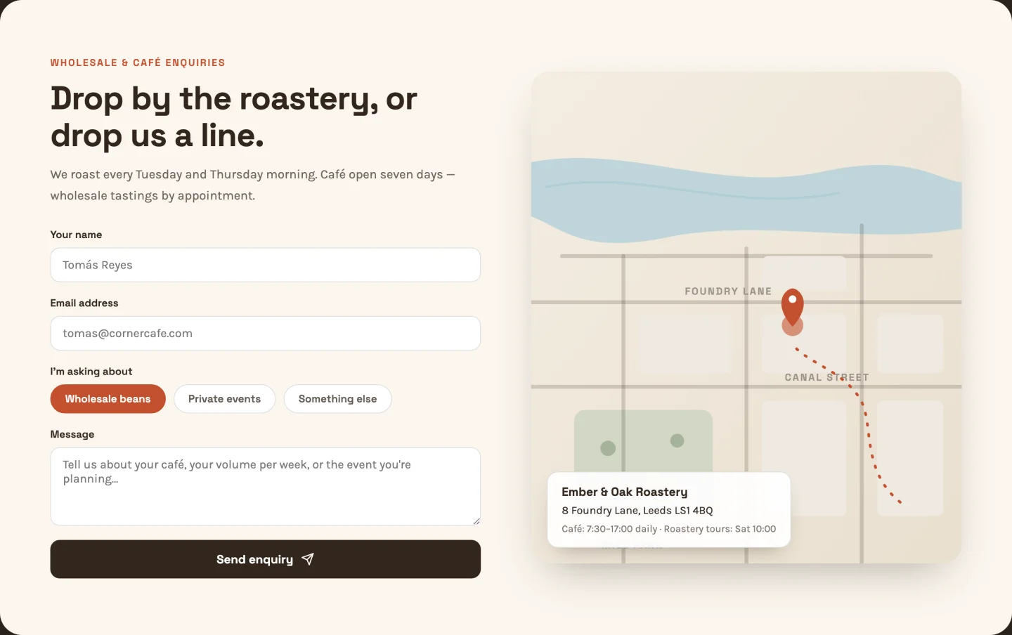
A form with topic-selection chips beside an illustrated SVG map: animated dashed route, pulsing pin, park and canal details. No Google Maps embed, no API key, no cookie banner implications. Street labels on the map are text fields, so put your actual streets on it.
30. Centered card: Elementor contact form section
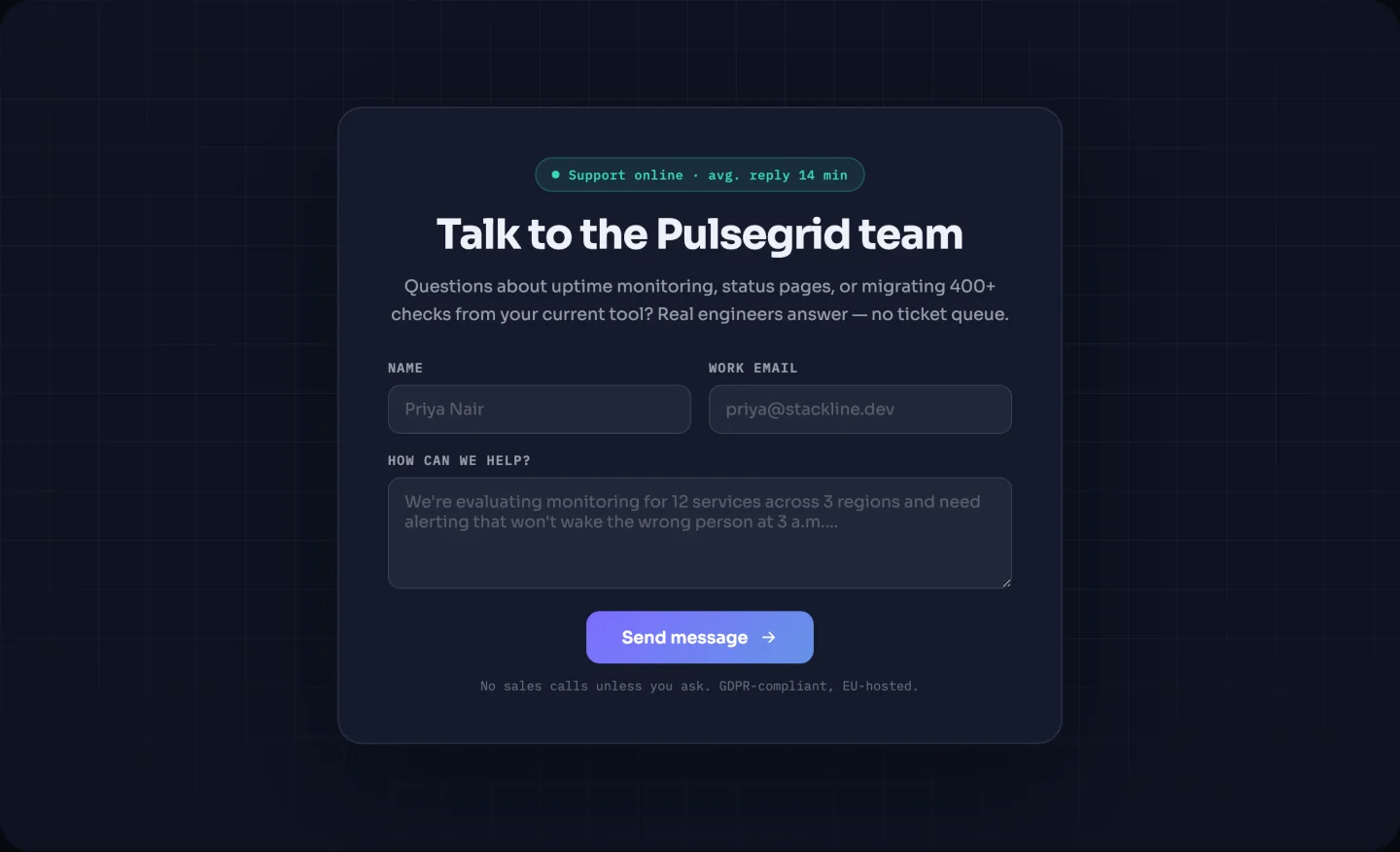
One centered card on a dark background with a spotlight that follows your cursor and a blinking “Replies within one business day” status badge. The badge text is a field and the whole badge is toggleable. Smallest footprint of the three. Drop it at the end of any page that needs a contact option without a dedicated contact page.
Logo strip templates
A grayscale grid that colours on hover, and an infinite marquee.
31. Static grayscale grid: Elementor logo grid template
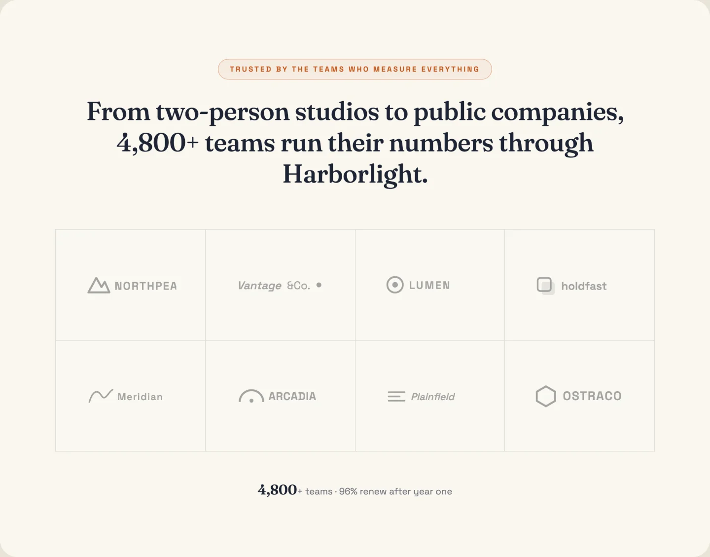
Eight logos in a grid, grayscale until hovered, with a count-up stat underneath (“Powering reporting for 1,400+ teams”). Columns are a slider, the stat row is toggleable, and the grayscale-to-color hover works on whatever PNG or SVG logos you upload.
32. Scrolling marquee: Elementor logo carousel template
An infinite marquee with edge fades that pauses on hover and stops for reduced-motion visitors. You add each logo once; the seamless loop clone is handled in JavaScript. Scroll speed is a slider; the demo runs a 28-second loop, which reads as confident rather than frantic.
Browse the 583-section library by type
The library is the other half: 583 designs installed from inside the Elementor editor instead of downloaded. Below are three picks from each of the main categories, each with a live demo you can scroll and click, and a button through to every design in that category.
| Section type | Designs | Where |
|---|---|---|
| hero section | 47 | Jump |
| features section | 64 | Jump |
| about us section | 40 | Jump |
| stats and counter section | 40 | Jump |
| testimonial section | 41 | Jump |
| pricing table | 19 | Jump |
| team section | 36 | Jump |
| FAQ section | 21 | Jump |
| call to action section | 27 | Jump |
| contact form section | 46 | Jump |
| blog and article section | 28 | Jump |
| mega menu section | 6 | Jump |
| Services sections | 41 | Browse |
| Process, steps and timeline sections | 29 | Browse |
| Tabs, content and media sections | 31 | Browse |
| Shop, product and menu sections | 23 | Browse |
| Case study and portfolio sections | 19 | Browse |
| Logo, brand and client sections | 13 | Browse |
| 404 error sections | 7 | Browse |
| Careers and jobs sections | 5 | Browse |
Counts are from the library on 23 September 2026. New sections land with most releases, so your plugin may show more than this.
Elementor hero section templates
47 hero designs in the library. They mostly differ by what sits beside the headline: a dashboard screenshot, a booking button, a review badge, or a counter row. If you want heroes you can download as JSON instead, there is a separate pack of hero section templates.
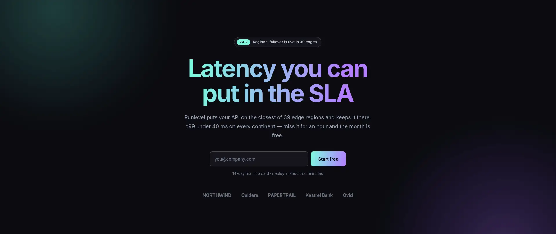
Edge Signal SaaS Hero
Dark SaaS hero with a latency headline and the product dashboard sitting under it.

Cleaner Hero
Photo hero for a service business, with a star rating and a phone number next to the button.

Craftova Hero
Illustrated hero with a floating results card beside the headline.
Every hero is a container stack, so the headline, the image and the button stay separate elements you can drag around.
Elementor features section templates
The biggest category at 64 sections. Most run on the Info Box widget, which keeps icon, title, text and link as separate controls instead of one block of formatted text.
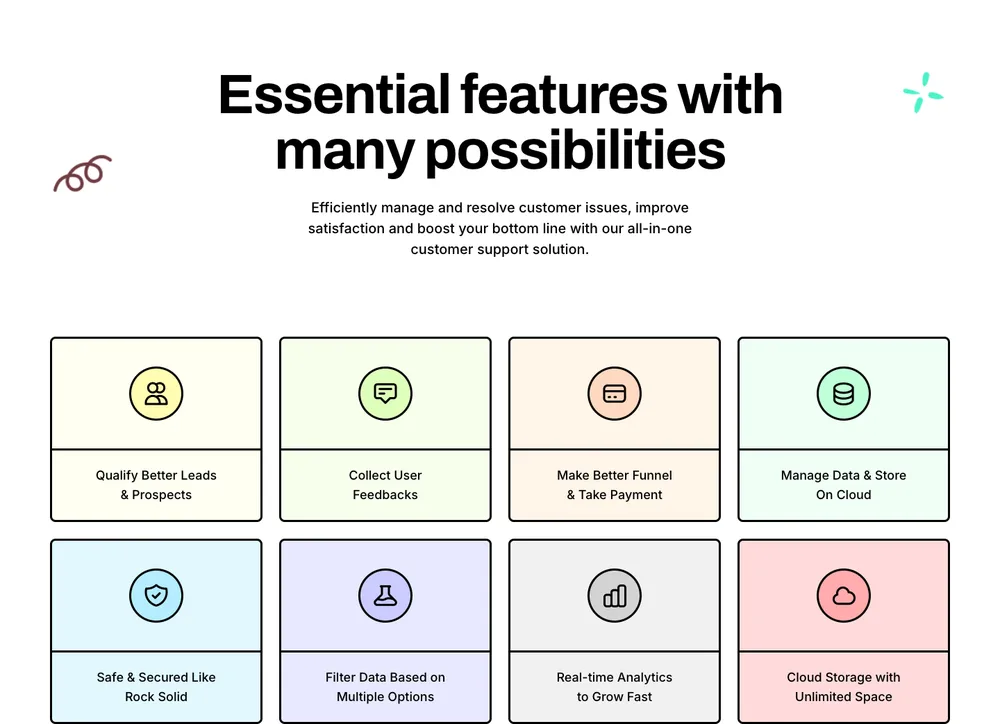
Lead Lift Features Grid
Eight pastel feature tiles under a serif headline, two rows of four.
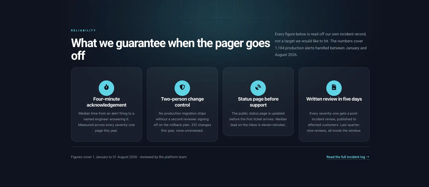
Dark Reliability Cards
Four dark cards with numbered icons, built for guarantees and SLAs.
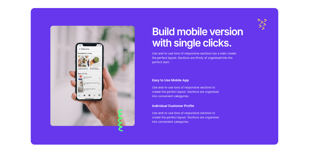
Clowdify Mobile App Features
Purple split section with a phone mockup and a checklist of app features.
Swap the icons from the Info Box control and the spacing holds. The text is real text, so it translates and it indexes.
Elementor about us section templates
40 about and story sections. The layout that repeats most is an image on one side with the story, a checklist and a stat row on the other.
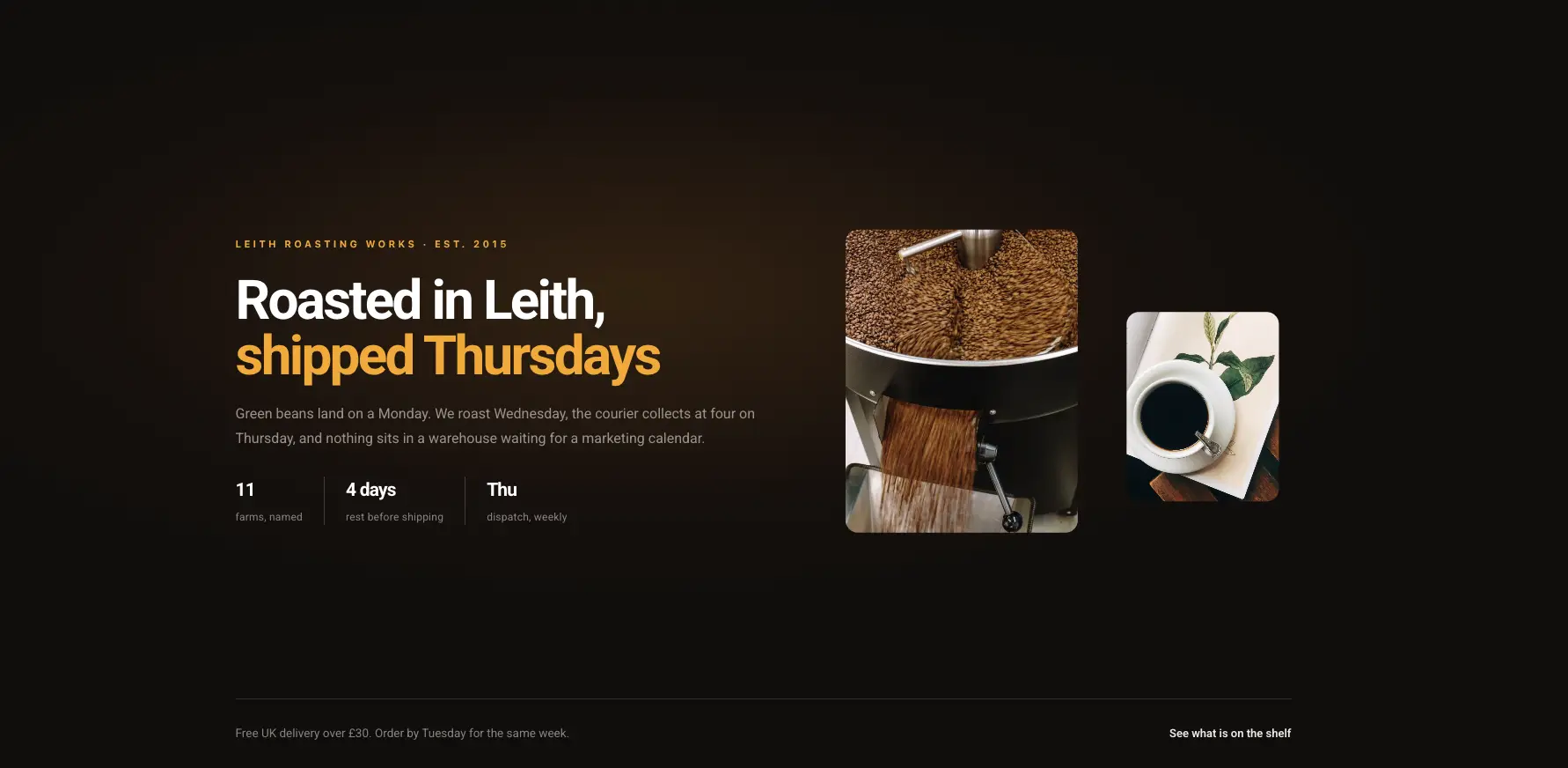
Dark Craft Story
Dark editorial story band with a product photo and a date line.

Cleanery About Us
Photo collage with a highlighted promise line and a phone-number button.
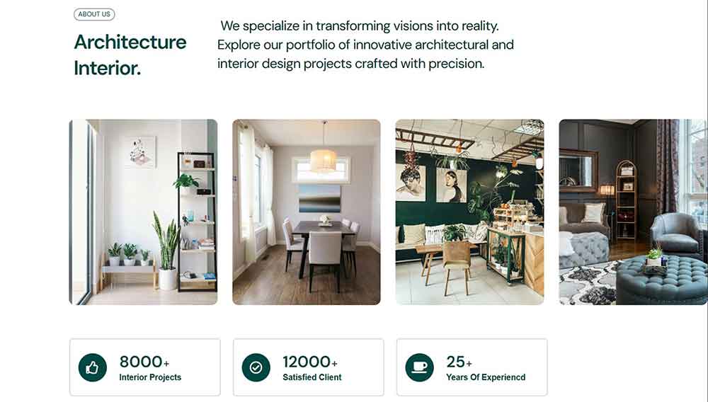
VibeSpace About
Interior-design about block with a four-image grid and three counters underneath.
These hold their shape when the story runs long, which is where most about sections fall apart.
Elementor stats and counter section templates
40 sections for numbers: counter rows, progress bars, bento metric boards and dashboards. The counters run on the Counter Up widget and animate on scroll without setup.
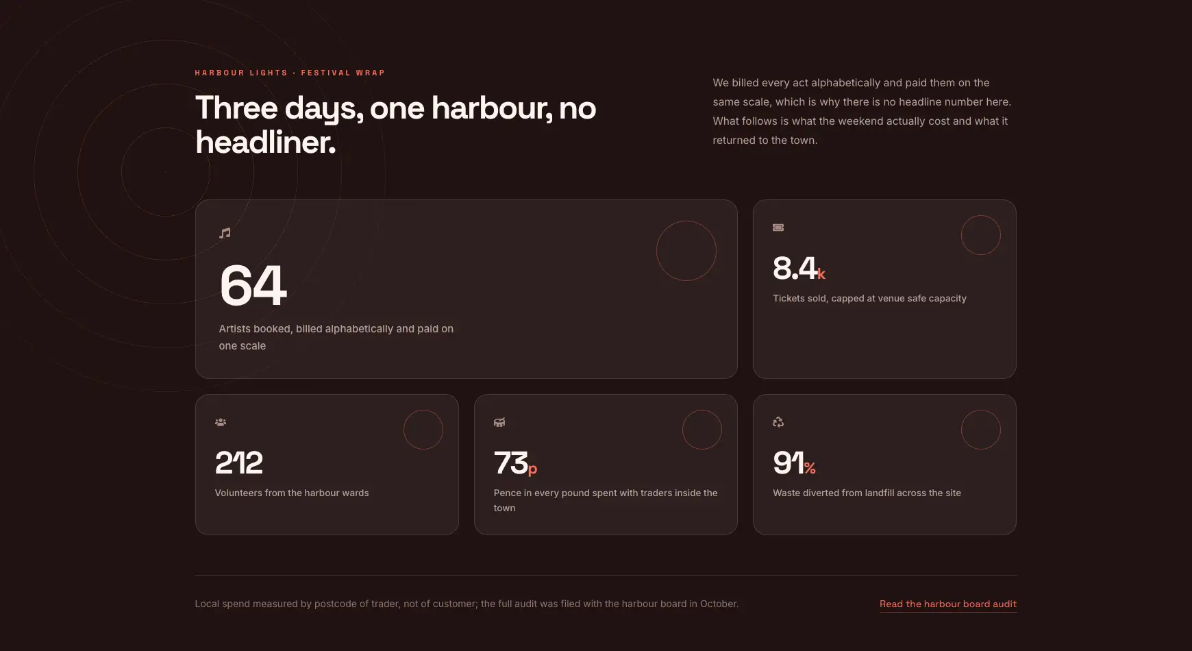
Bento Festival Wrap
Bento board of five metric tiles in different sizes, dark and warm.

Zaplyte Key Metrics
Bold purple band with three large counters and short labels.
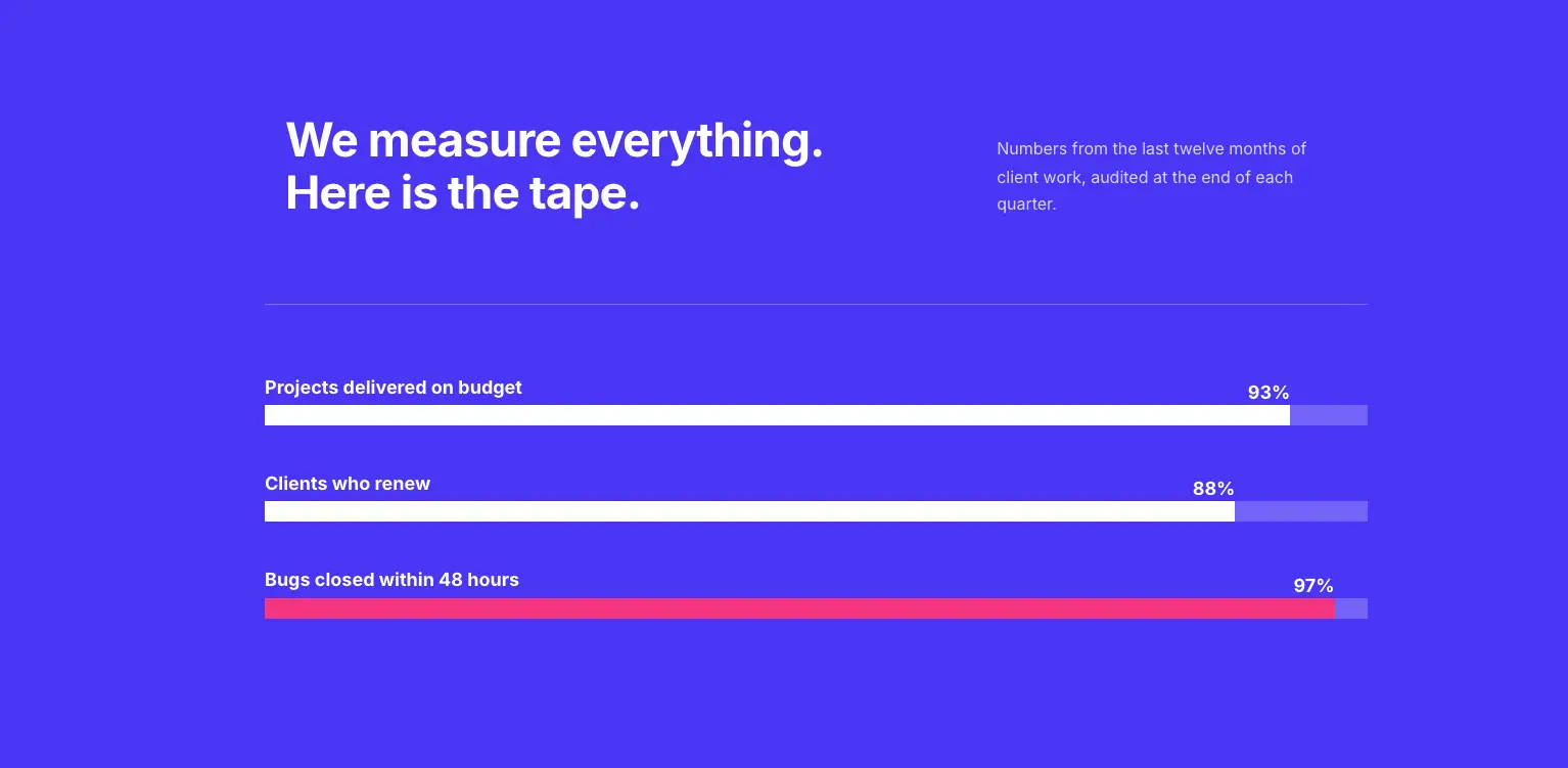
Bold Color Progress Bars
Blue block with three labelled progress bars for delivery or capacity numbers.
Counters take a prefix and a suffix, so 12k+, 99.9% and $4.2M all render without touching the number field.
Elementor testimonial section templates
41 testimonial and review sections: sliders, card grids, single quotes and review-platform layouts. There is also a walkthrough on building a testimonial carousel if you would rather build one yourself.

Craftova Customer Stories
Illustrated customer stories block with a happy-customer counter in the middle.
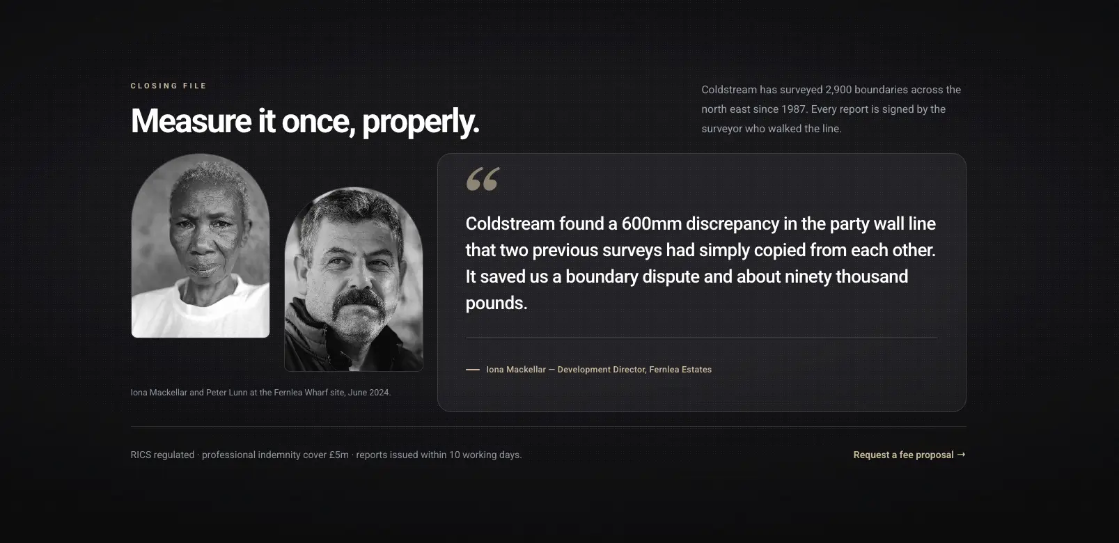
Portrait Client Story
Dark editorial quote with two portrait photos and a long pull quote.

Craftova Testimonials
Review cards with stars above a review-platform rating strip.
Reviews are repeater items in most of these, so a fifth one is a click and the row re-spaces itself.
Elementor pricing table templates
19 pricing sections built on the Pricing Table widget. Plan name, price, feature list, ribbon and button are separate controls, which is what keeps the rows aligned when plans have different feature counts.
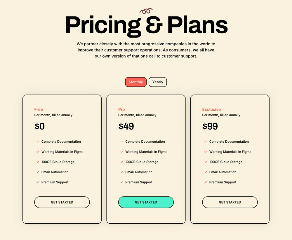
Lead Lift Pricing
Cream three-tier layout with a serif headline and a monthly or yearly switch.
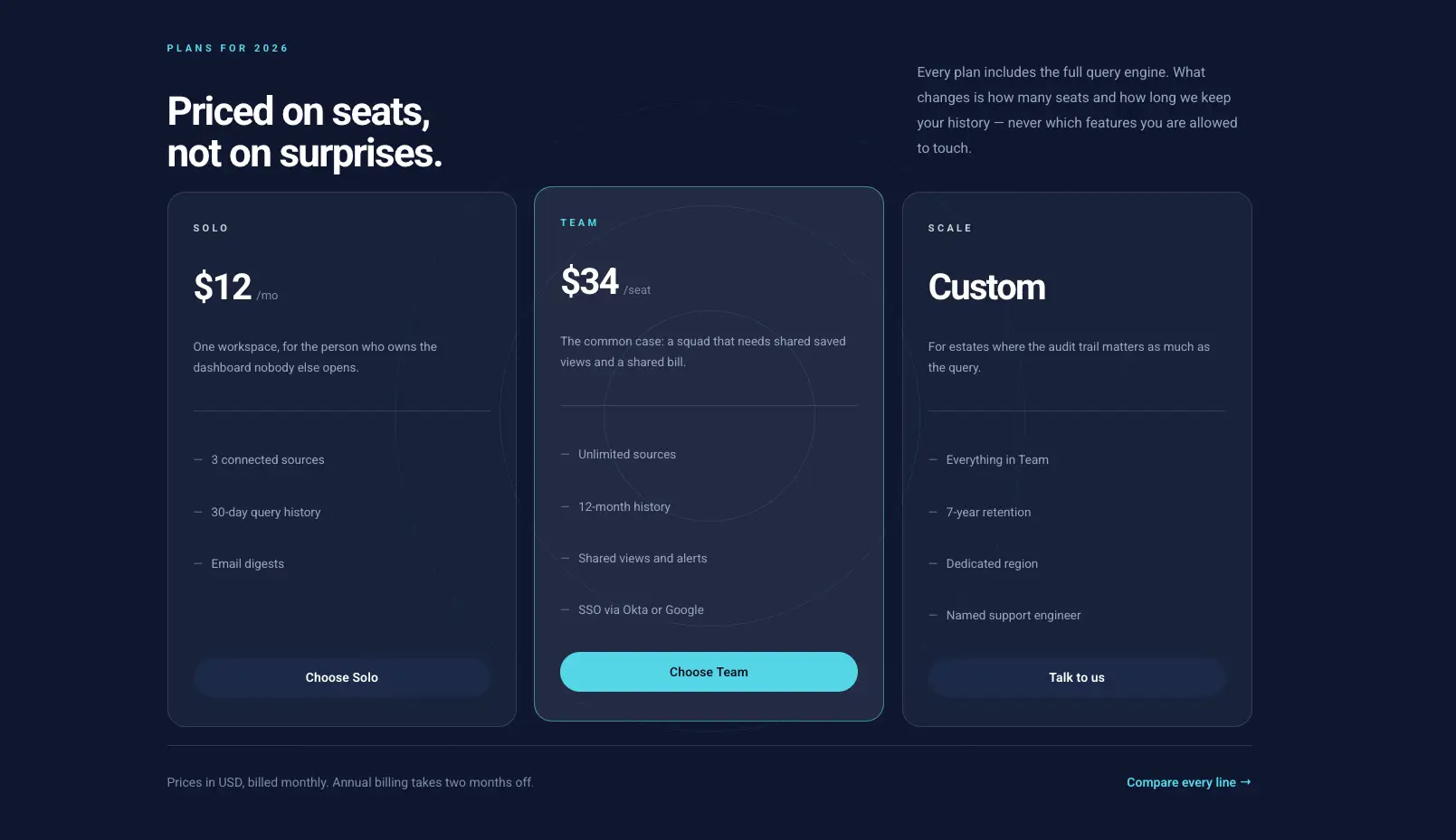
Dark Pricing Table
Dark three-column table with a highlighted plan and per-seat pricing.
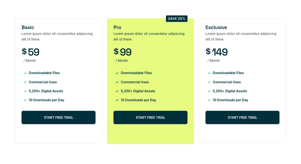
Craftova Pricing
Three plans with a lime middle card and a save badge on the yearly option.
For a monthly and annual switch inside one widget, the billing toggle template further up this page handles it.
Elementor team section templates
36 team sections running on the Team Member widget, so photo, role, bio and social links are fields rather than stacked text boxes.

Bento Portrait Mosaic
Dark bento mosaic of four portraits in mismatched frames.
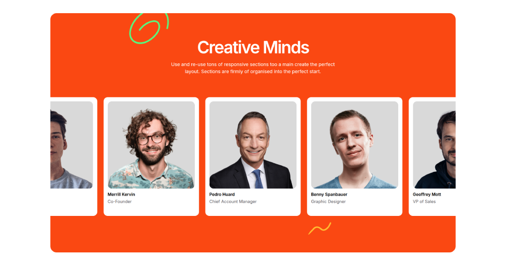
Clowdify Team
Orange band with five portrait cards and roles underneath.
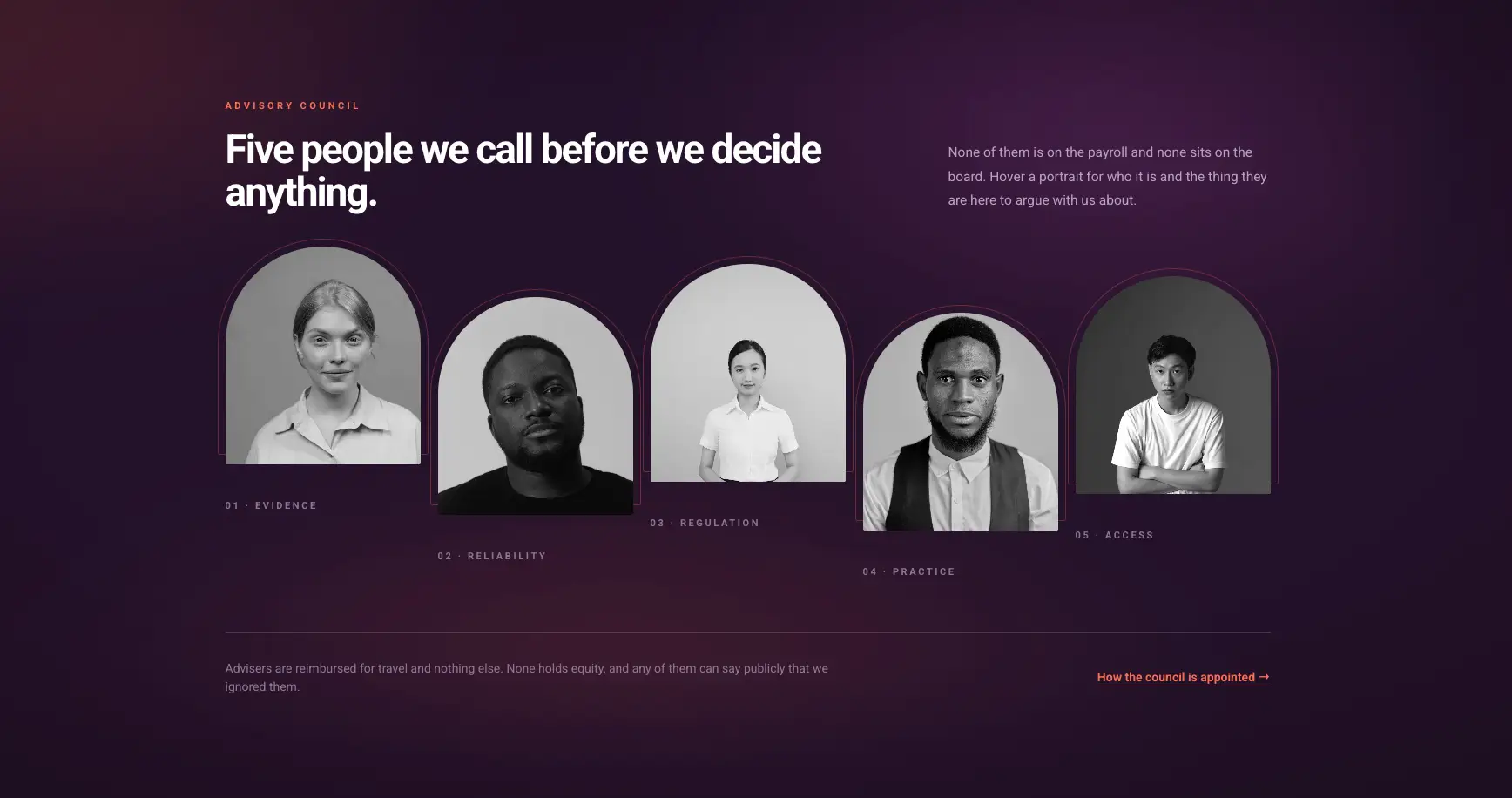
Staggered Portrait Row
Purple gradient row of arched portraits that reveal a note on hover.
Social icons are per member, so one person can have LinkedIn only and the row still balances.
Elementor FAQ section templates
21 FAQ sections. The accordion ones use the Advanced Accordion widget, which carries the single-open behaviour and the FAQ schema setting.
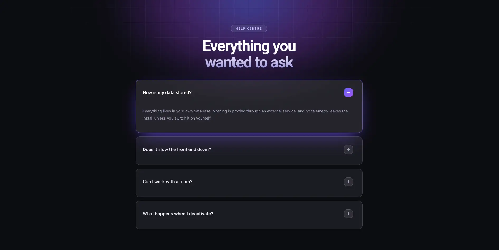
Dark Glow FAQ
Dark accordion with a purple glow behind the heading.
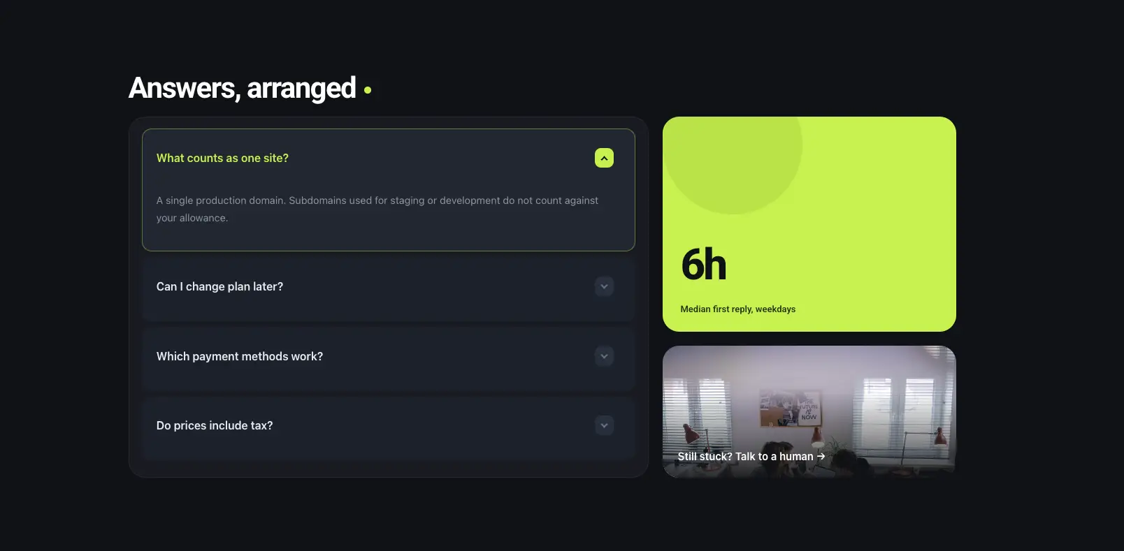
Bento FAQ Panel
Accordion on the left with a lime stat tile and a photo tile on the right.
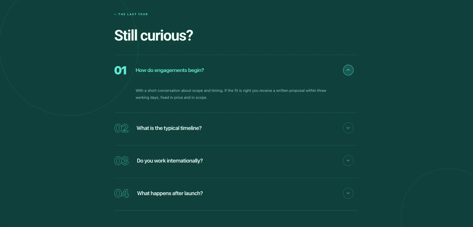
Numbered Editorial FAQ
Deep green numbered FAQ with a still-curious heading.
Turn schema on in the accordion widget before publishing if you want the questions eligible for rich results.
Elementor call to action section templates
27 CTA bands, the sections that sit above the footer and ask for the click. Built on the Call to Action and Creative Button widgets.
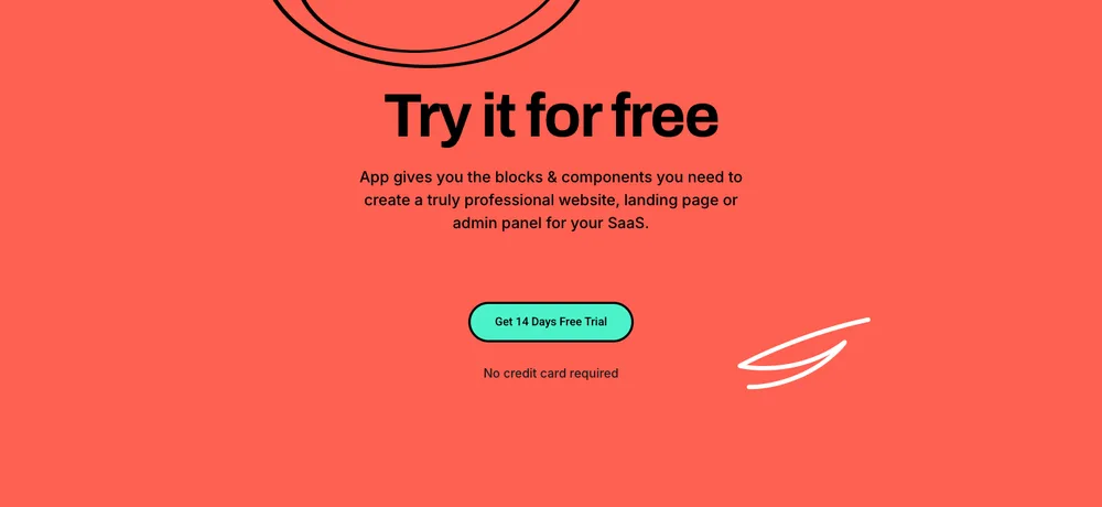
Lead Lift CTA
Coral full-width band with a free-trial headline and a no-credit-card line.

Tecpart CTA
Dark scale-up band with a wireframe globe behind the copy.

Zaplyte CTA
App promo split with store badges, a phone mockup and a rating line.
Button hover styles live in the widget’s Style tab, so brand colours are a picker rather than a stylesheet edit.
Elementor contact form section templates
46 contact, booking and opening-hours sections. Forms come from Contact Form 7 through the CF7 styler, so the fields stay yours and only the styling comes from the section.
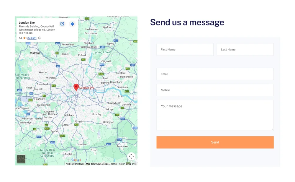
Balanciq Contact Form
Map on the left, message form on the right.
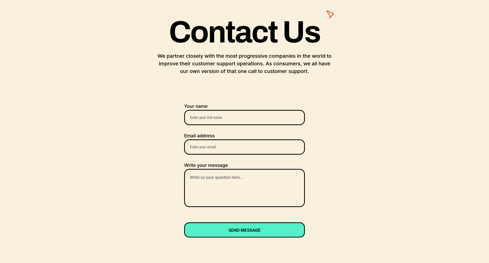
Lead Lift Contact Form
Cream centred form with a serif heading and rounded fields.
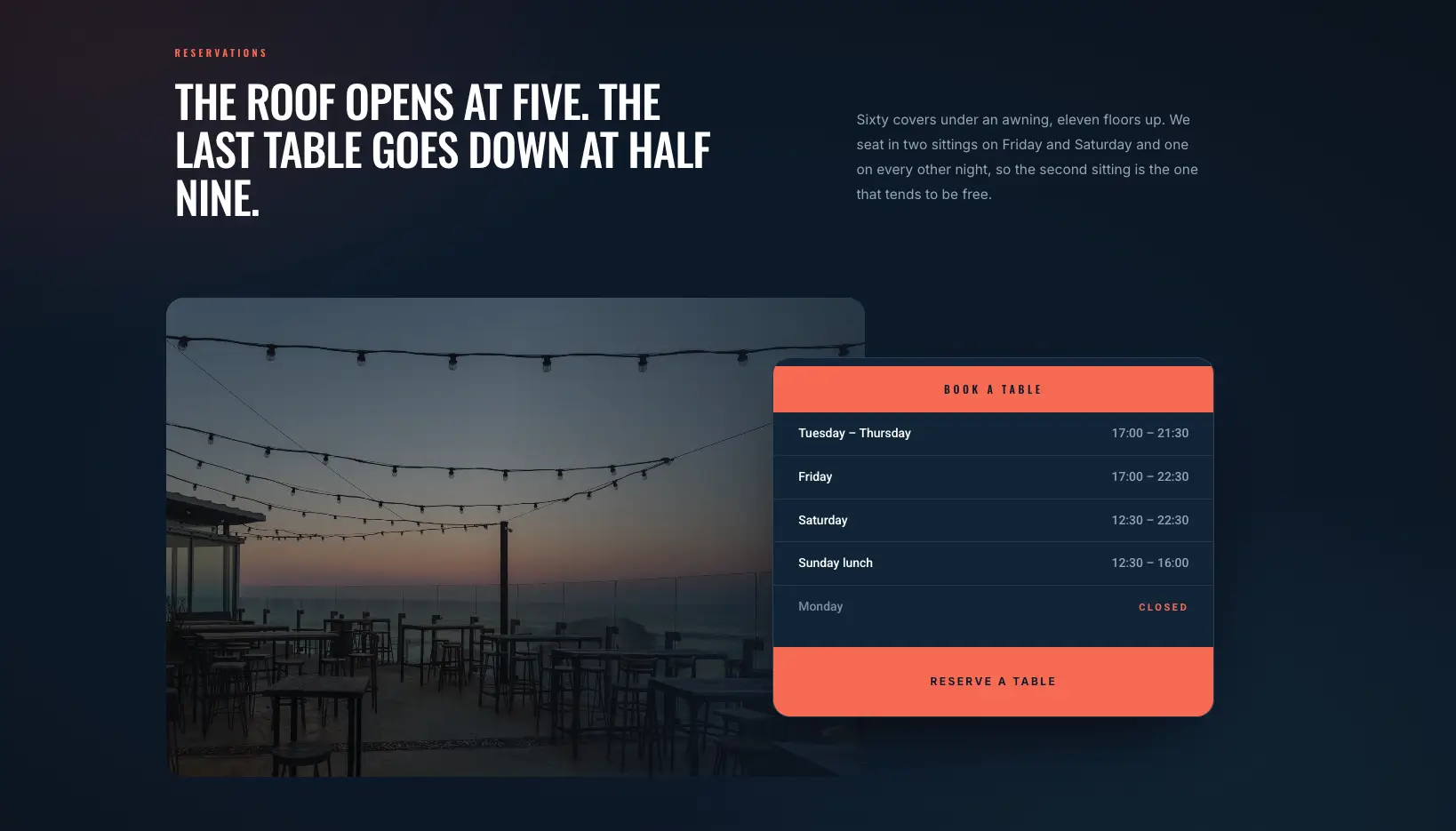
Overlap Reservation Card
Evening photo with an opening-hours card overlapping it and a booking button.
Install Contact Form 7 first, then pick your form in the widget. The section renders empty until a form is selected.
Elementor blog and article section templates
28 blog sections plus single-post layouts, built on the Blog Posts widget. For whole page templates rather than sections, see the Elementor blog templates post.
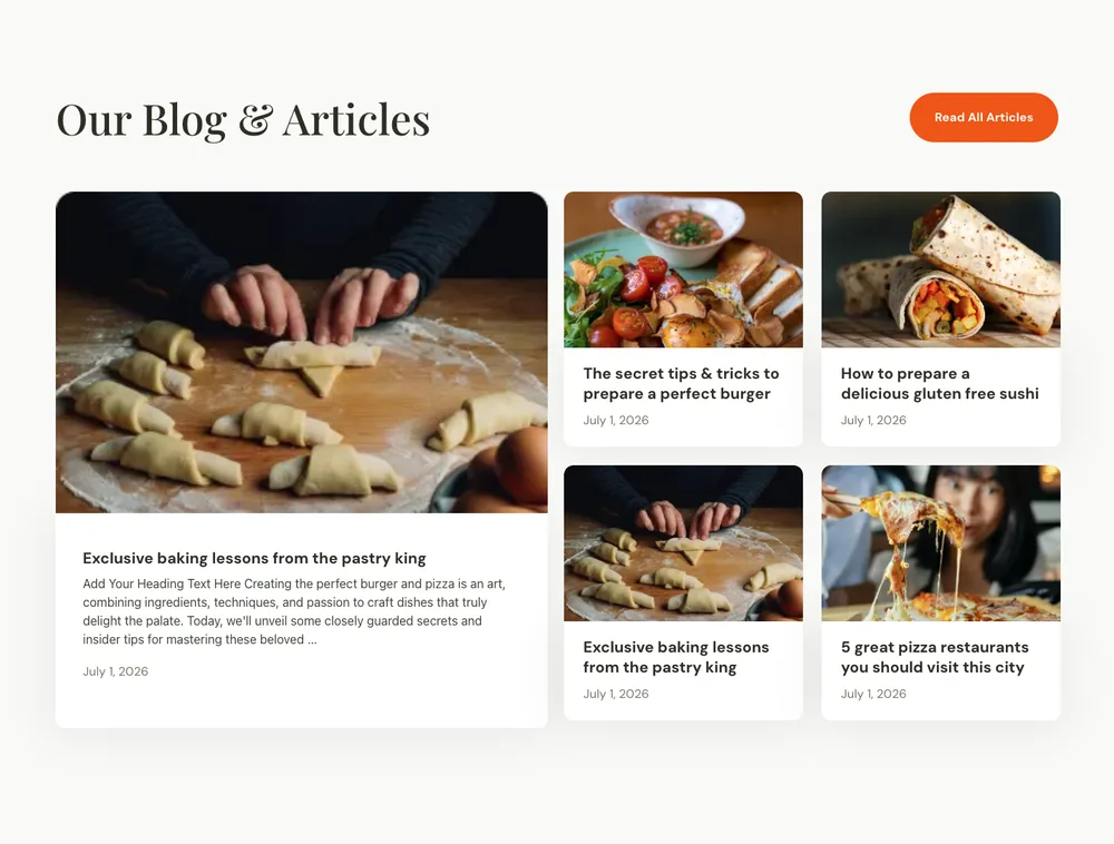
Culinary Blog Post
Magazine layout with one large feature post and four smaller cards.
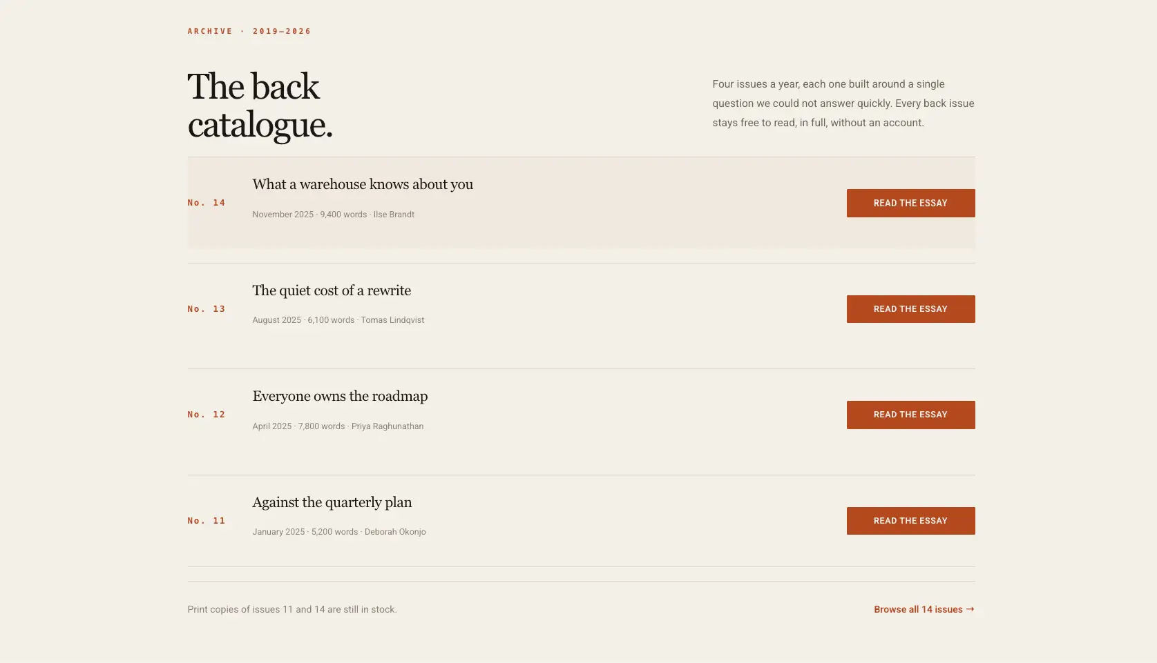
Editorial Archive List
Cream archive list with a read button on every row.

Balanciq Blog Post
Three-card post row with dates and a section intro on the left.
The grid pulls live posts, so it fills itself once the section is on your site.
Elementor mega menu section templates
Six mega menu panels: link columns, icon directories and promo blocks that drop out of a navigation item rather than sitting in the page.
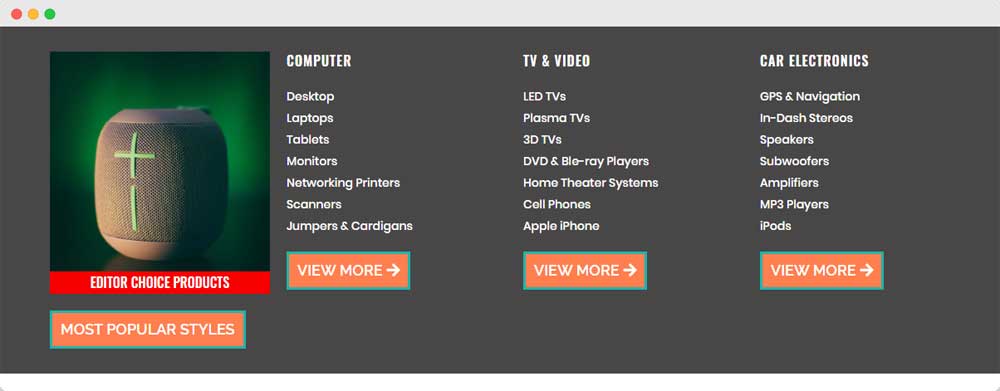
Electronics Store Mega Menu
Product-category panel with a featured product tile and three link columns.

Fashion Store Mega Menu
Three link columns above two sale banners.
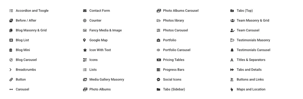
Widget Directory Mega Menu
Four-column directory of icon links for a large feature list.
Build the panel as a section first, then point the Mega Menu widget at it from your navigation.
That is 36 of 583. The full sections library has the rest, and the same designs are inside the plugin under the same category filters. If you want a whole page rather than one band, the full-page layouts live on the Elementor page templates page, with complete site designs on the template kits page. Headers, footers and popups have their own pages: Elementor header templates, Elementor footer templates and Elementor popup templates.
Elementor blocks, sections, page templates and kits
These four words get used for the same thing and mean different amounts of page.
- Sections are one horizontal band: a pricing table, an FAQ, a hero. What this page is about. You stack them to make a page.
- Blocks are the same thing under a different name. Some addon libraries say blocks where we say sections. A few use the word for the WordPress block editor, which is unrelated.
- Page templates are a complete page: home, about, contact, pricing. When people search for Elementor website templates this is usually what they mean. Master Addons has 211 of them on the page templates page.
- Template kits are a whole site in one style: header, footer and every page, designed to match. There are over 30 on the template kits page.
Sections are the useful unit when you already have a site and one part of a page is wrong. A kit makes more sense when you are starting from nothing and want the typography to agree with itself.
Elementor’s own container system replaced the old section-and-column structure. Everything here is built with containers, which is why the sections reflow properly on mobile instead of collapsing into squashed columns.
Elementor landing page templates: build one from these sections
A landing page is four to eight sections in a deliberate order. Three combinations that work, each assembled from sections on this page:
SaaS or software product
Hero with a product shot, logo strip for social proof, feature grid, stats band, pricing table with a monthly toggle, FAQ accordion, then the CTA band. Seven sections. The stats band directly under the features is doing the work of a case study you have not written yet.
Local service business
Hero with a booking button, services grid, about with the owner’s photo, review cards, FAQ, then a contact form with a map. The map matters more than it looks: for a business people drive to, it answers the question that decides the call.
Agency or studio
Hero, client logo marquee, alternating feature rows, team grid, case study cards, one large testimonial, then the CTA. Lead with the logos. For agency work, who you have worked with outranks what you say about yourselves.
Sections are container-based, so you can reorder them by dragging in the Navigator, and spacing between them stays consistent because the padding lives on the section rather than on the widgets inside it.
Which sections does a page actually need?
Most pages that convert use the same spine, in roughly this order:
- Hero: what this is and what to click. Every page.
- Logo or client strip: borrowed credibility, cheap to add.
- Features or services: what you actually get.
- About: why you, with a face if you have one.
- Stats: proof of scale where the numbers are good.
- Testimonials: proof from someone who is not you.
- Pricing: for anything with plans.
- Team: agencies, clinics, local businesses.
- FAQ: the objections that stop the click.
- CTA band: the last ask before the footer.
- Contact: the form, and the map if location matters.
Cut what you cannot fill honestly. An empty testimonial section with three invented quotes does more damage than no testimonial section.
Frequently asked questions
Are these Elementor section templates free?
The 32 JSON files on this page are free to download, and importing them uses the Widget Builder, which is a Master Addons Pro feature. In the library, 93 of the 583 sections import on the free plugin. The split is uneven by category: every pricing section is Pro, while FAQ has the most free designs of any category. The Template Library screen marks the locked ones.
Where can I find free Elementor templates?
Elementor’s own library has a free tier inside the editor. Master Addons adds 93 free sections plus free page templates and kits, all from the same Template Library screen once the plugin is active.
How do I import a section template in Elementor?
For the JSON downloads on this page: Master Addons → Widget Builder → Import Widget, upload the file, then drag the new widget onto your page. For library sections: open a page in Elementor, click the Master Addons template icon, switch to Sections, pick a category, and click Insert.
How do I create a section in Elementor?
Use a container. In the editor, click the plus icon, choose a structure, then drag widgets into it. Set the padding and background on the container itself rather than on the widgets. That is what keeps spacing consistent when you duplicate it later. Once a section is the way you want it, right-click it and choose Save as Template to reuse it.
Can I edit the templates after importing?
Yes, all of it. The JSON templates come in as single widgets where every string, link, image and base colour is a control in the Content or Style tab. Library sections come in as ordinary containers and widgets.
Do these work with any WordPress theme?
They work with any theme that supports Elementor, which is nearly all of them. Sections carry their own spacing and colours, so a theme’s styles rarely bleed in. If a heading looks off, it is usually the theme’s typography. Set the font on the widget and it overrides.
Is there a free alternative to Elementor?
Elementor’s free version is the alternative most people mean, and every section here works on it. Master Addons Pro is a separate licence from Elementor Pro.
What is the difference between a section and a page template?
A section is one band of a page. A page template is the whole page. Sections are what you reach for when a site exists and one part of it needs replacing.
Why do some downloads come with SVG files?
The demo artwork is vector so it stays sharp at any width. WordPress blocks SVG uploads by default for security reasons. Convert them to PNG or WebP before uploading, or enable SVG uploads if you trust the source.
Start with one section
Pick the section on your site that you like least, find it above, and replace it. That is a ten-minute job, and it settles whether this library fits how you work.
