

पॉपओवर टॉगल फ़ील्ड मास्टर ऐडऑन के साथ निर्मित कस्टम विजेट में एक ऑन/ऑफ नियंत्रण के पीछे कुछ संबंधित सेटिंग्स को समूहित करता है विजेट बिल्डरएलिमेंटर में यह एक पेंसिल आइकन के साथ एक पंक्ति के रूप में दिखाता है पेंसिल पर क्लिक करने से विकल्प चालू हो जाता है और अंदर की सेटिंग्स के साथ एक छोटा पॉपओवर खुलता है यह पैनल को भरने से वैकल्पिक अतिरिक्त, जैसे ओवरले या बैज रखता है।
पॉपओवर टॉगल एक प्रो फ़ील्ड है मुफ्त प्लगइन में एक सीमित विजेट बिल्डर शामिल है, और फ़ील्ड का पूरा सेट आता है मास्टर एडॉन्स प्रो.
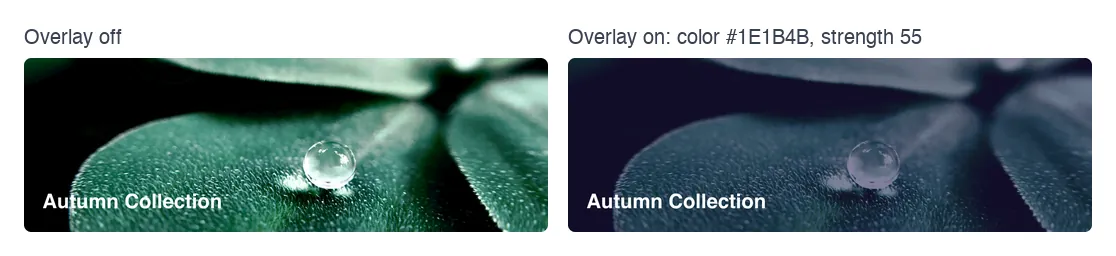
पॉपओवर टॉगल फ़ील्ड क्या करता है #
- यह आपके विजेट के पैनल में एक पंक्ति जोड़ता है: आपका लेबल, एक पेंसिल आइकन और, एक बार चालू होने पर, एक रीसेट तीर।
- पेंसिल विकल्प को चालू करती है और आपके द्वारा परिभाषित फ़ील्ड के साथ एक पॉपओवर खोलती है।
- टॉगल स्वयं स्टोर करता है
yesजब चालू हो और कुछ भी नहीं जब बंद हो, तो आपका टेम्पलेट इसे जांच सकता है{% if %}. - पॉपओवर के अंदर प्रत्येक फ़ील्ड को अपना टोकन मिलता है, जो टॉगल के नाम से बना होता है और फ़ील्ड का नाम एक अंडरस्कोर से जुड़ा होता है।
यदि आपने अभी तक विजेट नहीं बनाया है, तो पढ़ें विजेट बिल्डर अवलोकन पहले।
इससे पहले कि आप शुरू करें #
- एलिमेंटर स्थापित और सक्रिय के साथ वर्डप्रेस।
- एलिमेंटर और मास्टर एडॉन्स प्रो के लिए मास्टर एडॉन्स, दोनों सक्रिय हैं स्थापना गाइड सेटअप को कवर करता है।
- विजेट बिल्डर में एक विजेट खुला इस गाइड में उदाहरण एक वैकल्पिक ओवरले के साथ एक “Image बैनर” विजेट है: एक पॉपओवर टॉगल नामित
overlayअंदर दो क्षेत्रों के साथ,colorऔरstrength.
पॉपओवर टॉगल फ़ील्ड कैसे जोड़ें #
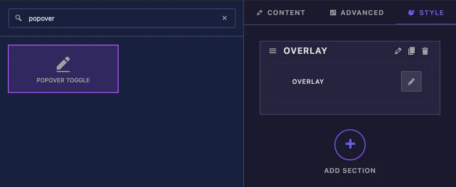
- को जा मास्टर ऐडऑन > विजेट बिल्डर और अपना विजेट खोलें।
- क्लिक करें शैली टैब करें और एक अनुभाग जोड़ें, उदाहरण के लिए “Overlay”।
- प्रकार
popoverबाईं ओर फ़ील्ड खोज बॉक्स में। - खींचना पॉपओवर टॉगल अनुभाग में इसकी सेटिंग्स बाएं साइडबार में खुलती हैं।
पॉपओवर टॉगल फ़ील्ड विकल्प समझाया गया #
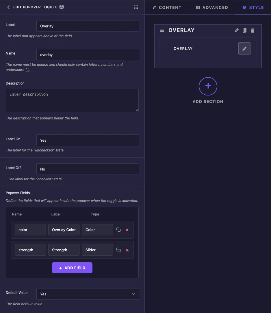
- लेबल एलिमेंटर में पेंसिल के बगल में पाठ है, उदाहरण के लिए “Overlay”।
- नाम क्या फ़ील्ड की विशिष्ट आईडी और उसके द्वारा बनाए गए प्रत्येक टोकन की शुरुआत है, इसलिए उदाहरण के लिए इसे छोटा रखें
overlay। केवल अक्षर, संख्याएँ और अंडरस्कोर। - विवरण बिल्डर के अंदर आपके लिए एक नोट है।
- लेबल चालू और लेबल बंद फ़ील्ड के साथ सहेजे जाते हैं, लेकिन एलिमेंटर इस नियंत्रण को एक पेंसिल आइकन के रूप में दिखाता है, इसलिए ये शब्द पैनल में दिखाई नहीं देते हैं।
- पॉपओवर फ़ील्ड पॉपओवर के अंदर फ़ील्ड सूचीबद्ध करता है प्रत्येक पंक्ति में एक है नाम, ए लेबल और ए प्रकार. क्लिक करें फ़ील्ड जोड़ें किसी अन्य पंक्ति के लिए, कॉपी आइकन को डुप्लिकेट करने के लिए, या लाल क्रॉस को हटाने के लिए।
- डिफ़ॉल्ट मान सेट करता है कि विजेट की नई प्रति (हां) या बंद (नहीं) विकल्प से शुरू होती है या नहीं।
टाइप मेनू टेक्स्ट, नंबर, टेक्सटेरिया, वाईएसआईडब्ल्यूवाईजी, कोड, हिडन, स्विचर, कलर, फॉन्ट, टाइपोग्राफी, डेट टाइम, यूआरएल, मीडिया, गैलरी, आइकॉन्स, स्लाइडर, डाइमेंशन और बैकग्राउंड प्रदान करता है पंक्तियों में केवल एक नाम, लेबल और प्रकार होता है, इसलिए पॉपओवर के अंदर एक क्षेत्र के लिए डिफ़ॉल्ट मान या रेंज सेट करने के लिए कहीं नहीं है यहां एक स्लाइडर फ़ील्ड एलिमेंट की मानक सीमा का उपयोग करता है, पीएक्स के लिए ० से १०००।
सामान्य सेटिंग्स अन्य क्षेत्रों की तरह ही काम करती हैं।
अपने टेम्पलेट में टॉगल और उसके फ़ील्ड पढ़ें #
दो नियम इस क्षेत्र में आपको जो कुछ भी देते हैंः
- टॉगल का अपना नाम प्रिंट होता है
yesजब यह चालू हो और कुछ भी नहीं जब यह बंद हो तो इसका उपयोग करें{% if overlay %}. - पॉपओवर के अंदर एक फ़ील्ड को टॉगल के नाम, एक अंडरस्कोर के रूप में पढ़ा जाता है, फिर फ़ील्ड का नाम। द
colorफील्ड बन जाता है{{ overlay_color }}, और दstrengthस्लाइडर बन जाता है{{ overlay_strength.size }}.
<div class="img-banner">
  {% if overlay %}
    <div class="img-banner__overlay" style="background: {{ overlay_color }}; opacity: {{ overlay_strength.size }}%;"></div>
  {% endif %}
  ...
</div>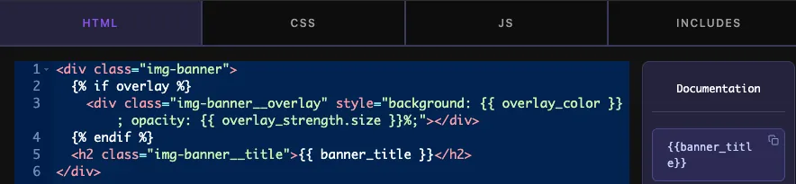
पॉपओवर के अंदर खेतों के लिए डॉट्स काम नहीं करते हैं हमारे परीक्षणों में {{ overlay.color }} कुछ भी नहीं मुद्रित, जबकि {{ overlay_color }} रंग मुद्रित करें टॉगल बंद होने पर फ़ील्ड भी अपने मान रखते हैं, इसलिए उन्हें हमेशा लपेटें {% if overlay %}.
क्लिक करें सेटिंग्स सहेजें जब आपका काम पूरा हो जाए।
एलिमेंटर में पॉपओवर टॉगल का उपयोग करें #
विजेट को किसी पृष्ठ पर जोड़ें, या यदि पृष्ठ पहले से ही खुला था तो संपादक को पुनः लोड करें विजेट का चयन करें और टैब खोलें जहां आपने फ़ील्ड रखा था यह एक पेंसिल आइकन के साथ आपके लेबल के रूप में दिखाता है।
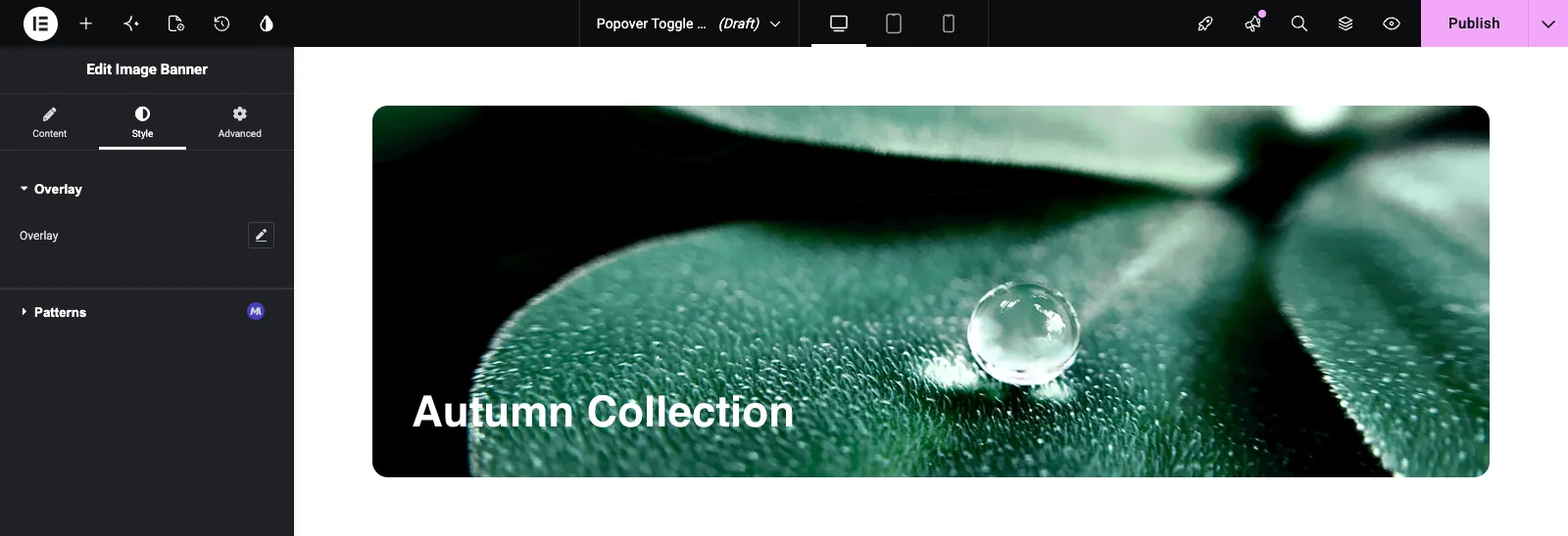
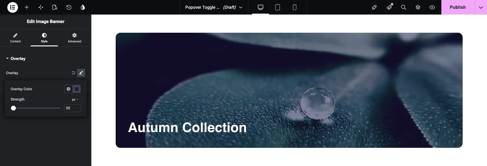
पेंसिल पर क्लिक करें विकल्प चालू हो जाता है और पॉपओवर आपके क्षेत्रों के साथ खुलता है उन्हें सेट करें और विजेट सीधे अपडेट करता है पॉपओवर के बाहर क्लिक करें इसे बंद करने के लिए विकल्प को फिर से बंद करने के लिए, पेंसिल के बगल में परिपत्र रीसेट तीर पर क्लिक करें।
सामान्य उपयोग के मामले #
- छवि और वीडियो बैनर पर एक वैकल्पिक रंग ओवरले।
- अपने स्वयं के पाठ और रंग के साथ एक वैकल्पिक बैज या रिबन।
- अतिरिक्त होवर प्रभाव जो अधिकांश संपादकों को कभी देखने की आवश्यकता नहीं होती है।
- उन्नत रिक्ति या सीमा विकल्प मुख्य पैनल से बाहर रखा गया।
पॉपओवर टॉगल फ़ील्ड के साथ काम करने के लिए युक्तियाँ #
- टॉगल का नाम छोटा रखें इसके अंदर का हर क्षेत्र उस नाम से शुरू होता है।
- हमेशा टॉगल की जाँच करें
{% if %}अपने फ़ील्ड का उपयोग करने से पहले, क्योंकि इसके बंद होने पर मान सहेजे रहते हैं। - प्रति पॉपओवर दो या तीन संबंधित फ़ील्ड का उपयोग करें सामान्य अनुभाग में इससे अधिक खोजना आसान है।
- सीएसएस टैब में डिफ़ॉल्ट शैलियों को सेट करें पॉपओवर के अंदर फ़ील्ड्स का अपना कोई डिफ़ॉल्ट मान नहीं है।
- बिना किसी सेटिंग के सरल ऑन/ऑफ के लिए, इसका उपयोग करें स्विचर फ़ील्ड.
अक्सर पूछे जाने वाले प्रश्न #
क्या पॉपओवर टॉगल फ़ील्ड मुफ़्त है?
नंबर पॉपओवर टॉगल विजेट बिल्डर में प्रो फ़ील्ड में से एक है, इसलिए मास्टर एडॉन्स प्रो को विजेट में जोड़ने से पहले सक्रिय होना होगा।
टॉगल टोकन क्या प्रिंट करता है?
{{ overlay }} प्रिंट yes जब विकल्प चालू होता है और कुछ भी नहीं जब यह बंद होता है, तो {% if overlay %} चेक का काम करता है।
मैं पॉपओवर के अंदर से एक फ़ील्ड कैसे प्रिंट करूं?
उदाहरण के लिए, टॉगल के नाम और फ़ील्ड के नाम को अंडरस्कोर के साथ जोड़ें {{ overlay_color }}. स्लाइडर के लिए, जोड़ें .size, जैसा कि {{ overlay_strength.size }}.
{{overlay।color }} कुछ भी प्रिंट क्यों नहीं करता?
पॉपओवर के अंदर फ़ील्ड टॉगल के नीचे नेस्ट नहीं किए गए हैं अंडरस्कोर फॉर्म का उपयोग करें। [+] {{ overlay_color }}इसके बजाय।
क्यों मेरे लेबल पर और लेबल बंद शब्द एलिमेंट में नहीं दिखाते हैं?
एलिमेंटर हां/नहीं स्विच के बजाय एक पेंसिल आइकन के रूप में पॉपओवर टॉगल दिखाता है, इसलिए उन लेबलों को प्रदर्शित नहीं किया जाता है।
लपेटकर #
पॉपओवर टॉगल जोड़ें, उसके फ़ील्ड सूचीबद्ध करें, जांचें {% if toggle_name %} अपने टेम्पलेट में और प्रत्येक फ़ील्ड को इस प्रकार पढ़ें {{ toggle_name_field_name }}संपादकों को एक साफ पैनल मिलता है, और अतिरिक्त सेटिंग्स केवल तभी दिखाई देती हैं जब वे विकल्प को चालू करते हैं सेटिंग्स को टैब में समूहित करने के लिए, इसके बजाय देखें टैब क्षेत्र, और जाँच करें मूल्य निर्धारण प्रत्येक योजना में क्या शामिल है।


