

Switcher 필드는 마스터 애드온으로 빌드한 사용자 지정 위젯에 켜기/끄기 토글을 추가합니다 위젯 빌더. 위젯의 일부를 옵션으로 만드는 표준 방법입니다: 배지,아이콘, 컴팩트 레이아웃. 편집자는 Elementor 에서 토글을 뒤집으면 템플릿이 반응합니다.
Switcher 는 무료 버전의 Widget Builder 에서 사용할 수있는 필드 중 하나입니다. 무료 플러그인에는 제한된 Widget Builder 가 포함되어 있으며 전체 필드 세트가 함께 제공됩니다 마스터 애드온 프로.
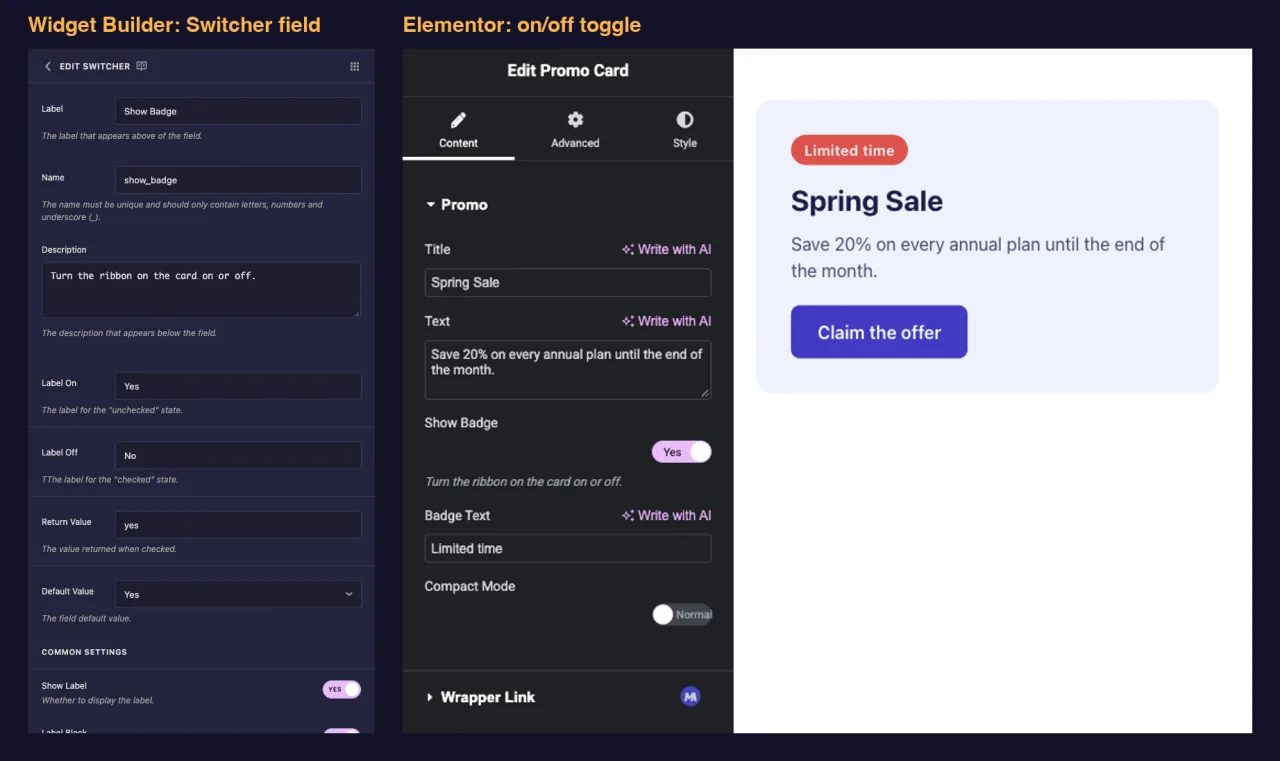
Switcher 필드가 수행하는 작업 #
- Elementor의 on/off 토글을 위젯의 패널에 추가합니다.
- 저장합니다 반환 값 (
yes기본적으로 켜져 있을 때), 꺼져 있을 때 빈 값입니다. - 와 함께 작동합니다
{% if %}템플릿에서, 그래서 마크업은 토글이 켜져 있을 때만 나타납니다. - 옵션을 사용할 때까지 패널을 짧게 유지하는 조건을 통해 패널의 다른 필드를 숨기고 표시할 수 있습니다.
건축업자에게 새로운? 읽기 위젯 빌더 개요 일단 위젯을 열어놓고 돌아오세요.
시작하기 전에 #
- Elementor가 설치되어 활성화된 WordPress입니다.
- Elementor 용 마스터 애드온이 설치되고 활성화되었습니다. The 설치 가이드 설정을 다룹니다.
- 위젯 빌더에서 열린 위젯. 이 가이드의 예는 두 개의 스위처가 있는 “프로모션 카드” 위젯입니다:
show_badge리본과 배지 텍스트 필드가 표시됩니다compact_mode카드를 조이는 것.
Switcher 필드를 추가하는 방법 #
- 로 이동 마스터 애드온 > 위젯 빌더 그리고 위젯을 엽니다.
- 옵션이 속한 탭에 섹션을 추가합니다. 배지 표시와 같은 콘텐츠 옵션이 해당됩니다 콘텐츠 탭.
- 유형
switch왼쪽의 필드 검색 상자에. - 드래그 스위처 섹션으로. 필드의 연필을 클릭하여 설정을 엽니다.
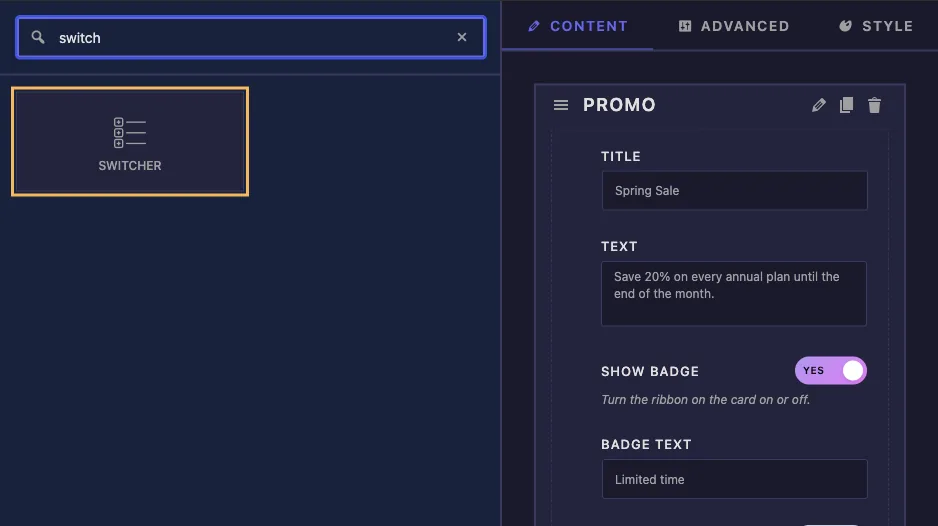
스위처 필드 옵션 설명 #
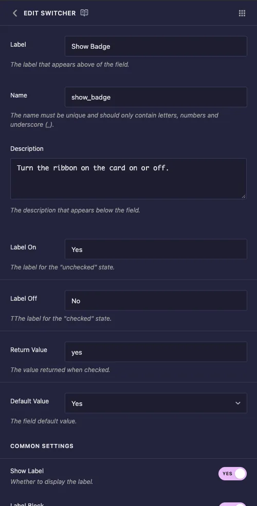
- 라벨: elementor의 토글 옆에 있는 텍스트, 예를 들어 “배지 표시”.
- 이름: 필드의 고유 ID 및 토큰 이름. 예를 들어 문자,숫자 및 밑줄만 사용합니다
show_badge. - 설명: elementor의 토글 아래에 표시된 힌트입니다.
- 라벨 온 그리고 라벨 끄기: 토글 안의 짧은 단어. Elementor 는 토글이 켜져 있는 동안 Label On 을,꺼져 있는 동안 Label Off 를 보여 주므로 레이아웃 옵션의 경우 “Compact” 및 “Normal”이 Yes 및 No 보다 더 잘 읽혀집니다.
- 반환값: 필드가 켜져 있는 동안 보유하는 값입니다. 에 둡니다
yes코드의 무언가가 다른 문자열을 필요로 하지 않는 한. - 기본값: 예 및 아니요가 포함된 드롭다운 예 는 새로 추가된 위젯이 토글 켜짐으로 시작됨을 의미합니다.
이 패널에 대해 알아둘 만한 두 가지. Label On 및 Label Off 아래의 도움말 텍스트가 바뀌고 Label Off 라인은 길 잃은 추가 T 로 시작합니다. 두 레이블 모두 여전히 예상한 대로 작동합니다: Label On 은 토글이 켜져 있는 동안 표시되는 단어입니다.
Return Value 와 Default Value 를 단계적으로 유지한다 #
기본값 드롭다운은 항상 저장됩니다 yes 예,Return Value 에 입력 한 것이 무엇이든간에. 그 조합은 잘못 발사됩니다. 우리의 테스트에서 Return Value 가있는 필드 enabled 그리고 Default Value Yes 는 이렇게 나왔습니다:
- Elementor의 토글이 꺼진 것으로 나타났습니다.
- 저장된 값은 여전히
yes, 그래서{% if %}필드를 켜짐으로 처리하고 마크업을 렌더링했습니다. - 편집자가 값을 설정한 토글을 한 번 클릭한 후에야 패널과 페이지가 다시 동의했습니다
enabled.
따라서 필드를 시작하려는 경우에만 반환 값을 변경하십시오(기본 값은 아니요로 설정됨). 그 밖의 모든 경우에는 반환 값을 그대로 두십시오 yes.
템플릿에서 토글을 사용하세요 #
꺼지면 스위처가 비어 있고 템플릿 엔진에서 빈 값이 false입니다 {% if %} 필요한 것은 입니다. 프로모션 카드 HTML 은 하나의 Switcher 를 마크업에 사용하고,하나는 클래스에 사용합니다:
<div class="promo{% if compact_mode %} promo--compact{% endif %}">
  {% if show_badge %}
  <span class="promo-badge">{{ badge_text }}</span>
  {% endif %}
  <p class="promo-title">{{ promo_title }}</p>
  <p class="promo-text">{{ promo_text }}</p>
  <a class="promo-button" href="#">Claim the offer</a>
</div>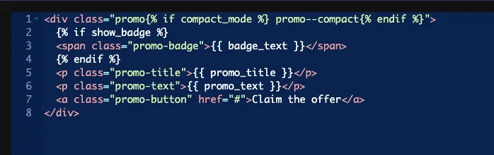
배지를 벗으면 전체가 됩니다 span 은 숨겨지은 것이 아니라 페이지에서 사라졌습니다. 컴팩트 클래스는 CSS 패널에서 몇 가지 규칙을 전환합니다:
.promo--compact { padding: 18px 22px; }
.promo--compact .promo-title { font-size: 20px; }
.promo--compact .promo-text { display: none; }
에서와 같이 값도 비교할 수 있습니다 {% if show_badge == 'yes' %}하지만 Label On 텍스트가 아닌 Return Value와 비교해 보세요. {% if show_badge == 'Yes' %} 절대 일치하지 않습니다. 평원 {% if show_badge %} 양식은 문제를 피합니다.
떠나세요 선택기 이 필드의 빈 상자. 토글 값은 CSS 값이 아니므로 스타일링은 위와 같은 클래스 뒤의 CSS 패널에 속합니다.
토글이 켜질 때까지 다른 필드 숨기기 #
이것은 스위처의 용도의 후반부입니다. 숨기고 싶은 필드에서 설정을 열고 스크롤합니다 조건 그리고 클릭하세요 조건 추가. 배지 텍스트 필드의 경우:
- 제어 이름:
show_badge, 스위처의 이름입니다. - 평등: 동등한.
- 제어 값:
yes, 스위처의 반환 값.
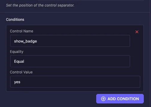
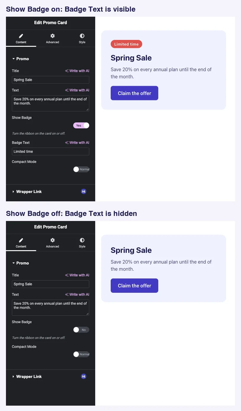
배지 텍스트가 이제 배지 보기가 켜져 있는 동안에만 Elementor 에 나타납니다. 참조 조건 다른 운영자의 경우.
Elementor 에서 스위처 컨트롤을 사용합니다 #
페이지에 위젯을 추가하거나 페이지가 이미 열려 있는 경우 편집기를 다시 로드합니다. 토글은 레이블 아래에 레이블 켜기 또는 레이블 끄기 단어가 안에 들어 있습니다. 클릭하면 미리보기가 바로 업데이트되며 조건이 있는 필드가 동시에 나타나거나 사라집니다.
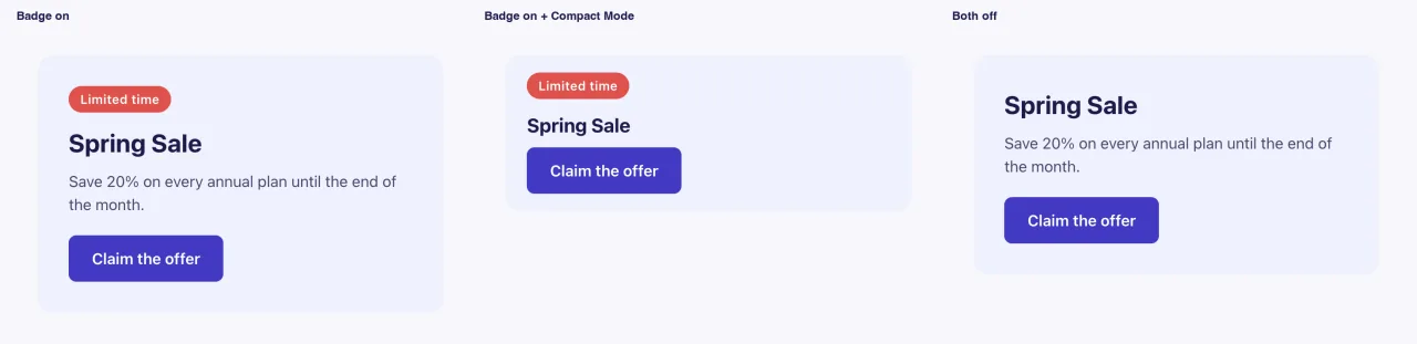
다음은 배지가 켜져 있고 컴팩트 모드도 켜져 있으며 두 스위처가 모두 꺼져 있는 전면 끝에 완성된 카드입니다:
일반적인 사용 사례 #
- 옵션 배지, 리본 및 아이콘.
- 컴팩트하거나 조밀한 레이아웃 변형입니다.
- 보조 버튼, 바닥글 메모 또는 구분선을 표시하거나 숨깁니다.
- 패널에서 관련 필드 그룹을 표시하는 마스터 스위치입니다.
Switcher 분야와 함께 작업하기 위한 팁 #
- 반환 값은 다음 위치에 둡니다
yes. 토글, 기본값 및 조건을 단계적으로 유지합니다. - 표시된 내용 뒤에 필드 이름을 지정합니다와 같은
show_badge또는compact_mode. 이름은 질문처럼 읽혀집니다{% if %}. - 옵션에 대해 레이블 켜기 및 레이블 끄기를 작성합니다두 주에 이름이 있을 때 예와 아니오뿐만이 아닙니다.
- 조건과 짝을 이루세요 따라서 옵션이 필요한 필드는 켜져 있을 때만 표시됩니다.
- 두 개 이상의 주? 를 이용하세요 필드 선택 드롭다운의 경우 필드 선택 아이콘 버튼의 경우.
자주 묻는 질문 #
Switcher 필드는 무료 버전에서 사용할 수 있습니까?
예. Switcher 는 무료 버전의 Widget Builder 에서 사용할 수있는 필드 중 하나입니다. Widget Builder 필드의 전체 세트는 Master Addons Pro 와 함께 제공됩니다.
Switcher 는 어떤 값을 출력합니까?
반환 값(yes 기본적으로) 토글이 켜져 있는 동안에는,그리고 꺼져 있는 동안에는 아무것도 없습니다. That makes {% if my_toggle %} 자연스러운 체크.
토글을 켜고 위젯을 시작하려면 어떻게 해야 하나요?
기본 값을 예 로 설정하고 반환 값은 에서 둡니다 yes. 기본값 예가 포함된 사용자 정의 반환 값은 편집기가 토글을 클릭할 때까지 패널과 페이지를 단계적으로 벗어나게 합니다.
토글이 켜져 있을 때만 다른 필드를 어떻게 표시합니까?
스위처의 이름,평등 평등 및 제어 값에 제어 이름이 설정된 해당 필드에 조건을 추가합니다 yes.
왜 내 {% if my_toggle == 'Yes' %} check work 가 안되나요?
Label On 텍스트와 비교됩니다. 에서와 같이 대신 반환 값과 비교합니다 {% if my_toggle == 'yes' %}또는 비교를 삭제하고 사용하세요 {% if my_toggle %}.
감싸는 #
스위처를 추가하고 명확한 이름과 레이블을 지정하고 반환 값을 남겨두세요 yes그리고 마크업의 선택적 부분을 래핑하세요 {% if %}. 옵션이 필요한 필드에 조건을 추가하고 편집기가 켜질 때까지 패널이 짧게 유지됩니다. 3 개 이상의 상태에 대해서는 을 참조하십시오 선택 그리고 선택 필드 및 확인 가격 각 계획에 포함된 내용입니다.


