

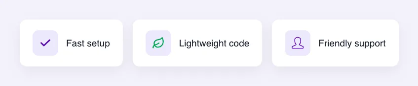
आइकॉन्स फ़ील्ड मास्टर ऐडऑन के साथ निर्मित कस्टम विजेट में एलिमेंटर के आइकन पिकर को जोड़ता है विजेट बिल्डर। संपादक आइकन लाइब्रेरी से एक आइकन चुनते हैं या अपना स्वयं का एसवीजी अपलोड करते हैं, और आपका टेम्पलेट इसे प्रिंट करता है। इसका उपयोग फीचर सूचियों, सूचना बक्सों, बटनों, सामाजिक लिंक और कहीं भी एक छोटा प्रतीक मदद करता है।
प्रतीक एक प्रो क्षेत्र है मुफ्त प्लगइन में एक सीमित विजेट बिल्डर शामिल है, और फ़ील्ड का पूरा सेट आता है मास्टर एडॉन्स प्रो.
आइकॉन्स फ़ील्ड क्या करता है #
- यह एलिमेंटर में आपके विजेट के पैनल में एक आइकन बॉक्स जोड़ता है, जिसमें आइकन लाइब्रेरी के लिए बटन और एसवीजी अपलोड करने के लिए बटन होते हैं।
- आइकन लाइब्रेरी में फ़ॉन्ट विस्मयकारी और अतिरिक्त आइकन सेट शामिल हैं जो मास्टर ऐडऑन के साथ आते हैं, जैसे एलिमेंटर आइकन, सिंपल लाइन आइकन, लीनियर आइकन और मटेरियल आइकन।
- मैदान दो चीजों को संग्रहीत करता हैः
value(आइकन की सीएसएस कक्षा, या अपलोड के लिए एसवीजी फ़ाइल) औरlibrary(यह किस सेट से आया है)। - आपका टेम्प्लेट एक प्रिंट करता है
<i>लाइब्रेरी आइकन और एक के लिए टैग<img>अपलोड किए गए एसवीजी के लिए टैग।
यदि आपने अभी तक विजेट नहीं बनाया है, तो पढ़ें विजेट बिल्डर अवलोकन पहले।
इससे पहले कि आप शुरू करें #
- एलिमेंटर स्थापित और सक्रिय के साथ वर्डप्रेस।
- एलिमेंटर और मास्टर एडॉन्स प्रो के लिए मास्टर एडॉन्स, दोनों सक्रिय हैं स्थापना गाइड सेटअप को कवर करता है।
- विजेट बिल्डर में एक विजेट खुला इस गाइड में उदाहरण एक “फीचर लिस्ट” विजेट है: एक आइकॉन्स फ़ील्ड नामित
feature_iconऔर शीर्षक के लिए एक पाठ फ़ील्ड।
एक प्रतीक क्षेत्र कैसे जोड़ें #
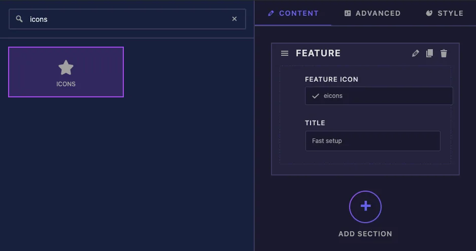
- को जा मास्टर ऐडऑन > विजेट बिल्डर और अपना विजेट खोलें।
- पर सामग्री टैब, एक अनुभाग जोड़ें, उदाहरण के लिए “Feature”।
- प्रकार
iconsबाईं ओर फ़ील्ड खोज बॉक्स में। - खींचना प्रतीक अनुभाग में इसकी सेटिंग्स बाएं साइडबार में खुलती हैं।
प्रतीक फ़ील्ड विकल्पों की व्याख्या की गई #
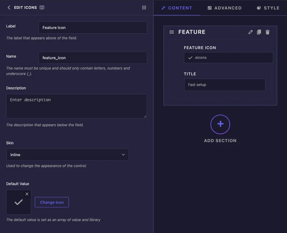
- लेबल एलिमेंटर में आइकन बॉक्स के ऊपर का पाठ है, उदाहरण के लिए “फीचर Icon”।
- नाम क्या फ़ील्ड की विशिष्ट आईडी और उसके टोकन की शुरुआत है, इसलिए
feature_iconदेता है{{ feature_icon.value }}। केवल अक्षर, संख्याएँ और अंडरस्कोर। - विवरण एलिमेंटर में नियंत्रण में दिखाई देता है।
- त्वचा इनलाइन और मीडिया प्रदान करता है यह बदलता है कि बिल्डर का अपना पूर्वावलोकन क्षेत्र कैसे खींचता है हमारे परीक्षणों में एलिमेंटर ने बड़े आइकन बॉक्स को किसी भी तरह से दिखाया।
- डिफ़ॉल्ट मान क्या आइकन विजेट की एक नई प्रति से शुरू होता है क्लिक करें चिह्न बदलें एक लेने के लिए, या इसे साफ़ करने के लिए छोटा क्रॉस कोई डिफ़ॉल्ट सेट नहीं होने के साथ, फ़ील्ड एलिमेंट लोगो आइकन से शुरू होता है।
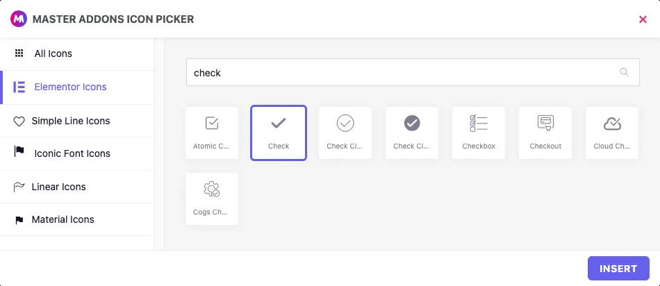
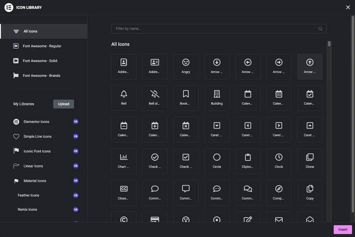
आइकन बदलें मास्टर एडॉन्स आइकन पिकर खोलता है बाईं ओर एक सेट चुनें, नाम से खोजें, एक आइकन पर क्लिक करें और फिर सम्मिलित करें.
अपने टेम्पलेट में आइकन प्रिंट करें #
{{ feature_icon }} अपने स्वयं के प्रिंट पर कुछ भी नहीं, क्योंकि क्षेत्र दो मूल्यों को रखता है इसके बजाय इसके हिस्सों का उपयोग करेंः
{{ feature_icon.value }}लाइब्रेरी आइकन के लिए आइकन क्लास है, जैसेeicon eicon-checkएक अपलोड किए गए एसवीजी के लिए यह फ़ाइल के यूआरएल प्रिंट।{{ feature_icon.library }}सेट नाम है, जैसेeicons,simple-line-iconsयाsvgएक अपलोड के लिए।{{ feature_icon.value.url }}लाइब्रेरी होने पर एसवीजी का यूआरएल हैsvg.
संपादक या तो प्रकार चुन सकते हैं, इसलिए लाइब्रेरी की जांच करें और सही टैग प्रिंट करें खाली मूल्य के लिए एक चेक में यह सब लपेटें ताकि आइकन हटा दिए जाने पर कुछ भी प्रिंट न होः
{% if feature_icon.value %}
  <span class="feature-icon">
    {% if feature_icon.library == 'svg' %}
      <img src="{{ feature_icon.value.url }}" alt="">
    {% else %}
      <i class="{{ feature_icon.value }}" aria-hidden="true"></i>
    {% endif %}
  </span>
{% endif %}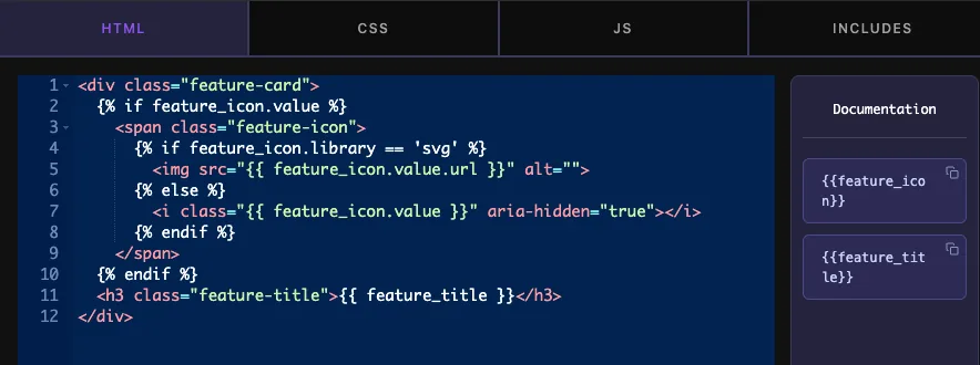
लाइब्रेरी आइकन फ़ॉन्ट ग्लिफ़ हैं, इसलिए वे लेते हैं color और font-size उनके आसपास के तत्व का एक अपलोड किया गया एसवीजी एक में <img> टैग अपने रंग रखता है, इसलिए इसे आकार दें width और height सीएसएस टैब में।
क्लिक करें सेटिंग्स सहेजें जब आपका काम पूरा हो जाए।
एलिमेंट में आइकन नियंत्रण का उपयोग करें #
विजेट को किसी पृष्ठ पर जोड़ें, या यदि पृष्ठ पहले से ही खुला था तो संपादक को पुनः लोड करें आइकन बॉक्स वर्तमान आइकन दिखाता है देखने के लिए उस पर होवर करें चिह्न पुस्तकालय और एसवीजी अपलोड करेंऔर आइकन को हटाने के लिए एक ट्रैश आइकन।
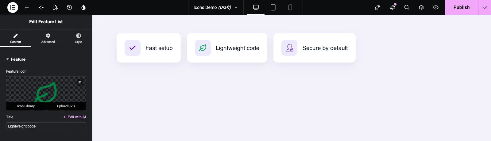
चिह्न पुस्तकालय एलिमेंट की आइकन विंडो खोलता है बाईं ओर एक सेट चुनें, नाम से फ़िल्टर करें, एक आइकन पर क्लिक करें और क्लिक करें सम्मिलित करें. एसवीजी अपलोड करें मीडिया लाइब्रेरी खोलता है ताकि आप एसवीजी फ़ाइल अपलोड या उठा सकें एलिमेंटर आपको पहली बार एसवीजी अपलोड की अनुमति देने के लिए कह सकता है।
फ़ॉन्ट अद्भुत आइकन और इनलाइन फ़ॉन्ट आइकन #
हमारी परीक्षण साइट पर, एलिमेंटर आइकन, सरल लाइन आइकन और अपलोड किए गए एसवीजी सभी प्रकाशित पृष्ठ पर दिखाए गए हैं, लेकिन एक फ़ॉन्ट विस्मयकारी आइकन नहीं था एलिमेंटर का इनलाइन फ़ॉन्ट प्रतीक फ़ीचर डिफ़ॉल्ट रूप से चालू है, और यह फ़ॉन्ट विस्मयकारी स्टाइलशीट को लोड होने से रोकता है, इसलिए <i> विजेट से टैग खाली रहता है पर जाएं एलिमेंट > सेटिंग्स > विशेषताएं, इनलाइन फ़ॉन्ट आइकन सेट करें निष्क्रिय और सहेजें फ़ॉन्ट विस्मयकारी आइकन तब दिखाई दिया यदि आप उस सुविधा को चालू रखना चाहते हैं, तो अन्य आइकन सेट या एसवीजी अपलोड का उपयोग करें।
सामान्य उपयोग के मामले #
- प्रत्येक शीर्षक के बगल में एक आइकन के साथ फ़ीचर सूचियाँ और जानकारी बॉक्स।
- अग्रणी या अनुगामी आइकन वाले बटन।
- सामाजिक लिंक, संपर्क विवरण और गोलियों की सूची।
- एसवीजी के रूप में लोगो अपलोड करके ब्रांड चिह्न।
आइकॉन्स क्षेत्र के साथ काम करने के लिए युक्तियाँ #
- हमेशा टेम्पलेट में दोनों मामलों को संभालेंः
<i>पुस्तकालय चिह्न के लिए और<img>एसवीजी अपलोड के लिए। - साथ गार्ड
{% if feature_icon.value %}तो एक खाली आइकन एक खाली रैपर को पीछे नहीं छोड़ता है। - एक डिफ़ॉल्ट मान सेट करें जो विजेट के अनुरूप हो, इसलिए यह कभी भी गलती से एलिमेंटर लोगो नहीं दिखाता है।
- रैपर को स्टाइल करें, आइकन टैग को नहीं, इसलिए दोनों आइकन प्रकार एक ही बॉक्स में बैठते हैं।
- लाइव पेज पर भरोसा करने से पहले उस पर फ़ॉन्ट विस्मयकारी चयन की जाँच करें (ऊपर अनुभाग देखें)।
- आइकन के बजाय छवियों के लिए, का उपयोग करें मीडिया क्षेत्र.
अक्सर पूछे जाने वाले प्रश्न #
क्या प्रतीक क्षेत्र मुक्त है?
नंबर आइकॉन्स विजेट बिल्डर में प्रो फ़ील्ड में से एक है, इसलिए मास्टर एडॉन्स प्रो को विजेट में जोड़ने से पहले सक्रिय होना होगा।
{{fice_icon }} कुछ भी प्रिंट क्यों नहीं करता?
फ़ील्ड एक मान और एक पुस्तकालय रखती है, इसलिए टोकन अपने आप में प्रिंट करने के लिए कुछ भी नहीं है उपयोग करें {{ feature_icon.value }} आइकन वर्ग के लिए, और {{ feature_icon.value.url }} अपलोड किए गए एसवीजी के लिए।
पृष्ठ पर मेरा फ़ॉन्ट विस्मयकारी आइकन रिक्त क्यों है?
एलिमेंट की इनलाइन फ़ॉन्ट आइकन सुविधा शायद चालू है, जो फ़ॉन्ट विस्मयकारी स्टाइलशीट को लोड होने से रोकती है इसे एलिमेंट, सेटिंग्स, फीचर्स में निष्क्रिय पर सेट करें, या किसी अन्य सेट से एक आइकन चुनें।
क्या संपादक अपने स्वयं के एसवीजी आइकन अपलोड कर सकते हैं?
हाँ। एलिमेंटर में आइकन बॉक्स पर होवर करें और एसवीजी अपलोड करें पर क्लिक करें। आपके टेम्पलेट की आवश्यकता है {% if feature_icon.library == 'svg' %} शाखा इसे एक छवि के रूप में मुद्रित करने के लिए।
क्या मैं सीएसएस के साथ अपलोड किए गए एसवीजी का रंग बदल सकता हूं?
तब नहीं जब यह किसी में मुद्रित हो <img> टैग, जो फ़ाइल के अपने रंग रखता है लाइब्रेरी आइकन का पालन करें color उनके आसपास के तत्व का।
लपेटकर #
आइकॉन्स फ़ील्ड जोड़ें, एक डिफ़ॉल्ट आइकन सेट करें, और इसे एक टेम्पलेट के साथ प्रिंट करें जो लाइब्रेरी आइकन और एसवीजी अपलोड दोनों को संभालता है प्रकाशित पृष्ठ पर फ़ॉन्ट विस्मयकारी पिक्स की जांच करें, और इनलाइन फ़ॉन्ट आइकन बंद करें यदि वे खाली बाहर आते हैं अन्य सामग्री टैब फ़ील्ड के लिए, देखें यूआरएल और चुनना फ़ील्ड, और जांचें मूल्य निर्धारण प्रत्येक योजना में क्या शामिल है।


