

Das Feld Wählen fügt einer benutzerdefinierten Widget, das Sie mit den Master-Addons erstellen, eine Reihe von Symbolschaltflächen hinzu Widget-builder. Es ist die gleiche Art von Steuerung, die Elementor für die Textausrichtung verwendet: ein paar Tasten, eine nach der anderen aktiv Verwenden Sie es, wenn es nur zwei bis vier Optionen gibt und ein Symbol jede schneller als ein Wort erklärt.
Choose ist eines der Felder, die Sie im Widget Builder der kostenlosen Version verwenden können. Das kostenlose Plugin enthält einen begrenzten Widget Builder und den vollständigen Satz an Feldern ist im Lieferumfang enthalten Master Add-dons Pro.
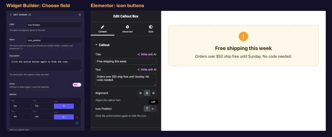
Was das Feld Wählen bewirkt #
- Fügt dem Panel Ihres Widgets in Elementor eine Reihe von Symbolschaltflächen hinzu, eine Schaltfläche pro Option.
- Zeigt den Titel jeder Option als Tooltip an, wenn ein Editor mit der Maus über eine Schaltfläche fährt.
- Speichert die Schlüssel der gewählten Option, wie z
center, nicht sein Titel. - Druckt diesen Schlüssel überall dort, wo Sie seinen Token platzieren, z
{{ align }}. Der übliche Ansatz besteht darin, daraus eine CSS-Klasse zu machen.
Neu beim Bauherrn? lesen Sie die Übersicht über Widget Builder Kommen Sie dann zuerst mit geöffnetem Widget zurück.
Bevor Sie beginnen #
- WordPress mit installiertem und aktivem Elementor.
- Master Addons für Elementor installiert und aktiv Die Installationsführung Cover-einrichtung.
- Ein Widget im Widget Builder geöffnet Das Beispiel in diesem Handbuch ist ein “Callout Box” - Widget mit zwei Choose-Feldern:
align(links, Mitte, rechts) undicon_position(oben oder links).
So fügen Sie ein Feld Wählen hinzu #
- Gehe zu Master-Addons > Widget Builder und öffnen Sie Ihr Widget.
- Fügen Sie einen Abschnitt hinzu Inhalt Tab, zum Beispiel “Callout” Layout-Wahlmöglichkeiten passen auch gut auf den Tab Stil.
- Typ
chooseIm Feldsuchfeld links. - Ziehen Wählen Sie In den Abschnitt Klicken Sie auf den Bleistift auf dem Feld, um seine Einstellungen zu öffnen.
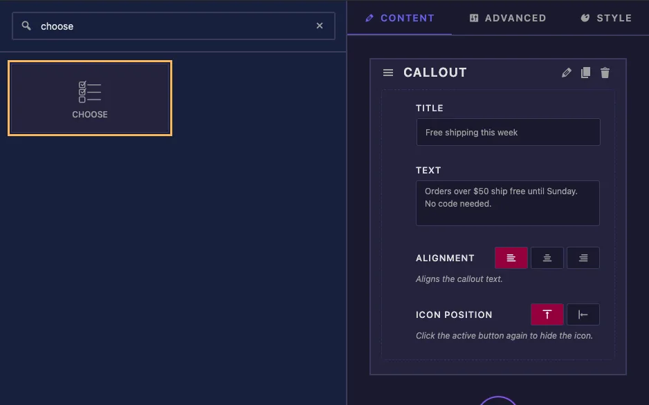
Ein neues Feld Wählen ist nicht leer Es kommt mit drei Ausrichtungsoptionen (links, Mitte und rechts) und Zentrum als Standard, so dass Sie für eine einfache Ausrichtungssteuerung nur die Beschriftung und den Namen ändern müssen.
Feldoptionen erklärt wählen #
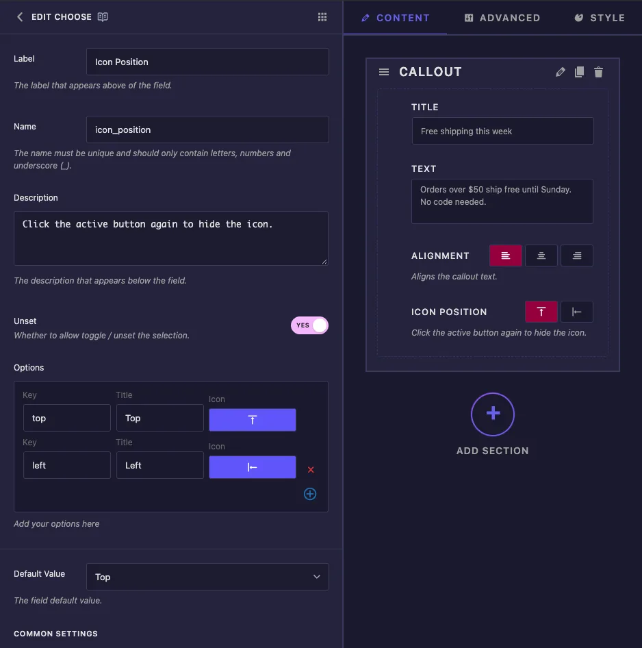
- Etikett: Der Text neben den Schaltflächen in Elementor, zum Beispiel “Icon Position”.
- Name: Die eindeutige ID des Feldes und der Name seines Tokens Verwenden Sie zum Beispiel nur Buchstaben, Zahlen und Unterstriche
icon_position. - Beschreibung: Ein Hinweis, der unter den Schaltflächen in Elementor angezeigt wird.
- Unset: Lassen Sie die Redakteure erneut auf die aktive Schaltfläche klicken, um die Wahl zu klären. Sehen Sie sich die Notiz unten an, bevor Sie sich darauf verlassen.
- Optionen: Eine Zeile pro Knopf. Schlüssel ist der Wert, den Ihre Vorlage erhält Titel Tooltip ist, und Symbol Öffnet den Icon-Picker Verwenden Sie das rote Kreuz, um eine Zeile zu entfernen, und den Plus-Button, um eine hinzuzufügen.
- Standardwert: Die Option eine neue Kopie des Widgets beginnt mit Der Dropdown zeigt Titel an, aber das Feld speichert den Schlüssel.
Unter Gemeinsame Einstellungen finden Sie Etikett anzeigen, Beschriftungsblock, Trenner und Bedingungen, die genauso funktionieren wie auf anderen Feldern.
Wählen Sie Symbole aus, die in Elementor angezeigt werden #
Durch Klicken auf das Symbol einer Option wird der Master Addons Icon Picker geöffnet Öffnen Sie die Elementor-symbole Tab und Suche zum Beispiel align, um Ausrichtungs- und Positionssymbole zu finden.
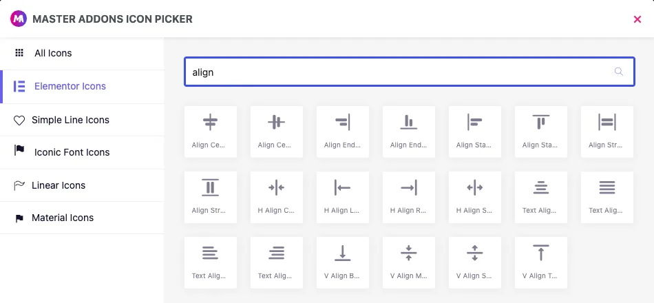
Halten Sie sich an diese Registerkarte Der Picker listet auch Symbole für einfache Linien, ikonische Schriftarten, lineare Elemente und Materialien auf, aber in unseren Tests wurden diese Schaltflächen im Elementorfeld leer angezeigt. Nur Elementor-Symbole werden angezeigt.
Schlüssel, Titel und Unset #
- Halten Sie die Tasten kurz, klein und ohne Leerzeichen, z
leftodertop. Sie landen in Klassennamen. - Sie können einen Titel jederzeit umbenennen Durch das Ändern einer Taste werden Seiten unterbrochen, die die alte bereits gespeichert haben.
- In unseren Tests wurde der Wert durch Klicken auf den aktiven Button sogar mit gelöscht uneingeschränkt Auf Nr. Planen Sie in beiden Fällen einen leeren Wert ein, wie in der folgenden Vorlage gezeigt.
Nutzen Sie die Wahl in Ihrer Vorlage #
Der Token druckt den Schlüssel aus, das sauberste Setup ist also eine Modifikatorklasse Dies ist die Callout Box HTML:
<div class="callout{% if align %} callout--{{ align }}{% endif %}{% if icon_position %} callout--icon-{{ icon_position }}{% endif %}">
  {% if icon_position %}<span class="callout-icon">!</span>{% endif %}
  <div class="callout-body">
    <p class="callout-title">{{ callout_title }}</p>
    <p class="callout-text">{{ callout_text }}</p>
  </div>
</div>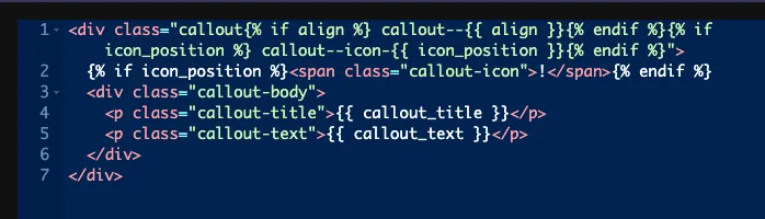
Jeweils {% if %} Überspringt die Klasse, wenn der Wert leer ist Bei Symbolposition verbirgt ein leerer Wert auch das Symbol, weshalb dieses Feld Unset on hat Das CSS-Panel styled dann jede Klasse:
.callout--left { text-align: left; }
.callout--center { text-align: center; }
.callout--right { text-align: right; }
.callout--icon-top .callout-icon { margin-bottom: 14px; }
.callout--icon-left { display: flex; gap: 18px; align-items: flex-start; }
Man kann den Wert auch direkt vergleichen, zum Beispiel {% if icon_position == 'left' %}. Vergleichen Sie mit dem Schlüssel, niemals mit dem Titel.
Lassen Sie den Selektor und die Reaktionskontrolle deaktiviert #
- Auswahl: Für dieses Feld schreibt es
color: {{VALUE}};. In unseren Tests ist ein Selektor von.callout-titleProduziertcolor:center;, die Browser ignorieren Im Gegensatz zu einigen anderen Feldern hat Choose keine CSS Selectors-Zeilen, in denen Sie Ihre eigene Eigenschaft schreiben könnten Klassen wie oben gezeigt verwenden. - Responsive Kontrolle: Hinzufügt Gerätesymbole, damit Redakteure eine andere Option auf Tablet und Mobilgerät auswählen können, aber das Token gibt nur die Desktop-Auswahl aus. Die Auswahlmöglichkeiten pro Gerät erreichen Ihre Vorlage nie.
Verwenden Sie die Steuerung Wählen in Elementor #
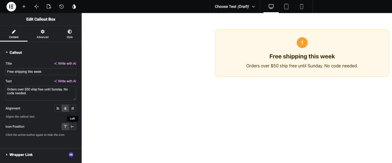
Fügen Sie das Widget zu einer Seite hinzu, oder laden Sie den Editor neu, wenn die Seite bereits geöffnet war Die Schaltflächen sitzen unter Ihrem Etikett mit hervorgehobener Standardoption Bewegen Sie die Maus über eine Schaltfläche, um den Titel anzuzeigen, und klicken Sie, um zu wechseln Die Vorschau aktualisiert sich sofort.
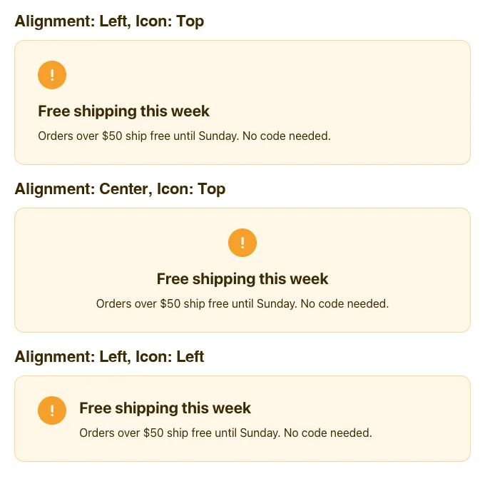
Hier ist der gleiche Callout mit unterschiedlichen Auswahlmöglichkeiten:
Häufige Anwendungsfälle #
- Textausrichtung für Überschriften, Zitate und Karten.
- Bild - oder Symbolposition: oben, links oder rechts.
- Layoutrichtung, wie z.B. eine Zeile oder eine Spalte.
- Kleine visuelle Varianten, wie z. B. ein heller oder dunkler Stil, wenn jede über ein klares Symbol verfügt.
Tipps für die Arbeit mit dem Feld Wählen #
- Behalten Sie es bei vier oder weniger Optionen. Für längere Listen verwenden Sie die Feld auswählen.
- Behandeln Sie immer einen leeren Wert. Wickeln Sie Klassen und Markup ein
{% if %}, und geben Sie der Basisklasse sinnvolle Standardstile. - Klare Titel schreiben. Der Tooltip ist der einzige Texteditor, den für jede Schaltfläche angezeigt wird.
- Verwenden Sie nur Elementor-Symbole„Also hat jede Schaltfläche ein sichtbares Symbol.
- Entscheiden Sie sich für Schlüssel, bevor Editoren das Widget verwenden. Titel und Icons können sich später ändern, Schlüssel nicht.
Häufig gestellte Fragen #
Ist das Feld Wählen in der kostenlosen Version verfügbar?
Ja. Wählen ist eines der Felder, die Sie im Widget Builder der kostenlosen Version verwenden können Der vollständige Satz der Widget Builder-Felder wird mit Master Addons Pro geliefert.
Was druckt der Choose-Token?
Der Schlüssel der gewählten Option, zum Beispiel center. Es druckt nichts, wenn keine Option ausgewählt ist.
Warum sind einige meiner Choose-Tasten in Elementor leer?
Das Icon stammt wahrscheinlich aus einer anderen Bibliothek als Elementor-Symbole In unseren Tests wurden nur Symbole aus dem Reiter Elementor-Symbole im Panel angezeigt Wählen Sie ein Ersatz-Symbol aus diesem Tab.
Kann ich die Option Selector für die Ausrichtung verwenden?
Nicht für dieses Feld Der Selector schreibt color: {{VALUE}};, so wird eine Ausrichtungs-Taste zu einer ungültigen Farbe Drucken Sie die Taste als Klasse und Stil, dass Klasse im CSS-Panel.
Warum können Redakteure die Wahl freigeben, wenn Unset ausgeschaltet ist?
In unseren Tests wurde der Wert durch Klicken auf die aktive Schaltfläche gelöscht, selbst wenn Unset auf Nr. gesetzt ist. Behandeln Sie einen leeren Wert so gut wie möglich und verarbeiten Sie ihn mit {% if %}.
Einwickelnd #
Fügen Sie ein Feld Wählen, kurze Tasten mit Elementorsymbolen und klaren Titeln setzen, dann drucken Sie den Schlüssel als Klasse in Ihrem HTML und stylen Sie jede Klasse im CSS-Panel Handhaben Sie den leeren Wert und das Widget bleibt aufgeräumt, wenn ein Editor eine Auswahl freigibt Für längere Listen von Optionen siehe die Feld auswählenund überprüfen Preisbildung Für das, was jeder Plan beinhaltet.


