

يضيف حقل الاختيار صفًا من أزرار الأيقونات إلى عنصر واجهة مستخدم مخصص تقوم بإنشائه باستخدام الإضافات الرئيسية منشئ القطعة. إنه نفس النوع من عناصر التحكم التي يستخدمها Elementor لمحاذاة النص: بضعة أزرار، واحد نشط في كل مرة. استخدمه عندما يكون هناك خياران إلى أربعة خيارات فقط ويشرح الرمز كل خيار بشكل أسرع من الكلمة.
يعد Choose أحد الحقول التي يمكنك استخدامها في Widget Builder للإصدار المجاني. يتضمن البرنامج الإضافي المجاني أداة إنشاء عناصر واجهة مستخدم محدودة، وتأتي المجموعة الكاملة من الحقول معها ماستر أدونز برو.
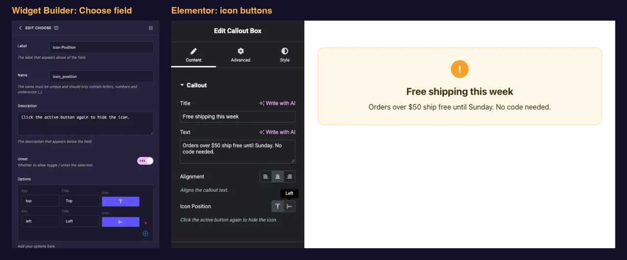
ما يفعله حقل الاختيار #
- يضيف صفًا من أزرار الأيقونات إلى لوحة عنصر واجهة المستخدم الخاص بك في Elementor، زر واحد لكل خيار.
- يعرض عنوان كل خيار كتلميح أداة عندما يقوم المحرر بتمرير زر.
- يحفظ مفتاح من الخيار المختار، مثل
centerوليس عنوانها. - يطبع هذا المفتاح أينما تضع رمزه المميز، مثل
{{ align }}. النهج المعتاد هو تحويلها إلى فئة CSS.
جديد على البناء؟ اقرأ نظرة عامة على منشئ القطعة أولاً، ثم عد باستخدام عنصر واجهة المستخدم مفتوحًا.
قبل أن تبدأ #
- WordPress مع تثبيت Elementor ونشطه.
- الإضافات الرئيسية للعنصر مثبتة ونشطة. ال دليل التثبيت إعداد الأغطية.
- عنصر واجهة مستخدم مفتوح في Widget Builder. المثال الموجود في هذا الدليل هو عنصر واجهة مستخدم “Callout Box” مع حقلين اختر:
align(يسار، وسط، يمين) وicon_position(أعلى أو يسار).
كيفية إضافة حقل اختيار #
- اذهب الى الإضافات الرئيسية > منشئ القطعة وافتح القطعة الخاصة بك.
- أضف قسمًا عن محتوى علامة التبويب، على سبيل المثال “Callout”. تتناسب خيارات التخطيط أيضًا بشكل جيد مع علامة التبويب "النمط".
- يكتب
chooseفي مربع البحث الميداني على اليسار. - يجر يختار في القسم. انقر فوق القلم الرصاص الموجود في الحقل لفتح إعداداته.
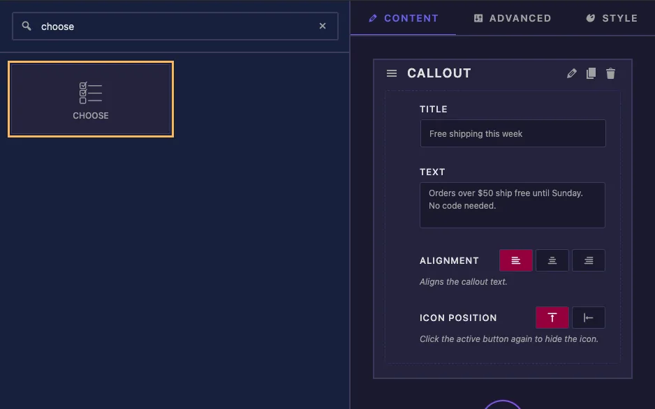
حقل اختيار جديد ليس فارغًا. يأتي مزودًا بثلاثة خيارات للمحاذاة (يسار ووسط ويمين) والوسط كخيار افتراضي، لذا للتحكم البسيط في المحاذاة، ما عليك سوى تغيير التسمية والاسم.
اختر خيارات الحقل الموضحة #
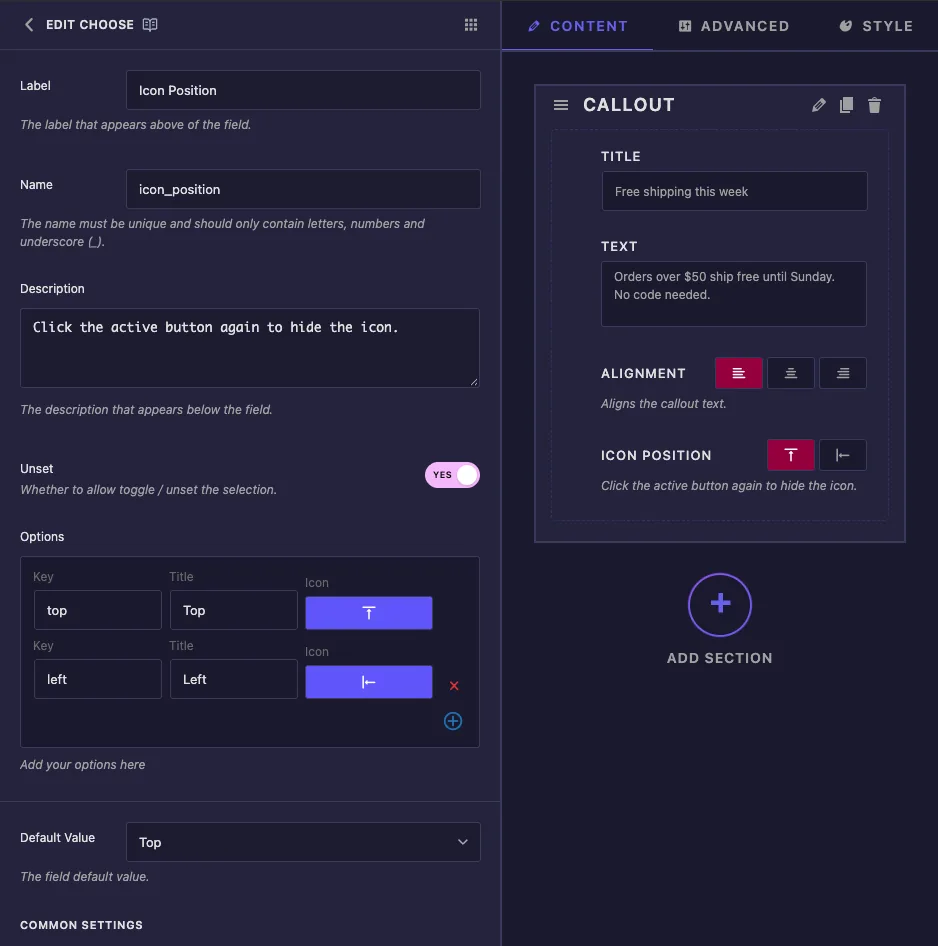
- ملصق: النص الموجود بجوار الأزرار في Elementor، على سبيل المثال “Icon Position”.
- اسم: المعرف الفريد للحقل واسم الرمز المميز الخاص به. استخدم الحروف والأرقام والتسطير فقط، على سبيل المثال
icon_position. - وصف: تلميح يظهر أسفل الأزرار في Elementor.
- غير محدد: يتيح للمحررين النقر فوق الزر النشط مرة أخرى لمسح الاختيار. راجع الملاحظة أدناه قبل الاعتماد عليها.
- خيارات: صف واحد لكل زر. مفتاح هي القيمة التي يحصل عليها القالب الخاص بك، عنوان هو تلميح الأداة، و أيقونة يفتح منتقي الأيقونات. استخدم الصليب الأحمر لإزالة صف وزر الزائد لإضافة واحد.
- القيمة الافتراضية: يبدأ الخيار نسخة جديدة من الأداة بـ. يعرض القائمة المنسدلة العناوين، لكن الحقل يخزن المفتاح.
ضمن الإعدادات العامة ستجد إظهار التسمية, كتلة التسمية, فاصل و شروط، والتي تعمل بنفس الطريقة كما في المجالات الأخرى.
اختر الرموز التي تظهر في Elementor #
يؤدي النقر فوق أيقونة أحد الخيارات إلى فتح منتقي أيقونات الإضافات الرئيسية. افتح أيقونات العنصر علامة التبويب والبحث، على سبيل المثال alignللعثور على أيقونات المحاذاة والموضع.
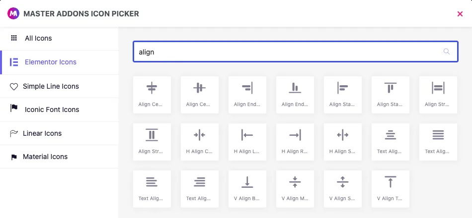
التزم بعلامة التبويب هذه. يسرد المنتقي أيضًا أيقونات Simple Line وIconic Font وLinear وMaterial، ولكن في اختباراتنا ظهرت هذه الأزرار فارغة في لوحة Elementor. يتم عرض أيقونات العنصر فقط.
المفاتيح والعناوين وغير محددة #
- احتفظ بالمفاتيح قصيرة وصغيرة وبدون مسافات، مثل
leftأوtop. وينتهي بهم الأمر في أسماء الفصول. - يمكنك إعادة تسمية العنوان في أي وقت. يؤدي تغيير المفتاح إلى كسر الصفحات التي حفظت الصفحة القديمة بالفعل.
- في اختباراتنا، أدى النقر فوق الزر النشط إلى مسح القيمة حتى مع غير محدد اضبط على رقم. خطط لقيمة فارغة في كلتا الحالتين، كما هو موضح في القالب أدناه.
استخدم الاختيار في القالب الخاص بك #
يقوم الرمز المميز بطباعة المفتاح، وبالتالي فإن الإعداد الأنظف هو فئة المعدل. هذا هو صندوق الاتصال HTML:
<div class="callout{% if align %} callout--{{ align }}{% endif %}{% if icon_position %} callout--icon-{{ icon_position }}{% endif %}">
  {% if icon_position %}<span class="callout-icon">!</span>{% endif %}
  <div class="callout-body">
    <p class="callout-title">{{ callout_title }}</p>
    <p class="callout-text">{{ callout_text }}</p>
  </div>
</div>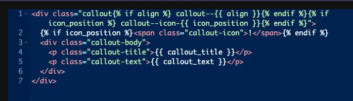
كل {% if %} يتخطى الفصل عندما تكون القيمة فارغة. بالنسبة لموضع الأيقونة، تقوم القيمة الفارغة أيضًا بإخفاء الأيقونة، ولهذا السبب تم إلغاء تعيين هذا الحقل. تقوم لوحة CSS بعد ذلك بتصميم كل فئة
.callout--left { text-align: left; }
.callout--center { text-align: center; }
.callout--right { text-align: right; }
.callout--icon-top .callout-icon { margin-bottom: 14px; }
.callout--icon-left { display: flex; gap: 18px; align-items: flex-start; }
يمكنك أيضًا مقارنة القيمة مباشرة، على سبيل المثال {% if icon_position == 'left' %}. قارن بالمفتاح، وليس العنوان أبدًا.
اترك المحدد والتحكم المستجيب معطلاً #
- محدد: لهذا المجال يكتب
color: {{VALUE}};. في اختباراتنا، محدد.callout-titleأنتجتcolor:center;، وهو ما تتجاهله المتصفحات. على عكس بعض الحقول الأخرى، لا يحتوي "اختيار" على صفوف محددات CSS حيث يمكنك كتابة الممتلكات الخاصة بك. استخدم الفئات كما هو موضح أعلاه. - التحكم المستجيب: يضيف أيقونات الجهاز حتى يتمكن المحررون من اختيار خيار مختلف على الجهاز اللوحي والهاتف المحمول، لكن الرمز المميز يطبع فقط اختيار سطح المكتب. لا تصل الاختيارات لكل جهاز إلى القالب الخاص بك أبدًا.
استخدم عنصر التحكم "اختيار" في Elementor #
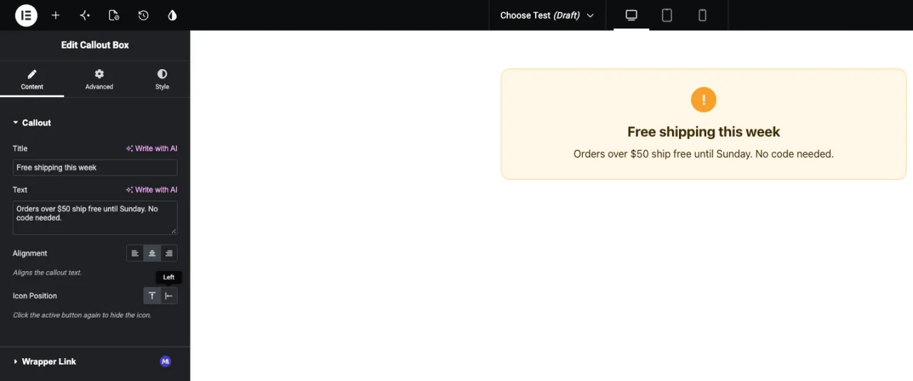
أضف عنصر واجهة المستخدم إلى الصفحة، أو أعد تحميل المحرر إذا كانت الصفحة مفتوحة بالفعل. توجد الأزرار أسفل التسمية الخاصة بك مع تمييز الخيار الافتراضي. قم بتمرير زر لرؤية عنوانه، وانقر للتبديل. تحديثات المعاينة على الفور.
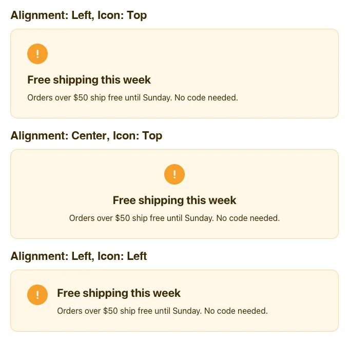
هنا نفس النداء مع خيارات مختلفة:
حالات الاستخدام الشائعة #
- محاذاة النص للعناوين وعروض الأسعار والبطاقات.
- موضع الصورة أو الرمز: أعلى أو يسار أو يمين.
- اتجاه التخطيط، مثل صف أو عمود.
- المتغيرات المرئية الصغيرة، مثل النمط الفاتح أو الداكن، عندما يكون لكل منها رمز واضح.
نصائح للعمل مع حقل الاختيار #
- احتفظ بها لأربعة خيارات أو أقل. للحصول على قوائم أطول، استخدم حدد الحقل.
- تعامل دائمًا مع قيمة فارغة. لف الفئات والترميز في
{% if %}، وإعطاء الفئة الأساسية أنماطًا افتراضية معقولة. - اكتب عناوين واضحة. تلميح الأداة هو النص الوحيد الذي يراه المحررون لكل زر.
- استخدم أيقونات العنصر فقط، لذلك كل زر لديه رمز مرئي.
- قرر المفاتيح قبل أن يستخدم المحررون الأداة. يمكن أن تتغير العناوين والأيقونات لاحقًا، ولا يمكن تغيير المفاتيح.
الأسئلة المتداولة #
هل حقل الاختيار متوفر في الإصدار المجاني؟
نعم. اختر أحد الحقول التي يمكنك استخدامها في Widget Builder للإصدار المجاني. تأتي المجموعة الكاملة من حقول Widget Builder مع Master Addons Pro.
ما الذي يطبعه رمز الاختيار؟
مفتاح الخيار المختار، على سبيل المثال center. لا يطبع شيئًا عند عدم تحديد أي خيار.
لماذا تكون بعض أزرار الاختيار فارغة في Elementor؟
من المحتمل أن يأتي الرمز من مكتبة أخرى غير Elementor Icons. في اختباراتنا، تظهر فقط الرموز من علامة التبويب Elementor Icons في اللوحة. اختر أيقونة بديلة من علامة التبويب هذه.
هل يمكنني استخدام خيار المحدد للمحاذاة؟
ليس لهذا الحقل. يكتب المحدد color: {{VALUE}};، لذلك يصبح مفتاح المحاذاة لونًا غير صالح. اطبع المفتاح كفئة وقم بتصميم تلك الفئة في لوحة CSS.
لماذا يمكن للمحررين مسح الاختيار عند إيقاف تشغيل Unset؟
في اختباراتنا، أدى النقر فوق الزر النشط إلى مسح القيمة حتى مع تعيين Unset على No. تعامل مع القيمة الفارغة قدر الإمكان وتعامل معها {% if %}.
إلتحاق بالركب #
أضف حقل اختيار، وقم بتعيين مفاتيح قصيرة باستخدام أيقونات Elementor وعناوين واضحة، ثم قم بطباعة المفتاح كفئة بتنسيق HTML الخاص بك وقم بتصميم كل فئة في لوحة CSS. تعامل مع القيمة الفارغة وستظل الأداة مرتبة عندما يقوم المحرر بمسح الاختيار. للحصول على قوائم أطول من الخيارات، راجع حدد الحقلو تحقق التسعير لما تتضمنه كل خطة.


