

Le Champ typographie donne à un widget personnalisé exactement le même panneau de typographie que les widgets principaux d'Elementor utilisent : famille de polices avec Google Fonts, taille, poids, transformation, style, décoration, hauteur de ligne, espacement des lettres et espacement des mots, le tout réactif à l'intérieur des modules complémentaires principaux Constructeur de widgets« , vous ajoutez le champ une fois, pointez-le sur un sélecteur CSS, et toute personne modifiant le widget dans Elementor peut restyle le texte sans toucher au code ».
Comme chaque contrôle Widget Builder, Typography prend en charge conditions« , vous pouvez donc le garder caché jusqu'à ce qu'une bascule de style personnalisé soit activée. La sortie du jeton dans le constructeur s'exécute via le Moteur de modèles de syntaxe Twig; les deux guides couvrent les détails et les limites.
Contrairement aux champs de texte ou de couleur, le champ Typographie n'utilise pas de shortcode dans votre CSS. Vous indiquez le champ quel sélecteur il contrôle, et Elementor écrit les styles de typographie à ce sélecteur tout seul Un champ, un sélecteur, fait.
Ce que fait le champ Typographie #
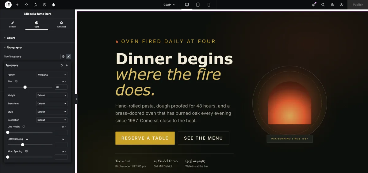
Un champ Typographie rend le contrôle du groupe typographique d'Elementor dans le panneau d'options de votre widget Lorsque quelqu'un sélectionne le widget et clique sur l'icône en forme de crayon à côté de l'étiquette du champ, un popover s'ouvre avec l'ensemble complet des contrôles de texte :
- Famille de polices : une liste déroulante consultable avec les polices système, les polices Google et toutes les polices personnalisées enregistrées sur le site.
- Taille de la police : un curseur et une entrée avec des unités px, em, rem et vw, réactifs par appareil.
- Poids de la police : 100 à 900 plus Normal et Audacieux.
- Transformer, Style et Décoration : majuscules et minuscules, italiques et obliques, soulignées et linéaires.
- Hauteur de ligne, espacement des lettres et espacement des mots : chacun avec sa propre entrée réactive.
L'icône du globe est là aussi, le widget peut donc suivre celle du site Polices mondiales préréglages au lieu d'un style unique Cela suit le même schéma que les autres champs Widget Builder : déposez le champ, nommez-le, connectez-le La seule différence est la façon dont il se connecte, via un sélecteur au lieu d'un shortcode Si vous êtes nouveau dans la construction de widgets, commencez par le Aperçu du constructeur de widgets d'abord.
Avant de commencer #
- wordpress avec Élémenteur installé et actif.
- Modules complémentaires principaux pour Elementor installé et actif. Nouveau au plugin ? voir le guide d'installation.
- Un widget personnalisé s'ouvre dans l'éditeur Widget Builder Notre exemple est un widget de héros de restaurant avec un
<h1 class="bfh-title">cap et a<p class="bfh-lede">paragraphe d'introduction dans son HTML.
Comment ajouter un champ Typographie #
Dans l'éditeur Widget Builder, faites défiler le panneau des champs sur la gauche jusqu'à ce que vous trouviez le Typographie champ, répertorié avec les autres champs de groupe de style.
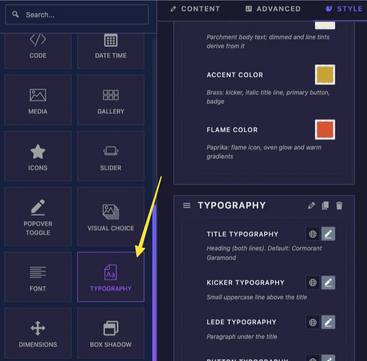
Faites glisser le champ Typographie dans une section sous le Contenu, modeler; ou Avancé onglet. Le style est la maison naturelle pour elle, bien qu'il fonctionne n'importe où Une fois qu'il atterrit, les options du champ s'ouvrent sur la gauche.
Options de champ de typographie expliquées #
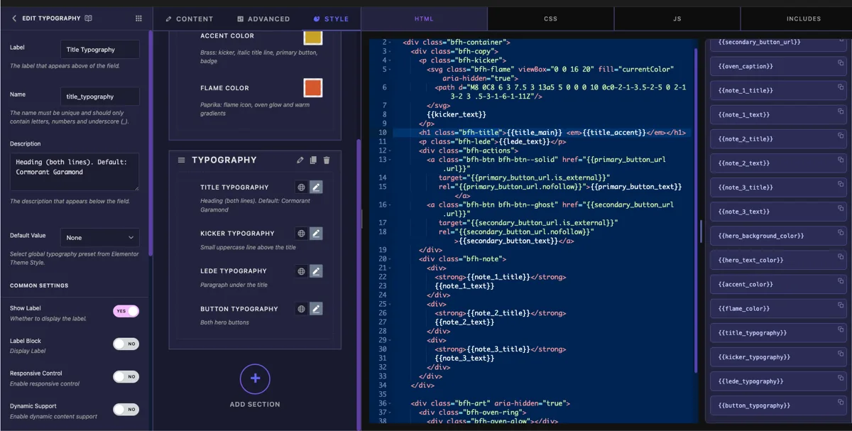
Sélectionnez le champ Typographie pour ouvrir ses paramètres.
- Étiquette: le texte affiché à côté du contrôle dans Elementor, “Typography” par défaut Avec plusieurs champs de typographie dans un widget, utilisez des noms comme“Title Typography” et “Button Typography”.
- Nom: l'identifiant unique du champ Il doit contenir uniquement des lettres, des chiffres, et des traits de soulignement, par exemple
title_typography. - Description : texte d'aide facultatif affiché sous le contrôle.
- Sélecteur: le sélecteur CSS auquel s'appliquent les styles de typographie C'est le seul paramètre qui fait fonctionner le terrain, couvert dans la section suivante.
- Valeur par défaut : éventuellement lier le champ à l'un des préréglages Global Fonts d'Elementor Primary, Secondary, Text, or Accent Le widget commence alors par ce préréglage appliqué, et le suit si les polices globales du site changent.
- Afficher l'étiquette et Séparateur : l'affichage standard bascule, plus Conditions plus bas pour afficher le champ uniquement lorsqu'un autre contrôle a une certaine valeur.
Pointez le champ sur votre sélecteur #
Voici la partie qui fait trébucher les gens s'ils sont habitués aux autres domaines : le champ Typographie n'a pas {{shortcode}} pour votre CSS. Une valeur de typographie est un ensemble entier de propriétés, pas une seule valeur, donc elle ne peut pas imprimer dans une déclaration CSS Au lieu de cela, vous remplissez le Sélecteur option et Elementor génère les styles pour vous.
Pour le paragraphe d'introduction du héros, le sélecteur est le suivant
{{WRAPPER}} .bfh-lede
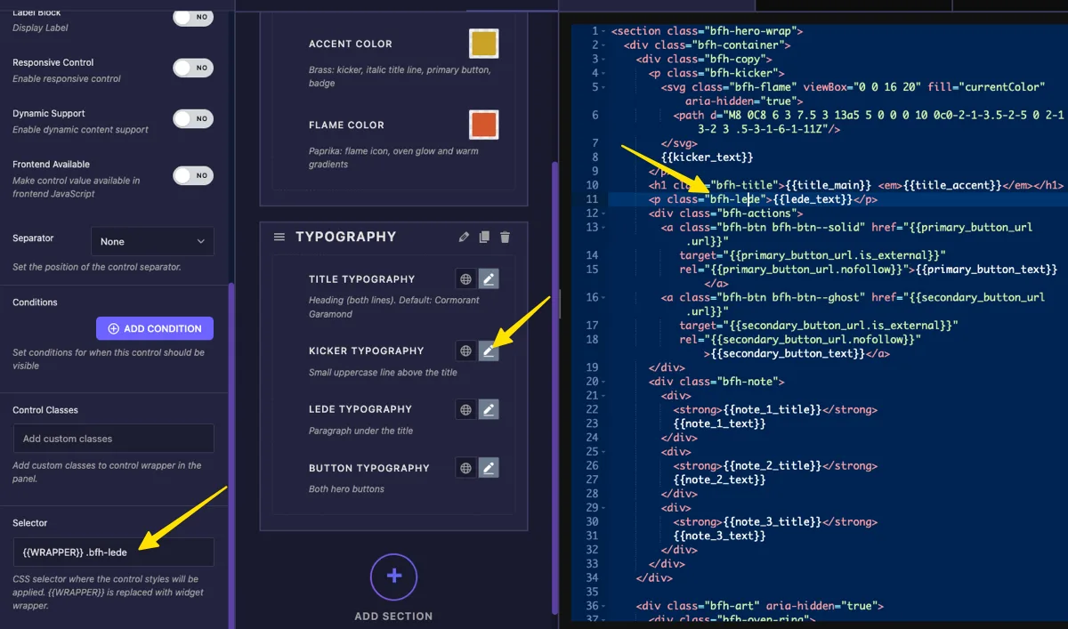
{{WRAPPER}}représente le propre conteneur du widget, de sorte que les styles n'atteignent ce widget et ne fuient jamais vers le reste de la page Démarrez toujours le sélecteur avec..bfh-ledeest l'élément à l'intérieur de votre widget HTML que le contrôle doit styliser.- Pour piloter plusieurs éléments avec une seule commande, séparez les sélecteurs par des virgules et donnez-leur les siennes
{{WRAPPER}}:{{WRAPPER}} .bfh-title, {{WRAPPER}} .bfh-lede.
Si vous laissez le Sélecteur vide, le champ retombe sur tout le conteneur du widget, qui stylise chaque morceau de texte du widget à la fois C'est généralement plus que ce que vous voulez Définissez le sélecteur, puis cliquez sur Enregistrer Paramètres.
Votre feuille de style dans l'onglet CSS continue de fonctionner comme look de départ du widget. Peu importe font-family ou font-size vous y avez écrit reste en place jusqu'à ce qu'un utilisateur choisisse quelque chose dans le panneau ; les valeurs du contrôle l'emportent alors.
Utilisez le contrôle Typographie dans Elementor #
Ajoutez votre widget personnalisé à une page dans Elementor, ou rechargez l'éditeur si la page était déjà ouverte Sélectionnez le widget et le contrôle Typographie apparaît dans son panneau avec l'étiquette que vous définissez, une icône de globe pour Global Fonts, et une icône de crayon pour les valeurs personnalisées.
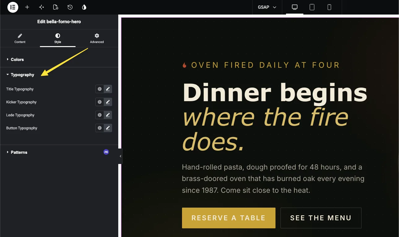
Choisissez une famille et une taille de police #
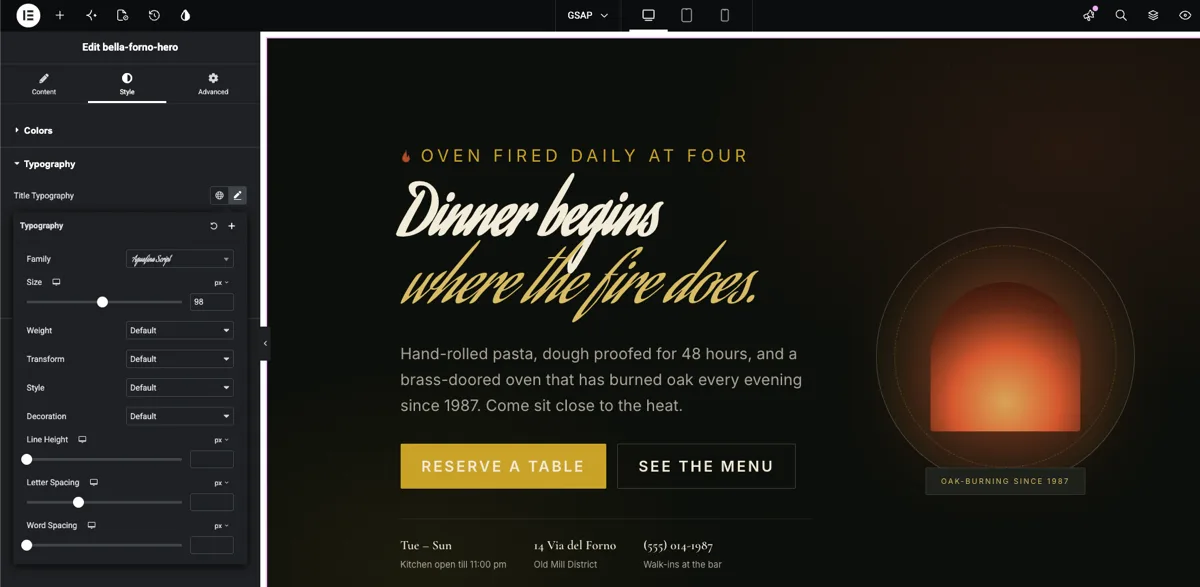
Cliquez sur l'icône en forme de crayon pour ouvrir la fenêtre contextuelle de typographie. Le Famille dropdown recherche les polices système et la bibliothèque complète de Google Fonts au fur et à mesure que vous tapez En dessous, Taille prend une valeur en px, em, rem ou vw, et l'icône de l'appareil vous permet de définir une taille différente par point d'arrêt. Un titre de bureau 96px peut tomber à 48px sur les téléphones à partir du même contrôle.
Réglez le poids, l'espacement et le reste #
Le même popover tient Poids, Transformer, modeler, Décoration, Hauteur de ligne, Espacement des lettres, et Espacement des mots. Chaque changement atterrit en direct dans l'aperçu, vous pouvez donc regarder l'en-tête se resserrer lorsque vous abaissez l'espacement des lettres. Si rien ne semble changer, vérifiez que votre sélecteur correspond réellement à un élément du widget HTML ; une faute de frappe dans le nom de la classe échoue silencieusement.
Ou suivez les Global Fonts du site #
Cliquez plutôt sur l'icône du globe et choisissez Primaire, Secondaire, Texte ou Accent Le texte du widget suit désormais ce préréglage global, et lorsqu'une refonte échange les polices du site, ce widget suit sans que personne ne le touche Si vous définissez une valeur par défaut sur le champ, ce lien est déjà actif lorsque le widget est d'abord déposé sur une page.
Dans notre exemple, le titre passe à un visage de script à 98 px, choisi directement dans la liste Google Fonts, et l'aperçu redessine au moment où la police se charge.
Cas d'utilisation courants #
- En-têtes dans les widgets de héros et de bannières où chaque site veut sa propre police d'affichage.
- Boutons cela doit correspondre à la typographie des boutons existante du site.
- Titres de cartes et extraits avec des champs séparés pour chacun, les titres et le corps du texte évoluent indépendamment.
- Widgets de témoignages et de citations où la citation prend un empattement italique et l'attribution reste dans la police corporelle.
- Widgets orientés client où les éditeurs doivent relooker le texte librement sans jamais ouvrir le CSS.
Conseils pour travailler avec le domaine Typographie #
- L'option Selector est toute la connexion. Il n'y a pas de shortcode typographique à coller dans votre CSS : définissez le sélecteur et laissez Elementor écrire les styles.
- Toujours démarrer le sélecteur avec
{{WRAPPER}}. Sans elle les styles s'appliquent à chaque match de la page, pas seulement votre widget Dans une liste séparée par des virgules, chaque partie a besoin de la sienne{{WRAPPER}}. - Conservez vos styles de base dans l'onglet CSS. Ils sont ce à quoi ressemble le widget sur une nouvelle goutte ; le contrôle ne fait que remplacer ce que l'utilisateur change réellement.
- Un champ par rôle de texte. Un champ de titre, un champ de corps et un champ de bouton donnent aux éditeurs un contrôle clair. Un champ pointé vers l’ensemble du widget aplatit le tout en un seul style.
- Utilisez les valeurs par défaut de Global Fonts pour les sites clients. Relier le champ à Primaire ou Secondaire permet de garder les widgets personnalisés en phase avec le système de conception du site dès le premier jour.
Foire aux questions #
Quel est le champ Typographie dans le Master Addons Widget Builder ?
Le champ Typographie ajoute le contrôle complet du groupe typographique d'Elementor à un widget personnalisé : famille de polices avec Google Fonts, taille réactive, poids, transformation, style, décoration, hauteur de ligne, espacement des lettres et espacement des mots Vous le pointez sur un sélecteur CSS et Elementor applique les styles choisis à ce sélecteur.
Où est le shortcode typographique pour l'onglet CSS ?
Il n'y en a pas La typographie est un groupe de nombreuses propriétés CSS, elle ne peut donc pas imprimer par une seule {{token}} la façon dont un texte ou un champ de couleur le fait L'option Selector du champ remplace le shortcode : définissez-le sur quelque chose comme {{WRAPPER}} .my-title et les styles sont générés pour vous.
Que signifie {{WRAPPER}} dans le sélecteur ?
C'est un espace réservé pour l'élément de conteneur du widget propre Démarrage du sélecteur avec {{WRAPPER}} met la typographie à portée de ce widget seulement Laissez-le de côté et le sélecteur correspond partout sur la page, ce qui peut relooker d'autres widgets par accident.
Un champ Typographie peut-il styliser plus d'un élément ?
Oui. Séparez les sélecteurs par des virgules et commencez chacun par {{WRAPPER}}, par exemple {{WRAPPER}} .card-title, {{WRAPPER}} .card-link. Les deux éléments suivent alors le même contrôle.
Pourquoi mon contrôle Typography stylise-t-il l'ensemble du widget ?
L'option Selector est vide, le champ est donc retombé dans le conteneur externe du widget Remplissez un sélecteur qui cible uniquement l'élément que vous souhaitez, enregistrez et rechargez l'éditeur Elementor.
Les styles de police que j'ai écrits dans l'onglet CSS comptent-ils toujours ?
Oui. Ils sont l'apparence et l'affichage par défaut du widget jusqu'à ce que quelqu'un change le contrôle dans Elementor. Les choix de l'utilisateur dans le panneau de typographie ont alors la priorité sur les valeurs de la feuille de style.
Envelopper #
Le champ Typographie du constructeur de widgets remet aux éditeurs le panneau qu'ils connaissent déjà à partir des propres widgets d'Elementor, avec les polices Google, les tailles réactives et les préréglages globaux, sur n'importe quel élément de votre widget personnalisé Nommez le champ, définissez le sélecteur sur {{WRAPPER}} plus la classe de votre élément, et chaque décision de police sort de votre feuille de style et entre dans le panneau Associez-la avec le Champ frontalier et le Champ texte pour construire un panneau de widgets qui couvre le contenu et le style en un seul endroit Explorez le reste de la Widgets et extensions Master Addons& voir le page de tarification pour ce que chaque plan comprend.


