

Das Box Shadow-Feld fügt die Box-Shadow-Steuerung von Elementor zu einem benutzerdefinierten Widget hinzu, das mit den Master-Add-ons erstellt wurde Widget-builder. Editoren stellen die Farbe, Offsets, Unschärfe, Spread und Position aus einem kleinen Popover ein, und der Schatten wird auf das Element angewendet, auf das Ihr CSS-Selektor zeigt. Es ist das Feld zum Heben von Karten von der Seite, zum Erweichen von Schaltflächen oder zum Verleihen eines Panels ein eingepresstes Aussehen.
Box Shadow ist ein Pro-Feld Das kostenlose Plugin enthält einen begrenzten Widget Builder und der gesamte Feldsatz ist im Lieferumfang enthalten Master Add-dons Pro.
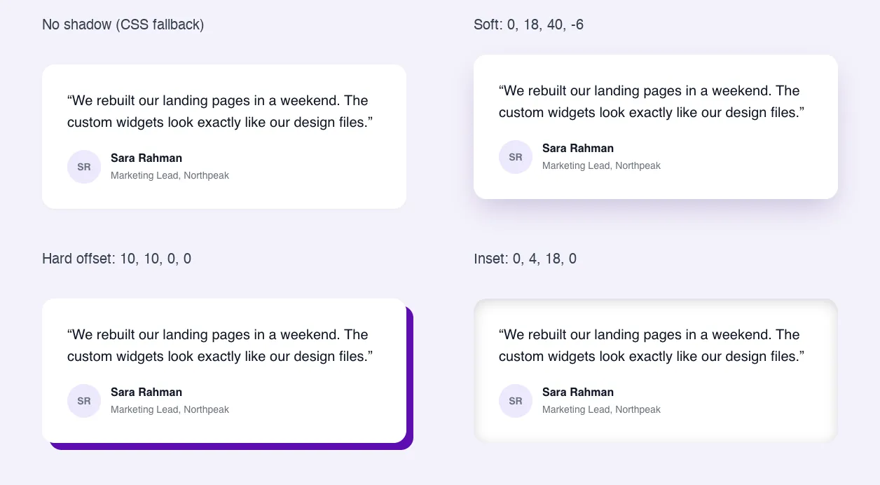
Was das Feld Box Shadow bewirkt #
- Es fügt dem Style-Tab Ihres Widgets ein Steuerelement hinzu: Ihr Etikett und ein Bleistiftsymbol, das die Schatteneinstellungen öffnet.
- Die Einstellungen sind Farbe, Horizontal, Vertikal, Unschärfe, Spread und Position (Outline oder Inset).
- Elementor schreibt die
box-shadowCSS zum Element im Selector, sodass Sie kein Token in Ihrem HTML oder CSS benötigen.
Wenn Sie noch kein Widget gebaut haben, lesen Sie die Übersicht über Widget Builder Zuerst.
Bevor Sie beginnen #
- WordPress mit installiertem und aktivem Elementor.
- Master Addons für Elementor und Master Addons Pro, beide aktiv Die Installationsführung Cover-einrichtung.
- Ein Widget im Widget Builder geöffnet Das Beispiel in diesem Handbuch ist ein Widget “Testimonial Card”, dessen Karte die Klasse hat
quote-card.
So fügen Sie ein Box Shadow-Feld hinzu #
- Gehe zu Master-Addons > Widget Builder und öffnen Sie Ihr Widget.
- Klicken Sie auf die Stil Tab und fügen Sie einen Abschnitt hinzu, zum Beispiel “Card Style”.
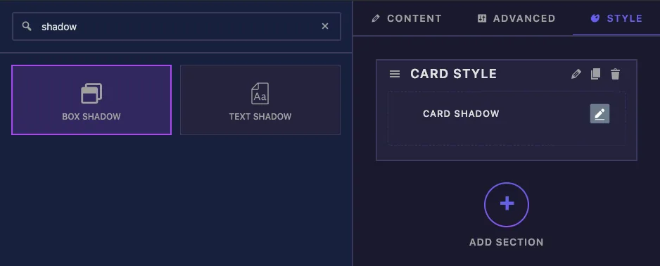
- Typ
shadowIm Feldsuchfeld links Box Shadow und Text Shadow kommen hoch. - Ziehen Kastenschatten In den Abschnitt Seine Einstellungen öffnen sich in der linken Seitenleiste.
Feldoptionen für Box Shadow erklärt #
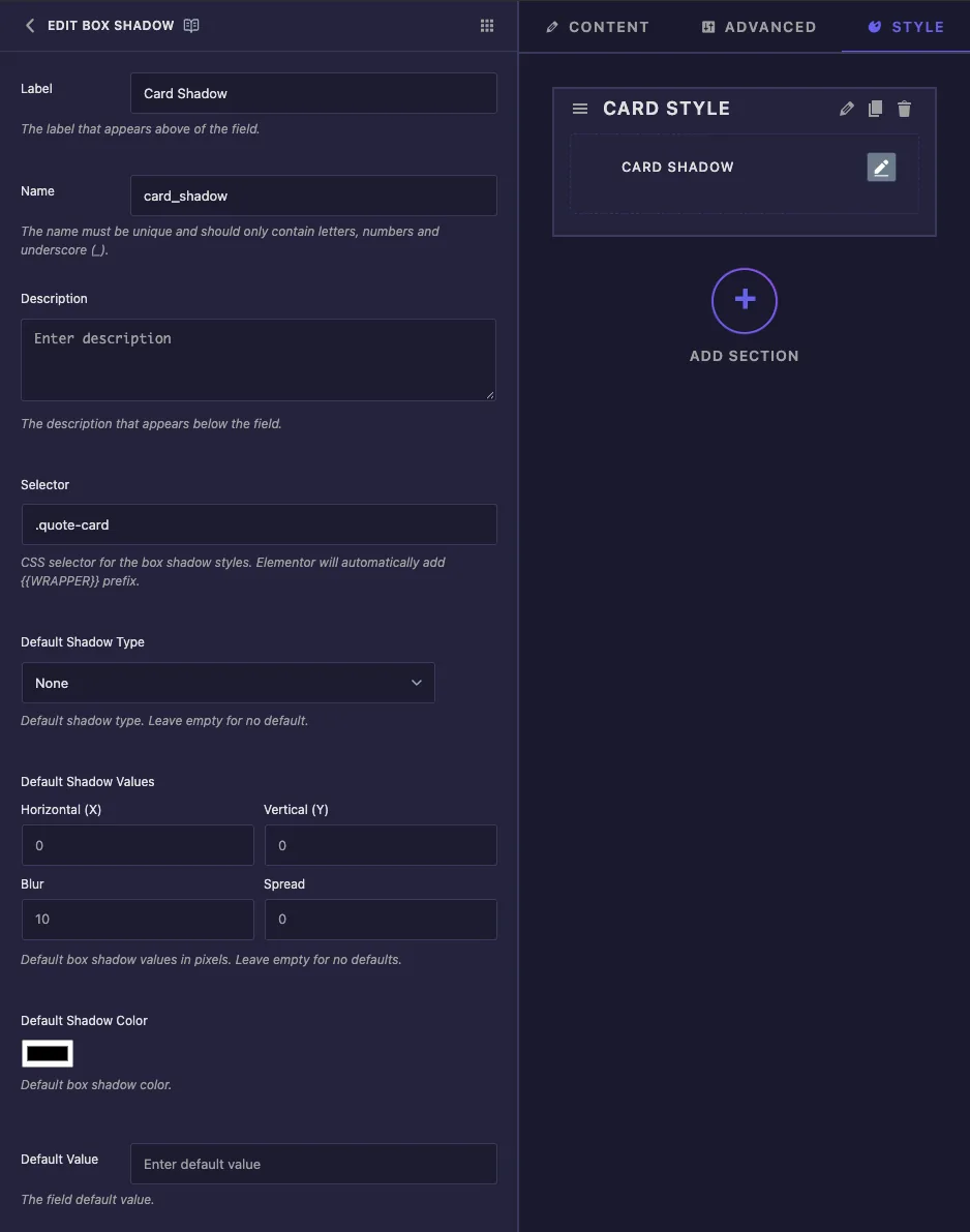
- Etikett Text neben dem Steuerelement in Elementor, zum Beispiel “Kartenschatten”, ist.
- heißen Ist die eindeutige ID des Feldes Nur Buchstaben, Zahlen und Unterstriche.
- Beschreibung Notiz für Sie im Inneren des Bauherrn ist.
- Wähler, Standard-Schattentyp, Standard-Schattenwerte und Standard-Schattenfarbe Unter der Beschreibung erscheinen In unseren Tests wurden in diese Boxen eingegebene Änderungen nicht gespeichert und der Builder hat einen Fehler protokolliert, also verlassen Sie sich erst einmal nicht darauf Setzen Sie stattdessen den Selektor in den gängigen Einstellungen (nächster Abschnitt) und geben Sie der Karte einen Startschatten im CSS-Tab.
- Standardwert Wird von diesem Feld nicht verwendet.
Stellen Sie den Selektor ein #
Scrollen Sie zum unteren Rand der Seitenleiste und geben Sie die Klasse des Elements in die ein Wähler Box unter Kontrollklassen Für die Testimonialkarte:
.quote-card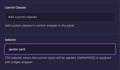
Sie müssen nicht tippen {{WRAPPER}}. Der Bauherr fügt es vor Ihrem Wähler hinzu, sodass die Regel lautet {{WRAPPER}} .quote-card Und betrifft nur dieses Widget Trennen Sie mehrere Selektoren mit Kommas, wenn ein Schatten auf mehr als ein Element zutreffen soll, ist der Selector leer, kommt der Schatten auf den äußeren Wrapper des Widgets.
Nachdem Sie gespeichert haben, zeigt das Selector-Feld oben in der Seitenleiste den gleichen Wert an.
Fügen Sie einen Fallback-Schatten hinzu #
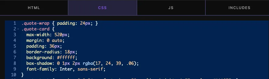
Startschatten in die CSS-Registerkarte legen Es wird angezeigt, bis ein Editor die Steuerung einschaltet, und der Schatten der Steuerung ersetzt sie danach:
.quote-card {
  box-shadow: 0 1px 2px rgba(17, 24, 39, .06);
}
Klicken Sie auf Einstellungen speichern Wenn du fertig bist.
Verwenden Sie die Box Shadow-Steuerung in Elementor #
Widget zu einer Seite hinzufügen, oder den Editor neu laden, wenn die Seite bereits geöffnet war Wählen Sie das Widget und öffnen Sie die Stil Tab. Ihr Etikett erscheint mit einem Bleistiftsymbol.
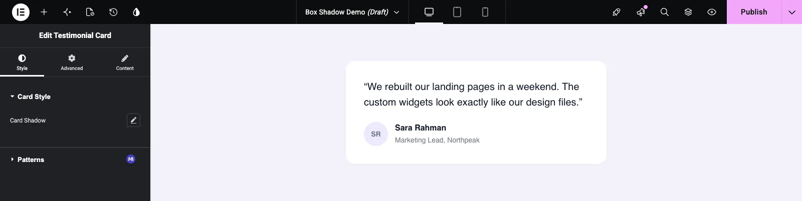
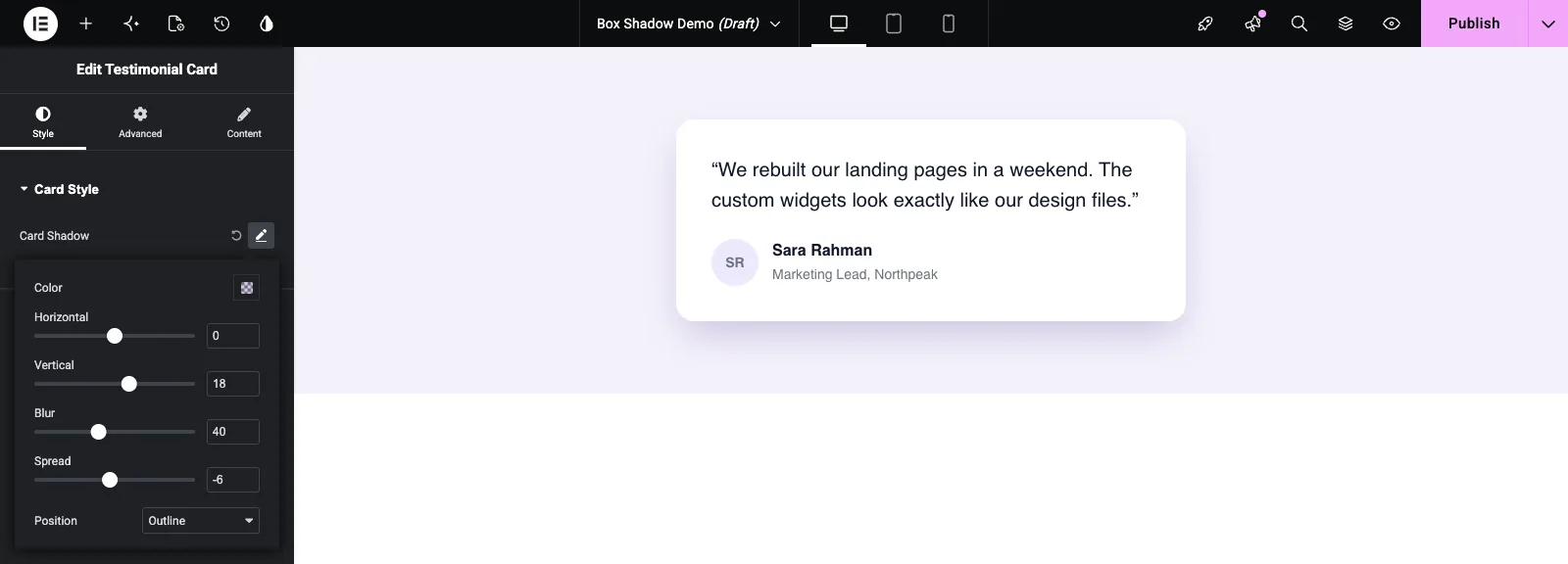
Klicken Sie auf den Bleistift, um den Popover zu öffnen. Das schaltet den Schatten mit den Startwerten von Elementor ein: Horizontal 0, Vertical 0, Blur 10, Spread 0 und Schwarz bei 50% Deckkraft. Passen Sie sie an und die Kartenaktualisierungen beim Ziehen an:
- Farbe Setzt die Schattenfarbe und Deckkraft Eine getönte, halbtransparente Farbe sieht weicher als schwarz aus.
- horizontal und Vertikal Bewegen Sie den Schatten seitwärts und nach oben oder unten.
- Unschärfe Weicht den Rand. 0 ergibt einen harten Schatten.
- Verbreiten Wächst oder schrumpft der Schatten Ein kleiner negativer Wert verhindert, dass eine große Unschärfe zu den Seiten austritt.
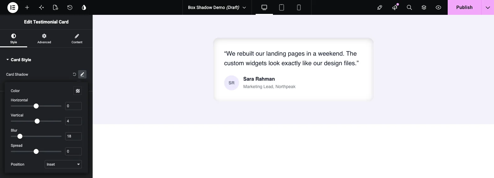
- Position Wechselt zwischen Outline (außerhalb des Kartons) und Inset (drinnen).
Position festlegen auf Einsetzen Für einen eingepressten Look, nützlich für Eingabefelder und leise Panels:
Der kreisförmige Pfeil neben dem Bleistift setzt die Steuerung zurück und entfernt den Schatten.
Häufige Anwendungsfälle #
- Karten in Testimonial, Preis, Team - und Blog-Widgets.
- Knöpfe, die ein wenig Tiefe benötigen, oft gepaart mit einem Hover-Stil.
- Harte versetzte Schatten für kräftige, flache Designs.
- Schatten auf Eingabefeldern, Suchleisten und vertieften Paneelen einfügen.
Tipps für die Arbeit mit dem Feld Box Shadow #
- Verwenden Sie den Selector unten in der Seitenleiste und geben Sie nur die Klasse ein.
{{WRAPPER}}Für Sie hinzugefügt wird. - Halten Sie einen Fallback
box-shadowIm CSS-Tab sehen neue Widgets also nicht flach aus. - Versuchen Sie es bei weichen Kartenschatten mit einer großen Unschärfe, einem vertikalen Versatz von etwa der Hälfte der Unschärfe und einer kleinen negativen Ausbreitung.
- Geben Sie dem Element einen Randradius Schatten folgen den Ecken, so erhalten abgerundete Karten abgerundete Schatten.
- Für Schatten auf Text verwenden Sie die Text Schattenfeld Stattdessen.
Häufig gestellte Fragen #
Ist das Box Shadow Feld frei?
No. Box Shadow ist eines der Pro-Felder im Widget Builder, daher muss Master Addons Pro aktiv sein, bevor Sie es zu einem Widget hinzufügen können.
Muss ich {{WRAPPER}} zum Selektor hinzufügen?
Nein. Der Bauherr fügt hinzu {{WRAPPER}} Vor dem Box Shadow-Selektor für Sie, also .quote-card Genügt.
Warum speichert mein Standard-Schattentyp oder meine Standard-Schattenwerte nicht?
In unseren Tests haben diese Boxen ihre Änderungen nicht eingehalten Stellen Sie den Startschatten mit einem ein box-shadow Regel stattdessen im Reiter CSS. Editoren können es dann mit dem Steuerelement ändern.
Wo ist das Box-Shadow-Token für mein CSS?
Es gibt keinen zu verwenden Ein Schatten sind mehrere Werte in einer CSS-Eigenschaft, also schreibt Elementor die Regel für Sie an den Selector.
Was ist der Unterschied zwischen Box Shadow und Text Shadow?
Box Shadow zeichnet um die Box des Elements und hat Spread und Inset Text Shadow folgt den Buchstaben des Textes Verwenden Sie Box Shadow für Karten und Knöpfe, Text Shadow für Überschriften.
Einwickelnd #
Fügen Sie das Feld Box Shadow zu einem Style-Abschnitt hinzu, geben Sie die Klasse Ihres Elements in den Selector am unteren Rand der Seitenleiste ein und behalten Sie einen leichten Fallback-Schatten in der CSS-Registerkarte bei. Die Redakteure steuern dann den Schatten von einem Popover. Für den Rest des Kartenstylings siehe die Grenze und Abmessungen Felder, und überprüfen Preisbildung Für das, was jeder Plan beinhaltet.


