

Поле "Номер" добавляет числовой ввод в пользовательский виджет, который вы создаете с помощью главных аддонов Виджет Строитель.Счет столбцов, размеры шрифтов, элементы в строке, звездные рейтинги: все, что имеет смысл только как число, принадлежит здесь. вы устанавливаете разрешенный диапазон в конструкторе, и редакторы получают входные данные, которые удерживают их внутри него.
Номер - одно из полей, которые вы можете использовать в конструкторе виджетов бесплатной версии. бесплатный плагин включает ограниченный конструктор виджетов, а полный набор полей поставляется с Мастер Аддоны Про.
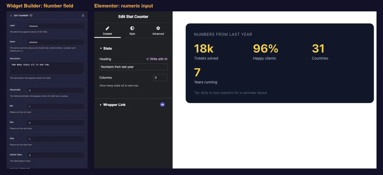
Что делает поле Число #
- Добавляет числовой ввод со стрелками-спиннерами на панель вашего виджета в Elementor.
- Ограничивает то, через что редакторы могут войти Мин, Макс и Шаг.
- Печатает номер, где бы вы ни разместили его токен, на панели HTML, CSS или JS.
- Работает в сравнениях, так что
{% if columns > 2 %}может переключать часть наценки.
Новое для строителя? Прочитать Обзор виджета-строителя сначала вернитесь с открытым виджетом.
Прежде чем начать #
- WordPress с установленным и активным элементом Elementor.
- Установлены и активны главные дополнения для Elementor.The руководство установки настройка обложек.
- Виджет, открытый в Widget Builder Пример в этом руководстве - виджет “Stat Counter” с двумя полями Number:
columns(от 1 до 4) на вкладке Содержимое иstat_size(20 to 96) на вкладке Стиль.
Как добавить поле Число #
- Перейти к Мастер-аддоны > Виджет-строитель и откройте виджет.
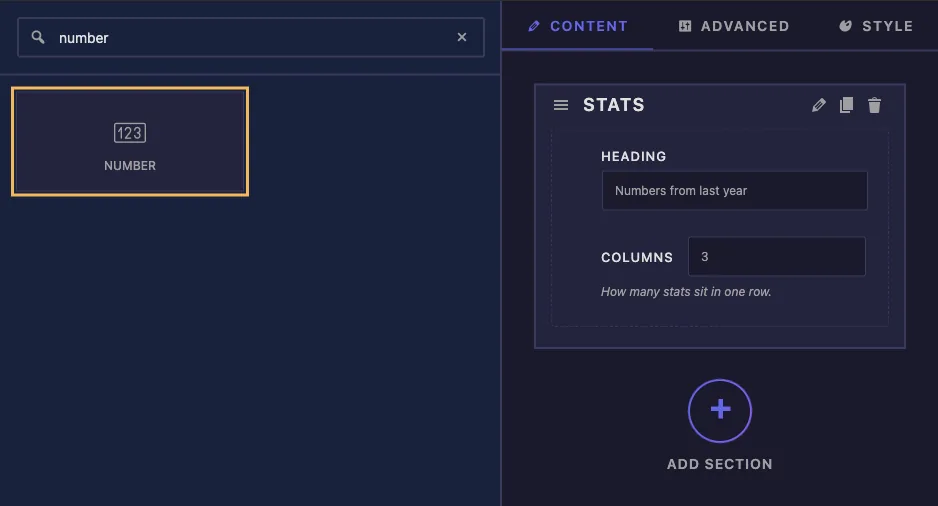
- Добавить раздел на вкладке, на которой принадлежит настройка Подходит счетчик макета Содержание, размер подходит Стиль.
- Тип
numberв поле поиска слева. - Драг Номер в раздел Нажмите на карандаш на поле, чтобы открыть его настройки.
Объяснены параметры поля номера #
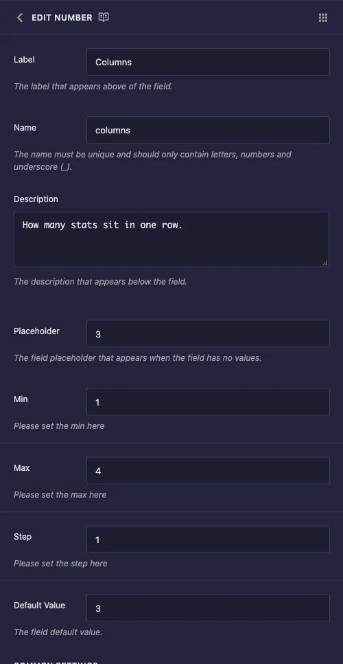
- Этикетка: текст рядом с входом в Elementor, например “Columns”.
- Имя: уникальный идентификатор поля и название его токена Используйте только буквы, цифры и подчеркивания, например
columns. - Описание: подсказка, показанная под входом в Elementor.Скажите, что контролирует число, и, если это важно, единица.
- Заполнитель: серый текст отображается, когда вход пуст.
- Мин и Макс: самые низкие и самые высокие значения, которые принимает вход.
- Шаг: насколько далеко перемещаются стрелки спиннера каждый клик Используйте 1 для целых чисел, 2 для четных чисел, 0,5 для полушагов.
- Значение по умолчанию: номер, с которого начинается новая копия виджета.
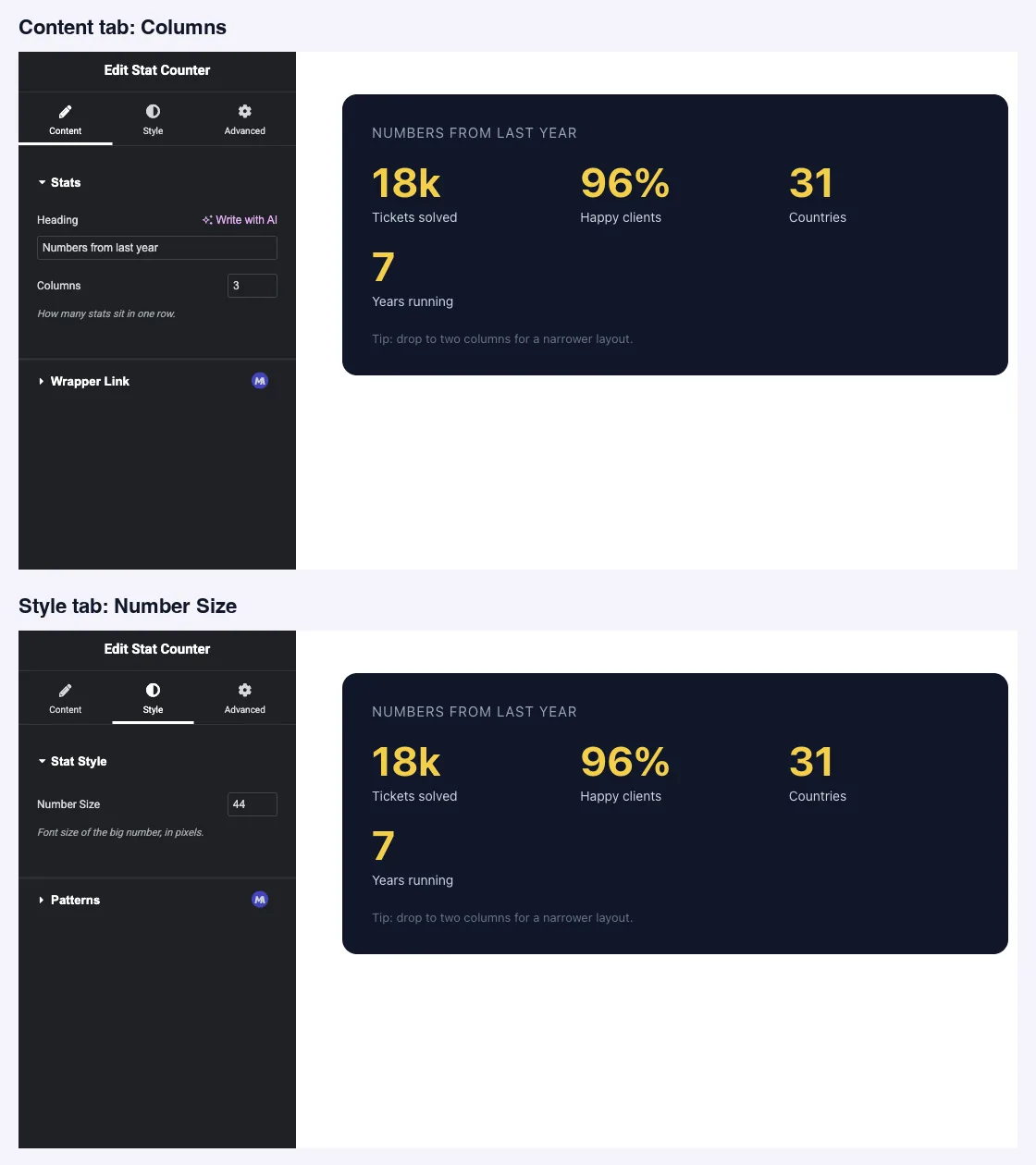
Мин, Макс и Шаг достигают самого входа В наших тестах поле Столбцы поступали в Элементор в качестве ввода числа с мин 1, макс 4 и шагом 1, поэтому стрелки останавливаются на концах диапазона.
Общие настройки работают, как и в других областях, в том числе Условия если число должно появиться только тогда, когда установлено другое поле.
Распечатайте номер в своем шаблоне #
Токен работает во всех трех панелях В виджете Stat Counter HTML помещает значение в атрибут данных и использует его в сравнении:
<div class="stats-grid" data-columns="{{ columns }}">
  ...
</div>
{% if columns > 2 %}
<p class="stats-note">Tip: drop to two columns for a narrower layout.</p>
{% endif %}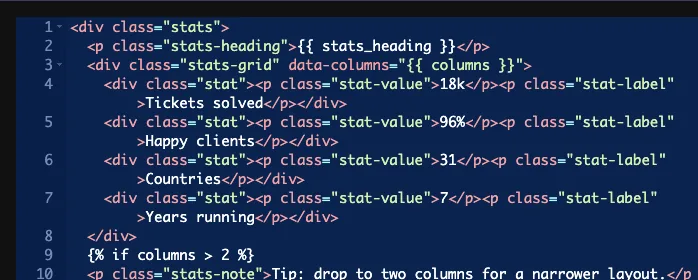
Панель CSS - это место, где числовое поле обычно получает свой запас. Поставьте устройство за пределы скобок, потому что поле хранит голое число:
.stats-grid { grid-template-columns: repeat({{ columns }}, 1fr); }
.stat-value { font-size: {{ stat_size }}px; }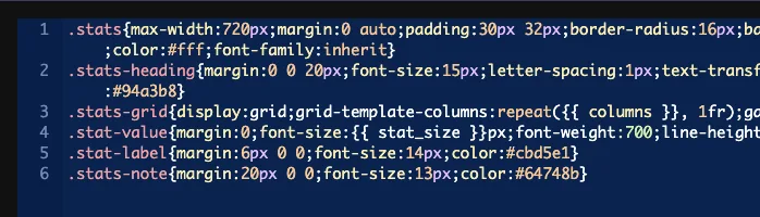
Тот же токен работает, например, на панели JS var perRow = {{ columns }};.
Дайте каждому полю "Число" значение по умолчанию #
Пустое поле ничего не печатает, и это молча нарушает правила вокруг него. С очищением поля столбцов наша CSS стала repeat(, 1fr), какие браузеры опускаются, а сетка возвращается к одному столбцу. The {% if columns > 2 %} проверка перестала совпадать одновременно Ничто в панели не предупреждает вас.
Таким образом, установите значение по умолчанию в любом поле "Число", которое подает CSS или JavaScript, и обработайте пустое значение как можно в своем шаблоне, если редакторы смогут его очистить.
Оставьте выбор пустым в поле "Число" #
Ящик Селектора ведет себя странно для этого поля, и в наших тестах он вызвал сразу две проблемы:
- Он записал в правило простое число без названия собственности, поэтому из него не вышел удобный CSS.
- Пока Селектор был заполнен, Значение по умолчанию поля перестало достигать токена Виджет, к которому никто не прикасался, отображался
font-size:pxна переднем конце. очистив селектор, исправил его, и тот же нетронутый виджет был визуализированfont-size:44px.
Вместо этого распечатайте токен на панели CSS, как показано выше. Это поддерживает работу по умолчанию и позволяет вам написать свойство и подключиться самостоятельно.
Используйте элемент управления числом в Elementor #
Добавьте виджет на страницу, или перезагрузите редактор, если страница уже была открыта Каждое поле Число отображается в виде небольшого ввода под своей меткой, на вкладке, где вы его поместили Введите значение или используйте стрелки, и предварительный просмотр обновляется.
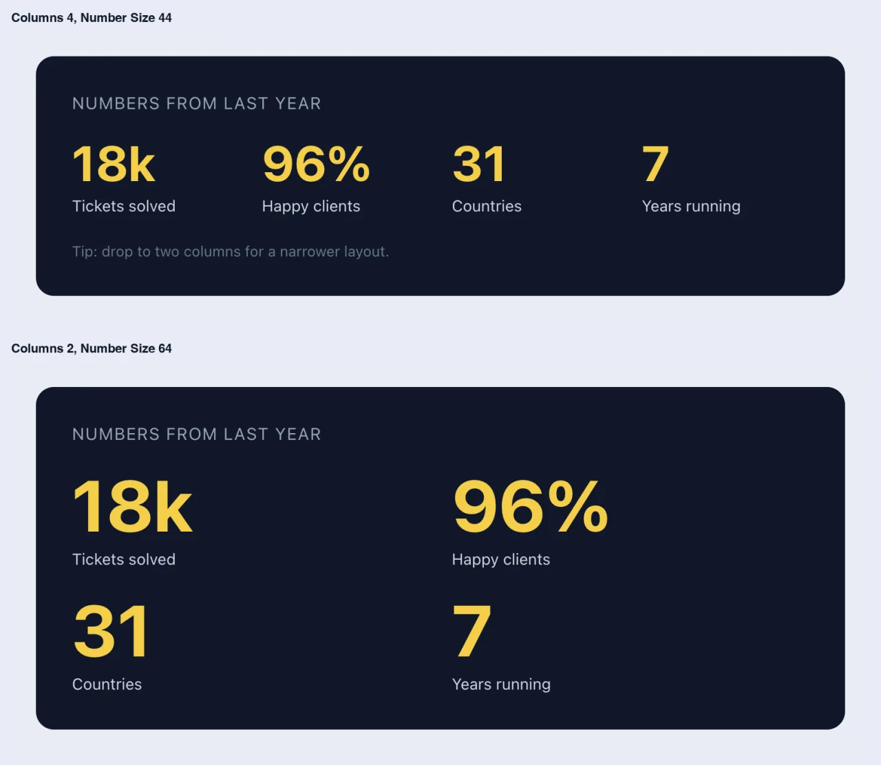
Вот тот же виджет в четыре столбца и в два столбца с большим размером числа:
Обычные случаи использования #
- Столбец или элемент учитываются в сетках и каруселях.
- Размеры шрифтов, значения интервалов и ширина в пикселях.
- Звездные рейтинги, оценки и проценты обзоров.
- Подсчитывает и ускоряет чтение сценария, например, элементов на слайд или задержку автовоспроизведения.
Советы по работе с полем Число #
- Всегда устанавливайте значение по умолчанию. В том-то и разница между работающим виджетом и молча нарушенным правилом.
- Установите Мин и Макс на то, что может принять дизайн. Сетка, построенная на четыре колонны, не должна принимать 12.
- Поместите устройство на этикетку или описание, например “Number Size” с “in pixels”, поскольку поле хранит простое число.
- Держите устройство вне токена в CSS:
{{ stat_size }}px, не внутри брекетов. - Хотите вместо этого ползунок с юнитами? выше Поле слайдера это поле Pro, которое дает редакторам дрэг-дескриптор.
Часто задаваемые вопросы #
Доступно ли поле "Номер" в бесплатной версии?
Да. номер - одно из полей, которые вы можете использовать в конструкторе виджетов бесплатной версии. полный набор полей конструктора виджетов поставляется с Master Addons Pro.
Ограничивают ли Мин, Макс и Степ на самом деле тип редакторов?
Они достигают входа в Elementor, поэтому стрелки останавливаются на заданном вами диапазоне. также установите значение по умолчанию, чтобы поле никогда не было пустым.
Почему мое правило CSS перестало работать?
Поле, вероятно, пустое. пустое поле Число ничего не печатает, поэтому правило, как repeat(, 1fr) становится недействительным, и браузер отбрасывает его. Установите значение по умолчанию.
Могу ли я использовать опцию "Выбор", чтобы использовать поле "Число"?
Не полезно В наших тестах он написал голый номер без свойства, и пока он был заполнен в поле по умолчанию перестал достигать шаблона Вместо этого напечатайте токен на панели CSS.
Как добавить единицу, например px или %?
Напишите его, например, за пределами брекетов font-size: {{ stat_size }}px;. В поле хранится только номер.
Завершая #
Добавьте поле Число, установите Мин, Макс, Шаг и Значение по Умолчанию, затем распечатайте токен, где вам нужно и добавьте единицу самостоятельно.Оставить Выбор пустым, чтобы дескриптор по умолчанию продолжал работать. для дескриптора перетаскивания с параметрами единицы см Поле слайдераи проверьте ценообразование за то, что включает каждый план.


