

O campo Dimensões adiciona o controle de espaçamento de quatro caixas do Elementor (superior, direito, inferior e esquerdo, com um ícone de link e um menu de unidade) a um widget personalizado construído com os Master Addons Construtor de widgets. Use-o sempre que for definido preenchimento, margem, largura da borda ou raio do canto no painel Elementor em vez de fixado em seu CSS.
Dimensions é um campo Pro. O plugin gratuito inclui um Widget Builder limitado, e o conjunto completo de campos vem com Complementos mestres Pro.
O que o campo Dimensões faz #
- Ele mostra quatro caixas numéricas no painel Elementor Com o ícone do link ligado, digitar uma caixa preenche todos os quatro.
- Um menu de unidade permite que os editores alternem entre as unidades permitidas, como px, em e%.
- Você pode esconder os lados que não precisa Um campo de preenchimento de botões pode mostrar apenas Direita e Esquerda.
- Elementor escreve o CSS para você através das linhas CSS Selectors do campo, incluindo valores separados por dispositivo quando o Controle Responsivo está ativado.
Se você ainda não construiu um widget, leia o Visão geral do Widget Builder primeiro.
Antes de começar #
- WordPress com Elementor instalado e ativo.
- Master Addons para Elementor e Master Addons Pro, ambos ativos. O guia instalação coberturas configuração.
- Um widget aberto no Widget Builder O exemplo neste guia é um widget “Pricing Card” com um
price-cardcaixa e aprice-btnbotão e três campos de dimensões: Preenchimento de cartão, Raio de cartão e Preenchimento de botão.
Como adicionar um campo Dimensões #
- Ir para Complementos mestres > Construtor de widgets e abra seu widget.
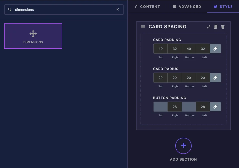
- Clique no Estilo tab e adicione uma seção, por exemplo “Card Spacing”.
- Tipo
dimensionsna caixa de pesquisa de campo à esquerda. - Arrastar Dimensões na seção. Suas configurações abrem na barra lateral esquerda.
Opções de campo de dimensões explicadas #
Aqui está o campo Card Padding:
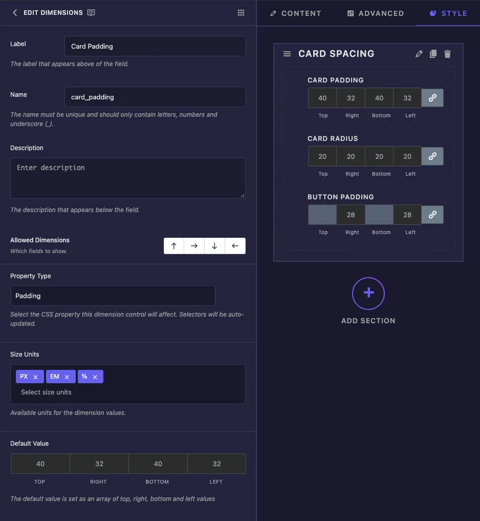
- Etiqueta o texto acima das caixas em Elementor, por exemplo “Card Padding”.
- Nome é o ID único do campo Apenas letras, números e sublinhados.
- Descrição aparece sob o controle em Elementor.
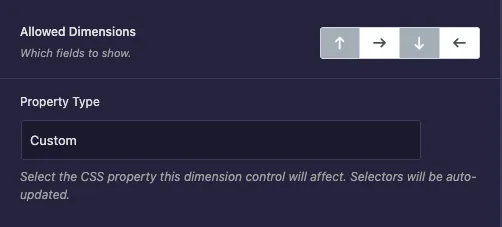
- Dimensões Permitidas tem quatro botões de seta para cima, direita, inferior e esquerda Clique em uma seta para desligar esse lado No Elementor, um lado que está desligado aparece como uma caixa cinza que não pode ser editada.
- Tipo de propriedade oferece Custom, Margem, Preenchimento, Largura da borda e Raio da borda Escolha um e o construtor preenche uma linha de seletores CSS para essa propriedade (mais sobre isso abaixo).A Largura da borda também adiciona
border-style: solid. - Tamanho Unidades lista as unidades que os editores podem escolher Um novo campo permite px, %, em, rem, vh e vw. Remova aqueles que não fazem sentido para o seu design.
- Valor padrão possui quatro caixas para os valores inicial superior, direito, inferior e esquerdo.
O campo de Preenchimento de Botões só precisa da esquerda e da direita, portanto as setas superior e inferior estão desligadas:
Mais abaixo, Controle Responsivo adiciona o ícone do dispositivo para que desktop, tablet e celular possam ter valores diferentes Mostrar rótulo, separador e condições funcionam como em outros campos.
Conecte o campo com os Seletores CSS #
Cada Seletores CSS a linha tem um Seletor CSS (qual elemento para estilizar) e Propriedades CSS (a regra a escrever).Quando você escolhe Padding como o Tipo de Propriedade, a linha começa assim:
CSS Selector:   {{WRAPPER}}
CSS Properties: padding: {{TOP}}{{UNIT}} {{RIGHT}}{{UNIT}} {{BOTTOM}}{{UNIT}} {{LEFT}}{{UNIT}};
{{WRAPPER}} por si só significa todo o widget. Mude-o para o elemento desejado, como .price-card. Você pode sair {{WRAPPER}} fora, porque o construtor adiciona na frente do seu seletor para que a regra fique dentro deste widget.
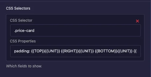
Em Propriedades CSS, {{TOP}}, {{RIGHT}}, {{BOTTOM}} e {{LEFT}} são substituídos pelos números das quatro caixas e {{UNIT}} com a unidade escolhida Com o Tipo de Propriedade definido como Personalizado, você mesmo escreve a regra O campo de Preenchimento de Botões usa apenas dois lados:
CSS Selector:   .price-btn
CSS Properties: padding-right: {{RIGHT}}{{UNIT}}; padding-left: {{LEFT}}{{UNIT}};
Clique Adicionar Item para aplicar o mesmo valor a outro elemento com uma segunda linha.
Duas coisas para saber O single Seletor caixa perto da parte inferior das configurações comuns não faz nada para um campo Dimensões, por isso sempre use as linhas Selectores CSS E escolher um Tipo de propriedade preenche a caixa Propriedades CSS para você, então escolha-o primeiro e marque as linhas novamente se você trocá-lo mais tarde.
Use os valores em seu modelo #
Você também pode imprimir os valores diretamente na guia HTML ou CSS O campo é mantido top, right, bottom, left e unit, então escreva cada lado seguido pela unidade:
.price-card {
  padding: {{ card_padding.top }}{{ card_padding.unit }} {{ card_padding.right }}{{ card_padding.unit }} {{ card_padding.bottom }}{{ card_padding.unit }} {{ card_padding.left }}{{ card_padding.unit }};
}
Um nu {{ card_padding }} imprime nada Para a maioria dos widgets as linhas CSS Selectors são a melhor escolha, uma vez que Elementor escreve uma regra separada para cada dispositivo quando o Controle Responsivo está ligado.
Clique Salvar configurações quando terminar.
Use o controle Dimensões no Elementor #
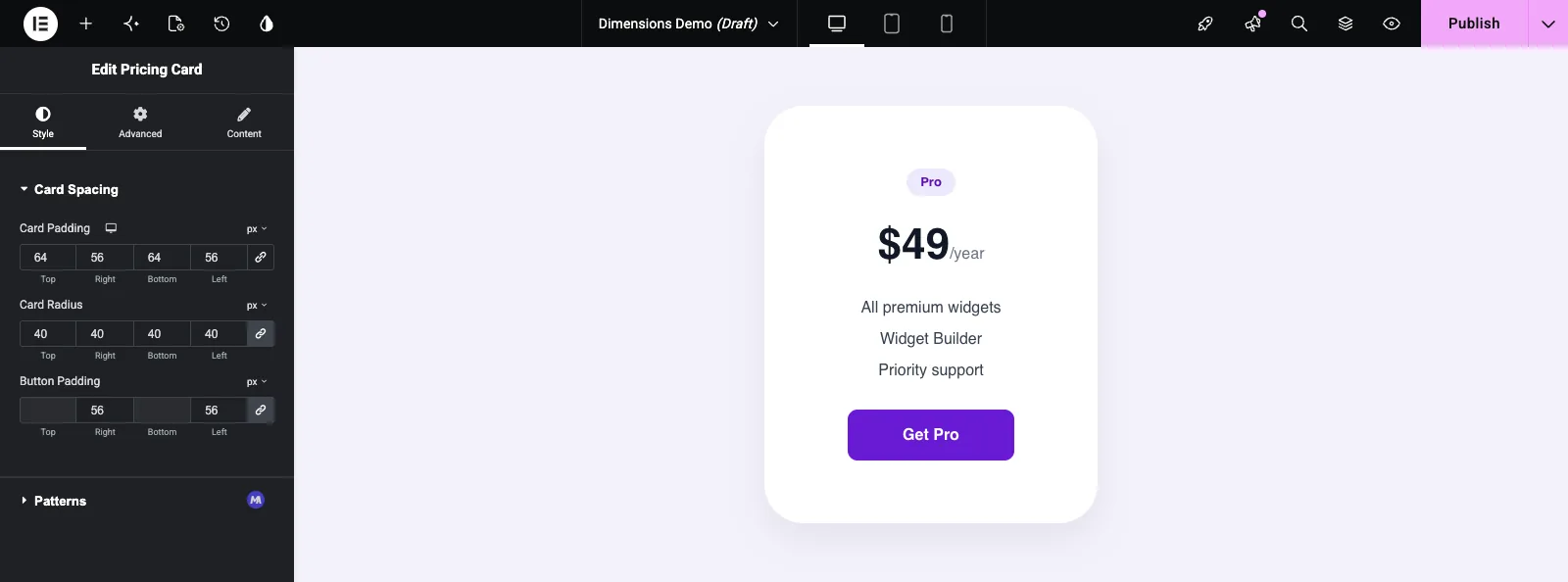
Adicione o widget a uma página ou recarregue o editor se a página já estiver aberta Selecione o widget e abra o Estilo guia. Cada campo Dimensões mostra quatro caixas rotuladas como Superior, Direita, Inferior e Esquerda, o ícone do link e um menu de unidade no canto superior direito. O preenchimento de botões mostra a parte superior e inferior acinzentadas.
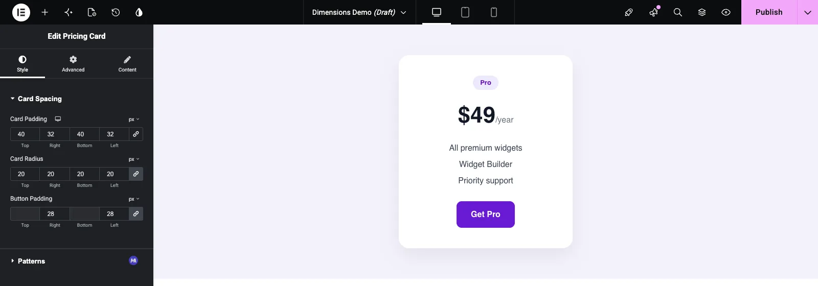
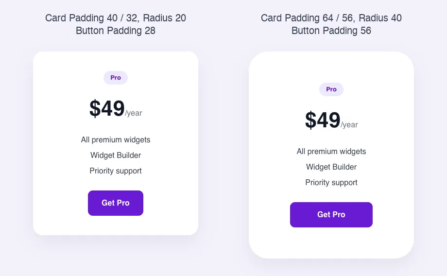
Digite um número e o cartão atualiza imediatamente Clique no ícone do link para desvincular os lados e dar a cada um seu próprio valor, como Card Padding faz aqui com 64 na parte superior e inferior e 56 nas laterais Use o menu da unidade para alternar entre as unidades que você permitiu.
Casos de uso comum #
- Estofamento interno para cartões, caixas e banners.
- Margens entre partes de um widget, como o espaço sob um título.
- Raio de canto em cartões, imagens e botões, usando o tipo de propriedade Border Radius.
- Almofada de botões esquerdo e direito, com os lados superior e inferior desligados.
- Larguras de borda por lado, usando o tipo de propriedade Border Width.
Dicas para trabalhar com o campo Dimensões #
- Sempre altere o Seletor CSS de
{{WRAPPER}}para o seu elemento. Esquerda como está, o espaçamento aplica-se a todo o widget wrapper. - Aparar as Unidades de Tamanho com as que você deseja que os editores usem. px e em cobrem a maior parte do espaçamento.
- Desligue os lados que não se aplicam Ele impede que os editores definam valores que não têm efeito.
- Defina um valor padrão que corresponda ao seu design, para que o widget pareça correto assim que for adicionado.
- Tenha cuidado com % para preenchimento e margem Os navegadores calculam o preenchimento percentual a partir da largura do elemento, mesmo para cima e para baixo.
- Para um único valor, como uma lacuna ou tamanho de ícone, o Campo deslizante é mais simples.
Perguntas frequentes #
O campo Dimensões é gratuito?
No. Dimensions é um dos campos Pro no Widget Builder, então Master Addons Pro tem que estar ativo antes que você possa adicioná-lo a um widget.
Por que meu campo Dimensões não muda nada?
Marque as linhas Selectores CSS O Selector CSS deve corresponder a um elemento no HTML do seu widget, e as Propriedades CSS devem conter a regra A única caixa Selector nas configurações comuns não é usada por este campo.
Preciso adicionar {{WRAPPER}} ao Seletor CSS?
Não. O construtor acrescenta {{WRAPPER}} na frente do seletor para você, então .price-card é suficiente.
Como mostro apenas caixas esquerda e direita?
Em Dimensões permitidas, clique nas setas para cima e para baixo para desligar a parte superior e inferior Elementor então mostra essas duas caixas acinzentadas.
Posso imprimir os valores no meu HTML ou CSS?
Sim. Usar {{ field_name.top }}{{ field_name.unit }} e o mesmo padrão para direita, inferior e esquerda. {{ field_name }} em suas próprias impressões nada.
Embrulhando #
Escolha um Tipo de Propriedade, aponte a linha de Seletores CSS para o seu elemento, corte as unidades e os lados e defina um padrão sensato Os editores então obtêm o mesmo controle de espaçamento que conhecem dos próprios widgets do Elementor Para o resto do estilo da caixa, consulte o Fronteira e Fundo campos e verifique preços para o que cada plano inclui.


