

선택 필드는 마스터 애드온으로 빌드한 사용자 지정 위젯에 드롭다운을 추가합니다 위젯 빌더. 고정된 선택 목록을 설정하고 편집자가 Elementor 에서 하나를 선택하고 템플릿이 일치하도록 변경됩니다: 다른 레이아웃 클래스,추가 배지,다른 마크업 블록 카드 스타일,배지 유형 또는 정렬 주문과 같은 명명된 변형에 사용할 필드입니다.
Select 는 무료 버전의 Widget Builder 에서 사용할 수 있는 필드 중 하나입니다. 무료 플러그인에는 제한된 Widget Builder 가 포함되어 있으며 전체 필드 세트가 함께 제공됩니다 마스터 애드온 프로.
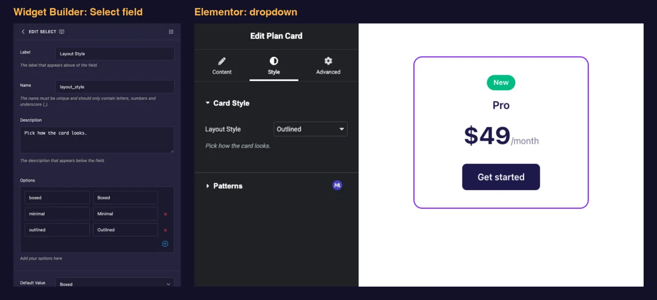
Select 필드가 수행하는 작업 #
- Elementor 에서 위젯의 패널에 표준 드롭다운을 추가합니다.
- 편집자가 정의한 목록에서 하나의 옵션을 선택하도록 합니다.
- 옵션을 저장합니다 키 (예를 들어
outlined), 편집자가 보는 레이블이 아닙니다. - 토큰을 배치하는 곳마다 해당 키를 인쇄합니다
{{ layout_style }}, 그래서 수업으로 사용하거나 로 확인할 수 있습니다{% if %}.
건축업자에게 새로운? 읽기 위젯 빌더 개요 일단 위젯을 열어놓고 돌아오세요.
시작하기 전에 #
- Elementor가 설치되어 활성화된 WordPress입니다.
- Elementor 용 마스터 애드온이 설치되고 활성화되었습니다. The 설치 가이드 설정을 다룹니다.
- 위젯 빌더에서 열린 위젯. 이 가이드의 예는 두 개의 선택 필드가 있는 “플랜 카드” 위젯입니다:
layout_style스타일 탭의 (상자, 최소, 윤곽선) 및badge콘텐츠 탭에 (배지 없음, 가장 인기 있음, 신규).
Select 필드를 추가하는 방법 #
- 로 이동 마스터 애드온 > 위젯 빌더 그리고 위젯을 엽니다.
- 설정이 속한 탭을 선택하고 섹션을 추가합니다.Layout Style 과 같은 모양과 느낌의 선택이 적합합니다 스타일 예를 들어 “카드 스타일” 섹션의 탭입니다.
- 유형
select왼쪽의 필드 검색 상자에. 두 개의 필드가 나타납니다: 선택 및 Select2. - 드래그 선택 섹션으로. 필드의 연필을 클릭하여 설정을 엽니다.
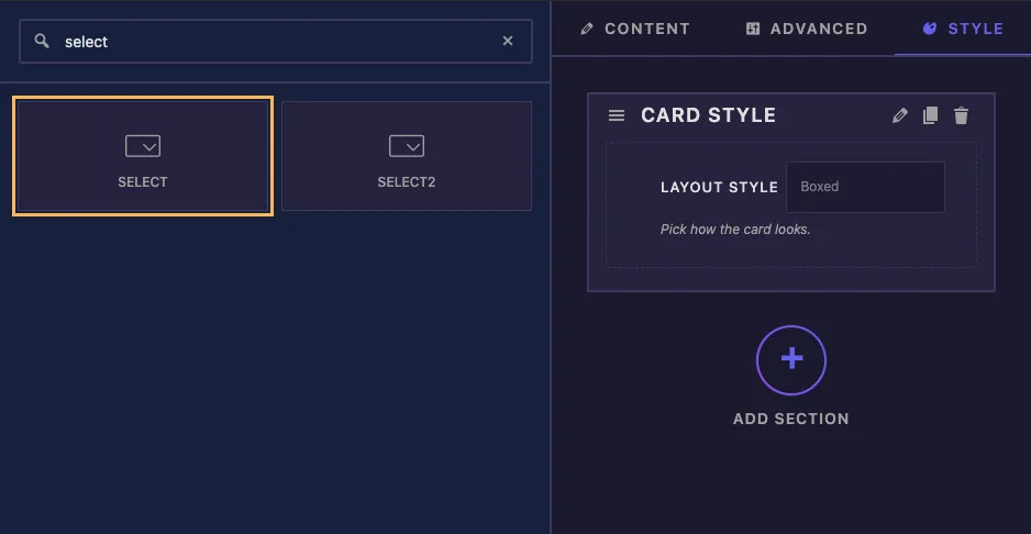
Select 는 짧은 목록에서 하나의 선택 항목을 보유합니다. 편집자가 긴 목록을 검색하거나 두 개 이상의 옵션을 선택해야 하는 경우 를 사용합니다 선택2 대신 Pro 필드입니다.
설명 된 필드 옵션을 선택 합니다 #
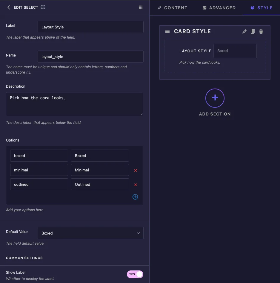
- 라벨: elementor의 드롭다운 옆에 있는 텍스트, 예를 들어 “레이아웃 스타일”.
- 이름: 필드의 고유 ID 및 토큰 이름. 예를 들어 문자,숫자 및 밑줄만 사용합니다
layout_style. - 설명: elementor의 드롭다운 아래에 표시된 힌트입니다.
- 옵션: 선택 당 1 개의 줄. 좌 상자는 the 키 템플릿이 수신되고 오른쪽 상자가 수신됩니다 라벨 편집기 참조. 행을 제거하려면 적십자를 사용하고 하나를 추가하려면 더하기 버튼을 사용하십시오.
- 기본값: 위젯의 새 복사본 옵션은 다음으로 시작합니다. 드롭다운에는 레이블이 표시되지만 필드는 키를 저장합니다.
새로운 Select 필드에는 세 개의 샘플 행이 제공됩니다 value-1 에 value-3 레이블 옵션 1 에서 옵션 3 으로 위젯을 사용하기 전에 자신의 키와 레이블로 바꿉니다.
키를 짧고 소문자로 유지하며 공백 없이 유지합니다 boxed 또는 most_popular. 클래스 이름과 비교로 끝납니다. 기본 값을 비워 두면 위젯은 목록의 첫 번째 옵션에서 시작됩니다.
공통 설정에서 찾을 수 있습니다 라벨 표시, 라벨 블록, 분리기 그리고 조건다른 분야와 동일하게 작동합니다.
템플릿에서 선택 항목을 사용하세요 #
Plan Card HTML은 두 가지 가장 일반적인 방법으로 Select 필드를 모두 사용합니다:
<div class="plan plan--{{ layout_style }}">
  {% if badge == 'popular' %}
  <span class="plan-badge">Most Popular</span>
  {% elseif badge == 'new' %}
  <span class="plan-badge plan-badge--new">New</span>
  {% endif %}
  <p class="plan-name">{{ plan_name }}</p>
  <p class="plan-price">{{ plan_price }}<span>/month</span></p>
  <a class="plan-button" href="#">Get started</a>
</div>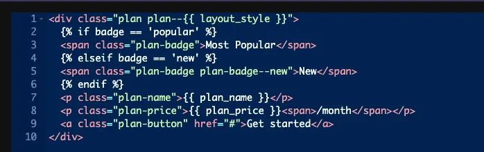
수정자 클래스 #
plan--{{ layout_style }} 된다 plan--boxed, plan--minimal 또는 plan--outlined. 각 변종은 CSS 패널에서 짧은 규칙이며 HTML 은 동일하게 유지됩니다:
.plan--boxed { background: #fff; box-shadow: 0 12px 32px rgba(29, 27, 76, .14); }
.plan--minimal { background: transparent; }
.plan--outlined { background: #fff; border: 2px solid #7c3aed; }
옵션 당 다른 마크업 #
옵션에 다른 HTML이 필요한 경우 키를 비교하세요 {% if %}. {% elseif %} 그리고 {% else %} 일도 하세요. 예제에서는 none 두 체크 모두 일치하지 않으므로 배지가 인쇄되지 않습니다.
항상 키와 비교하십시오. {% if badge == 'popular' %} 성냥, 동안 {% if badge == 'Most Popular' %} never does and gives no error.수표가 절대 발사되지 않는다면,키의 철자를 먼저 보세요.
선택기 및 반응 제어 #
- 선택기 항상 글을 씁니다
color: {{VALUE}};이 필드의 경우 속성을 변경할 상자가 없습니다. With keys likeboxed규칙은 아무것도 하지 않습니다. 오직 당신의 키가 색깔일 때만 도움이 됩니다: 우리의 테스트에서,같은 키#7c3aed그리고#0ea5e9선택기로.plan-price가격을 색칠했음 다른건 Selector 를 비워두고 class 를 사용함. - 반응형 제어 편집자가 장치당 다른 옵션을 선택할 수 있도록 합니다. 장치별 선택은 위의 선택기 규칙을 통해서만 페이지에 도달합니다. 토큰은 데스크톱 선택 항목을 인쇄하므로 템플릿의 값을 사용할 때 반응형 제어를 꺼두십시오.
Elementor 에서 Select 컨트롤을 사용합니다 #
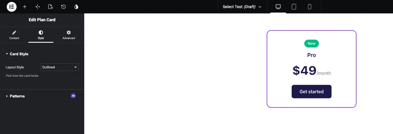
페이지에 위젯을 추가하거나 페이지가 이미 열려 있는 경우 편집기를 다시 로드합니다. 위젯을 선택하고 필드를 배치한 탭을 엽니다. 드롭다운에는 레이블이 표시되며 기본 옵션은 이미 선택되어 있습니다. 다른 옵션을 선택하고 미리보기 업데이트를 선택합니다.
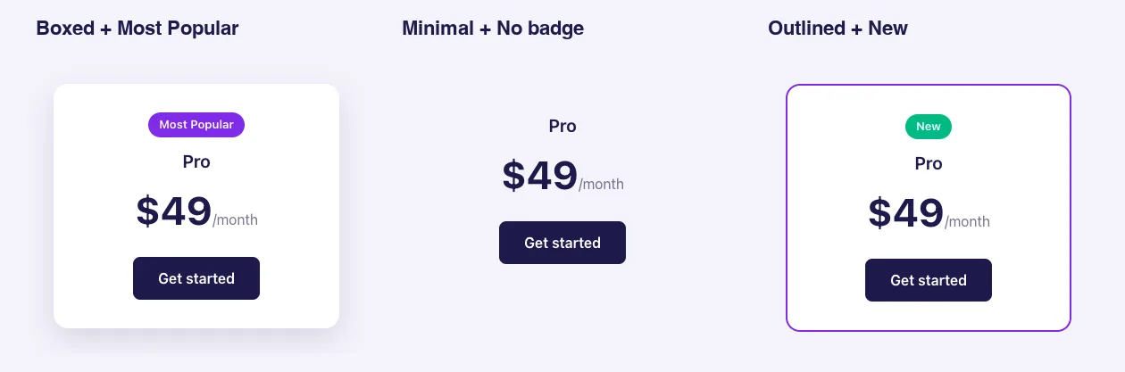
레이아웃 스타일과 배지의 세 가지 조합이 포함된 동일한 플랜 카드가 있습니다:
일반적인 사용 사례 #
- 카드, 버튼 또는 섹션 스타일 변형.
- 판매, 신규 또는 가장 인기 있는 것과 같은 배지 또는 리본.
- 제목 태그, 이미지 비율 또는 열 수 선택.
- 목록 위젯의 정렬 순서 또는 데이터 원본.
Select 필드로 작업하기 위한 팁 #
- 편집자가 위젯을 사용하기 전에 키를 결정합니다. 나중에 레이블 이름을 바꿀 수 있지만 키를 변경하면 이전 페이지를 이미 저장한 페이지가 중단됩니다.
- “없음” 옵션을 추가하십시오 예제의 배지처럼 요소가 선택 사항인 경우.
- 기본 값을 설정합니다 저것 자체는 좋아보여서 새로 추가된 위젯을 사용할 준비가 되었습니다.
- 명확한 아이콘이 있는 옵션은 두세 가지뿐인가요? X-1000 X 1000 X 1000 X 1000 X 1000 X 1000 X 1000 X 1000 X 1000 X 1000 X 1000 X 1000 X 1000 X 1000 X 1000 X 1000 X 1000 X 1000 X 1000 X 필드 선택 드롭다운 대신 버튼으로 표시합니다.
- 그냥 켜거나 끄나요? 를 이용하세요 스위처 필드.
자주 묻는 질문 #
Select 필드는 무료 버전에서 사용할 수 있습니까?
예. Select 는 무료 버전의 Widget Builder 에서 사용할 수 있는 필드 중 하나입니다. Widget Builder 필드의 전체 세트는 Master Addons Pro 와 함께 제공됩니다.
토큰이 키나 라벨을 인쇄합니까?
열쇠. 선택권이 인 경우에 outlined 라벨 윤곽이 그려져 있습니다 {{ layout_style }} 인쇄물 outlined.
내 {% if %} 체크가 일치하지 않는 이유는 무엇입니까?
레이블이나 철자가 틀린 키와 비교하는 것일 겁니다. 예를 들어 옵션 행의 왼쪽 상자에서 정확한 키를 사용합니다 {% if badge == 'popular' %}.
Default Value 를 비워두면 어떻게 되나요?
위젯은 목록의 첫 번째 옵션에서 시작됩니다.
Select 와 Select2 의 차이점은 무엇입니까?
Select 는 하나의 선택으로 이루어진 일반 드롭다운입니다. Select2 는 여러 선택도 허용할 수 있는 검색 가능한 목록이 있는 Pro 필드입니다.
감싸는 #
Select 필드를 추가하고 샘플 행을 짧은 키와 명확한 레이블로 바꾼 다음 기본값을 설정합니다. 그런 다음 키를 스타일 변형에 대한 클래스로 인쇄하거나 다음으로 확인합니다 {% if %} 마크업이 변경될 때. 검색 가능 또는 다중 선택에 대해서는 를 참조하십시오 선택2, 그리고 확인 가격 각 계획에 포함된 내용입니다.


