

Every site needs a menu, and the theme’s default header rarely matches a custom Elementor design. The free Nav Menu widget in Master Addons for Elementor renders any WordPress menu inside the Elementor editor: horizontal or vertical layouts set per device, styled submenus, and a hamburger toggle that takes over on phones.
This guide walks through the widget from the first drag to a styled menu with a working dropdown on the live page.
What the Navigation Menu widget does #
The widget pulls a menu you built under Appearance, Menus and renders it as an Elementor element. You pick the layout and behavior, style every state of the items, the dropdowns, and the mobile toggle, all from the Elementor panel. The menu items themselves, their labels, order, and submenus, stay managed in WordPress, so content editors never touch Elementor to add a page to the menu.
Before you start #
- WordPress with Elementor installed and active.
- Master Addons for Elementor installed and active. New to the plugin? See the installation guide.
- The Nav Menu widget enabled in the Master Addons option panel, under Navigation Widgets.
- A menu created under Appearance, Menus in your dashboard. The demo uses a “main menu” with Home, Pricing, Team, and Contact, plus an FAQ submenu under Contact.
How to add the Navigation Menu widget #
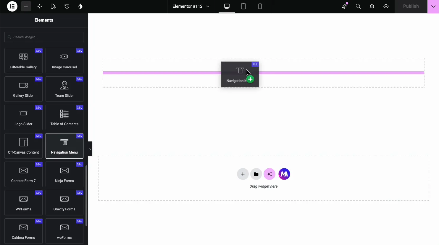
In the Elementor editor, search the Elements panel for Nav Menu and drag it onto the page, typically into a header section. The widget renders your first WordPress menu immediately.
Pick the menu and layout #
The General section drives the whole widget. Select Menu lists every menu from your Menus screen; pick the one to render. Layout offers Horizontal, Vertical and Hamburger (Pro), and you can set it separately for each device. For vertical menus, Type adds the behavior: Normal, Toggle, Accordion or Side. Here is the demo menu in a vertical layout:
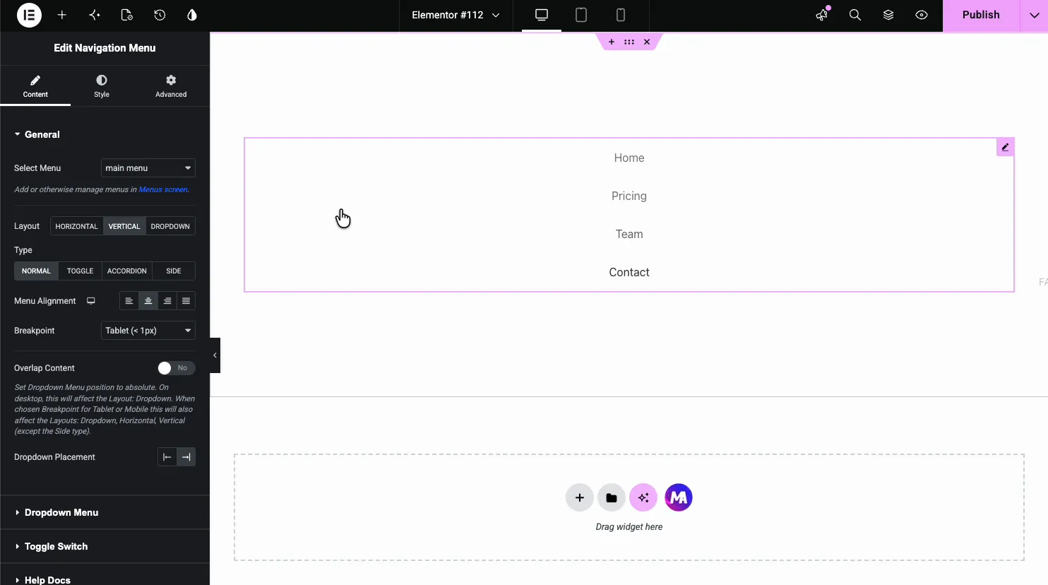
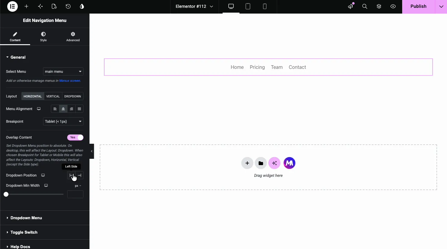
For a header, Horizontal is the usual pick. Alignment places the items left, center, right or justified. There is no single breakpoint setting: switch Elementor to tablet or phone view and pick the layout for that device. Phones use the hamburger toggle by default. Worth trying Vertical once even if you don’t need it; seeing both layouts makes the alignment options click.
Configure the dropdown #
The Dropdown Menu section controls the submenu behavior and indicator:
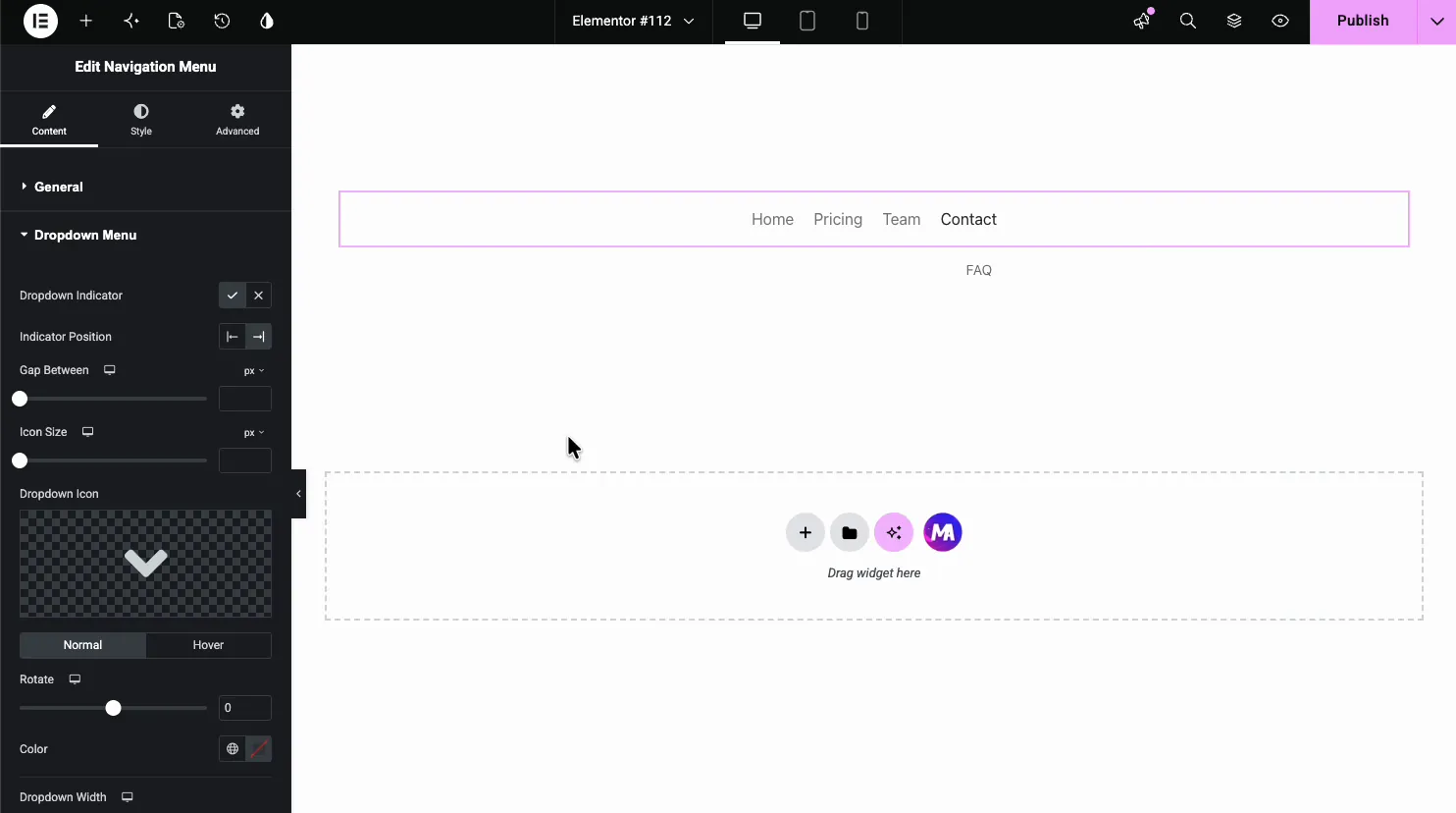
- Dropdown Indicator: show or hide the arrow beside items that carry a submenu.
- Indicator Position, Gap Between, Icon Size: where the arrow sits and how big it is.
- Dropdown Icon: swap the default chevron for any icon, with Normal and Hover states and a Rotate control.
- Dropdown Width and Alignment: the submenu panel’s size and text alignment.
- Submenu Indicator: the icon for third-level menus.
Set up the mobile toggle #
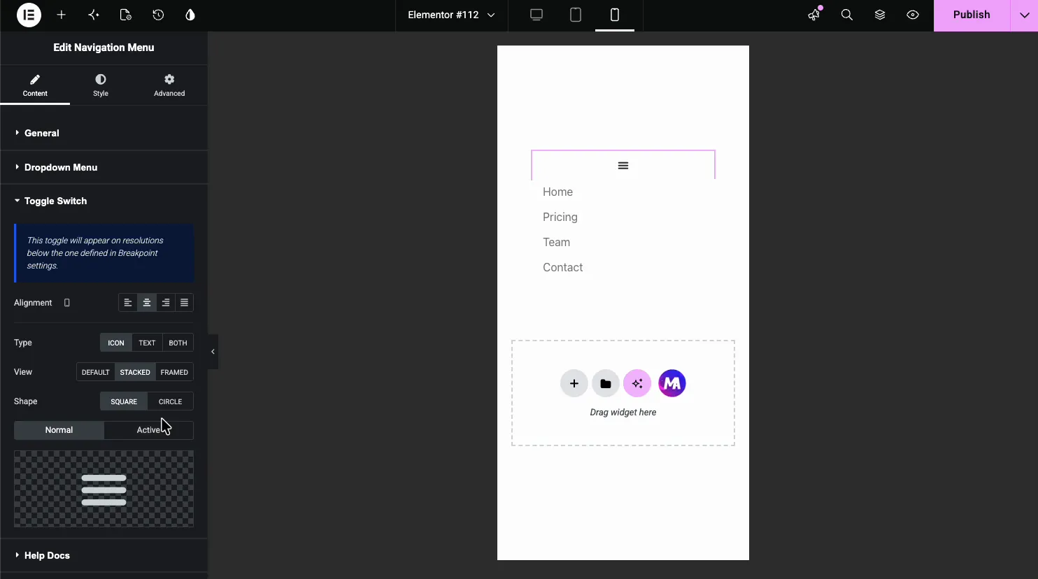
When a device uses the hamburger layout, the menu collapses behind a toggle button. The Hamburger Menu section configures it: Alignment, Type (Icon, Text, or Both), View (Default, Stacked, or Framed), Shape (Square or Circle), and separate icons for the Normal and Active states. Switch the editor to mobile preview and the toggle appears with the menu stacked beneath it:
Style the menu items #
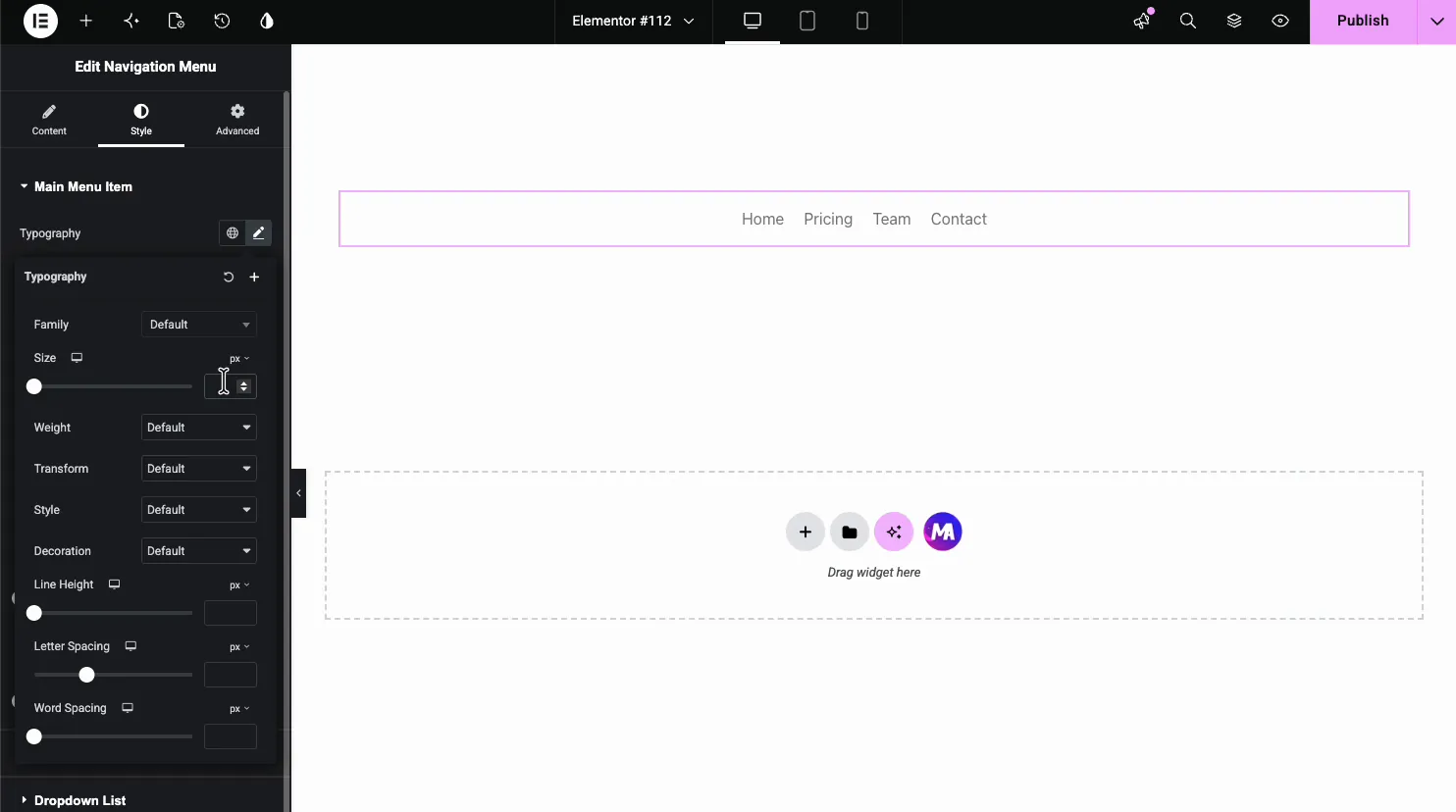
In the Style tab, Main Menu Item covers the top-level links. Typography handles the font:
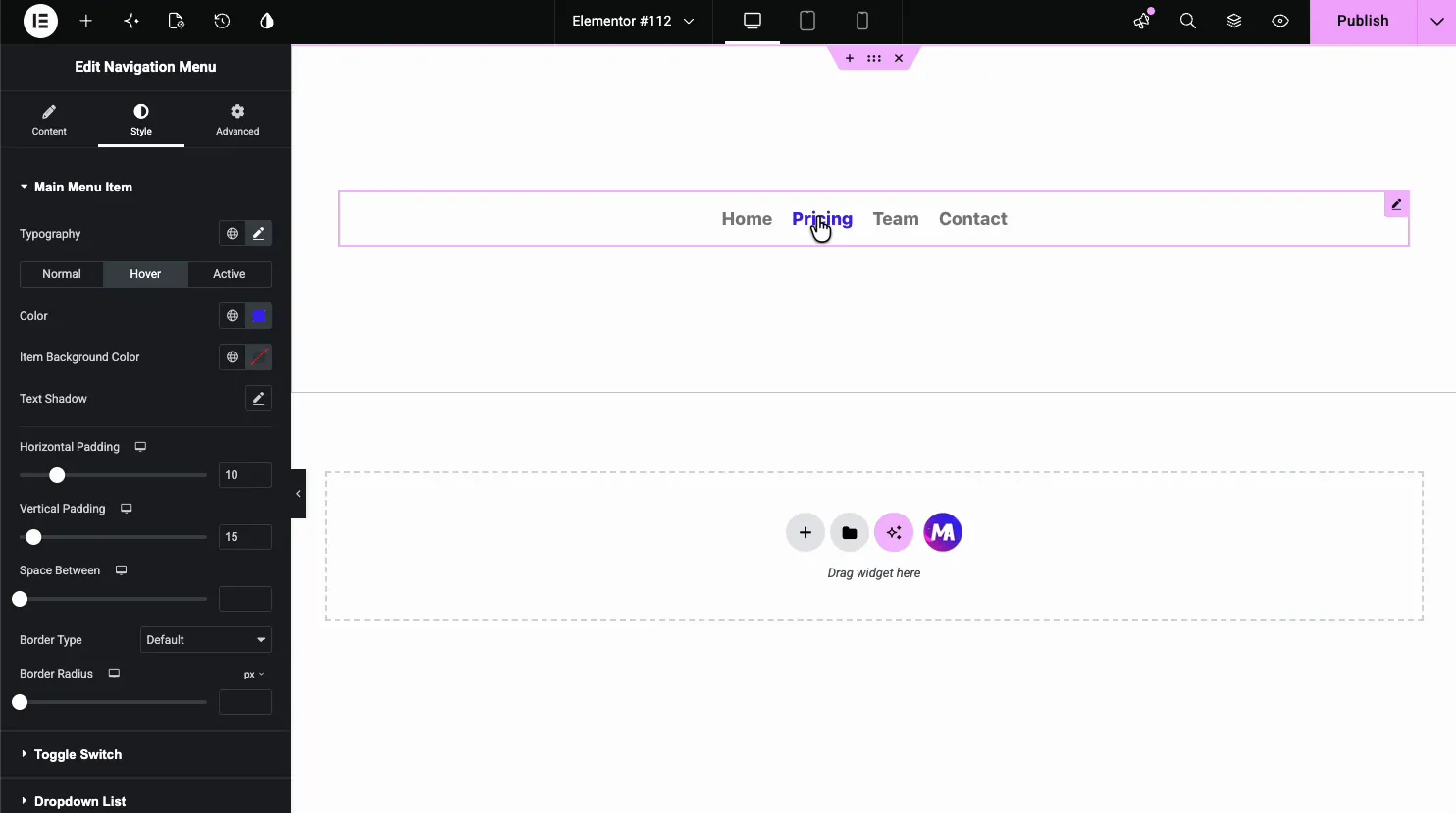
Below it, Normal, Hover, and Active tabs each carry Color, Item Background Color, and Text Shadow, plus shared Horizontal and Vertical Padding, Space Between, and border controls. The demo sets a blue hover color, previewing live as the cursor crosses Pricing:
Style the toggle, dropdown list, and items #
Three more Style sections finish the job:
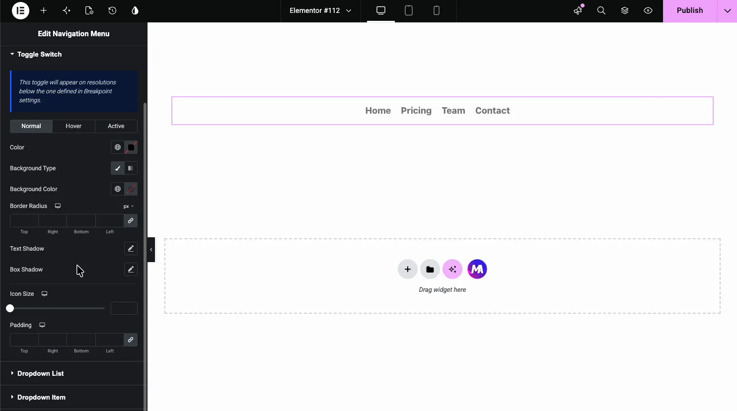
Hamburger styles the toggle: color, background, border radius, shadows, icon size, and padding, with Normal, Hover, and Active states.
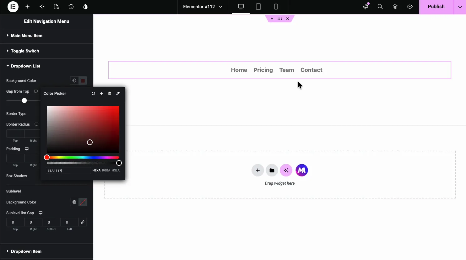
Dropdown Menu styles the submenu panel: background color, gap from the top, border and padding. Dropdown Submenu covers deeper menus.
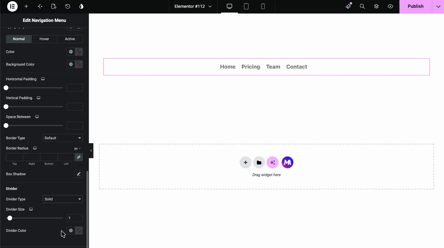
Dropdown Menu Item styles the links inside the panel, with the same three states plus a Divider group for the line between items:
The result on the page #
On the live page, the menu renders in your styling: hover states firing, and the FAQ submenu dropping under Contact exactly where the dropdown settings put it.

Common use cases #
- Custom headers built with Elementor, where the theme menu can’t follow the design.
- Landing pages with their own slim menu, separate from the site-wide one.
- Sidebar navigation using the Vertical layout on documentation or category pages.
- Mobile-first menus leaning on the toggle’s icon, view, and shape options.
- Multi-level menus with styled dropdowns and sublevel panels.
Tips for a better navigation menu #
- Build the menu in WordPress first. The widget renders menus from Appearance, Menus; it doesn’t create them. Structure there, style here.
- Give Hover and Active different colors. Hover answers the cursor; Active tells visitors which page they’re on. Same color wastes the signal.
- Check each device on a real phone. A four-item menu may fit tablets fine, while a seven-item one may need a vertical layout on tablets too.
- Style the dropdown background explicitly. A transparent submenu over page content is the most common menu complaint we see; a solid Dropdown Menu background fixes it in one click.
Video Tutorial #
If you’d like to see the Navigation Menu widget in action, this video walks through the full setup, from picking the menu to the styled dropdown on the live page:
Frequently Asked Questions #
What is the Navigation Menu widget in Master Addons?
It is an Elementor widget that renders any WordPress menu with full styling control. It offers horizontal and vertical layouts set per device, styled submenus with custom indicators, and a configurable hamburger toggle that phones use by default.
Where do I add or remove menu items?
In WordPress, under Appearance, Menus. The widget’s Select Menu dropdown lists every menu you’ve built there and renders the one you pick. Items, order, and submenus are managed in WordPress; the widget handles layout and styling.
How do I make a dropdown submenu?
Nest items in your WordPress menu by dragging them under a parent on the Menus screen. The widget shows a dropdown indicator beside parents automatically, and the Dropdown Menu and Dropdown List sections control the panel’s behavior and styling.
When does the mobile hamburger menu appear?
On phones by default. Master Addons Pro lets you choose the Hamburger layout for any device, with Popup and Offcanvas types. The Hamburger Menu section styles the toggle, including icon or text type, stacked or framed views, square or circle shape, and separate normal and active icons.
Can the menu be vertical instead of horizontal?
Yes. The Layout control offers Horizontal, Vertical and Hamburger (Pro). Vertical suits sidebars and documentation pages, and the Type control adds Toggle, Accordion, or Side behaviors on top.
Wrapping up #
The Navigation Menu widget puts the site menu where the rest of your design lives: pick a WordPress menu, choose the layout, style the items, dropdowns, and mobile toggle, and publish. It pairs naturally with the Off-Canvas Content widget (Pro) for slide-out mobile navigation. Browse the full set of Master Addons widgets and extensions, and see the Nav Menu widget page for a comparison with Elementor Pro’s menu widgets.


