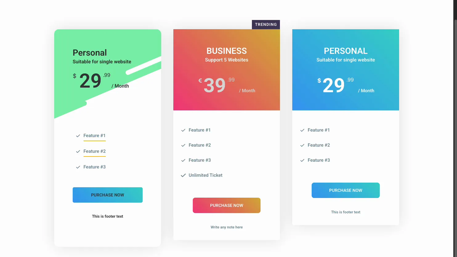
Pricing is where visitors decide, so the table has to be easy to scan and easy to compare. The Pricing Table widget in Master Addons for Elementor builds a single plan with a header, a price, a feature list, and a call to action button, and you set a few side by side to make a full pricing section.
You name the plan, set the price and period, list the features, then add a ribbon to mark the popular one and style the colors. No hand-coded tables. This guide covers every setting in the widget.
What the Pricing Table widget does #
The widget builds one plan at a time. Each has a header with a title, subtitle, and price, a list of features with checkmark icons, a button, and an optional footer note. Drop three into a row and you have a classic pricing comparison.
Three tabs run it. Content holds the layout, the header text, the price, the features, and the ribbon. Style handles the header background, the feature and price colors, and the button. Advanced is the usual Elementor spacing and visibility.
Before you start #
- WordPress with Elementor installed and active.
- Master Addons for Elementor installed and active. New to the plugin? See the installation guide.
- Your plan names, prices, feature lists, and where each button should link.
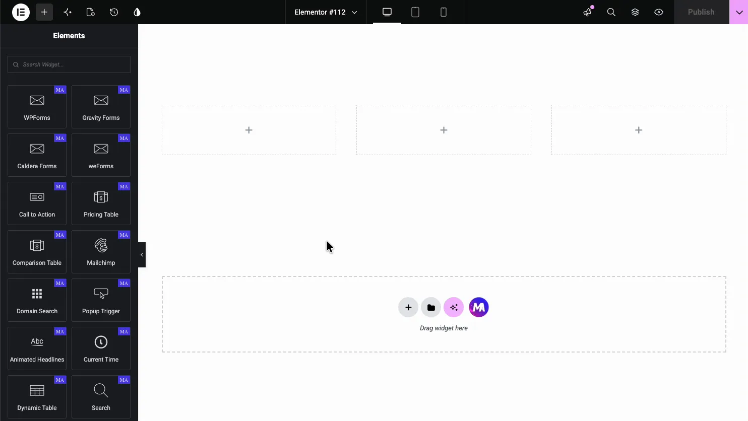
How to add the Pricing Table widget #
In the Elementor editor, open the Elements panel and search for Pricing Table, or scroll to the Master Addons section (the widgets carry a purple MA badge). Drag it onto the page and it loads with a sample plan you can edit.
Set the layout #
Open the Content tab. The Pricing Contents section sets the overall layout plus two quick toggles, and under it sit the Header, Pricing, Features, Footer, and Ribbon sections.
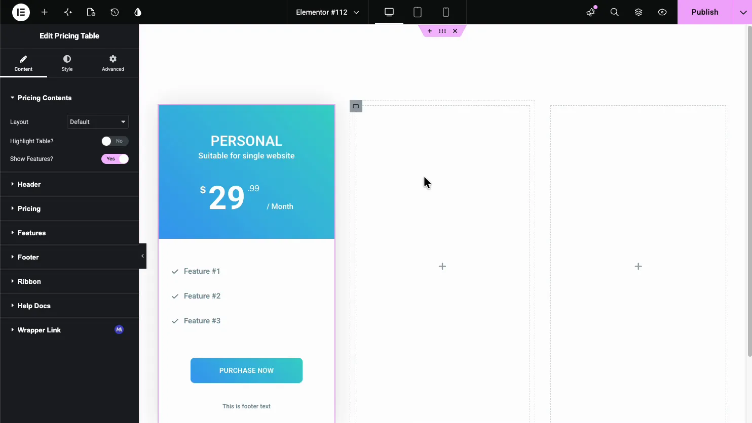
- Layout: the arrangement of the header, price, and features.
- Highlight Table?: raise this plan so it stands out from the others.
- Show Features?: show or hide the feature list.
Edit the header #
Open the Header section for the plan name and the tagline. This is also where you pick the header background, which is what gives each plan its color.
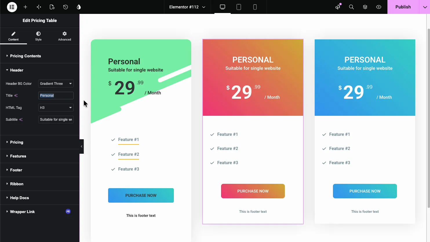
- Header BG Color: a solid color or a gradient preset for the header band.
- Title and HTML Tag: the plan name and its heading level.
- Subtitle: a short line under the title, like Suitable for single website.
Set the price #
Open the Pricing section for the number and how it reads. You set the currency, the amount, the billing period, and an optional sale price.
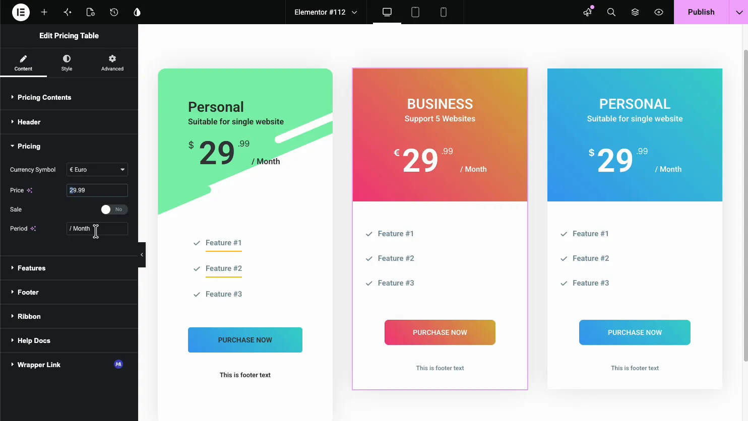
- Currency Symbol: the symbol shown before the price, like $ or € Euro.
- Price and Sale: the amount, with a Sale toggle to show a struck-through original.
- Period: the billing cycle text, like / Month or / Year.
Add the features #
Open the Features section. It is a repeater, so each list item is its own entry with a label and an icon.

- Text: the feature label, like Feature #1 or Unlimited Tickets.
- Icon: the checkmark or cross shown next to each feature.
- Tooltip: an optional hover note to explain a feature.
- Add Item: add as many features as the plan needs.
Add a ribbon #
Open the Ribbon section to add a corner badge like Trending or Popular. It is the fastest way to point people at the plan you want them to pick.
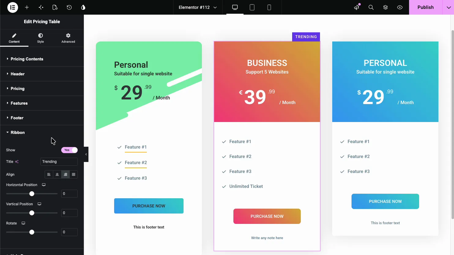
- Show and Title: turn the ribbon on and set its text.
- Align and Position: place the ribbon in a corner and nudge it.
- Rotate: angle the ribbon across the corner.
Style the table #
Open the Style tab to control colors and spacing. There are sections for the header, price, features, and the button, each with its own color and typography.
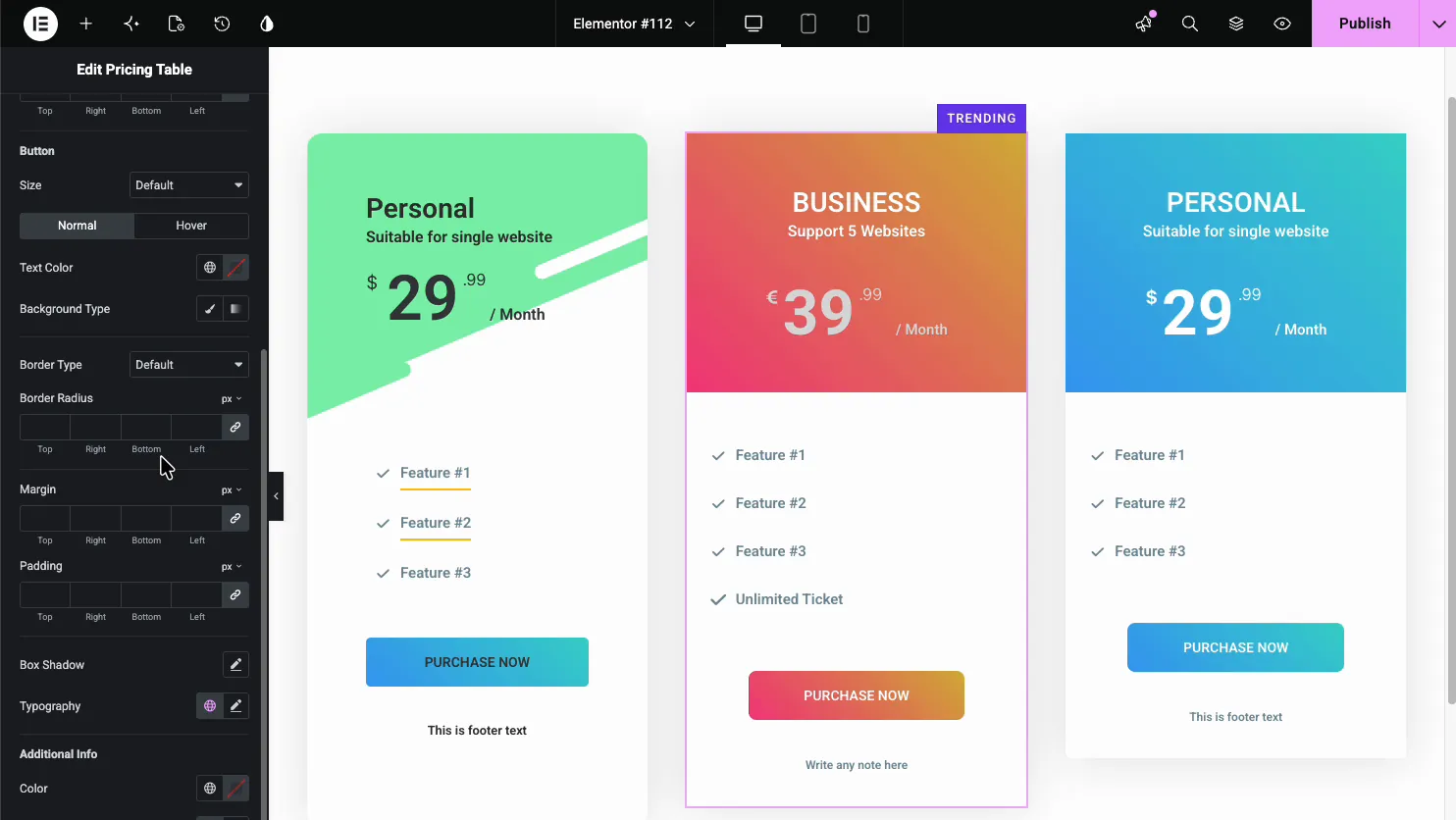
The Button section sets the call to action size, colors, border, and Normal and Hover states, so the button matches your brand and stands out from the feature list.
Common use cases #
- SaaS and app plans with three tiers and a highlighted favorite.
- Membership sites comparing monthly and yearly pricing.
- Agencies and freelancers showing packaged service tiers.
- Hosting and tools listing features per plan with checkmarks.
- Courses and events offering basic and premium tickets.
Tips for working with the Pricing Table widget #
- Highlight one plan. Use the Highlight Table toggle and a ribbon on the plan you want most people to buy. Highlight all three and none of them stands out.
- Keep feature lists even. Similar row counts across plans make them easy to compare at a glance.
- Match the button to the action. Purchase Now, Start Free, and Get Started all read differently, so pick the one that fits the offer.
- Use gradients sparingly. One accent color per plan reads cleaner than three loud gradients fighting each other.
- Set clear periods. Always show / Month or / Year so the price is never ambiguous.
Frequently Asked Questions #
What is the Pricing Table widget in Master Addons?
It is an Elementor widget that builds one pricing plan with a header, a price and period, a feature list, and a button. You place a few side by side to make a full pricing section, and everything is set from the Elementor panel with no code.
How do I mark a plan as the most popular?
Turn on the Highlight Table toggle in the Pricing Contents section to raise the plan, and add a ribbon in the Ribbon section with text like Trending or Popular. Together they draw the eye to the plan you want visitors to choose.
Can I add a sale or discounted price?
Yes. The Pricing section has a Sale toggle. Turn it on and the widget shows the original price struck through next to the sale price, so visitors can see the discount. You set the currency symbol and billing period in the same section.
Can I show more or fewer features per plan?
Yes. The Features section is a repeater. Use Add Item to add rows and the X to remove them, so each plan can list exactly its own features. You can also hide the feature list entirely with the Show Features toggle.
Can I add tooltips to pricing features?
Yes. Each feature in the repeater has a Tooltip tab, so you can attach a short hover note that explains what the feature means. It is handy for technical features where the label alone is not clear enough.
Wrapping up #
The Pricing Table widget turns your plans into a clean comparison: set the header and price, list the features, add a ribbon on the popular plan, then style the colors and button. For related widgets, see the Call to Action widget and the Info Box widget, browse the full Master Addons widgets and extensions, and check the pricing page for what each plan includes.


