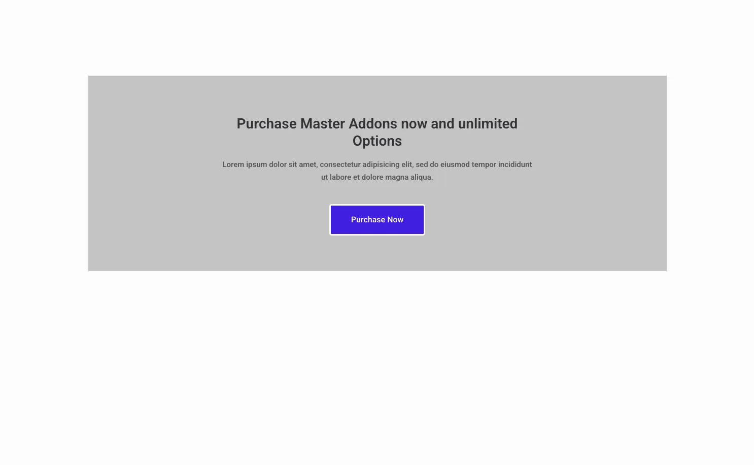
Every landing page needs a spot that tells visitors what to do next. The Call to Action widget in Master Addons for Elementor builds that block: a headline, a short line of supporting text, and a button, wrapped in a styled box you can drop anywhere on the page.
You type the message, set the button link, pick a layout preset, then color the background, title, and button to match your brand. This guide walks through every setting in the widget.
What the Call to Action widget does #
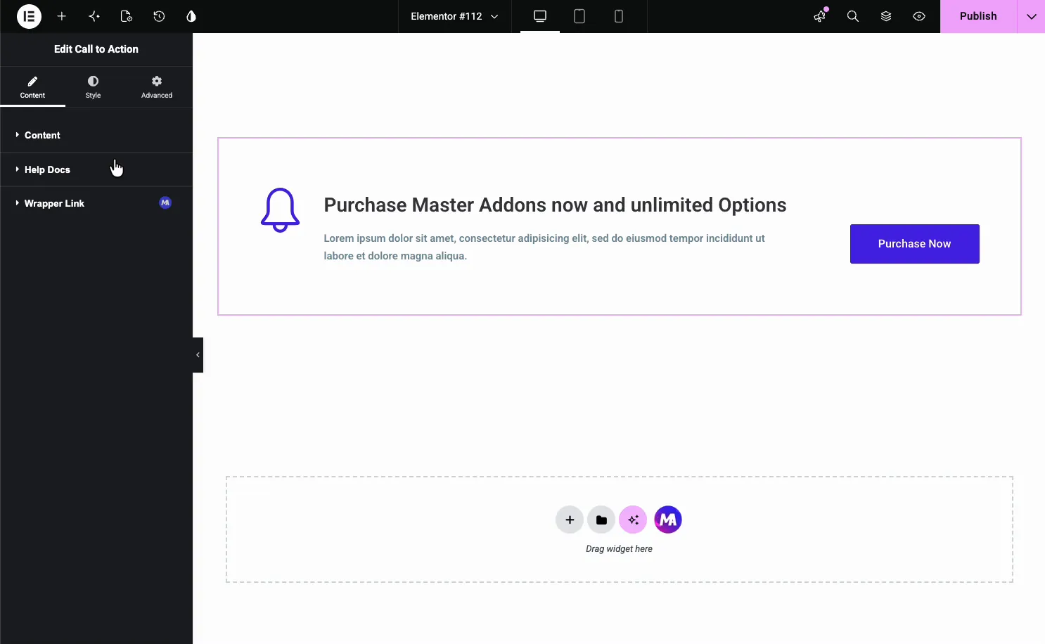
The widget renders a self-contained CTA box with an optional icon, a title, a description, and a button. A Style Preset dropdown changes the layout, from an icon on the left to a fully centered block, and the Style tab colors every part.
It has three tabs. Content holds the text, the button label, the link, and the preset. Style controls the background, title, description, and button look. Advanced carries the usual Elementor spacing and visibility options.
Before you start #
- WordPress with Elementor installed and active.
- Master Addons for Elementor installed and active. New to the plugin? See the installation guide.
- Your CTA copy and the destination URL for the button.
How to add the Call to Action widget #
In the Elementor editor, open the Elements panel and search for Call to Action, or scroll to the Master Addons section (the widgets carry a purple MA badge). Drag it onto your page and it loads with a sample CTA ready to edit.
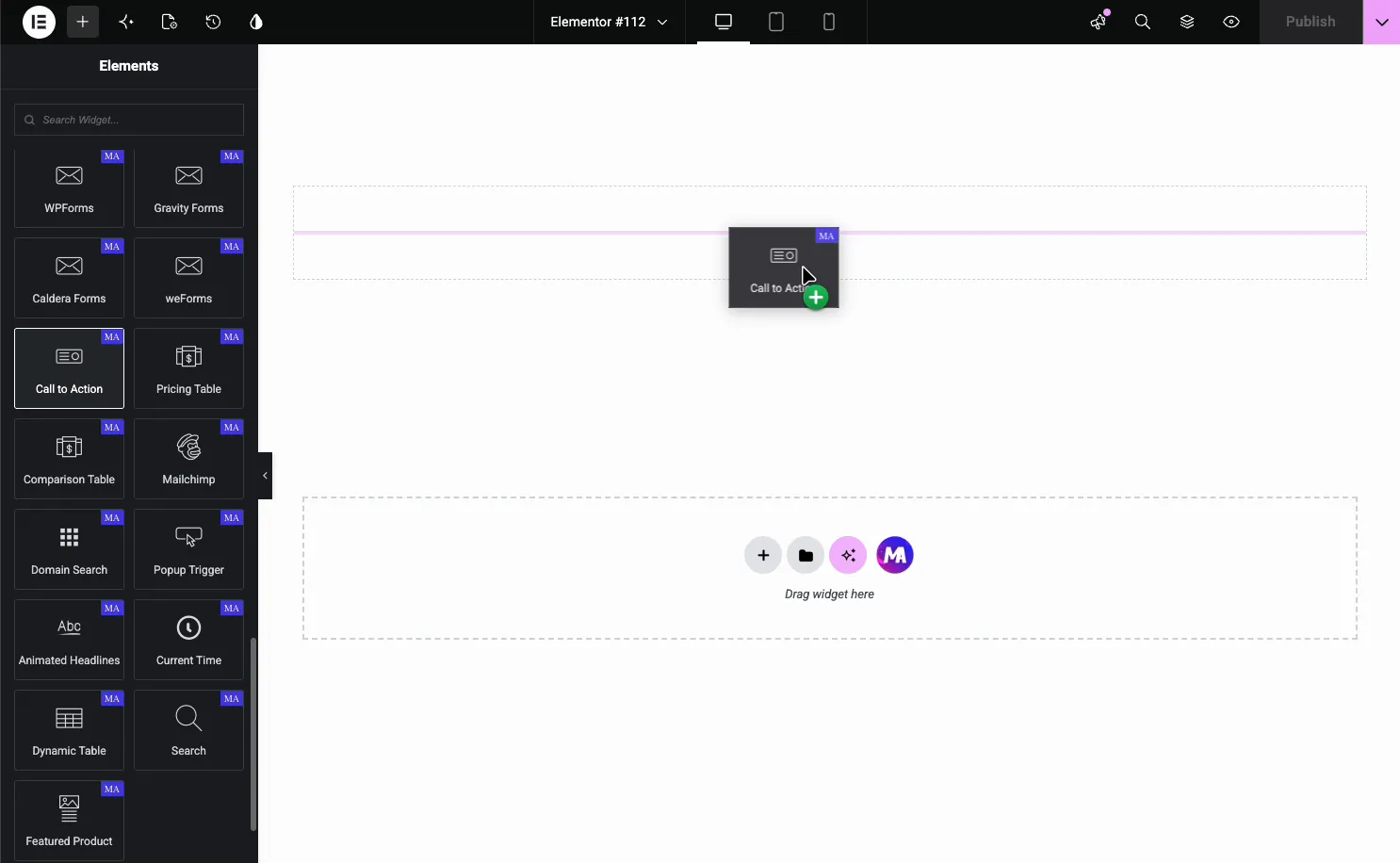
It starts with an icon, a title, a description, and a Purchase Now button, so you edit from a working block instead of a blank one.
Set the content and pick a preset #
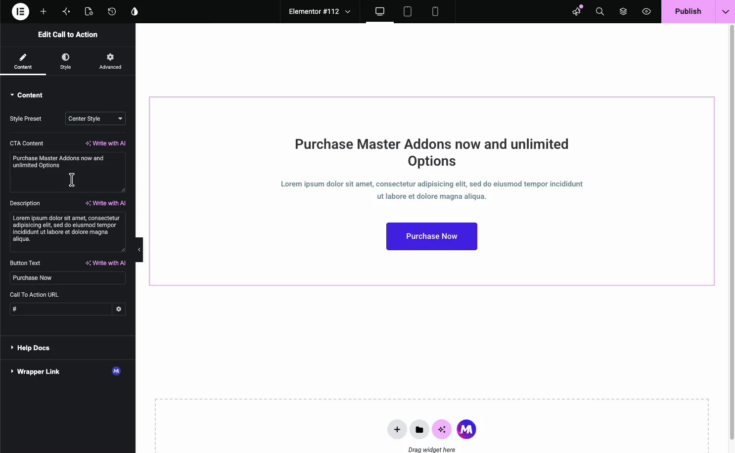
Open the Content tab. The Style Preset dropdown sits at the top, followed by the text fields.
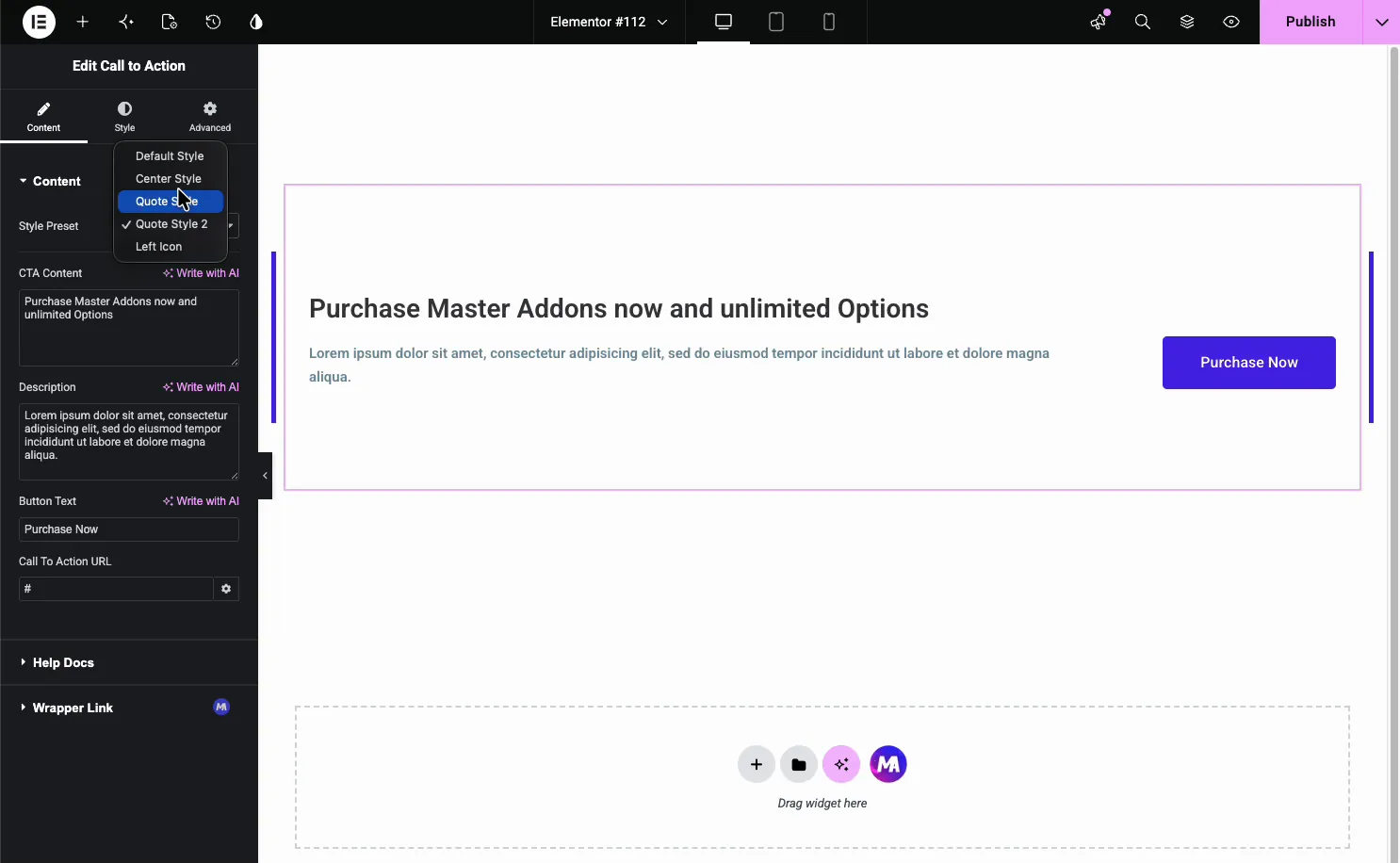
- Style Preset: Default Style, Center Style, Quote Style, Quote Style 2, and Left Icon.
- CTA Content: the headline, with a Write with AI option.
- Description: the supporting line under the title.
- Button Text: the button label, like Purchase Now or Get Started.
- Call To Action URL: where the button (and the box, if you link it) points.
Layout presets #
The preset changes how the block is arranged without touching your text. Center Style stacks the title, description, and button in the middle, a good fit for a full-width section.
The other presets shift the layout: Left Icon keeps the icon beside the text, and the Quote styles add an accent for testimonial-style blocks. Try a couple, since the same copy reads differently once the layout changes.
Style the block #
The Style tab breaks the widget into parts you can style on their own: Presets Style, Title Style, Description Style, Button Style, and Patterns (a Pro option).
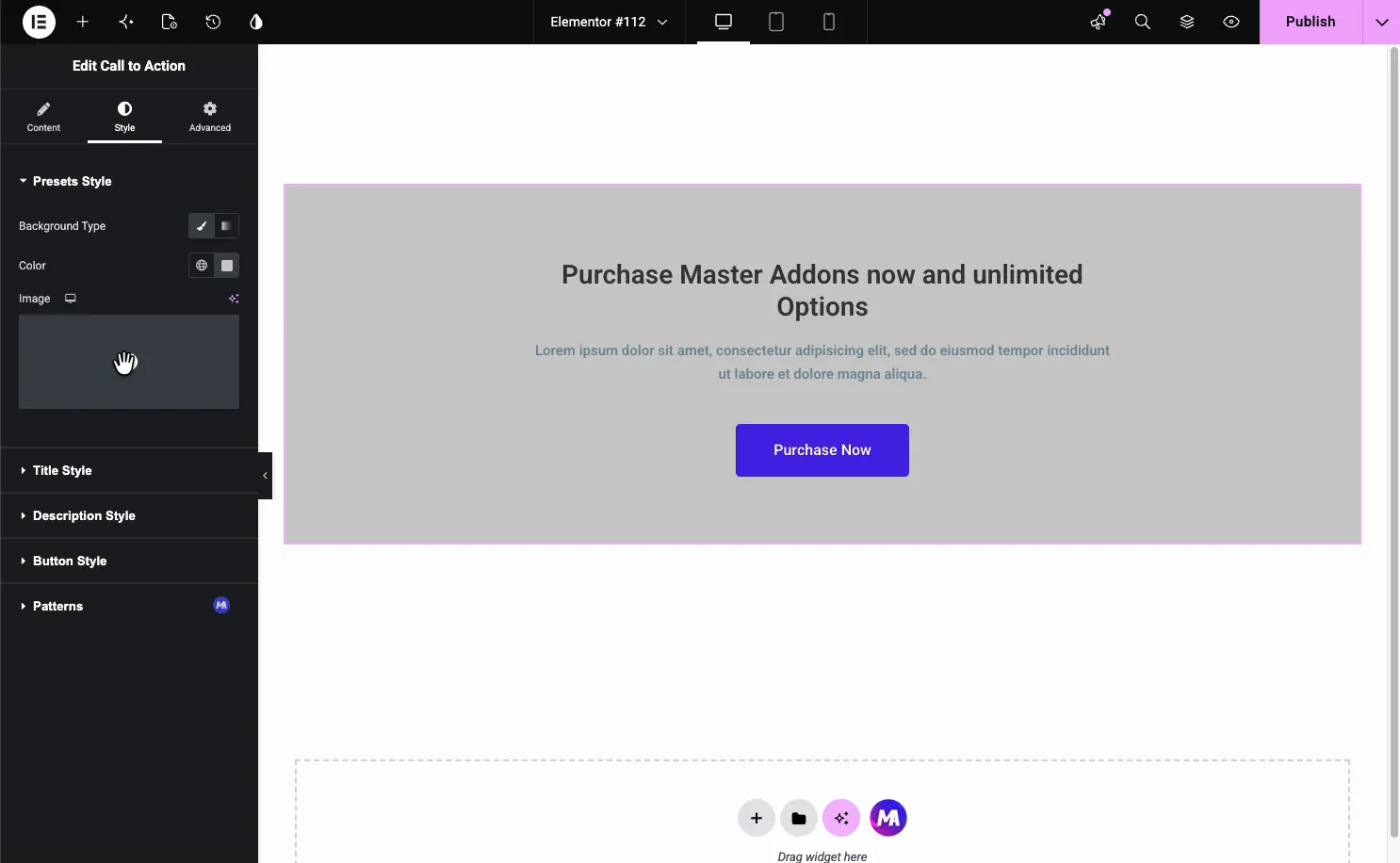
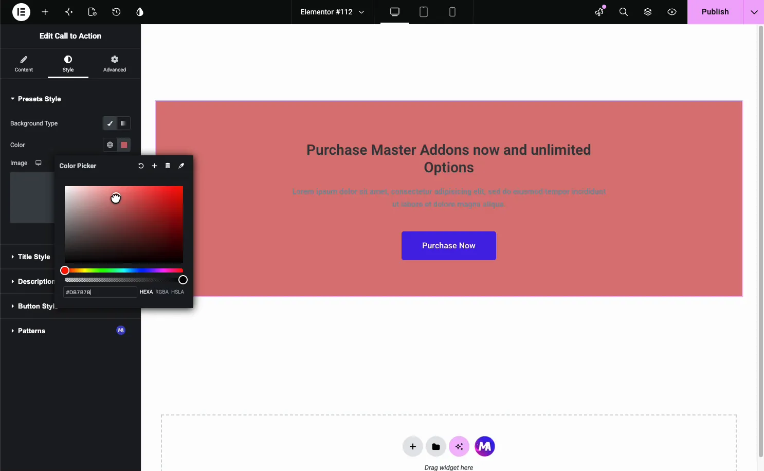
The Presets Style section sets the box background. Switch Background Type between a solid color and an image, then pick the color.
Style the button #
Open Button Style for the call to action button. It has Normal and Hover tabs, so you set a resting look and a hover look.
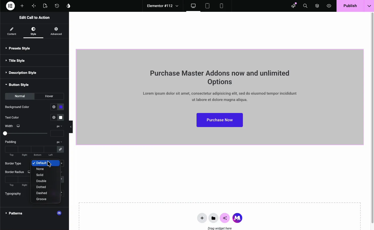
- Background Color and Text Color: the button fill and label color, per state.
- Width and Padding: the button size.
- Border Type and Border Radius: an outline and rounded corners.
- Typography: the button font.
Common use cases #
- Landing page CTAs pushing a signup, demo, or purchase.
- End-of-post prompts linking to a product or pricing page.
- Section banners announcing an offer or launch.
- Sidebar or footer callouts with a single clear action.
- Quote-style blocks pairing a testimonial with a button.
Tips for working with the Call to Action widget #
- Lead with the benefit. The title should say what the visitor gets, not just what to click.
- Keep the description short. One or two lines is plenty above a button.
- Use one button. A single clear action converts better than two competing ones.
- Contrast the button. Make it stand out from the box background.
- Set a hover state. A color shift on hover tells visitors the button is clickable.
Watch the video tutorial #
Prefer to follow along on screen? The video tutorial below walks through the Call to Action element from start to finish, showing how each preset, background, and button option works in the Elementor editor.
Frequently Asked Questions #
What is the Call to Action widget in Master Addons?
It is an Elementor widget that builds a CTA block with a title, description, and button inside a styled box. You choose a layout preset, set the button link, and color every part from the Elementor panel, with no custom code.
What layout presets does the Call to Action widget include?
Five: Default Style, Center Style, Quote Style, Quote Style 2, and Left Icon. Each rearranges the block, like centering everything or keeping the icon beside the text, without changing your title, description, or button.
Can I add a background image to the CTA block?
Yes. In the Style tab, open Presets Style and set Background Type to image instead of a solid color, then choose your image. You can also stick with a solid background color and style the title, description, and button separately.
Can I make the whole box clickable?
The button uses the Call To Action URL from the Content tab. The widget also has a Wrapper Link option, so you can link the entire box to a destination instead of only the button, which suits banner-style CTAs.
Can I style the button hover state?
Yes. Open Button Style in the Style tab and switch to the Hover tab. You can set a different background color, text color, and border for hover, so the button reacts when a visitor moves over it.
Wrapping up #
The Call to Action widget turns a headline, a line of text, and a button into a styled block that drives clicks. Write the message, pick a preset like Center Style, set the link, then color the background and button to match your page. For related conversion widgets, see the Pricing Table widget and the Info Box widget, browse the full Master Addons widgets and extensions, and check the pricing page for what each plan includes.


