

Ever pulled up your Elementor landing page on a phone and watched the headline chop in half, buttons stack weird, or an image push text clean off the screen? It happens to everyone who builds in Elementor long enough. The plugin ships with sensible responsive defaults, but real designs on real devices still break.
Global traffic data from 2025 puts mobile at around 63 to 64 percent of sessions and laptops at 36 to 37 percent. When a layout falls apart on small screens, you’re losing two out of every three visitors before they’ve read a word.
Here’s what I’ll cover: fixing the most common responsive bugs in three clicks, turning on Elementor’s additional custom breakpoints, and setting up layouts that hold together on every device. If six native breakpoints aren’t enough, the free Custom Breakpoints plugin from Master Addons adds more inside the same editor: 3 custom breakpoints free, unlimited with Master Addons Pro.
What Are Elementor Breakpoints?
Elementor breakpoints are the screen-width thresholds where your layout switches styling for different devices. By default Elementor uses three — Desktop, Tablet, and Mobile — and its Additional Custom Breakpoints feature lets you add up to six so you can fine-tune spacing, font sizes, and visibility per device. Because every control in Elementor is set per breakpoint, almost any responsive design issue can be fixed without writing CSS.
Why Responsive Design Matters More Than Ever
Responsive design matters because most of your visitors are on mobile and Google ranks the mobile version of your page first — a layout that breaks on small screens costs you both rankings and conversions.
Responsive design isn’t a polish task you bolt on at the end of a project. It’s the baseline Google uses to rank pages, the first thing a new visitor notices, and often the difference between a conversion and a bounce.
A few things worth getting comfortable with:
- Mobile traffic dominates. Most visitors see your mobile layout before the desktop one, if they ever see desktop at all.
- Device sizes keep multiplying. Foldables, tablets, giant phones, tiny phones, and ultrawide monitors all show up in analytics now.
- Browser preview lies. DevTools at 375px width doesn’t match what a real iPhone or Pixel renders. Font rendering, scroll behavior, and touch targets all differ.
- It’s a ranking signal. A cramped mobile layout hurts Core Web Vitals, and Core Web Vitals hurt rankings.
My rule of thumb: load the live site on a real phone and a real tablet at least once a month. Preview tools catch the obvious stuff. Real hardware catches everything else.
Common Responsive Design Issues in Elementor
The most common Elementor responsive issues are oversized heading text, images overflowing their containers, columns that won’t stack cleanly, and desktop padding that swallows the mobile screen — nearly all of them caused by previewing only on desktop.
Most responsive bugs in Elementor come from the same handful of sources:
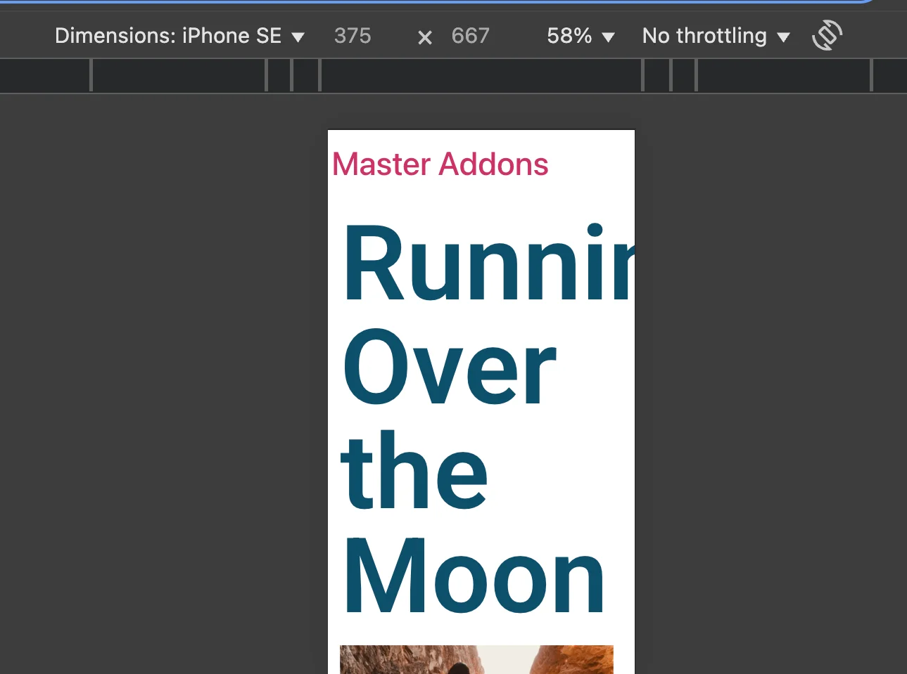
- Heading text spills past the screen edge because the desktop font size is way too big for a 375px viewport.
- Images crop weirdly or blow past their containers.
- Columns stack into a mess instead of a clean single column.
- Buttons hug the edge or wrap to two lines when they shouldn’t.
- Desktop-sized padding eats half the mobile screen before content even loads.
Why does any of this happen? Usually it’s the workflow. Designers build on a 1920px canvas, preview the finished page on that same canvas, and hit publish assuming Elementor will gracefully adjust. It rarely does.

Fix is almost never technical. Usually less than thirty seconds per element once you know where to click.
How to Fix Elementor Responsive Issues in 3 Clicks
About 80 percent of the responsive issues I see can be fixed inside the editor, one element at a time, without touching a line of CSS. The flow I use on every project:
- Open the problem page in the Elementor editor.
- Click the element that looks broken on mobile (heading, button, image, column, whatever).
- Switch the device preview using the device icon at the bottom of the editor panel, then adjust the property for that specific breakpoint.
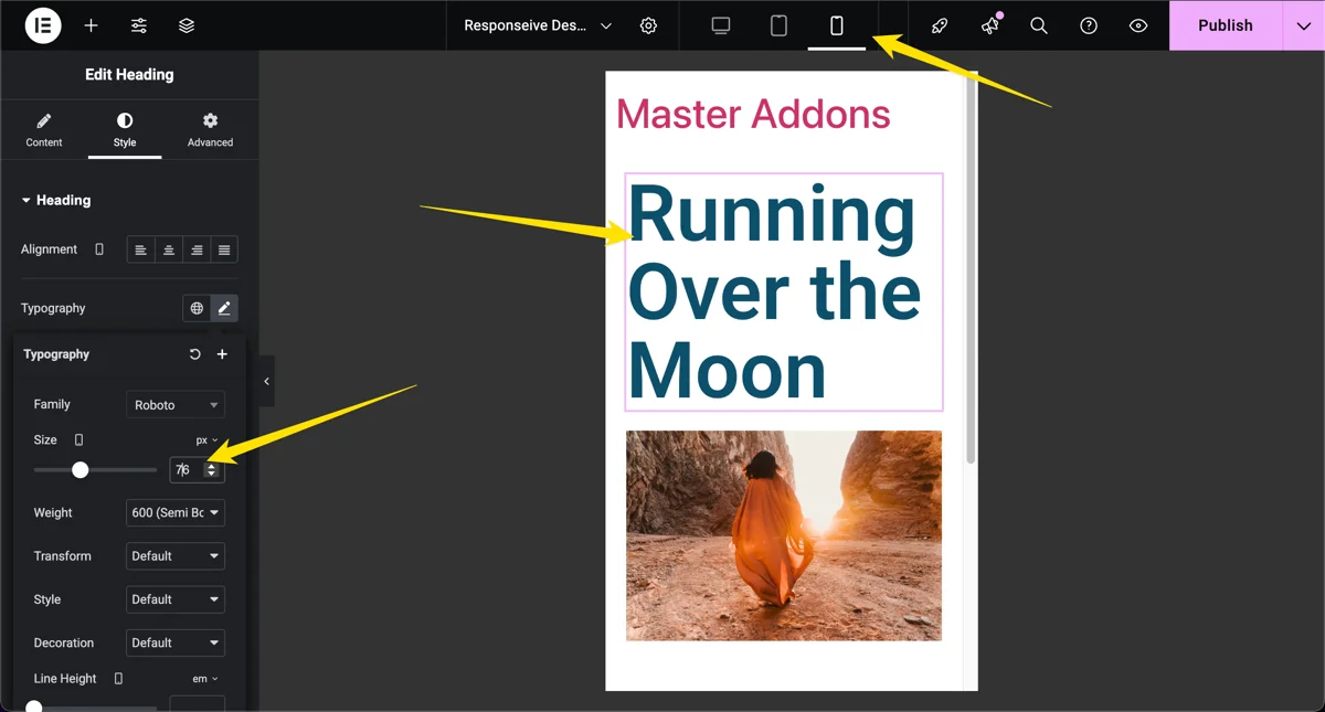
One thing that trips people up: any value you set while a device preview is active only applies to that device and smaller. Elementor uses a cascading model. Change the font size while Mobile is selected and only Mobile inherits the new value. Desktop stays untouched. If you accidentally set the font size with Desktop selected, every device inherits it, and you’ll spend ten minutes wondering why your fix didn’t take.
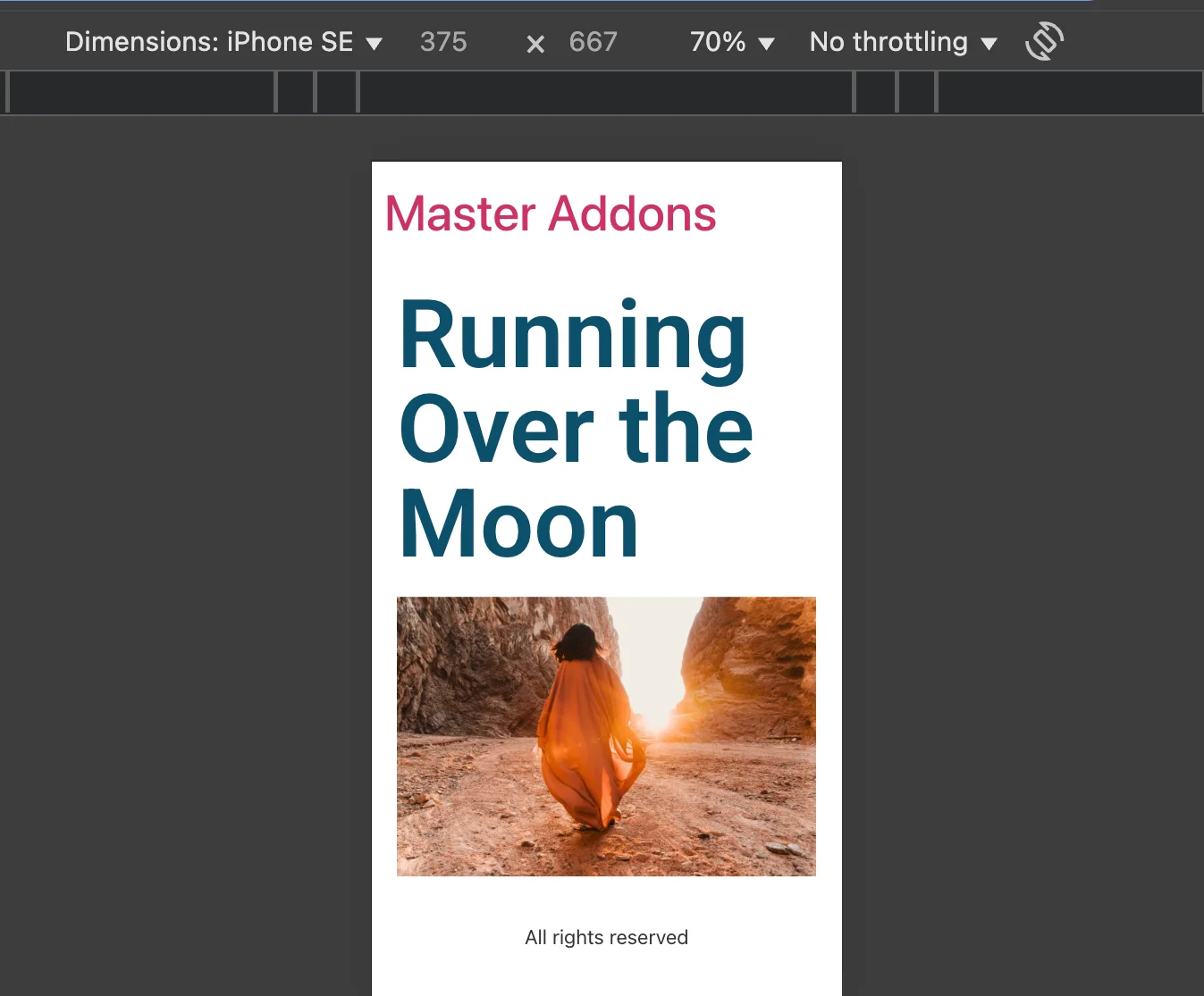
Use the same workflow for padding, margins, font sizes, column widths, image sizes, and visibility. Almost every style control in Elementor is per-device.
If you’re dealing with structural problems like a sticky header that behaves differently on tablet, the same logic applies inside theme templates. Walk through how to create a sticky header in Elementor for a full example.
Enable Additional Custom Breakpoints in Elementor
Elementor’s default breakpoints are Desktop (above 1024px), Tablet (768px to 1024px), and Mobile (below 768px). For most sites, those three are fine. For anything more ambitious like large tablets, small laptops, ultrawide monitors, or foldable phones, you’ll want Elementor’s Additional Custom Breakpoints.
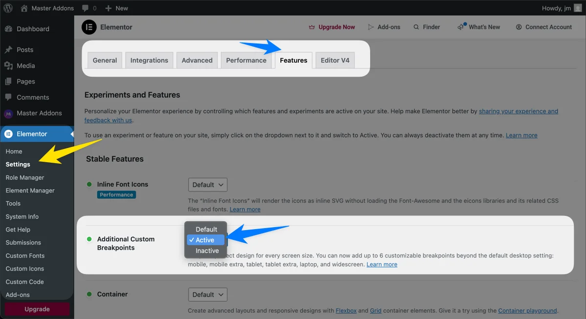
It’s off by default. You have to turn it on. Once active, Elementor lets you add up to six custom breakpoints: Mobile, Mobile Extra, Tablet, Tablet Extra, Laptop, and Widescreen.
Step 1: Turn on the Additional Custom Breakpoints Experiment
From your WordPress dashboard, go to Elementor > Settings > Features. Scroll until you find Additional Custom Breakpoints. Flip the dropdown to Active and save.
Step 2: Open Site Settings from the Elementor Editor
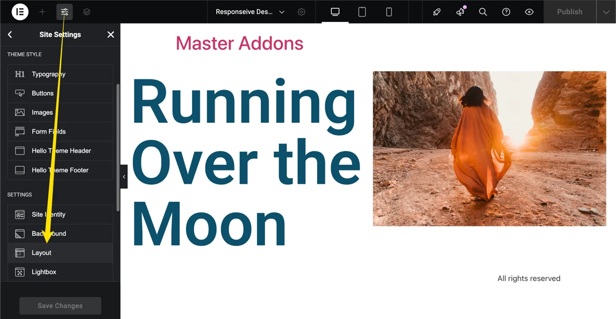
Open any page or post in the Elementor editor. Click the hamburger icon at the top of the left panel and pick Site Settings. From there, click Layout.
Step 3: Define Your Custom Breakpoint Widths
Scroll down to the Breakpoints panel. Click Add Breakpoint and pick the device category you want (Mobile Extra, Tablet Extra, Laptop, or Widescreen). For each one, enter the width in pixels that should trigger it.
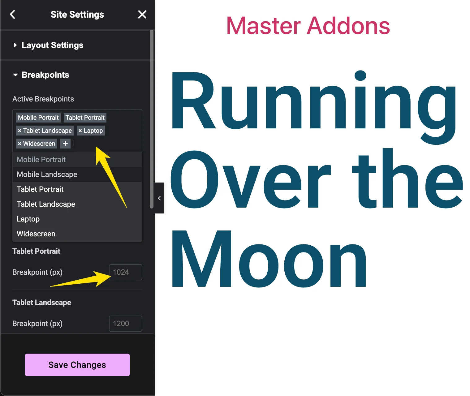
A decent starter set for 2026:
| Breakpoint | Width Range | Typical Devices |
|---|---|---|
| Mobile Extra | Below 360px | Small phones, older iPhones |
| Mobile | 360 to 767px | Standard phones |
| Tablet | 768 to 1024px | iPad, tablets in portrait |
| Tablet Extra | 1025 to 1199px | Tablets in landscape, small laptops |
| Laptop | 1200 to 1439px | 13-14 inch laptops |
| Widescreen | 1440px and up | Large monitors, ultrawides |
Save the settings. Elementor will prompt you to reload the editor. Save your page content first. I’ve lost in-progress edits more than once by reloading before saving, and it’s always annoying.
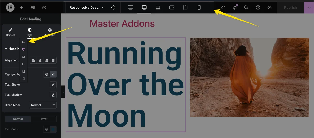
From here on, clicking any device icon lets you style for that specific range. No more squeezing a design into three cookie-cutter sizes.
Quick tip: Elementor’s breakpoints cascade from large to small. Values you set at a larger breakpoint flow down to smaller ones unless you override them. Design from widescreen down to mobile and you’ll end up writing fewer rules overall.
5 Best Practices for Responsive Design With Elementor
Breakpoints are a tool. They don’t replace a design strategy. These five habits save me hours of fiddling on every project.
1. Build the Content First, Then Go Responsive
Add all your text, images, and base styles (fonts, sizes, margins, padding) on desktop first. Only once the page is structurally finished should you start tweaking for smaller screens. Trying to build and go responsive at the same time usually leaves you with dozens of tiny overrides you’ll forget exist six months later when something looks off.
2. Use REM for Font Sizes, Not PX
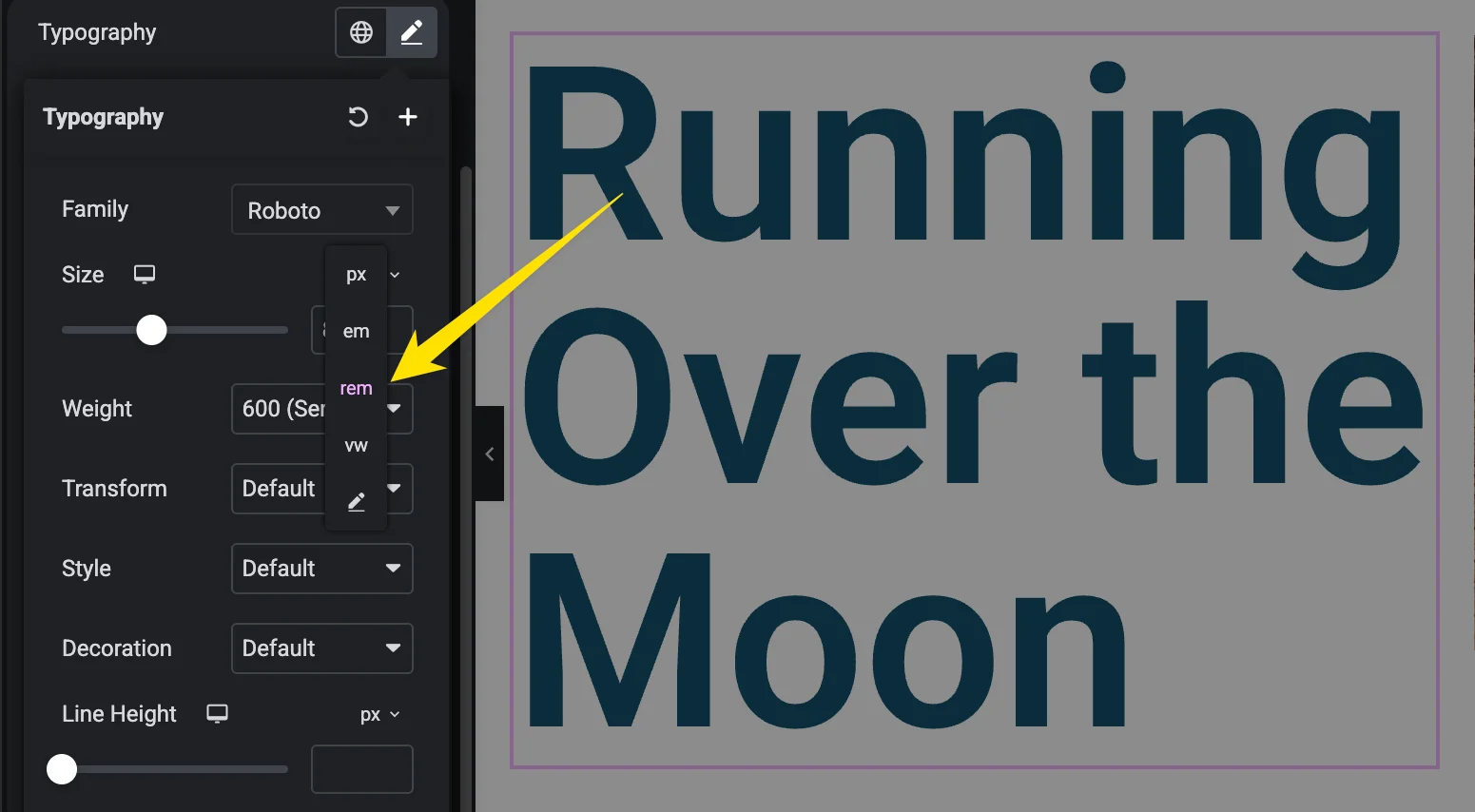
Pixels are rigid. When a visitor bumps up their browser’s default font size for accessibility, pixel-based text ignores them. REM units scale with the root font size, so they respect user settings and give you cleaner proportional scaling across breakpoints.
3. Hide Complex Sections on Smaller Screens
If you’ve built a fancy container with transforms, parallax, and absolute positioning, odds are it looks great on desktop and terrible on mobile. Rather than fighting with it for an hour, hide that container on tablet and mobile and build a simpler alternative for smaller screens.
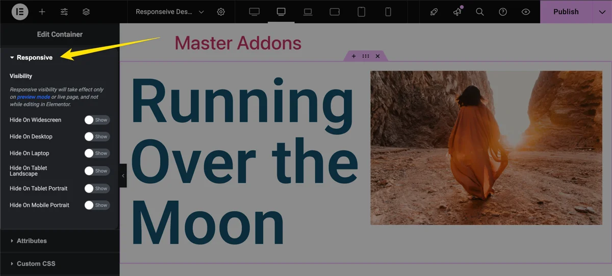
The controls live in the Advanced tab of any container, section, or widget. Hide on Desktop, Hide on Tablet, and Hide on Mobile combined with duplicate containers give you two tailored experiences without writing CSS.
4. Keep Custom CSS Minimal
Every line of custom CSS is a line that can conflict with Elementor’s inline styles, slow down rendering, or break after an Elementor update. Use the built-in controls first. When you do need CSS, keep it scoped, commented, and short. Free Master Addons users get the Custom CSS extension right inside the editor, which beats digging into the theme’s style.css.
If performance is already a problem, work through how to speed up Elementor websites before piling on more rules.
5. Test on Real Devices, Not Just Previews
Chrome DevTools is fine for a first pass. It’s not a final check. Real phones render typography, scrolling, and touch targets differently, and Safari on iOS in particular catches stuff simulators miss. Test on at least one phone and one tablet before going live.
When you don’t have every device on your desk (nobody does), BrowserStack and Responsive Test Tool cover the gaps.
Do You Need More Than 6 Custom Breakpoints?
Elementor caps you at six. For a standard business site or blog, six is plenty. For design-heavy agency work, online stores with custom product grids, or sites targeting weird viewports (automotive displays, kiosks, foldable phones), six starts to feel tight.
That’s the gap Custom Breakpoints for Elementor fills. It extends Elementor’s native system with:
- Custom breakpoints beyond Elementor’s six: 3 free, unlimited with Master Addons Pro.
- Full compatibility with Elementor’s existing breakpoints, no replacement needed.
- A free plugin from the Master Addons team that also works without Master Addons installed.
Agencies benefit the most because each client project can carry its own breakpoint configuration without fighting Elementor’s defaults. The Custom Breakpoints documentation has the full setup.
Frequently Asked Questions
What are the default Elementor breakpoints?
Elementor ships with three breakpoints: Desktop (1025px and above), Tablet (768px to 1024px), and Mobile (below 768px). These apply globally until you turn on Additional Custom Breakpoints from the Features panel.
How many custom breakpoints can I add in Elementor?
Elementor’s native Additional Custom Breakpoints feature supports up to six total: Mobile, Mobile Extra, Tablet, Tablet Extra, Laptop, and Widescreen. If you need more, the free Custom Breakpoints for Elementor plugin adds 3 custom breakpoints, or unlimited with Master Addons Pro.
Do Elementor breakpoints affect page speed?
Turning on Additional Custom Breakpoints actually improves front-end performance by up to 23 percent because Elementor stops duplicating controls at every device level. Keep custom CSS light and skip unnecessary hidden duplicate containers for the cleanest result.
Why does my Elementor mobile view look different from my real phone?
Browser previews approximate viewport width but ignore OS-level font scaling, touch-target rendering, Safari quirks, and browser chrome height. Always check critical pages on a real phone before publishing.
Can I change Elementor breakpoints after my site is live?
Yes, but carefully. Changing a breakpoint width shifts which styles apply on which devices, which can cause layout shifts on existing pages. Test on a staging site first and audit your most important templates (homepage, landing pages, checkout) before pushing changes live.
Final Thoughts
Responsive design in Elementor boils down to two habits. Fix issues element by element inside the editor. Give yourself breathing room with custom breakpoints when three defaults aren’t enough. Do both consistently, test on real hardware, and your visitors get the same clean experience on a $200 budget phone as they do on a $3000 ultrawide.
If you want to skip the default three without wrestling with custom CSS, Master Addons has the pieces ready: Theme Builder for headers and footers, Popup Builder for lead capture, Widget Builder for custom widgets without PHP, and the Custom Breakpoints plugin when six breakpoints run out.
Related reading:
- 100 Best Elementor Addons for 2026
- How to Speed Up Elementor Websites
- Best SEO Practices for Elementor
Join 30,000+ Web Creators Who Trust Master Addons
Every premium widget, Theme Builder, Popup Builder, and Custom Breakpoints control in one lightweight plugin. Build beyond limits without the bloat. See Master Addons Pricing.
Spot a responsive design trick I skipped? Drop it in the comments below or reach out through Contact.
