

A sticky header stays pinned to the top of the screen while the visitor scrolls. Your logo, menu, and call-to-action button stay reachable no matter how far down someone goes, which is why almost every SaaS and agency site ships one.
This guide shows how to create a sticky header in Elementor using the free Master Addons Theme Builder, so you won’t need Elementor Pro. And while I’m using Master Addons here, the method is universal: build the header as a template, then set its container position to Fixed. Any header builder that lets you edit the header in Elementor follows the same three clicks.
The 2020 version of this post told you to drop a CSS ID on a section and paste it into the Navigation Menu widget. That was the Sections era. Elementor has used Flexbox Containers as its default layout since 3.6, and the position control now sits right in the panel, so the whole CSS ID dance is gone.
What a sticky header actually is
Two different behaviors get called by the same name, and mixing them up is why people end up hunting for a setting that doesn’t exist.
A fixed header is on screen from the moment the page loads and never leaves. That’s what position: fixed does, and that’s what we’re building here.
A sticky-on-scroll header sits at the top normally, scrolls away, then slides back in when the visitor scrolls up. You’ll see it called smart scroll or hide-on-scroll. It needs a scroll effect, and Elementor keeps those in Pro.
For most sites the fixed header is the one you actually want, and it’s the one you can build for free.
The problem: your header scrolls away
Here’s the starting point. A normal Elementor header sits at the top of the page like any other container.

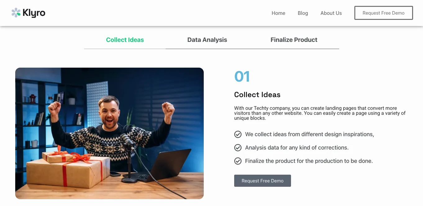
Scroll down a bit and it’s gone. Logo, menu, Request Free Demo button, all of it off the top of the screen. So a visitor who gets to your pricing section and wants to click Contact has to scroll back up to find the menu again.

That’s the whole problem a sticky header solves.
Before you start
You need free Elementor, version 3.6 or newer, so that Containers are switched on.
You also need a header template to apply the setting to. Elementor’s own Theme Builder is Pro-only, so grab a free one: Master Addons includes a free header builder, and its Theme Builder handles footers, 404s, archives, and single templates too.
Already have a header template from another plugin? Skip to Step 2. The position setting is native Elementor, so it behaves the same wherever your header came from.
Step 1: Open your header template in Elementor
Go to Master Addons > Theme Builder. Your templates are listed by type. Mine has a header and a footer, both Active, both set to display across the entire site.
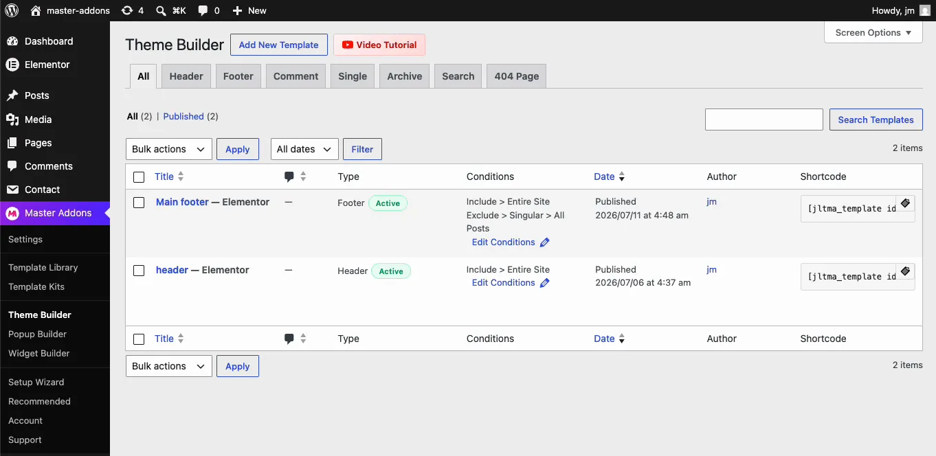
No header yet? Click Add New Template, set the type to Header, switch Activation on, and set the condition to Entire Site. The header builder docs cover it, and the flow is the same one I walked through in the guide to editing the footer in Elementor. To skip the design work, import one of these Elementor header templates and make it sticky.
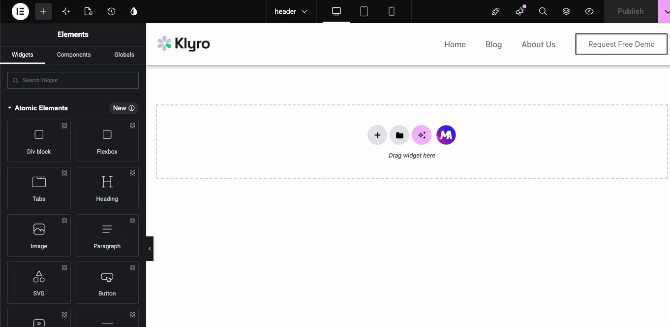
Hover the header template and hit Edit with Elementor. The header opens on its own canvas.
Step 2: Select the header container
People get this one wrong constantly, so be precise here: you want the outer container of the header. Not the logo, not the nav menu widget, and not a nested container tucked inside it.
The reliable way to be sure is the Structure panel, the layers icon in the top bar. Click the top-level Container in that tree and the whole header should highlight. If only the logo or the menu lights up, you’ve grabbed a child element, and setting position on it will pin that one widget to the screen instead of your header. It looks bizarre, and it’s the first thing to check if your result is weird.
Step 3: Set the container position to Fixed
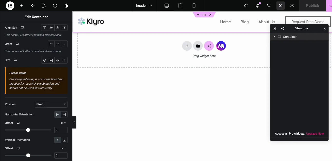
With the header container selected, open the Advanced tab and expand the Layout section. The Position dropdown has three options.
Default is what you have now: the header scrolls away with the page. Absolute pins the header to the page rather than the screen, so it still scrolls off, which is for overlay headers, not sticky ones. Fixed pins it to the viewport, and that’s the one you want.
Pick Fixed, and the panel expands with the orientation controls.
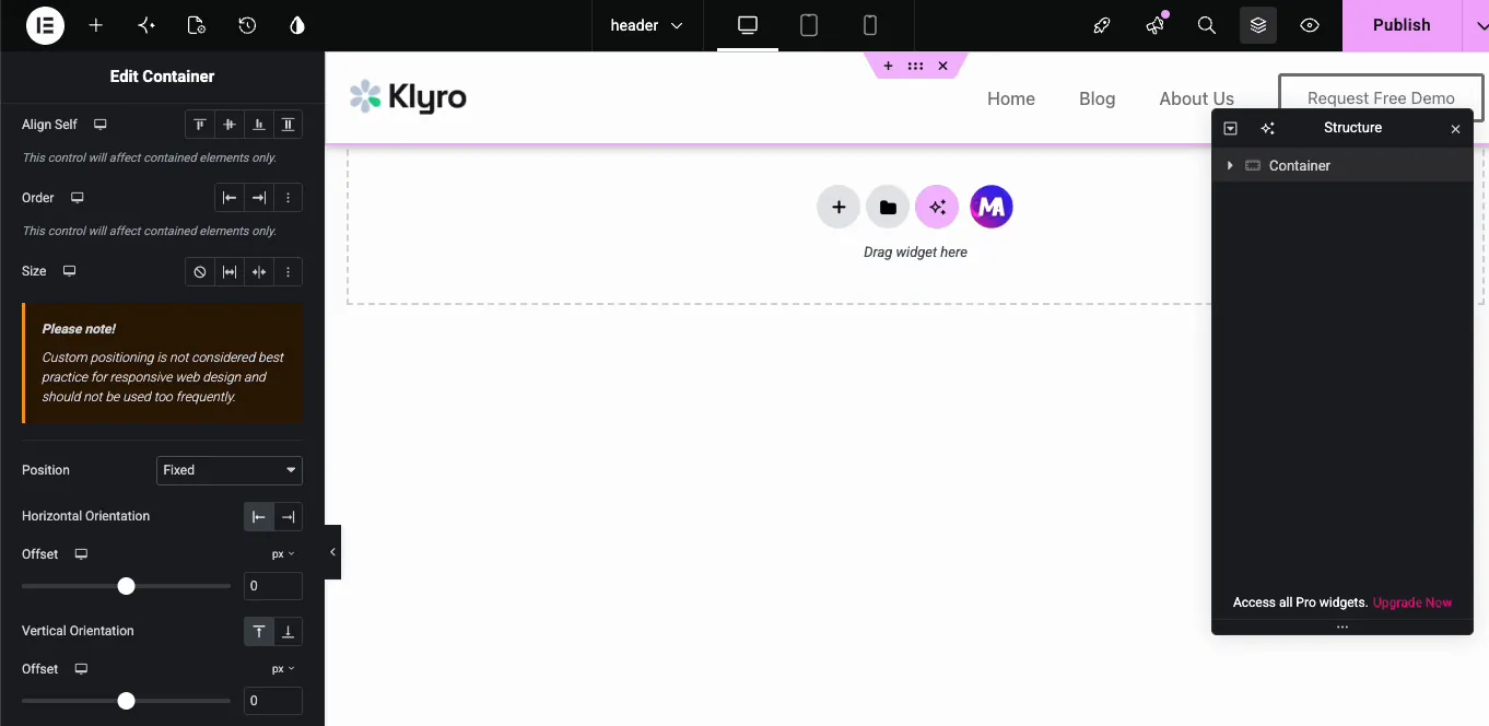
Set Horizontal Orientation to Left with an offset of 0, and Vertical Orientation to Top with an offset of 0. Zero on both glues the header to the very top-left of the viewport. Raise the vertical offset if you’d rather the header floated a little below the top edge.
Elementor will also throw a warning at you: “Custom positioning is not considered best practice for responsive web design and should not be used too frequently.” Ignore it. That’s a general caution against scattering fixed and absolute elements through a layout, and a fixed header is the textbook case where it’s the right call. Just check the mobile view when you’re done, which I’ll come back to.
Step 4: Raise the z-index
Still in the Layout section, find the Z-Index field and set it to something comfortably high. I use 99.
Z-index decides which element sits on top when two overlap. A fixed header is guaranteed to overlap your page content as the visitor scrolls, and if its z-index is too low, the content scrolls straight over the top of it. That’s the classic bug where the header is technically sticky but sliders, popups, and images plough right through it.
If something still covers the header, bump the number up. It only has to beat whatever it’s losing to, and plenty of slider and popup plugins set their own z-index in the thousands.
Step 5: Publish
Hit Publish.
Open the live site and scroll. The header stays locked to the top of the screen the whole way down.
If it still scrolls away on the front end but looks right in the editor, clear your cache before you start debugging. A caching plugin will happily serve the old header CSS for a while.
Three things that break a fixed header, and the fixes
The steps above get the header pinned. What follows is what separates a sticky header that survives contact with a real site from one you rip back out a week later.
1. The header goes transparent and content shows through
A fixed element is lifted out of the normal page flow, so it stops inheriting a background from anything. If you never set a background color on the header, your page content scrolls underneath it and shows straight through, and your menu text turns into unreadable soup the moment an image passes behind it.
Select the header container, go to Style > Background, and give it a solid color. If you genuinely want a transparent header, that’s a valid look, but then design the first section to work behind it.
2. The first section hides behind the header
Same root cause. A fixed header no longer takes up space in the layout, so the first section slides up to fill the gap it left and part of it ends up trapped behind the header.
Add top padding to your first section, roughly matching the header’s height. If the header is 80px tall, give the hero 80px of top padding. If you’re not sure how tall it is, right-click the header on the front end and inspect it; the height is right there in the browser tools.
3. It eats the screen on mobile
Phone screens are short. A header that feels fine on a desktop monitor can swallow a serious chunk of a phone’s viewport and then follow the visitor down every page.
Switch to mobile view in Elementor’s responsive mode and cut the header’s vertical padding. The position controls are per-device too, so you can set Position back to Default on mobile only and let the header scroll away there. On a long article page that’s usually the better call. If you run custom breakpoints, the Custom Breakpoints plugin lets you tune this to your real device widths.
Does this work with other header plugins?
Yes, and this is the part worth understanding. Position: Fixed is a native Elementor control, not a Master Addons feature. Master Addons is doing exactly one job here: giving you a free header template that opens in Elementor. Once you’re in the editor, the sticky part is plain Elementor.
So if you build headers with a different theme builder, or your theme ships an Elementor-editable header of its own, the same Advanced > Layout > Position > Fixed path applies. The only thing that changes is where you go to open the header for editing.
A no-jump alternative: position sticky with free Custom CSS
Fixed positioning lifts the header out of the page flow, which is why you have to pad the first section so nothing hides behind it. If you want to skip that step, CSS position: sticky is the alternative. It keeps the header in the flow and only pins it once it reaches the top, so there is no content jump to fix.
The catch is where you add the CSS. Elementor’s per-element Custom CSS box is a Pro feature, but the free Master Addons Custom CSS extension gives you the same box at no cost. Select the header container, open its Custom CSS field, and paste this:
selector {
    position: sticky;
    top: 0;
    z-index: 99;
}
selector is Elementor shorthand for the element you are editing, so you do not need an ID or class. One gotcha: if any parent container has overflow: hidden, sticky silently stops working, so clear that from the ancestor if the header refuses to pin. The full behaviour is documented in the MDN reference on CSS position.
Free sticky header methods compared
Three of these routes are free, and each fits a different need. Fixed lives in Elementor’s own Position control. The Master Addons Positioning extension has no Fixed option, but it helps inside the header: nudge a logo or badge with Relative or Absolute offsets, with separate values per device.
| Method | Needs code | Cost | Content jump | Best for |
|---|---|---|---|---|
| Position Fixed (Elementor Advanced tab) | No | Free | Needs a padding fix | Always-visible header |
| position: sticky (Custom CSS) | One snippet | Free | None | Clean layout, no jump |
| Elementor Pro sticky scroll effects | No | Paid | Handled | Hide-on-scroll and shrink |
| Dedicated sticky-header plugin | No | Free | Handled | Prebuilt scroll effects |
Adding shrink or color change on scroll
Want the header to shrink or swap color once the visitor scrolls? That reads scroll distance, which CSS cannot do on its own. A few lines of JavaScript through the Custom JS extension in Master Addons Pro can toggle a class on the header past a scroll threshold, then you style that class in Custom CSS. It is more work than a plugin that ships the effect, so weigh the effort before you build it by hand.
Making the header worth sticking
Once it’s glued to the screen, the header is visible 100% of the time, so it’s worth a second pass.
Trim the height first. A tall header that never goes away gets annoying fast, and every pixel you save is a pixel of content the visitor can see. Then look at what’s in it: a permanent slot on screen is a good home for your best link, whether that’s a demo, pricing, or contact button.
Big site? The Master Addons Navigation Menu widget builds mega menus, so you can keep the whole structure one click away without the header growing. And keep an eye on weight, since the header now loads on every page and never unloads. The Elementor speed guide is worth a read if your load time is already tight.
If you’d rather not build a header from scratch, the Master Addons Template Library has ready-made headers you can import and then make sticky with the same steps, and the Elementor template kits ship matching headers and footers for a whole site.
Frequently asked questions
Can I create a sticky header in Elementor free?
Yes. The Position: Fixed control is part of free Elementor. You only need a header template to apply it to, and the Master Addons Theme Builder gives you one for free. Elementor’s own Theme Builder and its sticky scroll effects are the Pro-only parts.
What is the difference between a fixed and a sticky header?
A fixed header is always visible from page load and never scrolls away. A sticky-on-scroll header scrolls off, then slides back in when the visitor scrolls up. Position: Fixed gives you the first one. The second needs Elementor Pro’s scroll effects.
Why is my content hiding behind the sticky header?
A fixed header is removed from the normal page flow, so the section below slides up underneath it. Add top padding to your first section, roughly matching the header’s height, and set a solid background color on the header container.
Why does my page content scroll over the top of my header?
The z-index is too low. In the Advanced tab under Layout, set Z-Index to 99 (or higher) on the header container so it stacks above everything else on the page.
Should I use a sticky header on mobile?
Often not. A fixed header eats scarce vertical space on a phone. Elementor’s position controls are per-device, so switch to mobile view and set Position back to Default, or at least cut the header’s padding down.
Wrapping up
Creating a sticky header in Elementor is three settings on one element. Select the header container, set Position to Fixed with zero offsets, raise the z-index. Everything after that is cleanup: give the header a solid background, pad the first section so nothing hides behind it, and check how it feels on a phone before you call it done.
All of it runs on free Elementor. The only thing you need is a header template to edit, which is what the free Theme Builder in Master Addons provides, along with footer, 404, archive, and single templates. If you later want the rest of the toolkit, that’s what the Pro plans cover, but nothing in this tutorial needs it.
Related reading: how to edit the footer in WordPress with Elementor, how to create a skewed background in Elementor, and how to create a one page website with Elementor.
