

Key Takeaways
- All eight Elementor table examples in this post are live demos built with the Master Addons Dynamic Table widget, and each one has a link you can open.
- The eight table designs cover a class timetable, shipping rates, system requirements, a restaurant menu, a plan comparison, support hours, an order confirmation and a task list.
- Most of the Elementor table templates here use three to five columns and five to seven rows, a size that still stacks cleanly into cards on a phone.
- The plan comparison example uses tick and dash icons in 24 cells, set with the Type option on each body cell.
- A size chart follows the same layout as the system requirements table: one label column and one column per size or option.
A good Elementor table template starts with the right shape for the data. A timetable, a price list and a spec sheet need different columns, and they behave differently on a phone. The eight examples below show those shapes in use.
Each example is a live page, so you can open it and check it on your phone. For each one we note the columns, what makes the design work, and which settings to copy.
Table of Contents
The 8 examples at a glance
| Example | Columns | Rows | Good for |
|---|---|---|---|
| Class timetable | 5 | 6 | Gyms, studios, schools, events |
| Shipping rates | 5 | 6 | Stores, delivery pages |
| System requirements | 3 | 7 | Software, hosting, spec sheets, size charts |
| Restaurant menu | 4 | 6 | Cafes, restaurants, price lists |
| Plan comparison | 5 | 7 | Feature lists across plans |
| Support desk hours | 4 | 5 | Contact and help pages |
| Order confirmation | 6 | 2 | Thank-you and receipt pages |
| Task management | 5 | 6 | Team pages, project status |
Elementor table examples
1. Class timetable
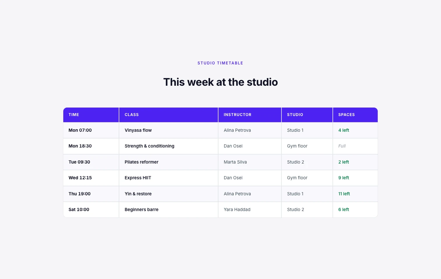
Five columns: Time, Class, Instructor, Studio and Spaces. The time comes first because that is what people scan for, and the last column answers the next question, whether there is room. The header uses one strong color and the body rows are lightly striped.
Copy this: put the column people search by on the left. Keep the last column short (“4 left”, “Full”) so it reads at a glance. On a phone each class becomes its own card. Open the timetable demo.
2. Shipping rates
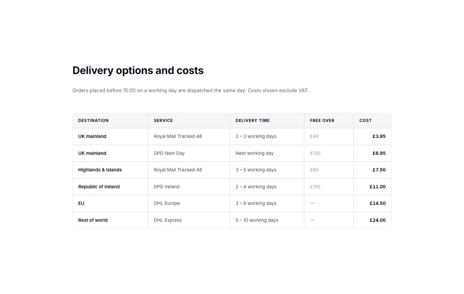
Destination, Service, Delivery time, Free over and Cost. This table turns striping off and uses a pale header with thin borders, which suits a store page where the table should not compete with product photos.
Copy this: for a price list, put the price in the last column and keep the units in the cell (“£3.95”), so every card still makes sense when the table stacks on a phone. Open the shipping demo.
3. System requirements
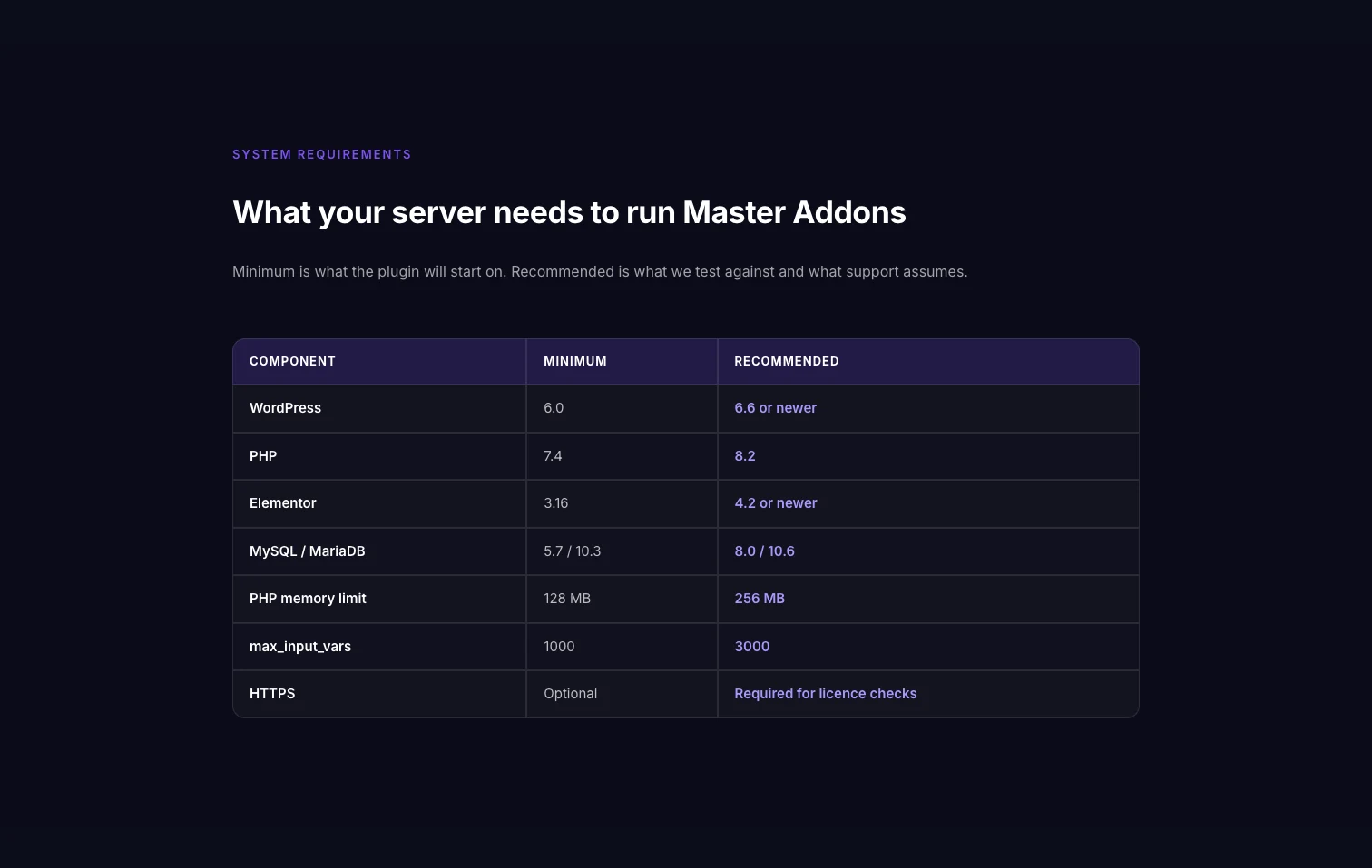
Three columns: Component, Minimum and Recommended, over seven rows. It sits on a dark section with a translucent header, so you can see the widget’s colors on a dark background.
Copy this: the layout is one label column plus one column per option. A size chart has the same shape. Swap Component for Size and the other columns for Chest, Waist and Length. Open the requirements demo.
4. Restaurant menu
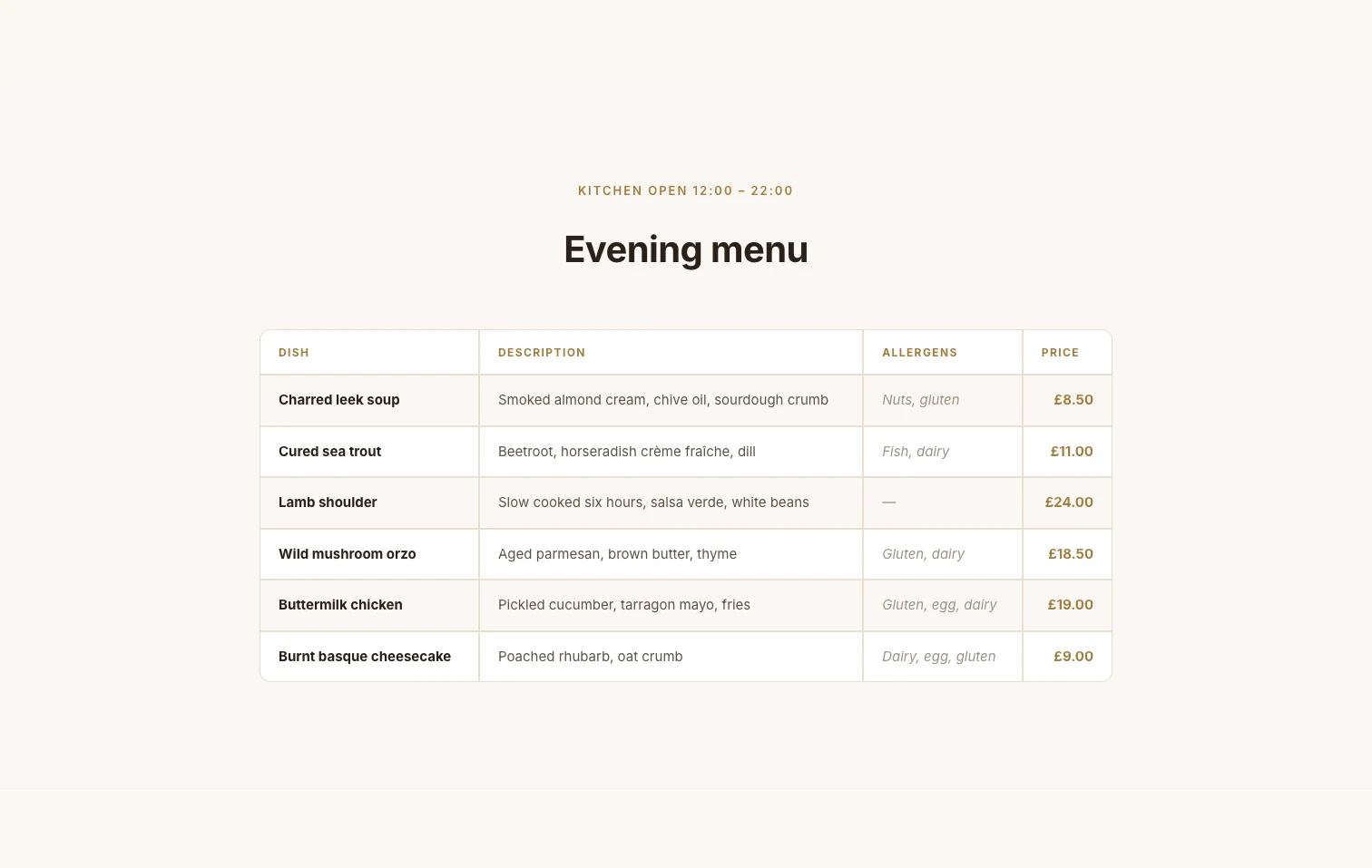
Dish, Description, Allergens and Price. There is no striping and very little border, so it reads like a printed menu. The allergens column is the reason to use a table here: a plain list cannot line that information up.
Copy this: turn off Striped Table? and lower the border weight when the table should feel like text. Open the menu demo.
5. Plan comparison
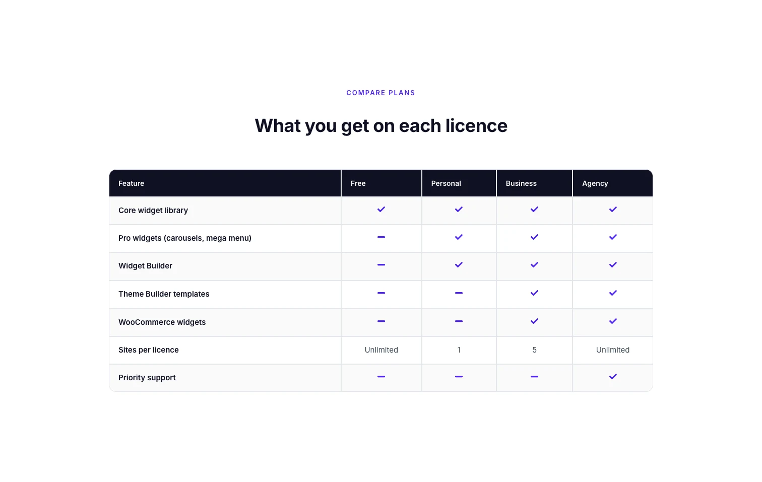
A Feature column and four plan columns, with a tick or a dash in each cell. The icons come from the Type option on each body cell, which can be None, Icon or Image. This demo uses 24 icons.
Copy this: set Type to Icon, pick a check or a minus, and color them in the Table Body style section. For a comparison with highlighted columns and buy buttons, the Comparison Table widget (Pro) or a Pricing Table is a closer fit. Open the plan comparison demo.
6. Support desk hours
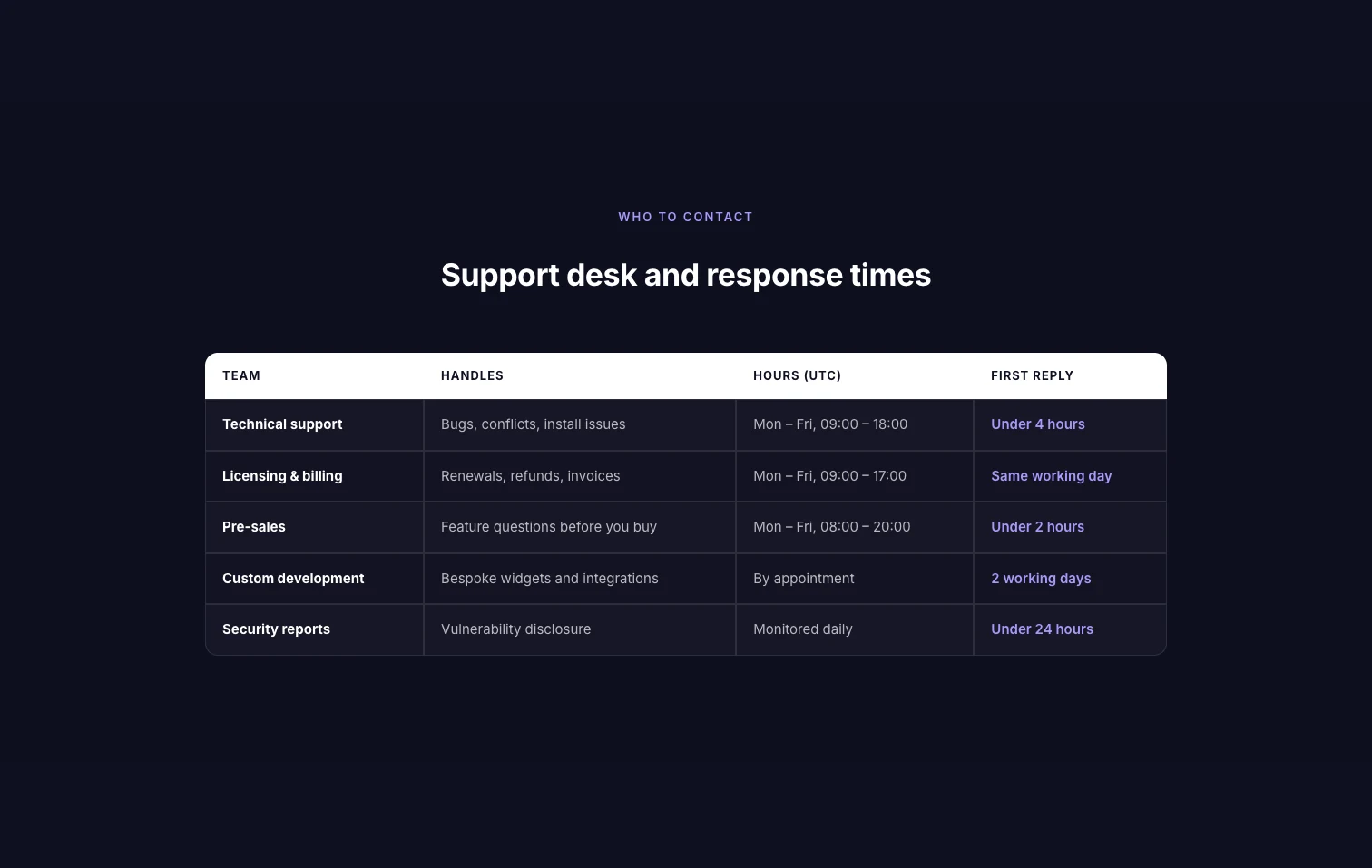
Team, Handles, Hours (UTC) and First reply. Four columns answer who to contact, about what, when, and how fast they respond. Naming the time zone in the header saves a line of small print.
Copy this: put units and time zones in the header so the cells stay short. If you only need opening hours for one location, the Business Hours widget is quicker. Open the support hours demo.
7. Order confirmation
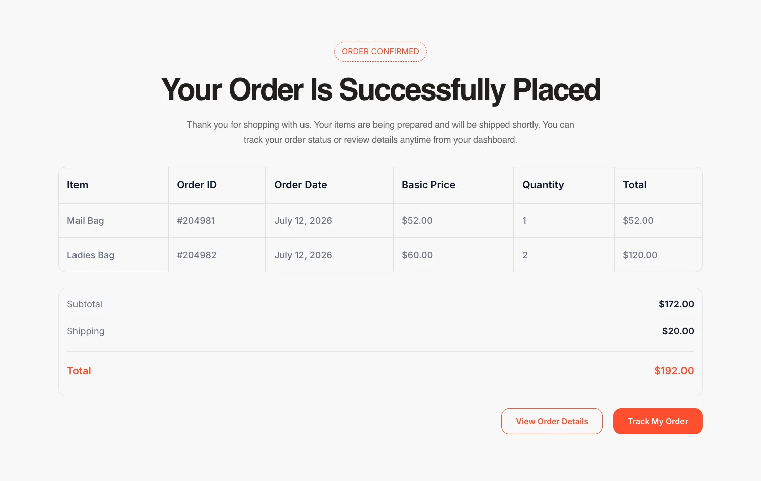
Six columns on a thank-you page: Item, Order ID, Order Date, Basic Price, Quantity and Total. The table is only two rows long, and the totals sit in a separate box under it.
Copy this: keep sums outside the table. A subtotal box under the table is easier to style than a merged footer row. Open the order confirmation demo.
8. Task management
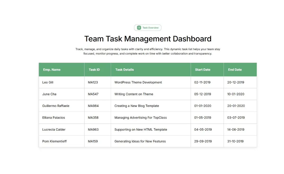
Emp. Name, Task ID, Task Details, Start Date and End Date, with a small photo next to each name. The photos use the Image type on the first cell of every row.
Copy this: a small image in the first column makes rows easier to tell apart. Keep the images the same size, and keep them small so rows stay one line tall. Open the task table demo.
Want these as a starting point? All eight open from the demo viewer on the Dynamic Table page, next to three live tables you can test on your phone.
Table design tips from these examples
- Five columns is the practical limit. Seven of the eight examples use five or fewer. Past that, cells wrap on laptops and the stacked cards get long on phones.
- Lead with the lookup column. Time in a timetable, destination in a shipping table, feature in a comparison.
- Use one header color. Every example has a single header treatment and plain body text.
- Stripe long tables. Striping helps the eye across five or more rows. On a two-row table it adds nothing.
- Write short cells. “4 left” beats “There are 4 spaces left in this class”.
- Check the phone layout. With Responsive Table? on, rows stack into cards on devices up to 768px wide. Our guide to responsive tables in Elementor covers the other options.
How to build one of these tables
Each example is one Dynamic Table widget. The short version:
- Drag Dynamic Table onto the page.
- In Table Head, add one header cell per column.
- In Table Body, add the cells left to right and turn on New Row? at the start of each new row.
- Set Type to Icon or Image on cells that need one.
- In the Style tab, set the header background, the stripe color, the border and the corner radius.
The step-by-step version, along with three other ways to make a table, is in how to create a table in Elementor.
Frequently asked questions
Does Elementor have table templates?
Elementor has no table widget, so its template library has no data tables. Table templates for Elementor come from addon widgets. The eight examples here are Dynamic Table demos you can open and rebuild.
How do I make a timetable in Elementor?
Use a table widget with the time in the first column, then columns for the class or event, the person, the place and availability. Add one row per session. With Dynamic Table, each session stacks into its own card on phones.
How do I create a size chart in Elementor?
Build a table with Size as the first column and one column per measurement, such as Chest, Waist and Length. Add one row per size. It is the same layout as the system requirements example above.
Can I put icons or images in an Elementor table?
In Dynamic Table, yes. Every header and body cell has a Type option with None, Icon and Image. The plan comparison example uses icons for ticks and dashes, and the task table uses a small photo in the first column.
How many columns should a table have?
Three to five works on most pages. Seven of the eight examples here stay at five or fewer. More columns force text to wrap on laptops and make the mobile layout long.
Final thoughts
Pick the Elementor table template whose shape matches your data. A timetable leads with the time and a price list ends with the price. Start from the closest example above and change the text. If you need the page around the table too, the Elementor page templates library has pricing and services pages.
All eight are built with Dynamic Table, one of the widgets in Master Addons.
Related reading
