

Key Takeaways
- Good pricing table design shows three or four plans side by side, with one plan visually raised above the rest so the reader has a default to pick.
- A pricing table converts better when every card follows the same order: plan name, who it is for, price, billing period, a short feature list and one button.
- Feature rows should be three to six words each; a row that wraps to a second line slows reading and makes the cards uneven.
- A crossed-out original price next to the sale price gives the reader an anchor, and the Master Addons Pricing Table widget has a Sale switch for exactly that.
- A monthly and yearly toggle needs two sets of cards; in Master Addons the Toggle Content widget (Pro) switches between two saved section templates.
- On a phone, pricing cards stack in one column, so the highlighted plan should sit first or second, not third.
Pricing table design decides whether a visitor who already wants your product can find the right plan in a few seconds. The layout is simple: a row of cards, one price each, one button each. The decisions that matter are smaller than that: how many plans, which one is raised, what the price looks like, how long each feature row runs, and what the button says.
This post walks through ten pricing table design tips, each shown on a real table built with the Pricing Table widget from Master Addons for Elementor. The examples use made-up plans (Starter, Growth, Agency) so you can copy the structure without copying the prices. Where a tip needs a second widget, such as the monthly and yearly toggle, the post says which one and whether it is in the Pro plan.
Table of Contents
1. Show three plans, four at most
Three plans is the pricing table design most readers can compare at a glance. Two plans forces a yes or no decision. Five or more plans turns the table into a spreadsheet, and the reader starts scrolling sideways on a laptop and giving up on a phone.
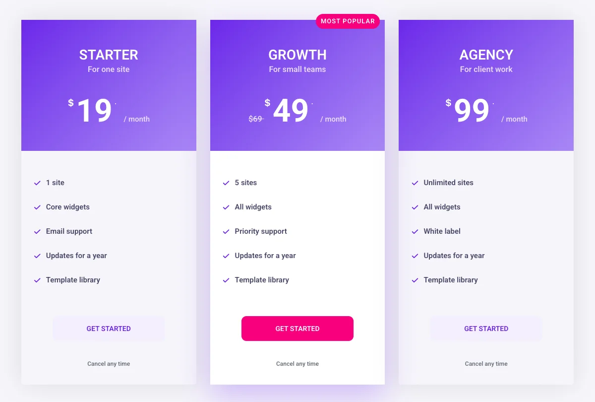
Put the plan you want most people to buy in the middle. People read a row left to right, but they settle on the centre, which is also where the eye lands first on a phone when the cards stack. If you sell an Agency or Enterprise plan with custom pricing, keep it as a fourth card with a “Contact us” button rather than a separate table.
In Elementor, each card is one Pricing Table widget dropped into its own column or container. Three widgets in a three-column container, each set to the same layout, gives you the table above. The Pricing Table widget page has the full control list and five live layouts.
2. Raise one plan above the rest
A highlighted plan gives the reader a default, and most will take it. The highlight does three things at once: the card is a little taller or lifted, the button uses the accent colour instead of the outline style, and a ribbon names the reason (“Most popular”, “Best value”, “Recommended”).
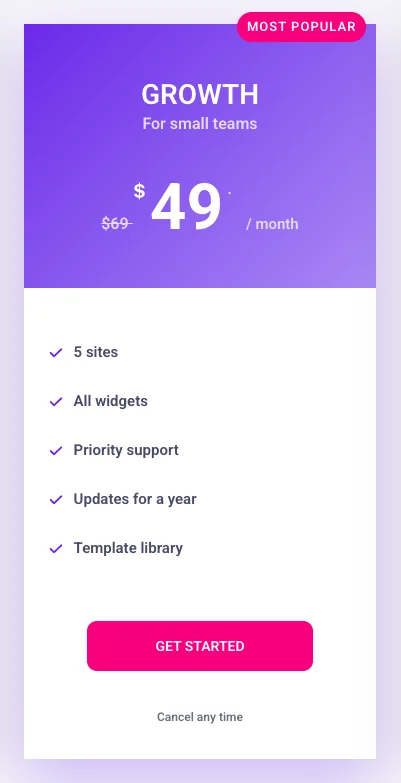
Highlight exactly one card. Two highlighted cards cancel each other out. Pick the plan with the best margin for you that still fits most readers, not the most expensive one.
In the Pricing Table widget, switch on Highlight Table in the Content tab, then open the Ribbon section to set the text, alignment, position and rotation. Give the highlighted card a different button colour in the Style tab so it does not rely on the ribbon alone.
3. Make the price the biggest thing on the card
The price should be the largest text on the card, larger than the plan name. Readers scan a pricing table for the numbers first and read the plan names second, so a design that makes the name bigger than the price slows them down.
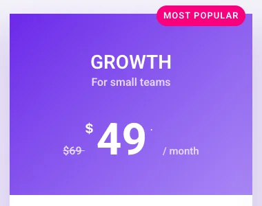
Keep the currency symbol and the billing period smaller than the number. “$49” reads faster than “49.00 USD per month”. If you discount a plan, show the original price crossed out next to the sale price. The crossed-out number is an anchor: 49 looks cheaper when 69 sits next to it than it does alone.
The widget has a Sale switch under Pricing. Turn it on, fill in the Original Price, and the strike-through appears automatically. Pick the currency from the list or type your own symbol.
4. Name the plan after the buyer, not the tier
Plan names work best when they tell the reader who the plan is for. “Starter, Growth, Agency” says more than “Basic, Standard, Premium”, and a one-line subtitle under each name (“For one site”, “For small teams”, “For client work”) removes the guessing.
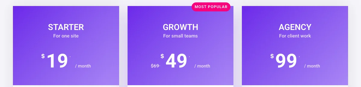
Avoid names that need the feature list to make sense. If a reader has to compare rows to work out which plan is “Standard”, the name has failed. Avoid jokes and internal codenames for the same reason.
The Pricing Table widget has a Title and a Subtitle field in the Header section, plus an optional icon and tag. The subtitle is the right place for “For small teams”.
5. Keep feature rows short and in the same order
Each feature row should fit on one line, three to six words. Long rows wrap, the cards become uneven, and the reader stops comparing across plans because the rows no longer line up.
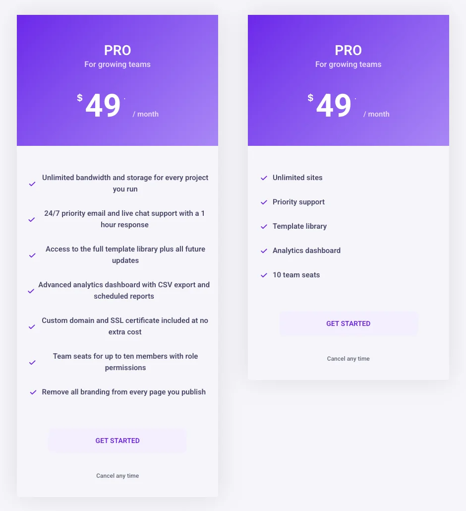
Order the rows the same way in every card, with the rows that change between plans at the top (“1 site” vs “5 sites” vs “Unlimited sites”). Five to seven rows per card is enough. If you have twenty features, the pricing table is the wrong place for them: put the top five here and link to a comparison table for the rest.
The widget’s Features repeater takes a text, an icon and an optional tooltip per row. Use the same icon for every included feature and a different one (or none) for features a plan does not include, so the visual pattern matches across cards.
6. Put the detail in a tooltip, not in the row
A tooltip lets you keep the row short and still answer the question “what does that include?”. The row says “All widgets”; the tooltip says “Every widget and extension”.
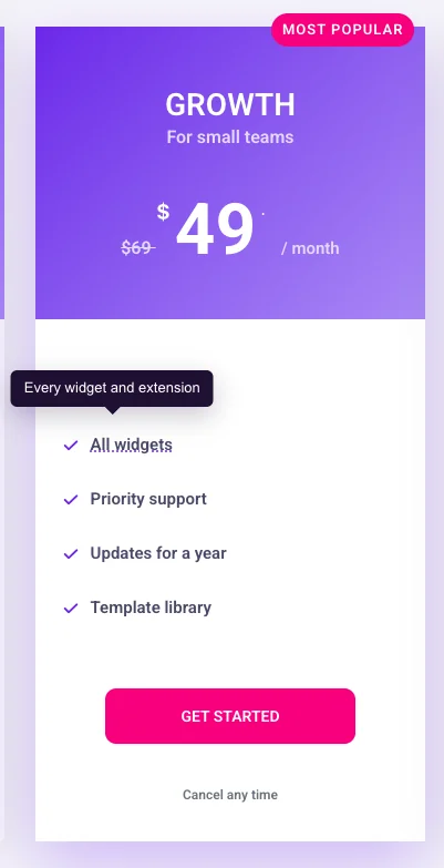
Use tooltips for the two or three rows that generate support questions, not for every row. A card where every feature has a dotted underline looks like it is hiding something. Keep tooltip text to one sentence.
In the Pricing Table widget, each row in the Features repeater has a Tooltip switch, a text field and a placement option (top, bottom, left, right).
7. One button per card, with a verb on it
The button is the only element on the card that does anything, so give it one job and label it with a verb. “Get started”, “Start free trial”, “Choose Growth” all work. “Submit” and “Click here” do not.

Under the button, one short trust line removes the last objection: “Cancel any time”, “14-day money back”, “No card needed”. Keep it to five words and do not stack three of them.
The widget’s Footer section has the button text, the link and an Additional Info field for the trust line. If you sell with Easy Digital Downloads, the same section has an EDD purchase button that links straight to the product. For a WooCommerce product, link the button to the product or checkout page.
8. Add a monthly and yearly toggle only when the saving is worth showing
A monthly and yearly toggle makes sense when yearly billing saves the reader a clear amount, usually two months or more. If the yearly discount is small, the toggle adds a step without changing the decision, and a single “billed yearly” line does the same job.
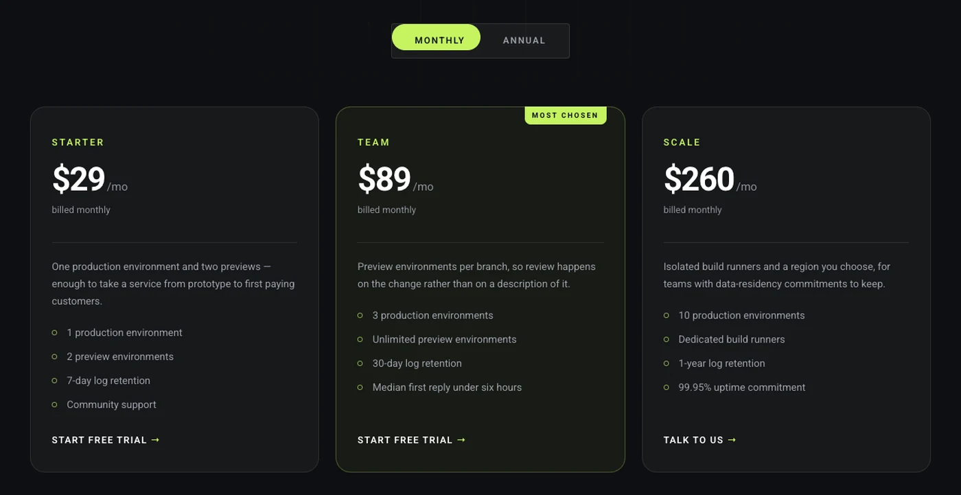
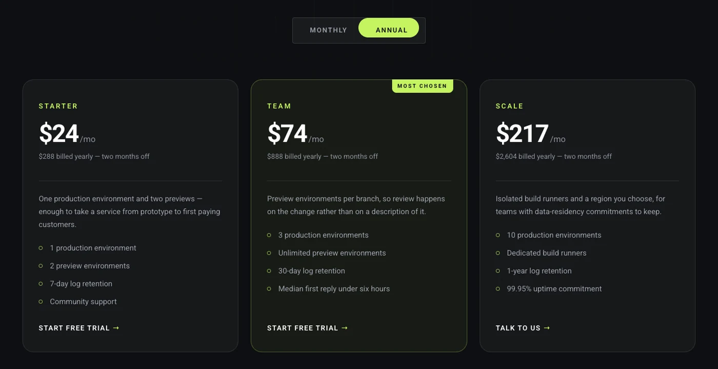
Show the yearly price per month (“$39 / month, billed yearly”) rather than the full yearly total, so the two toggle states compare like for like. Put the saving next to the toggle (“Save 20%”) so the reader knows why the switch exists before they click it.
The Pricing Table widget holds one price per card, so the toggle comes from a second widget. Build one set of cards with monthly prices and one with yearly prices, save each as a section template, and put both in the Toggle Content widget, which is in the Master Addons Pro plan. The Toggle Content page has the setup steps and a live example.
9. Pick a layout that matches the page, then keep it
The layout of a pricing table should match the section around it: a plain card on a clean SaaS page, a rounded header on a softer brand, a background image when the rest of the page uses photography. Pick one and use it for every card in the table.
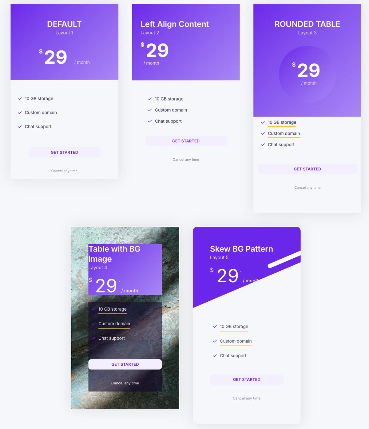
Mixing layouts inside one table is a common mistake. The reader reads the difference in shape as a difference in the plans. Keep colours limited too: one accent colour for the highlighted card, one neutral for the rest.
The Pricing Table widget has five layouts in the Layout dropdown (Default, Left Align Content, Rounded Table, Table with BG Image and Skew BG Pattern), and the content stays in place when you switch between them. The Template Library has pricing sections built on these layouts if you would rather start from a finished design.
10. Check the table on a phone before you publish
On a phone the cards stack in one column, so the reader sees one plan at a time and scrolls past the others. That changes two decisions: which card comes first, and how tall each card is.
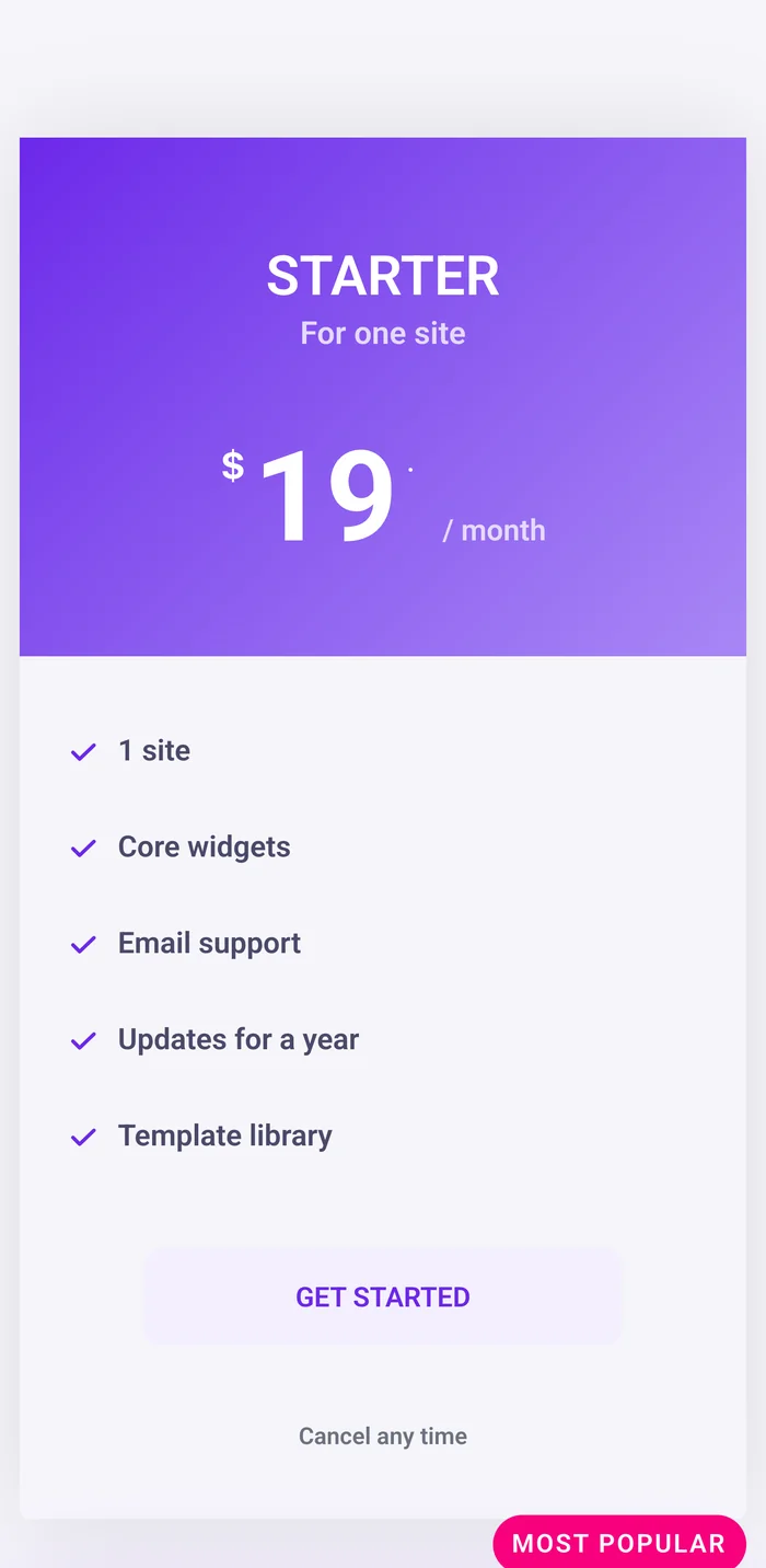
Put the highlighted plan first or second on mobile. If it sits third on desktop, use Elementor’s responsive ordering on the container to move it up. Keep feature lists to five rows so a card fits in roughly one screen, and make the button wide enough to tap.
Open the Elementor responsive mode (the phone icon at the bottom of the panel) and check the table at the mobile breakpoint. The Pricing Table widget’s Style tab controls have responsive switches, so you can shrink the price font and the padding on phones without changing the desktop version.
Want all ten tips in one widget? The Pricing Table widget has the highlight switch, ribbon, sale price, feature tooltips and five layouts as panel controls, so each tip above is a setting rather than custom CSS.
Frequently asked questions
How many plans should a pricing table have?
Three is the safest number, and four works when one plan has custom pricing. Two plans forces a yes or no choice, and five or more stops fitting side by side on a laptop screen and turns into a long scroll on a phone.
Which plan should be highlighted in a pricing table?
Highlight the plan that fits most readers and still has a good margin for you, usually the middle one. Raise it with a shadow, a solid button and a ribbon such as “Most popular”. Highlight one card only; two highlighted cards cancel each other out.
How do I add a monthly and yearly toggle to an Elementor pricing table?
Build two sets of pricing cards, one with monthly prices and one with yearly, and save each as a section template. The Toggle Content widget in Master Addons Pro shows one template at a time behind a switch. The Pricing Table widget itself holds one price per card.
Should a pricing table show the original price crossed out?
Yes when a plan is discounted. A crossed-out original price next to the sale price gives the reader an anchor, and the sale price looks lower than it does alone. In the Master Addons Pricing Table widget, the Sale switch and the Original Price field do this.
How do I make pricing table columns the same height in Elementor?
Put the cards in one container and set its Align Items to Stretch, then give each plan the same number of feature rows. Rows that wrap to two lines are the usual cause of uneven cards, so shorten the text before adjusting padding.
Final Thoughts
Pricing table design comes down to a short list: three plans, one raised, the price as the biggest text, plan names that say who the plan is for, feature rows that fit one line, tooltips for the detail, one button with a verb, a toggle only when the yearly saving is real, one layout per table, and a check on a phone. Each of the ten examples above was built with the Pricing Table widget and a few panel settings.
If you are starting from scratch, open the Pricing Table widget page to see the five layouts live, or pick a finished pricing section from the Template Library and change the plans. The widget is one of the widgets and extensions in Master Addons, and the Toggle Content widget for the billing switch is in the plans on the pricing page.
Related Reading
- Comparison Table widget: the full feature matrix that a pricing table should link to
- Dynamic Table widget: a price list with one price per row, for menus and service lists
- Elementor Animated Buttons: button styles for the card footer
- Elementor Marketing Widgets: the other conversion widgets in Master Addons
- Pricing Table widget documentation: every control explained
- Theme Builder: header and footer templates for the rest of the pricing page
