

Key Takeaways
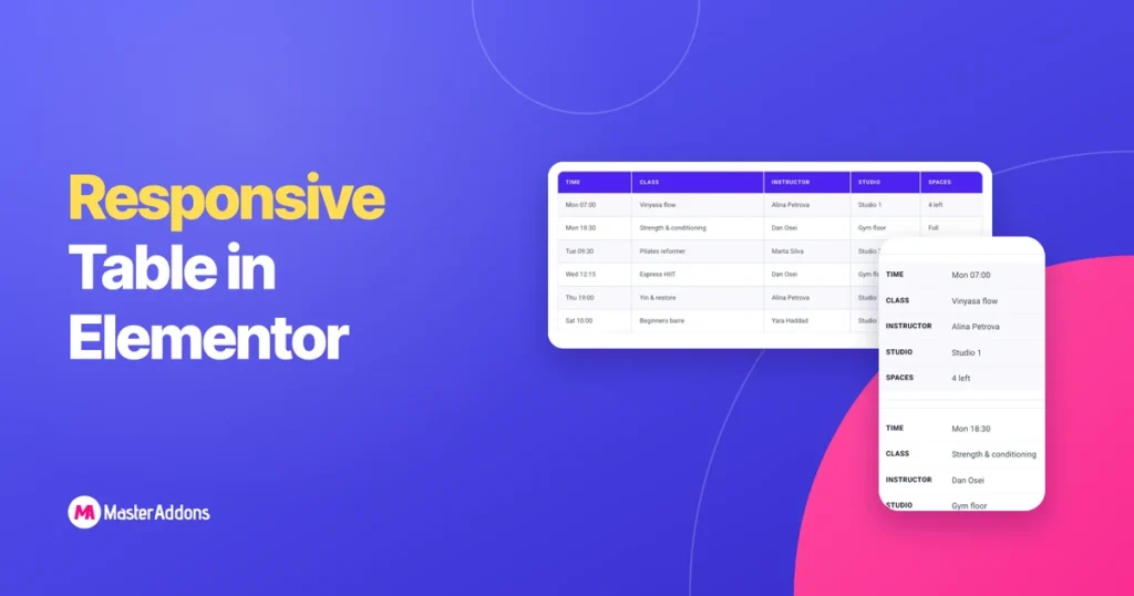
- An Elementor responsive table uses one of three patterns on phones: rows stacked into cards, a sideways scroll inside the table’s own box, or fewer columns.
- A five-column table needs about 640px of width to stay readable, and most phones show between 360px and 430px, so a wide table overflows unless you choose a pattern.
- The Master Addons Dynamic Table widget stacks every row into a card on devices up to 768px wide when Responsive Table? is on, which is the default.
- Horizontal scroll takes two CSS rules: overflow-x set to auto on a wrapper and a min-width on the table inside it.
- TablePress has a Horizontal Scrolling checkbox in each table’s settings, and it is off by default.
An Elementor responsive table is one that stays readable on a phone, and tables do not do that by themselves. Columns need more width than a phone has, so the table usually pokes out of the right side of the screen.
There are three ways to deal with it. We built all three on Elementor 4.3 and checked them on a 390px wide phone screen.
Table of Contents
Why tables break on mobile
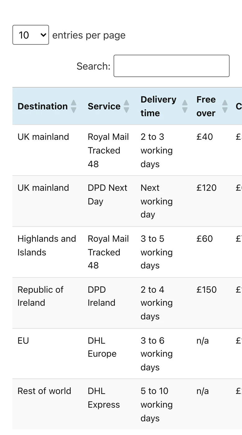
A table cannot wrap its columns the way a row of Elementor containers can. Every column has to sit beside the others, and each one needs room for its longest word. Our five-column shipping table is comfortable at about 640px. On a 390px phone the browser squeezes the columns until words stack three lines deep, and then the last column falls off the edge.
Elementor’s own responsive controls do not help much here. You can hide a whole widget per device or change its width, but you cannot reach inside a table and rearrange its cells.
The three responsive table patterns
Each pattern has a cost.
| Pattern | What the visitor sees | Best for | Cost |
|---|---|---|---|
| Stack rows into cards | One card per row, labels on the left | Rows read one at a time: timetables, spec sheets, price lists | Hard to compare one column across rows |
| Horizontal scroll | The normal table, swiped sideways | Comparing values down a column | Columns stay hidden until the visitor swipes |
| Hide columns | A shorter table with the key columns | Tables with one or two optional columns | Phone visitors lose that data |
Pattern 1: Stack rows into cards
Stacking turns each row into a small card. The header row disappears and every cell shows its column name as a label. Nothing is hidden and nobody scrolls sideways, so it is the safest default.
The Dynamic Table widget does this with one switch.
- Select the Dynamic Table widget in Elementor.
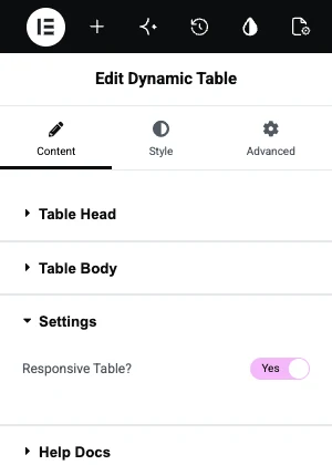
- In the Content tab, open Settings.
- Leave Responsive Table? set to Yes. It is on by default.
- Open the page on a phone. Rows stack on devices up to 768px wide.
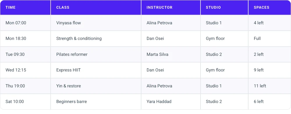
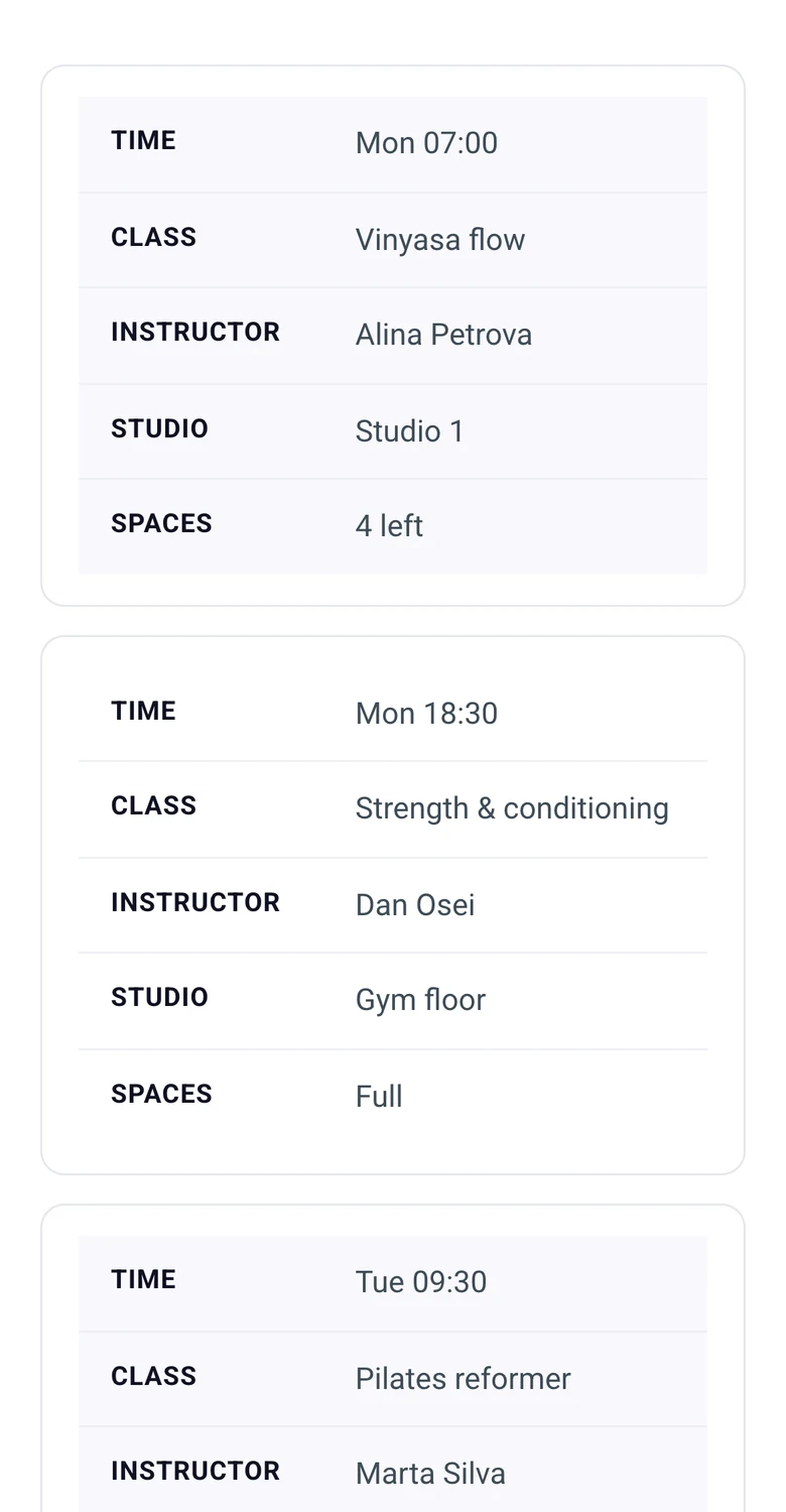
The stacking rule checks the device width, so shrinking a desktop browser window will not trigger it. Test on a real phone or with device emulation. If you set large cell padding in the Style tab, check that the labels and values do not sit too close together on the phone.
Want a table that stacks without CSS? The Dynamic Table widget has the Responsive Table switch on from the start.
Pattern 2: Horizontal scroll
Horizontal scroll keeps the table as it is and lets the visitor swipe it sideways inside its own box. The page itself does not scroll sideways. Use it when people need to read down a column, such as comparing prices.
For an HTML table in Elementor’s HTML widget, wrap the table in a div and add two rules:
<div class="table-scroll">
  <table class="wide-table">
    ...
  </table>
</div>

<style>
.table-scroll { overflow-x: auto; }
.table-scroll table { min-width: 640px; }
</style>
The min-width stops the browser from crushing the columns, and overflow-x: auto adds the scroll only when the screen is narrower than that. Change 640px to whatever width your table needs to stay on one line per cell.
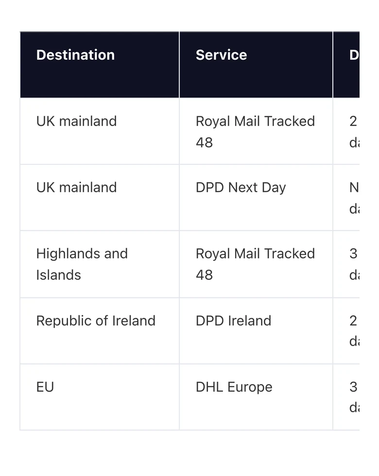
The weakness is that nothing tells the visitor there is more to the right. A column that is cut in half, as in the screenshot, is the best hint you can give, so do not set the min-width to a value that ends exactly at a column edge.
Pattern 3: Hide columns
Sometimes a column is nice to have on a desktop and unnecessary on a phone. Hide it below a breakpoint and the table may fit without any other change.
Add a class to every th and td in the columns you can lose, then hide that class on small screens:
<th class="hide-mobile">Delivery time</th>
...
<td class="hide-mobile">2 to 3 working days</td>

<style>
@media (max-width: 767px) {
  .hide-cols .hide-mobile { display: none; }
}
</style>
Here hide-cols is a class on the table itself. 767px is Elementor’s default mobile breakpoint, so the columns come back on tablets.
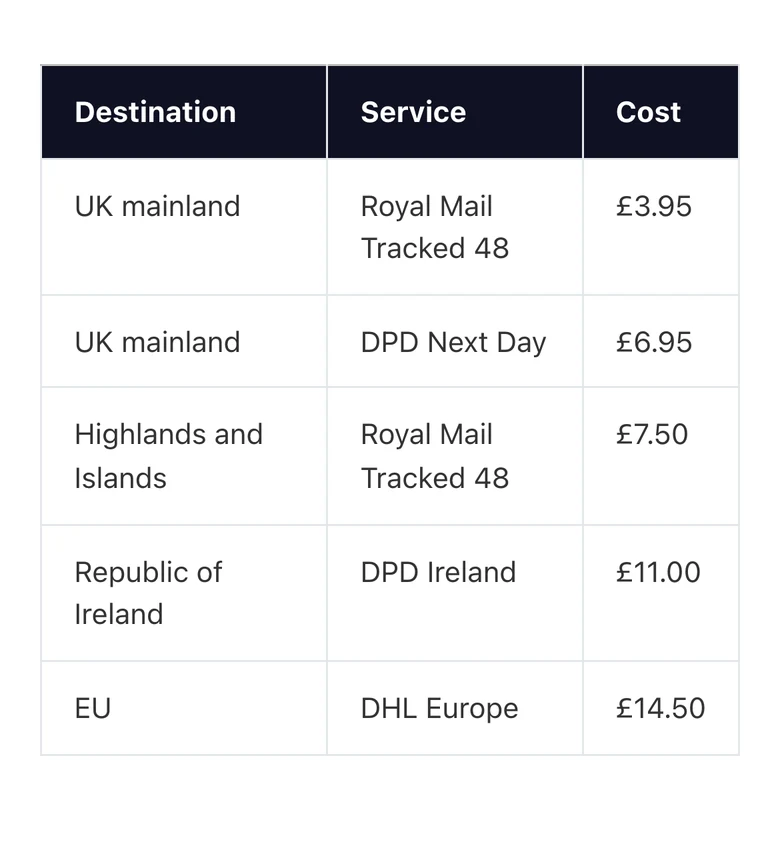
Only hide what a phone visitor can do without. If the hidden column decides whether someone buys, use stacking or scrolling.
Responsive TablePress tables in Elementor
A TablePress table placed in Elementor behaves like any other table: wide ones overflow. The fix lives in the TablePress settings.
- Go to TablePress and edit the table.
- Scroll to Table Features for Site Visitors.
- Tick Horizontal Scrolling. It is off by default.
- Click Save Changes.
In our test this fixed the overflow: the table scrolled inside its box and the page stayed still. TablePress also has stacking and collapsing modes for phones, and those are part of its paid Responsive Tables feature.
A quick mobile checklist
- Open the page on a real phone. Emulators miss touch scrolling and some device-width rules.
- Scroll the page sideways. If the whole page moves, the table is overflowing.
- Keep header text short. “Free over” wraps better than “Free delivery on orders over”.
- Put the most important column first. It is the one that stays visible when a table scrolls.
- Aim for 16px body text in cells. Shrinking the font to fit a table makes it unreadable.
Frequently asked questions
How do I make a table responsive in Elementor?
Choose one of three patterns. Stack rows into cards with a table widget that supports it, such as Dynamic Table. Wrap an HTML table in a div with overflow-x set to auto so it scrolls sideways. Or hide optional columns below 767px with a CSS media query.
Why is my Elementor table cut off on mobile?
The table is wider than the screen and nothing tells it how to adapt. Tables cannot wrap columns, so the extra width spills past the edge. Add a scroll wrapper, turn on a stacking option in your table widget, or remove a column on small screens.
Can I make a table scroll horizontally in Elementor?
Yes. For an HTML table, put it inside a div with overflow-x: auto and give the table a min-width such as 640px. For a TablePress table, tick Horizontal Scrolling under Table Features for Site Visitors in that table’s settings.
Does Elementor have a responsive table widget?
Elementor has no table widget at all, in the core plugin or in Pro. Responsive tables in Elementor come from addon widgets, table plugins such as TablePress, or HTML tables with your own CSS.
Which is better on mobile, stacking or scrolling?
Stacking is better when each row stands alone, such as one class in a timetable. Scrolling is better when visitors compare numbers down a column, because stacked cards put those numbers far apart.
Final thoughts
To make an Elementor responsive table, decide what a phone visitor needs from it. Stack rows when each row is read alone, scroll when columns are compared, and hide columns only when the data is optional.
If you would rather not write CSS, Dynamic Table handles the stacking pattern from a switch in the panel.
Related reading
