

يضيف حقل Text Shadow عنصر التحكم في ظل النص الخاص بـ Elementor إلى عنصر واجهة مستخدم مخصص تم إنشاؤه باستخدام الإضافات الرئيسية منشئ القطعة. يحصل المحررون على لون وإعداد ضبابية وإزاحتين، ويتم تطبيق الظل على أي نص يشير إليه محدد CSS الخاص بك. استخدمه عندما يتعين أن يظل العنوان قابلاً للقراءة أعلى الصورة.
Text Shadow هو حقل احترافي. يتضمن البرنامج الإضافي المجاني أداة إنشاء عناصر واجهة مستخدم محدودة، وتأتي المجموعة الكاملة من الحقول مع ماستر أدونز برو.
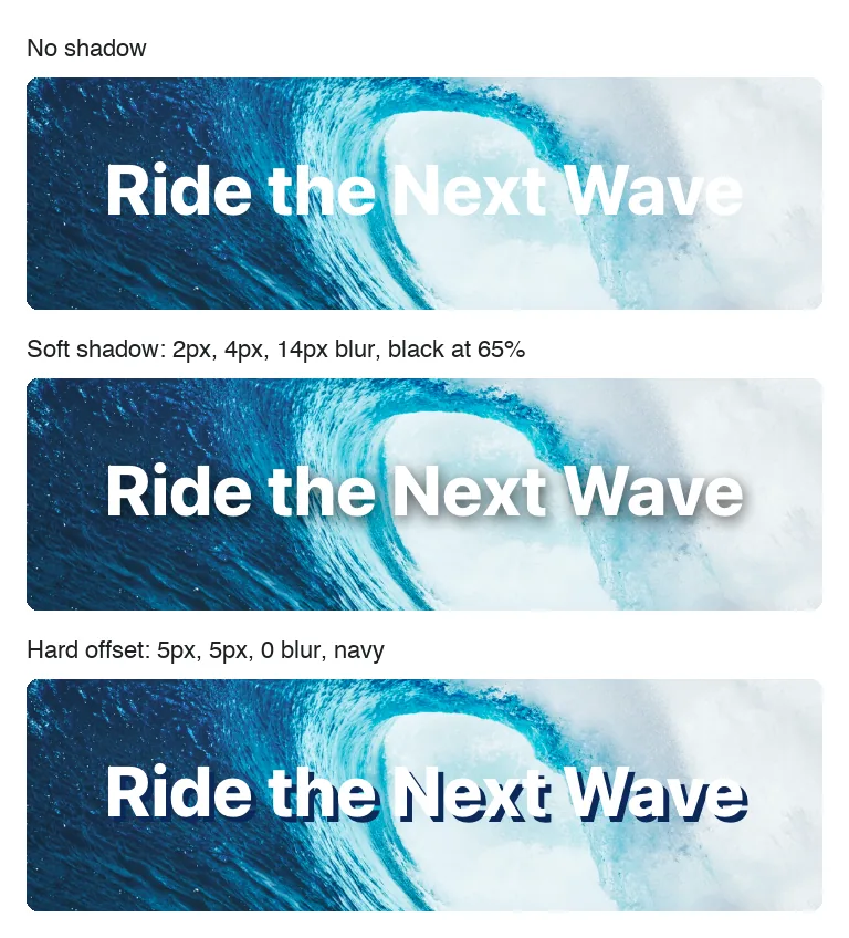
ما يفعله حقل ظل النص #
- فهو يضيف عنصر تحكم واحدًا إلى لوحة عنصر واجهة المستخدم الخاص بك في Elementor: الملصق الخاص بك بالإضافة إلى رمز القلم الرصاص الذي يفتح إعدادات الظل.
- هذه الإعدادات هي اللون (مع العتامة)، والطمس، والأفقي، والعمودي.
- العنصر يكتب
text-shadowCSS إلى العنصر المحدد في خيار محدد الحقل، لذلك لا تضع رمزًا مميزًا في HTML أو CSS.
إذا لم تكن قد قمت ببناء عنصر واجهة مستخدم بعد، فاقرأ نظرة عامة على منشئ القطعة أولاً ثم عد باستخدام عنصر واجهة المستخدم مفتوحًا.
قبل أن تبدأ #
- WordPress مع تثبيت Elementor ونشطه.
- الإضافات الرئيسية لـ Elementor وMaster Addons Pro، وكلاهما نشط. ال دليل التثبيت إعداد الأغطية.
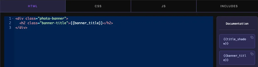
- عنصر واجهة مستخدم مفتوح في Widget Builder. المثال الموجود في هذا الدليل هو عنصر واجهة مستخدم “Photo Banner”: صورة خلفية مع عنوان H2 في الأعلى يحتوي على الفئة
banner-title، مملوءة من حقل نص اسمهbanner_title.
كيفية إضافة حقل ظل النص #
- اذهب الى الإضافات الرئيسية > منشئ القطعة وافتح القطعة الخاصة بك.
- انقر فوق أسلوب علامة التبويب الموجودة أعلى منطقة الأقسام وأضف قسمًا إذا كانت علامة التبويب فارغة. أعط القسم عنوانًا واضحًا، مثل “Banner Title”.
- يكتب
shadowفي مربع البحث الميداني على اليسار. يظهر Box Shadow وText Shadow. - يجر ظل النص في القسم. فتح إعداداته في الشريط الجانبي الأيسر.
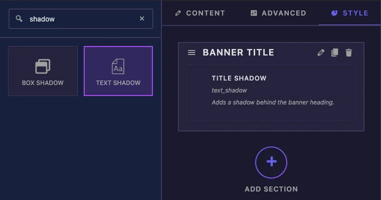
يمكنك أيضًا إسقاط الحقل في قسم المحتوى أو القسم المتقدم، ثم يظهر عنصر التحكم في علامة التبويب Elementor تلك. يبحث المحررون عادةً عن الظلال ضمن Style.
تم شرح خيارات حقل ظل النص #
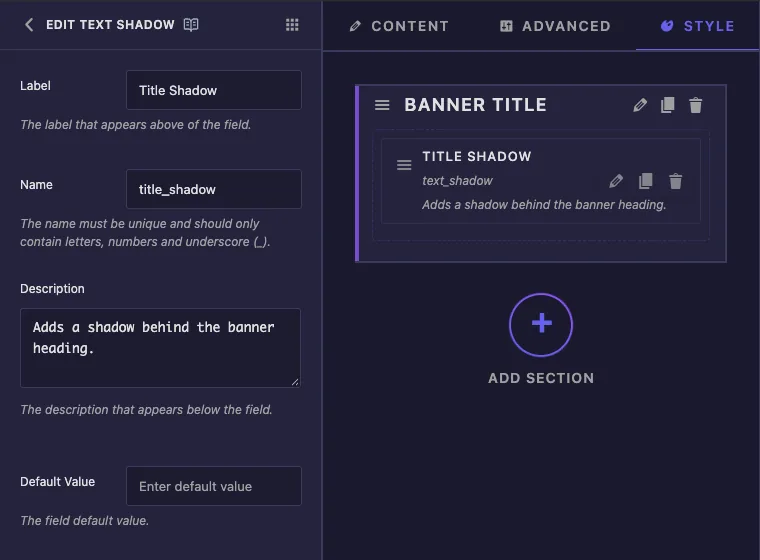
- ملصق هو النص الموجود بجوار عنصر التحكم في Elementor. يستخدم المثال “Title Shadow”.
- اسم هو المعرف الفريد للحقل (الحروف والأرقام والتسطير فقط). يقوم Elementor بحفظ قيم المحرر تحت هذا الاسم، لذا قم بتعيينه مرة واحدة واتركه وشأنه.
- وصف هي ملاحظة لك داخل البناء. لا يعرضه Elementor تحت هذا التحكم.
- القيمة الافتراضية لا يستخدم في هذا الحقل. يبدأ الظل الجديد دائمًا من الإعدادات الافتراضية الخاصة بـ Elementor، والمدرجة في الأسفل.
قم بالتمرير لأسفل في الشريط الجانبي للوصول إلى الإعدادات الشائعة والمحدد.
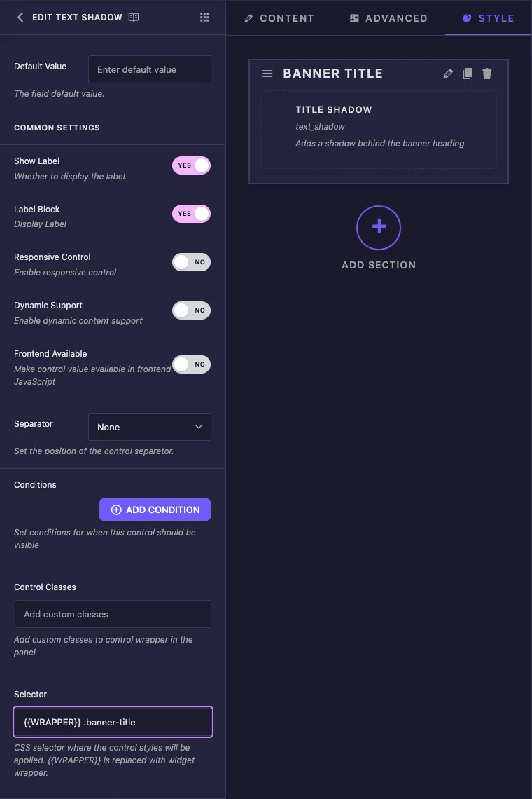
- إظهار التسمية يخفي أو يظهر الملصق في اللوحة.
- فاصل يرسم خط فاصل قبل أو بعد التحكم.
- شروط إظهار عنصر التحكم فقط عندما يكون لحقل آخر قيمة معينة، على سبيل المثال محول “Show Shadow”. يرى شروط.
- محدد هو محدد CSS الذي يستقبل الظل. لا يفعل الحقل شيئًا مفيدًا بدونه، لذا فهو يحتوي على قسم خاص به أدناه.
تظهر أيضًا كتلة التسمية والتحكم المستجيب والدعم الديناميكي والواجهة الأمامية المتاحة وفئات التحكم في القائمة. لا يستخدمها عنصر التحكم في ظل النص، وليس لتغييرها أي تأثير على هذا الحقل.
اضبط المحدد #
يخبر المحدد العنصر بالعنصر الذي يحصل على الظل. لعنوان الشعار، أدخل:
{{WRAPPER}} .banner-title
{{WRAPPER}}يتم استبداله بالفئة الفريدة من هذه الأداة على الصفحة، والتي تحافظ على الظل داخل هذه الأداة الواحدة..banner-titleهو الفصل الموجود على العنوان في HTML الخاص بأداة واجهة المستخدم الخاصة بك.
يستخدم الحقل المحدد الخاص بك تمامًا كما هو مكتوب. بدون {{WRAPPER}}، تصبح القاعدة .banner-title { text-shadow: ... } بالنسبة للصفحة بأكملها، وكل عنصر في تلك الفئة يلتقطها، بما في ذلك العناوين الموجودة في عناصر واجهة المستخدم الأخرى. إذا تركت المحدد فارغًا، فسيذهب الظل إلى {{WRAPPER}} .elementor-widget-container، والذي يغطي كل النص الموجود في الأداة.
يمكن لعنصر تحكم واحد تصميم عدة عناصر. افصل المحددات بفواصل وابدأ كل واحدة منها بـ {{WRAPPER}}، على سبيل المثال {{WRAPPER}} .banner-title, {{WRAPPER}} .banner-subtitle.
تسرد لوحة التوثيق الموجودة بجانب محرر التعليمات البرمجية أ {{title_shadow}} رمز لهذا الحقل. اتركه خارج HTML وCSS. يتم تخزين الظل كأرقام ولون، وبالتالي لا يحتوي الرمز المميز على نص للطباعة، ويتعامل المحدد بالفعل مع الإخراج.
انقر حفظ الإعدادات عندما تنتهي.
استخدم عنصر تحكم Text Shadow في Elementor #
أضف عنصر واجهة المستخدم إلى صفحة، أو أعد تحميل المحرر إذا كانت الصفحة مفتوحة بالفعل. حدد عنصر واجهة المستخدم وافتح أسلوب علامة التبويب. يوجد عنصر التحكم في القسم الذي قمت بإنشائه، ويظهر الملصق الخاص بك وأيقونة القلم الرصاص.
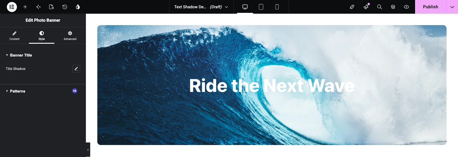
انقر فوق القلم الرصاص لفتح النافذة المنبثقة. يؤدي ذلك إلى تشغيل الظل باستخدام قيم البداية الخاصة بـ Elementor: Blur 10 وHorizontal 0 وVertical 0 والأسود بنسبة عتامة تبلغ 30%. يتم تحديث اللوحة القماشية أثناء سحب أشرطة التمرير.
- طمس يعمل من 0 إلى 100 بكسل. عند 0 تحصل على نسخة حادة من الحروف، والقيم الأعلى تخففها وتتوهج.
- أفقي و عمودي قم بالتشغيل من -100 إلى 100 بكسل وحرك الظل يسارًا أو يمينًا ولأعلى أو لأسفل.
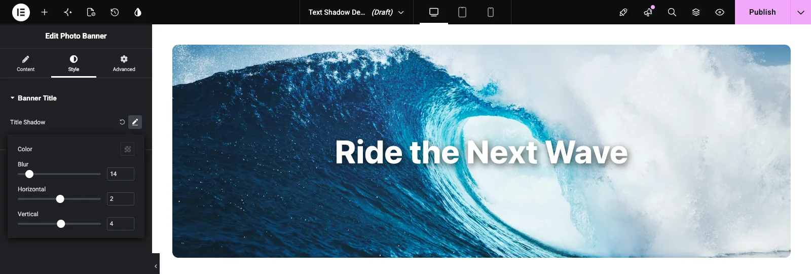
انقر فوق عينة الألوان لاختيار لون الظل. يحتوي المنتقي على شريط تمرير عتامة ويقبل قيم HEXA أو RGBA أو HSLA، حتى تتمكن من كتابة قيمة مثل rgba(0, 0, 0, 0.65) مباشرة.
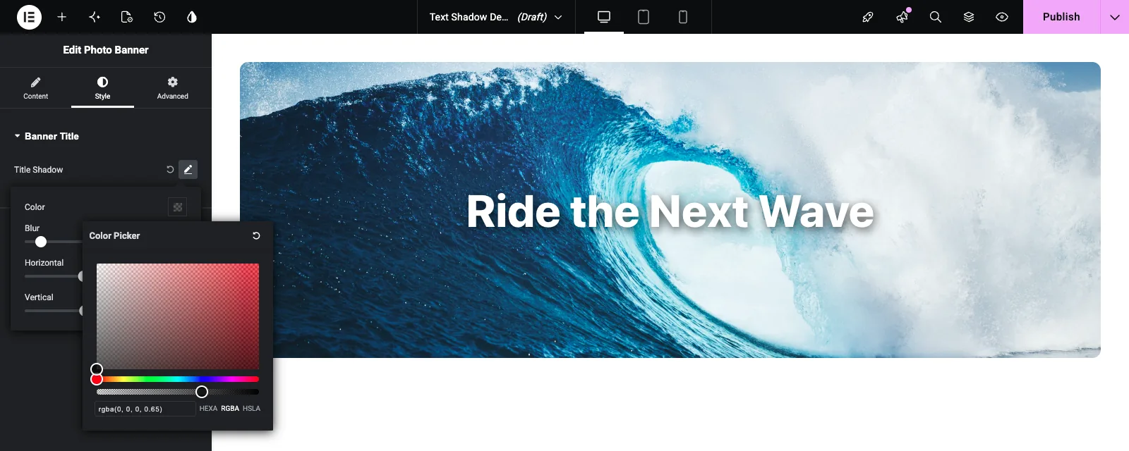
لإزالة الظل، انقر فوق سهم إعادة الضبط الدائري بجوار قلم الرصاص.
حالات الاستخدام الشائعة #
- عناوين صور الأبطال واللافتات مع وجود مناطق مشرقة خلف النص.
- النص على خلفيات الفيديو، حيث يحافظ الظل الناعم على الكلمات قابلة للقراءة مع تغير الإطار.
- نوع العرض القديم، مثل الإزاحة الصلبة مع عدم وجود ضبابية على الأعداد الكبيرة أو شارات البيع.
- توهج على خلفيات داكنة، مصنوع بلون ظل فاتح، ضبابية كبيرة وبدون إزاحة.
نصائح للعمل مع حقل Text Shadow #
- ابدأ كل محدد باستخدام
{{WRAPPER}}. وإلا فقد يتسرب الظل إلى عناصر واجهة مستخدم أخرى على الصفحة. - ضع الحقل بجوار حقل الطباعة الذي يستخدم نفس المحدد، بحيث توجد إعدادات الخط والظل للعنوان في قسم واحد.
- اختر لونًا شبه شفاف. يبدو اللون الأسود بنسبة عتامة تتراوح من 40 إلى 70% طبيعيًا، بينما يبدو اللون الأسود الصلب ثقيلًا.
- تحقق من الظل مقابل الصورة الأكثر سطوعًا التي من المحتمل أن تحصل عليها الأداة. يمكن أن يختفي الظل الذي يعمل على الصورة المظلمة على الصورة الفاتحة.
- إذا كان التصميم يحتاج إلى ظل قبل أن يلمس أي شخص عنصر التحكم، أضف أ
text-shadowحكم ل.banner-titleفي علامة التبويب CSS. تستبدله قيمة عنصر التحكم بمجرد قيام المحرر بتعيين واحد. - بالنسبة للبطاقات والأزرار والحاويات، استخدم حقل ظل الصندوق بدلاً من ذلك. يتبع Text Shadow شكل الحروف.
الأسئلة المتداولة #
هل حقل ظل النص مجاني؟
يعد No. Text Shadow أحد حقول Pro في Widget Builder، لذا يجب أن يكون Master Addons Pro نشطًا قبل أن تتمكن من إضافته إلى عنصر واجهة المستخدم.
لماذا لا يظهر ظل النص الخاص بي؟
حدد المحدد أولاً. يجب أن يطابق عنصرًا في HTML الخاص بأداة واجهة المستخدم الخاصة بك، على سبيل المثال {{WRAPPER}} .banner-title للحصول على عنوان مع الفصل banner-title. ثم احفظ عنصر واجهة المستخدم وأعد تحميل محرر Elementor.
هل يمكنني استخدام الرمز المميز {{title_shadow}} في CSS الخاص بي؟
لا. لا يطبع الرمز المميز أي شيء مفيد لهذا الحقل. قم بتعيين خيار المحدد ويقوم Elementor بكتابة text-shadow حكم لك.
لماذا يظهر الظل على العناوين في عناصر واجهة المستخدم الأخرى؟
المحدد مفقود {{WRAPPER}}، لذا فهو يطابق هذا الفصل عبر الصفحة بأكملها. يضيف {{WRAPPER}} أمام الفصل وحفظ.
ما الفرق بين Text Shadow وBox Shadow؟
يرسم Text Shadow حول الحروف ولا يحتوي على إعدادات انتشار أو إدراج. يرسم Box Shadow حول مستطيل العنصر. استخدم Text Shadow للعناوين والتسميات، وBox Shadow للبطاقات والأزرار.
إلتحاق بالركب #
قم بإسقاط حقل Text Shadow في قسم النمط، وأعطه تسمية واسمًا، وقم بتعيين المحدد عليه {{WRAPPER}} بالإضافة إلى فئة النص الخاص بك. يحصل المحررون بعد ذلك على عناصر التحكم في اللون والطمس والإزاحة في Elementor، ويبقى الظل داخل عنصر واجهة المستخدم هذا. إقرانه مع مجال الطباعة بالنسبة لبقية تصميم العنوان، تحقق التسعير لما تتضمنه كل خطة.


