


Most Elementor slider templates you find online are the same slider. Full-width image, text over the middle, arrows on the sides, next.
These twenty aren’t that. One bends the slides around the rim of a circle. One pins entries to a dated timeline where the gaps between years are drawn to scale. One turns a list of rows into the navigation itself. Eight of them import into the free Master Addons plugin with no Pro licence, which the free-versus-Pro breakdown goes through in detail, and every one of the twenty has a live demo you can open, poke at, and break before you decide whether you want it.
Below: every design, what it’s actually good for, and the honest note on which ones are a bad idea for your site. For the plugin’s conventional carousels alongside these, start at the carousel widget hub.
The 20 designs at a glance
Pick by what you’re building, not by what looks best in a screenshot. A coverflow that looks stunning on a portfolio will bury a product grid.
Past a dozen pieces a slider starts hiding work. The Filterable Image Gallery keeps the whole set on the page and lets visitors filter it by project type.
| # | Design | Motion | Best for | Tier |
|---|---|---|---|---|
| 01 | Meridian Coverflow | 3D depth, rotating panels | Case studies, portfolios | Pro |
| 02 | Concertina Accordion | Panels expand on hover | Service pages, categories | Pro |
| 03 | Umbra Overlay | Caption reveals over image | Photography, editorial | Pro |
| 04 | Stratum Deck | Stacked cards, top card peels | Testimonials, feature tours | Pro |
| 05 | Bisect Split | Two halves, opposite directions | Hero sections, comparisons | Pro |
| 06 | Ascent Mousewheel | Scroll wheel drives the slide | Long-form, storytelling | Pro |
| 07 | Pivot Flip | 3D flip on the Y axis | Before/after, team cards | Pro |
| 08 | Arc Curved | Slides ride a circle’s rim | Collections, catalogues | Pro |
| 09 | Tessera Mosaic | Grid tiles shuffle | Galleries, image-heavy pages | Pro |
| 10 | Meander Drag | Free drag, momentum scroll | Portfolios, lookbooks | Pro |
| 11 | Slate Curtain | Panels draw back like curtains | Launches, hero reveals | Pro |
| 12 | Halo Orbit | Circular orbit around a centre | Process steps, ecosystems | Pro |
| 13 | Plinth Hero Slider | Instant swap, full-bleed stage | Homepage heroes | Free |
| 14 | Ledger Index Slider | Row list drives the image | Collections, archives | Free |
| 15 | Vitrine Plate Gallery | Thumbnail strip, data panel | Photography | Free |
| 16 | Quadrant Paged Catalogue | Grid paged three at a time | Catalogues, feature grids | Free |
| 17 | Bulletin Tabbed Panels | Tab strip, editorial panels | Comparisons, deep-dives | Free |
| 18 | Rostrum Quote Slider | Stepped quotes with progress | Testimonials, reviews | Free |
| 19 | Almanac Timeline Slider | Entries on a dated axis | Histories, milestones | Free |
| 20 | Keystone Feature Slider | Click to promote, FLIP motion | Rooms, spaces, exhibits | Free |
What you need to run these
Elementor free is enough for the page itself. The split is in the designs:
- Designs 13 to 20 are free. They import through Master Addons → Widget Builder → Import Widget on the free plugin: no Pro licence, no trial, no card. Each one lands in the Elementor panel under Favorites with its own controls.
- Designs 01 to 12 need Master Addons Pro. They’re built on the full Widget Builder, which is a Pro feature.
What doesn’t need anything: the live demos. Open any of the twenty, resize the browser, drag a slide, watch how it behaves on a phone-width viewport. That costs nothing and it’s the only way to judge whether a motion style suits your content.
The free plugin also ships conventional carousel widgets (Image Carousel, Logo Slider, Team Slider, and the Blog widget in carousel mode) all covered on the carousel widget page linked in the intro.
To see the Blog widget in carousel mode on a finished page, open the Marquee layout in our Elementor blog templates. It starts with a rotating banner of featured posts.
01. Meridian Coverflow
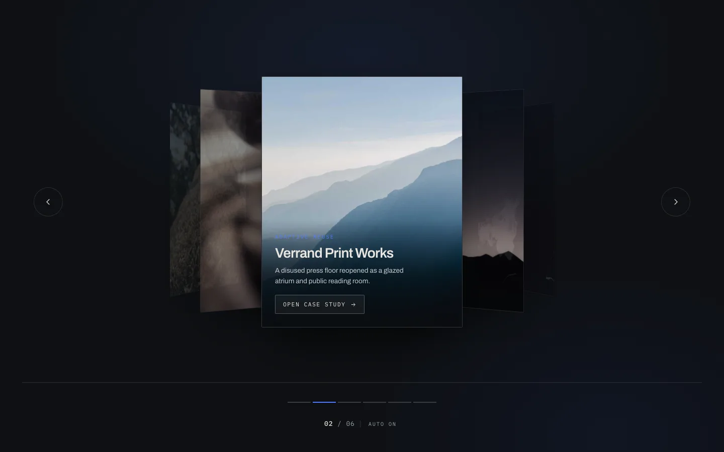
The centre slide sits flat and square. The ones either side rotate away on the Y axis and dim, so your eye lands where it should. Classic coverflow, minus the reflection nobody has wanted since 2011.
It works because it shows context without competing for attention. A visitor sees there are five more case studies without being able to read any of them, which is exactly the tension that makes people click the arrow.
Use it for: case study reels, portfolio pieces, anything where each slide deserves a full read.
Don’t use it for: product grids. Coverflow shows one item properly and hints at two. Shoppers comparing six products will hate you.
02. Concertina Accordion
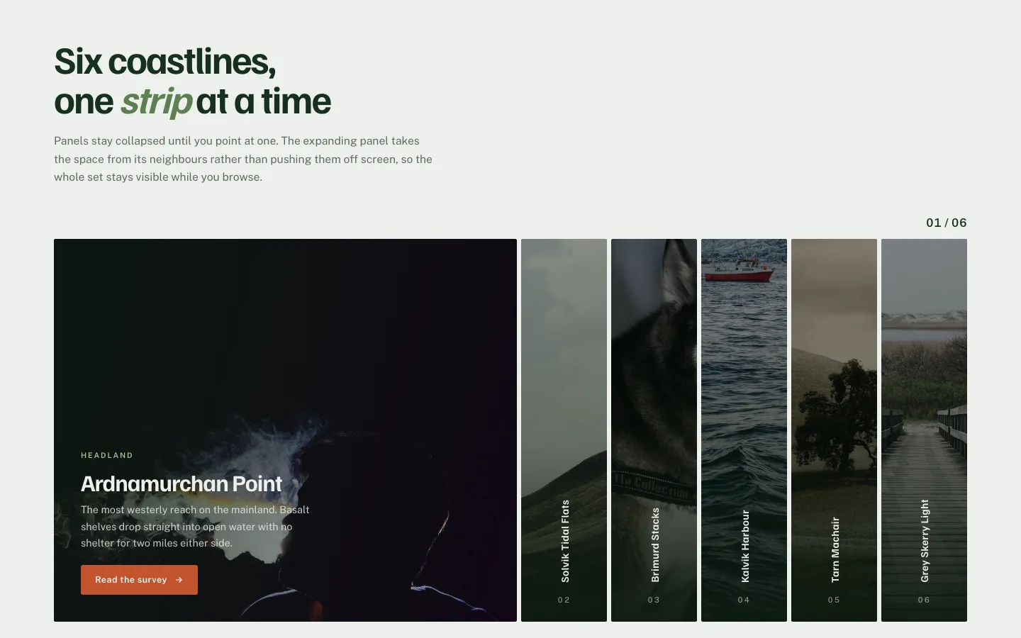
Six narrow vertical panels. Hover one and it expands; the others compress to make room. No arrows, no dots, no autoplay: the whole navigation is the hover.
Watch what happens on mobile though. There’s no hover on a touchscreen, so the panels fall back to tap-to-expand. That’s fine, but it means the first-tap behaviour has to be obvious or people will scroll straight past it. Add a visible chevron on the active panel and the problem goes away.
Use it for: six or fewer service categories, destination lists, anything where the labels do the selling.
03. Umbra Overlay

Image fills the frame, caption sits in a gradient that only darkens the bottom third. Slide changes, caption cross-fades a beat later.
That delay is the whole design. Text and image arriving together reads as a banner ad. Text arriving second reads as a caption on a photograph, which is what you want if the photograph is the product.
This is the closest design to the Elementor Image Carousel widget if you want the same look without Pro. The free widget does image plus caption, just without the staggered fade.
04. Stratum Deck

Cards stacked with a slight offset so you can see three or four edges behind the top one. Advance and the top card lifts and slides off, revealing the next.
The stack does something a flat carousel can’t: it shows quantity. A visitor knows there are more testimonials without counting dots. For social proof that’s most of the job.
Use it for: testimonials, pricing tiers, onboarding steps.
Watch out: keep the stack to five or six visible cards. Past that the offsets get so thin the depth reads as a rendering bug.
05. Bisect Split
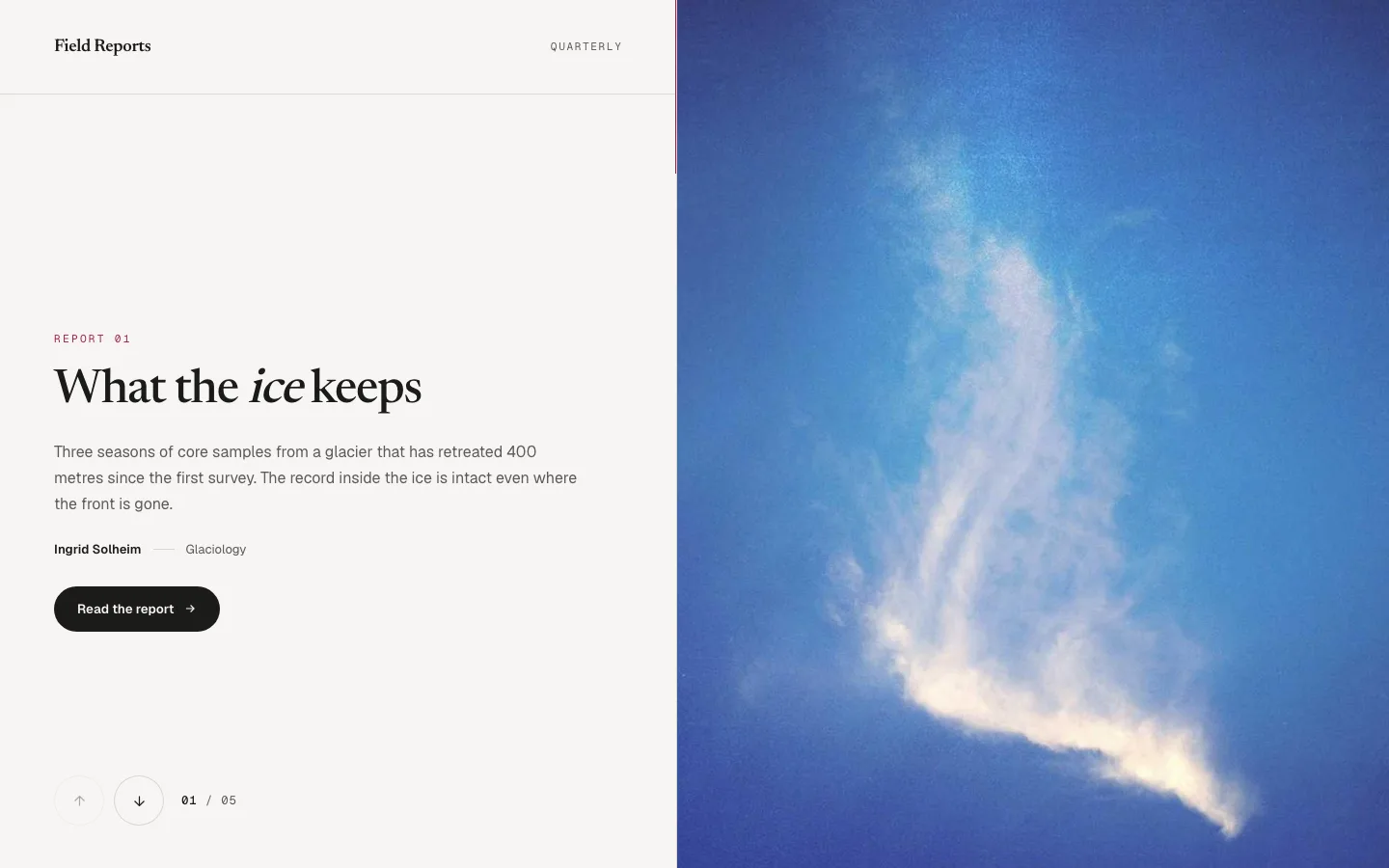
Screen splits down the middle. Top half moves up, bottom half moves down, and they meet on the next slide. Two panels, one gesture.
I’d put this in a hero and nowhere else. It’s a big motion: it eats the full viewport and demands a second of the visitor’s attention. In a hero that’s a fair trade. Halfway down a services page it’s just noise.
Use it for: homepage heroes, campaign landing pages, before/after pairs.
06. Ascent Mousewheel

No arrows. You scroll, it advances. The slider captures the wheel while it’s in view and releases it once you hit the last slide.
Scroll-jacking has a bad reputation and it earned it. The version here releases the wheel the moment you reach either end, so a visitor who wants to keep going down the page never gets trapped. Test this one on a trackpad before you commit, because trackpad momentum is much twitchier than a wheel, and if your slides are text-heavy people will overshoot.
Use it for: narrative sections, product stories, timelines.
Don’t use it: above the fold. A visitor’s first scroll should move the page, not a widget.
07. Pivot Flip
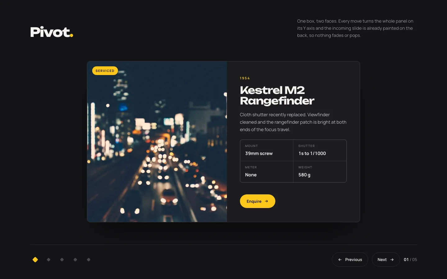
Card rotates 180° on the vertical axis. Front face out, back face in. Both faces are editable, so the reverse can hold a bio, a spec sheet, or a price.
Two-sided content is rarer than it sounds and this design is the reason to look for it. Team member on the front, role and links on the back. Product shot front, dimensions back.
Use it for: team grids, before/after, spec cards. Flip sits alongside coverflow, arc and orbit in the 3D carousel breakdown.
08. Arc Curved
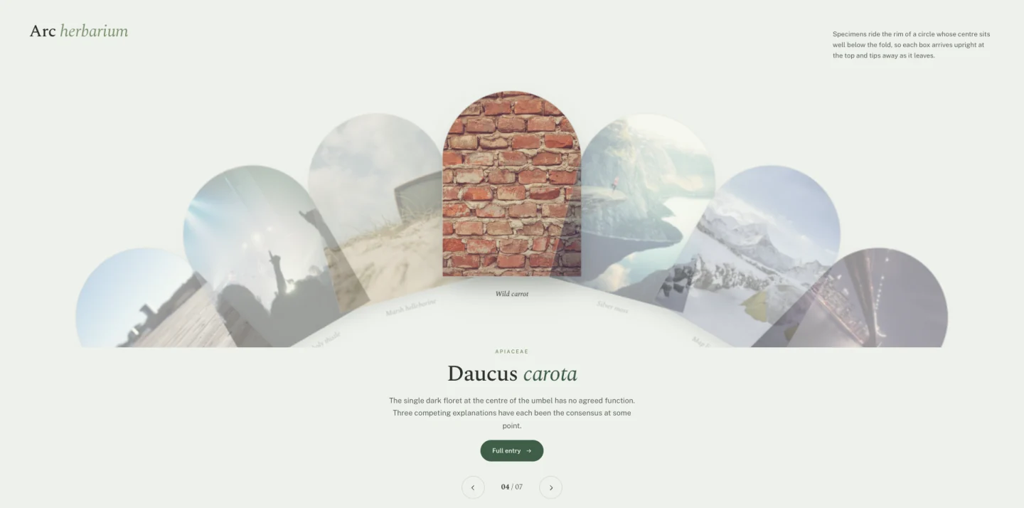
The slides sit on the rim of a circle whose centre is somewhere below the fold. Each arrives upright at the top and tips away as it leaves. Arch-shaped image masks follow the same curve.
Nothing else in the set looks like this, and that’s the argument for it. Nobody has seen this on another WordPress site.
Use it for: collections where the items are similar and the presentation has to carry the interest: a catalogue, a specimen list, a menu.
09. Tessera Mosaic
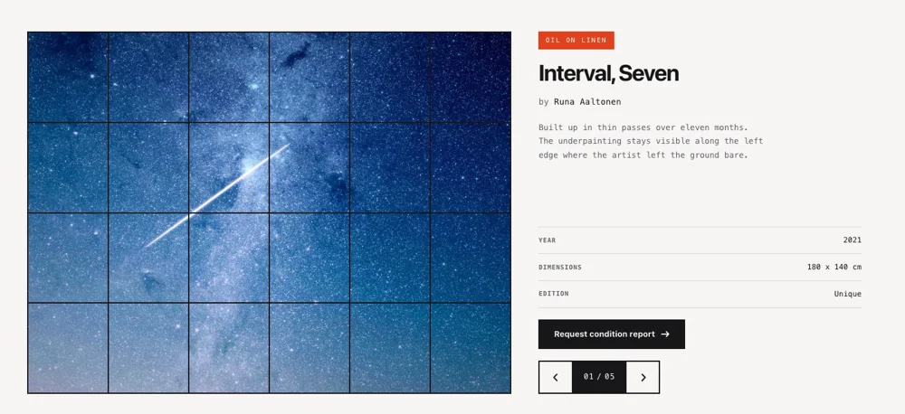
A grid of unequal tiles that reshuffles instead of sliding. Tiles animate to new positions and sizes; the composition changes but never empties.
This is the one to reach for when you have thirty images and no hierarchy between them. A conventional carousel forces a reading order onto content that doesn’t have one. A mosaic doesn’t.
Use it for: event photography, gallery pages, image-heavy about pages.
Cost: it’s the heaviest design in the set for layout work. Keep source images under 200 KB each or the reshuffle stutters on mid-range Android.
10. Meander Drag
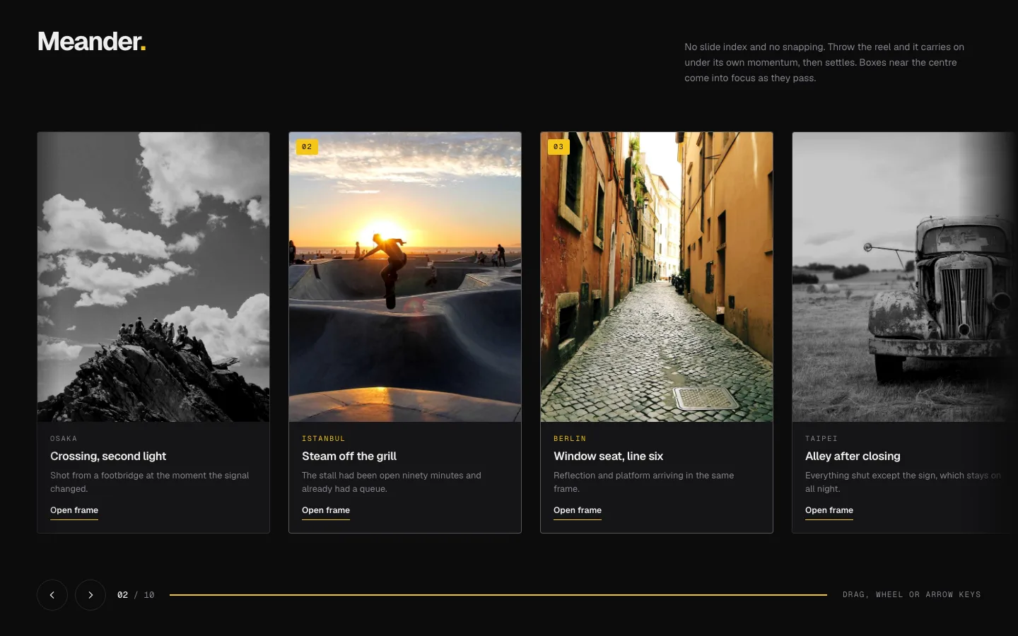
Grab and throw. Momentum carries the track past where you let go and eases to a stop. No snapping to slide boundaries, so a slide can sit half-visible, which is the point, because a half-visible slide is a signal that there’s more.
Free-drag has a genuine accessibility cost: keyboard users get nothing from a drag interaction. Arrow-key support is wired in, but if your audience skews toward assistive tech, design 01 or 04 will serve them better.
Use it for: lookbooks, portfolios, long horizontal collections.
11. Slate Curtain
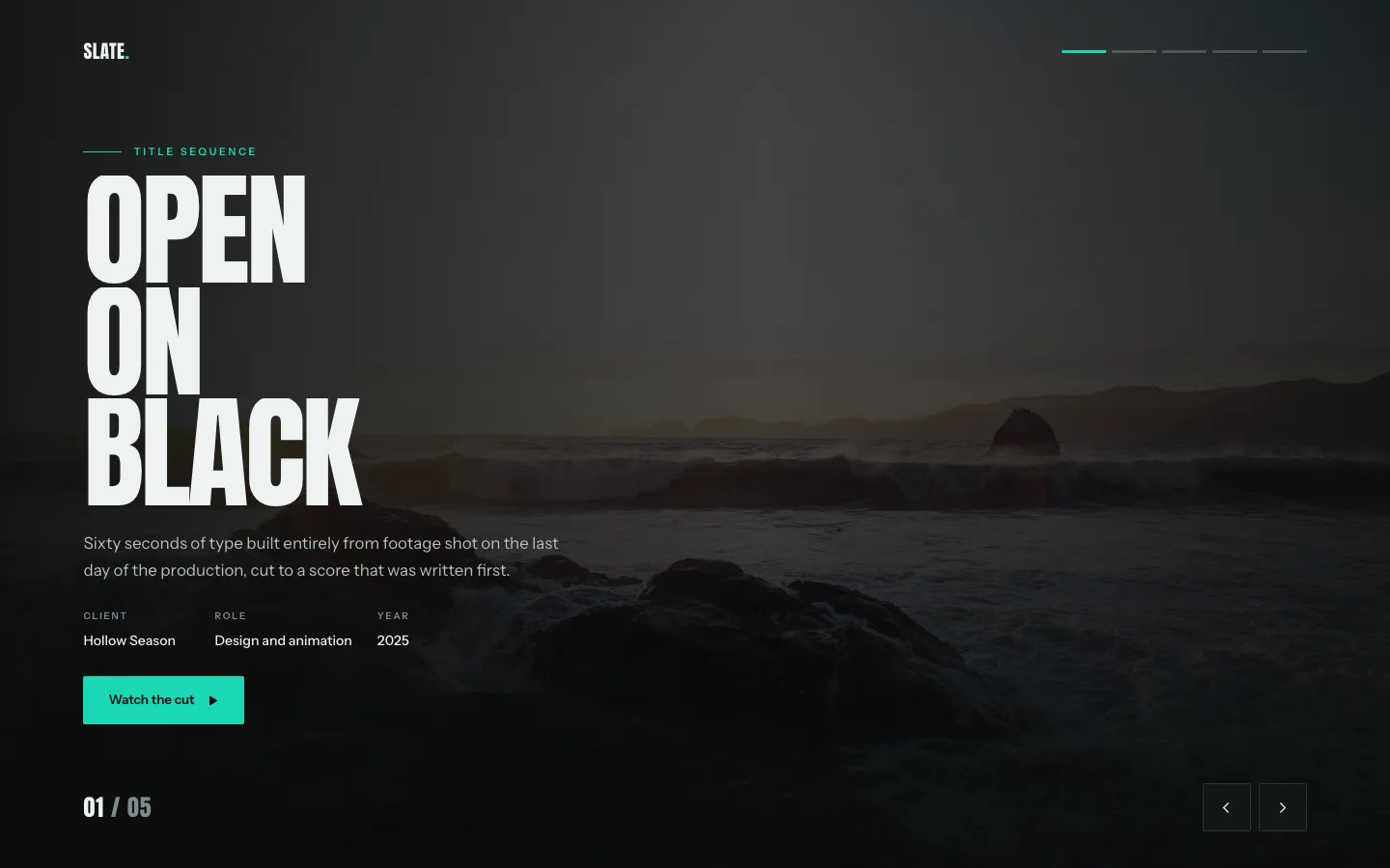
Vertical panels draw apart like curtains and the next slide is already sitting behind them. The reveal is the transition.
It reads as ceremony. That’s useful precisely twice on a website, a product launch and a homepage hero, and misplaced everywhere else.
Use it for: launches, announcement heroes, seasonal campaigns.
12. Halo Orbit

Items orbit a fixed centre point. The one at the top is active and full-size; the rest shrink as they travel round the back.
Circular layouts suit content that genuinely loops. A four-stage process, an ecosystem diagram, a service wheel. Put a linear list in it and you’ll confuse people, because a circle implies “returns to the start,” and a five-step onboarding flow doesn’t.
Use it for: process diagrams, ecosystem maps, capability wheels.
13. Plinth Hero Slider (free)
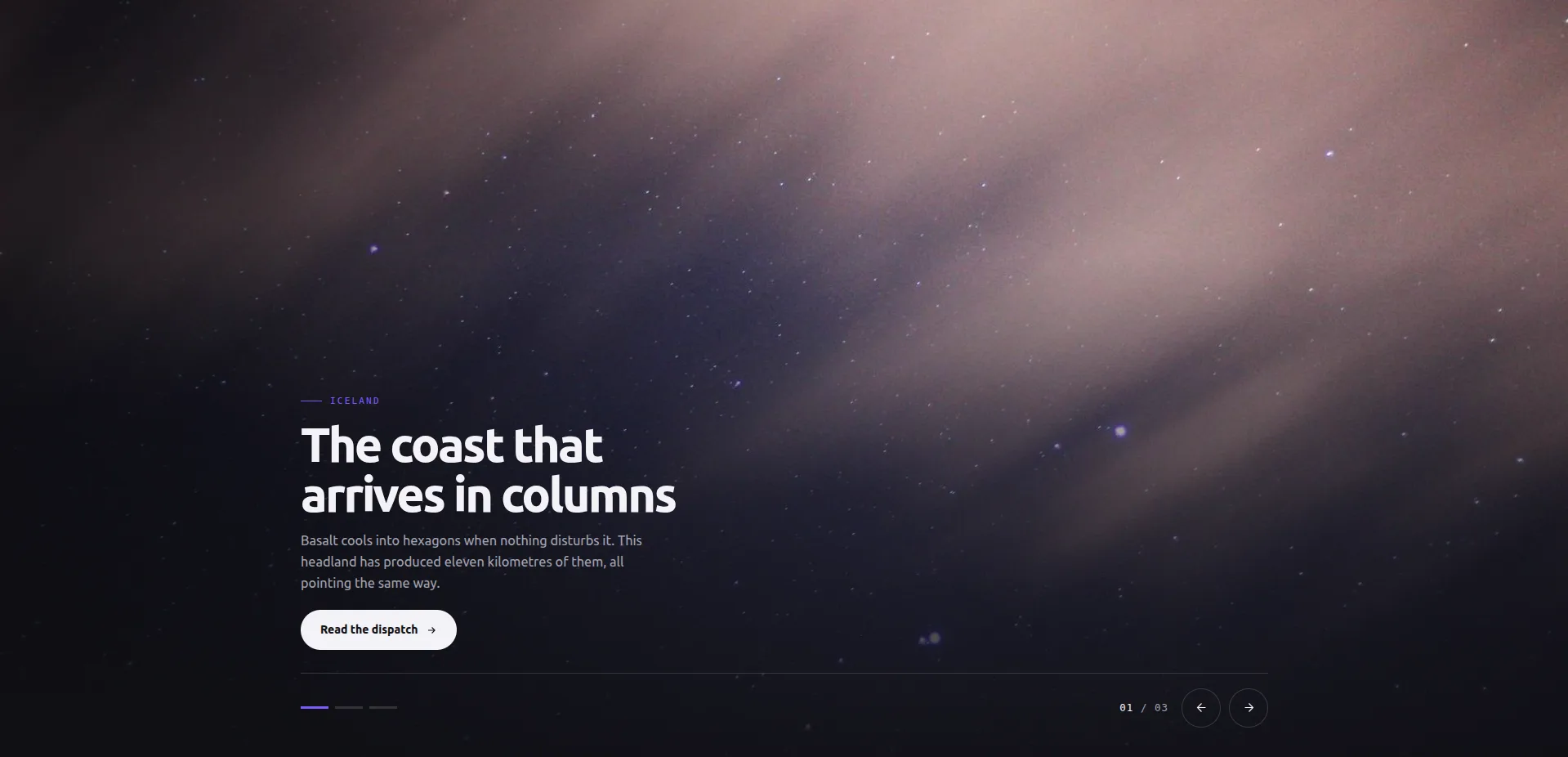
One picture fills the stage. A caption plinth sits lower-left, the control bar (dots, arrows, counter) lower-right. Slides swap instantly: no fade, no slide-in, nothing to go out of sync or stutter on a slow phone.
The instant swap sounds like a limitation until you time a fade against it. A hero transition eats attention twice: once leaving, once arriving. This design spends that budget on the photograph instead. It’s also the only design in the set with a per-slide link control, plus one CTA label shared across all slides, which is exactly the shape a homepage hero needs.
Use it for: homepage heroes, landing page tops, anywhere the image is the argument.
Don’t use it for: content that needs motion to explain itself. There is none, on purpose.
14. Ledger Index Slider (free)
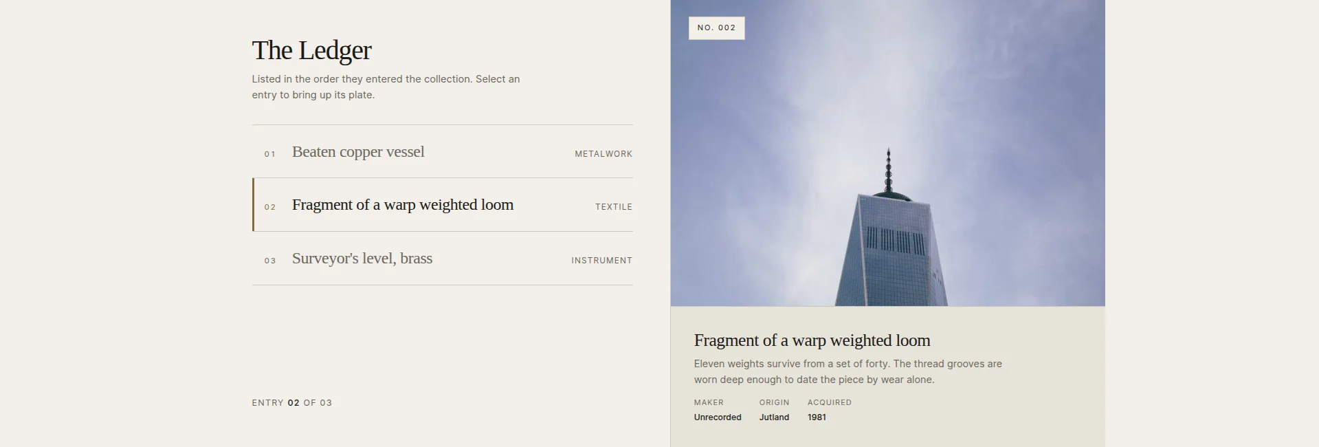
A column of entry rows beside a large plate. Pick a row and the plate, its stamp and its caption swap to match. The list is the navigation, with no arrows required, though they’re there.
This inverts the usual carousel problem. A normal slider hides everything except the current slide; here the full table of contents is visible the whole time, and the image is the detail view. There’s a select-on-hover toggle if you want the rows to respond before the click.
Use it for: collections, archives, lists of works: anywhere the titles carry real information.
Watch out: the rows sell the click. “Item 1, Item 2, Item 3” wastes the whole design; write row titles like headlines.
15. Vitrine Plate Gallery (free)
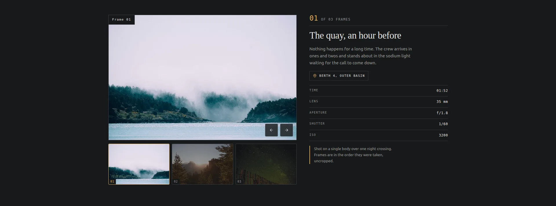
A single plate under a strip of thumbnails, with a sticky panel beside it holding the caption and a frame-data table: place, time, lens, aperture, shutter, ISO. Frames replace outright; nothing slides.
If you searched “elementor image slider with thumbnails,” this is that, built for photographers. The data table labels are all editable, so a print shop can turn lens/aperture into paper/edition, and a museum can turn them into medium/date/provenance.
Use it for: photography portfolios, object photography, product detail galleries. For the same plate-and-thumbnail shape with video in it, see the gallery slider guide.
Don’t use it for: images that don’t deserve metadata. An empty data panel reads as an unfinished page.
16. Quadrant Paged Catalogue (free)
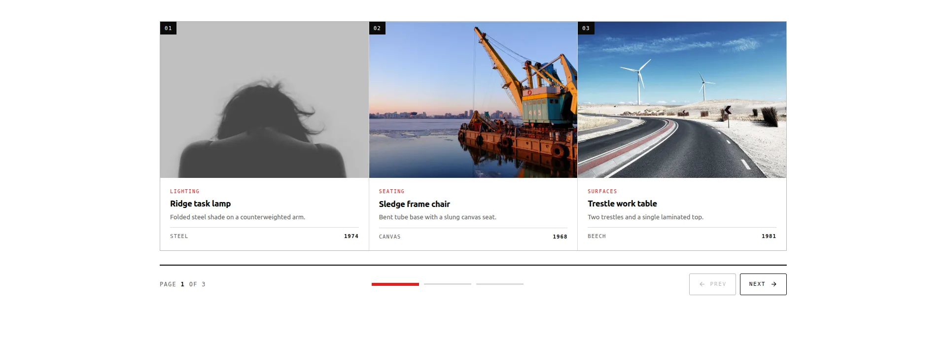
A grid of item boxes, paged three at a time: nine items across three pages. A rail of segments shows where you are in the run and doubles as the jump control; step buttons walk it forwards and back.
This is the design for the job most carousels are wrongly given: showing many comparable things. Each box carries an image, category, title, copy and a stat, and because a full page of three is visible at once, a visitor can actually compare, which is what coverflow and its cousins deliberately prevent.
Use it for: product-style catalogues, feature grids, service menus. It is also the free route in the WooCommerce product carousel guide.
Watch out: it holds exactly nine items in three pages. If your catalogue is thirty items deep, you want a real product grid with filters, not any carousel.
17. Bulletin Tabbed Panels (free)
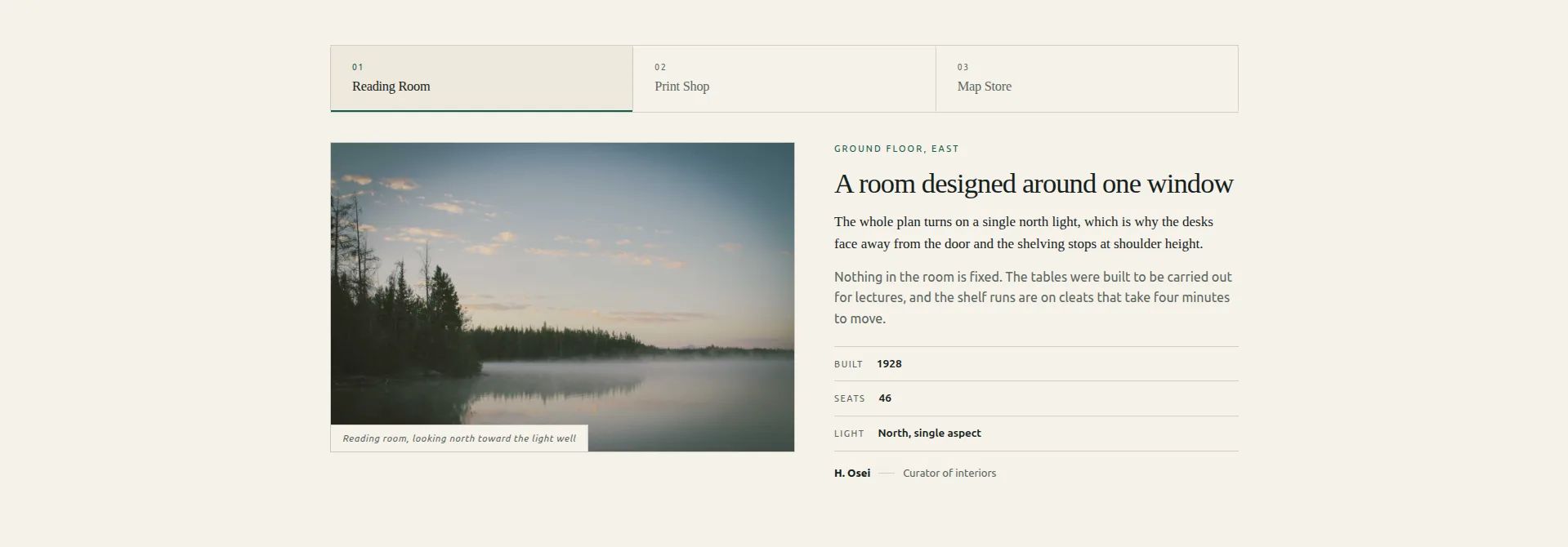
A tab strip over stacked panels. Each panel is a small editorial layout: a figure with its caption, a kicker, a title, a lede, body copy, a three-row facts table and a byline.
Strictly, this is tabs, not a slider, and that’s why it’s here. Half of what people try to force into carousels (compare three plans, three locations, three case studies) is tabbed content wearing a costume. This one also does the accessibility properly: real ARIA tablist semantics with roving tabindex, which most tab widgets fake.
When that is what you are building, the Tabs widget is the shorter route: a tab strip, panels, and no slider timing to tune.
Use it for: plan comparisons, location pages, case study panels: any three things a visitor picks between rather than browses through.
18. Rostrum Quote Slider (free)

A quote panel beside a portrait, stepped through with two chevrons. A progress bar and a tally track where you are, and the step buttons can name the voice they’ll move to, like “Next: Amara Okafor” instead of an anonymous arrow.
That named step is the detail worth stealing. Testimonial carousels lose readers at the transition, because an arrow promises nothing. A name is a reason to click. The quote mark is an editable text control too, so it can be set to the right glyph for the site’s language, or removed.
Use it for: testimonials, reviews, client quotes. There’s a full testimonial carousel walkthrough, and you can see real customer quotes on our own site.
Watch out: it holds three voices, and each gets the stage alone. Pick your three best quotes, and keep them short enough to read in one breath.
19. Almanac Timeline Slider (free)
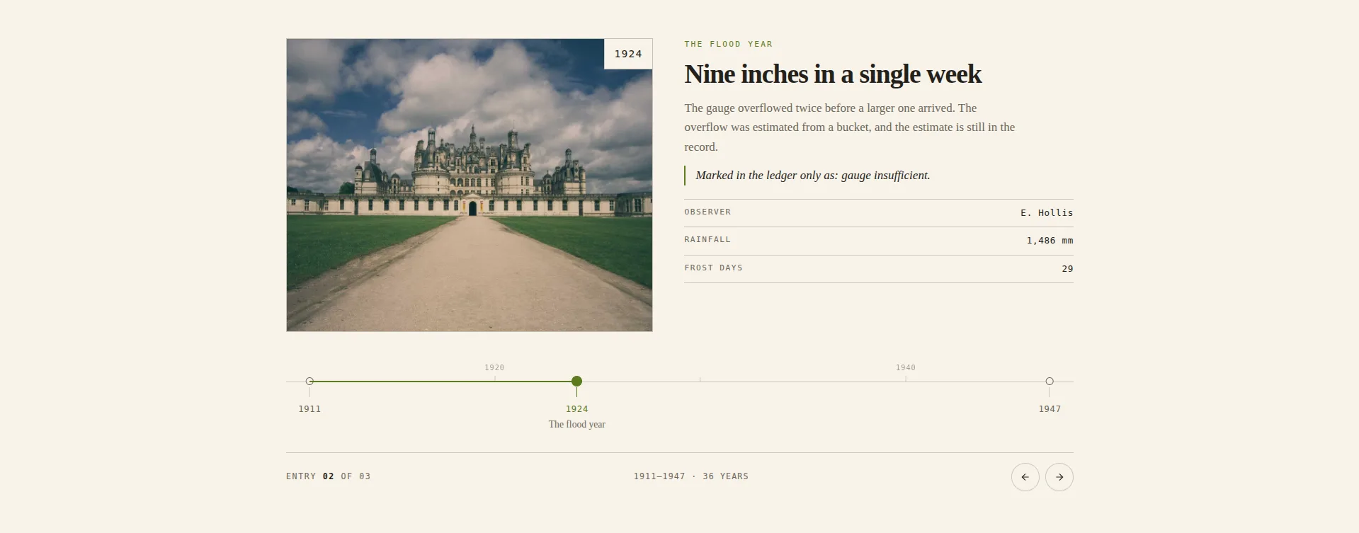
Entries pinned to a dated axis. The tick positions are computed from the years you type, so the spacing is real rather than even. 1994 and 1996 sit close together, 1996 and 2011 sit far apart, and the gap tells its own story. A decade comb above the rule gives the spacing a scale to read against.
Every other timeline widget spaces its entries evenly, which quietly lies about the history. This one doesn’t, and that makes it the most opinionated design in the set. It’s also the deepest panel here, at 143 controls, because the axis, the comb and the tick states style separately from the entries.
Use it for: company histories, project milestones, changelogs, records with meaningful gaps. For a static version, there’s a timeline tutorial using the stock Timeline widget.
Don’t use it for: undated content. The axis is the design; without real years there’s nothing for it to draw.
20. Keystone Feature Slider (free)
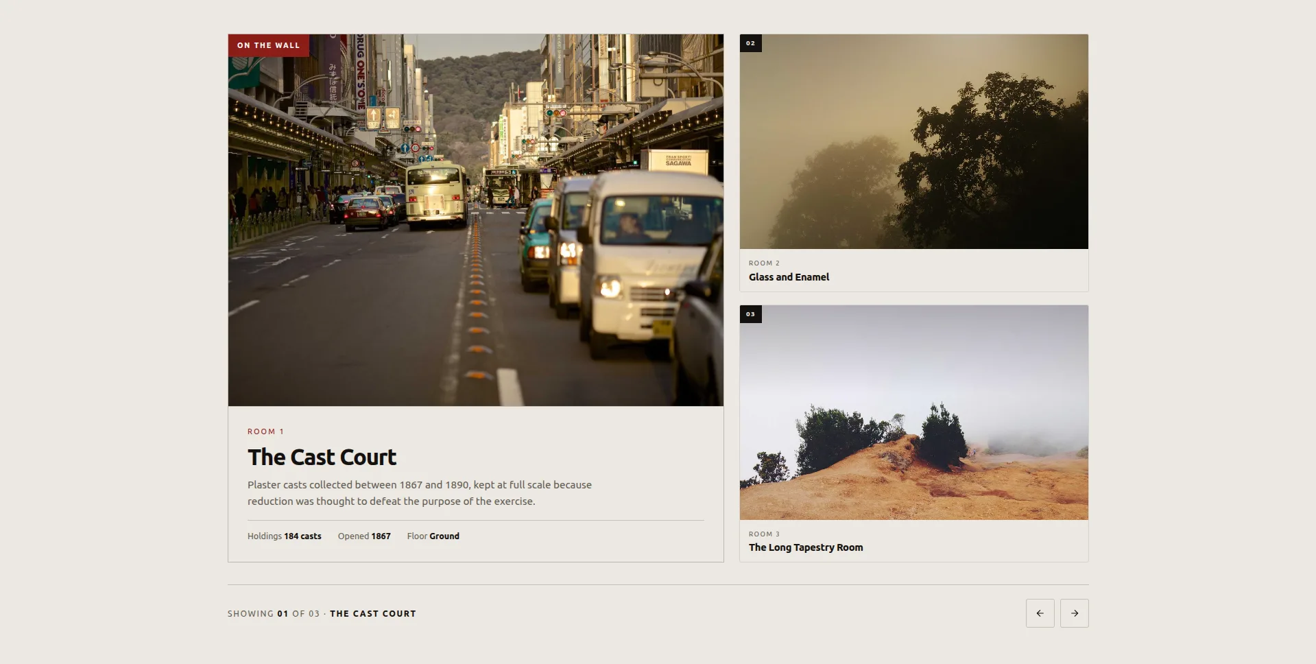
One item featured large; the rest wait on a wall beside it, each carrying just its number and name. Click a satellite and it’s promoted to the feature, and the boxes FLIP into their new places rather than teleporting, so your eye follows the swap instead of losing it.
The feature carries a plaque of three facts. It was built for rooms, spaces and rotating exhibits, and that’s the honest scope: it presents a small set of distinct things one at a time, with the others visibly queued.
Use it for: venue rooms, studio spaces, exhibits, a three-to-five-piece portfolio.
Watch out: the satellites show only number and name, so the feature has to do the persuading. Lead with your strongest item, because most visitors never click past it.
How to import a slider template into Elementor
Four steps, about ninety seconds. Same flow for free and Pro designs, and different from importing an Elementor template, because a design registers as a widget rather than a page layout.
- Download the design’s JSON file from its demo page. One file per design.
- Go to Master Addons → Widget Builder in your WordPress admin and click Import Widget.
- Drop the JSON on the dropzone. The design registers as a widget with its own controls: content, colours, typography, breakpoints. The eight free designs import on the free plugin; the twelve Pro designs ask for a Pro licence here.
- Drag it onto a page from the Elementor panel, where it appears under Favorites, and swap the placeholder content for yours.
The import doesn’t touch your theme, doesn’t enqueue anything globally, and doesn’t create a shortcode. It becomes a widget in the panel like any other.
Do these sliders work on mobile?
All twenty are touch-enabled and responsive. Four change behaviour rather than just scaling:
- Concertina Accordion switches from hover-to-expand to tap-to-expand.
- Ascent Mousewheel drops the wheel capture and uses swipe.
- Meander Drag keeps drag but shortens the momentum so a flick doesn’t overshoot the whole track.
- Ledger Index Slider stacks the index above the plate, and select-on-hover falls back to tap.
The free eight also keep keyboard navigation on by default, and Plinth Hero and Rostrum Quote respond to swipe gestures out of the box. Test the mosaic on a real phone rather than in the browser’s device emulator, because emulated viewports don’t reproduce mid-range Android layout cost, and the mosaic is where that shows up first.
Which one should you actually pick?
If you’re stuck, these cover most sites:
- Portfolio or agency: Meridian Coverflow, or Meander Drag if you have more than a dozen pieces. On a free licence, Keystone Feature Slider.
- Service business: Concertina Accordion. On free, Bulletin Tabbed Panels, whose facts table earns its keep on plan comparisons.
- Shop: Quadrant Paged Catalogue for a curated nine. There’s no free widget that slides a live product feed; that job needs Elementor Pro’s Loop Carousel. Skip the 3D designs either way: shoppers want to compare, and coverflow is built to stop them.
- Testimonials: Rostrum Quote Slider. It’s free, and the named step buttons are the best transition prompt in the set.
- Homepage hero: Plinth Hero Slider if the photography is strong, and the hero section templates if you want the whole block rather than the slider; Bisect Split or Slate Curtain if you want the motion to be the moment, and only one of them, once.
- About page or history: Almanac Timeline Slider. Nothing else here does dated content honestly.
Whatever you choose, run it past the one test that matters: load the page on your own phone, on cellular, and see whether the slider is the first thing that renders or the last. A design that arrives after the text has already been read isn’t a slider, it’s a decoration.
Frequently asked questions
Are these Elementor slider templates free?
Eight of the twenty are: Plinth Hero, Ledger Index, Vitrine Plate Gallery, Quadrant Paged Catalogue, Bulletin Tabbed Panels, Rostrum Quote, Almanac Timeline and Keystone Feature all import on the free Master Addons plugin. The other twelve are built on the full Widget Builder, which is a Pro feature. Live demos are open for all twenty.
Does Elementor have a free slider widget?
Elementor free ships an Image Carousel and a Basic Gallery. Media Carousel, Testimonial Carousel and Loop Carousel are all Elementor Pro. Master Addons adds Image Carousel, Logo Slider, Team Slider and a Blog widget with a carousel mode to the free tier, plus the eight free designs above. See the full carousel widget list.
What’s the difference between a slider and a carousel in Elementor?
A slider shows one slide at a time and usually fills the width. A carousel shows several at once and scrolls sideways through a longer set. In practice people use the words interchangeably, and most widgets labelled “carousel” can be configured to behave like a slider by setting slides-per-view to one. Carousel versus slider works through where the distinction still matters.
Can I add text on an Elementor image slider?
Yes. Every design here is an image box, with image, eyebrow, title, description, and in Plinth Hero’s case a button, so text is part of the slide rather than an overlay you position by hand. Umbra Overlay and Plinth Hero Slider are the two built specifically around text sitting on the image.
How do I make an Elementor slider autoplay and loop continuously?
Turn on Autoplay and Infinite Loop in the widget’s carousel settings, then set the delay. Two things that catch people out: pause-on-hover is a separate toggle, and a loop needs at least twice the slides-per-view count to run without a visible jump. Four slides at two-per-view will stutter; six won’t. Set the autoplay delay to zero instead and it becomes a continuous marquee.
Why is my Elementor carousel not working after import?
Nine times out of ten it’s JavaScript optimisation. Caching plugins that defer or combine JS will break the slider’s initialisation. Exclude the carousel script in your cache plugin’s JS settings and it comes back. If you’re on LiteSpeed, the exclusion has to go in the Guest Mode field too, not just the main one. The Swiper troubleshooting guide lists the exact handles to exclude.
Where to go next
Open two or three demos and give them a real look on your phone before you pick. Then:
Twelve of the twenty need a licence to import, so the pricing page is the place to check which tier covers the design you picked.
- Browse everything in one place on the Elementor Carousel Widgets page, with all twenty designs plus the plugin’s own carousel widgets.
- Sticking to the free tier? The free carousel widgets post walks through everything that costs nothing, these eight included.
- Going for depth over motion? The 3D carousel designs (coverflow, flip, arc and orbit) get a closer look of their own.
- Want a whole page rather than one section? The Elementor template kits ship complete layouts with carousels already placed. Single pages are in the Elementor page templates library.
- Building the whole page, not just the slider? The free Elementor section templates library covers features, pricing, testimonials, team, FAQ and CTA blocks, each importable as one editable widget.
