

আপনি অনলাইনে খুঁজে পান বেশিরভাগ এলিমেন্টর স্লাইডার টেমপ্লেট একই স্লাইডার। পূর্ণ-প্রস্থের ছবি, মাঝখানে পাঠ্য, পাশে তীর, পরবর্তী।
এই বিশটি তা নয়। একজন একটি বৃত্তের রিমের চারপাশে স্লাইডগুলিকে বাঁকিয়ে দেয়। একটি তারিখের টাইমলাইনে একটি পিন এন্ট্রি যেখানে বছরের মধ্যে ব্যবধানগুলি স্কেলে আঁকা হয়। একজন ন্যাভিগেশন নিজেই সারি একটি তালিকা পরিণত। তাদের মধ্যে আটটি প্রো লাইসেন্স ছাড়াই বিনামূল্যের মাস্টার অ্যাডঅন প্লাগইনে আমদানি করে, যা ফ্রি-বনাম-প্রো ব্রেকডাউন বিস্তারিতভাবে যায়, এবং বিশটির প্রত্যেকটির একটি লাইভ ডেমো রয়েছে যা আপনি এটি চান কিনা তা সিদ্ধান্ত নেওয়ার আগে আপনি খুলতে, খোঁচা দিতে এবং ভাঙতে পারেন।
নীচে: প্রতিটি ডিজাইন, এটি আসলে কিসের জন্য ভাল, এবং সৎ নোট যার উপর আপনার সাইটের জন্য একটি খারাপ ধারণা। এইগুলির পাশাপাশি প্লাগইনের প্রচলিত ক্যারোসেলগুলির জন্য, থেকে শুরু করুন ক্যারোজেল উইজেট হাব.
এক নজরে 20টি ডিজাইন
আপনি যা তৈরি করছেন তা বেছে নিন, স্ক্রিনশটে যা সবচেয়ে ভালো দেখায় তা দিয়ে নয়। একটি কভারফ্লো যা একটি পোর্টফোলিওতে অত্যাশ্চর্য দেখায় তা একটি পণ্য গ্রিডকে কবর দেবে।
এক ডজন টুকরো পেরিয়ে একটি স্লাইডার লুকানোর কাজ শুরু করে। দ্য ফিল্টারযোগ্য ইমেজ গ্যালারি পুরো সেটটি পৃষ্ঠায় রাখে এবং দর্শকদের প্রকল্পের ধরন অনুসারে এটি ফিল্টার করতে দেয়।
| # | নকশা | গতি | জন্য সেরা | স্তর |
|---|---|---|---|---|
| 01 | মেরিডিয়ান কভারফ্লো | 3D গভীরতা, ঘূর্ণায়মান প্যানেল | কেস স্টাডি, পোর্টফোলিও | প্রো |
| 02 | কনসার্টিনা অ্যাকর্ডিয়ন | প্যানেলগুলি হোভারে প্রসারিত হয় | পরিষেবা পৃষ্ঠা, বিভাগ | প্রো |
| 03 | আমব্রা ওভারলে | ক্যাপশন ছবির উপর প্রকাশ করে | ফটোগ্রাফি, সম্পাদকীয় | প্রো |
| 04 | স্ট্র্যাটাম ডেক | স্তুপীকৃত কার্ড, শীর্ষ কার্ডের খোসা | প্রশংসাপত্র, বৈশিষ্ট্য ট্যুর | প্রো |
| 05 | দ্বিখণ্ডিত বিভক্ত | দুটি অর্ধেক, বিপরীত দিক | নায়ক বিভাগ, তুলনা | প্রো |
| 06 | আরোহণ Mousewheel | স্ক্রোল হুইল স্লাইড চালায় | দীর্ঘ ফর্ম, গল্প বলা | প্রো |
| 07 | পিভট ফ্লিপ | y অক্ষে 3D ফ্লিপ | আগে/পরে, টিম কার্ড | প্রো |
| 08 | আর্ক বাঁকা | স্লাইডগুলি একটি বৃত্তের রিমে চড়ে | সংগ্রহ, ক্যাটালগ | প্রো |
| 09 | টেসেরা মোজাইক | গ্রিড টাইলস এলোমেলো | গ্যালারী, ছবি-ভারী পাতা | প্রো |
| 10 | মেন্ডার টানুন | বিনামূল্যে টেনে আনুন, ভরবেগ স্ক্রোল | পোর্টফোলিও, লুকবুক | প্রো |
| 11 | স্লেট পর্দা | প্যানেলগুলি পর্দার মতো পিছনে আঁকা | লঞ্চ, নায়ক প্রকাশ | প্রো |
| 12 | হ্যালো কক্ষপথ | একটি কেন্দ্রের চারপাশে বৃত্তাকার কক্ষপথ | প্রক্রিয়া পদক্ষেপ, বাস্তুতন্ত্র | প্রো |
| 13 | প্লিন্থ হিরো স্লাইডার | তাত্ক্ষণিক অদলবদল, পূর্ণ-রক্তপাত পর্যায় | হোমপেজ হিরো | বিনামূল্যে |
| 14 | লেজার ইনডেক্স স্লাইডার | সারি তালিকা ছবিটি চালায় | সংগ্রহ, সংরক্ষণাগার | বিনামূল্যে |
| 15 | ভিট্রিন প্লেট গ্যালারি | থাম্বনেইল স্ট্রিপ, ডেটা প্যানেল | ফটোগ্রাফি | বিনামূল্যে |
| 16 | চতুর্ভুজ পৃষ্ঠাযুক্ত ক্যাটালগ | গ্রিড এক সময়ে তিন পেজ | ক্যাটালগ, বৈশিষ্ট্য গ্রিড | বিনামূল্যে |
| 17 | বুলেটিন ট্যাবড প্যানেল | ট্যাব স্ট্রিপ, সম্পাদকীয় প্যানেল | তুলনা, গভীর ডুব | বিনামূল্যে |
| 18 | রোস্ট্রাম কোট স্লাইডার | অগ্রগতির সাথে ধাপে ধাপে উদ্ধৃতি | প্রশংসাপত্র, পর্যালোচনা | বিনামূল্যে |
| 19 | অ্যালম্যানাক টাইমলাইন স্লাইডার | একটি তারিখযুক্ত অক্ষে এন্ট্রি | ইতিহাস, মাইলফলক | বিনামূল্যে |
| 20 | কীস্টোন ফিচার স্লাইডার | প্রচার করতে ক্লিক করুন, গতি ফ্লিপ করুন | রুম, স্পেস, প্রদর্শনী | বিনামূল্যে |
এগুলো চালানোর জন্য আপনার যা দরকার
এলিমেন্টর ফ্রি পৃষ্ঠার জন্যই যথেষ্ট। বিভাজন ডিজাইনে রয়েছে:
- ডিজাইন 13 থেকে 20 বিনামূল্যে। তারা মাস্টার অ্যাডঅন → উইজেট বিল্ডার → ফ্রি প্লাগইনে উইজেট আমদানি করে: কোনও প্রো লাইসেন্স নেই, কোনও ট্রায়াল নেই, কোনও কার্ড নেই৷ প্রত্যেকে তার নিজস্ব নিয়ন্ত্রণ সহ ফেভারিটের অধীনে এলিমেন্টর প্যানেলে অবতরণ করে।
- ডিজাইন 01 থেকে 12 এর জন্য মাস্টার অ্যাডঅন প্রো প্রয়োজন। তারা সম্পূর্ণ উপর নির্মিত করছি উইজেট নির্মাতা, যা একটি প্রো বৈশিষ্ট্য।
কিসের কিছু দরকার নেই: লাইভ ডেমো। বিশটির যেকোনো একটি খুলুন, ব্রাউজারের আকার পরিবর্তন করুন, একটি স্লাইড টেনে আনুন, ফোন-প্রস্থ ভিউপোর্টে এটি কীভাবে আচরণ করে তা দেখুন। এটির কোন খরচ নেই এবং এটি একটি গতি শৈলী আপনার বিষয়বস্তুর সাথে মানানসই কিনা তা বিচার করার একমাত্র উপায়।
বিনামূল্যের প্লাগইনটি প্রচলিত ক্যারোজেল উইজেটগুলিও পাঠায় (ইমেজ ক্যারোজেল, লোগো স্লাইডার, টিম স্লাইডার, এবং ক্যারোজেল মোডে ব্লগ উইজেট) সমস্ত ভূমিকায় লিঙ্ক করা ক্যারোজেল উইজেট পৃষ্ঠায় আচ্ছাদিত৷।
একটি সমাপ্ত পৃষ্ঠায় ক্যারোজেল মোডে ব্লগ উইজেট দেখতে, আমাদের মধ্যে মার্কি লেআউট খুলুন এলিমেন্টর ব্লগ টেমপ্লেট। এটি বৈশিষ্ট্যযুক্ত পোস্টগুলির একটি ঘূর্ণায়মান ব্যানার দিয়ে শুরু হয়৷।
01। মেরিডিয়ান কভারফ্লো
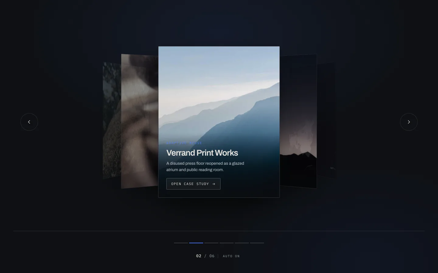
কেন্দ্রের স্লাইডটি সমতল এবং বর্গাকার বসে। উভয় পক্ষই Y অক্ষের উপর ঘোরে এবং ম্লান করে, তাই আপনার চোখ যেখানে থাকা উচিত সেখানে অবতরণ করে। ক্লাসিক কভারফ্লো, বিয়োগ প্রতিফলন 2011 সাল থেকে কেউ চায়নি।
এটি কাজ করে কারণ এটি মনোযোগের জন্য প্রতিযোগিতা ছাড়াই প্রসঙ্গ দেখায়। একজন দর্শক দেখেন যে তাদের কোনটি পড়তে সক্ষম না হয়ে আরও পাঁচটি কেস স্টাডি রয়েছে, যা ঠিক সেই উত্তেজনা যা মানুষকে তীরটিতে ক্লিক করে।
এর জন্য এটি ব্যবহার করুন: কেস স্টাডি রিল, পোর্টফোলিও টুকরা, যে কোনও কিছু যেখানে প্রতিটি স্লাইড সম্পূর্ণ পড়ার যোগ্য।
এর জন্য এটি ব্যবহার করবেন না: পণ্য গ্রিড। কভারফ্লো একটি আইটেম সঠিকভাবে দেখায় এবং দুটিতে ইঙ্গিত দেয়। ছয়টি পণ্যের তুলনাকারী ক্রেতারা আপনাকে ঘৃণা করবে।
02. কনসার্টিনা অ্যাকর্ডিয়ন
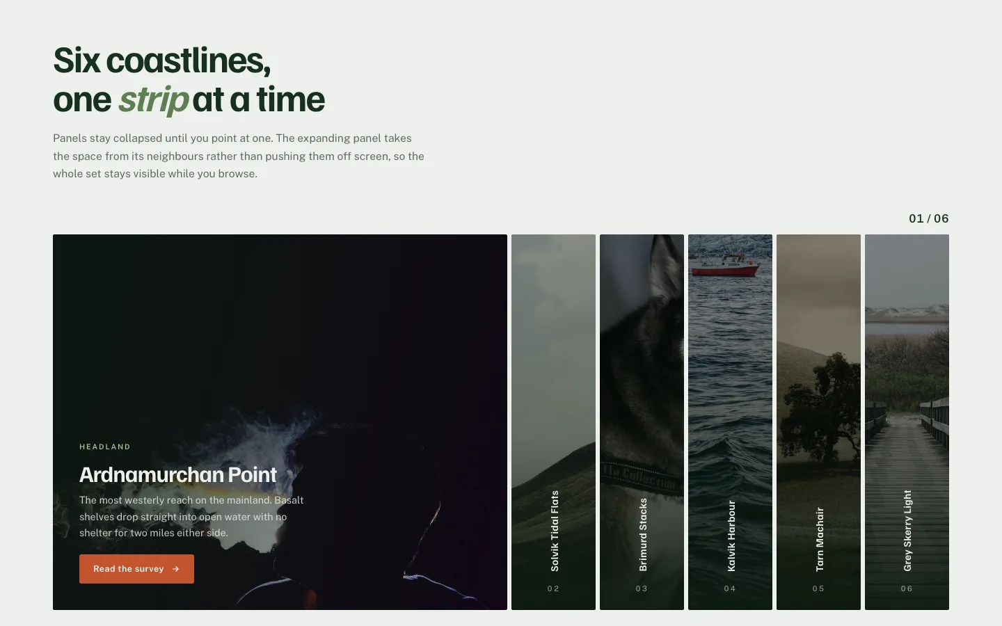
ছয়টি সরু উল্লম্ব প্যানেল। একটি ঘোরান এবং এটি প্রসারিত হয়; অন্যরা জায়গা তৈরি করতে সংকুচিত করে। কোন তীর নেই, কোন বিন্দু নেই, কোন অটোপ্লে নেই: পুরো নেভিগেশন হল হোভার।
যদিও মোবাইলে কি হয় তা দেখুন। টাচস্ক্রিনে কোন হোভার নেই, তাই প্যানেলগুলি ট্যাপ-টু-প্রসারিত করতে ফিরে আসে। এটা ঠিক আছে, কিন্তু এর মানে হল প্রথম-ট্যাপ আচরণটি সুস্পষ্ট হতে হবে বা লোকেরা সরাসরি এটির পাশ দিয়ে স্ক্রোল করবে। সক্রিয় প্যানেলে একটি দৃশ্যমান শেভরন যোগ করুন এবং সমস্যাটি চলে যায়।
এর জন্য এটি ব্যবহার করুন: ছয় বা তার কম পরিষেবা বিভাগ, গন্তব্য তালিকা, লেবেল বিক্রি করে এমন কিছু।
03। আমব্রা ওভারলে
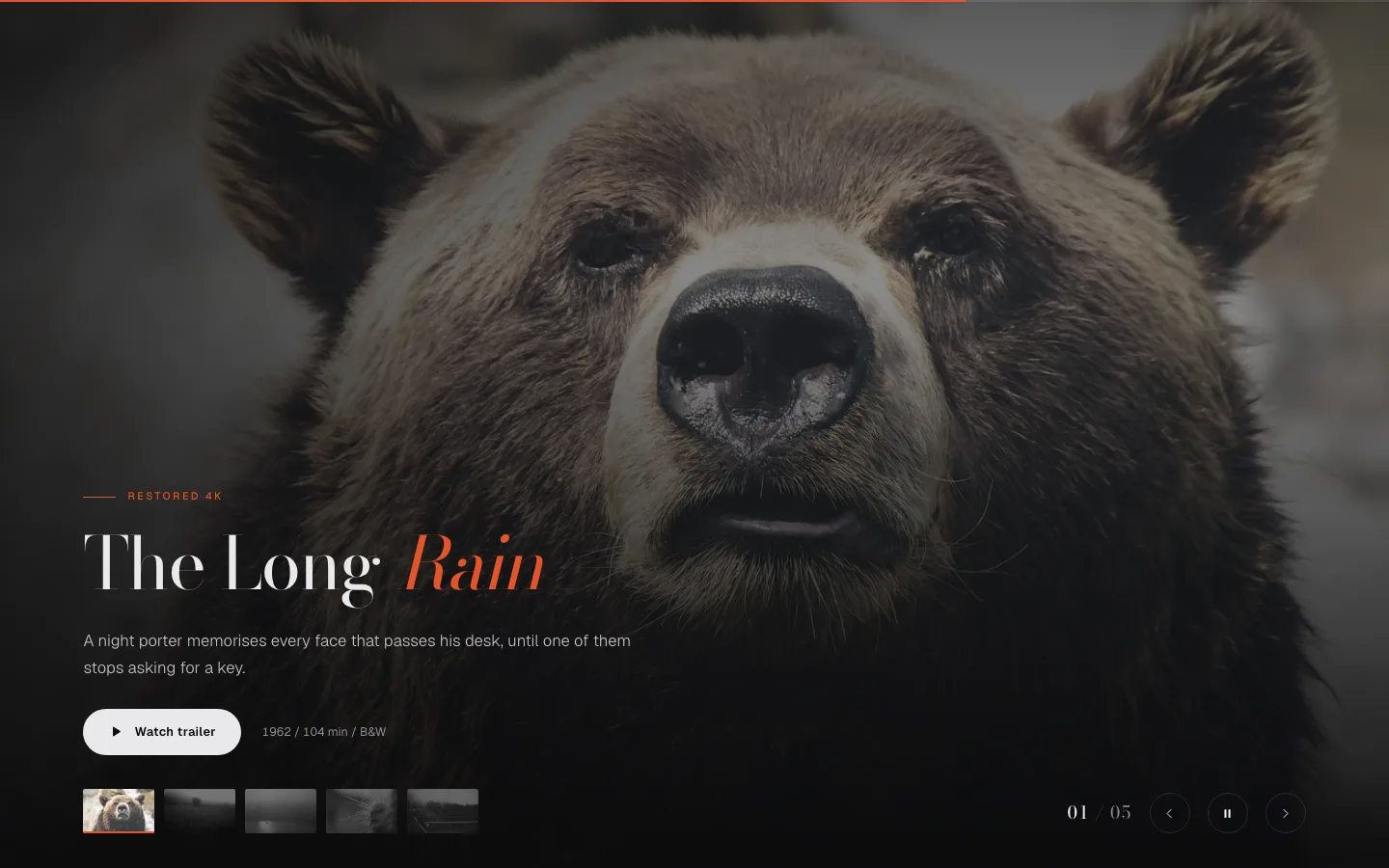
চিত্রটি ফ্রেমটি পূরণ করে, ক্যাপশনটি একটি গ্রেডিয়েন্টে বসে যা কেবল নীচের তৃতীয়টিকে অন্ধকার করে। স্লাইড পরিবর্তন, ক্যাপশন ক্রস-বিবর্ণ একটি বীট পরে।
সেই বিলম্ব পুরো ডিজাইন। টেক্সট এবং ইমেজ একসাথে আগত একটি ব্যানার বিজ্ঞাপন হিসাবে পড়া হয়। টেক্সট আগত দ্বিতীয় একটি ফটোগ্রাফ একটি ক্যাপশন হিসাবে পড়া, যা আপনি কি চান যদি ফটোগ্রাফ পণ্য হয়।
এই সবচেয়ে কাছের নকশা এলিমেন্টর ইমেজ ক্যারোজেল উইজেট আপনি যদি প্রো ছাড়া একই চেহারা চান। বিনামূল্যের উইজেটটি ইমেজ প্লাস ক্যাপশন করে, শুধু স্তব্ধ বিবর্ণ ছাড়াই।
04। স্ট্র্যাটাম ডেক
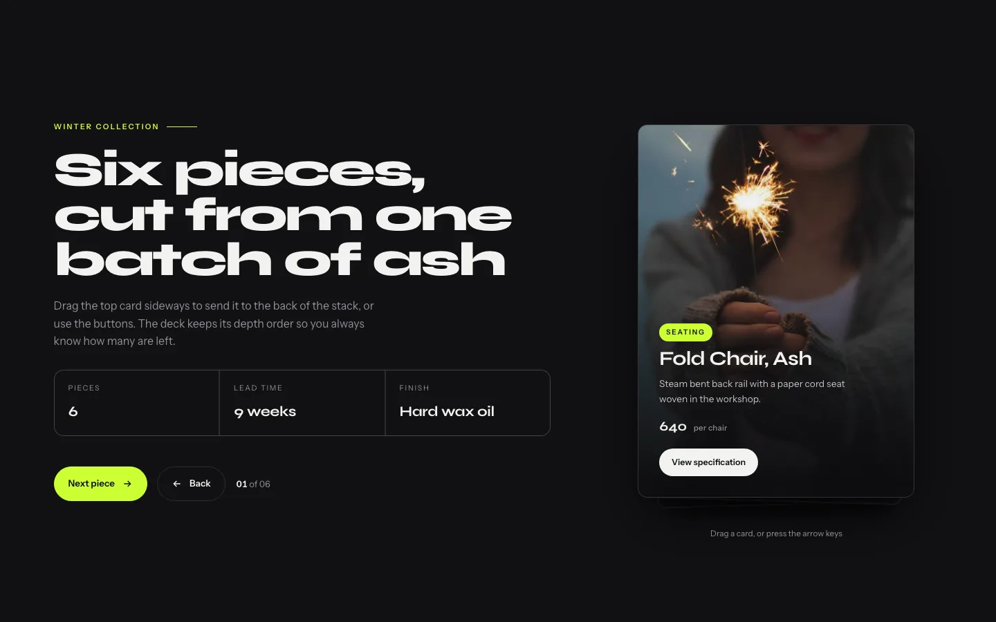
কার্ডগুলি সামান্য অফসেট দিয়ে স্ট্যাক করা হয়েছে যাতে আপনি উপরেরটির পিছনে তিন বা চারটি প্রান্ত দেখতে পারেন। অগ্রিম এবং উপরের কার্ডটি উত্তোলন করে এবং স্লাইড বন্ধ করে, পরবর্তীটি প্রকাশ করে।
স্ট্যাক এমন কিছু করে যা একটি ফ্ল্যাট ক্যারোজেল পারে না: এটি পরিমাণ দেখায়। একজন দর্শক জানেন বিন্দু গণনা ছাড়াই আরও প্রশংসাপত্র রয়েছে। সামাজিক প্রমাণের জন্য যে কাজ অধিকাংশ।
এর জন্য এটি ব্যবহার করুন: প্রশংসাপত্র, মূল্যের স্তর, অনবোর্ডিং পদক্ষেপ।
সতর্ক থেকো: স্ট্যাকটি পাঁচ বা ছয়টি দৃশ্যমান কার্ডে রাখুন। অতীতে অফসেটগুলি এত পাতলা হয়ে যায় যে গভীরতা একটি রেন্ডারিং বাগ হিসাবে পড়ে।
05। দ্বিখণ্ডিত বিভক্ত
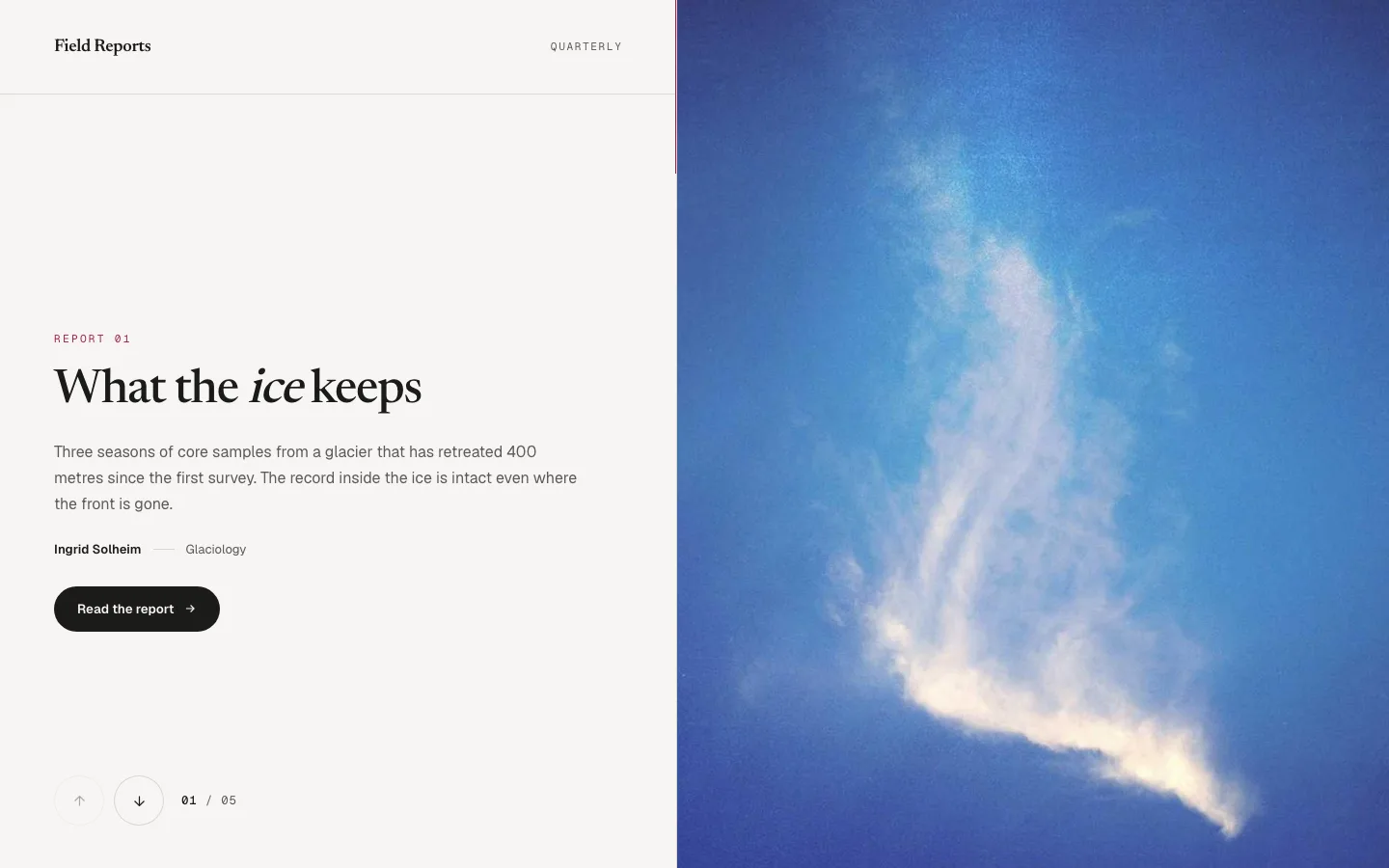
পর্দা মাঝখানে নিচে বিভক্ত। উপরের অর্ধেক উপরে চলে যায়, নীচের অর্ধেক নিচে চলে যায় এবং তারা পরবর্তী স্লাইডে মিলিত হয়। দুটি প্যানেল, একটি অঙ্গভঙ্গি।
আমি এটি একটি নায়কের মধ্যে রাখব এবং অন্য কোথাও নেই। এটি একটি বড় গতি: এটি সম্পূর্ণ ভিউপোর্ট খায় এবং দর্শকদের মনোযোগের এক সেকেন্ড দাবি করে। একটি নায়ক যে একটি ন্যায্য বাণিজ্য। একটি পরিষেবা পৃষ্ঠার অর্ধেক নিচে এটা শুধু গোলমাল।
এর জন্য এটি ব্যবহার করুন: হোমপেজ হিরো, ক্যাম্পেইন ল্যান্ডিং পেজ, জোড়ার আগে/পরে।
06। আরোহণ Mousewheel
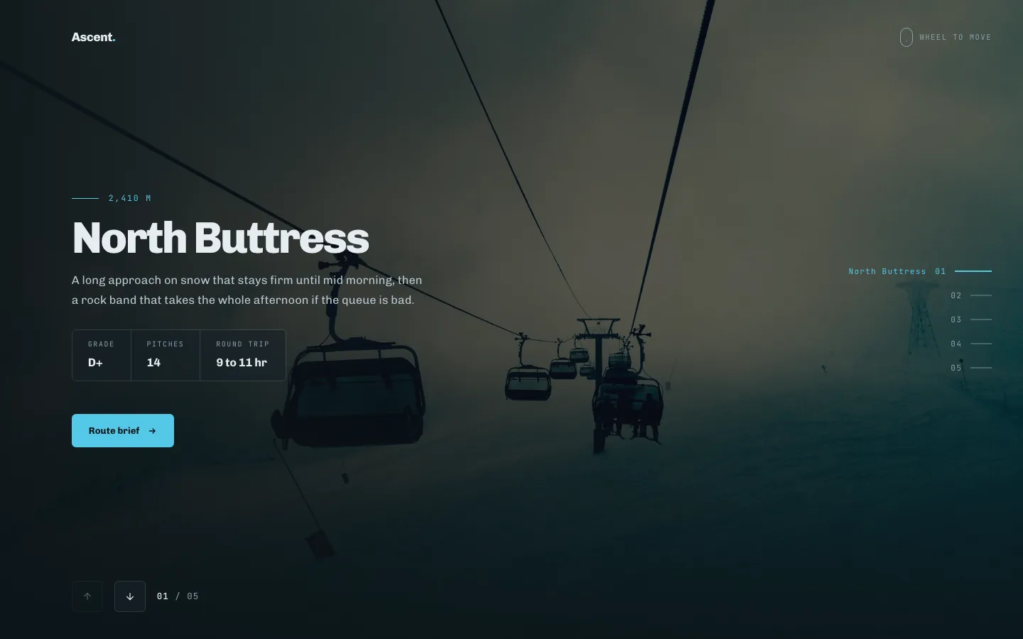
তীর নেই। আপনি স্ক্রোল করুন, এটি অগ্রসর হয়। স্লাইডারটি চাকাটি দেখার সময় ক্যাপচার করে এবং আপনি শেষ স্লাইডে আঘাত করার পরে এটি ছেড়ে দেয়।
স্ক্রোল-জ্যাকিংয়ের একটি খারাপ খ্যাতি রয়েছে এবং এটি এটি অর্জন করেছে। এখানে সংস্করণটি চাকাটি প্রকাশ করে যে মুহূর্তে আপনি উভয় প্রান্তে পৌঁছান, তাই একজন দর্শক যিনি পৃষ্ঠাটি নীচে যেতে চান তিনি কখনই আটকা পড়েন না। আপনি প্রতিশ্রুতি দেওয়ার আগে এটিকে একটি ট্র্যাকপ্যাডে পরীক্ষা করুন, কারণ ট্র্যাকপ্যাডের গতিবেগ একটি চাকার চেয়ে অনেক বেশি টুইচিয়ার, এবং যদি আপনার স্লাইডগুলি পাঠ্য-ভারী হয় তবে লোকেরা ওভারশুট করবে।
এর জন্য এটি ব্যবহার করুন: বর্ণনামূলক বিভাগ, পণ্যের গল্প, সময়রেখা।
এটি ব্যবহার করবেন না: ভাঁজ উপরে। একজন দর্শকের প্রথম স্ক্রোল পৃষ্ঠাটি সরানো উচিত, উইজেট নয়।
07। পিভট ফ্লিপ
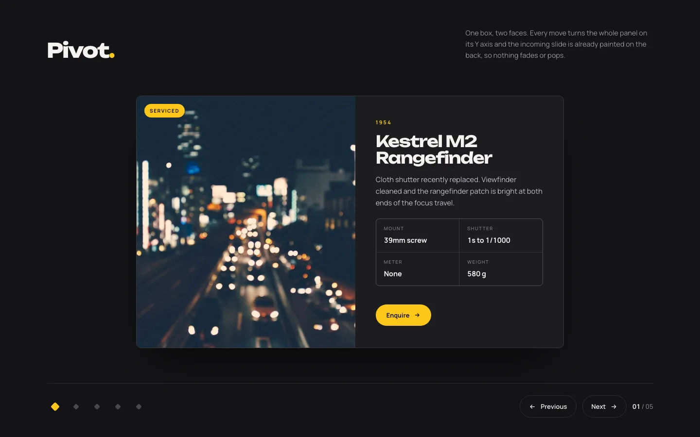
কার্ডটি উল্লম্ব অক্ষে 180° ঘোরে। সামনের মুখ বাইরে, পিছনের মুখ ভিতরে। উভয় মুখই সম্পাদনাযোগ্য, তাই বিপরীতটি একটি বায়ো, একটি বিশেষ শীট বা একটি মূল্য ধরে রাখতে পারে।
দ্বি-পার্শ্বযুক্ত বিষয়বস্তু এটি শোনার চেয়ে বিরল এবং এই নকশাটি এটি সন্ধান করার কারণ। সামনে দলের সদস্য, ভূমিকা এবং পিছনে লিঙ্ক। পণ্য শট সামনে, মাত্রা ফিরে।
এর জন্য এটি ব্যবহার করুন: টিম গ্রিড, আগে/পরে, স্পেক কার্ড। ফ্লিপ কভারফ্লো, আর্ক এবং কক্ষপথের পাশাপাশি বসে 3D ক্যারোজেল ব্রেকডাউন.
08। আর্ক বাঁকা
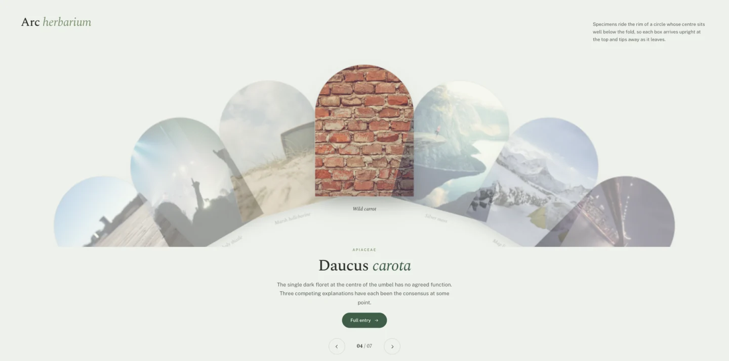
স্লাইডগুলি একটি বৃত্তের রিমে বসে যার কেন্দ্রটি ভাঁজের নীচে কোথাও রয়েছে। প্রতিটি উপরের দিকে সোজা হয়ে আসে এবং এটি ছেড়ে যাওয়ার সাথে সাথে দূরে চলে যায়। খিলান আকৃতির ইমেজ মাস্ক একই বক্ররেখা অনুসরণ করে।
সেটের অন্য কিছুই এইরকম দেখাচ্ছে না, এবং এটিই এর পক্ষে যুক্তি। অন্য ওয়ার্ডপ্রেস সাইটে কেউ এটি দেখেনি।
এর জন্য এটি ব্যবহার করুন: সংগ্রহ যেখানে আইটেমগুলি একই রকম এবং উপস্থাপনাকে আগ্রহ বহন করতে হবে: একটি ক্যাটালগ, একটি নমুনা তালিকা, একটি মেনু৷।
09. টেসেরা মোজাইক
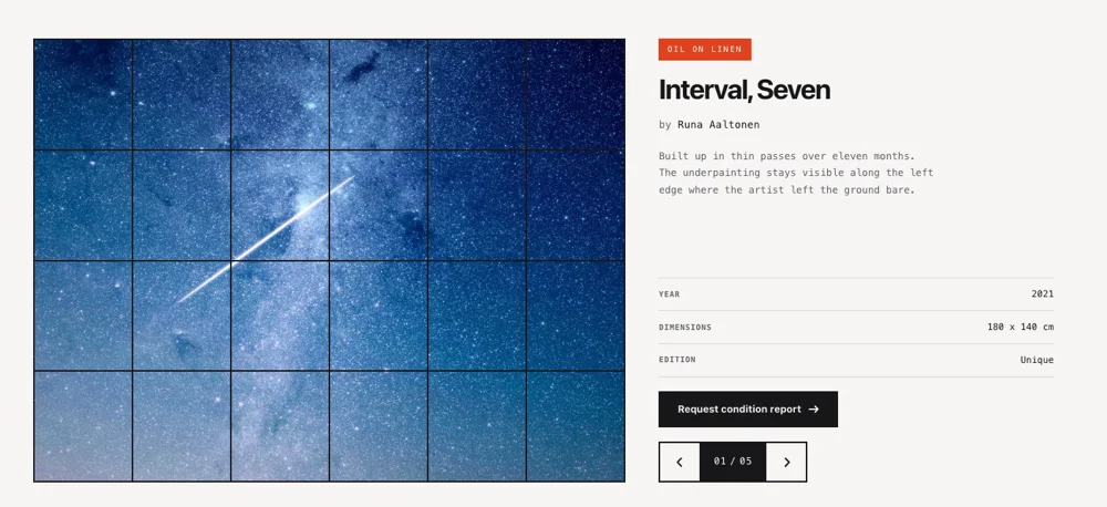
অসম টাইলসের একটি গ্রিড যা স্লাইডিংয়ের পরিবর্তে রদবদল করে। টাইলস নতুন অবস্থান এবং আকার অ্যানিমেট; রচনা পরিবর্তিত হয় কিন্তু খালি হয় না।
যখন আপনার কাছে ত্রিশটি ছবি থাকে এবং সেগুলির মধ্যে কোনও শ্রেণিবিন্যাস থাকে না তখন এটিই পৌঁছাতে পারে৷ একটি প্রচলিত ক্যারোজেল একটি পড়ার ক্রমকে এমন সামগ্রীতে বাধ্য করে যার একটি নেই৷ একটি মোজাইক নেই।
এর জন্য এটি ব্যবহার করুন: ইভেন্ট ফটোগ্রাফি, গ্যালারি পৃষ্ঠা, পৃষ্ঠাগুলি সম্পর্কে চিত্র-ভারী।
খরচ: লেআউট কাজের জন্য এটি সেটের সবচেয়ে ভারী ডিজাইন। সোর্স ইমেজ প্রতিটি 200 KB এর নিচে রাখুন বা মিড-রেঞ্জ অ্যান্ড্রয়েডে রদবদল স্টাটার।
10। মেন্ডার টানুন
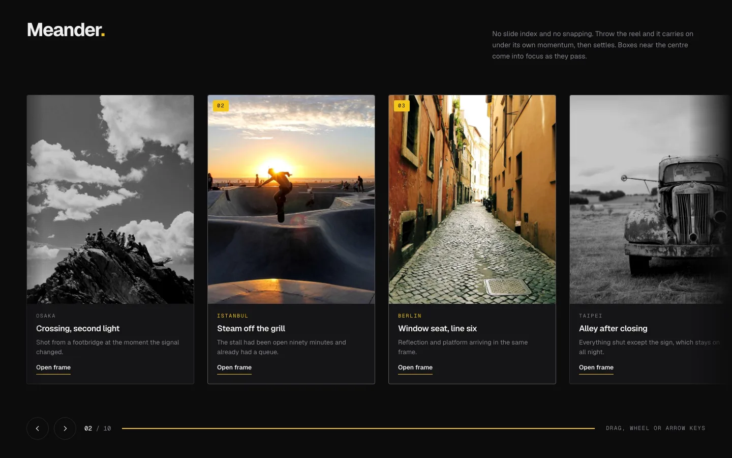
ধর এবং নিক্ষেপ। মোমেন্টাম ট্র্যাক অতীত বহন করে যেখানে আপনি যেতে দেন এবং একটি স্টপ সহজ হয়। স্লাইড বাউন্ডারিতে কোন স্ন্যাপিং নেই, তাই একটি স্লাইড অর্ধ-দৃশ্যমান বসতে পারে, যা বিন্দু, কারণ একটি অর্ধ-দৃশ্যমান স্লাইড একটি সংকেত যে আরও আছে।
ফ্রি-ড্র্যাগের একটি প্রকৃত অ্যাক্সেসিবিলিটি খরচ রয়েছে: কীবোর্ড ব্যবহারকারীরা ড্র্যাগ ইন্টারঅ্যাকশন থেকে কিছুই পান না। অ্যারো-কী সমর্থন তারযুক্ত, কিন্তু যদি আপনার শ্রোতারা সহায়ক প্রযুক্তির দিকে ঝুঁকে পড়ে, তাহলে ডিজাইন 01 বা 04 তাদের আরও ভাল পরিবেশন করবে।
এর জন্য এটি ব্যবহার করুন: লুকবুক, পোর্টফোলিও, দীর্ঘ অনুভূমিক সংগ্রহ।
11। স্লেট কার্টেন
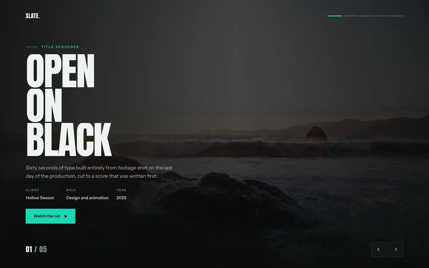
উল্লম্ব প্যানেলগুলি পর্দার মতো আলাদা হয়ে যায় এবং পরবর্তী স্লাইডটি ইতিমধ্যে তাদের পিছনে বসে আছে। প্রকাশ হল রূপান্তর।
এটি অনুষ্ঠান হিসাবে পড়ে। এটি একটি ওয়েবসাইট, একটি পণ্য লঞ্চ এবং একটি হোমপেজ হিরোতে অবিকল দুবার দরকারী এবং অন্য সব জায়গায় ভুল স্থান পেয়েছে৷।
এর জন্য এটি ব্যবহার করুন: লঞ্চ, ঘোষণা নায়ক, মৌসুমী প্রচারণা।
12। হ্যালো কক্ষপথ
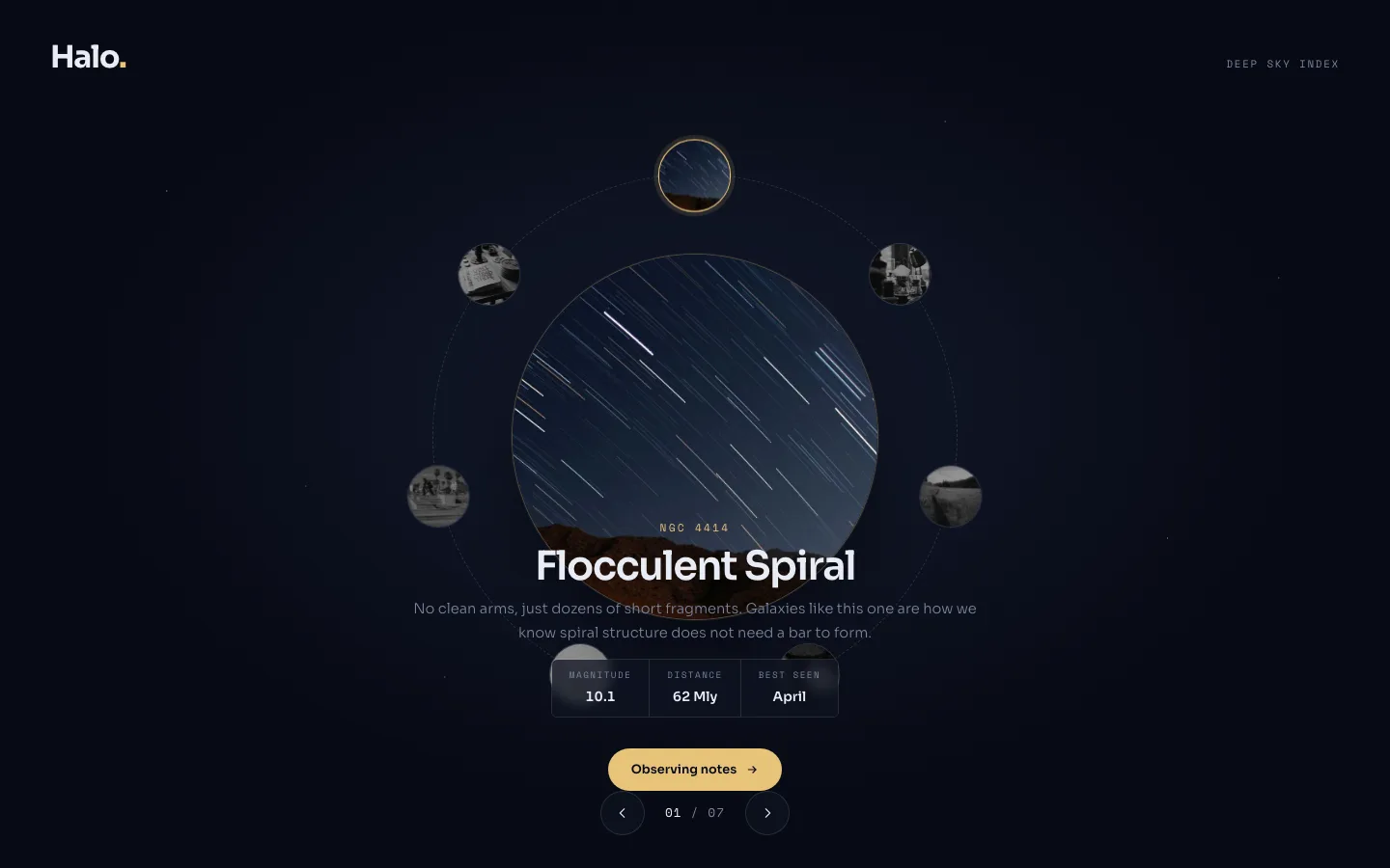
আইটেম একটি নির্দিষ্ট কেন্দ্র বিন্দু প্রদক্ষিণ। শীর্ষে একটি সক্রিয় এবং পূর্ণ আকারের; বাকিগুলো সঙ্কুচিত হয় যখন তারা পিছনের দিকে ঘুরে বেড়ায়।
বৃত্তাকার লেআউটগুলি এমন সামগ্রীর সাথে মানানসই যা সত্যিকারের লুপ হয়৷ একটি চার-পর্যায়ের প্রক্রিয়া, একটি ইকোসিস্টেম ডায়াগ্রাম, একটি পরিষেবা চাকা৷ এটিতে একটি রৈখিক তালিকা রাখুন এবং আপনি লোকেদের বিভ্রান্ত করবেন, কারণ একটি বৃত্ত বোঝায় "শুরুতে ফিরে আসে," এবং একটি পাঁচ-পদক্ষেপ অনবোর্ডিং প্রবাহ হয় না।
এর জন্য এটি ব্যবহার করুন: প্রসেস ডায়াগ্রাম, ইকোসিস্টেম ম্যাপ, ক্যাপাবিলিটি হুইল।
13। প্লিন্থ হিরো স্লাইডার (বিনামূল্যে)
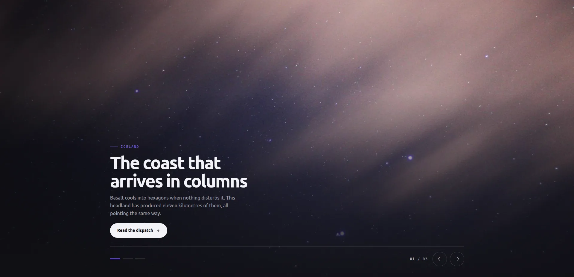
একটি ছবি মঞ্চ পূর্ণ করে। একটি ক্যাপশন প্লিন্থ নীচে-বামে বসে, নিয়ন্ত্রণ বার (বিন্দু, তীর, কাউন্টার) নীচে-ডানে। স্লাইডগুলি তাত্ক্ষণিকভাবে অদলবদল করে: কোনও ফেইড নয়, কোনও স্লাইড-ইন নেই, ধীর ফোনে সিঙ্ক বা তোতলামির বাইরে যাওয়ার কিছুই নেই৷।
তাত্ক্ষণিক অদলবদল একটি সীমাবদ্ধতার মতো শোনাচ্ছে যতক্ষণ না আপনি এটির বিরুদ্ধে বিবর্ণ হয়ে যান। একটি নায়ক রূপান্তর দুইবার মনোযোগ খায়: একবার চলে গেলে, একবার পৌঁছালে। এই নকশাটি পরিবর্তে ফটোগ্রাফে সেই বাজেট ব্যয় করে। এটি প্রতি-স্লাইড লিঙ্ক নিয়ন্ত্রণ সহ সেটের একমাত্র নকশা, এছাড়াও সমস্ত স্লাইড জুড়ে একটি CTA লেবেল ভাগ করা হয়েছে, যা একজন হোমপেজ নায়কের ঠিক সেই আকৃতির।
এর জন্য এটি ব্যবহার করুন: হোমপেজ হিরোস, ল্যান্ডিং পেজ টপস, যে কোন জায়গায় ইমেজ আর্গুমেন্ট।
এর জন্য এটি ব্যবহার করবেন না: নিজেকে ব্যাখ্যা করার জন্য গতি প্রয়োজন যে বিষয়বস্তু। উদ্দেশ্যমূলকভাবে কেউ নেই।
14। লেজার ইনডেক্স স্লাইডার (বিনামূল্যে)
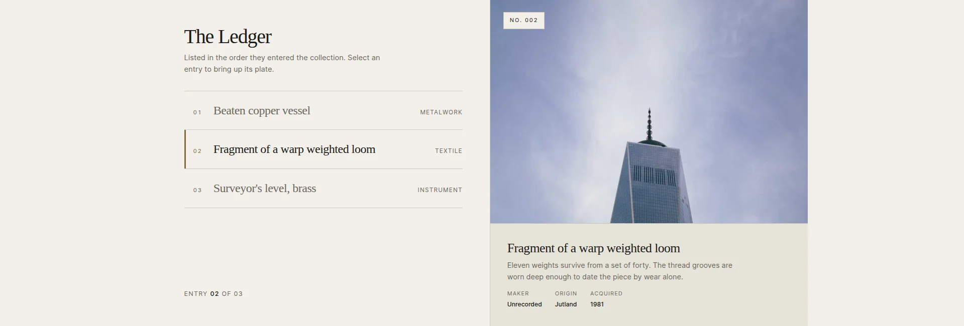
একটি বড় প্লেটের পাশে এন্ট্রি সারিগুলির একটি কলাম। একটি সারি এবং প্লেট, এর স্ট্যাম্প এবং এর ক্যাপশন অদলবদল মেলে বেছে নিন। তালিকাটি হল নেভিগেশন, যেখানে কোন তীর প্রয়োজন নেই, যদিও তারা সেখানে আছে।
এটি স্বাভাবিক ক্যারোজেল সমস্যাকে উল্টে দেয়। একটি সাধারণ স্লাইডার বর্তমান স্লাইড ছাড়া সবকিছু লুকিয়ে রাখে; এখানে বিষয়বস্তুর সম্পূর্ণ সারণী পুরো সময় দৃশ্যমান হয়, এবং চিত্রটি বিশদ দৃশ্য। আপনি যদি ক্লিকের আগে সারিগুলি প্রতিক্রিয়া জানাতে চান তবে একটি নির্বাচন-অন-হোভার টগল আছে।
এর জন্য এটি ব্যবহার করুন: সংগ্রহ, সংরক্ষণাগার, কাজের তালিকা: যে কোনো জায়গায় শিরোনাম বাস্তব তথ্য বহন করে।
সতর্ক থেকো: সারি ক্লিক বিক্রি। "আইটেম 1, আইটেম 2, আইটেম 3" পুরো নকশা নষ্ট করে; শিরোনামের মতো সারি শিরোনাম লিখুন।
15। ভিট্রিন প্লেট গ্যালারি (বিনামূল্যে)
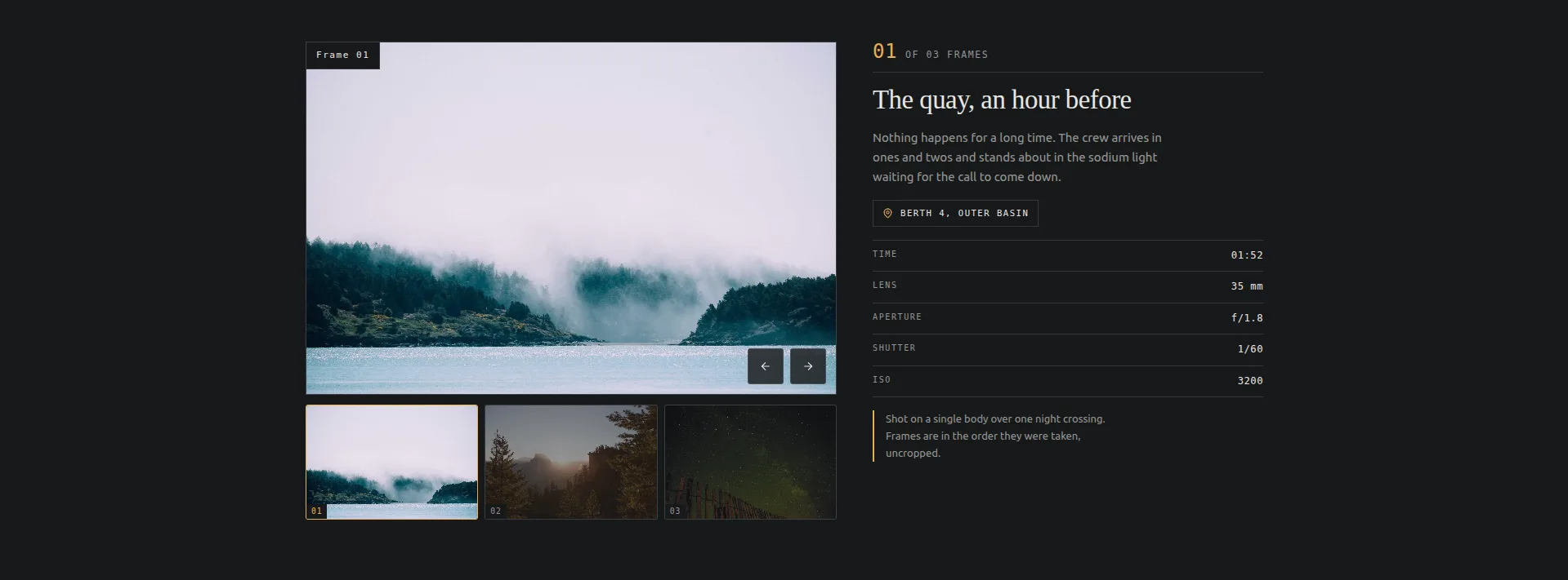
থাম্বনেইলের স্ট্রিপের নীচে একটি একক প্লেট, যার পাশে একটি স্টিকি প্যানেল রয়েছে ক্যাপশন এবং একটি ফ্রেম-ডেটা টেবিল: স্থান, সময়, লেন্স, অ্যাপারচার, শাটার, ISO। ফ্রেম সরাসরি প্রতিস্থাপন; কিছুই স্লাইড।
আপনি যদি থাম্বনেইল সহ "এলিমেন্টর ইমেজ স্লাইডার" অনুসন্ধান করেন, তাহলে এটি ফটোগ্রাফারদের জন্য তৈরি করা হয়েছে। ডেটা টেবিলের লেবেলগুলি সবই সম্পাদনাযোগ্য, তাই একটি মুদ্রণের দোকান লেন্স/অ্যাপারচারকে কাগজ/সংস্করণে পরিণত করতে পারে এবং একটি যাদুঘর সেগুলিকে মাঝারি/তারিখ/প্রমাণে পরিণত করতে পারে।
এর জন্য এটি ব্যবহার করুন: ফটোগ্রাফি পোর্টফোলিও, অবজেক্ট ফটোগ্রাফি, পণ্যের বিস্তারিত গ্যালারী। ভিডিও সহ একই প্লেট-এবং-থাম্বনেল আকৃতির জন্য, দেখুন গ্যালারি স্লাইডার গাইড.
এর জন্য এটি ব্যবহার করবেন না: যে ছবিগুলি মেটাডেটা প্রাপ্য নয়৷ একটি খালি ডেটা প্যানেল একটি অসমাপ্ত পৃষ্ঠা হিসাবে পড়ে৷।
16। চতুর্ভুজ পৃষ্ঠাযুক্ত ক্যাটালগ (বিনামূল্যে)
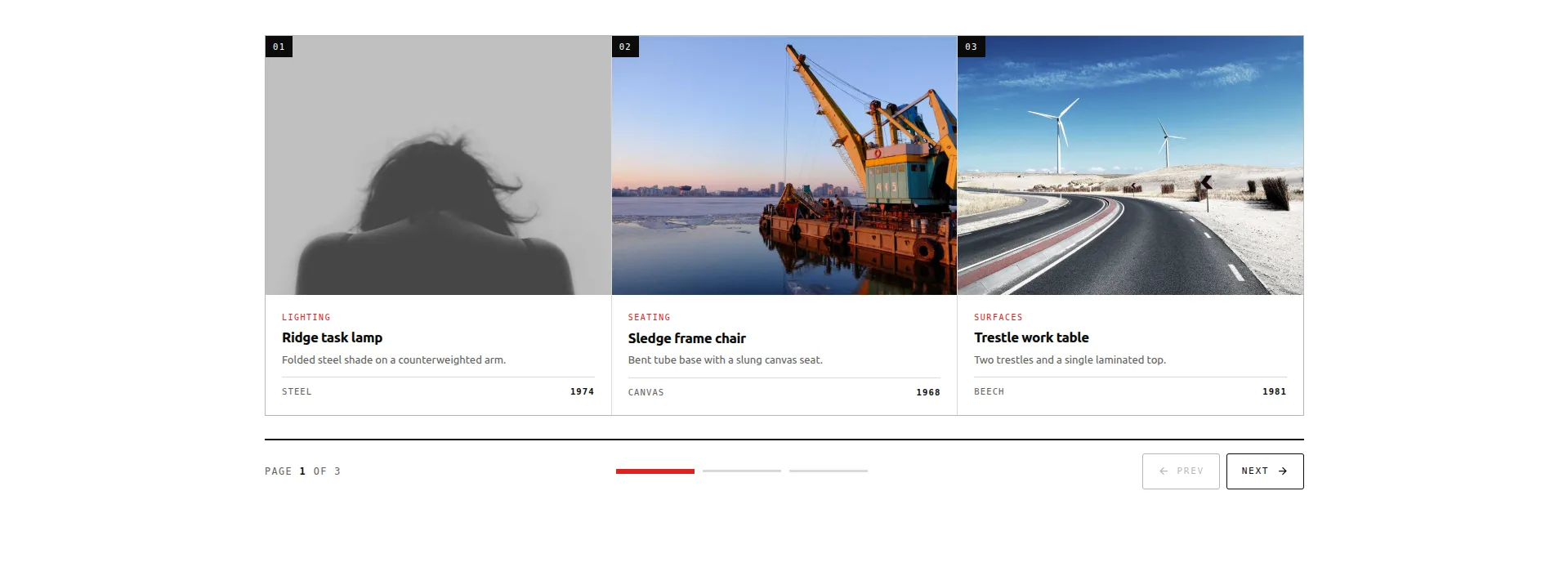
আইটেম বাক্সের একটি গ্রিড, একবারে তিনটি পৃষ্ঠা: তিনটি পৃষ্ঠা জুড়ে নয়টি আইটেম। সেগমেন্টের একটি রেল দেখায় যে আপনি কোথায় দৌড়ে আছেন এবং লাফ নিয়ন্ত্রণ হিসাবে দ্বিগুণ হয়; ধাপ বোতাম এটি সামনে এবং পিছনে হাঁটা।
বেশিরভাগ ক্যারোসেল ভুলভাবে দেওয়া কাজের জন্য এটি ডিজাইন: অনেক তুলনামূলক জিনিস দেখানো। প্রতিটি বাক্সে একটি চিত্র, বিভাগ, শিরোনাম, অনুলিপি এবং একটি স্ট্যাট রয়েছে এবং যেহেতু তিনটির একটি পূর্ণ পৃষ্ঠা একবারে দৃশ্যমান, একজন দর্শক আসলে তুলনা করতে পারেন, যা কভারফ্লো এবং এর কাজিনরা ইচ্ছাকৃতভাবে প্রতিরোধ করে।
এর জন্য এটি ব্যবহার করুন: পণ্য-শৈলী ক্যাটালগ, বৈশিষ্ট্য গ্রিড, পরিষেবা মেনু। এটি বিনামূল্যের রুটও WooCommerce পণ্য ক্যারোজেল গাইড.
সতর্ক থেকো: এটি তিনটি পৃষ্ঠায় ঠিক নয়টি আইটেম ধারণ করে। যদি আপনার ক্যাটালগ ত্রিশটি আইটেম গভীর হয়, আপনি ফিল্টার সহ একটি বাস্তব পণ্য গ্রিড চান, কোনো ক্যারোজেল নয়।
17। বুলেটিন ট্যাবড প্যানেল (বিনামূল্যে)
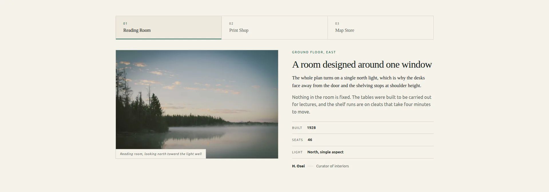
স্ট্যাক করা প্যানেলের উপর একটি ট্যাব স্ট্রিপ। প্রতিটি প্যানেল একটি ছোট সম্পাদকীয় বিন্যাস: এর ক্যাপশন সহ একটি চিত্র, একটি কিকার, একটি শিরোনাম, একটি লেড, বডি কপি, একটি তিন-সারির তথ্য টেবিল এবং একটি বাইলাইন৷।
কঠোরভাবে, এটি ট্যাব, একটি স্লাইডার নয়, এবং সেই কারণেই এটি এখানে। লোকেরা ক্যারোসেলে জোর করার চেষ্টা করে তার অর্ধেক (তিনটি পরিকল্পনা, তিনটি অবস্থান, তিনটি কেস স্টাডির তুলনা করুন) একটি পোশাক পরা ট্যাবযুক্ত সামগ্রী। এটি সঠিকভাবে অ্যাক্সেসিবিলিটিও করে: রোভিং ট্যাবিনডেক্সের সাথে আসল ARIA ট্যাবিলিস্ট শব্দার্থবিদ্যা, যা বেশিরভাগ ট্যাব উইজেট জাল।
যখন আপনি কি নির্মাণ করছেন, ট্যাব উইজেট সংক্ষিপ্ত রুট: একটি ট্যাব স্ট্রিপ, প্যানেল এবং টিউন করার জন্য কোন স্লাইডার টাইমিং নেই।
এর জন্য এটি ব্যবহার করুন: প্ল্যান তুলনা, অবস্থান পৃষ্ঠা, কেস স্টাডি প্যানেল: যেকোন তিনটি জিনিস একজন দর্শক ব্রাউজ করার পরিবর্তে বেছে নেয়।
18। রোস্ট্রাম কোট স্লাইডার (বিনামূল্যে)
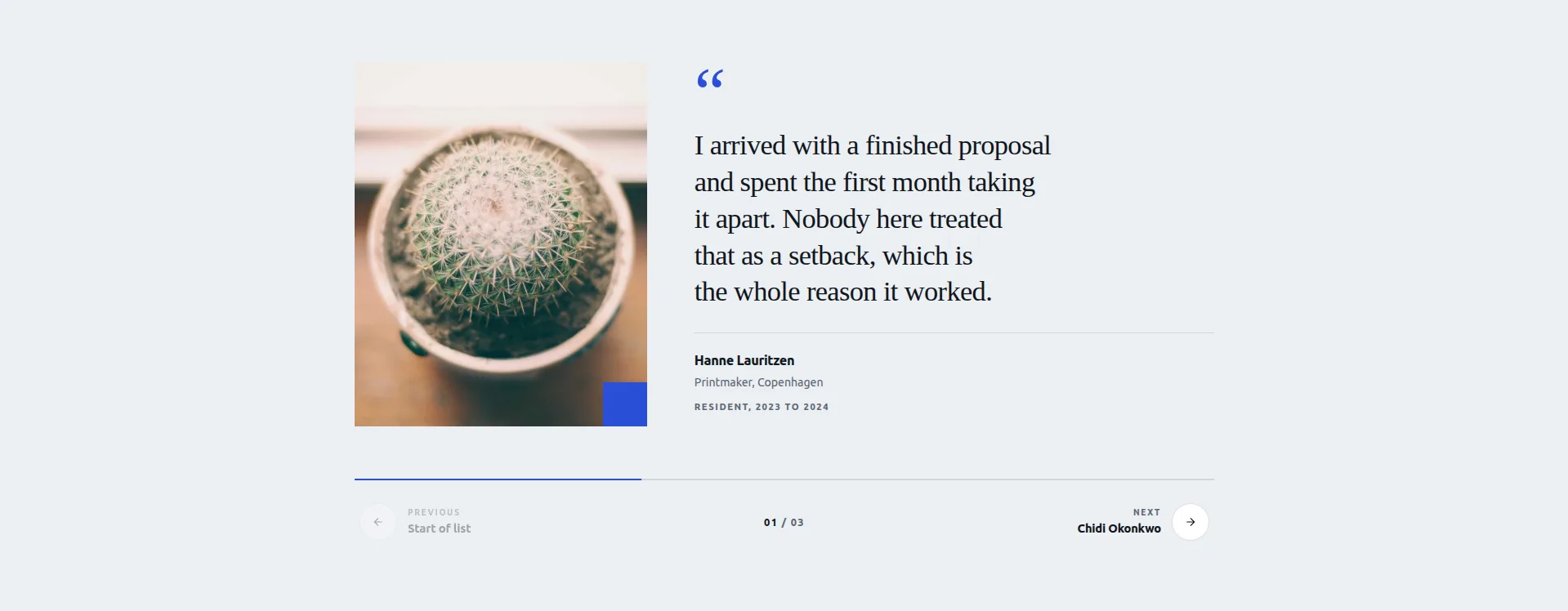
একটি প্রতিকৃতির পাশে একটি উদ্ধৃতি প্যানেল, দুটি শেভরন দিয়ে ধাপে ধাপে। একটি অগ্রগতি বার এবং একটি ট্যালি ট্র্যাক যেখানে আপনি আছেন, এবং স্টেপ বোতামগুলি একটি বেনামী তীরের পরিবর্তে "পরবর্তী: আমরা ওকাফোর" এর মতো ভয়েসের নাম দিতে পারে।
যে নামযুক্ত পদক্ষেপ চুরি মূল্য বিস্তারিত। প্রশংসাপত্র ক্যারোসেল ট্রানজিশনে পাঠক হারায়, কারণ একটি তীর কিছুই প্রতিশ্রুতি দেয় না। একটি নাম ক্লিক করার একটি কারণ। উদ্ধৃতি চিহ্নটি একটি সম্পাদনাযোগ্য পাঠ্য নিয়ন্ত্রণও, তাই এটি সাইটের ভাষার জন্য সঠিক গ্লিফে সেট করা যেতে পারে বা সরানো যেতে পারে।
এর জন্য এটি ব্যবহার করুন: প্রশংসাপত্র, পর্যালোচনা, ক্লায়েন্ট উদ্ধৃতি। একটি আছে সম্পূর্ণ প্রশংসাসূচক ক্যারোজেল ওয়াকথ্রু, এবং আপনি দেখতে পারেন আমাদের নিজস্ব সাইটে প্রকৃত গ্রাহক উদ্ধৃতি.
সতর্ক থেকো: এটি তিনটি কণ্ঠ ধারণ করে এবং প্রতিটি একা মঞ্চ পায়। আপনার তিনটি সেরা উদ্ধৃতি চয়ন করুন, এবং সেগুলিকে এক নিঃশ্বাসে পড়ার জন্য যথেষ্ট ছোট রাখুন।
19। অ্যালম্যানাক টাইমলাইন স্লাইডার (বিনামূল্যে)
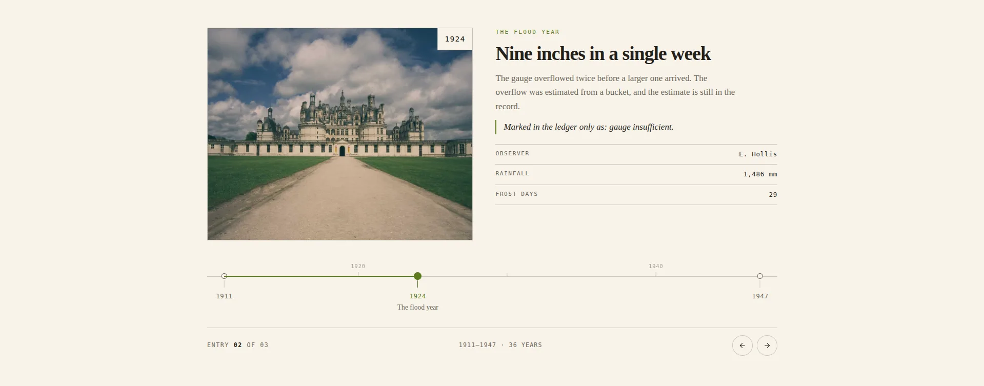
একটি তারিখ অক্ষে পিন করা এন্ট্রি। টিক পজিশনগুলি আপনার টাইপ করা বছরগুলি থেকে গণনা করা হয়, তাই ব্যবধানটি সমান না হয়ে বাস্তব। 1994 এবং 1996 একসাথে বসে, 1996 এবং 2011 অনেক দূরে বসে, এবং ফাঁকটি তার নিজস্ব গল্প বলে। নিয়মের উপরে এক দশকের চিরুনি ব্যবধানটিকে পড়ার জন্য একটি স্কেল দেয়।
অন্য প্রতিটি টাইমলাইন উইজেট তার এন্ট্রিগুলিকে সমানভাবে স্পেস করে, যা শান্তভাবে ইতিহাস সম্পর্কে মিথ্যা বলে। এটি একটি করে না, এবং এটি সেটের সবচেয়ে মতামতযুক্ত নকশা করে তোলে। এটি এখানে গভীরতম প্যানেল, 143 নিয়ন্ত্রণে, কারণ অক্ষ, চিরুনি এবং টিক স্টেটগুলি এন্ট্রি থেকে আলাদাভাবে স্টাইল করে।
এর জন্য এটি ব্যবহার করুন: কোম্পানির ইতিহাস, প্রকল্পের মাইলফলক, চেঞ্জলগ, অর্থপূর্ণ ফাঁক সহ রেকর্ড। একটি স্ট্যাটিক সংস্করণের জন্য, একটি আছে টাইমলাইন টিউটোরিয়াল স্টক ব্যবহার করে টাইমলাইন উইজেট.
এর জন্য এটি ব্যবহার করবেন না: তারিখবিহীন বিষয়বস্তু। অক্ষ হল নকশা; বাস্তব বছর ছাড়া এটি আঁকার জন্য কিছুই নেই।
20। কীস্টোন ফিচার স্লাইডার (বিনামূল্যে)
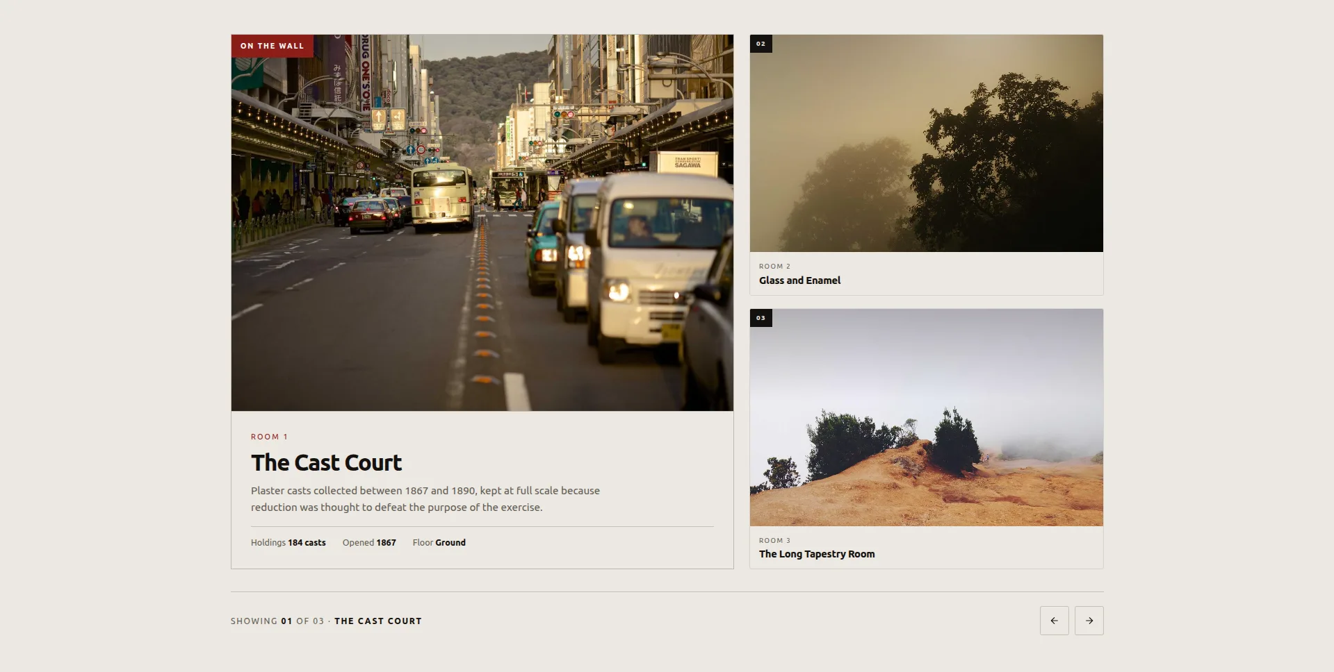
একটি আইটেম বড় বৈশিষ্ট্যযুক্ত; বাকিরা এটির পাশে একটি দেয়ালে অপেক্ষা করে, প্রত্যেকে কেবল তার নম্বর এবং নাম বহন করে। একটি স্যাটেলাইটে ক্লিক করুন এবং এটি বৈশিষ্ট্যটিতে উন্নীত হয়েছে, এবং বাক্সগুলি টেলিপোর্ট করার পরিবর্তে তাদের নতুন জায়গায় ফ্লিপ করে, তাই আপনার চোখ এটি হারানোর পরিবর্তে অদলবদল অনুসরণ করে।
বৈশিষ্ট্যটি তিনটি তথ্যের একটি ফলক বহন করে। এটি কক্ষ, স্থান এবং ঘূর্ণায়মান প্রদর্শনীর জন্য তৈরি করা হয়েছিল, এবং এটিই সৎ সুযোগ: এটি একটি সময়ে স্বতন্ত্র জিনিসগুলির একটি ছোট সেট উপস্থাপন করে, অন্যগুলি দৃশ্যমানভাবে সারিবদ্ধ।
এর জন্য এটি ব্যবহার করুন: ভেন্যু রুম, স্টুডিও স্পেস, প্রদর্শনী, একটি তিন থেকে পাঁচ-পিস পোর্টফোলিও।
সতর্ক থেকো: স্যাটেলাইট শুধুমাত্র সংখ্যা এবং নাম দেখায়, তাই বৈশিষ্ট্য প্ররোচিত করতে হবে। আপনার শক্তিশালী আইটেম দিয়ে নেতৃত্ব দিন, কারণ বেশিরভাগ দর্শক কখনই এটিকে অতিক্রম করে ক্লিক করেন না।
এলিমেন্টরে কীভাবে একটি স্লাইডার টেমপ্লেট আমদানি করবেন
চার ধাপ, প্রায় নব্বই সেকেন্ড। বিনামূল্যে এবং প্রো ডিজাইনের জন্য একই প্রবাহ, এবং থেকে ভিন্ন একটি Elementor টেমপ্লেট আমদানি করা হচ্ছে, কারণ একটি নকশা একটি পৃষ্ঠা বিন্যাসের পরিবর্তে একটি উইজেট হিসাবে নিবন্ধিত হয়।
- ডিজাইনের JSON ফাইলটি ডাউনলোড করুন এর ডেমো পৃষ্ঠা থেকে। ডিজাইন প্রতি একটি ফাইল।
- মাস্টার অ্যাডঅন → উইজেট বিল্ডারে যান আপনার ওয়ার্ডপ্রেস অ্যাডমিনে এবং আমদানি উইজেটে ক্লিক করুন।
- ড্রপজোনে JSON ড্রপ করুন। ডিজাইনটি তার নিজস্ব নিয়ন্ত্রণ সহ একটি উইজেট হিসাবে নিবন্ধিত হয়: বিষয়বস্তু, রঙ, টাইপোগ্রাফি, ব্রেকপয়েন্ট। আটটি বিনামূল্যের ডিজাইন বিনামূল্যে প্লাগইনে আমদানি করে; বারোটি প্রো ডিজাইন এখানে একটি প্রো লাইসেন্সের জন্য জিজ্ঞাসা করে।
- এটি একটি পৃষ্ঠায় টেনে আনুন এলিমেন্টর প্যানেল থেকে, যেখানে এটি ফেভারিটের অধীনে প্রদর্শিত হয় এবং আপনার জন্য স্থানধারক সামগ্রী অদলবদল করুন।
আমদানি আপনার থিম স্পর্শ করে না, বিশ্বব্যাপী কিছু সারিবদ্ধ করে না এবং একটি শর্টকোড তৈরি করে না। এটি অন্য যেকোনো প্যানেলের মতো একটি উইজেট হয়ে যায়।
এই স্লাইডারগুলি কি মোবাইলে কাজ করে?
সমস্ত বিশটি স্পর্শ-সক্ষম এবং প্রতিক্রিয়াশীল। শুধু স্কেলিং না করে চারটি আচরণ পরিবর্তন করুন:
- কনসার্টিনা অ্যাকর্ডিয়ন হোভার-টু-এক্সপ্যান্ড থেকে ট্যাপ-টু-প্রসারণে স্যুইচ করে।
- আরোহণ Mousewheel চাকা ক্যাপচার ড্রপ এবং সোয়াইপ ব্যবহার করে।
- মেন্ডার টানুন টেনে রাখে কিন্তু গতিকে ছোট করে যাতে একটি ফ্লিক পুরো ট্র্যাককে ওভারশুট না করে।
- লেজার ইনডেক্স স্লাইডার প্লেটের উপরে সূচকটি স্ট্যাক করে এবং সিলেক্ট-অন-হোভার ট্যাপ করতে ফিরে আসে।
বিনামূল্যের আটটি ডিফল্টরূপে কীবোর্ড নেভিগেশনও চালু রাখে এবং প্লিন্থ হিরো এবং রোস্ট্রাম কোট বাক্সের বাইরে অঙ্গভঙ্গি সোয়াইপ করার প্রতিক্রিয়া জানায়। ব্রাউজারের ডিভাইস এমুলেটরের পরিবর্তে একটি বাস্তব ফোনে মোজাইক পরীক্ষা করুন, কারণ অনুকরণ করা ভিউপোর্টগুলি মধ্য-পরিসরের অ্যান্ড্রয়েড লেআউট খরচ পুনরুত্পাদন করে না এবং মোজাইকটি যেখানে প্রথমে প্রদর্শিত হয়।
আপনি আসলে কোনটি বাছাই করা উচিত?
আপনি আটকে থাকলে, এইগুলি বেশিরভাগ সাইটকে কভার করে:
- পোর্টফোলিও বা সংস্থা: মেরিডিয়ান কভারফ্লো, বা মেন্ডার ড্র্যাগ যদি আপনার এক ডজনেরও বেশি টুকরা থাকে। একটি বিনামূল্যে লাইসেন্সে, কীস্টোন বৈশিষ্ট্য স্লাইডার।
- পরিষেবা ব্যবসা: কনসার্টিনা অ্যাকর্ডিয়ন। বিনামূল্যে, বুলেটিন ট্যাবড প্যানেল, যার তথ্য সারণী তার পরিকল্পনা তুলনা চালিয়ে যায়।
- দোকান: একটি কিউরেটেড নয়টির জন্য কোয়াড্রেন্ট পেজড ক্যাটালগ। একটি লাইভ পণ্য ফিড স্লাইড যে কোন বিনামূল্যে উইজেট নেই; যে কাজ প্রয়োজন এলিমেন্টর প্রো এর লুপ ক্যারোজেল। 3D ডিজাইন যেকোন উপায়ে এড়িয়ে যান: ক্রেতারা তুলনা করতে চান, এবং কভারফ্লো তাদের থামাতে তৈরি করা হয়েছে।
- প্রশংসাপত্র: রোস্ট্রাম কোট স্লাইডার। এটি বিনামূল্যে, এবং নামযুক্ত ধাপ বোতামগুলি সেটের সেরা রূপান্তর প্রম্পট।
- হোমপেজ হিরো: প্লিন্থ হিরো স্লাইডার যদি ফটোগ্রাফি শক্তিশালী হয়, এবং হিরো বিভাগের টেমপ্লেট আপনি যদি স্লাইডারের চেয়ে পুরো ব্লকটি চান; দ্বিখণ্ডিত স্প্লিট বা স্লেট কার্টেন যদি আপনি চান গতি মুহূর্ত হতে, এবং তাদের মধ্যে শুধুমাত্র একটি, একবার।
- পৃষ্ঠা বা ইতিহাস সম্পর্কে: অ্যালম্যানাক টাইমলাইন স্লাইডার। এখানে আর কিছুই সততার সাথে তারিখের বিষয়বস্তু করে না।
আপনি যাই চয়ন করুন না কেন, এটি একটি গুরুত্বপূর্ণ পরীক্ষার পরে চালান: আপনার নিজের ফোনে, সেলুলে পৃষ্ঠাটি লোড করুন এবং দেখুন স্লাইডারটি প্রথম জিনিস যা রেন্ডার করে নাকি শেষ। টেক্সট ইতিমধ্যে পড়া হয়েছে পরে যে একটি নকশা আসে 'একটি স্লাইডার নয়, এটি একটি প্রসাধন।
প্রায়শই জিজ্ঞাসিত প্রশ্নাবলী
এই এলিমেন্টর স্লাইডার টেমপ্লেট বিনামূল্যে?
বিশটির মধ্যে আটটি হল: প্লিন্থ হিরো, লেজার ইনডেক্স, ভিট্রিন প্লেট গ্যালারি, কোয়াড্রেন্ট পেজড ক্যাটালগ, বুলেটিন ট্যাবড প্যানেল, রোস্ট্রাম কোট, অ্যালম্যানাক টাইমলাইন এবং কীস্টোন ফিচার সবই ফ্রি মাস্টার অ্যাডনস প্লাগইনে আমদানি করা হয়। বাকি বারোটি সম্পূর্ণ উইজেট বিল্ডারে নির্মিত, যা একটি প্রো বৈশিষ্ট্য। লাইভ ডেমো সব বিশ জন্য উন্মুক্ত।
Elementor একটি বিনামূল্যে স্লাইডার উইজেট আছে?
এলিমেন্টর ফ্রি শিপ একটি ইমেজ ক্যারোজেল এবং একটি বেসিক গ্যালারি। মিডিয়া ক্যারোজেল, টেস্টিমোনিয়াল ক্যারোজেল এবং লুপ ক্যারোজেল সবই এলিমেন্টর প্রো। মাস্টার অ্যাডনস ইমেজ ক্যারোজেল, লোগো স্লাইডার, টিম স্লাইডার এবং একটি ক্যারোজেল মোড সহ একটি ব্লগ উইজেটকে ফ্রি টিয়ারে যোগ করে, সাথে উপরের আটটি ফ্রি ডিজাইন। দেখা সম্পূর্ণ ক্যারোজেল উইজেট তালিকা.
এলিমেন্টরে একটি স্লাইডার এবং একটি ক্যারোজেলের মধ্যে পার্থক্য কী?
একটি স্লাইডার একবারে একটি স্লাইড দেখায় এবং সাধারণত প্রস্থ পূরণ করে। একটি ক্যারোজেল একবারে বেশ কয়েকটি দেখায় এবং একটি দীর্ঘ সেটের মাধ্যমে পাশে স্ক্রোল করে। অনুশীলনে লোকেরা শব্দগুলিকে বিনিময়যোগ্যভাবে ব্যবহার করে এবং "ক্যারোজেল" লেবেলযুক্ত বেশিরভাগ উইজেটগুলিকে স্লাইড-প্রতি-ভিউ সেট করে স্লাইডারের মতো আচরণ করার জন্য কনফিগার করা যেতে পারে। ক্যারোজেল বনাম স্লাইডার যেখানে পার্থক্য এখনও গুরুত্বপূর্ণ তার মাধ্যমে কাজ করে।
আমি কি এলিমেন্টর ইমেজ স্লাইডারে টেক্সট যোগ করতে পারি?
হ্যাঁ। এখানে প্রতিটি ডিজাইন একটি ইমেজ বক্স, ইমেজ, ভ্রু, শিরোনাম, বর্ণনা এবং প্লিন্থ হিরোর ক্ষেত্রে একটি বোতাম সহ, তাই টেক্সটটি স্লাইডের অংশ নয় বরং একটি ওভারলে যা আপনি হাত দিয়ে অবস্থান করেন। আমব্রা ওভারলে এবং প্লিন্থ হিরো স্লাইডার দুটি বিশেষভাবে চিত্রের উপর বসে থাকা পাঠ্যের চারপাশে নির্মিত।
আমি কিভাবে একটি এলিমেন্টর স্লাইডার অটোপ্লে এবং ক্রমাগত লুপ তৈরি করব?
উইজেটের ক্যারোজেল সেটিংসে অটোপ্লে এবং ইনফিনিট লুপ চালু করুন, তারপর বিলম্ব সেট করুন। দুটি জিনিস যা লোকেদের ধরে ফেলে: পজ-অন-হোভার হল একটি আলাদা টগল, এবং একটি লুপের দৃশ্যমান লাফ ছাড়াই চালানোর জন্য স্লাইড-প্রতি-ভিউ গণনার অন্তত দ্বিগুণ প্রয়োজন। দুই-প্রতি-ভিউতে চারটি স্লাইড তোতলাবে; ছয় হবে না। পরিবর্তে অটোপ্লে বিলম্ব শূন্যে সেট করুন এবং এটি একটি হয়ে যায় ক্রমাগত মার্কি.
কেন আমার এলিমেন্টর ক্যারোজেল আমদানির পরে কাজ করছে না?
দশটির মধ্যে নয় বার এটি জাভাস্ক্রিপ্ট অপ্টিমাইজেশান। ক্যাশিং প্লাগইন যা JS স্থগিত বা একত্রিত করে স্লাইডারের প্রারম্ভিকতা ভেঙে দেবে। আপনার ক্যাশে প্লাগইনের JS সেটিংসে ক্যারোজেল স্ক্রিপ্টটি বাদ দিন এবং এটি ফিরে আসে। আপনি যদি LiteSpeed-এ থাকেন, তাহলে বর্জনটি গেস্ট মোড ক্ষেত্রেও যেতে হবে, শুধুমাত্র প্রধানটি নয়। সুইপার সমস্যা সমাধানের গাইড বাদ দেওয়ার জন্য সঠিক হ্যান্ডেলগুলি তালিকাভুক্ত করে।
এরপর কোথায় যাবেন
দুটি বা তিনটি ডেমো খুলুন এবং বাছাই করার আগে আপনার ফোনে তাদের একটি বাস্তব চেহারা দিন। তারপর:
বিশটির মধ্যে বারোটির আমদানির লাইসেন্স প্রয়োজন, তাই মূল্য পৃষ্ঠা আপনি বাছাই করা নকশা কোন স্তর কভার করে তা পরীক্ষা করার জায়গা।
- এক জায়গায় সবকিছু ব্রাউজ করুন এলিমেন্টর ক্যারোজেল উইজেট পৃষ্ঠা, সমস্ত বিশটি ডিজাইন এবং প্লাগইনের নিজস্ব ক্যারোজেল উইজেট সহ।
- বিনামূল্যে স্তর লেগে থাকা? বিনামূল্যে ক্যারোজেল উইজেট পোস্ট এই আটটি অন্তর্ভুক্ত যা কিছুর দাম নেই এমন সবকিছুর মধ্য দিয়ে চলে।
- গতির উপর গভীরতার জন্য যাচ্ছেন? 3D ক্যারোজেল ডিজাইন (কভারফ্লো, ফ্লিপ, আর্ক এবং কক্ষপথ) তাদের নিজস্ব একটি ঘনিষ্ঠ চেহারা পেতে।
- একটি বিভাগের পরিবর্তে একটি পুরো পৃষ্ঠা চান? দ্য এলিমেন্টর টেমপ্লেট কিট ইতিমধ্যে স্থাপন করা carousels সঙ্গে সম্পূর্ণ লেআউট জাহাজ। একক পৃষ্ঠা আছে এলিমেন্টর পেজ টেমপ্লেট গ্রন্থাগার।
- পুরো পাতা তৈরি করছেন, শুধু স্লাইডার নয়? দ্য বিনামূল্যে এলিমেন্টর বিভাগ টেমপ্লেট লাইব্রেরি বৈশিষ্ট্য, মূল্য, প্রশংসাপত্র, দল, FAQ এবং CTA ব্লক কভার করে, প্রতিটি একটি সম্পাদনাযোগ্য উইজেট হিসাবে আমদানিযোগ্য।
