

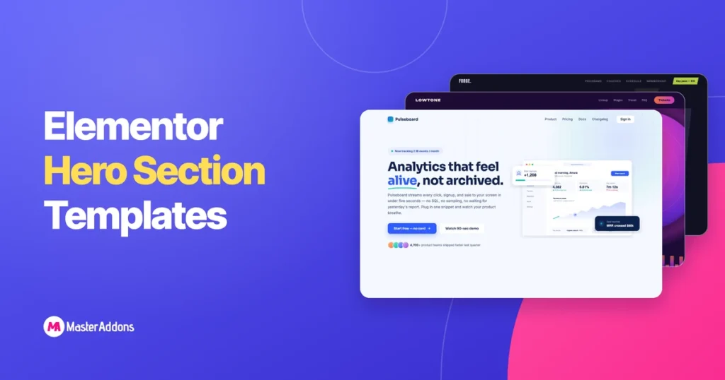
Most free Elementor hero section templates have the same problem: you import a JSON file, get a frozen layout, and then spend an hour clicking into individual heading widgets, image widgets, and spacers trying to make it yours. Change the accent color? That’s twelve separate style panels.
Before you scroll: this collection just grew to 11. The newest one, Loose Ends, the GPU particle hero sitting at #11, was built after we filmed the YouTube video, so you won’t find it there. Don’t skip it. A thousand particles orbiting your headline and dodging your visitor’s cursor isn’t something you’ll see in any other Elementor library, and there’s an animated preview below so you can watch it move.
We built these 10 hero sections differently. Each one imports as a single widget through the Master Addons Widget Builder. When you drag it into Elementor, every headline, paragraph, button, link, and image is a labeled field in the Content tab, and the entire color scheme sits in the Style tab as 3 to 6 color pickers. Change one “Accent Color” and the buttons, hover states, glows, and underlines all update together, because the CSS derives every secondary tint from the base colors you pick.
All 10 are free to download on this page. Each zip contains the widget file, the demo images you see in the screenshots (as upload-ready PNGs plus the original SVGs), and a README that maps each image to its exact field. The animations (parallax mountains, self-drawing charts, orbiting ingredient badges) come along automatically, and every one of them respects the visitor’s reduced-motion setting, so you’re not shipping accessibility problems along with the eye candy.
Screenshoots don’t explain how actually the animation looks. I made a video for you which you should watch so that you get a proper idea on the animation and what you will get after you download the hero sections template.
And a hero is only the first screen. Everything a visitor scrolls to after it – the feature grid that explains, the testimonials that convince, the pricing table that closes, the FAQ that kills the last objection – still needs building. We packed all of those into a companion collection of 30+ free Elementor section templates, built the same widget-based way: pick a hero here, stack the rest of the page from there, and a complete landing page comes together in an afternoon instead of a week. If you’d rather import a whole page than build one, our Elementor page templates library has 211 finished pages, and 35 of them are free.
Below you’ll find all 10 designs with real screenshots, an honest note on who each one actually fits, and then a step-by-step import guide with screenshots from the exact workflow.
Some heroes read better with motion in them than with a still photo. If that’s the direction you’re going, the 20 Elementor carousel designs are the companion set to this one – coverflow, an image accordion, a curtain wipe, an orbit, a drag-scroll strip, and a full-bleed hero slider called Plinth that carries its own caption panel and call-to-action.
They import exactly like the heroes below: one JSON file, Widget Builder, then a widget with labeled fields. Eight of the twenty run on the free plugin and twelve need Pro, which is the one difference worth knowing before you pick. Every design has a live demo, so you can watch a motion style for ten seconds instead of guessing from a screenshot.
What’s in this collection
- 1. Pulseboard – SaaS / analytics product
- 2. Alpenrute – travel & adventure
- 3. Ember & Oak – coffee shop / restaurant
- 4. Atelier Norr – fashion & e-commerce
- 5. Offbeat Studio – creative agency
- 6. Forge Athletics – gym & fitness
- 7. Wiggly Minds – kids apps & education
- 8. Studio Meridian – architecture & interiors
- 9. Lowtone – events & music
- 10. Måne – beauty & skincare
- 11. Loose Ends – for portfolios, studios, and launch pages that need a jaw-drop
- How to import a hero section into Elementor (step by step)
- FAQ
Why these aren’t ordinary section templates
A quick distinction before the showcase, because it changes how you’ll use them.
A normal Elementor section template is a saved arrangement of stock widgets. It looks finished, but structurally it’s dozens of loose parts. These 10 heroes are custom widgets built with the Widget Builder: HTML, CSS, and JavaScript packaged behind Elementor controls. Three practical consequences:
- Editing is faster. The music festival hero has 24 fields (date, location, three lineup rows with their own links, two buttons, colors). You edit them in one panel instead of hunting through a tree of nested containers.
- Animations survive. The JavaScript ships inside the widget: magnetic buttons, count-up stats, mouse parallax. No extra plugins, no CDN calls except Google Fonts, which each widget loads once, by itself.
- Nothing leaks. Every stylesheet is scoped to its own wrapper class and every animation name is prefixed, so two heroes on the same page won’t fight each other or your theme’s styles. We learned that one the hard way.
You’ll need the Master Addons plugin PRO installed alongside Elementor. The Widget Builder and its import feature are included in the free version, which is how 30,000+ sites already run it.
1. Pulseboard – for SaaS and analytics products
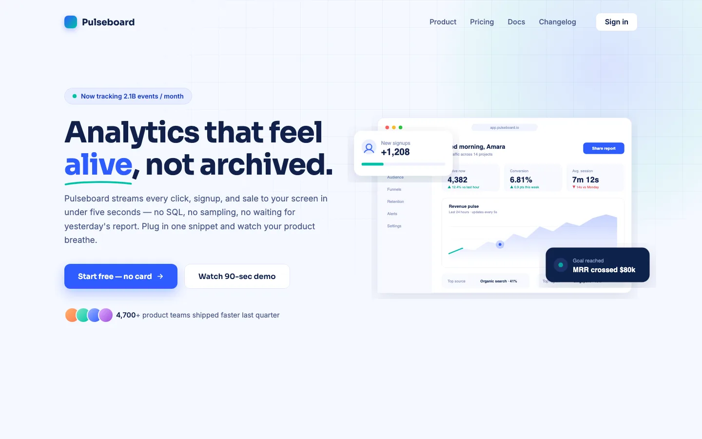
The classic split hero, copy on the left and product on the right, but with three details that make visitors stop. The revenue chart draws itself on load with a pulse dot traveling along the line. Two stat cards float over the dashboard on a slow bob. And the whole visual tilts a few degrees toward your cursor, which makes a flat mockup read as an object.
The social-proof row underneath counts up to your number (default: 4,700 teams). You type a plain number in the panel and the animation handles the rest. This is the layout to pick if your product has a screen worth showing: analytics tools, CRMs, dashboards, booking systems. If your product doesn’t demo well in a screenshot, look at Offbeat (#5) instead, because this layout lives or dies on that right-hand image.
You can edit: 4-part headline (the underlined accent word is its own field), badge text, paragraph, 2 buttons with full link controls, count-up number, proof text, 3 images, 6 colors.
2. Alpenrute – for travel, tours, and outdoor brands
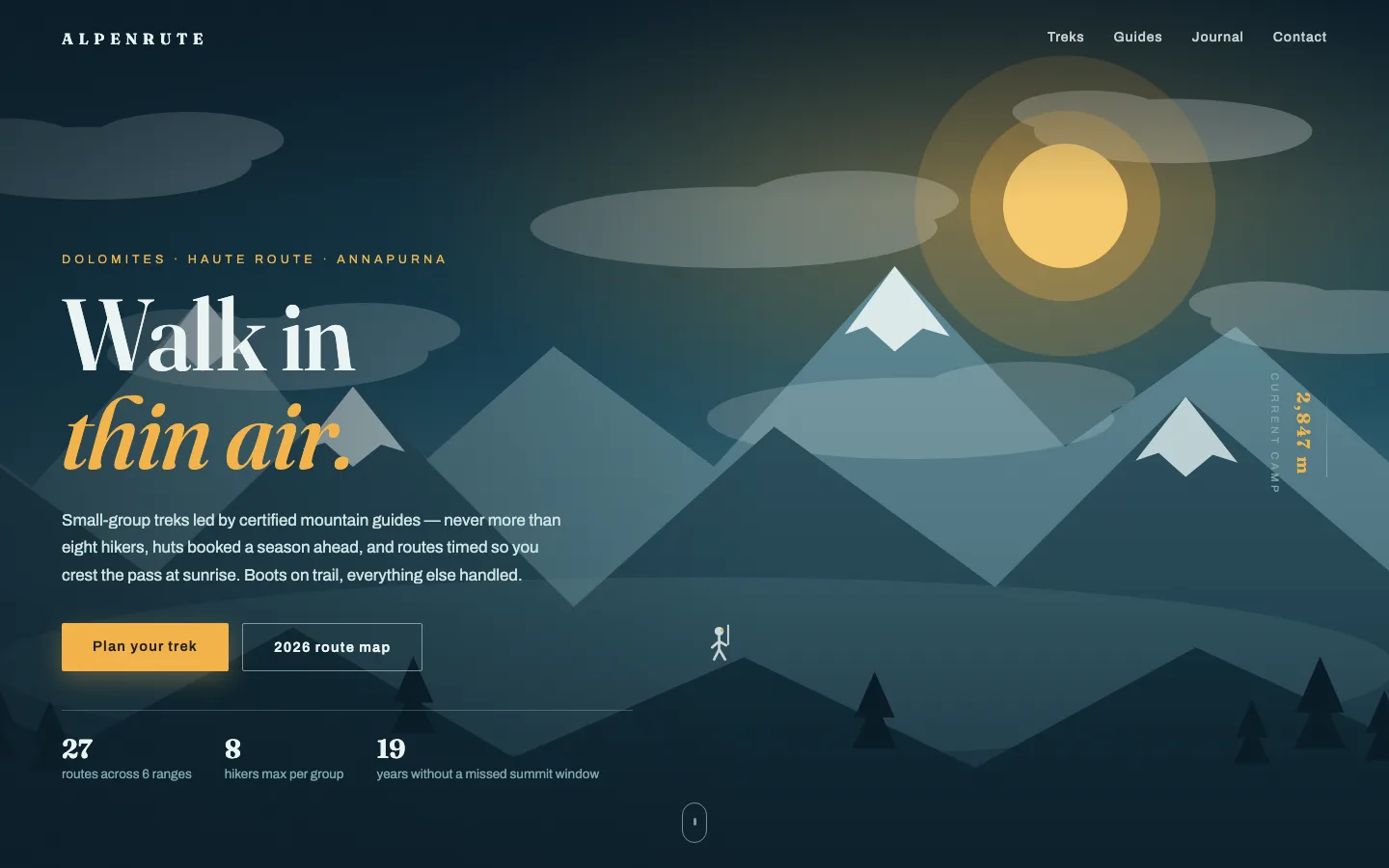
A full-screen mountain panorama built from three separate image layers. Move your mouse and the layers shift at different speeds. That’s real depth, not a flat photo with text on top. Clouds drift across on 55- and 90-second loops, and a vertical altitude ticker on the right counts from 0 to 2,847 m as the page loads. There’s even a tiny hiker with a blinking headlamp on the front ridge. Nobody needs the hiker. Everybody remembers the hiker.
Because the scenery comes from three image fields, you can swap the mountains for your own layered artwork (dunes, coastline, city skyline) and keep the parallax. The facts row (27 routes / 8 hikers max / 19 years) is six editable fields, and it’s where this hero earns trust: specific numbers instead of adjectives. Best fit: trekking companies, tour operators, national park sites, any brand selling a place rather than a product.
You can edit: 2-line headline, eyebrow, paragraph, 2 buttons + links, altitude number and label, 3 fact pairs, 4 scenery images, 4 colors (the entire sky gradient re-tints from one base color).
3. Ember & Oak – for coffee shops, cafés, and restaurants
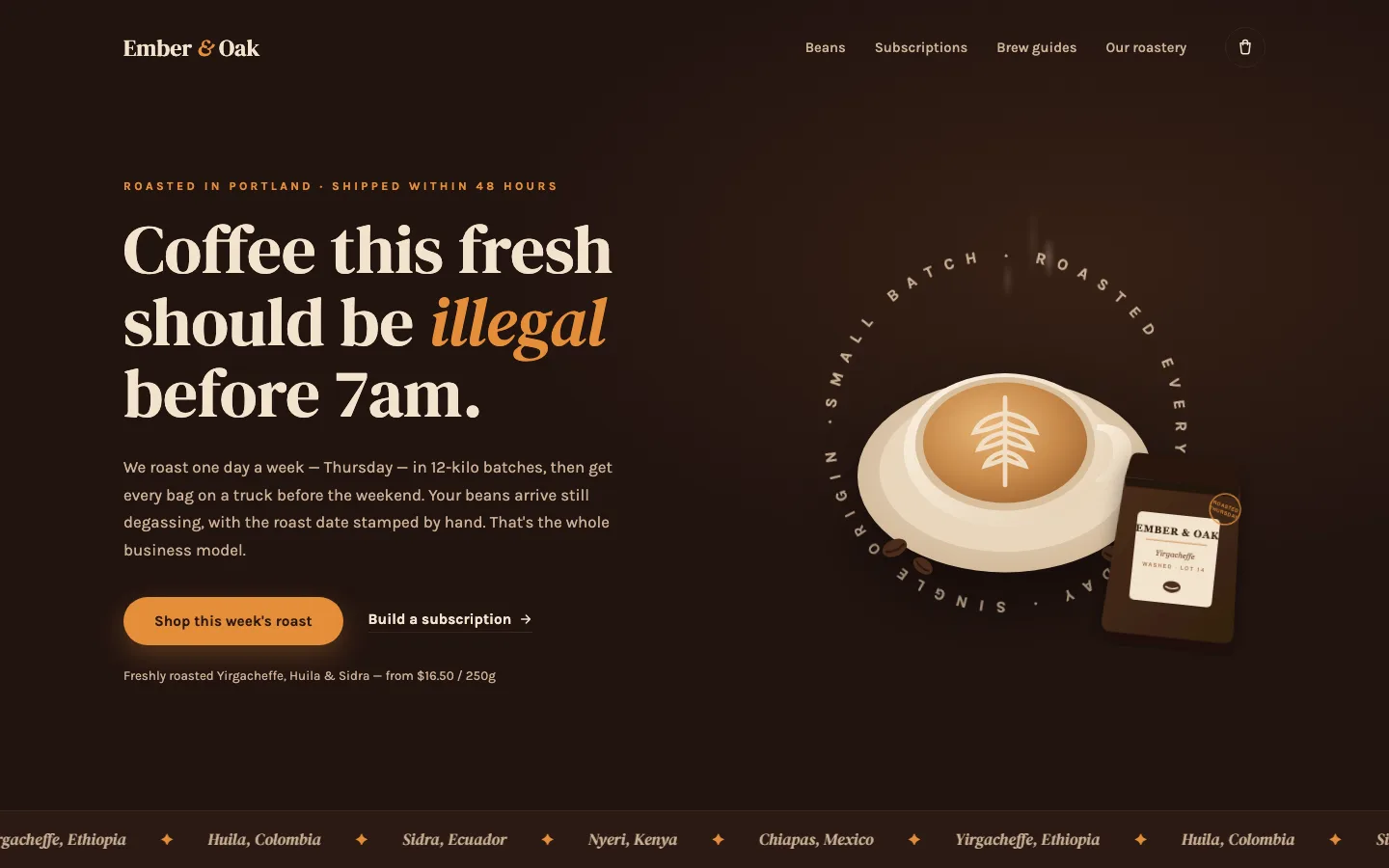
Dark espresso background, serif headline with an italic amber accent word, and the signature piece: a ring of text reading “SMALL BATCH · ROASTED EVERY THURSDAY · SINGLE ORIGIN” that rotates slowly around a top-down latte photo while steam rises from the cup. A coffee bag leans into the corner and straightens up when hovered. At the bottom, an origin-name marquee (Yirgacheffe, Huila, Sidra…) scrolls on loop and pauses on hover.
The ring text is one editable field, so a bakery writes “SOURDOUGH · BAKED AT 5AM · NO SHORTCUTS” and the whole personality transfers. Same for the marquee: one field, printed twice internally so the loop never shows a seam. Works for any food business where craft is the pitch – roasteries, bakeries, breweries, farm-to-table restaurants.
You can edit: 3-part headline with accent word, paragraph, price note, 2 buttons + links, ring text, marquee text, 2 images, 5 colors.
4. Atelier Norr – for fashion labels and premium e-commerce
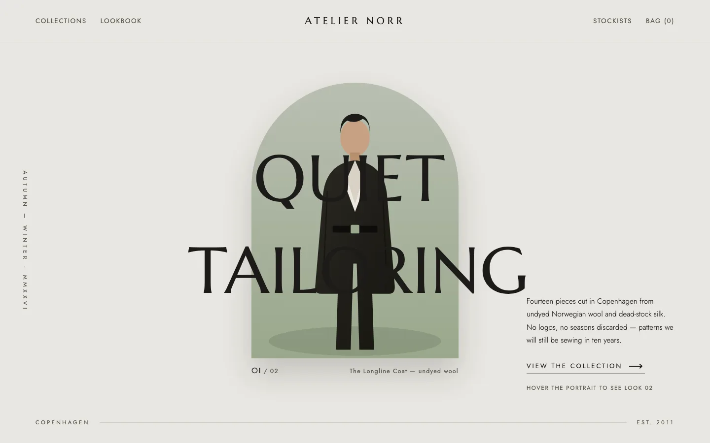
The quietest design in the set, and the most editorial. Two oversized words (QUIET / TAILORING by default) straddle an arched portrait frame, each word wiping in from a clipped edge on load. Hover the portrait and it crossfades to a second look while the caption underneath switches from “01 / 02 – The Longline Coat” to “02 / 02 – The Drape Dress”. That two-image hover swap is the whole widget in miniature: restrained, but alive. For hover overlays on an ordinary image further down the page, there is the Image Hover Effects widget.
Only three colors to manage (canvas, ink, sage accent) because the design’s power is typography and negative space rather than palette. If your brand photographs well and you want the site to feel like a lookbook, this is the one. Fashion, jewelry, ceramics, furniture. If you need to cram five value propositions above the fold, it will fight you, and it should.
You can edit: both headline words, vertical season label, paragraph, button + link, hover hint, 2 look images with 2 captions, footer strip, 3 colors.
5. Offbeat Studio – for creative agencies and studios
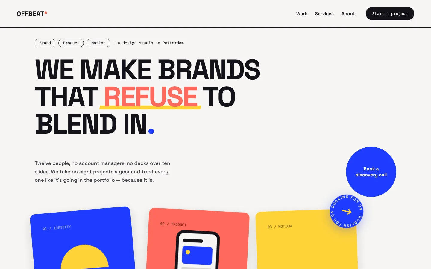
Cobalt, coral, and lemon on off-white – Bauhaus poster energy. The headline shouts in uppercase with a highlighted accent word that gets a yellow swipe underline half a second after load. Below it, three portfolio tiles sit slightly rotated like prints on a table; each one straightens, lifts, and tilts toward your cursor in 3D on hover. A “BOOKING FOR Q4” sticker spins lazily above the collage.
The circular call-to-action is the piece people play with. It’s magnetic: it follows your cursor inside its radius and springs back when you leave. Every tile has its own link field, so the collage doubles as a mini portfolio with three case studies clickable straight from the hero. For agencies, designers, photographers, anyone whose work is the pitch.
If the portfolio section below the hero needs category tabs, that part is the Filterable Image Gallery widget.
You can edit: 3 service tags, kicker, 5-part headline (accent word separate), paragraph, magnetic button + link, 3 tiles with 3 links, sticker text, client marquee, 5 colors.
6. Forge Athletics – for gyms and fitness brands
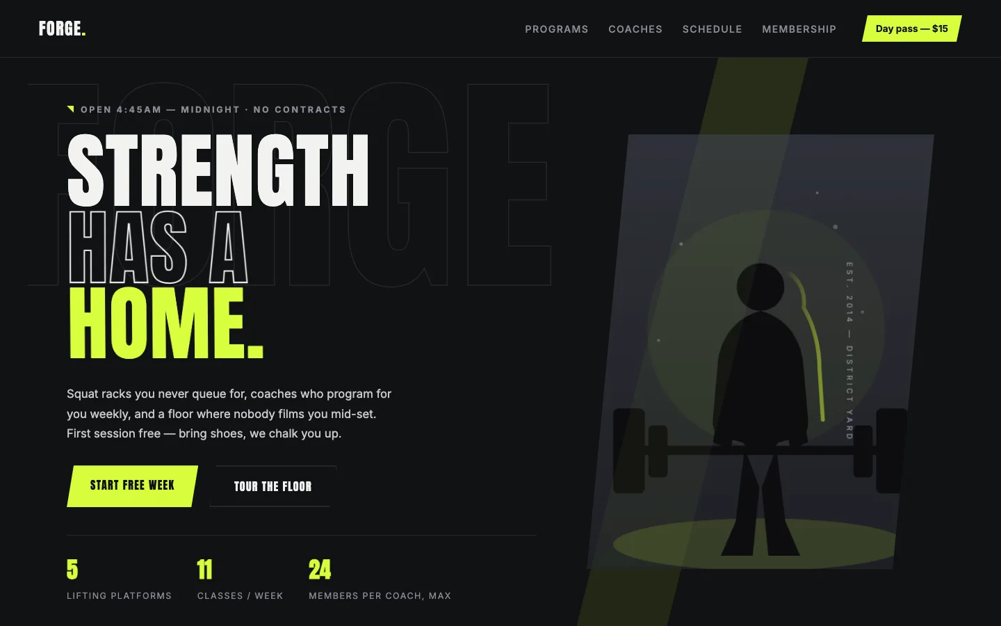
Charcoal and volt green, condensed uppercase type, and a headline that slams in: each line lands with a skew-and-scale snap instead of a polite fade. Line two is outlined instead of filled, line three takes the volt color. Behind everything, a giant ghost word (FORGE) drifts against your scroll. The athlete image sits in an angled parallelogram frame with a volt slash cutting the layout diagonally.
Stats count up along the bottom: 14 platforms, 31 classes, 24 members per coach max. Notice what that last number does. “Members per coach, max” is a promise, not a boast, and it’s the kind of line that fills intro sessions. Swap the ghost word for your gym’s name in one field. Built for strength gyms, CrossFit boxes, martial arts studios, and coaches whose brand is intensity.
You can edit: 3-line headline, eyebrow, paragraph, ghost word, vertical tag, 2 buttons + links, 3 stat pairs, athlete image, 4 colors.
7. Wiggly Minds – for kids apps, schools, and education
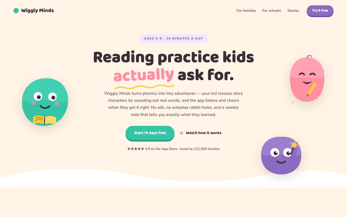
Candy pastels, rounded type, and three blob mascots: one reading a book, one holding a pencil, one waving a star wand. They pop in with a spring, bob gently, and shy away from your cursor as it moves. Stars twinkle across the background, a yellow squiggle draws itself under the tilted accent word, and the main button squishes down like jelly when pressed. A white wave closes the section so it flows into whatever comes next.
The centered layout keeps parents (the actual buyers) on a clear path: age range badge, promise, one paragraph that answers “is this screen time I’ll regret?”, trust line with the App Store rating. The mascots are three image fields. Swap in your own characters and the bounce, shadow, and cursor-shy behavior apply automatically. For learning apps, daycares, kids’ clubs, pediatric practices, and toy brands.
You can edit: headline with tilted accent word, badge, paragraph, 2 buttons + links, trust line, 3 mascot images, 6 colors.
8. Studio Meridian – for architects, interior designers, and portfolios
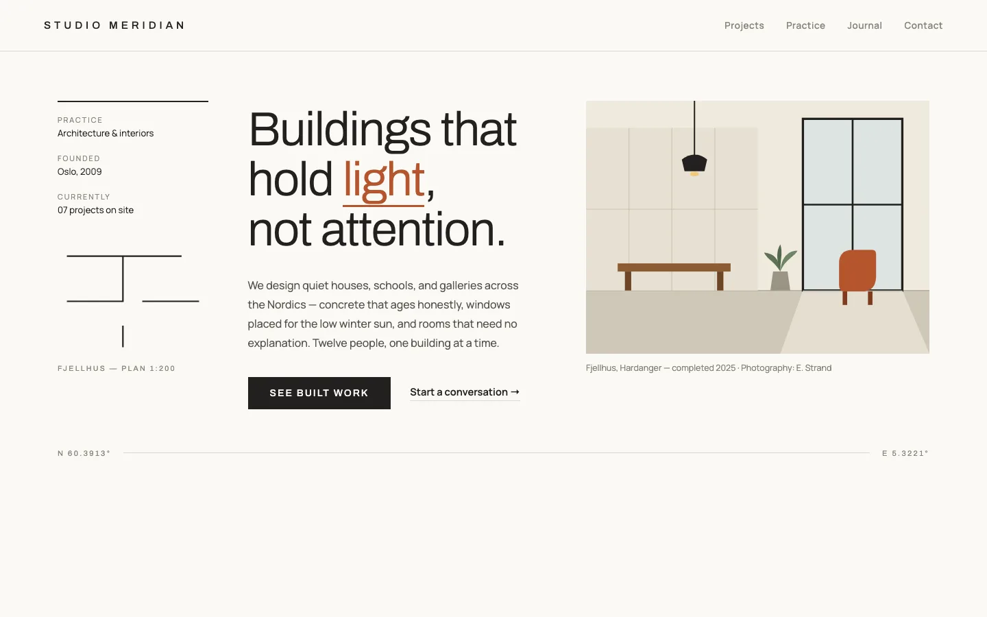
Swiss grid discipline: a meta column (practice, founded, projects on site), a thin 300-weight headline with one brick-underlined word, and a large project photo that reveals with a wipe. A paper-colored curtain slides off and the image settles from a slight zoom over a full second. The detail people email us about is the floor plan in the sidebar, which draws itself – walls first, then door swings, then room labels fading in. It’s an SVG animation that ships inside the demo image, no plugin involved.
Twenty-five editable fields make this the most data-rich hero of the ten. Every meta label, both captions, even the coordinates in the bottom rule. Three colors only, and that’s deliberate: graphite, paper, and brick is a system, and systems are what this audience respects. For architecture firms, interior studios, structural engineers, and any portfolio where restraint signals competence.
You can edit: 5-part headline, paragraph, button + text link with URLs, 3 meta pairs, photo + caption, floor plan + caption, coordinate rule, 3 colors.
9. Lowtone – for festivals, concerts, and event pages
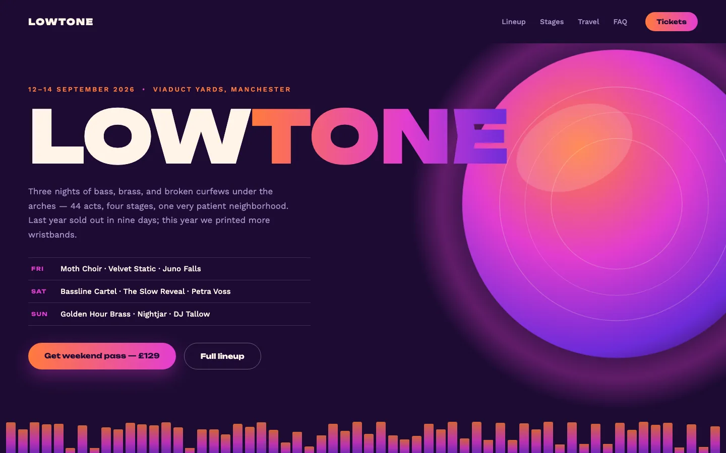
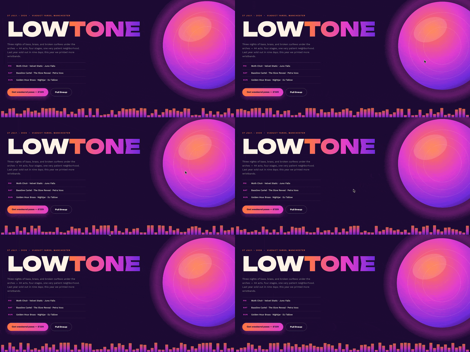
The loudest design here, and it earns it. A giant wordmark splits mid-word into an orange-to-violet gradient, a glowing orb drifts behind the content and leans away from your cursor, and along the bottom runs a full-width equalizer: dozens of bars, each animating on its own rhythm so the strip never visibly loops. The bars are generated by the widget’s own script and pull their gradient from your Style tab colors, so recoloring the festival recolors the sound.
Three lineup rows (FRI / SAT / SUN) each carry their own label, act list, and link, so you can send each day to its own schedule page. The gradient is three separate color stops in the Style tab. Shift them and the wordmark, buttons, glow, and equalizer all follow. For festivals, venues, club nights, conferences with headliners, and album launches.
You can edit: split wordmark, date, location, paragraph, 3 lineup rows with 3 links, 2 buttons + links, orb image, 5 colors including all 3 gradient stops.
10. Måne – for skincare, beauty, and wellness brands
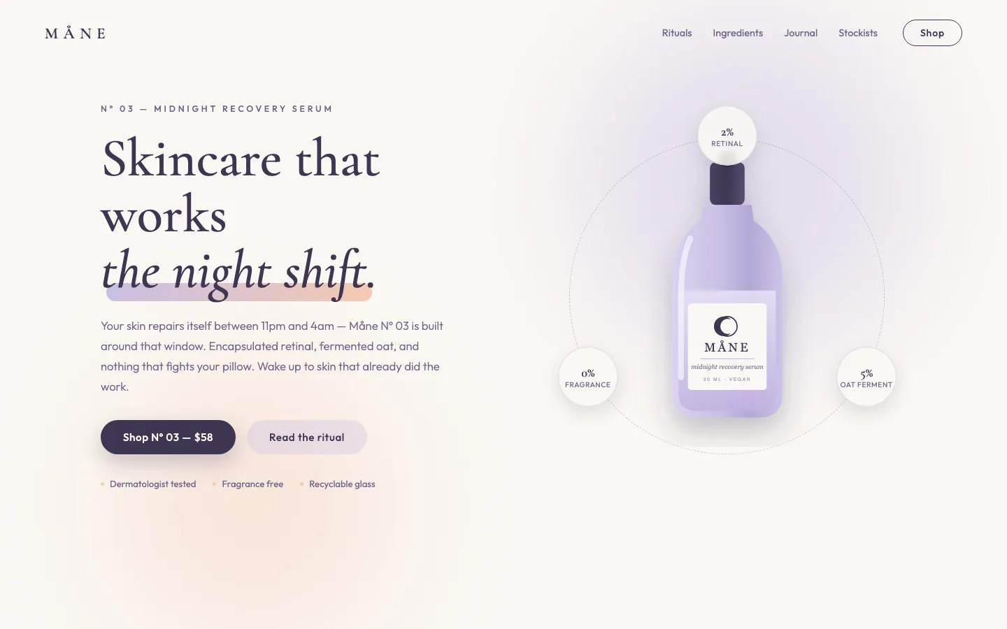
Misty lavender and peach hazes blur and drift behind a serif headline whose italic line, “the night shift.”, gets a soft gradient underline that blooms outward. The product bottle floats gently at the center of a dashed ring, and three ingredient badges (2% retinal, 5% oat ferment, 0% fragrance) orbit it on a 26-second loop, counter-rotating so they stay upright the whole way around.
Those badges are the conversion play. Percentage claims are what skincare buyers scan for, and here they literally circle the product. All six badge values and labels are plain text fields. The claims row underneath (dermatologist tested · fragrance free · recyclable glass) rounds out the trust story. For skincare, supplements, candles, haircare – any product where the ingredient list is the argument.
You can edit: 2-part headline, eyebrow, paragraph, 2 buttons + links, 3 claims, 3 orbiting badge pairs, bottle image, 4 colors.
11. Loose Ends – for portfolios, studios, and launch pages that need a jaw-drop
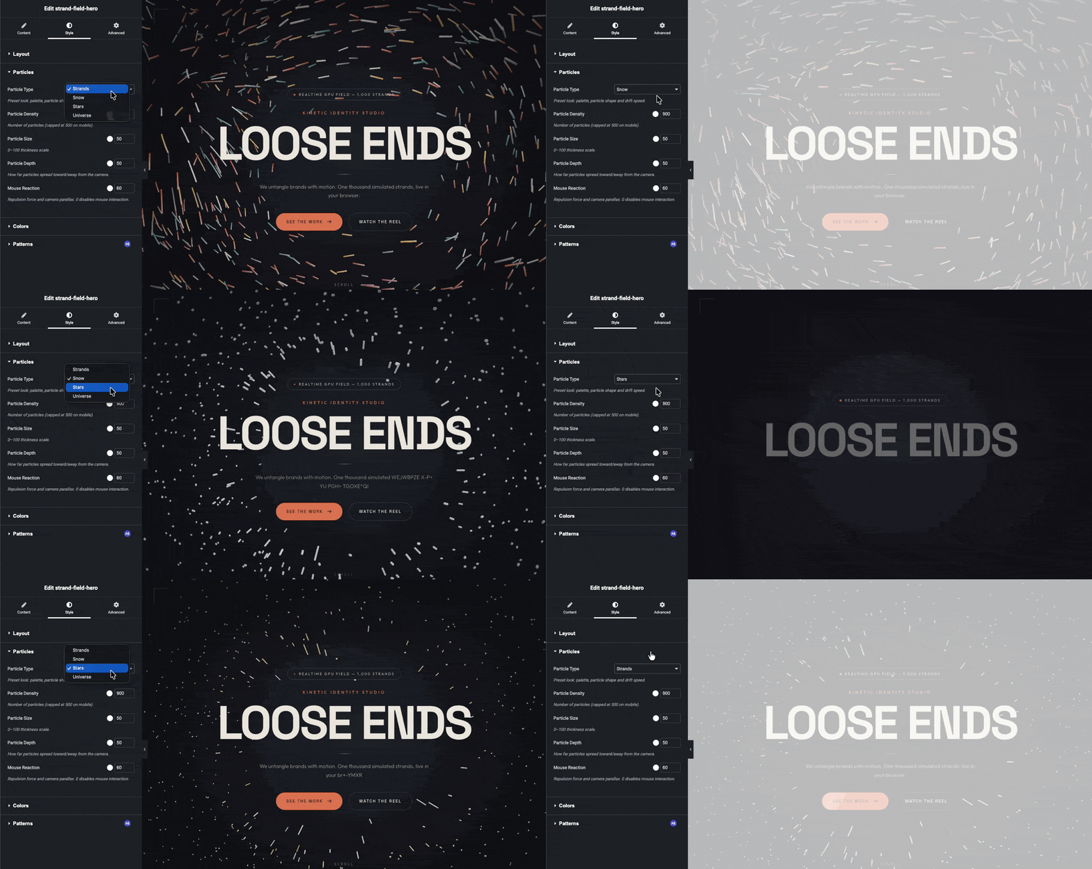
This one is new, and it’s the most ambitious thing we’ve pushed through the Widget Builder so far: a full-screen headline sitting in the eye of a vortex of one thousand particles, simulated on the visitor’s GPU in real time. Move the mouse and the swarm parts around the cursor, then springs back. The camera drifts a little too, which makes the field read as a space rather than a background video. The headline decodes itself with a character scramble on load, the primary button carries a slow light sweep, and a film-grain layer keeps the dark background from banding.
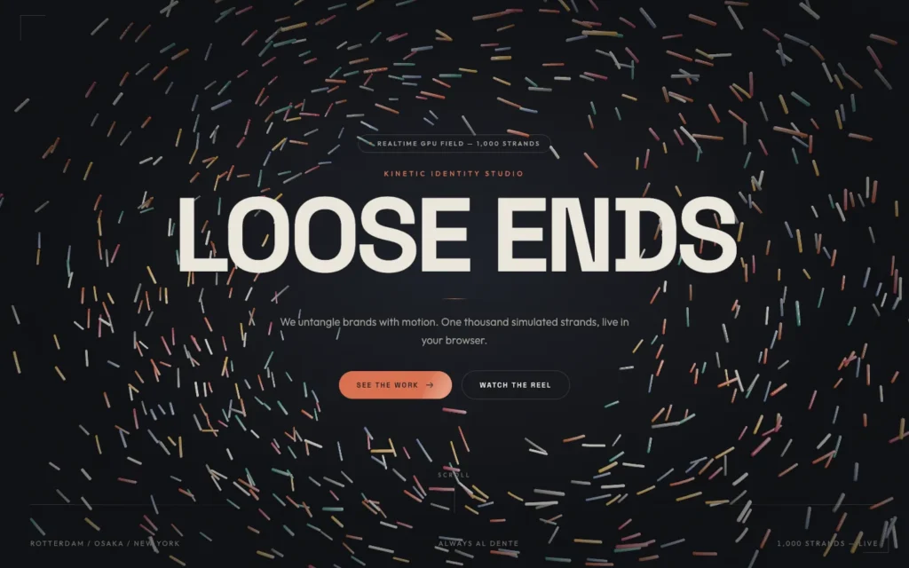
The particles aren’t one fixed look. A dropdown in the Style tab switches the field between Strands (colorful swirling filaments), Snow (slow white drift), Stars (a near-still starfield), and Universe (long deep-space wisps). Four sliders control density (100 to 2,000 particles), size, depth, and how hard the swarm reacts to the mouse. There’s also an alignment control that moves the whole content stack left, center, or right, so the same widget works as an editorial left-aligned hero or a centered splash page. One honest note: the 3D engine loads from a CDN, about 1.2 MB cached after the first visit, and runs on WebGPU in Chrome and Edge with a WebGL2 fallback everywhere else. If that request fails, the hero renders as a normal styled section and nothing breaks. No images to upload either; the whole scene is generated.
You can edit: pill text, eyebrow, heading, tagline, 2 buttons with full link controls, scroll cue, 3 bottom-bar texts, content alignment (left / center / right), particle type (strands / snow / stars / universe), density, size, depth and mouse-reaction sliders, 5 colors.
If none of these heroes fits your site, the Master Addons template library has 26 Elementor home page templates. Each one is a complete homepage with the hero, service blocks and call to action already built, and two are free. For a whole site in one style, see the Elementor template kits.
For the blog side of the site, our Elementor blog templates cover 10 blog page layouts and 5 single post designs, each with a live demo.
How to import a hero section template into Elementor (step by step)
The whole process takes about two minutes per widget. You need WordPress with Elementor and the Master Addons PRO plugin active. Here’s the exact workflow, screenshotted from a real import of the music festival hero.
Step 1: Unzip the download
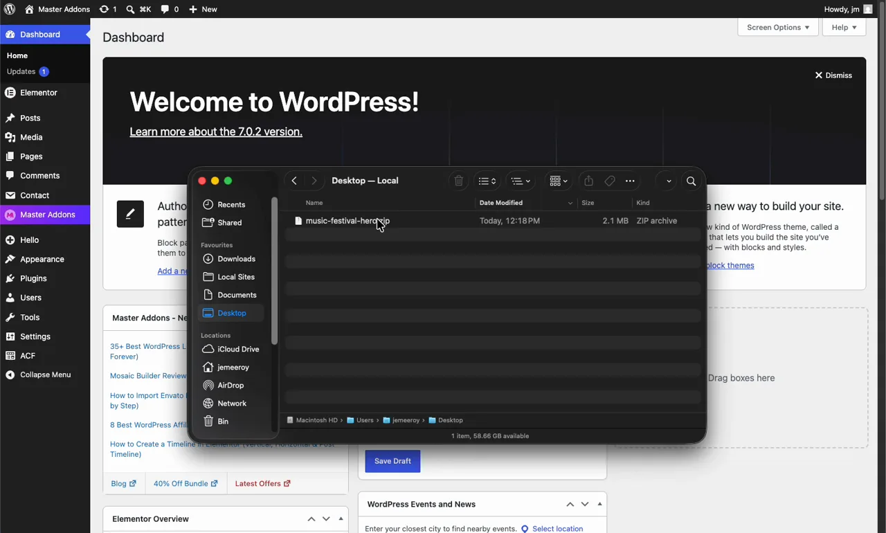
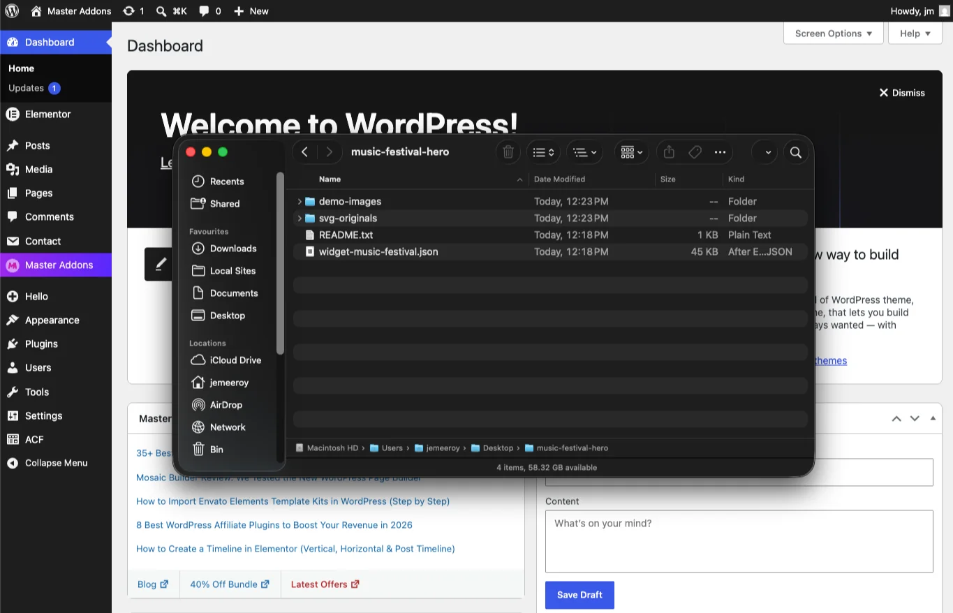
Double-click the zip (here, music-festival-hero.zip). Inside you’ll find three things: the widget file (widget-music-festival.json), a demo-images folder with upload-ready PNGs, and a README.txt that tells you which image belongs in which field. There’s also an svg-originals folder – more on that in the FAQ.
Step 2: Import the JSON into the Widget Builder
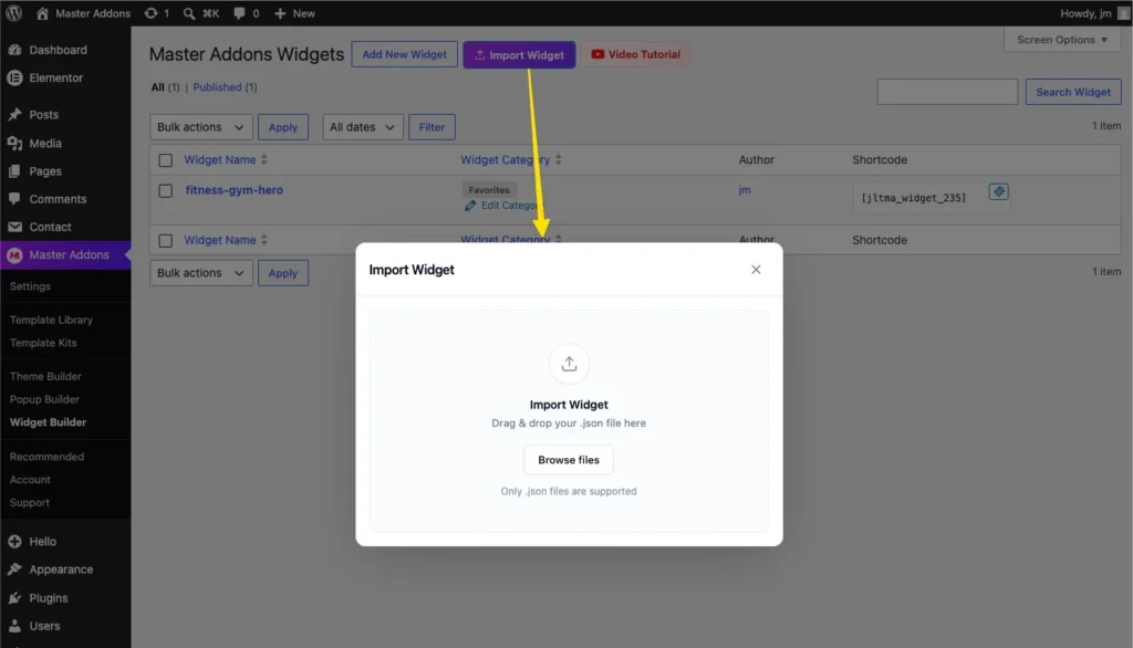
In your WordPress admin, go to Master Addons → Widget Builder and click Import Widget. Drag the .json file into the dialog, or click Browse Files. Only the JSON goes here. The images come later, through the normal media library.
Step 3: Check the widget and save
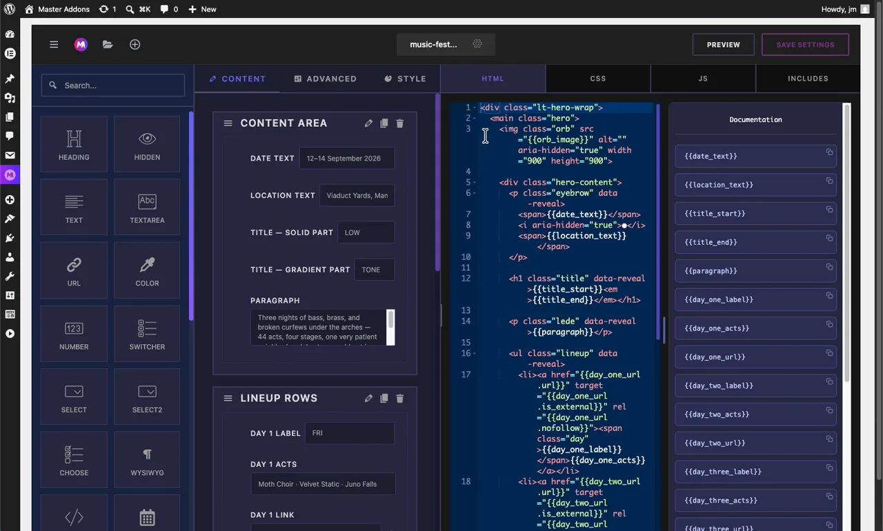
The widget opens in the builder with everything already wired: content sections on the left, the HTML/CSS/JS behind tabs, and a Documentation sidebar listing every field token. You don’t need to touch any of it. Just hit Save Settings. If you’re curious how the fields connect to the code, the Widget Builder settings guide explains the token system.
Step 4: Drag it into your page
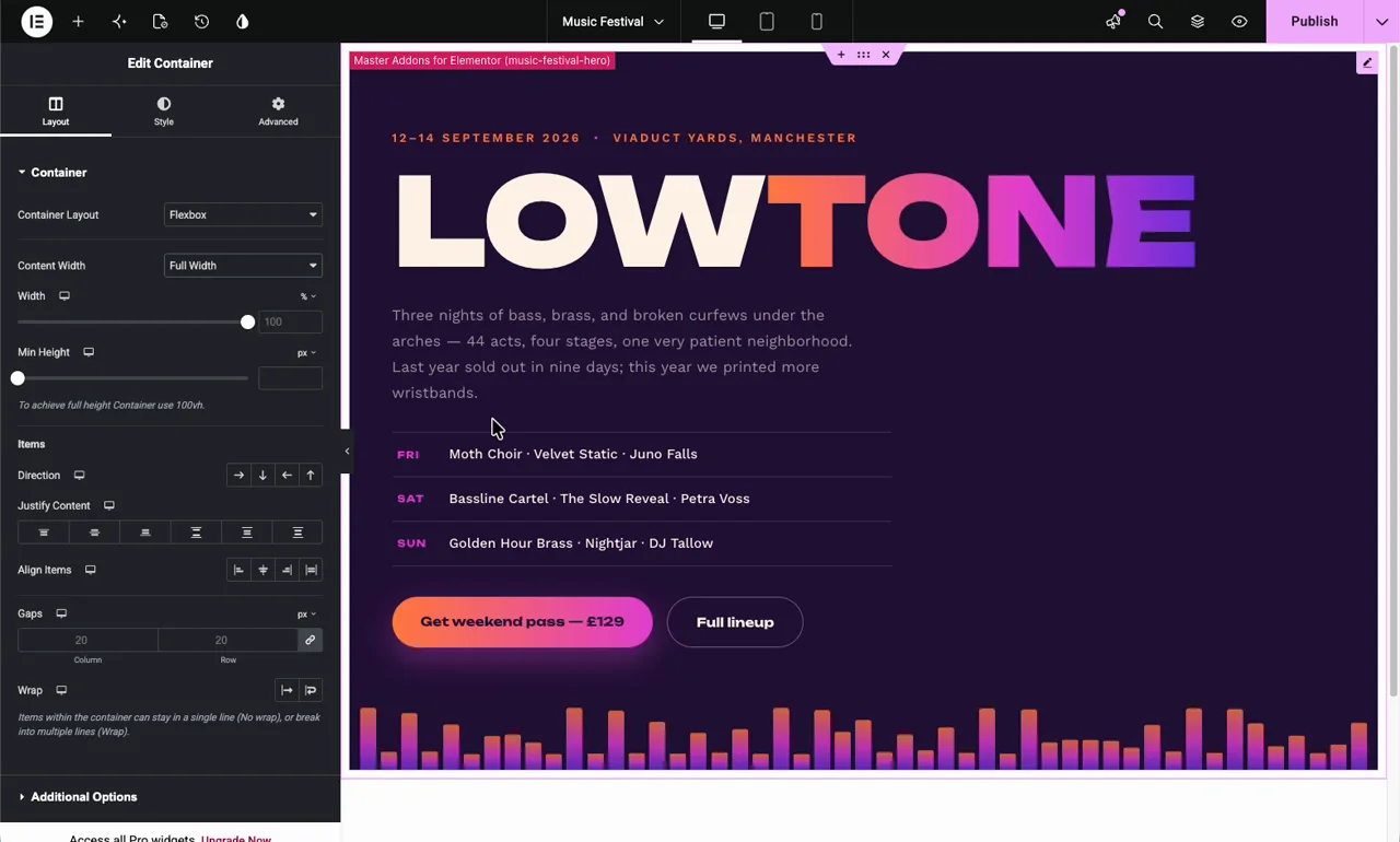
Open any page with Elementor. Your new widget appears in the panel under Favorites; search its name if you don’t spot it. Drag it into a container. One tip for you: set the container’s Content Width to Full Width so edge-to-edge designs like the festival and travel heroes can actually reach the edges.
Step 5: Edit the content and links
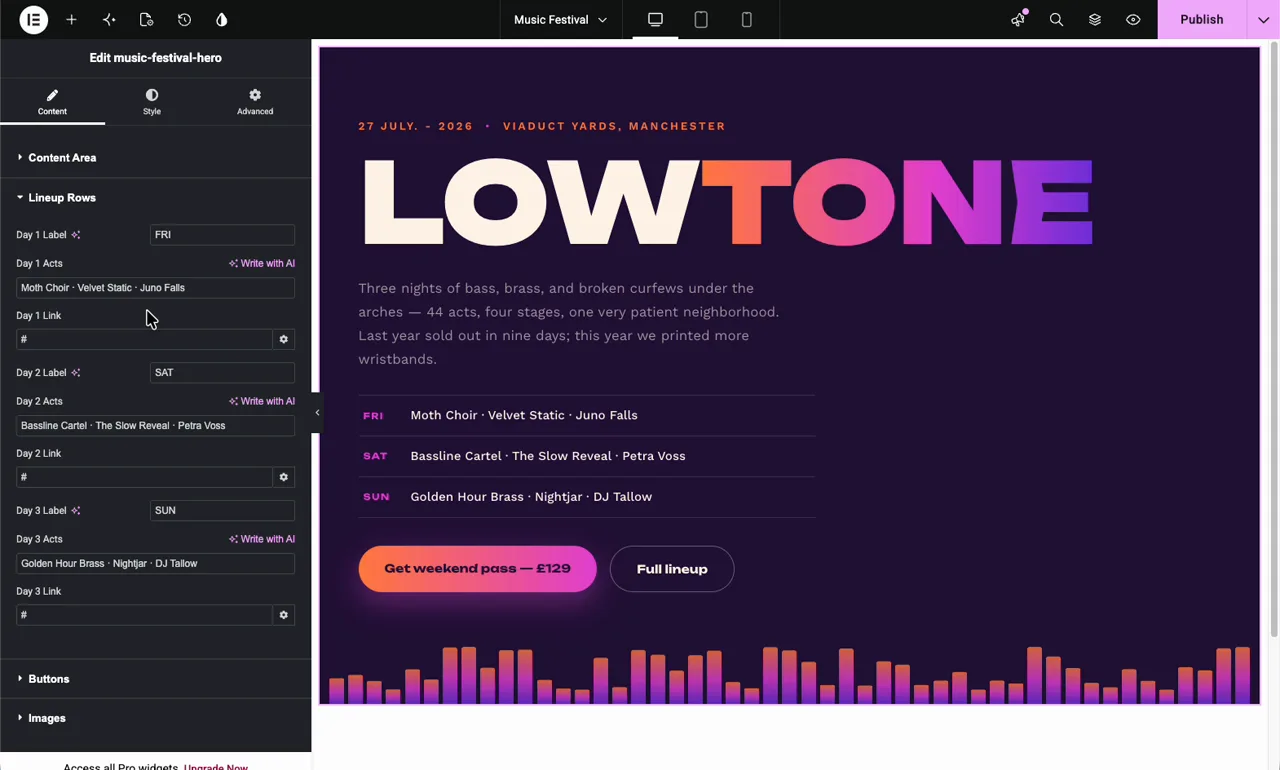
Click the widget and the Content tab lists every editable piece, grouped the way the design is grouped: Content Area, Lineup Rows, Buttons, Images. Type over any text and the preview updates live. Every button and linked row has a proper Elementor link control. Paste your URL, then hit the gear to toggle “open in new window” and “nofollow”.
Step 6: Upload the demo images
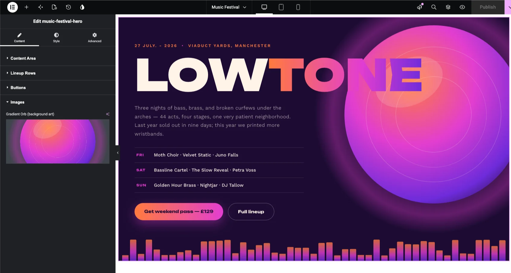
In the Images section, click each field and upload the matching file from the demo-images folder. The README maps them if a widget has several. The demo PNGs are exported at 2x resolution, so they stay sharp on retina screens. Swap in your own photos any time; the field is a standard WordPress media picker. Then Publish. Done.
To restyle: open the Style tab. Each hero exposes its full palette as a handful of color controls, and every derived shade (hover states, glows, borders, gradients) recalculates from those. You cannot half-recolor these designs, which is exactly the point.
FAQ
Do these hero section templates work with free Elementor?
Yes. Everything here runs on free Elementor plus the Master Addons PRO plugin. No Elementor Pro required. The Widget Builder import feature ships in the free version.
Are the animations going to slow my site down?
No measurable difference in our tests. The animations are CSS and a small scoped script per widget. No animation libraries, no jQuery dependency, no external requests except one Google Fonts call per widget (and it loads once even if the widget appears twice). The zips themselves run 30 KB to 2 MB, and that’s almost entirely the demo images.
What happens for visitors who turn off animations?
Every widget checks the operating system’s reduced-motion preference. If it’s on, entrances render instantly, marquees and orbits stop, and counters show their final numbers. The design stays intact; the motion politely leaves.
Why are there SVG files in the zip if WordPress won’t upload them?
WordPress blocks SVG uploads by default for security reasons, so the zips include PNG versions that upload anywhere. Those are what the import guide uses. The svg-originals folder is a bonus: if your site allows SVG (through a plugin like Safe SVG), the vector versions are infinitely sharp at a fraction of the file size.
Can I use two of these hero sections on the same site?
Yes, even on the same page. Each widget’s styles are scoped to its own wrapper class and its animation names are prefixed, so they can’t collide with each other or with your theme.
Can I change the fonts?
Each widget loads its two Google Fonts automatically to match the design. To swap them, open the widget in the Widget Builder, edit the font URL in the JS tab and the font-family names in the CSS tab. It’s a two-line change. The Widget Builder docs cover how the code tabs work.
Can I edit the design itself, not just the content?
That’s the fun part. Every widget is fully open in the Widget Builder. The HTML, CSS, and JS are right there in tabs, commented and readable. Add a field, remove a section, change a breakpoint. If you can edit a stylesheet, you can fork any of these into something new. The Widget Builder page has an overview, and if you build something good, we want to see it.
All 10 hero sections are free for personal and commercial projects. Built and tested by the Master Addons team on Elementor with Master Addons v3.x. Questions or a widget request? Tell us in the comments. The collection grows based on what people ask for.
