

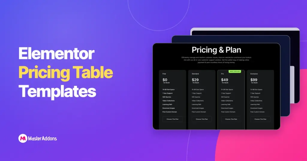
Key Takeaways
- The Master Addons Pricing Table widget ships five Elementor pricing table templates as a Layout dropdown: Default, Left Align Content, Rounded Table, Table with BG Image and Skew BG Pattern.
- Switching the Layout dropdown keeps the plan name, price, features and button in place, so one set of content can be previewed in all five designs in under a minute.
- The Master Addons Template Library has ready-made pricing sections, including dark, two-plan, four-plan and billing-switch designs, that import into any Elementor page from the editor.
- Every pricing table example on this page follows the same order: plan name, who it is for, price and period, three to seven feature rows, one button and an optional trust line.
- A dark pricing table reads best with one bright accent on the highlighted plan only; the examples below use green, cyan or pink for that single card.
- A monthly and yearly switch on a pricing section needs two sets of cards and the Toggle Content widget from Master Addons Pro.
An Elementor pricing table template saves you the part of the job that takes longest: the design decisions. The widget layouts below give you a card shape in one click, and the ready-made sections give you a whole pricing block with heading, switch and cards already arranged. Either way you replace the plan names, prices and features and keep the design.
This page collects twelve pricing table examples built with Master Addons for Elementor. The first five are the widget’s own layouts with the exact settings used, so you can reproduce each one. The next seven are sections from the Template Library, chosen to cover the common pricing page shapes: three plans, two plans, four plans, dark, light, and a billing switch.
Table of Contents
How to use these templates
There are two kinds of template on this page. Examples 1 to 5 are widget layouts: drop the Pricing Table widget into a container, pick the layout from the dropdown, and copy the settings listed under each example. Examples 6 to 12 are full sections: open the Template Library, import the section, and edit the text in place.
The settings listed for each layout are the ones that change the look. Everything else is at its default. Colours are given as hex values so you can paste them into the Style tab, and all five layout cards use the same content: a $29 plan with three features and a “Get started” button.
The five Pricing Table widget layouts
1. Default
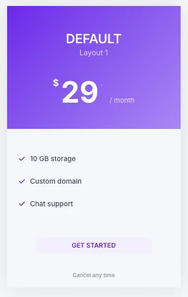
The Default layout is the one to start with. The header is centred, the price sits under the name, and the features and button follow in the body. It works for any plan count and is the safest choice for a three-column row.
- Layout: Default
- Header colour scheme: Custom, gradient from #6938EF to #B497FF at 135 degrees
- Heading and price colour: #FFFFFF; subtitle and period: #E4DBFF
- Feature icon: check, #6938EF; feature text: #1A1033
- Button: background #F1EEFF, text #6938EF, radius 6 px
- Additional info: “Cancel any time”, #6B7280
2. Left Align Content
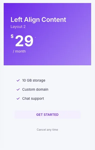
Left Align Content moves the name, price and features to the left edge. It reads faster when the plan names are long or when the card sits next to a paragraph of text, and it matches editorial-style pricing pages where everything else is left aligned.
- Layout: Left Align Content
- All colours as in Default
- Button alignment: left, with 24 px left padding on the footer
3. Rounded Table
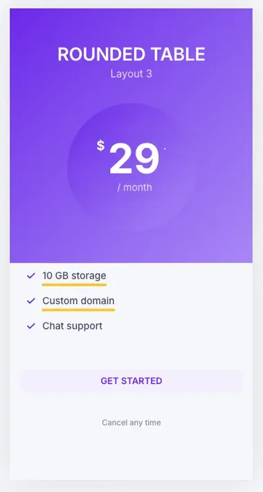
Rounded Table puts the price inside a large circle in the header, which makes the number the first thing anyone sees. It needs a taller header, so give it the same feature count on every card or the row will look uneven. The yellow underline on feature rows is part of the layout.
- Layout: Rounded Table
- Header gradient as in Default; circle gradient from #F50A7F to #FF6FB1 at 135 degrees, or leave it on the default tint
- Features text: #1A1033, underline colour #FFD600 (layout default)
4. Table with BG Image
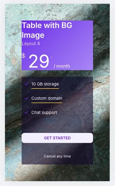
Table with BG Image fills the whole card with an image, gradient, video or slideshow, with the header and features floating on top. It suits one featured plan or a pricing page for a visual product. The feature panel needs a dark semi-transparent background so the text stays readable on any photo.
- Layout: Table with BG Image
- Background: Image, position centre centre, size cover
- Features background: rgba(20, 10, 45, 0.6); features text: #FFFFFF
- Header gradient as in Default, with 70 percent opacity so the photo shows through
5. Skew BG Pattern
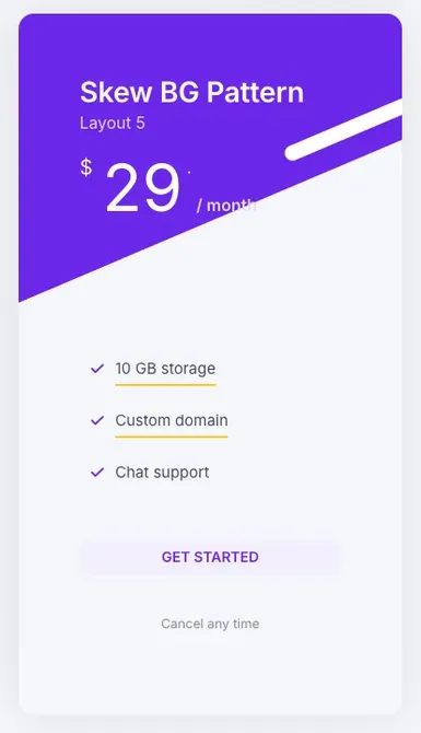
Skew BG Pattern cuts the header at an angle and adds two white stripes, which gives the card movement without an image. Use one accent colour; a gradient fights with the stripes. It is the layout most often picked for a single card on a landing page.
- Layout: Skew BG Pattern
- Header colour scheme: Custom, solid #6938EF
- Card radius: 20 px; card background #FFFFFF
- Feature underline on, button as in Default
6. Three plans with a highlighted middle card
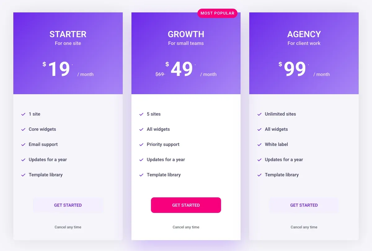
The standard SaaS pricing row: three Pricing Table widgets in a three-column container, the middle one raised. The raised card uses Highlight Table, a ribbon reading “Most popular”, a solid pink button instead of the outline, and the Sale switch with $69 as the original price and $49 as the current one. The outer cards use the lighter body colour so the middle one stands forward.
- Container: three child containers at 31.5 percent width, gap 28 px, Align Items: Stretch
- Middle card: Highlight Table on; ribbon “Most popular”, vertical 18, horizontal -10; button background #F50A7F, text #FFFFFF
- Outer cards: body background #F6F5FA; middle card: #FFFFFF with a 0 24px 60px rgba(105, 56, 239, 0.28) shadow
7. Dark four-plan pricing table
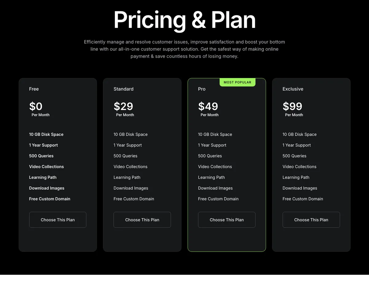
Four plans on a black background, with a single lime accent on the highlighted plan’s border and tag. The features are identical across cards, which is a deliberate choice: the difference between plans is only price and the reader is meant to pick by budget. The buttons use the Creative Button widget, so the hover effects come from that widget rather than custom CSS.
Use this template when the plans differ by limits rather than features. Bold feature text on the first card and regular text on the others is the only visual hierarchy, so keep it that way.
8. Dark SaaS pricing with a custom plan
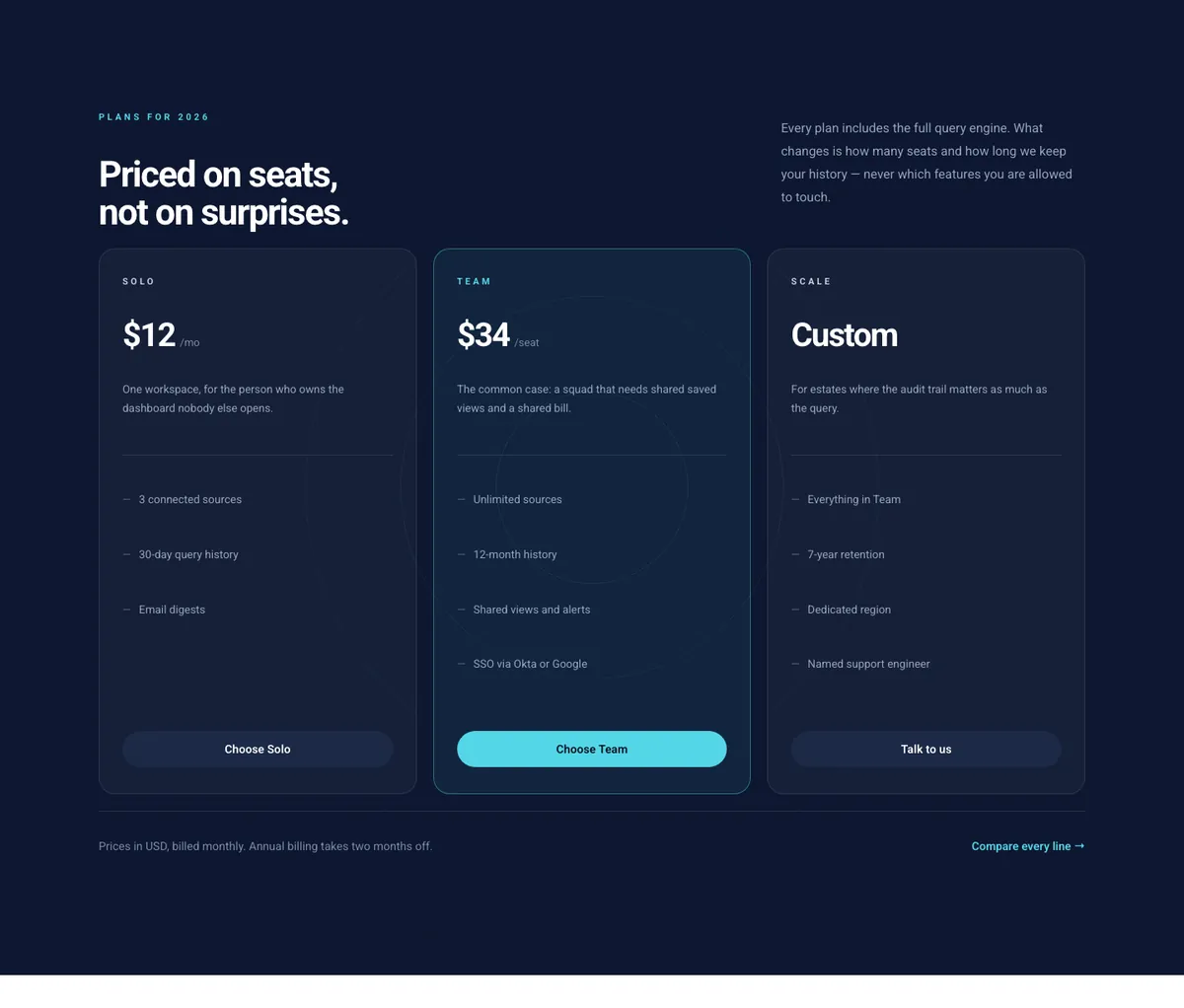
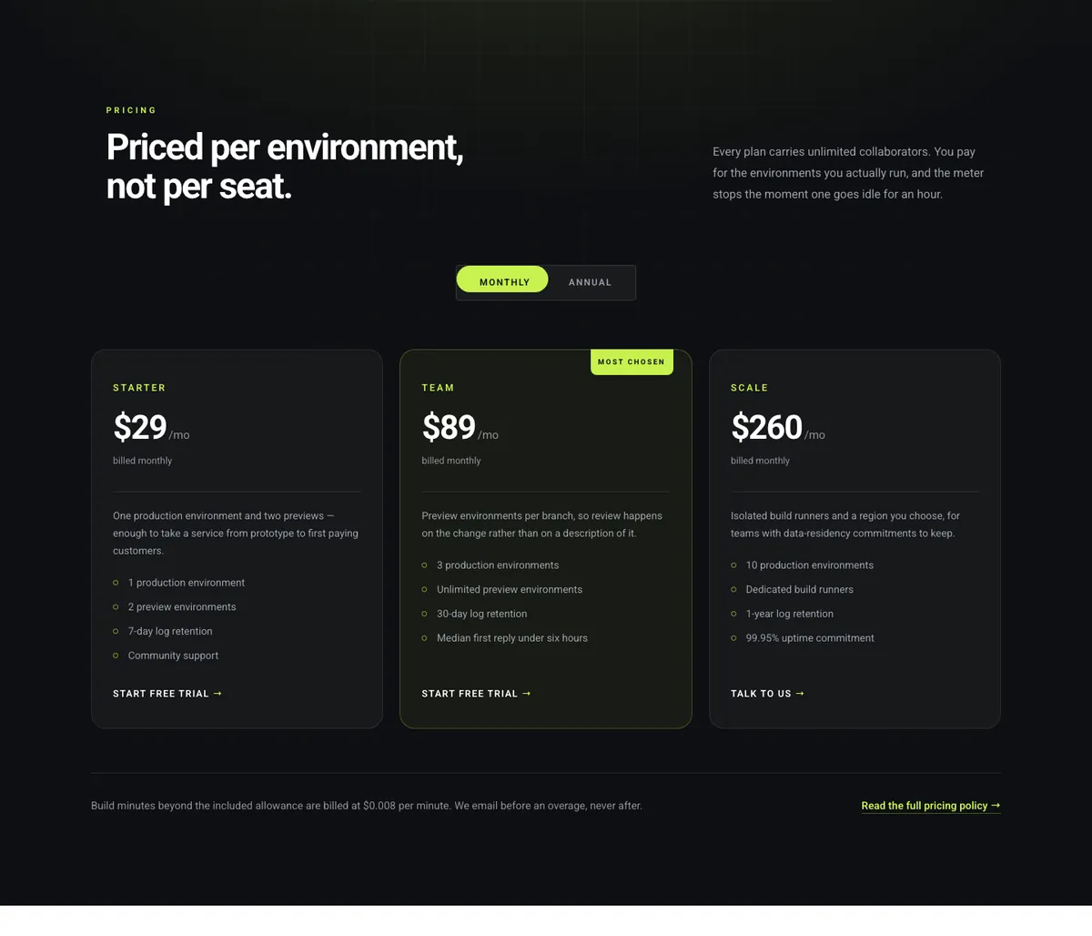
From the Finix template kit, this section shows how to handle a plan without a fixed price. The third card prints “Custom” where the number would be and swaps the button text for “Talk to us”. A one-line description under each price explains who the plan is for, and a footnote under the row covers billing and the annual discount in one sentence.
The faint concentric circles behind the cards are a section background image, not part of the widget. Replace the image or remove it and the cards stay as they are.
9. Two-plan light pricing table
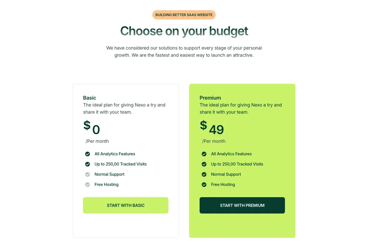
Two plans is a yes or no decision, so this layout makes the paid card impossible to miss: the whole card is filled with the accent colour and the button inverts to dark. Grey check icons on the basic card mark features that are not included, which lets both cards keep the same four rows.
Use this when there is a free tier and one paid tier. With three or more plans the full-colour card becomes too loud.
10. Pricing cards with a billing switch
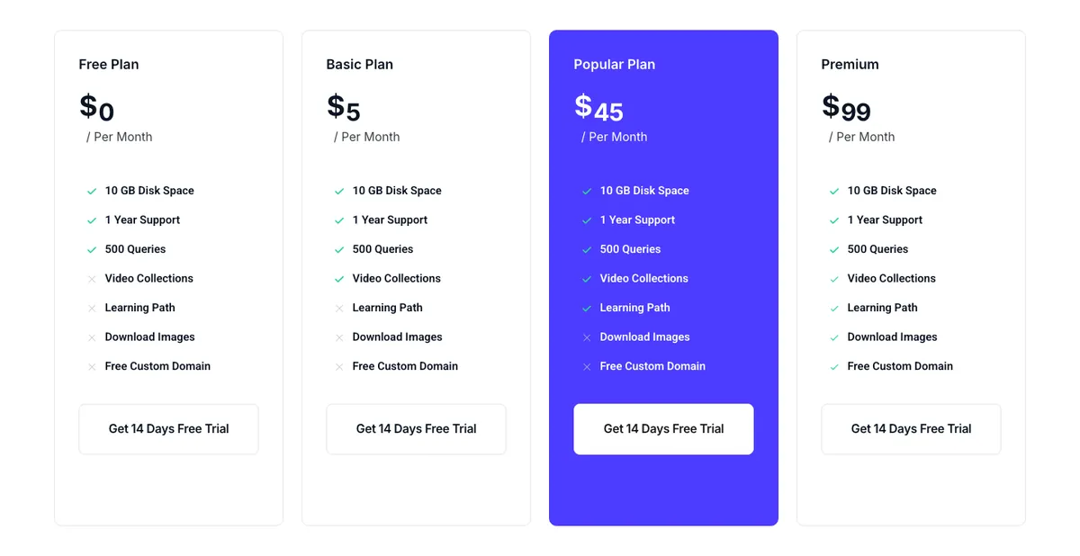
This section has the monthly and yearly toggle already built. The switch is the Toggle Content widget from Master Addons Pro, and each state loads a saved pricing row. The cards print “billed monthly” or “billed annually” under the price so the reader knows which state is showing. Import it, open Templates > Saved Templates, and edit the two pricing rows there. To build the same thing from scratch, including the Section-type template catch, follow the monthly and yearly toggle guide.
11. Four-plan comparison with feature ticks
When plans differ by features rather than limits, ticks and crosses let the reader scan down a column. Past about seven rows, a comparison table does this job better than cards. All four cards carry the same seven rows in the same order, and the icon changes per plan. The highlighted plan is filled with the accent colour, with a white button, and sits third rather than second because the page expects most readers to pick the higher tier.
12. Dark pricing with a monthly and yearly toggle
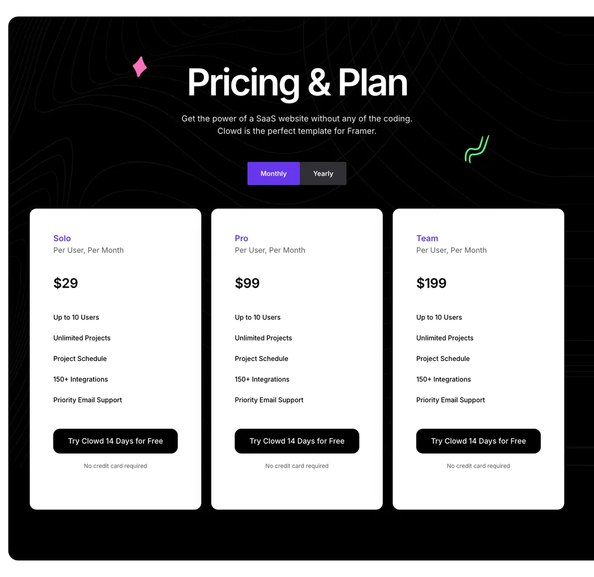
A dark section with light cards is the reverse of example 7, and it makes the cards the brightest thing on the page. The toggle sits between the heading and the cards, the per-user note under each plan name sets expectations, and “No credit card required” under each button removes the last objection. The decorative shapes in the corners are section background elements.
How to import a pricing section
- Open the page in Elementor and click the Master Addons template icon in the editor, or open Templates > Master Addons Templates.
- Search “pricing”, preview the section and click Import. Sections built with Pro widgets need Master Addons Pro active.
- The section lands where your cursor was. Edit each card’s text in the panel; the design stays.
- For sections with a toggle, edit the two pricing rows under Templates > Saved Templates.
The template import guide covers the editor button, the Import Pages screen and what happens to the imported copy.
Want all five layouts without importing anything? The Pricing Table widget has them in one dropdown, and the Template Library has the full sections shown above.
Frequently asked questions
Does Elementor have pricing table templates?
Elementor’s template library has pricing blocks for Pro users, and its Price Table widget is Pro too. On free Elementor, pricing templates come from an addon: the Master Addons Pricing Table widget has five layouts, and its Template Library has full pricing sections.
How many plans should a pricing table template have?
Three is the safest number, and four works when one plan is a custom or enterprise tier. The examples above show two, three and four plans; past four, side-by-side cards stop fitting on a laptop screen.
Can I change the layout after building the table?
Yes. The Layout dropdown in the Master Addons Pricing Table widget switches between the five designs and keeps the plan name, price, features and button in place. Only the style settings that belong to a layout, such as the circle or the skew, change.
How do I make a dark pricing table in Elementor?
Set the section background to black or dark navy, give each card a dark grey body with a one-pixel lighter border, and use one accent colour for the highlighted card’s border, tag and button. Examples 7, 8, 10 and 12 above show four versions of this.
Are the pricing table examples responsive?
Yes. The cards stack in one column on phones. Put the highlighted plan first or second in the container order for mobile, keep feature lists to about five rows, and check the table at the mobile breakpoint in Elementor’s responsive mode before publishing.
Final thoughts
The twelve templates come by two routes. The five widget layouts cover the card shape and take one dropdown change each. The seven library sections cover the page shapes: three plans with a highlighted middle, dark four-plan, SaaS with a custom tier, two-plan light, a billing switch, four-plan ticks and crosses, and dark with light cards. Each one keeps the order that works: name, who it is for, price, a short feature list, one button.
Start with the layout or section closest to your plans on the Pricing Table widget page, change the text, and check it on a phone before it goes live.
Related reading
- Pricing Table Design: 10 Tips With Examples
- Master Addons Template Library
- Elementor Template Kits
- Elementor Section Templates
- Pricing Table widget documentation
- How to Add a Monthly and Yearly Toggle to an Elementor Pricing Table
- Elementor Pricing Table vs Comparison Table: Which to Use
- How to Build a Price List or Menu in Elementor
