Glassmorphism
Home Glassmorphism is the design trend that gives your website a soft, translucent, modern look...
View Details 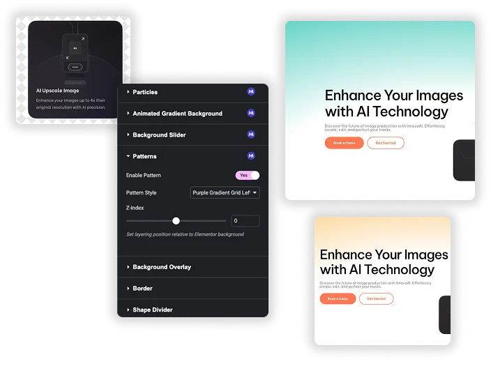
Patterns
Home Transform flat, static containers into visually engaging design elements with the Master Addons Patterns...
View Details 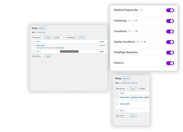
Post/Page Duplicator
Home Streamline your workflow and eliminate repetitive setup with the Master Addons Post/Page Duplicator. This...
View Details 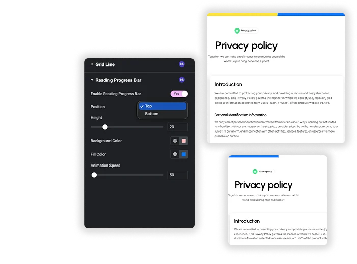
Reading Progress Bar
Home Ever start reading a long article and wonder how much is left? So do...
View Details 
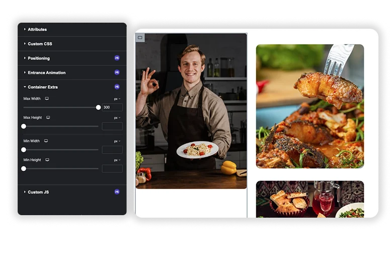
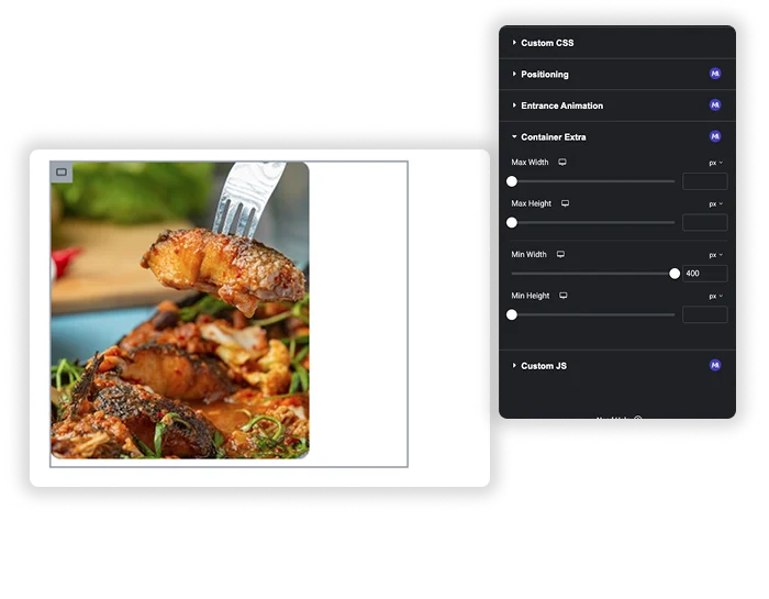
Which Element
Home Ever hover over a container in Elementor and forget exactly which elements or addon...
View Details 
