

Key Takeaways
- An Elementor toggle button can mean three things: a title that opens and closes text, a Read More link that expands a paragraph, or a switch that swaps one section for another.
- Elementor 4.3 hides the old Toggle widget from the widget panel, and the Accordion widget now covers it through the Max Items Expanded setting, which has two options: One and Multiple.
- A Read More toggle in Elementor is an Accordion widget with a single item, with Default State set to All collapsed so the extra text stays closed until a visitor clicks.
- Elementor and Elementor Pro have no widget that switches between two content blocks, so a monthly and yearly style toggle button needs an addon widget or nested Tabs.
- The Master Addons Toggle Content widget is a Pro widget that puts a toggle button above two or more options, and each option holds text or a saved Elementor template.
You can create an Elementor toggle button in three ways, and the right one depends on what the button should do. To open and close text, use the Accordion widget. To expand a long paragraph, use a one-item accordion as a Read More toggle. To swap one block of content for another, such as monthly prices for yearly ones, use a content toggle widget.
This guide walks through all three with the exact settings. Every screenshot comes from Elementor 4.3 on a test site, so the panels match what you will see today.
Table of Contents
What a toggle button means in Elementor
A toggle button is any control that flips between two states when you click it. In Elementor, people use the phrase for three different jobs, and each job has its own widget.
| What you want | What it is called | Widget to use |
|---|---|---|
| Click a title, the text under it opens. Click again, it closes. | Toggle or accordion | Elementor Accordion |
| Show a short intro and hide the rest behind a Read More link | Read More toggle | Elementor Accordion with one item |
| Flip a switch and one section is replaced by another | Content toggle or content switcher | Master Addons Toggle Content, or nested Tabs |
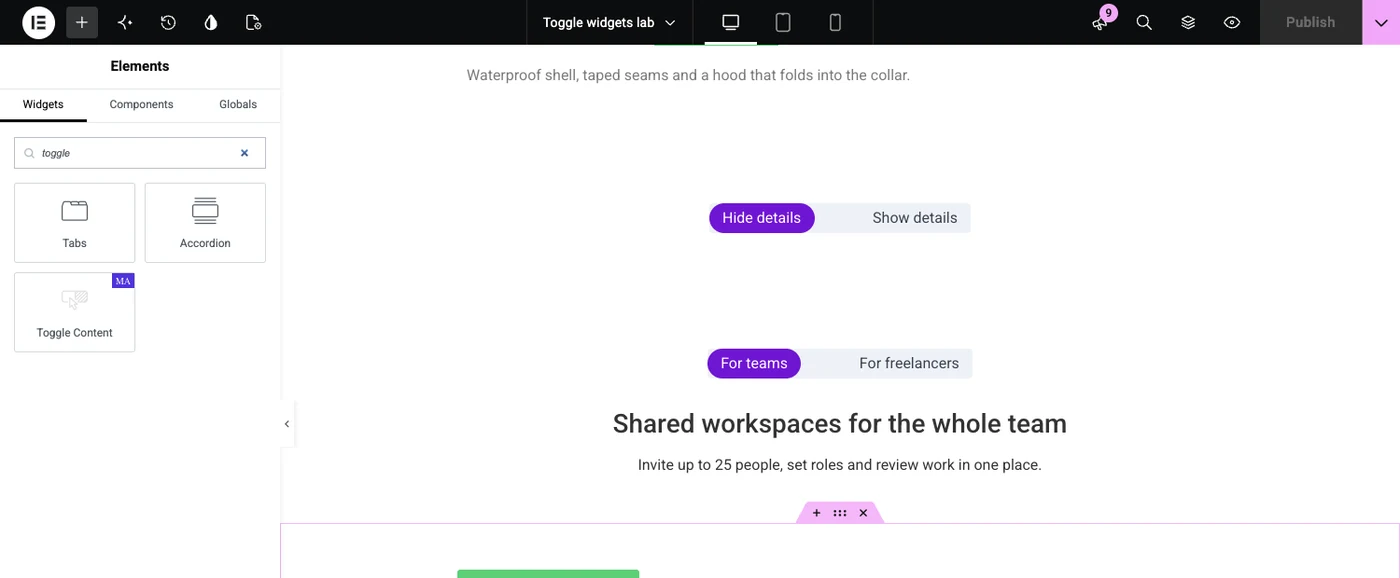
If you search the widget panel for “toggle” in Elementor 4.3, you will not find a widget named Toggle. Elementor shows Tabs and Accordion for that search, plus Toggle Content if you have Master Addons Pro.
Way 1: A toggle that opens and closes text
Use the Accordion widget when the toggle should open and close a block of text, as in an FAQ. The old Toggle widget let several items stay open at once, and the Accordion widget now does the same thing through one setting.
- Edit your page with Elementor, search the widget panel for Accordion and drag it onto the page.
- Click each item and type its title. Then click inside the item and add a Text Editor widget, or any other widget, for the content.
- Open the Interactions section in the Content tab.
- Set Max Items Expanded to Multiple. Each item now opens and closes on its own, which is the classic toggle behaviour.
- Set Default State to All collapsed if every item should start closed, or leave it on First expanded.
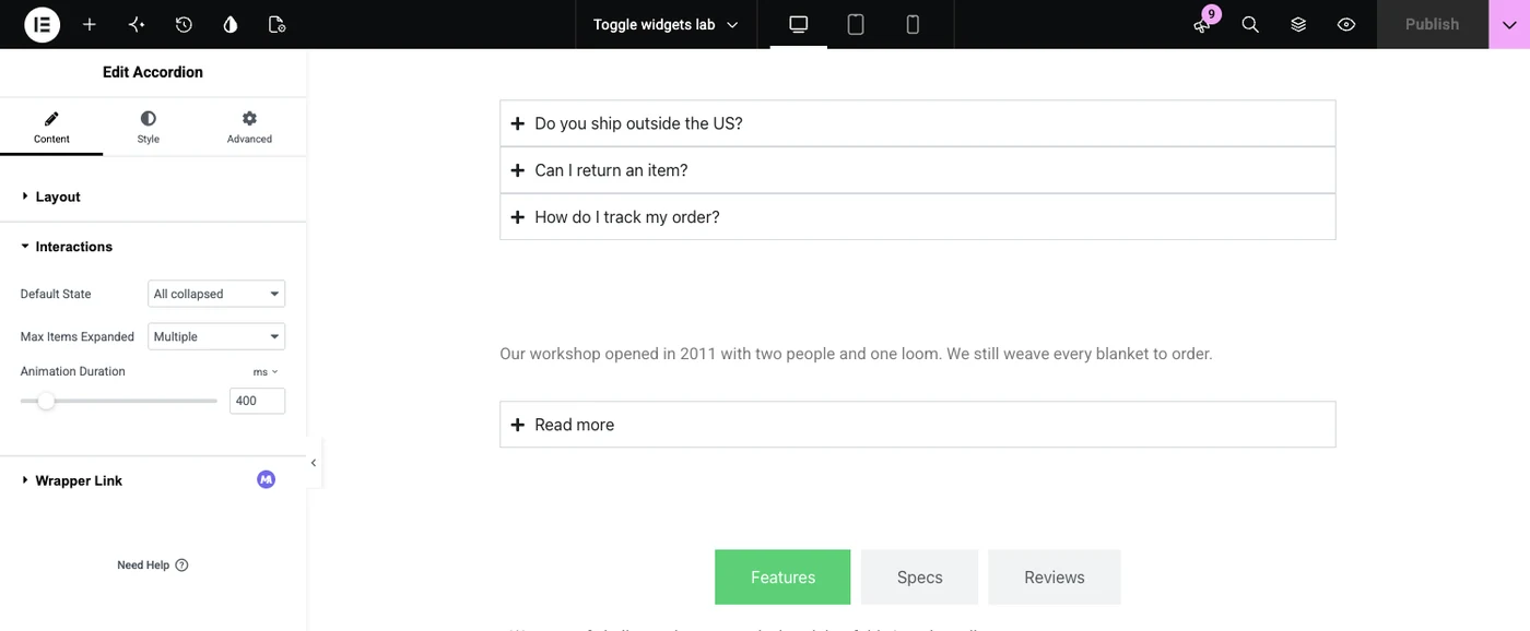
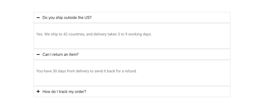
With Max Items Expanded on One, opening an item closes the one before it. With Multiple, visitors can keep two or three answers open and compare them.
The Layout section of the widget has a FAQ Schema switch. Turn it on when the items are real questions and answers. For more title styles and icons, the Advanced Accordion widget from Master Addons is an alternative.
Way 2: A Read More toggle
A Read More toggle is an accordion with one item. The visitor sees the opening lines, clicks Read more, and the rest of the text appears below.
- Add a Text Editor widget with the part of the text that should always show.
- Drag an Accordion widget right under it.
- Delete the extra items so only one is left, and rename it Read more.
- Put the remaining text inside that item.
- In Interactions, set Default State to All collapsed.
- In the Style tab, remove the border and padding if you want the link to sit flush with the paragraph above.
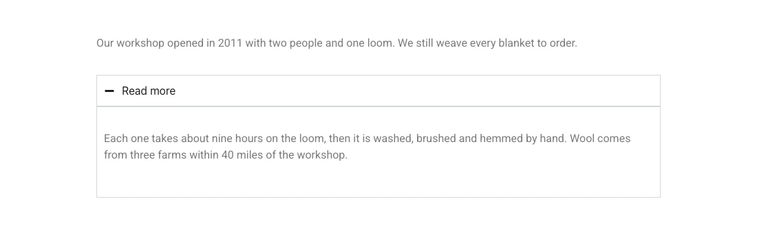
Elementor also has a widget called Read More, and it does a different job. It marks where the excerpt of a post ends on archive pages, the same as the WordPress More tag. It does not expand or collapse anything, as Elementor’s documentation explains.
Way 3: A toggle switch that swaps content
Use a content toggle when clicking the button should replace one block with another. Neither Elementor nor Elementor Pro has a widget for this, so you need an addon or a workaround with Tabs.
The steps below use Toggle Content from Master Addons Pro.
- Edit your page with Elementor, search for Toggle Content and drag it into place. It starts with two items, Label One and Label Two.
- In the Elements list, click the first item and type its Label, for example For teams.
- Leave Type on Content and write the text for that option in the editor. To show a full layout, set Type to Template and pick a saved template.
- Do the same for the second item. Click Add Item if you need a third option.
- Open Toggle Settings. Active Index decides which option shows first, and Position puts the switch before or after the content.
- In the Style tab, pick Round or Square for the switch and set the indicator and label colours.

The most common use is a billing switch. Each option holds a set of pricing cards, and the toggle button moves between them.
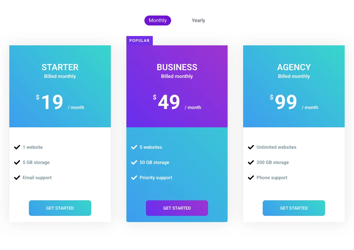
Want to see it working? The Toggle Content widget page has ten live demos you can click, from billing switches to spec tables.
If you do not want an addon, drop a Tabs widget on the page and name the two tabs Monthly and Yearly. Tabs in Elementor 4.3 accept any widget inside each tab. You get tab titles in place of a sliding switch, and the content swaps the same way.
Which toggle button should you use?
Pick the widget by what happens after the click.
| Situation | Use | Why |
|---|---|---|
| FAQ with many questions | Accordion, Max Items Expanded on One | The page stays short because only one answer is open |
| Product details visitors compare | Accordion, Max Items Expanded on Multiple | Several panels can stay open together |
| Long About text | One-item Accordion as Read More | The intro shows and the rest waits for a click |
| Monthly and yearly prices | Toggle Content | One set replaces the other in the same space |
| Two audiences, one section | Toggle Content | Each visitor picks the version written for them |
| Four or more sections of equal weight | Tabs | Tab titles are easier to scan than a long switch |
Common toggle button problems
Three problems come up most often with toggles in Elementor.
- The Toggle widget is missing. Elementor hides it from the panel in current versions. Use Accordion with Max Items Expanded set to Multiple.
- The toggle opens on page load. In the Accordion widget, set Default State to All collapsed. In Toggle Content, one option always shows, and Active Index decides which.
- Clicking the switch does nothing. Check that each option has content. An option set to Template with no template chosen shows an empty area.
If you need content to appear only for some visitors, such as logged-in users, a toggle is the wrong tool. That is a job for display conditions in Elementor, which decide what loads before the visitor clicks anything.
Frequently asked questions
How do I add a toggle button in Elementor?
Drag the Accordion widget onto the page for a toggle that opens and closes text, and set Max Items Expanded to Multiple in the Interactions section. For a toggle button that switches between two sections, add a content toggle widget such as Master Addons Toggle Content and give each option its own content.
Where is the Toggle widget in Elementor?
Elementor 4.3 no longer shows the Toggle widget in the widget panel. Searching for “toggle” returns Accordion and Tabs. The Accordion widget covers the same job: set Max Items Expanded to Multiple and several items can stay open, which is how the Toggle widget behaved.
What is the difference between a toggle and an accordion in Elementor?
In an accordion, opening one item closes the others. In a toggle, each item opens and closes on its own, so several can be open together. In current Elementor versions both are the same Accordion widget, and the Max Items Expanded setting switches between the two behaviours.
Can I make an Elementor toggle open by default?
Yes. In the Accordion widget, set Default State to First expanded and the first item opens when the page loads. In the Toggle Content widget, set Active Index to the number of the option that should show first, with 1 for the first item.
Does Elementor Pro have a toggle switch for pricing?
No. Elementor Pro has a Price Table widget but no switch that swaps monthly and yearly tables. You can place the tables inside Tabs, or use a content toggle widget from an addon and load each set of prices as one option.
Final thoughts
An Elementor toggle button is one of three things, and each has a clear home. Open and close text with the Accordion widget and its Max Items Expanded setting. Build a Read More toggle from a one-item accordion. Switch between two sections with a content toggle.
For the third kind, the Toggle Content widget handles text and saved templates in each option, and the Master Addons Pro plans list what else comes with it.
Related reading
