

Key Takeaways
- Elementor without Pro cannot place a WordPress menu on a page or in a header, because the Elementor Menu widget (formerly Nav Menu) ships only with Elementor Pro.
- An Elementor nav menu without Pro can be built with the Master Addons Nav Menu widget, which displays any WordPress menu and sets its layout separately for desktop, tablet and mobile.
- Submenus in an Elementor nav menu come from WordPress: drag an item slightly right under its parent in Appearance > Menus until it reads “sub item”, then save.
- The Master Addons Nav Menu widget has four vertical types: Normal opens submenus to the side on hover, Toggle and Accordion expand them on click, and Side pins the menu to the page edge.
- The Master Addons Nav Menu widget gives phones a hamburger toggle by default, while Hamburger on desktop or tablet and the Popup and Offcanvas types need Master Addons Pro.
You can build a styled Elementor nav menu without buying Elementor Pro. Elementor’s own menu widget is Pro only, but the Master Addons Nav Menu widget pulls any WordPress menu into the editor, styles every level from the panel and collapses to a hamburger on phones.
This guide covers why core Elementor leaves the gap, the ways to fill it and the header build in six steps. Then come submenus, the four vertical menu types, mobile behavior, the usual reasons a menu does not show up, and the parts that need Master Addons Pro.
Table of Contents
Why Elementor free has no menu widget
Elementor’s free plugin ships dozens of layout and content widgets and no way to place a WordPress navigation menu in a page or template. The widget that does it, originally called Nav Menu and now the Menu widget, is Pro only. Elementor’s own documentation confirms it.
You can still build the menu under Appearance > Menus. The gap is on the design side: core Elementor has nothing to drop that menu into, so it appears wherever your theme prints it.
On a simple site with a menu-ready theme, that may be enough. Once you want a custom header, a hamburger toggle you control or a mega menu, free Elementor alone cannot get there. Old tutorials call the Pro widget Nav Menu and newer ones call it Menu, but it has always needed Pro.
Three ways to add a nav menu without Pro
There are three real options without an Elementor Pro license. The fourth row is Elementor Pro, for comparison.
| Method | Needs Elementor Pro | Editor styling | Mobile | Best for |
|---|---|---|---|---|
| Theme menu location | No | None, the theme controls it | Depends on the theme | Simple sites on a menu-ready theme |
| Master Addons Nav Menu widget | No | Full, from the panel | Hamburger toggle on phones | A custom header without Elementor Pro |
| Master Addons Mega Menu | No | Full | Collapses to a toggle | Multi-column panels, large navigation |
| Elementor Pro Menu widget | Yes, paid license | Full | Includes off-canvas | Sites already on Elementor Pro |
Theme menu location. Every theme registers at least one menu area. Assign your menu and it works with zero plugins, but you get no control over its look from Elementor, and mobile behavior is whatever the theme author built. If that menu already looks right on a phone, skip the widget.
Master Addons Nav Menu widget. This is the Elementor-native option that runs without Elementor Pro. Drop the Nav Menu widget into any template, point it at a menu from Appearance > Menus, and style colors, spacing, submenus and the mobile toggle from the panel.
Master Addons Mega Menu. For sites with a lot of categories, the Mega Menu extension builds multi-column panels on top of the same widget and runs without Elementor Pro. Walkthrough: how to build a mega menu in Elementor without Pro.
Elementor Pro. If you already own it, use its Menu widget and Theme Builder. Two plugins for one job only add weight.
Want to see every layout before you build? The Nav Menu widget page has live demos of horizontal headers, vertical sidebars and the phone hamburger.
Build the menu, start to finish
The build happens in wp-admin and the Elementor editor, with no code. First check that your theme is not printing its own header, because two stacked headers is the most common mess here.
Step 1: Register the menu
Go to Appearance > Menus, create a menu, add your pages and links, and give it a name you will recognize in six months. This is plain WordPress, nothing plugin-specific, and WordPress has a guide to the Menus screen if you have not built one before. Set up any dropdowns here too (see the submenu section).
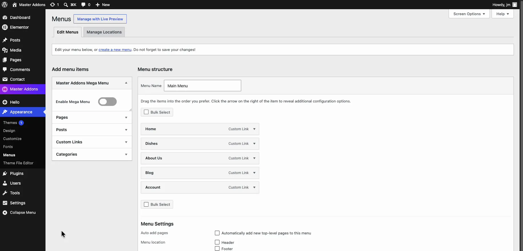
Step 2: Create a Header template
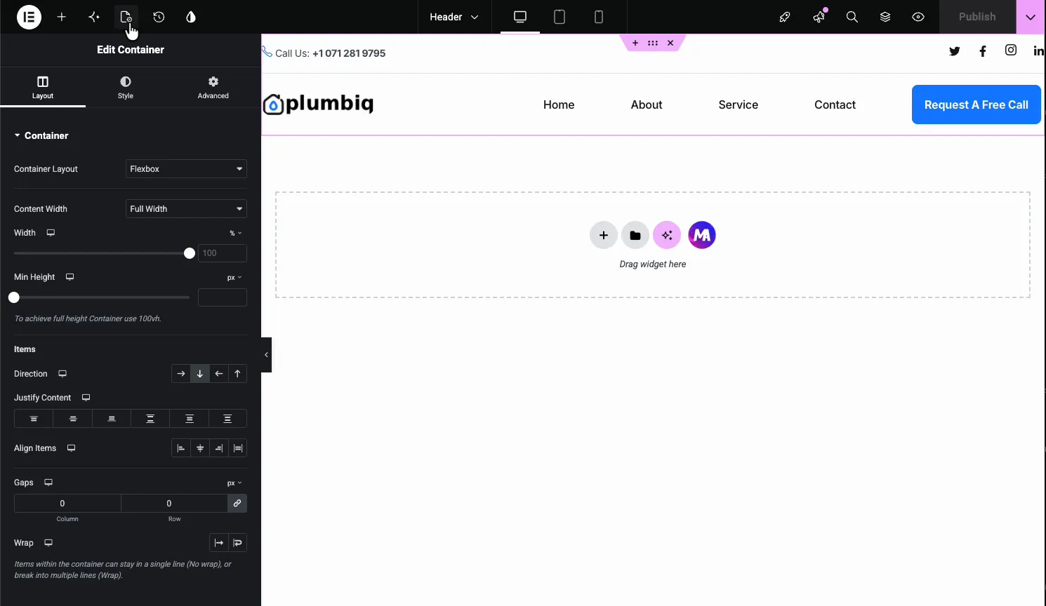
Open the Master Addons Theme Builder and add a new template with the type set to Header. This lets you replace the theme’s header instead of fighting it. To start from a finished design, import one of these Elementor header templates and point its menu widget at your menu.
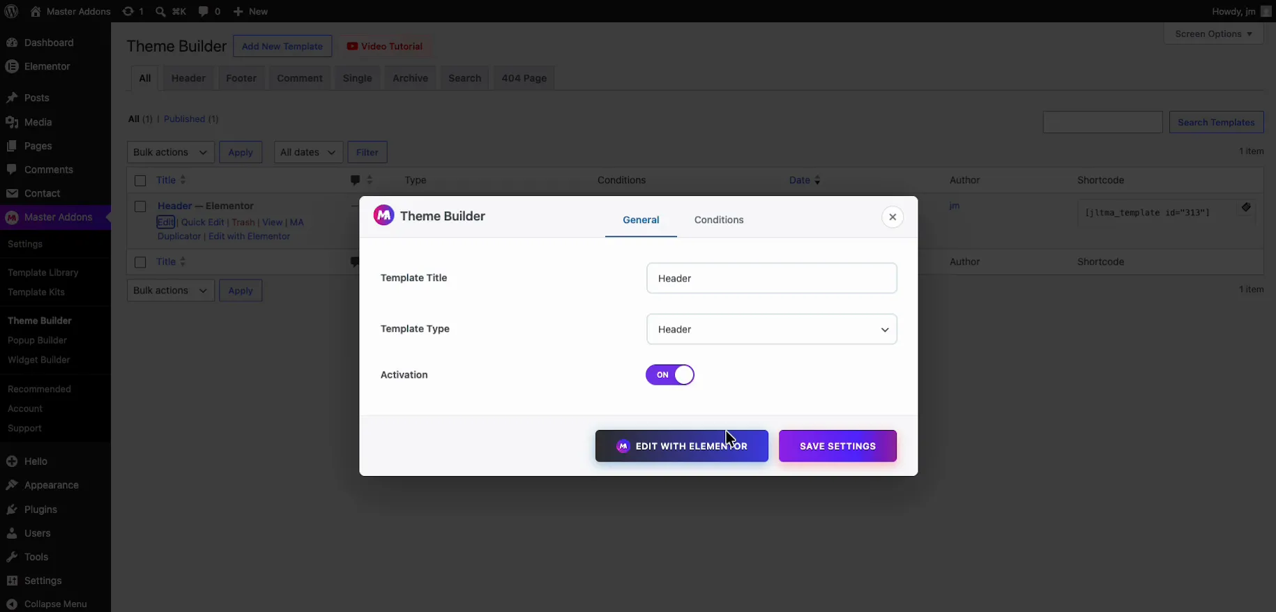
Step 3: Add the Nav Menu widget and pick your menu
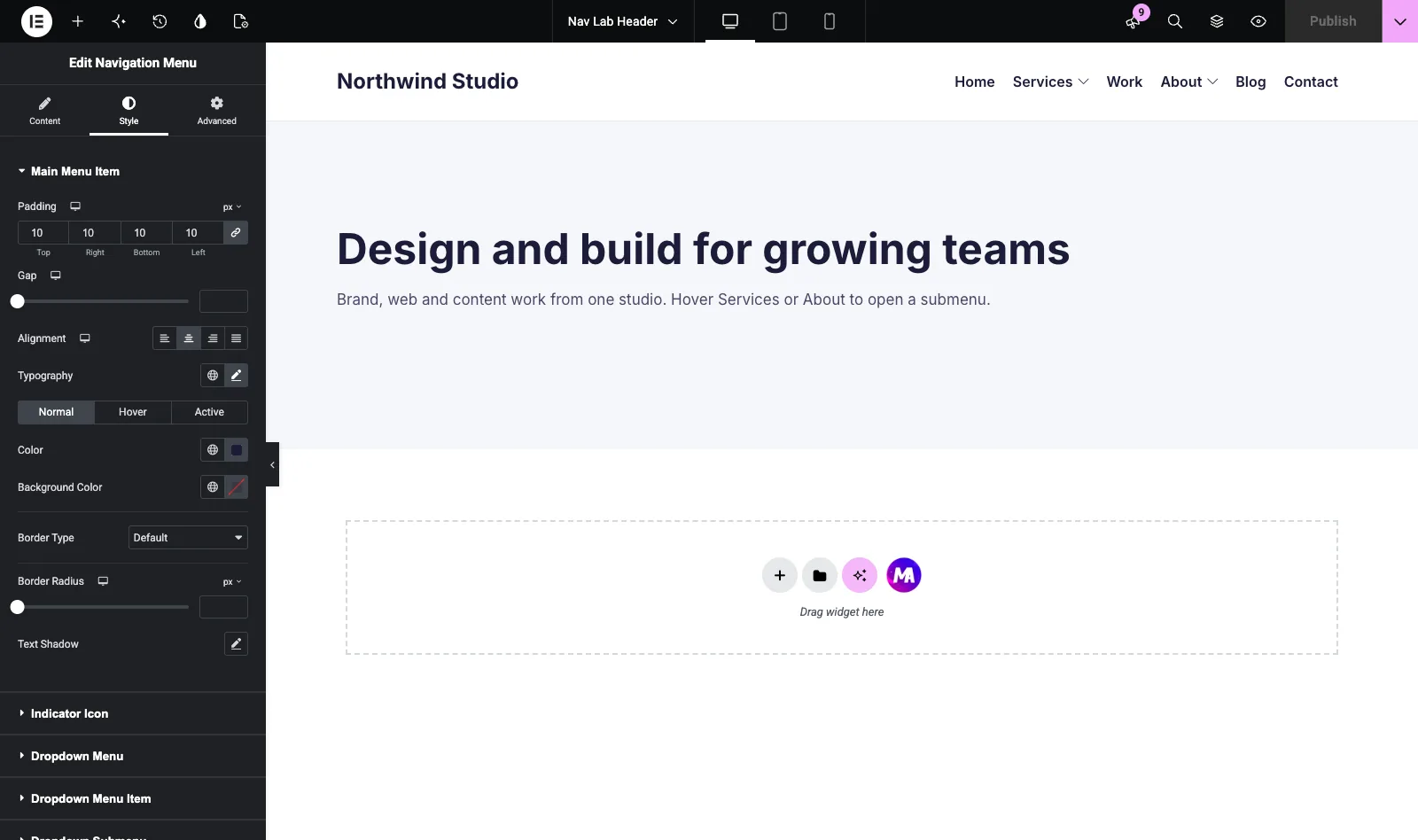
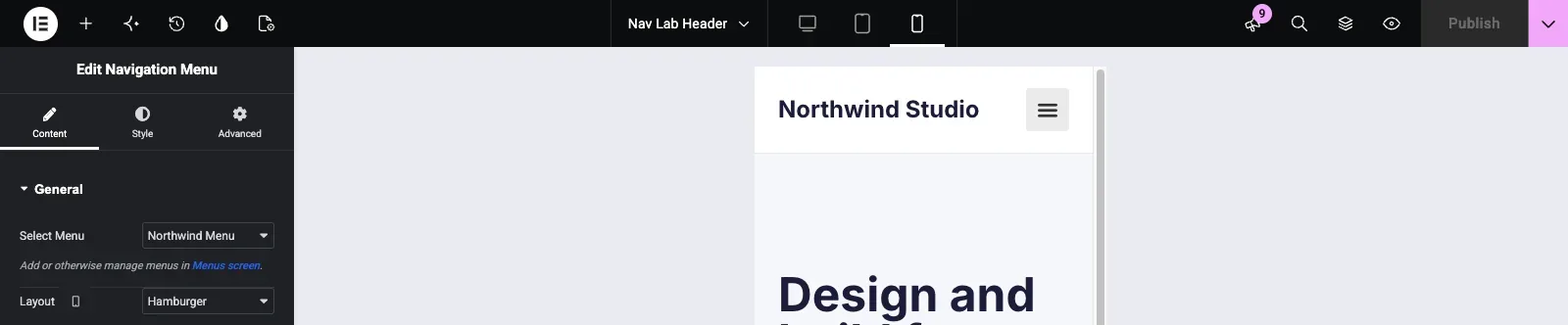
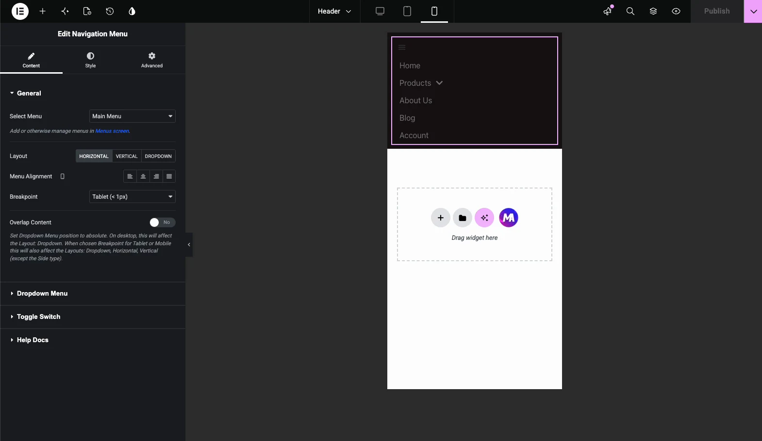
Search the Elementor panel for “Nav Menu” and drag it into the header (its panel reads Navigation Menu). In Content > General, choose the menu you built in step 1 from the Select Menu dropdown, then set the Layout. Horizontal suits a standard header, with an Alignment control beside it. Vertical suits a sidebar and adds a Type control with Normal, Toggle, Accordion and Side.
Layout is set per device. Desktop starts on Horizontal and phones start on Hamburger, so the menu collapses on a phone without extra setup.
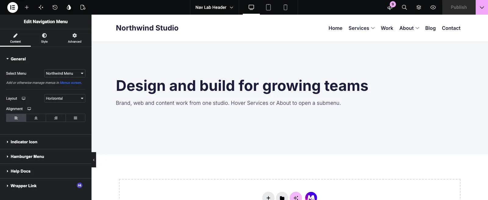
Step 4: Style it
Font, color, spacing and hover states are all in the Style tab, with no custom CSS. Main Menu Item holds padding, item gap, alignment, typography, Normal, Hover and Active colors, background, border, radius and text shadow. Core Elementor cannot do any of this for a menu.
Step 5: Publish and assign it
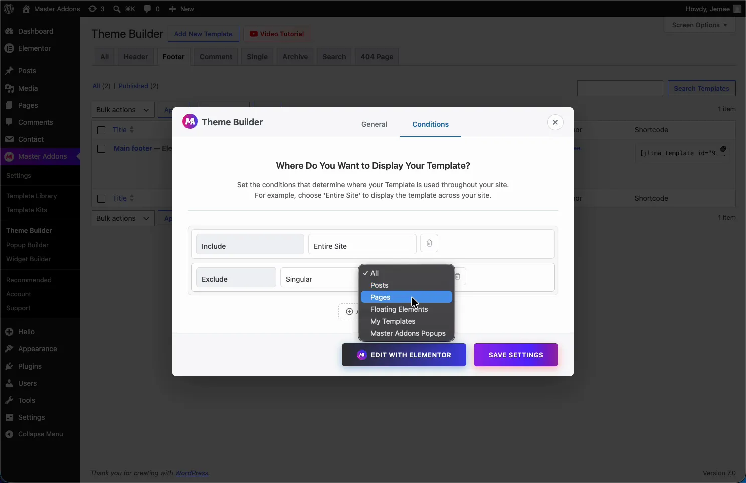
Save the template and assign it to Entire Site. Without Master Addons Pro that is the only display condition available, which works when you want one header everywhere.
Step 6: Check it on the front end
Load the site and confirm only one header renders. If the theme’s menu shows too, switch it off in the theme’s Customizer settings, since hiding it with CSS leaves the markup in the page.

How to add a submenu and style the dropdown
To add a submenu to an Elementor nav menu, nest the item under its parent in Appearance > Menus, and the widget turns it into a dropdown. There is no submenu setting inside Elementor.
- Open Appearance > Menus and select the menu the widget uses.
- Add the child page or link if it is not in the menu yet.
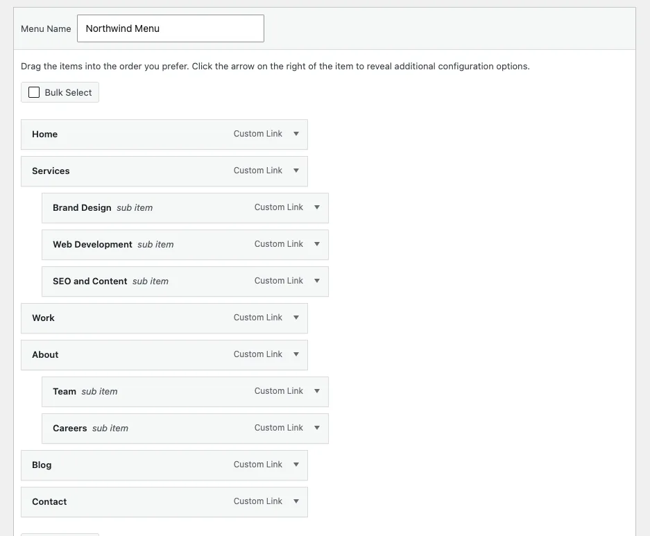
- Drag it under its parent and slightly to the right until the label “sub item” appears next to its name.
- Click Save Menu, then reload the Elementor editor or the front end.
On a horizontal header, the parent gets an indicator arrow (set in Content > Indicator Icon) and the submenu opens on hover.
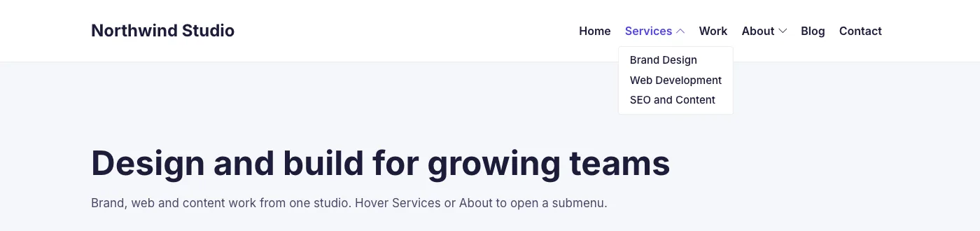
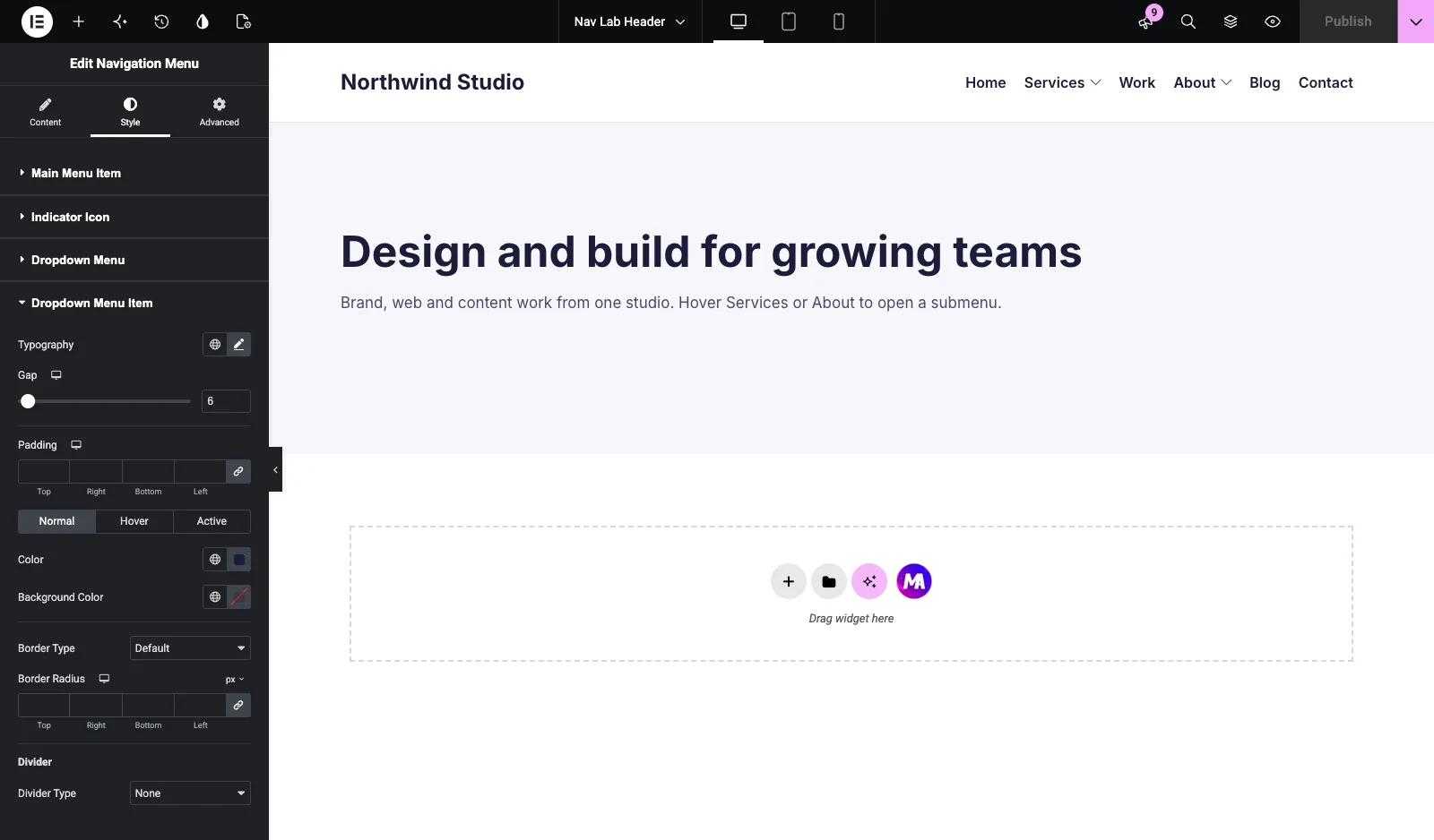
Dropdown Menu styles the panel (width, background, border, radius, shadow, distance from the top bar). Dropdown Menu Item styles the links inside it: typography, gap, padding, Normal, Hover and Active colors, and an optional divider. Third-level menus get matching Dropdown Submenu sections. The dropdown menu variations demo shows several panel styles built this way.
The four vertical menu types
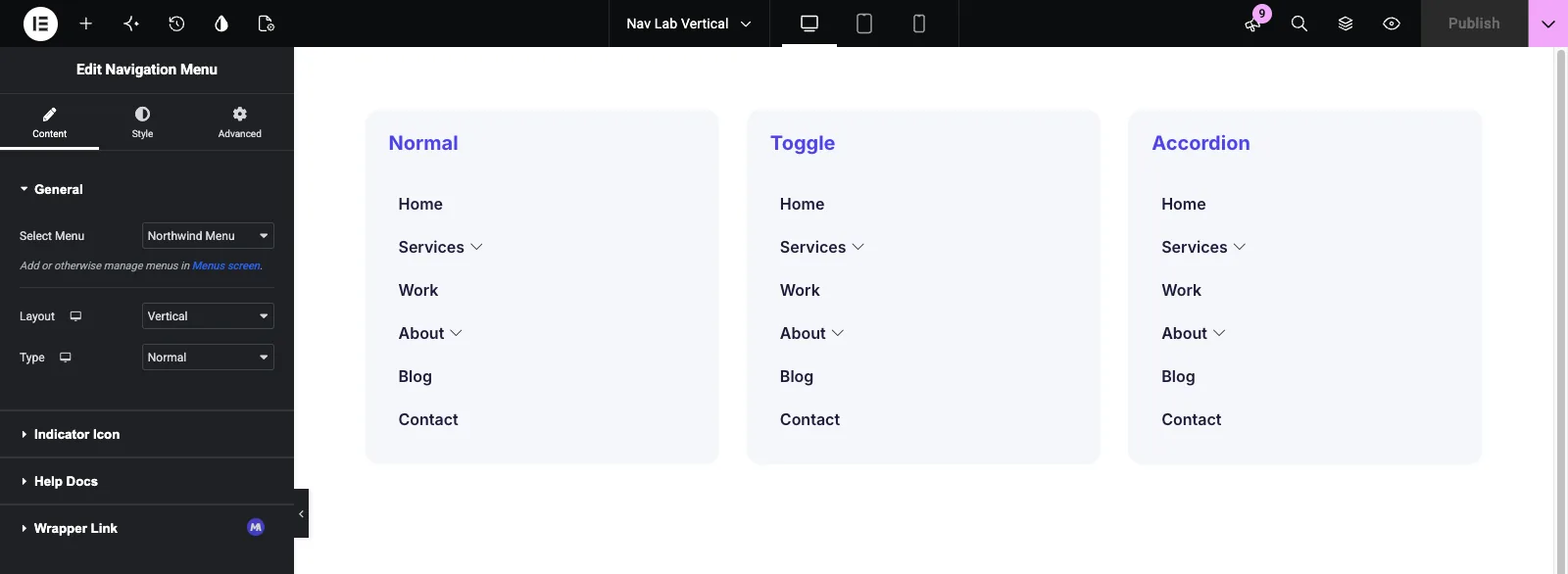
The Elementor vertical menu in Master Addons comes in four types: Normal, Toggle, Accordion and Side. Set Layout to Vertical and a Type control appears under it. Type is set per device too, so a sidebar can use Accordion on a tablet and Normal on desktop.
Normal
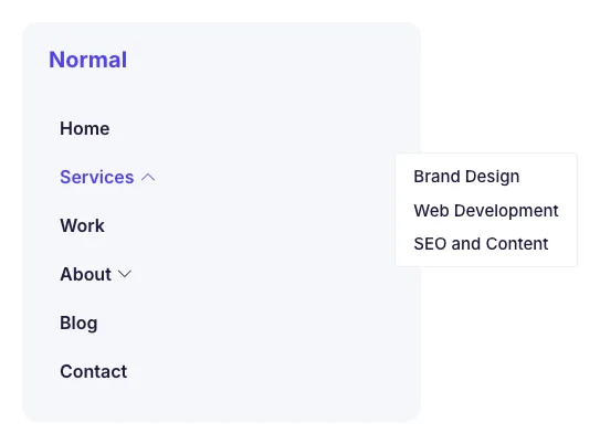
Normal opens each submenu to the side of its parent on hover, like a flyout. It suits a desktop sidebar with room to the right.
Toggle
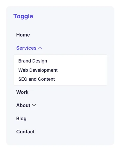
Toggle expands the submenu under its item on click and pushes the items below down. Several submenus can stay open at once, which helps when the sidebar doubles as an index.
Accordion
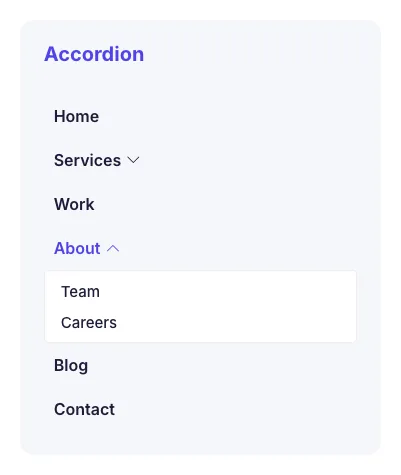
Accordion also expands on click, but opening one submenu closes the open one. That keeps long menus short in a narrow column.
Side
Side pins the menu to the page edge, with the main items in a vertical bar and each submenu in a panel beside it. The vertical side menu demo shows it on a full page.
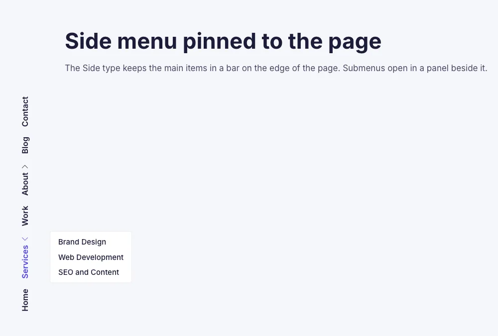
The vertical navigation menu demo shows a styled sidebar version.
Making it work on mobile
On phones the Nav Menu widget collapses into a hamburger toggle by default. The Hamburger Menu section of the Content tab sets its alignment, icon, text or both, a default, stacked or framed view, shape, and separate normal and active icons.
The toggle works from the keyboard as well as by touch. Enter and Space open it, Esc closes it, and a tap outside the menu closes it too.
On phones the menu opens in place under the toggle, and submenus expand inside it. That suits short and medium menus. An off-canvas panel that slides in from the side is a Pro feature, covered below.
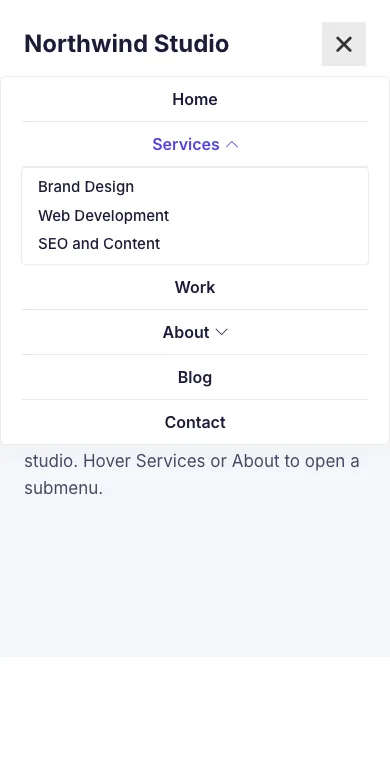
Test on a real phone as well as the browser’s device toolbar, because tap targets and outside taps behave differently on a touchscreen. Check that the icon changes state when the menu is open and that a submenu item is reachable with one thumb.
Why your Elementor nav menu is not showing
When an Elementor nav menu does not show, the cause is almost always one of these four. Check them in order.
- No menu is selected, or no menu exists. Creating a menu does not connect it to the widget, so pick it in Select Menu. If the field says “There are no menus in your site”, create one first.
- The header template is not applied. A Header template does nothing until it has a display condition. Set Entire Site in the Theme Builder and check that no theme header covers it.
- On a phone, the menu is behind the hamburger. Phones show the toggle instead of the links. If the toggle color matches the header background, the icon is invisible and the menu looks missing. Give the toggle a contrasting color in Style > Hamburger.
- Caching or delayed JavaScript. A page cache can serve the old header, and JavaScript delay can stop dropdowns and the toggle from working until the visitor moves the mouse. Clear the cache and exclude the menu scripts from JS delay.
What needs Master Addons Pro
Two parts of this setup need Master Addons Pro.
Hamburger on desktop or tablet, plus the Popup and Offcanvas types. Layout offers Horizontal and Vertical on every device, with Hamburger marked Pro. Phones get the Default hamburger out of the box, but Hamburger on wider screens and the Popup or Offcanvas types need Pro. So a sliding off-canvas menu is a paid feature here, through the Hamburger layout or the separate Off-Canvas Content widget, which opens any saved template in a panel. Without Pro, the closest option is the Vertical layout’s Side type.
Theme Builder targeting is one rule. The free Theme Builder saves exactly one display condition: Entire Site. A different header on a landing page or for logged-in members needs Pro. Our display conditions breakdown explains how condition rules work, and the free Theme Builder guide covers the rest of that tier.
The widget has no hover pointer animations (Elementor Pro’s menu has them) and no sticky setting on any plan. To keep the header in view, use Elementor Pro’s Motion Effects on the header container, or add selector { position: sticky; top: 0; z-index: 99; } to the container through the Master Addons Custom CSS extension. The sticky header guide walks through both.
If you already own Elementor Pro, none of this applies. The widgets and extensions directory lists the rest of the plugin, and if the header needs a section you keep rebuilding by hand, the Widget Builder (Pro) turns it into a real widget. The pricing page lists the tiers.
Frequently asked questions
Does free Elementor have a menu widget?
No. Elementor’s Menu widget ships only with Elementor Pro. Master Addons adds its own Nav Menu widget that runs without Elementor Pro, so you can place and style a real navigation menu without that license.
Can you create a nav menu in Elementor without Pro?
Yes. Register the menu under Appearance > Menus, then use an addon such as Master Addons to drop a Nav Menu widget into a header template and style it from the panel. Free Elementor alone cannot place or style a menu.
How do I add a mobile hamburger menu in Elementor without Pro?
Add the Master Addons Nav Menu widget to your header template and select your menu. It collapses to a hamburger toggle on phones by default, with icon, text, view and shape settings in the Hamburger Menu section.
Does the off-canvas menu need Master Addons Pro?
Yes. Off-canvas is a type inside the Hamburger layout, and the Popup and Offcanvas types, or Hamburger on desktop and tablet, require Master Addons Pro. Without Pro you get Horizontal and Vertical layouts plus the default hamburger on phones, and the Vertical Side type is the closest side-anchored option.
How do I create a mega menu in Elementor without Pro?
Master Addons includes a Mega Menu extension that builds multi-column panels, collapses on mobile and runs without Elementor Pro. It works with the Nav Menu widget for larger navigation with categories or promotional content.
Why is my Elementor nav menu not showing?
Usually no menu is picked in the widget’s Select Menu field. Then check that the header template is assigned to Entire Site, that the hamburger icon is not the same color as the header on phones, and that caching or JavaScript delay is not serving an old version.
Do I need Master Addons Pro for the Nav Menu widget?
No. The widget is included without Pro, with styling, submenus, per-device Horizontal and Vertical layouts, four vertical types and the phone hamburger. Pro adds Hamburger on desktop and tablet, the Popup and Offcanvas types, and Theme Builder conditions beyond Entire Site.
How do I add a submenu to an Elementor nav menu?
Go to Appearance > Menus, drag the child item under its parent and slightly to the right until it is labeled “sub item”, then click Save Menu. The Nav Menu widget shows it as a dropdown, styled in Style > Dropdown Menu and Dropdown Menu Item.
What to do next
Build the header with a Horizontal layout and one or two submenus, then load it on your own phone before styling anything else. Most menu problems are mobile problems, and they show up in ten seconds on a real device. If the menu needs multi-column panels, the mega menu guide picks up from there, and the Nav Menu documentation lists every control.
- Nav Menu widget page: layouts, live demos and a comparison with Elementor Pro’s menu widgets.
- Mega Menu extension: multi-column panels with any Elementor widget inside.
- Charcoal navbar with mega menu demo: a full header built with both.
Related reading
