

Table of Contents
A mega menu is a large, panel-style dropdown that opens beneath a navigation item and lays out many links at once in columns, instead of stacking them one under another. It replaces a narrow, scrollable submenu with a wide preview of an entire site section, so visitors see their options instead of hunting through nested menus.
You have used one on nearly every large retail or SaaS site you have visited. Amazon’s category menu, a university’s academics dropdown, a software company’s product-and-solutions panel: all mega menus. This guide covers what makes a mega menu different from a regular dropdown, when the extra complexity pays off, when it does not, and how to build one in Elementor without paying for a page builder license.
What Is a Mega Menu?
A mega menu is a two-dimensional dropdown panel, meaning it uses both width and height instead of a single vertical stack. Rather than one column of six or seven links, a mega menu might show four or five columns, each with its own heading, sub-links, and sometimes an icon, thumbnail image, or short promo block.
The trigger works the same as any dropdown: hover or click a top-level item like Products, Services, or Shop. What appears is different. A standard dropdown shows a narrow list. A mega menu opens a full-width or near-full-width panel that can hold dozens of links organized by category, according to research from Nielsen Norman Group on how visitors scan large navigation panels.
How a Mega Menu Differs From a Standard Dropdown
The practical difference comes down to three things: width, structure, and content type.
- Width: a standard dropdown runs 200 to 300 pixels wide; a mega menu can span most of the viewport.
- Structure: a dropdown is one column; a mega menu uses multiple columns, often grouped under sub-headings.
- Content: a dropdown is plain text links; a mega menu often mixes links with icons, thumbnail images, or short descriptions.
That structural difference is also why mega menus take more planning. A standard dropdown is easy to throw together: list six links and you are done. A mega menu needs an actual information architecture: which categories get top billing, what goes in each column, and how the whole thing collapses on a phone screen with no room for four columns side by side.
Mega Menu vs Dropdown vs Off-Canvas Menu
Mega menus are not the only way to organize a lot of navigation. Here is how the three most common patterns compare.
| Navigation Type | Best For | Strength | Watch Out For |
|---|---|---|---|
| Standard Dropdown | Sites with a handful of pages per section | Fast to build, no learning curve for visitors | Runs out of room past 8 to 10 links |
| Mega Menu | Large catalogs, many categories or product lines | Shows the whole section at a glance, room for images and grouping | Needs real design and content planning; easy to overdo |
| Off-Canvas Menu | Mobile-first sites, minimal headers | Keeps the header clean, works well on small screens | Hides navigation behind a tap, adding one extra step |
When a Mega Menu Actually Helps
A mega menu earns its complexity when a site has genuinely deep navigation. E-commerce stores with dozens of product categories, universities with departments and programs, media sites with many sections, and SaaS companies with multiple products and use cases all tend to outgrow a standard dropdown fast.
The test is simple: if your current dropdown already needs a scrollbar, or visitors are landing on category pages through search because they could not find them in the header, a mega menu is solving a real problem instead of decorating one.
When a Mega Menu Hurts More Than It Helps
A small brochure site with five pages does not need a mega menu, and building one anyway usually makes the site feel more complicated than it is. If your entire navigation fits in six or seven links, a mega menu adds visual weight, extra markup, and one more thing that can break on a phone, for no real benefit.
A bad mega menu is worse than a simple menu. Cramming every page on the site into one panel because “more visible is better” buries the links visitors actually want under ones they do not. If every column looks equally important, none of them are. Trim the list to the sections people actually search for before you build the panel.
Common Mega Menu Design Patterns
- Column of links: plain categorized link lists, the most common pattern and the easiest to maintain.
- Featured or promo panel: link columns mixed with a promo image, banner, or call-to-action block.
- Icon-led menu: each link paired with a small icon, common on SaaS feature and solutions menus.
- Tabbed mega menu: top-level categories act as tabs inside the panel, switching which columns show.
Accessibility and Mobile Considerations
A mega menu is only as good as its keyboard support. Every trigger needs to open on both hover and focus, since a visitor tabbing through the header with a keyboard cannot hover anything. Add aria-expanded to the trigger and aria-haspopup so screen readers announce that a panel is available, and make sure Escape closes the panel and returns focus to the trigger.
On phones there is no room for four columns side by side, so most mega menus collapse into a stacked accordion under a hamburger icon. Test the collapsed version like a real visitor: tap targets should be large enough for a thumb, and the list should not take more scrolling to reach the bottom than the page it is protecting.
How to Build a Mega Menu Free in Elementor
Elementor’s own mega menu option lives behind Elementor Pro, inside the Nested Menu component covered in Elementor’s mega menu documentation. If you are on the free version of Elementor, that path is closed.
The Master Addons Mega Menu extension gets you the same result without Elementor Pro. It turns any item in your existing WordPress navigation menu into a trigger for a fully designed Elementor panel underneath it, and it is one of dozens of tools in the Master Addons widgets and extensions library.
- Install and activate Master Addons (free) alongside Elementor, then enable the Mega Menu extension from Master Addons → Extensions.
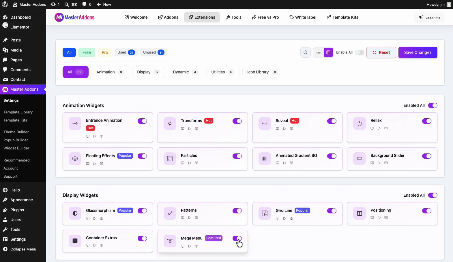
- Go to Appearance → Menus, or open your header in the Master Addons Theme Builder if that is where your header lives, and switch on Enable Mega Menu. A purple Master Mega badge appears beside every menu item; click the badge on the item you want to turn into a mega menu.
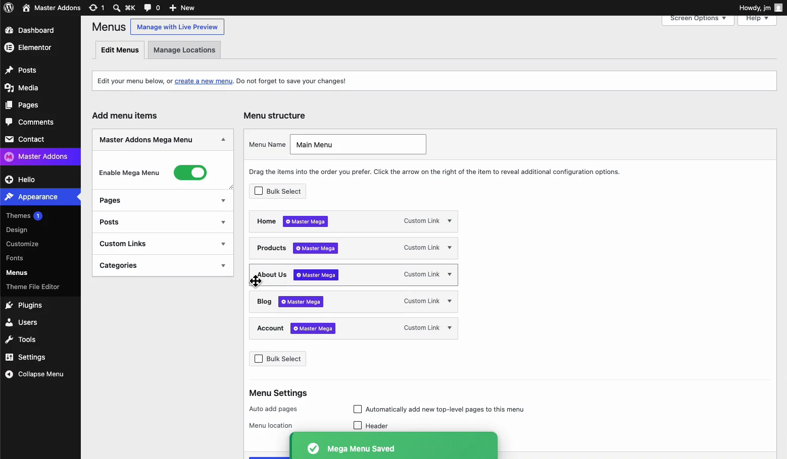
- Enable Mega Menu on that item, then click Edit with Elementor to design the panel: columns, images, icons, or promo blocks, whatever the section needs.
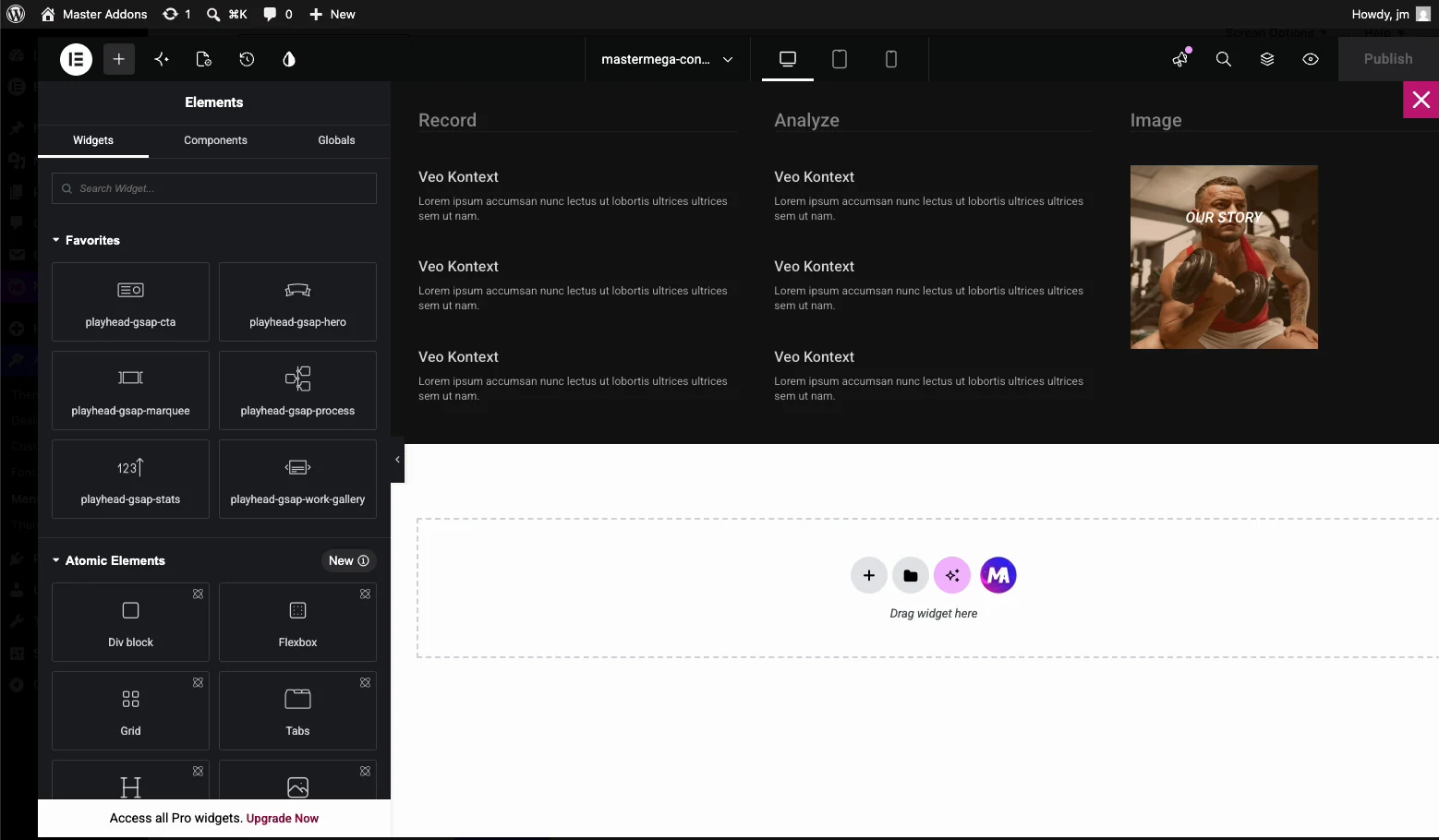
- Set the panel width, full width or contained, then publish and check it on both desktop and a real phone.
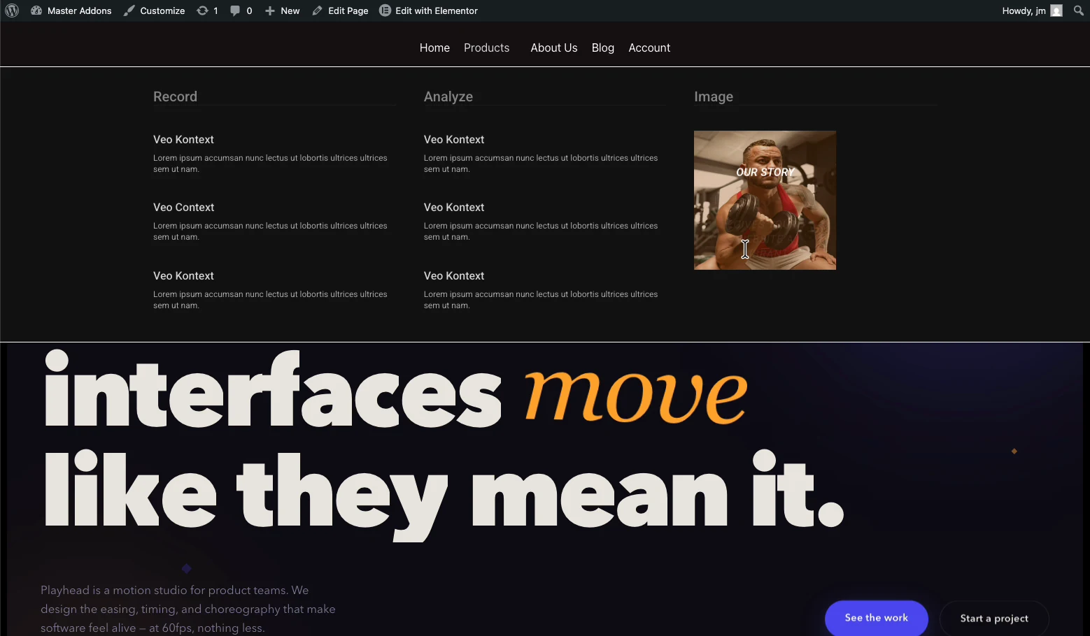
Want to see it in a finished layout first? The Mega Menu demo and the Charcoal Navbar & Mega Menu section both show the extension in a live header.
Frequently Asked Questions
What does mega menu mean?
A mega menu is a large, multi-column dropdown panel that opens beneath a navigation item and displays many links at once, often grouped by category and paired with icons or images. It replaces a single narrow list with a wider, organized preview of a site section.
How to create a mega menu?
Turn a regular navigation menu item into a mega menu trigger, then design the panel content: columns of links, headings, and optional images or icons. In WordPress and Elementor, a plugin like Master Addons Mega Menu handles the trigger and lets you build the panel visually, so you do not need to hand-code the dropdown markup.
What is the difference between a regular menu and a mega menu?
A regular dropdown menu shows a single narrow column of text links. A mega menu opens a wider panel with multiple columns, and often mixes in images, icons, or short descriptions alongside the links. Regular menus suit a handful of pages; mega menus suit sites with many categories or sections.
What are the advantages of using a mega menu?
A mega menu shows an entire site section at a glance instead of forcing visitors to open and re-open nested submenus. It reduces the number of clicks to reach a deep page, gives you room for visual cues like icons or thumbnails, and works well for stores, universities, and software sites with a lot of categories to organize.
Is the Max Mega menu free?
Max Mega Menu, a standalone WordPress plugin, has a free version on WordPress.org with paid add-ons for extra features. If you are already building in Elementor, the Master Addons Mega Menu extension is a free alternative that designs the panel with the Elementor editor instead of a separate menu-builder interface.
How do I create my own menu?
Build your navigation menu first under Appearance, then Menus in WordPress, adding the pages and links you want in the order visitors should see them. Once that menu exists, you can turn any of its items into a mega menu trigger and design the dropdown panel on top of it.
Related Reading
