


يمكنك إنشاء قائمة تنقل عملية ومصممة في Elementor دون شراء Pro. أداة القائمة الخاصة بـ Elementor هي Pro-only، لكن أداة القائمة Master Addons Nav المجانية تسحب أي قائمة WordPress إلى المحرر، وتصممها من اللوحة، وتنهار إلى مفتاح همبرغر على شاشات صغيرة.
أدناه: لماذا يترك العنصر الأساسي الفجوة، والطرق الثلاث لملءها، والبناء نفسه، وأين تتوقف الخدمة المجانية. هذا الجزء الأخير مهم أكثر من المعتاد، لأن أحد أوضاع الهاتف المحمول الشائعة ليس مجانيًا ومعظم الأدلة تقول خلاف ذلك.
لماذا لا يحتوي Elementor free على عنصر واجهة مستخدم في القائمة
يقوم المكون الإضافي المجاني لـ Elementor بشحن العشرات من عناصر واجهة مستخدم التخطيط والمحتوى ولا توجد طريقة لوضع قائمة التنقل في WordPress في صفحة أو قالب. الأداة التي تقوم بذلك، والتي كانت تسمى في الأصل Nav Menu والآن أداة WordPress Menu، هي Pro فقط. وثائق Elementor الخاصة يؤكد ذلك.
لا يزال بإمكانك إنشاء القائمة نفسها ضمن المظهر > القوائم. يقوم WordPress بتسجيله بشكل جيد. الفجوة موجودة في جانب التصميم: ليس لدى Core Elementor ما يسقط تلك القائمة فيه، لذلك أنت عالق في المكان الذي يقرر فيه السمة طباعتها.
في موقع بسيط ذو سمة جاهزة للقائمة، قد يكون ذلك كافيًا. في اللحظة التي تريد فيها رأسًا مخصصًا، أو شريطًا لاصقًا، أو مفتاح همبرغر تتحكم فيه، أو قائمة ضخمة، لا يمكن لـ Elementor المجاني وحده الوصول إلى هناك.
لقد تغيرت التسمية على مر السنين، مما يزيد من الارتباك. تقول البرامج التعليمية القديمة قائمة Nav، بينما تقول البرامج الأحدث قائمة WordPress. الترخيص لم يتغير أبدا. لقد كان دائمًا بحاجة إلى Pro.
ثلاث طرق لإضافة قائمة التنقل بدون Pro
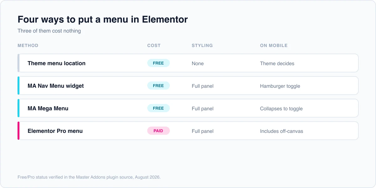
ثلاثة خيارات حقيقية، يتم تداول كل منها بشكل مختلف على التصميم وسلوك الهاتف المحمول.
| طريقة | تكلفة | تصميم المحرر | متنقل | الأفضل ل |
|---|---|---|---|---|
| موقع قائمة الموضوع | حر | لا شيء، الموضوع يتحكم فيه | يعتمد على الموضوع | مواقع بسيطة على موضوع جاهز للقائمة |
| أداة قائمة التنقل الرئيسية للإضافات | حر | ممتلئ من اللوحة | همبرغر التبديل على الهواتف | رأس مخصص بدون Pro |
| إضافات رئيسية قائمة ميجا | حر | ممتلئ | ينهار إلى تبديل | لوحات متعددة الأعمدة، ملاحة كبيرة |
| عنصر واجهة المستخدم لقائمة Elementor Pro | رخصة مدفوعة | ممتلئ | يتضمن خارج القماش | المواقع الموجودة بالفعل على Elementor Pro |
موقع قائمة الموضوع. يسجل كل سمة منطقة قائمة واحدة على الأقل. قم بتعيين القائمة الخاصة بك وهي تعمل بدون مكونات إضافية. لن تتمكن من التحكم في مظهرها من Elementor، ويكون سلوك الهاتف المحمول هو كل ما أنشأه مؤلف السمة. إذا كانت قائمة السمات الخاصة بك تبدو صحيحة بالفعل وتنهار بشكل نظيف، فلا يوجد سبب حقيقي لإضافة عنصر واجهة مستخدم في الأعلى.
أداة قائمة التنقل للإضافات الرئيسية. خيار Elementor الأصلي بدون ترخيص Pro. إسقاط أداة قائمة التنقل في أي قالب، قم بتوجيهه إلى قائمة من المظهر > القوائم وألوان الأنماط والمسافات والقوائم الفرعية وتبديل الهاتف المحمول من اللوحة.
إضافات رئيسية قائمة ميجا. بالنسبة للمواقع التي تحتوي على الكثير من الفئات، يقوم ملحق Mega Menu بإنشاء لوحات متعددة الأعمدة وهو مجاني أيضًا. إنها أداة منفصلة لها إرشادات خاصة بها كيفية إنشاء قائمة ضخمة في Elementor بدون Pro.
إليمنتور برو. إذا كنت تمتلكه بالفعل، فإن أداة القائمة ومنشئ السمات يقومان بذلك محليًا ويجب عليك استخدامهما. يؤدي تشغيل مكونين إضافيين لمهمة واحدة إلى زيادة الوزن فقط.
قم ببناء القائمة، ابدأ بالانتهاء
يحدث البناء بالكامل في wp-admin ومحرر Elementor. لا يوجد مقتطف من التعليمات البرمجية، ولا يوجد تحرير للموضوع الفرعي. قبل البدء، تأكد من أن السمة الخاصة بك لا تقوم بالفعل بطباعة رأسها الخاص، لأن الرأسين المكدسين هما أكثر الفوضى شيوعًا التي يحدثها الأشخاص هنا.
الخطوة 1: تسجيل القائمة
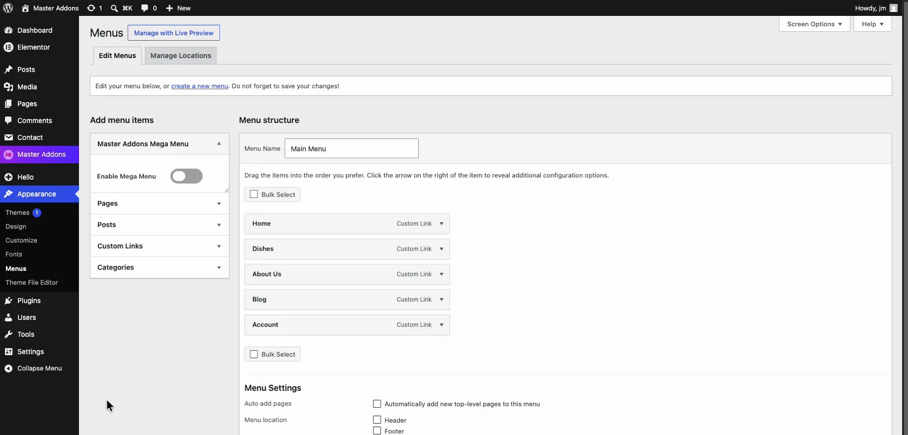
انتقل إلى المظهر > القوائم، وقم بإنشاء قائمة، وأضف صفحاتك وروابطك، وأعطها اسمًا ستتعرف عليه خلال ستة أشهر. هذا WordPress عادي، ولا يوجد شيء خاص بالمكون الإضافي، ويحتوي WordPress على دليل شاشة القوائم إذا لم تكن قد بنيت واحدة من قبل.
الخطوة 2: إنشاء قالب رأس
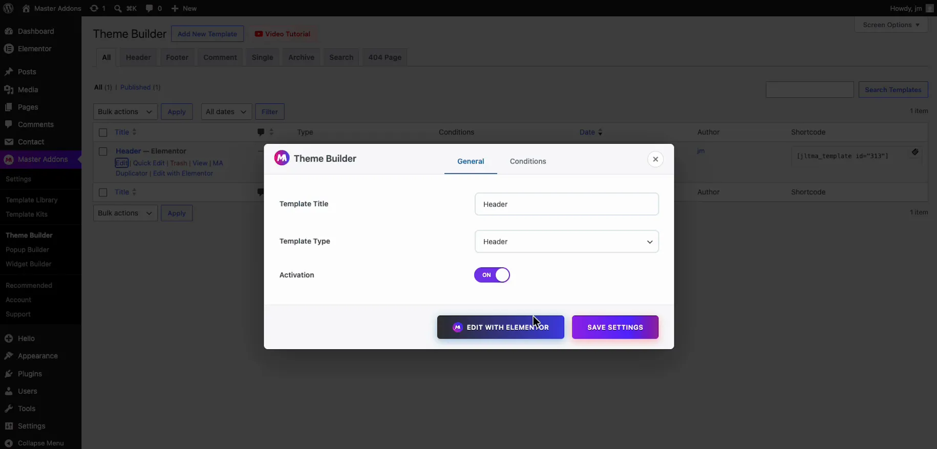
افتح المجاني منشئ موضوع الإضافات الرئيسية وأضف قالبًا جديدًا مع النوع المضبوط على الرأس. هذه هي الحاوية التي توجد بها قائمتك، وهي ما يتيح لك استبدال رأس السمة بدلاً من محاربتها. إذا كنت تفضل البدء من التصميم النهائي، فاستورد واحدًا منها قوالب رأس العنصر ووجه عنصر واجهة المستخدم الخاص بالقائمة إلى القائمة الخاصة بك.
الخطوة 3: أضف عنصر واجهة مستخدم قائمة التنقل واختر القائمة الخاصة بك
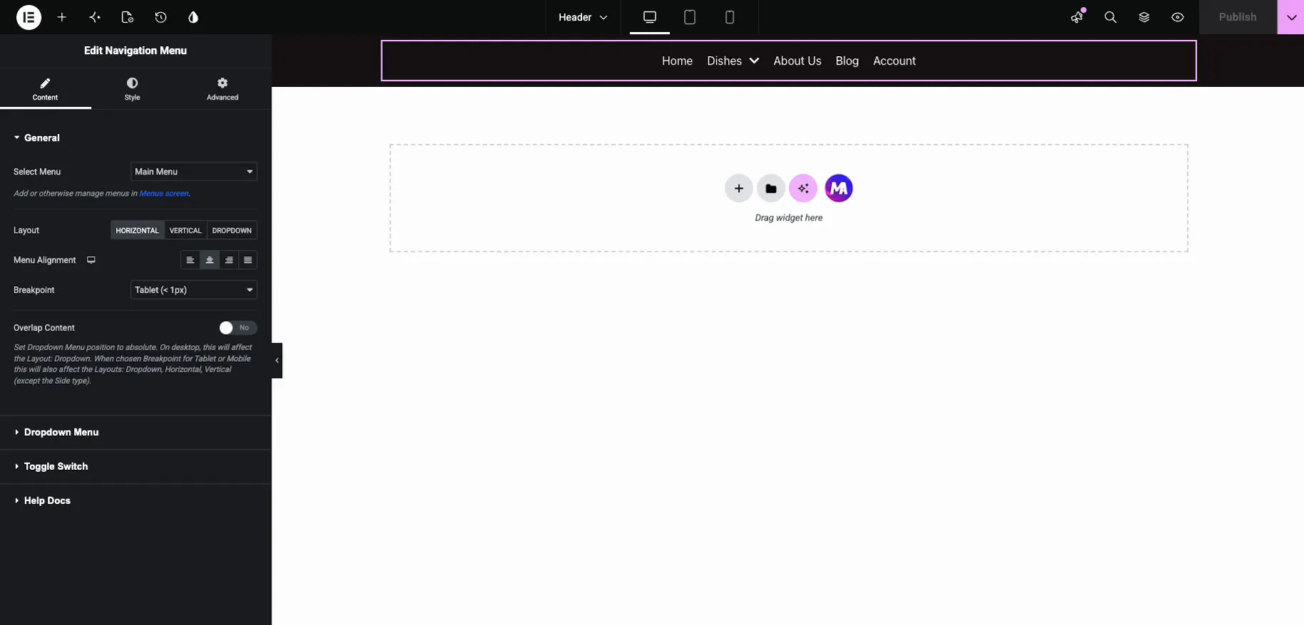
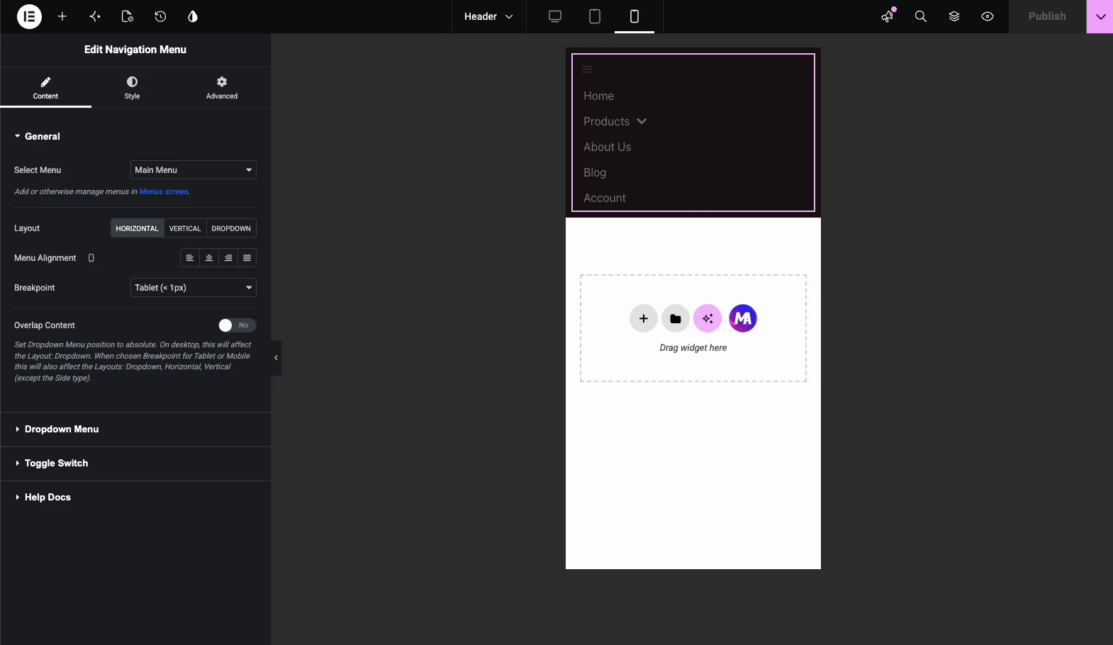
ابحث في لوحة Elementor عن “Nav Menu” واسحبها إلى الرأس. في إعدادات عنصر واجهة المستخدم، اختر القائمة التي قمت بإنشائها في الخطوة الأولى من القائمة المنسدلة تحديد القائمة، ثم قم بتعيين التخطيط. الأفقي يناسب الرأس القياسي؛ يناسب الوضع الرأسي الشريط الجانبي ويمنحك الأنواع الفرعية العادية والتبديل والأكورديون والجانبية.
يتم تعيين التخطيط لكل جهاز. تستخدم الهواتف تبديل الهامبرغر افتراضيًا، وبالتالي تنهار قائمة سطح المكتب هناك دون إعداد إضافي.
الخطوة 4: قم بتصميمه
الخط واللون والتباعد وحالات التمرير وسلوك القائمة الفرعية كلها موجودة في علامة تبويب النمط. لا يلزم وجود CSS مخصص. هذا هو الجزء الأساسي الذي لا يستطيع Elementor القيام به على الإطلاق، وهو السبب الكامل لإضافة عنصر واجهة مستخدم بدلاً من استخدام موقع قائمة السمات.
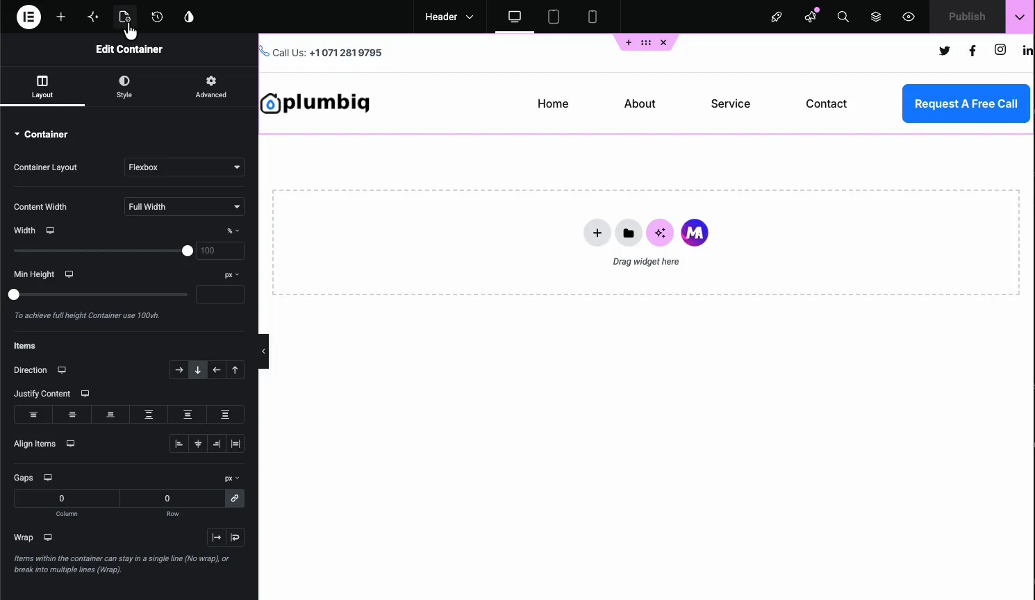
الخطوة 5: نشره وتعيينه
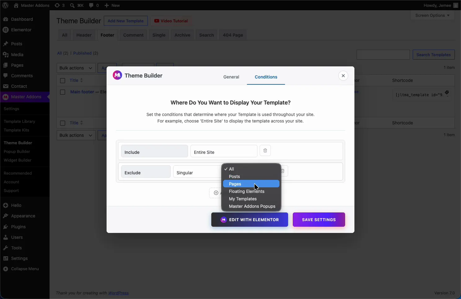
احفظ القالب وقم بتعيينه للموقع بأكمله. في الطبقة المجانية، يعد هذا هو شرط العرض الوحيد المتاح، وهو أمر جيد عندما تريد رأسًا واحدًا في كل مكان.
الخطوة 6: التحقق من ذلك على الواجهة الأمامية
قم بتحميل الموقع وتأكد من عرض رأس واحد، وليس رأسين. إذا رأيت قائمة السمة أيضًا، فقم بتعطيلها في إعدادات المخصص الخاصة بالموضوع بدلاً من إخفائها باستخدام CSS.

جعلها تعمل على الهاتف المحمول
القائمة التي تعمل فقط على سطح المكتب لم تنته بعد. على الهواتف، تنهار أداة قائمة التنقل إلى مفتاح همبرغر، ويكون هذا التبديل مجانيًا، بما في ذلك رمزه وحالته النشطة وتصميمه.
تم تصميم التبديل لاستخدام لوحة المفاتيح وقارئ الشاشة بدلاً من الماوس فقط. أدخل وافتحه بمسافة، ويغلقه Esc. وهذا يستحق التحقق من أي عنصر واجهة مستخدم في القائمة تقوم بتثبيته، نظرًا لأن العديد منها مبني من divs لا يمكن للوحة المفاتيح الوصول إليها.
كن واضحًا بشأن قائمة الهاتف المحمول المجانية: تتوسع اللوحة المطوية في مكانها أسفل مفتاح التبديل. يناسب القوائم القصيرة والمتوسطة جيدًا. تعد اللوحة الكاملة غير القماشية التي تنزلق من الجانب إحدى ميزات Pro، والتي سيتم تغطيتها في القسم التالي.
اختبار على هاتف حقيقي بدلاً من شريط أدوات جهاز المتصفح. تعمل أهداف النقر وسرعة الانتقال وما إذا كانت اللوحة تغلق بنقرة خارجية بشكل مختلف على شاشة اللمس عنها في نافذة سطح المكتب التي تم تغيير حجمها. تأكد من أن الأيقونة تتغير حالتها بحيث يكون من الواضح أن القائمة مفتوحة، وأنه يمكن الوصول إلى عنصر القائمة الفرعية بإبهام واحد.
حيث تتوقف النسخة المجانية
حدان، وكلاهما يستحق المعرفة قبل أن تصمم حولهما وليس بعده.
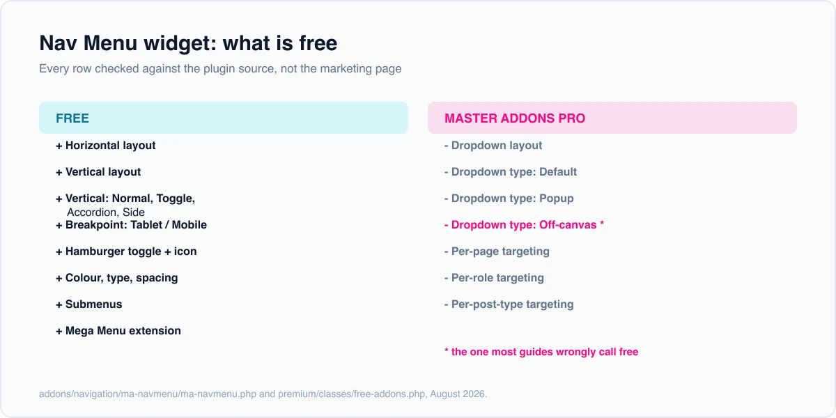
يعد التصميم غير القماشي واختيار تخطيط الهامبرغر احترافيًا. يوفر التحكم في التخطيط أفقيًا وعموديًا مجانًا، مع وضع علامة هامبرغر على Pro. تستخدم الهواتف همبرغرًا بالنوع الافتراضي خارج الصندوق، ولكن اختيار همبرغر للعروض الأخرى، أو التبديل إلى الأنواع المنبثقة أو Offcanvas، يحتاج إلى Pro. لذا فإن اللوحة الجانبية المنزلقة التي تعني قائمة “off-canvas” عادةً هي ميزة مدفوعة هنا. المسار المجاني لشيء مشابه هو النوع الجانبي للتخطيط الرأسي، والذي يضع القائمة أسفل جانب الصفحة، أو تبديل الهامبرغر القياسي للجوال.
يعد استهداف منشئ السمات إحدى القواعد. يحفظ Theme Builder المجاني حالة عرض واحدة بالضبط: الموقع بأكمله. جيد إذا كنت تريد رأسًا واحدًا في كل مكان. لا يكفي لرأس مختلف في الصفحة المقصودة، أو قائمة مختلفة للأعضاء الذين قاموا بتسجيل الدخول، أو رأس محدد لنوع منشور واحد. تلك تحتاج إلى محترف. لدينا انهيار شروط العرض يتتبع هذا الخط من خلال مصدر البرنامج المساعد، و دليل منشئ السمات المجاني يغطي بقية هذا المستوى.
إذا كنت تمتلك Elementor Pro بالفعل، فلن ينطبق أي من هذا الحل البديل. وإذا كان موقع قائمة السمة الخاصة بك كافيًا، فإن المظهر العادي > القوائم التي لا تحتوي على أي إضافة على الإطلاق هو المكالمة الصحيحة. أضف مكونًا إضافيًا بمجرد أن يتوقف الإعداد الافتراضي للموضوع عن كونه كافيًا. ال دليل الحاجيات والإضافات يسرد ما يتم شحنه مجانًا إذا كنت تزن البرنامج المساعد ككل.
إذا كان الرأس يحتاج إلى قسم، فإنك تستمر في إعادة البناء يدويًا، وهو منشئ القطعة يتيح لك تأليفه مرة واحدة كأداة حقيقية. هذا موجود في Pro، و صفحة التسعير يسرد الطبقات.
الأسئلة المتداولة
هل هناك أداة قائمة مجانية لـ Elementor؟
ليس من Elementor نفسه. لا يحتوي المكون الإضافي الأساسي على عنصر واجهة مستخدم القائمة؛ يتم شحن هذا الجهاز فقط مع Pro. يضيف Master Addons، وهو ملحق مجاني، عنصر واجهة مستخدم قائمة التنقل الخاصة به حتى تتمكن من وضع قائمة تنقل حقيقية وتصميمها دون ترخيص.
هل يمكنك إنشاء قائمة التنقل في Elementor بدون Pro؟
نعم. قم بتسجيل القائمة ضمن المظهر > القوائم كالمعتاد، ثم استخدم ملحقًا مجانيًا لإسقاط عنصر واجهة مستخدم قائمة التنقل في قالب رأس وتصميمه من اللوحة. لا يمكن لـ Elementor free وحده وضع قائمة أو تصميمها، لذلك تحتاج إما إلى موقع قائمة السمات أو عنصر واجهة مستخدم إضافي.
كيف يمكنني إضافة قائمة همبرغر متنقلة في Elementor مجانًا؟
أضف عنصر واجهة مستخدم قائمة التنقل الخاصة بـ Master Addons إلى قالب الرأس الخاص بك، وحدد القائمة الخاصة بك، وسوف تنهار إلى مفتاح همبرغر على الهواتف بشكل افتراضي. التبديل وأيقونته وتصميمه كلها مجانية. تتوسع اللوحة في مكانها أسفل التبديل.
هل القائمة غير القماشية مجانية في Master Addons؟
رقم Off-canvas هو واحد من ثلاثة أنواع داخل تخطيط هامبرغر. يتطلب اختيار هذا التخطيط أو أنواع النوافذ المنبثقة وغير القماشية Master Addons Pro. مجانًا، يمكنك الحصول على تخطيطات أفقية وعمودية بالإضافة إلى تبديل الهامبرغر الافتراضي على الهواتف. إذا كنت تريد قائمة مثبتة على الجانب دون الدفع، فإن النوع الجانبي للتخطيط الرأسي هو أقرب مكافئ مجاني.
كيف يمكنني إنشاء قائمة ضخمة في Elementor مجانًا؟
تتضمن الإضافات الرئيسية امتدادًا مجانيًا لقائمة Mega Menu يقوم بإنشاء لوحات متعددة الأعمدة وينهار على الهاتف المحمول. وهو منفصل عن أداة Nav Menu القياسية ومصمم للتنقل بشكل أكبر مع الفئات أو الأعمدة أو المحتوى الترويجي.
لماذا لا تظهر قائمة التنقل الخاصة بـ Elementor؟
عادة قائمة غير مخصصة. تحقق من تحديد القائمة فعليًا في إعدادات عنصر واجهة المستخدم، وليس فقط تم إنشاؤها ضمن المظهر > القوائم. ثم تأكد من تعيين قالب الرأس إلى الموقع بأكمله في Theme Builder، وأنه لا يوجد رأس سمة لا يزال نشطًا ويتداخل معه.
هل أحتاج إلى Master Addons Pro أم أن القائمة مجانية؟
أداة قائمة التنقل مجانية، بما في ذلك التصميم والقوائم الفرعية والتخطيطات لكل جهاز وتبديل الهامبرغر على الهواتف. يضيف Pro تخطيط هامبرغر لأي عرض مع أنواعه المنبثقة وغير القماشية، وشروط Theme Builder التي تتجاوز قاعدة موقع كاملة واحدة.
ماذا تفعل بعد ذلك
أنشئ الرأس بتصميم أفقي، ثم قم بتحميله على هاتفك الخاص قبل تصميم أي شيء آخر. معظم مشكلات القائمة هي مشكلات تتعلق بالهاتف المحمول، وتظهر خلال عشر ثوانٍ على جهاز حقيقي.
إذا تبين أن القائمة تحتاج إلى لوحات متعددة الأعمدة، فإن دليل القائمة الضخمة يلتقط من هناك. ال صفحة عناصر واجهة مستخدم قائمة التنقل يقارنه بأدوات قائمة Elementor Pro و وثائق قائمة التنقل يسرد كل عنصر تحكم.
