An Elementor image box is a widget that pairs an image with a heading and a short description in one linked block. It’s how most WordPress sites build services grids, feature rows and team sections. Elementor ships one free; the sixteen designs below replace it with layouts and motion the default widget can’t produce.
Because everybody has the same widget, the services section on a plumber’s site in Leeds is laid out identically to a design studio’s in Lisbon. Same three columns, same centred image, same 16px gap.
So we built sixteen replacements. Each one is a working Elementor widget, each has a live demo you can open right now and a download link on this page. You don’t need to hand over an email address or make an account to get one.
On this page
Table of Contents
The 16 designs at a glance
| # | Design | What it does | Best for |
|---|---|---|---|
| 01 | Lumen Image Boxes | A light source follows your cursor across the card | Dark sites, technical services |
| 02 | Verge Image Boxes | Offset plates that open as you scroll past | Editorial, guides, outdoor brands |
| 03 | Aperture Image Boxes | Each image opens from a clipped aperture | Photography, print, six-item grids |
| 04 | Bascule Image Boxes | Cards turn on a hinge, showing a back face | Before and after, spec reveals |
| 05 | Cascade Image Boxes | Four cards settle in sequence, not all at once | Process steps, studio services |
| 06 | Filigree Image Boxes | Small thumbnails, fine rules, dense two-column list | Long service menus, price lists |
| 07 | Frieze Strip | A horizontal strip you drag or scroll through | Long sequences, production lines |
| 08 | Gyre Image Boxes | Cards tilt toward the pointer with a sheen | Products, crafted goods |
| 09 | Impulse Image Boxes | Cards pull toward the cursor like a magnet | Bookings, courses, hire |
| 10 | Kintsugi Image Boxes | Images arrive as shards and reassemble | Craft, glass, ceramics, restoration |
| 11 | Palisade Image Boxes | Tall panels built from vertical slats | Workshops, joinery, narrow columns |
| 12 | Refract Image Boxes | A blend-mode colour wash sits over each image | Studios, music, licensing |
| 13 | Riser Image Boxes | Cards rise into place with a lip that fits its text | Agencies, production |
| 14 | Solstice Image Box | Large staggered pair with a duotone treatment | Coffee, sourcing, storytelling |
| 15 | Threshold Image Box | Doors part down the middle to reveal the image | Growers, nurseries, reveals |
| 16 | Vellum Image Box | A soft blur clears as the card clips open | Binding, archives, quiet brands |
What you need to run these
Elementor free is enough for the page itself. The designs are a different matter.
- All sixteen need Master Addons. Every one of them is built on controls (repeater, typography, dimensions, border, icon picker, tabs) that the full Widget Builder provides. The free plugin has a Widget Builder, but those controls show as locked.
- The downloads on this page are free and ungated. Grab the JSON and keep it. You can modify limited options in the free version. But pro version unclock everything.
- The live demos cost nothing at all. Open one, resize the browser, drag a card, tab through with the keyboard. That’s the honest way to judge whether a motion style fits your content, and it’s free.
If you want designs that run on the free plugin, the eight free widgets in our Elementor slider templates collection use no Pro controls, and several of them are card layouts rather than sliders.
01. Lumen Image Boxes
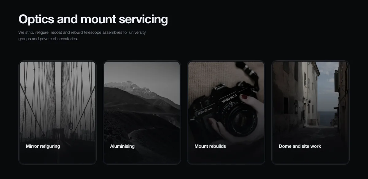
Four cards on a near-black background. Move the pointer across them and a soft light moves with it, brightening the part of the image under your cursor and leaving the rest dim. The card you’re looking at is the card that’s lit.
What makes it work is the restraint. The cards don’t move or scale on hover. The only thing that changes is where the light falls, which is close to how you’d actually look at objects on a workbench under a lamp.
Use it for: technical services, dark-themed sites, anything photographed against a dark ground.
Don’t use it for: white backgrounds. The spotlight has nothing to work against and the whole thing reads as a slightly grubby hover state.
02. Verge Image Boxes
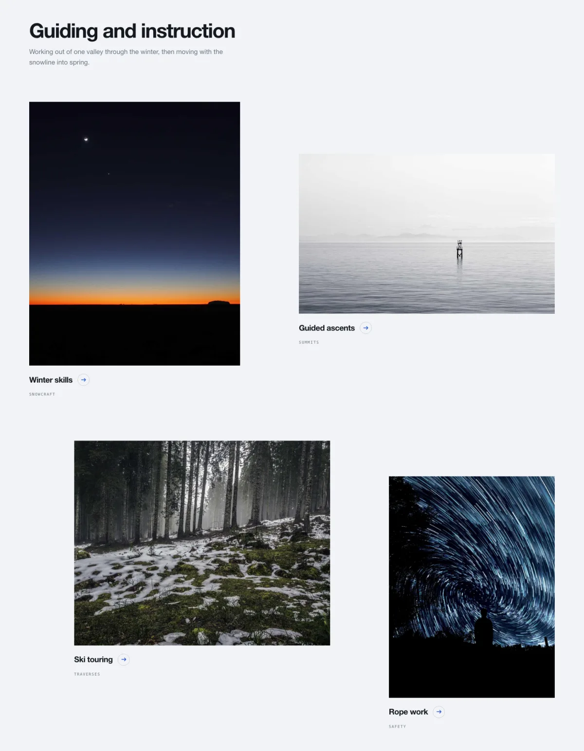
Two columns, deliberately out of step, so the right column sits lower than the left. Each plate opens as it crosses into view. Titles carry a small circular arrow, and below them sits an eyebrow label in letter-spaced caps: SNOWCRAFT, SUMMITS, TRAVERSES.
That offset is doing real work. A straight grid tells the eye to scan across in rows and it stops reading. Stagger the columns and it has to travel down the page instead, which is the direction you actually want.
Use it for: editorial pages, guides, anything with four to six substantial items.
Don’t use it for: more than about eight items. The stagger accumulates and the page gets very tall, very fast.
03. Aperture Image Boxes
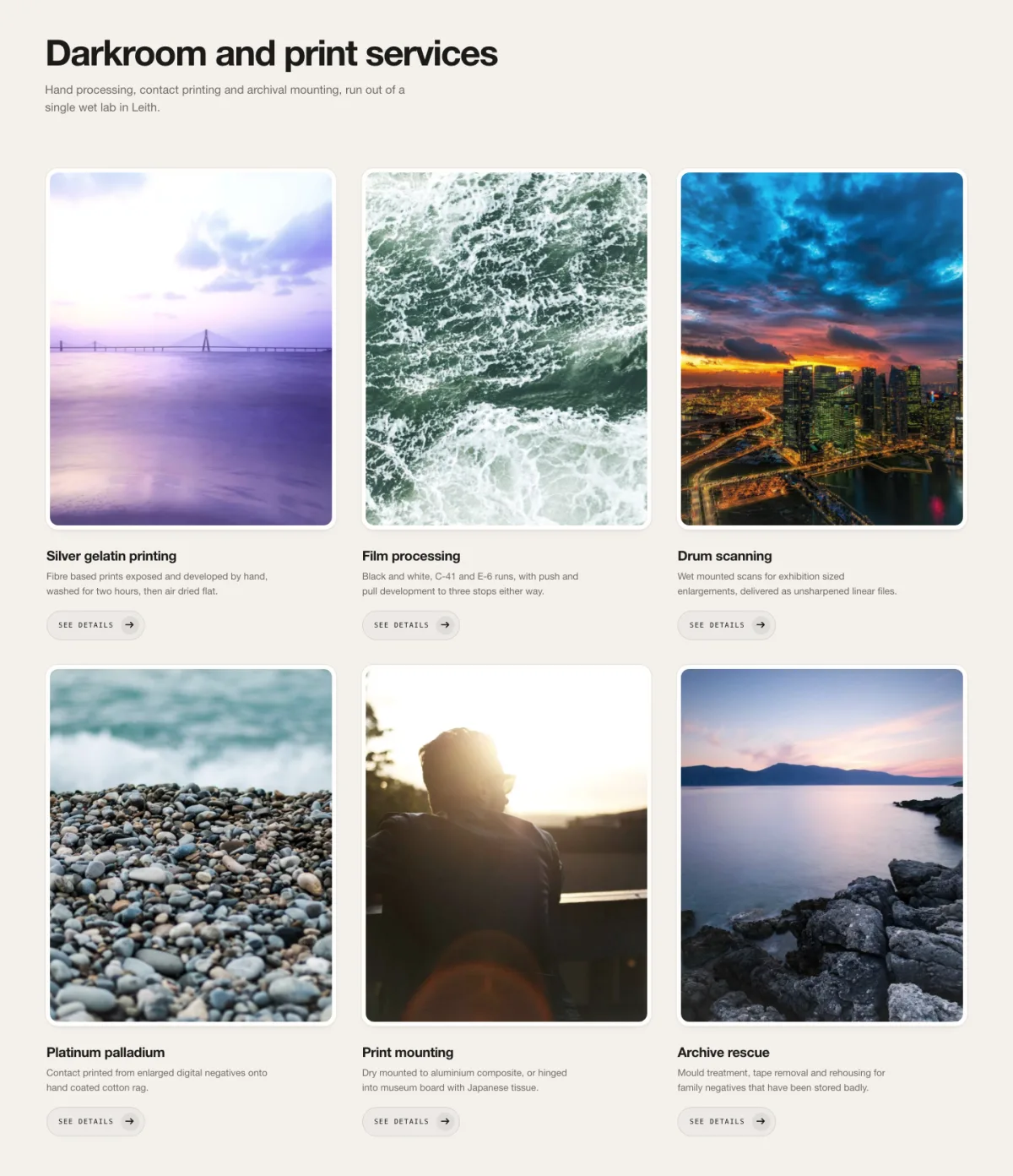
Six boxes in two rows of three, on warm paper-grey. Each image is masked and the mask opens outward as the row arrives, the way a lens aperture does. Every card carries a small SEE DETAILS link under its description.
This is the one to reach for when you have six things and they’re genuinely equal. Most image box layouts quietly rank their items by size or position. This one doesn’t.
Use it for: darkroom and print services, six-item feature grids, anything photographic.
Don’t use it for: three items. The two-row rhythm is the whole design and a single row of three loses it.
04. Bascule Image Boxes
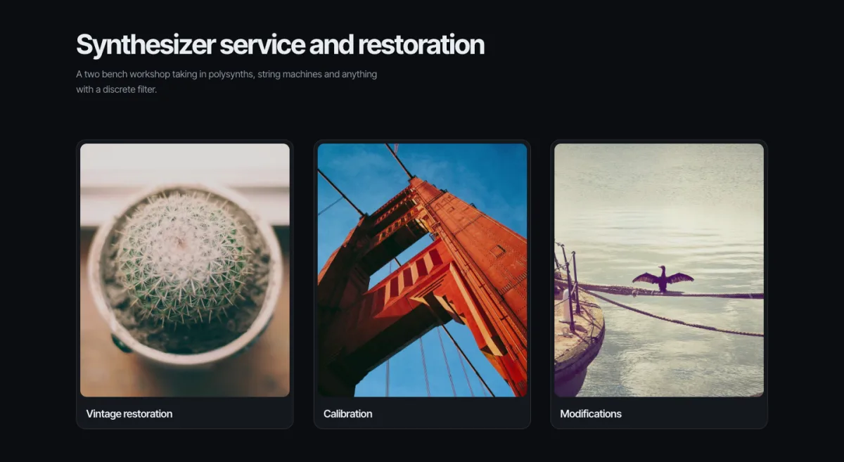
Named after the bridge, not the balance. Each card turns on a horizontal hinge and there’s a real back face waiting behind it, not a CSS filter over the same picture but an actual second side you write copy into.
A note from building it: the flip switches off below a breakpoint, and that’s on purpose. A hinge animation on a phone means a tap does something unexpected, and the fix is to not do it rather than to do it slower.
Use it for: before and after, spec sheets, anything where the second piece of information is as interesting as the first.
Don’t use it for: your primary navigation into a page. Content behind a flip is content most visitors never see.
05. Cascade Image Boxes
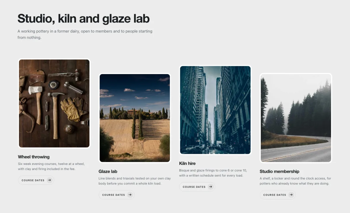
Four cards that arrive one after another rather than together, each settling a beat behind the last. The difference is small, but you feel it. The section gets dealt out to you instead of just appearing.
Every card carries a COURSE DATES link, which is the giveaway for what this layout is really for: things that recur, in an order, where the order matters.
Use it for: studio and workshop services, course listings, process steps.
Don’t use it for: above the fold. Stagger the entrance of the first thing a visitor sees and your site feels slow even when it isn’t.
06. Filigree Image Boxes
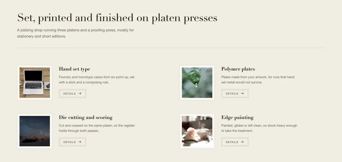
The quiet one. Thumbnails the size of a postage stamp, hairline rules, two columns, four items in the space most of these designs use for one. Hand set type, polymer plates, die cutting, edge painting: a trade list, laid out like a trade list.
It’s here because not every services section deserves a hero treatment. Sometimes there are eleven things you do and the visitor wants to scan them, not admire them.
Use it for: long service menus, price lists, specialist trades with a lot of line items.
Don’t use it for: three headline services. At that count it looks like you forgot to finish the section.
07. Frieze Strip
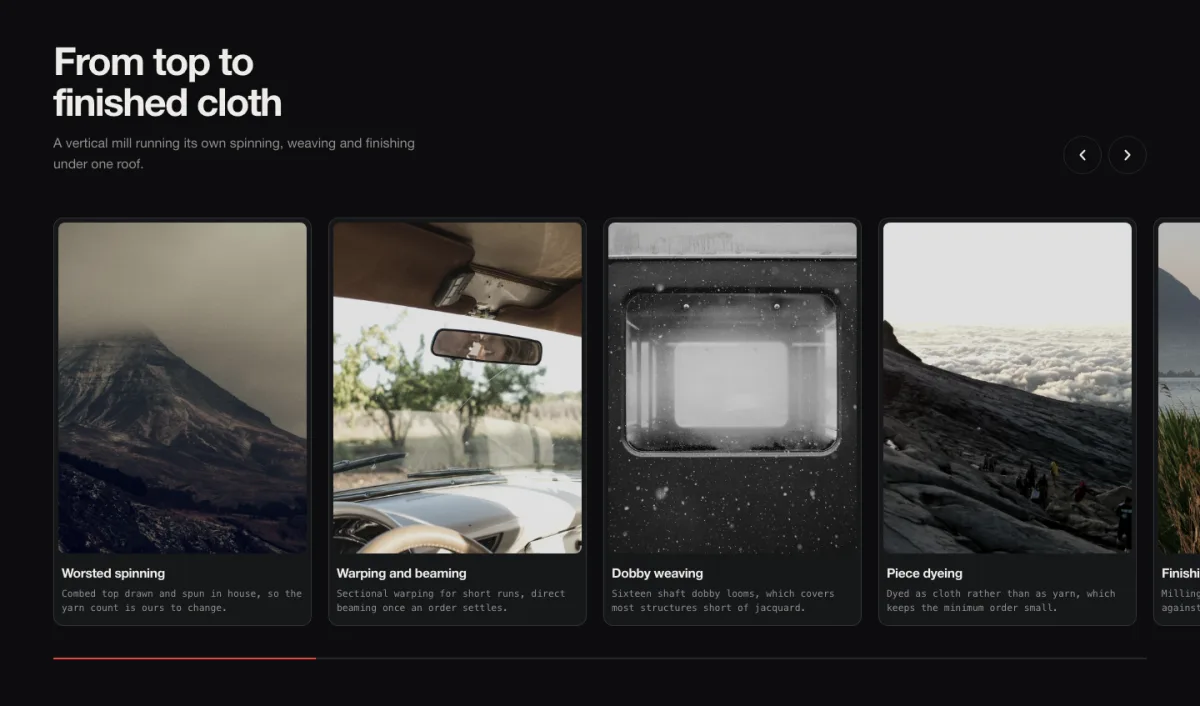
The only one here that goes sideways. Cards run off the right edge of the screen and you drag them, scroll them, or use the two round arrow buttons top right. A thin rule underneath fills as you go, so you always know how much is left.
Worsted spinning, warping and beaming, dobby weaving, piece dyeing, finishing. Five stages of a mill in the order they happen. A grid would have broken that sequence into rows. A strip keeps it on one line, which is what a production sequence actually is.
Use it for: production sequences, long lists that would wreck a grid, anything with an inherent order.
Don’t use it for: four items. If everything already fits on screen, you’re asking people to scroll sideways for nothing.
08. Gyre Image Boxes
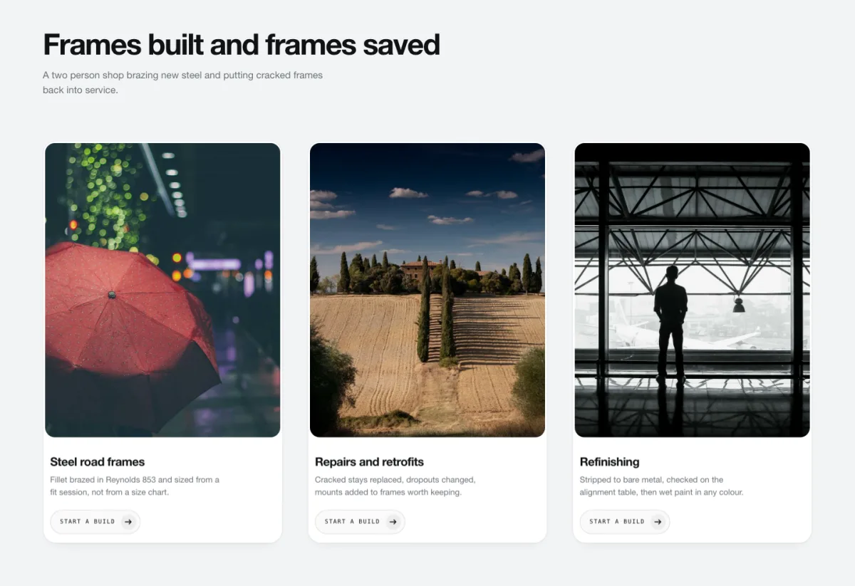
Cards tilt toward wherever the pointer is, and a sheen crosses the surface as they move. It’s the effect everyone tried in 2021 and most people overdid. The tilt here is a couple of degrees, not fifteen.
Keyboard users get handled properly, which almost nothing does. Tab to a card and you get the lift and the sheen but no rotation, because a keyboard has no pointer position to rotate toward and faking one is nonsense.
Use it for: physical products, frames, crafted goods, anything with a surface worth catching light.
Don’t use it for: text-heavy cards. Tilting a paragraph while someone reads it is hostile.
09. Impulse Image Boxes
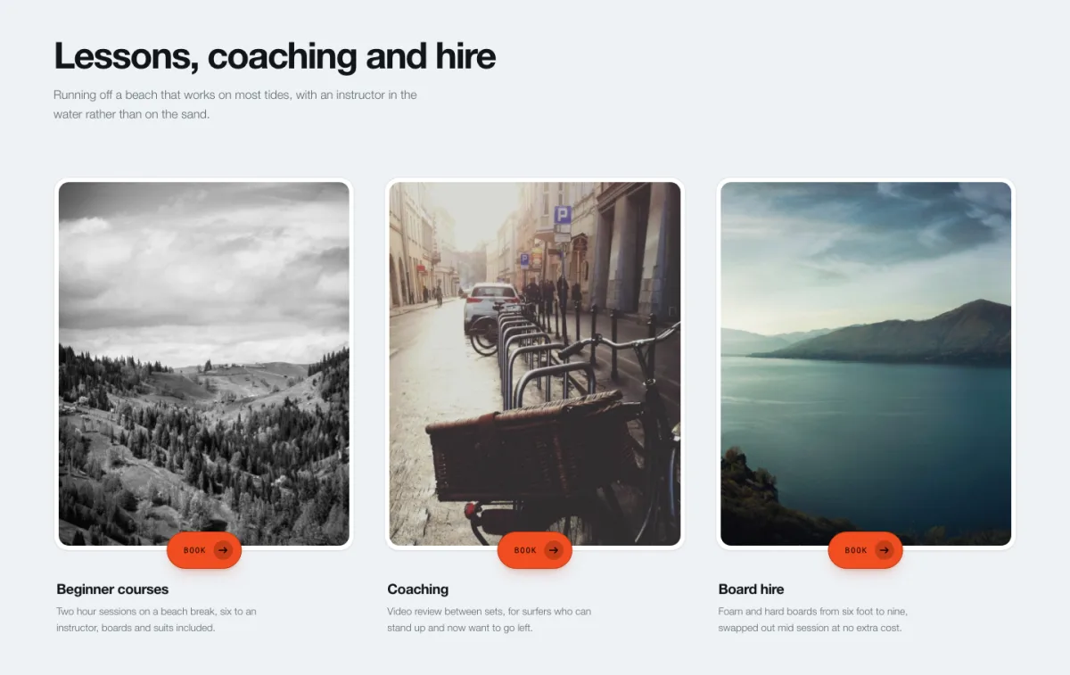
Cards lean toward your cursor as it approaches, then let go as it leaves. The pull is normalised against half the card and clamped, so once you’re past the edge it stops increasing rather than flinging the card across the screen.
Each card ends in a hot orange button. Beginner courses, coaching, board hire. Magnetism is a booking-page trick, because it makes the button feel like it wants to be pressed, and it’s wasted anywhere the card isn’t a call to action.
Use it for: lessons, hire, bookings, anything where every card ends in a button.
Don’t use it for: informational cards with no click target. You’re promising an interaction you don’t deliver.
10. Kintsugi Image Boxes
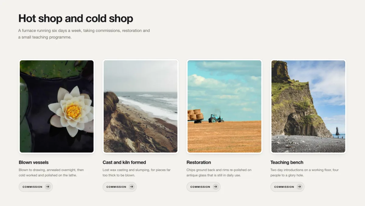
Images arrive in pieces and reassemble. Two break patterns ship with it: three tall pieces, like a pane cracked across its height, and six wedges radiating from a point set off-centre, which reads as impact rather than a clean break.
Blown vessels, cast and kiln formed, restoration, teaching bench. The demo is glass work throughout. The design was built for a hot shop and it shows, but it lands anywhere the subject is something made, broken, or put back together.
Use it for: glass, ceramics, restoration, repair, conservation.
Don’t use it for: hospitals, insurance, anything where “shattering” carries a meaning you don’t want.
11. Palisade Image Boxes
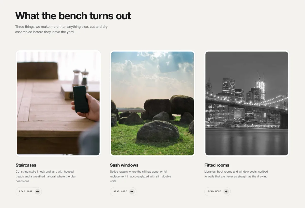
Three tall panels, each assembled from vertical slats that arrive in sequence, a fence being built one board at a time. The slat count adapts to the panel width, so a narrower column gets fewer, wider boards instead of the same number squeezed thinner.
Staircases, sash windows, fitted rooms. All of them are subjects you’d photograph standing up rather than lying down, and that suits this layout better than a landscape card ever will.
Use it for: joinery, architecture, interiors, tall product shots.
Don’t use it for: landscape photography. Portrait panels crop the picture to a slot and you lose the shot.
12. Refract Image Boxes
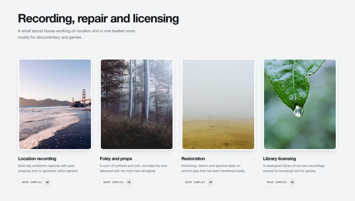
A colour wash sits over every image in blend mode, so four photographs shot on four different days in four different lights come out looking like one set. That’s the actual job here, and it’s less glamorous than it sounds.
Location recording, foley and props, restoration, library licensing. It’s sound work, where stock photography is unavoidable and the pictures never match, so the wash hides the seams.
Use it for: mixed-source imagery, stock photos, anything where you can’t reshoot.
Don’t use it for: product colour accuracy. A wash over a paint sample is a returns problem.
13. Riser Image Boxes
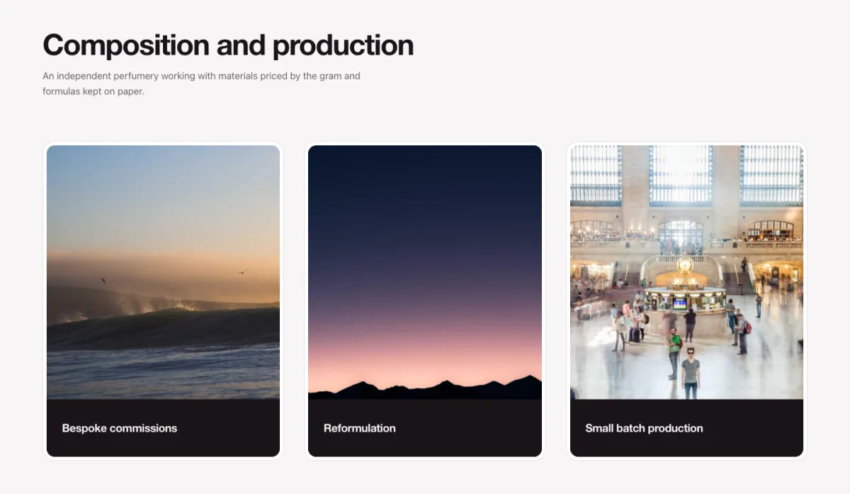
Cards rise from below with a lip of caption showing at the bottom. The lip is measured against the text inside it rather than set to a fixed height, so a two-word caption and a two-line one both sit correctly instead of one of them clipping.
Bespoke commissions, reformulation, small batch production. Three items, three dark images, minimal chrome. It’s the most conventional design in the set. Sometimes you want the layout to get out of the way of the work.
Use it for: agencies, production companies, three-service pages.
Don’t use it for: long descriptions. The lip is a caption, not a paragraph.
14. Solstice Image Box
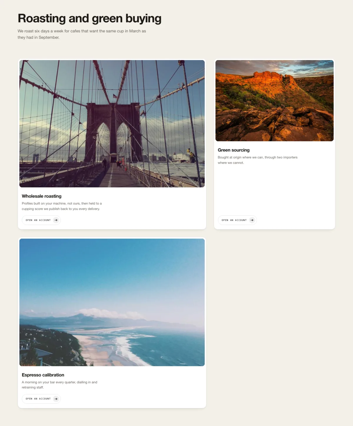
The biggest boxes in the set. Two columns, badly out of step on purpose, images large enough to actually look at. A duotone treatment links across the images and can be dropped per card if one photo fights it.
Wholesale roasting, green sourcing, espresso calibration. Three services given the space of six. Use it when you have few things to say and they’re worth a whole screen each.
Use it for: two to four premium services, storytelling pages, coffee and food brands.
Don’t use it for: six or more items. This design at six items is a very long page nobody reaches the bottom of.
15. Threshold Image Box
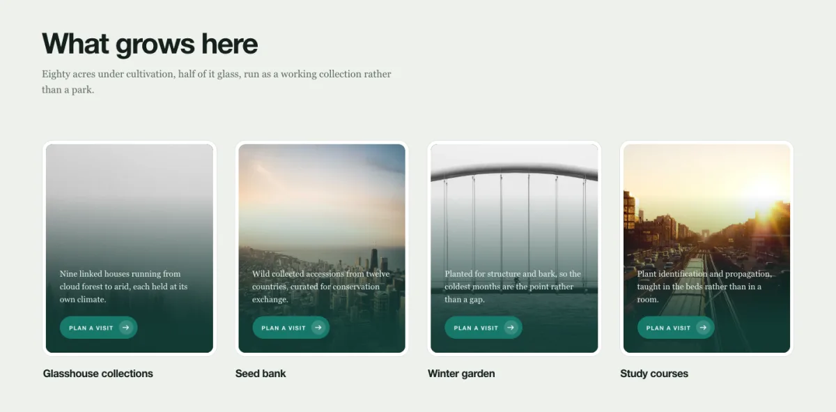
Two doors sit closed over each image and part down the middle as the card enters view. The doors are built from the image’s own source, so they never mismatch the picture behind them.
Deep green ground, four cards: glasshouse collections, seed bank, winter garden, study courses. Using doors for a section about entering a garden is obvious, and in this case obvious is fine.
Use it for: gardens, venues, openings, anything a visitor physically enters.
Don’t use it for: twelve cards. Twelve sets of doors opening is a lot of doors.
16. Vellum Image Box
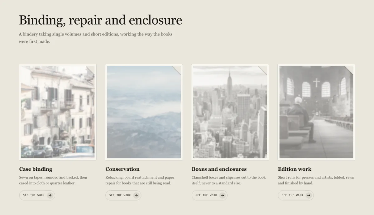
Each card opens from a clip while a soft blur clears off the image, like paper being drawn away. Every card in the section is armed in a single commit, which means one layout pass for the whole row rather than one per card.
Case binding, conservation, boxes and enclosures, edition work. The demo is a bookbindery. This is the gentlest motion in the set and the one most likely to survive a client who says they hate animation.
Use it for: archives, binding, conservation, quiet and expensive brands.
Don’t use it for: anything that needs urgency. This design has none and isn’t pretending to.
What can the default Elementor image box widget do?
The free Elementor image box gives you an image, a title, a description and an optional link. In the Style tab you can set image width, border radius, spacing between image and text, alignment, and the image position (top, left or right). Hover effects are limited to Elementor’s global CSS filters and transforms.
That covers a lot of sites, and if it covers yours, use it. You don’t need an addon to put a picture above a heading.
Where it runs out is motion and structure. There’s no back face, no per-card sequencing, no horizontal layout, no way to make one card behave differently from its neighbours. Those are the gaps the sixteen designs above fill.
Image box vs icon box: which should you use?
Use an image box when the picture is the content, such as a photograph of the work, the room or the product. Use an icon box when the picture is decoration and the words carry the meaning. The widgets are otherwise near-identical: both pair a graphic with a heading and a description in one linked block.
The practical test is whether you’d notice if the graphic vanished. If a services grid still reads fine with the icons gone, they were decorative and an icon box was the right call. If removing the images leaves you with a list of names, you needed an image box.
A third option people forget: a flipbox, which is an image box with a back. Bascule above is that idea rebuilt with a hinge.
How do you add a hover effect to an Elementor image box?
Select the widget, open the Style tab, expand the Image section and switch to the Hover tab. You get opacity, CSS filters (blur, brightness, saturation, contrast, hue) and a transition duration. For transforms like scale or rotate, use the Advanced tab’s hover controls.
That’s the whole built-in surface. Anything beyond it, such as a light that tracks the cursor, a magnetic pull, or a sheen that crosses on tilt, needs custom CSS or a widget that ships the behaviour.
For overlay animations on a single image, the Image Hover Effects widget in Master Addons has 30 of them built in, with a title and caption that appear on hover.
If it’s specifically text-over-image effects you’re after, we catalogued 25+ Elementor text over image hover effects separately, and those work with the stock widget.
How to import these Elementor image box designs
Download the JSON from any design above, then in WordPress go to Master Addons → Widget Builder → Import Widget and upload the file. The widget appears in the Elementor panel under Favorites, with its own controls in the Content and Style tabs.
- Click Download Widget JSON on the design you want. The zip contains the JSON and a preview image.
- Unzip it. Elementor’s own template importer won’t read this file, because it goes to the Widget Builder rather than to Templates.
- Go to Master Addons → Widget Builder and choose Import Widget.
- Upload the JSON. Edit any page with Elementor and search the panel for the widget name.
- Replace the placeholder images and text. The cards are a repeater, so add or remove items there rather than duplicating the widget.
The common mistake is step 2. These are Widget Builder widgets, not Elementor section templates, so importing them through Templates → Import will fail and the error message doesn’t explain why.
Do these image boxes work on mobile, and are they accessible?
Yes to both, with one design-level caveat. Every widget here respects prefers-reduced-motion: if a visitor has reduced motion enabled at the OS level, the entrance animations don’t run and the cards render in their final state. That’s handled in the widget, not left to you.
Pointer-driven designs degrade rather than break. Gyre’s tilt and Impulse’s magnet need a pointer position that a touchscreen doesn’t provide, so on mobile the cards render static and everything stays readable and tappable. Bascule switches its flip off below a breakpoint deliberately.
Gyre also handles keyboard focus separately from hover. Tab to a card and you get the lift and the sheen without the rotation. Most tilt effects skip that and leave keyboard users with nothing.
Which Elementor image box should you actually pick?
Start from your item count, not from the effect.
- Two to four items, each important: Solstice or Verge.
- Exactly three services: Riser, Gyre or Bascule.
- Four items: Lumen, Cascade, Kintsugi, Threshold or Vellum.
- Six equal items: Aperture.
- Eight or more: Frieze Strip if they’re a sequence, Filigree if they’re a list.
- Tall, portrait imagery: Palisade.
- Photos that don’t match each other: Refract.
- Every card ends in a button: Impulse.
Then check the effect against your subject. Kintsugi on a law firm is a bad joke. Threshold on a garden is almost too neat. If the motion doesn’t say something about the work, drop it and use Riser.
Frequently asked questions
Is the Elementor image box widget free?
Yes. The image box ships in the free Elementor plugin, with image, title, description, link, image position and basic hover filters. The sixteen designs on this page are different: they’re Master Addons Widget Builder widgets and need Master Addons Pro to edit, though the downloads themselves are free.
Can I add a button to an Elementor image box?
Not in the stock widget, which links the whole box instead of giving you a separate button. To get a real button you either place a Button widget underneath inside the same container, or use a design that includes one. Impulse, Aperture, Cascade and Gyre all ship with a button in the card.
How do I make Elementor image boxes the same height?
Put the boxes in a flex container and set the container’s Align Items to Stretch, then set each image box column to full height. Uneven text lengths are the usual cause. Every design on this page handles equal heights in its own CSS, so the problem doesn’t arise.
What’s the difference between an image box and an image widget?
An image widget places a single picture with an optional caption and link. An image box is a composite: image, heading, description and link in one block, styled and spaced as a unit. Use the image widget for a standalone photo, the image box for a card in a grid.
Do I need Elementor Pro for these designs?
No. Elementor free is enough, because the designs are built with Master Addons rather than Elementor Pro widgets. What you need is Master Addons Pro, since each design uses Widget Builder controls (repeater, typography, dimensions, border, icons, tabs) that are locked in the free plugin.
Where to go next
If you want more importable designs, the 20 Elementor slider templates collection is the closest sibling to this page and eight of those run on the free plugin. For carousels specifically, see Elementor carousel widgets, or what’s actually free if the licence question is the one you care about.
If the blog is next on your list, there are 15 Elementor blog templates as well: 10 layouts for the page that lists your posts and 5 for single posts, each with a live demo and a JSON download.
For related card patterns: image hotspots for annotating a single large picture, team member sections for people rather than services, and 3D flipbox animations if Bascule caught your eye. Licence details are on the pricing page, and the full widget list is in 100+ best Elementor addons.