


Adding text over an image in Elementor sounds like a two-minute job. Then you try it with the default widgets and end up wrestling with negative margins, absolute positioning, and a Heading widget stacked on a background image that breaks on mobile. There is a faster way. The free Image Hover Effects widget from Master Addons puts a heading and description on top of any image and reveals them with one of its 30 hover animations, 8 of which are free. You never touch CSS.
In this tutorial you will set up an Elementor text over image section from scratch: upload the image, pick a hover effect from a dropdown, style the overlay, and decide what happens when someone clicks. Every screenshot below comes straight from the Elementor editor, so you can follow along click by click.
What this guide covers:
- Why text over image needs a widget
- The Image Hover Effects widget at a glance
- How to add text over an image (step by step)
- Styling the overlay: color, opacity, shape
- Typography for the title and description
- Click actions: open a popup or link the image
- Design tips that keep the text readable
- Other Master Addons widgets for image effects
- Free vs Pro: what you actually need
- Frequently asked questions
Why Text Over Image Needs a Widget (Not a CSS Hack)
Elementor’s own documentation suggests two workarounds for text over image: set the image as a section background and drop a Heading widget inside, or push a heading upward with negative margins. Both work for a static caption. Neither gives you a hover reveal, an animated overlay, or a click action, and the negative-margin trick tends to fall apart at tablet and mobile breakpoints.
A dedicated widget solves all of that in one place:
- Hover reveal built in. The image stays clean until the visitor hovers, then the title and description animate in.
- One settings panel. Image, text, overlay color, and typography live in a single widget instead of three stacked ones.
- Responsive by default. The overlay scales with the image, so nothing shifts out of place on smaller screens.
- Click actions. The whole image can open a link or a popup. Portfolio grids and service cards depend on this.
This is why text-over-image layouts show up everywhere: portfolio tiles that reveal the project name, team cards that show a bio on hover, blog category banners, and gallery grids where captions would otherwise clutter the design.
For a portfolio grid visitors can narrow by category, pair those hover tiles with the Filterable Image Gallery.
The Image Hover Effects Widget at a Glance
Image Hover Effects ships in the free version of Master Addons, a library of 80+ widgets and extensions running on 30,000+ active WordPress sites. Here is what you get in this one widget:
- 30 named hover effects, each a different reveal animation. Eight are free (Lily, Sadie, Roxy, Bubba, Romeo, Layla, Honey and Oscar), while Chico, Marley, Ruby and the other 19 need Pro
- A heading field with a selectable HTML tag (H1 to H6), so your overlay text can stay SEO-correct
- A description field for a short supporting line
- Overlay background color, image opacity, and hover opacity controls
- Border radius, padding (Pro), box shadow, and separate typography for title and description
- Three click behaviors: nothing, follow a link, or open a popup (popup content needs Pro)
The widget, the eight free effects, the text fields and link clicks all work without a Pro license. If you want the full settings reference, the Image Hover Effects widget page has the full feature rundown and live demos.
How to Add Text Over an Image in Elementor (Step by Step)
Step 1: Install Master Addons
In your WordPress dashboard, go to Plugins > Add New and search for “Master Addons”. Install and activate the free plugin from WordPress.org. If anything trips you up, the installation guide walks through it. You need Elementor active too, but the free version is enough.
Step 2: Drag the Image Hover Effects Widget Into Your Page
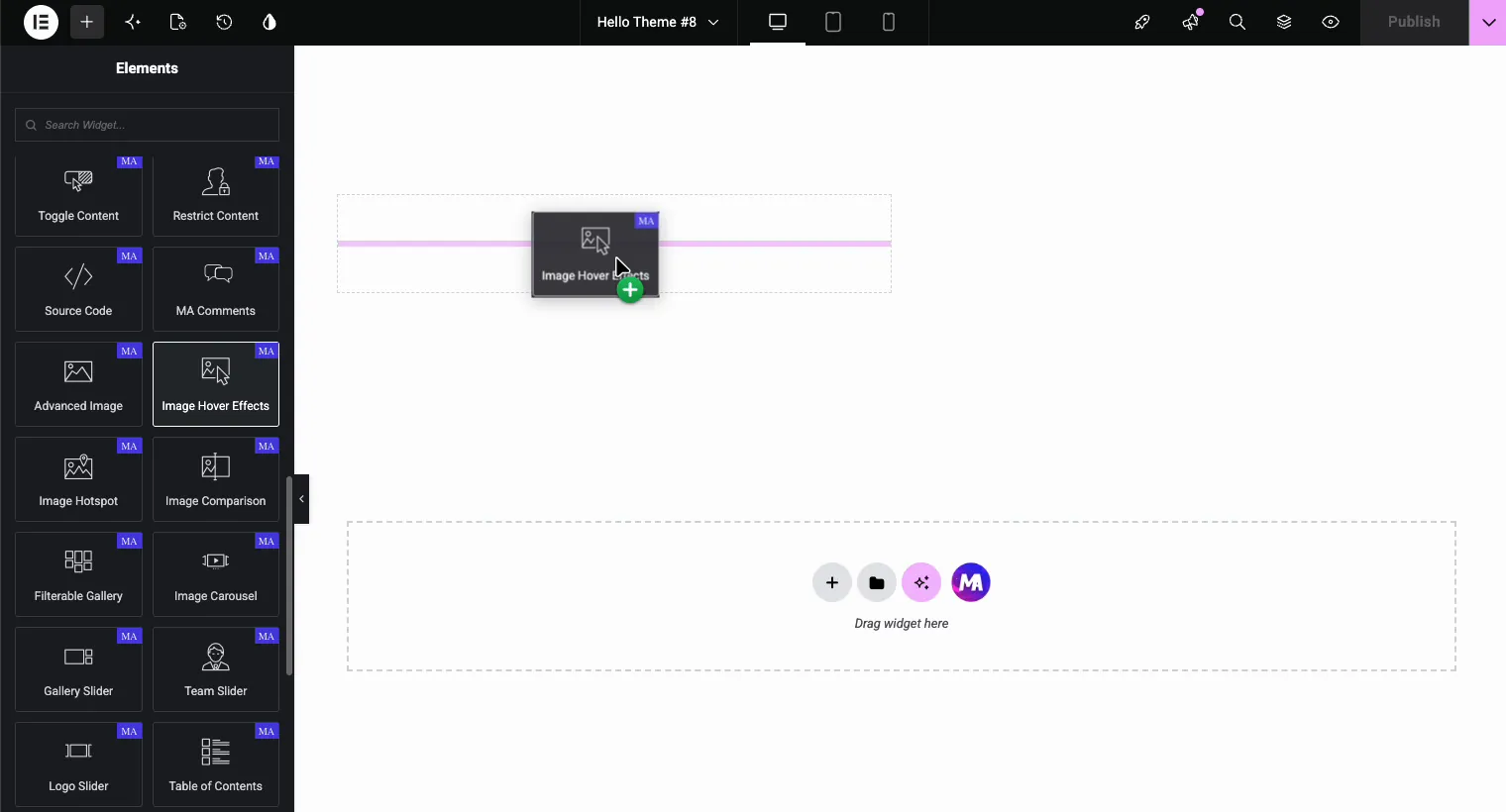
Open any page with Elementor and search for “Image Hover Effects” in the widget panel. You will spot it among the other MA-badged widgets like Advanced Image, Image Hotspot, and Image Comparison. Drag it into your section.
Step 3: Upload Your Image
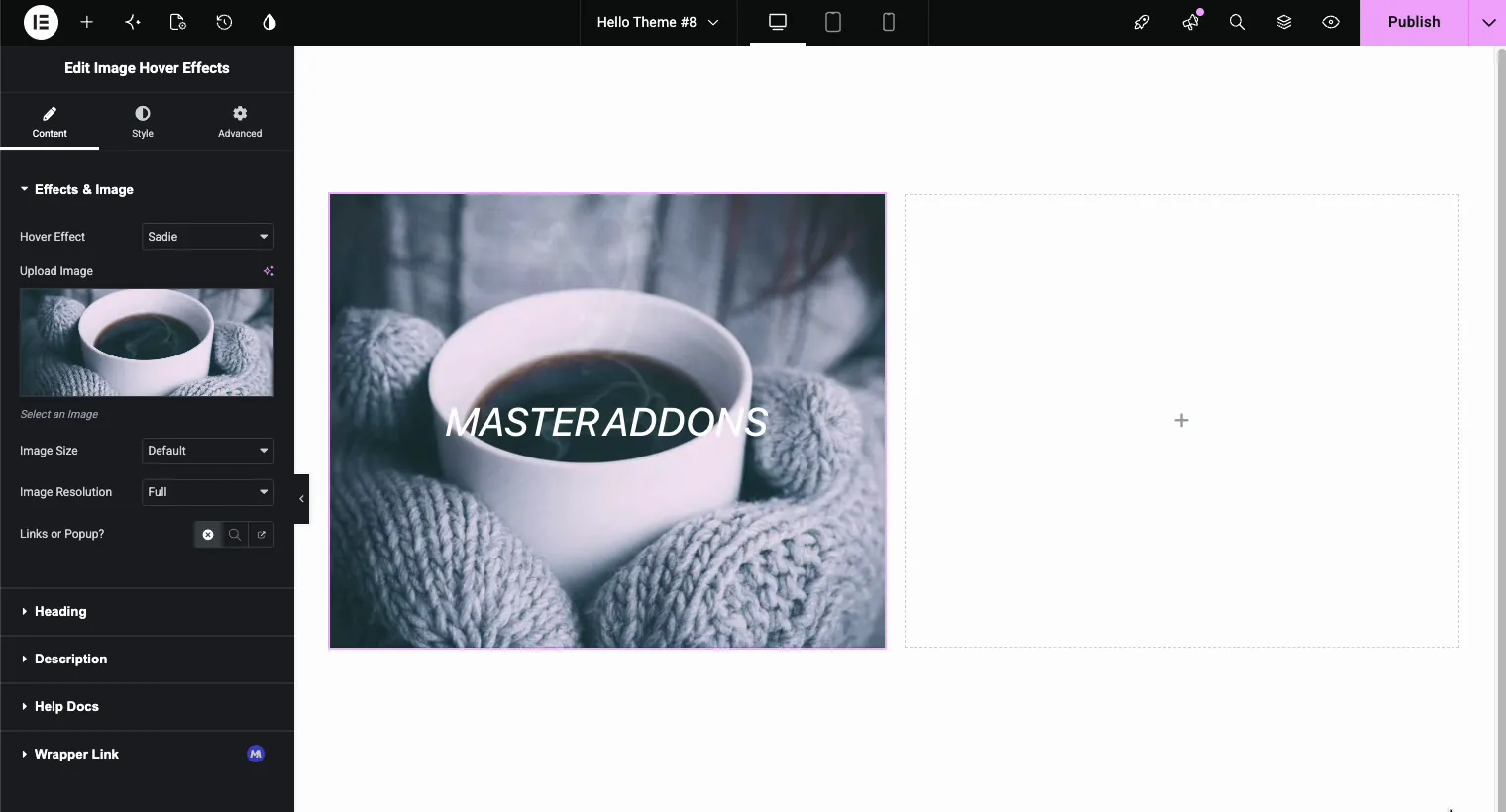
The Content tab opens with the Effects & Image section. Click Upload Image and pick something from your media library. Two settings sit right below it:
- Image Size controls the rendered dimensions. Default works for most layouts.
- Image Resolution picks which WordPress-generated size loads. “Full” gives the sharpest result. On a page with eight or ten of these tiles, drop to “Large” instead; nobody sees the difference at grid size and the page loads noticeably faster.
Step 4: Pick a Hover Effect
Here is the fun part. Open the Hover Effect dropdown and you get the full list of named effects: Lily, Sadie, Roxy, Bubba, Romeo, Layla, Honey, Oscar, Marley, Ruby, Milo, Dexter, Sarah, Zoe, Chico, Julia, Goliath, Hera, Winston, Selena, Terry, Phoebe, Apollo, Kira, Steve, Moses, Jazz, Ming, Lexi, and Duke. The first eight are free, and the rest carry a Pro label in the free plugin.
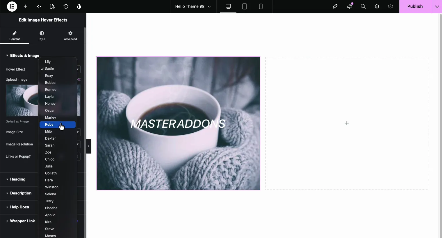
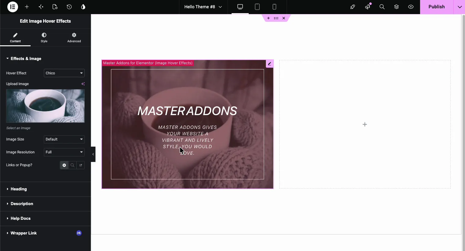
Each name is a different combination of overlay animation and text reveal. Sadie slides a gradient up from the bottom. Marley drops the title in with an underline. Chico zooms the image out slightly and frames the text with a thin border. The editor preview updates live, so click through a few and hover over the image to test. Here is Chico (a Pro effect) mid-hover:
A quick grouping to save you clicking through all of them:
- Subtle fades: Lily, Sadie, Layla, Zoe. Good default choices for portfolios.
- Directional slides: Honey, Oscar, Romeo, Sarah. Text pushes in from an edge.
- Zoom and scale: Chico, Bubba, Milo, Julia. The image moves, which draws the eye.
- Playful and bold: Marley, Ruby, Dexter, Goliath, Apollo. Stronger motion, best for creative sites.
Step 5: Add Your Heading
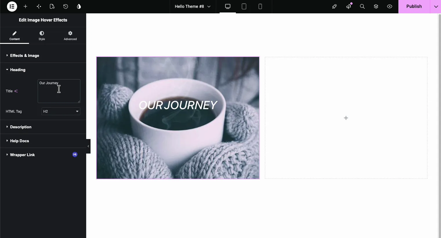
Open the Heading section. Type your title and pick an HTML Tag. This matters more than it looks: if the image sits in a grid of services, H3 usually fits your page hierarchy better than the default H2. Search engines read this tag like any other heading on the page.
Step 6: Write the Description
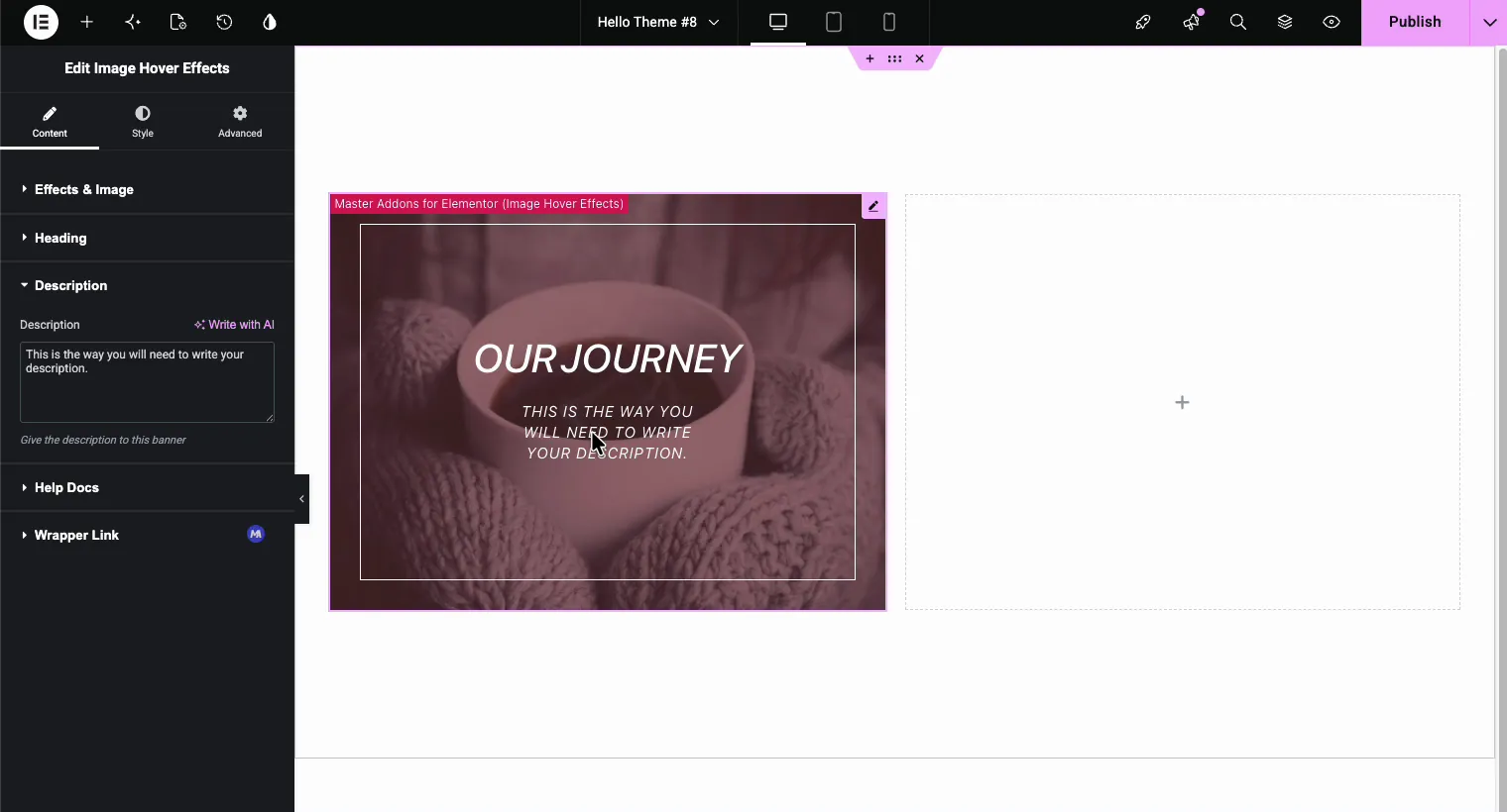
The Description section adds the smaller line that appears under the title on hover. Keep it to one or two short sentences. Long paragraphs get cut off on smaller images and defeat the point of a clean overlay.
Styling the Overlay: Color, Opacity, and Shape
Switch to the Style tab. The Image panel controls how the overlay looks:
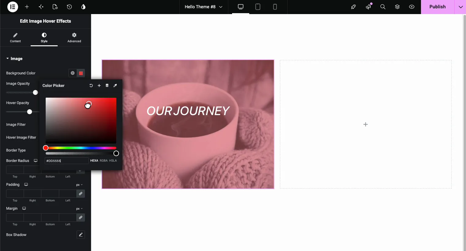
- Background Color tints the overlay that appears on hover. Pick a color from your brand palette; a HEXA value like #DD5555 with reduced alpha keeps the photo visible underneath.
- Image Opacity sets the resting state, and Hover Opacity sets how much the image dims when the overlay appears. A gap between the two (say 0.5 resting, 0.7 on hover) makes the reveal feel deliberate.
- Image Filter and Hover Image Filter add CSS filters like grayscale or blur for before/after moods.
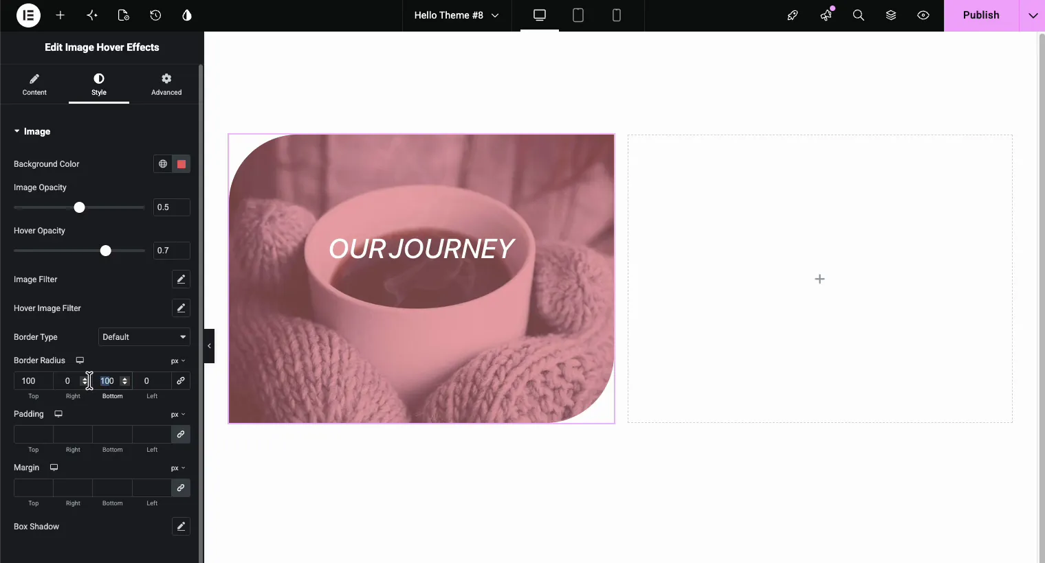
Below that, Border Radius reshapes the whole block. Matching values give you soft rounded corners; asymmetric values (100 top-left, 0 top-right, 100 bottom-right, 0 bottom-left) create the leaf shape you see on a lot of modern agency sites.
Typography for the Title and Description
Still in the Style tab, the Title and Description panels each get their own color, typography, and spacing controls. Font family, size, weight, transform, line height, and letter spacing are all here, plus a text shadow option for the description. If your image is light, switch the title color to a dark value so the text stays readable in both states.
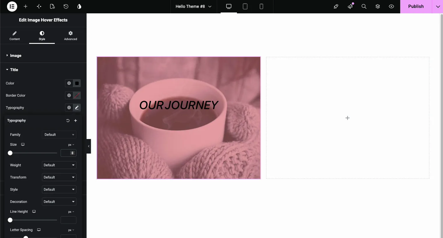
One readability rule worth keeping: aim for clear contrast between text and whatever sits behind it. If the photo is busy, lean on the overlay color and opacity from the previous step rather than fighting it with font weight alone.
Click Actions: Open a Popup or Link the Whole Image
Back in the Content tab, the Links or Popup? control decides what a click does. Three options sit behind the small icon toggle: none, popup, and external link.
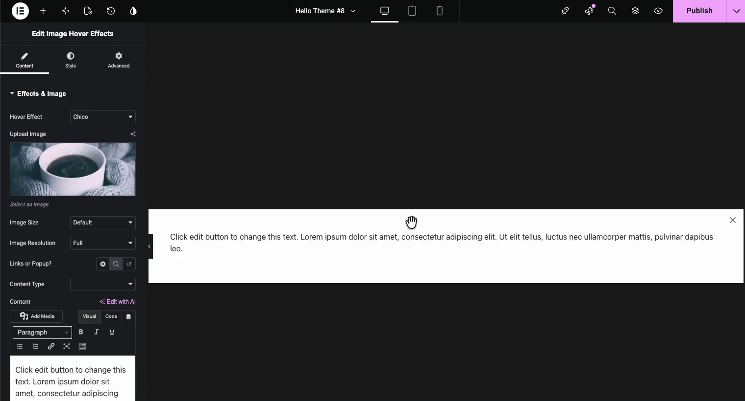
Popup (Pro) opens an overlay window with whatever content you choose. Pick a Content Type and either write content directly in the WYSIWYG editor or load a saved Elementor template. Portfolio grids use this constantly: each tile opens a case study without leaving the page.
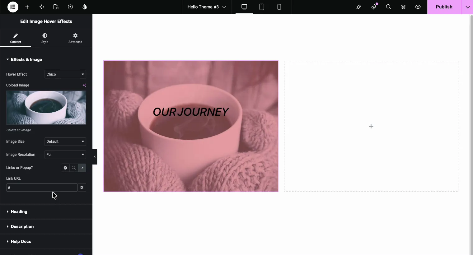
Link turns the entire image into a clickable card. Paste the URL into the Link URL field and the whole hover area points there, which beats a tiny text link for tap targets on mobile.
If you want more popup patterns beyond this widget (exit intent, scroll triggers, timed popups), see how to add a popup in Elementor for free.
The Finished Result
Hit preview and hover over your image. The overlay fades in, the title and description reveal with the effect you picked, and the cursor signals the click action:
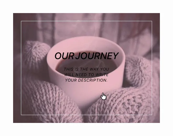
Total build time is about five minutes. And since every choice lives in the widget settings, you can swap the effect or recolor the overlay next month without rebuilding anything.
Design Tips That Keep Text Over Image Readable
- One effect per grid. If you build a 6-tile portfolio, give every tile the same hover effect. Mixed effects read as accidental.
- Contrast first. White text needs a dark overlay; dark text needs a light image or a light overlay tint.
- Short descriptions. Ten words or fewer. The overlay is a teaser, not a paragraph.
- Test on touch. On phones the first tap reveals the overlay and the second tap fires the click action, so make sure the revealed state looks complete on a small screen.
- Match your border radius to the rest of the page. A 100px leaf shape next to sharp-cornered cards looks off.
For broader motion design guidance, our guide to Elementor animation effects covers when hover, scroll, and entrance animations each earn their place, and the Master Addons animation features page shows what else the plugin can animate.
Other Master Addons Widgets for Image Effects
Image Hover Effects is the right tool for text reveals, but a few sibling widgets cover the neighboring use cases:
- Advanced Image adds 3D tilt, ribbons, and badges to a single image without overlay text.
- The Flipbox widget flips a card to a fully designed back side, better when you need buttons or icons in the revealed state.
- Image Hotspot pins interactive tooltip markers to specific points on one image, ideal for product callouts.
- The Image Carousel handles multi-image sliders when one hover tile is not enough.
- Image Comparison puts a draggable before/after slider on two versions of a shot.
Free vs Pro: What Do You Actually Need?
For a basic text over image section, the free plugin is enough. It includes the widget, eight hover effects (Lily, Sadie, Roxy, Bubba, Romeo, Layla, Honey and Oscar), the heading and description fields, image filters and link clicks. Pro unlocks the other 22 effects, popup content, and the padding and rounded corner controls. Master Addons Pro adds the wider premium widget set, template kits, and extras like the Widget Builder, so it is worth a look once you are building whole sites rather than one section. There is a 14-day money-back guarantee if you try it and change your mind.
Prefer to watch? Here’s a quick walkthrough in Elementor:
Frequently Asked Questions
How do I add text over an image in Elementor?
Install the free Master Addons plugin, drag the Image Hover Effects widget onto your page, upload an image, then type your title and description in the Content tab. Pick a hover effect from the dropdown and the text appears over the image on hover. No CSS required.
Can I show text over an image without hover in Elementor?
Yes. Set the image as a section or column background and place a Heading widget inside for a static caption. Use the Image Hover Effects widget instead when you want the text to reveal on hover with an animation and a click action.
Is the Image Hover Effects widget free?
Yes. It ships in the free Master Addons for Elementor plugin on WordPress.org with eight hover effects, link clicks and the main styling controls. The other 22 effects, popup content, and the padding and rounded corner controls need Pro.
Does text over image on hover work on mobile?
Yes. Touch devices treat the first tap as a hover, revealing the overlay text, and a second tap triggers the link or popup. The overlay scales with the image across Elementor’s responsive breakpoints.
Can the image open a popup when clicked?
Yes. Set Links or Popup to the popup option, then add content in the built-in editor or load a saved Elementor template. Clicking the image opens that content in an overlay window, which works well for portfolio case studies.
Wrapping Up
An Elementor text over image section takes five minutes with the right widget: drop in Image Hover Effects, upload your photo, pick an effect by name, and style the overlay to match your brand. Positioning and responsive behavior are already handled for you, and the free version covers the basics in this guide.
Grab the free plugin, browse the rest of the widget and extension library, and if you get stuck, the Image Hover Effects page walks through the setup.
Related reading: Elementor animation effects, the Elementor Flipbox widget, and adding popups in Elementor for free.
