

Key Takeaways
- “Advanced tabs” is not an Elementor feature. It is what addon widgets call their tabs widget, and it points at four things core Elementor skips.
- Those four: an image or icon on each title, style presets so the strip arrives designed, switching panels on hover, and pointing a panel at a saved template.
- In the Master Addons Tabs widget the first three need no Elementor Pro. Saved templates in a panel are a Pro feature.
- Core Elementor still wins on one thing an addon cannot match: a container in every panel, so forms and galleries go inside a tab.
- Decide by panel contents. Widgets inside means core. A designed strip over text means an addon.
Search for advanced tabs in Elementor and you will not find a widget by that name in the editor. The phrase comes from addon libraries, and it is a reasonable shorthand: the core Tabs widget is deliberately minimal, and “advanced” means the handful of things it leaves out.
This post goes through those features one at a time, what each is genuinely useful for, and where core Elementor is still the better choice.
Table of Contents
What core Elementor already does
Worth settling first, because some of what gets sold as advanced is already in the free plugin. The core Tabs widget gives you:
- Horizontal or vertical layout, through the Direction control
- An accordion switch below a breakpoint you choose
- Horizontal scrolling for a long title row
- Full Style tab control over colours, borders, spacing and typography
- A container in each panel, so any widget can go inside

If that list covers the job, an addon adds nothing you need.
Image and icon titles
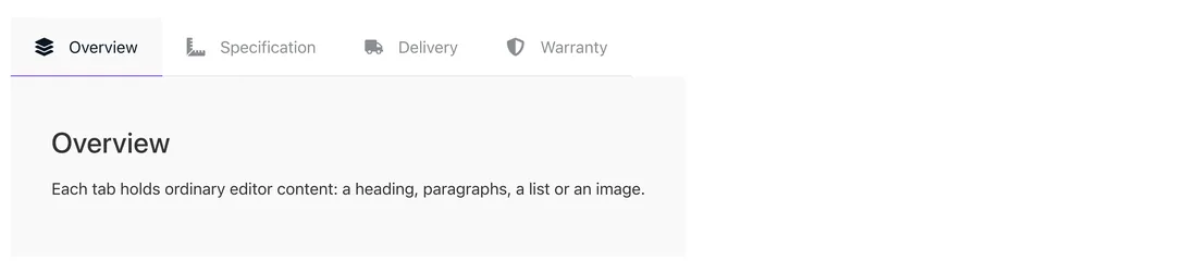
The core widget takes text plus an optional icon on a title. An addon widget’s Icon Type control takes None, Icon or Image, and the image option is the one core cannot match.
Where it earns its place:
- Brand or payment logos as the titles, where the logo is more recognisable than the word
- Product photos on a variant switcher
- Flags on a region selector
- Screenshots on a feature comparison, so the title previews the panel
Style presets
Core tabs drop in unstyled, which is flexible and means every border and colour is a decision. Presets invert that: pick a look, adjust from there.
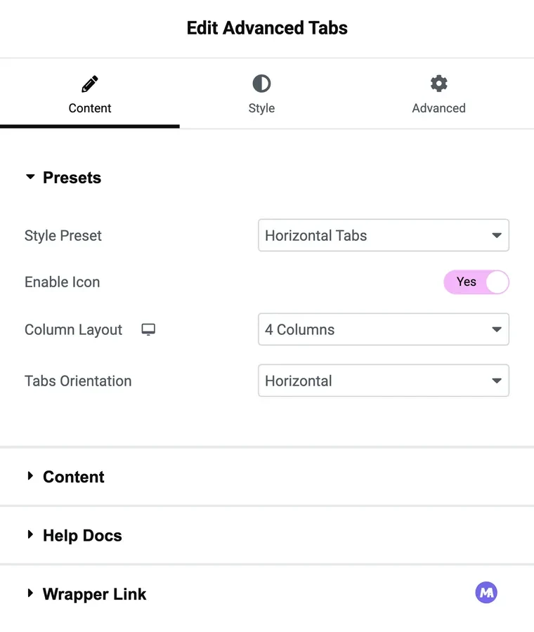
The Master Addons widget has three available without Elementor Pro:
- Horizontal Tabs, the standard strip across the top, with the active state already handled.
- Vertical Tabs, titles in a side column with the panel beside them, which the vertical tabs post covers in detail.
- Left Active Border, a vertical column with no box, where a coloured bar marks the active title. Good on documentation pages.
A fourth, Tabular, is a Pro option, as are the deeper styling sections: Column Layout, Icon & Tabs Style, Tabs & Content Style and Tabs Orientation.
Hover switching and default tab
Tab Effect takes Click or Hover. Hover suits a desktop feature display where moving the pointer along the strip previews each panel, and it is the wrong choice for anything with real phone traffic, since hover does not exist on a touch screen. Click is the safe default.
Set as Default gets less attention and is more useful. It decides which panel is open on load, independent of order, so the tab most visitors want can sit third in the strip and still be the one they land on. Core Elementor always opens the first tab.
Saved templates in a panel
Content Type decides what a panel holds. Content, the standard option, is the editor: text, headings, images, links. The Pro options point a panel at a Saved Widget, a Saved Section or a Page Template.
That is the reuse feature. Build a pricing table once, save it, and reference it from a tab on five pages. Edit the saved section and all five update. It is also the only way to get a form or a gallery into an addon tab, since the panel itself does not take widgets.
Core Elementor solves the same problem differently: the panel is a container, so you drop the form straight in. It has no equivalent of referencing one saved block from many pages.
Side by side
| Feature | Core Tabs | Master Addons Tabs |
|---|---|---|
| Horizontal and vertical layout | Yes, Direction control | Yes, style presets |
| Style presets | No | Three, plus Tabular on Pro |
| Icon on a title | Yes | Yes |
| Image on a title | No | Yes |
| Switch on hover | No | Yes, Tab Effect |
| Choose which tab opens first | No, always the first | Yes, Set as Default |
| Widgets inside a panel | Yes, container in each panel | No, saved template on Pro instead |
| Accordion below a breakpoint | Yes | No, titles stack into a column |
| Horizontal scroll for long title rows | Yes | No |
| Reuse one saved block across pages | No | Yes, on Pro |
Frequently asked questions
Is there an Advanced Tabs widget in Elementor?
No. The core widget is called Tabs. “Advanced tabs” is addon naming for a tabs widget with extra controls.
Do I need Elementor Pro for advanced tabs?
Not for the style presets, image titles, hover switching or default tab. Pointing a panel at a saved template is a Pro feature.
Can an addon tab hold a contact form?
Only through a saved template, which is a Pro option. For a form in a panel with no extra steps, use the core widget, where each panel is a container.
Which widget should I use for a product page?
Core Tabs, if specification, reviews and shipping panels need widgets inside. An addon, if the strip carries product photos or payment logos as titles.
Can I use both widgets on one site?
Yes. They are separate widgets and do not conflict, so a product page can use core tabs while a landing page uses the addon.
Final thoughts
“Advanced” comes down to the strip: image titles, a preset to start from, hover switching, and a chosen default tab. Those are real gaps in core Elementor and an addon fills them without Pro. No addon replaces a container in the panel, so interactive content inside a tab still points at the core widget. Most sites end up using both.
Related reading
