

Key Takeaways
- Elementor has two tab widgets. The original one has carried a deprecation notice since version 3.8, and the Nested Tabs widget replaced it.
- Nested Tabs puts a container in every panel, so a form, a gallery or a pricing table can live inside a tab.
- Nested Tabs also switches to a vertical accordion layout below a breakpoint you choose, which is the behaviour most people want on phones.
- An addon widget such as the Master Addons Tabs widget is the route when the tab strip itself is the design problem: image titles, style presets or switching on hover.
- Pick by what goes inside the panel. Widgets inside means core. A styled tab strip over text means an addon.
Tabs do one job: keep a long page short. Specification, delivery and warranty do not all need to be on screen at once, and a visitor who wants one of them should not scroll past the other two.
Elementor gives you two widgets for this and addons give you more, which is why the panel search for “tabs” is confusing. This guide covers all three routes, what each one can hold, and how they behave on a phone.
Table of Contents
Which tabs widget you actually have
Open the widget panel and search for tabs. On a current Elementor install you get the Tabs widget, and what you drag in is the nested version. The old widget is still in the code for pages that already use it, and it shows a notice in the panel when you edit one: any new tabs widget you drag in will be the new one with nested capabilities. That notice has been there since Elementor 3.8.
So in practice there are three things you might be using, and they are not the same.
| Widget | What goes in a panel | Where it comes from |
|---|---|---|
| Tabs (nested) | A container, so any widgets | Elementor, free |
| Tabs (old) | Editor content only | Elementor, deprecated since 3.8 |
| Addon tabs widget | Editor content, or a saved template with Pro | Master Addons and others |
Route 1: the Nested Tabs widget
This is the default and the right starting point. Drag Tabs onto the page and you get three tabs, each holding an empty container.
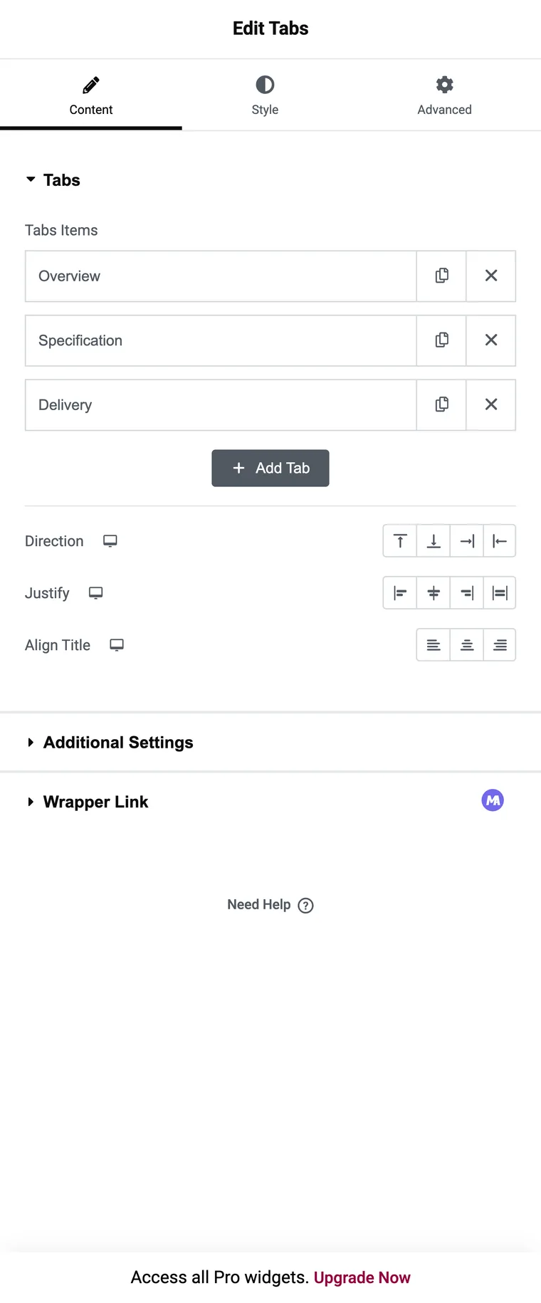
- Drag the Tabs widget onto the page.
- Rename each item in the Tabs repeater. The title is all the repeater holds, because the content lives in the container.
- Click a tab on the canvas, then build inside its container as you would anywhere else.
- In Layout, use Direction to move the strip: Top, Bottom, Start or End, where Start and End put the titles in a side column.
- In Additional Settings, set Horizontal Scroll if the titles will not fit, and set the Breakpoint where the strip should become an accordion.

The container is the whole point. A contact form, a gallery, a pricing table or a loop grid all work inside a tab, and nothing else on this list can do that. The trade is that the tab strip itself is fairly plain: titles with an optional icon, and no preset to start from.
Route 2: an addon tabs widget
Addon widgets exist for the other half of the problem, where the strip is the design. The Master Addons widget builds each tab from a repeater row that carries its own fields.
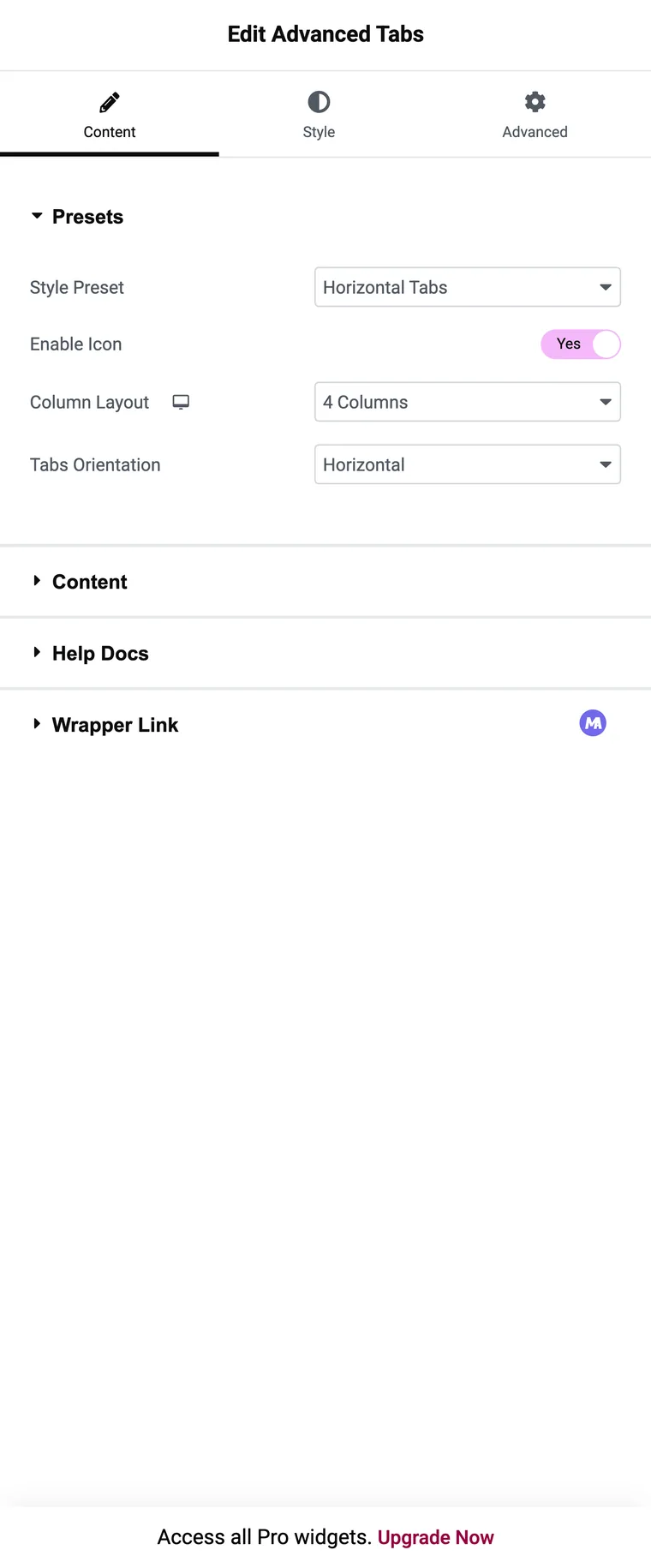
The build is:
- Drag the widget in and pick a Style Preset.
- Add one repeater item per tab, with a Tab Title.
- Set Icon Type to None, Icon or Image, then choose the icon or upload the image.
- Write the panel content in the editor, or on Pro point Content Type at a saved section, widget or page template.
- Set Tab Effect to Click or Hover, and switch Set as Default on the tab that should open first.
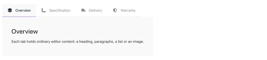
What you give up is the container. Panels take editor content, so a form inside a tab means either the Pro route with a saved template, or the core widget.
Route 3: the old Tabs widget
If you are editing a page built a few years ago, you may be looking at the original widget: a Tabs Items repeater with a title and a content field, plus a Position control for horizontal or vertical. It still works, and Elementor still ships it so old pages do not break.
There is no reason to start a new page with it. If you are already in there, the question is whether rebuilding the block as Nested Tabs is worth the few minutes, and usually it is, because you get the accordion breakpoint and the container.
Which route fits the job
| What you need | Use |
|---|---|
| A form, gallery or pricing table inside a tab | Nested Tabs |
| Tabs that become an accordion on phones | Nested Tabs |
| An image on each tab title | Addon widget |
| A designed strip without styling from scratch | Addon widget, via the presets |
| Switching panels on hover | Addon widget |
| The same saved template reused in several tab blocks | Addon widget on Pro |
| Editing a page built before Elementor 3.8 | The old widget, or rebuild it |
Five things worth getting right
- Keep titles to one or two words. Long titles wrap, and a wrapped strip stops reading as a strip.
- Four tabs is a comfortable maximum on desktop, and three is better when the titles carry icons.
- Decide what opens first. The core widget always opens tab one, so put the panel most people want there.
- Anything a visitor must read belongs on the page rather than behind a click in tab four.
- Check the phone view before you publish, because the two routes behave differently there.
Frequently asked questions
Does Elementor have a tabs widget in the free version?
Yes. The Tabs widget is in the free plugin, and the current version is the nested one, which puts a container inside each panel.
What happened to the old Tabs widget?
It is deprecated. Since Elementor 3.8 the panel shows a notice when you edit one, and any new tabs widget you drag in is the nested version.
Can I put a form or a gallery inside a tab?
With Nested Tabs, yes, because each panel is a container. With an addon widget the panel takes editor content, so the equivalent is a saved template on Pro.
Can a tab title use an image instead of text?
Not in the core widget. Addon widgets with an Icon Type control can use an icon or an image on the title.
How many tabs is too many?
Past four or five, the strip wraps on laptops and gets unreadable on phones. At that point an accordion is usually the better layout.
Final thoughts
What sits inside the panel decides this. Widgets in a panel means Nested Tabs, every time. A strip that has to look like something specific, with image titles or hover switching, means an addon. Both are a ten minute build once you know which one you are in.
Related reading
