Elementor FlipBox Widget: Create Interactive Hover Cards (Free Tutorial)

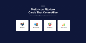
Elementor FlipBox widget creating interactive hover cards

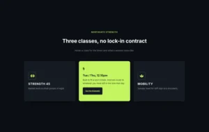
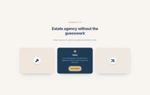
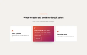
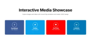
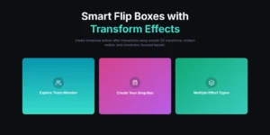
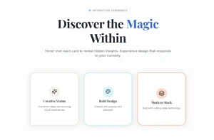
The Elementor FlipBox widget turns a static info card into something visitors actually want to hover over. The front shows an icon or image with a short headline. On hover, the back flips into view with a description and a button. No code required.

This tutorial walks you through the FlipBox widget that ships with Master Addons for Elementor, a free plugin used on 40,000+ websites. You get 4 design variations, 20+ flip animations, full typography control, and a proper action button on the back side. Most of it works in the free version.

By the end, you will have a working flipbox section on your WordPress page, a sense of which animation fits which job, and a clearer idea of when a flipbox is the right call (and when it is overkill).

What Is a FlipBox Widget in Elementor?

A flipbox is a two-sided card. Visitors see one face first, and on hover (or tap, on mobile) the card rotates to show a second face with more detail. Think business card that spins when you wave your hand over it.

Elementor does not ship a flipbox out of the box, so you need an addon. The Master Addons FlipBox widget gives you the front face, the back face, and a button on the back, all editable from the regular Elementor panel. No shortcodes, no template code.

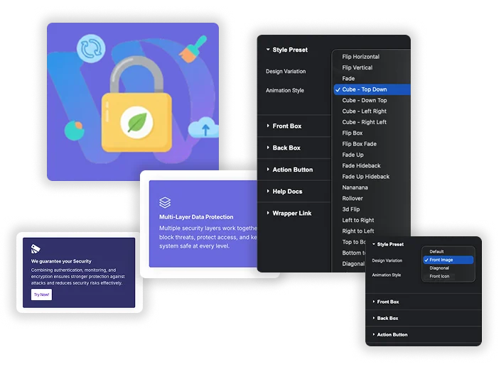
Master Addons FlipBox widget preview showing front and back card faces inside Elementor

The widget handles three jobs: the front content (icon, image, or heading), the back content (description and button), and the flip animation between them. Everything runs through visual controls.

Why Use a FlipBox Instead of a Static Info Card?

A regular info card shows everything at once. That works, but it chews up vertical space and visitors scan right past it. A flip box in Elementor does a few things a static card cannot:

  • Saves vertical space. The back side carries your longer description, so the front stays short.
  • Earns attention. Movement draws the eye. Heat maps consistently show interactive elements get more hover time than static ones.
  • Cuts reading load. Visitors only see the detailed copy if they want to. Handy for feature grids with six or eight items.
  • Drives clicks. The back side has a button, so the interaction ends with a clear next step.

If your section has a lot of copy, a flipbox helps. If it is one line of text with a photo, a static card is fine. Use flipboxes where the payoff is either a longer explanation or a direct CTA.

How to Add the FlipBox Widget to Elementor (Step-by-Step)

Full setup below. This assumes Elementor is already installed. If not, grab the free version from the WordPress plugin directory first.

Step 1: Install Master Addons for Elementor

In your WordPress admin, go to Plugins → Add New and search for “Master Addons for Elementor.” Install, activate, done. The installing Master Addons doc has the longer version if something breaks.

Step 2: Drag the FlipBox Widget Into Your Layout

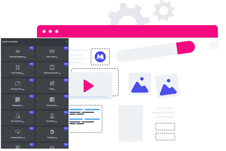
Open the page in Elementor. In the widget panel on the left, type “FlipBox” in the search box. You will see it with the Master Addons icon. Drag it into any column.

Animated demo of the Master Addons FlipBox widget flipping from front to back inside Elementor

Elementor loads a default flipbox the moment you drop it in. Hover over it in the preview to see the flip in action before you change anything. Worth doing because it gives you a sense of the default animation speed.

Step 3: Configure the Front Box

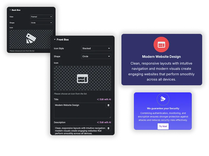
The Content tab has three sections: Front Box, Back Box, and Action Button. Start with the front, since that is what visitors see first.

Inside Front Box you can set:

  • Icon: pick from the Elementor icon library or upload an SVG. Master Addons also ships with 8 premium icon libraries if Font Awesome is not enough.
  • Title: the headline on the front. Keep it to 3–5 words so it fits on one line.
  • Title HTML Tag: H2, H3, H4, div, span. Use H3 or H4 if the flipbox sits inside a section that already has an H2 (otherwise you break your heading hierarchy and SEO tools will flag it).
  • Text / Subtitle: a short supporting line. One sentence max.

Step 4: Configure the Back Box

The Back Box uses the same fields plus a description area. This is where the real information lives, so give yourself room to write.

  • Icon or image: optional. Plenty of designers skip the back icon and let the description breathe.
  • Title: often the same as the front, but it can differ. A question on the front with the answer on the back works well for feature callouts.
  • Description: 2–3 sentences. Anything longer and the card feels cramped, especially on tablet.

Step 5: Add an Action Button (Optional but Recommended)

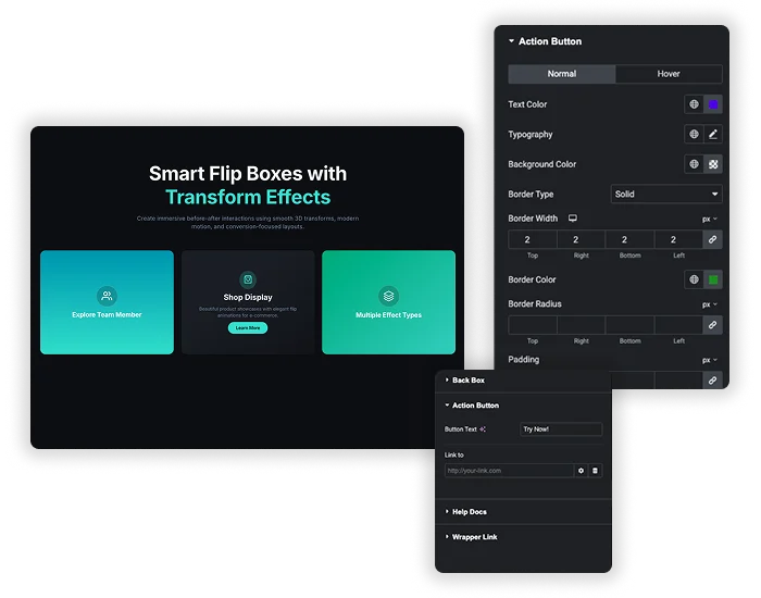
The button only appears on the back side. Scroll to Action Button and fill in:

  • Button Text: “Learn More,” “Get Started,” “See Pricing.” Match the copy to what the next page actually offers.
  • Link URL: internal or external. Toggle “Open in new tab” and “Add nofollow” if needed.

Skip the button if the flipbox is purely informational (like a feature overview grid). Add it if the card sits in a conversion-focused section where you want a next click.

4 FlipBox Design Variations Explained

The Master Addons FlipBox widget has four built-in designs. Each one changes how the front face is laid out. The back face stays the same across all four.

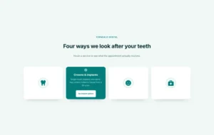
  1. Front Icon (default). Centered icon, title, and subtitle. Fits feature grids, service blocks, and value propositions.
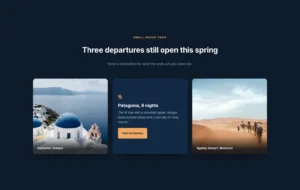
  2. Front Image. Replaces the icon with a full image. Good for team members, portfolio tiles, and product cards.
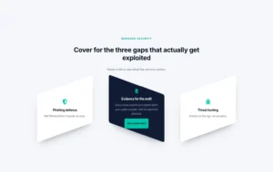
  3. Diagonal. Splits the front at an angle. Modern look. Use it sparingly, one flipbox row per page max, since the angle fights with everything around it if you repeat it too often.
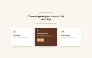
  4. Centered. Minimalist layout with everything stacked vertically. Reads cleanly on dark backgrounds.

Pick a variation based on what the front needs to say. If the icon carries the message, stick with Front Icon. If a photo does the job better, switch to Front Image. Not much more to it.

20+ Flip Animations You Can Use

Under the General section in the Style tab, you get a dropdown with 20+ flip animations. The animation controls how the card reveals the back face.

The common ones:

  • Flip (Horizontal / Vertical): the classic 3D card flip. Safe default for most use cases.
  • Slide (Left / Right / Up / Down): the back face pushes the front out. Snappy, works well on mobile.
  • Zoom In / Zoom Out: a scale-based reveal. Useful when you want the card to feel like it is popping forward.
  • Fade: the simplest option. Good pick when other elements on the page are already animated.
  • Push (Left / Right / Up / Down): back slides in while the front slides out in sequence.
  • 3D Flip variants: add perspective for a more dramatic flip. The 3D Elementor FlipBox guide has a deeper walkthrough of those settings.

Practical tip: Stick to one animation style per page. If your flipbox grid has six cards and each one flips differently, the section feels chaotic. Pick one, commit to it. Mix styles only when you want two clearly separate sections to feel different from each other.

Want to see what each one looks like before you commit? The Elementor animation effects guide has side-by-side previews of the most common styles.

Styling the Front, Back & Button

Switch to the Style tab and you get four collapsible panels: General, Front Box, Back Box, and Action Button. Each one has its own color, typography, spacing, and border controls.

Animated walkthrough of the Elementor FlipBox widget style panel covering front, back, and button customization

What matters most in each panel:

General

Set the overall height of the flipbox (200px is a sensible minimum, 350px looks right for feature grids), the border radius, and the animation speed. Keep animation duration between 400ms and 700ms. Anything faster feels jumpy. Anything slower feels sluggish, and visitors will move their cursor away before the flip finishes.

Front Box

Background color or gradient, icon color, icon size, title typography, subtitle typography, and internal padding. Match the background to your brand. Most designers use a soft tint (light gray, pale blue) on the front and save the strong color for the back.

Back Box

Same controls as the front, but this is where your brand color usually lives. Make the back visually distinct from the front so the flip feels like a real reveal, not a subtle tint shift. A white-to-purple flip reads better than a light-gray-to-slightly-lighter-gray flip.

Action Button

Text color, background, hover color, border, padding, and typography. Use the same button style you use elsewhere on the page so it does not feel out of place. If your primary CTA buttons on the site are solid purple with white text, make the flipbox button match those.

6 Practical Use Cases for the Elementor FlipBox Widget

Real-world places the widget earns its keep:

  1. Service grids. Front: service icon and name. Back: one-sentence description and a “Learn More” button linking to the service page.
  2. Feature showcases. Front: feature icon. Back: two-line explanation and a link to the full feature page.
  3. Team member cards. Front: photo and name. Back: bio and a link to their author page or LinkedIn.
  4. Pricing highlights. Front: plan name. Back: top three features and a button to the full pricing table.
  5. FAQ-style reveals. Front: question. Back: short answer. Fits landing pages where a full accordion feels too heavy.
  6. Portfolio thumbnails. Front: project image. Back: client name, project type, and a “View Case Study” button.

If you want something more visual for portfolio work, the Image Hotspot widget is a better fit when you need to highlight specific areas inside a single image instead of flipping whole cards.

Design Tips That Actually Convert

Things worth knowing from watching real sites use the widget:

  • Keep the front simple. Icon, 3-word title, 1-line subtitle. That is it. Visitors scan the front, they do not read it.
  • Put the real value on the back. Someone hovered because something on the front caught them. Reward the hover with something useful, not more marketing fluff.
  • Match heights across a row. One flipbox at 280px next to one at 320px makes the row look broken. Set a fixed height in the General section.
  • Test on mobile. On touch devices, the first tap flips the card and the second tap follows the button link. Make sure that two-step flow works with a real thumb, not just a mouse.
  • Do not overuse them. More than 6–8 flipboxes on a single page starts to feel gimmicky. One or two sections per page is the sweet spot.

Accessibility note: Flipboxes rely on hover, which screen readers and keyboard users cannot trigger the same way a mouse user can. Make sure the back-side content is also available somewhere else on the page (a collapsible section, a dedicated page, an H2 nearby) or add a visible focus state so keyboard users can flip the card too. This is the single most common thing WordPress designers forget.

Free vs Pro: What You Get

The Master Addons FlipBox widget is in the free version. You can download the plugin from the WordPress directory and use it on unlimited sites. Pro unlocks more widgets and extensions around it, not the flipbox itself.

FeatureFreePro
FlipBox widget (all 4 designs)YesYes
All 20+ flip animationsYesYes
Icon librariesFont Awesome8 premium libraries
3D transforms & advanced effectsBasicFull
Template Kits & Widget BuilderNoYes
Premium supportCommunityPriority

If you only need the flipbox, free is enough. If you want the full 76+ widget library, theme builder, popup builder, and template kits, take a look at Master Addons Pro pricing.

Ready to Build Your First FlipBox?

Join 40,000+ web creators who use Master Addons to ship Elementor sites faster. Free forever. Upgrade when you actually need more.

Frequently Asked Questions

What is a flipbox in Elementor?

A flipbox is a two-sided card that flips on hover to show different content on each side. The front usually has an icon and title, the back has a description and button. Elementor does not include a flipbox by default, so you need an addon like Master Addons.

Is the Elementor FlipBox widget free?

Yes. The FlipBox widget is part of the free Master Addons for Elementor plugin on WordPress.org. All 4 design variations and 20+ flip animations are included in the free version, with no usage limits or site caps.

How do I add a flip effect in Elementor?

Install Master Addons, drag the FlipBox widget onto your page, and fill in your front and back content. Pick a flip animation from the General section in the Style tab. That is the whole process. No CSS, no custom code.

How do I create a 3D flipbox in Elementor?

Pick one of the 3D animation options from the animation dropdown in the Style tab. The 3D variants add perspective so the card rotates on an axis instead of fading. The 3D Elementor FlipBox guide has step-by-step settings for the cleaner 3D effects.

Does the FlipBox widget work on mobile?

Yes. On touch devices the first tap flips the card and the second tap follows the button link. The widget is responsive, so you can set different column counts for tablet and mobile from the standard Elementor responsive controls.

What is the best flipbox widget for Elementor?

Master Addons FlipBox is a solid free option with 4 designs, 20+ animations, and full style control from the Elementor panel. For a wider comparison across all major Elementor addon plugins, see our 100 best Elementor addons roundup.

Wrapping Up

The Elementor FlipBox widget is one of those small additions that punches above its weight. A clean flipbox row can replace a whole block of text, pull in more hover time, and still load fast. The trick is restraint: keep the front simple, put the value on the back, and pick one animation style per section.

For deeper settings coverage, the official FlipBox documentation walks through every option. And if you want more interactive widgets to pair with it, the Elementor icon libraries guide is a good next read.

Related reading: Master Addons Animation features | Elementor marketing widgets | Elementor Pricing Table widget

Picture of Roy
Roy
I'm Roy, part of the Master Addons for Elementor team. I write the tutorials, record the videos, and keep the documentation current, so you always know how to use every feature. I also handle support, so if you hit a snag, I'm the person who helps you fix it. Real answers, from someone who uses these tools every day.
Master Addons mid-year reset promotion banner offering 40% off

Still On The Fence? We Get It.

Every Master Addons Pro license comes with a 14-day no-questions refund, lifetime updates, and priority support. Try it risk-free this Spring – 40% OFF with “RESET40″ coupon.

No thanks, I'll pay full price later