


Key Takeaways
- CSS image hover effects in Elementor take two steps: add a class name to the Image widget under Advanced, CSS Classes, then paste a CSS rule that targets that class.
- The five CSS image hover effects in this guide are a zoom inside the frame, grayscale to colour, a lift with a shadow, a dark overlay and a caption that slides up.
- Elementor Pro has a Custom CSS box in every widget’s Advanced tab, and without Pro the same CSS can go in Appearance, Customize, Additional CSS.
- Elementor’s Image widget prints its caption as a figcaption inside a figure, which is what makes a sliding caption possible with CSS alone.
- Grayscale to colour and opacity changes need no CSS in Elementor, because the Image widget’s Style tab already has CSS Filters and Opacity on a Hover tab.
CSS image hover effects work in Elementor the same way they work anywhere: a class on the element and a rule with :hover. The only Elementor-specific parts are where you type the class and where you paste the CSS. Below are five effects you can copy, each tested on Elementor 4.3 with the standard Image widget.
If you would rather not touch code, the last section shows the no-code route with the Image Hover Effects widget.
Table of Contents
How CSS hover effects work in Elementor
Every snippet below follows the same pattern. You give the Image widget a class, and the CSS changes the image inside that widget when the pointer is over it.
- Select the Image widget in Elementor.
- Open the Advanced tab and find CSS Classes.
- Type the class name without a dot, for example
hover-zoom. - Add the matching CSS to your site once. Any image with that class then gets the effect.
The class lands on the widget’s outer element and the picture is an img inside it, so the rules target .hover-zoom img.
Where to add the CSS
You have four places to paste CSS, depending on what is installed.
| Place | Needs | Applies to |
|---|---|---|
| Widget, Advanced, Custom CSS | Elementor Pro | That widget |
| Site Settings, Custom CSS | Elementor Pro | The whole site |
| Appearance, Customize, Additional CSS | WordPress only | The whole site |
| Custom CSS extension | Master Addons | The element you add it to |
For classes you plan to reuse, a site-wide place is the better home. The Custom CSS extension page explains how the Master Addons option works.
5 CSS image hover effects to copy
Each effect has a class name, the CSS and a screenshot of the result before and during hover.
1. Zoom inside the frame
The image scales up while its box stays the same size. Class name: hover-zoom.
.hover-zoom { overflow: hidden; border-radius: 10px; }
.hover-zoom img { transition: transform 0.4s ease; display: block; }
.hover-zoom:hover img { transform: scale(1.08); }
2. Grayscale to colour
The image sits in black and white and turns to full colour on hover. Class name: hover-color.
.hover-color img { filter: grayscale(100%); transition: filter 0.4s ease; }
.hover-color:hover img { filter: none; }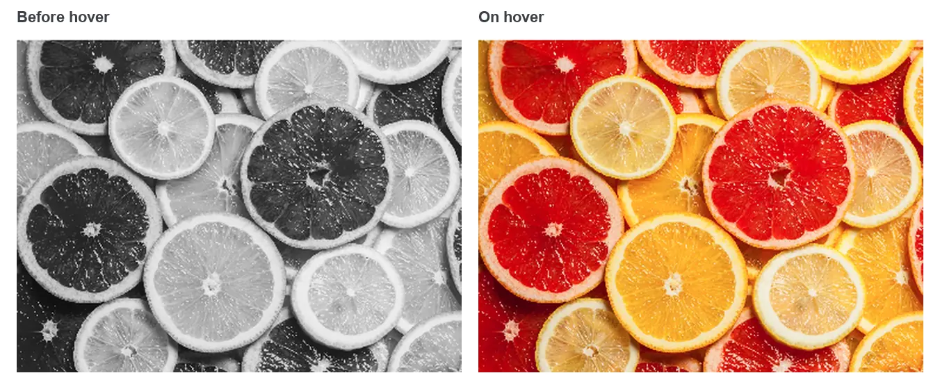
3. Lift with a shadow
The image moves up a few pixels and gains a soft shadow, like a card being picked up. Class name: hover-lift.
.hover-lift img { transition: transform 0.3s ease, box-shadow 0.3s ease; }
.hover-lift:hover img { transform: translateY(-6px); box-shadow: 0 18px 30px rgba(0, 0, 0, 0.18); }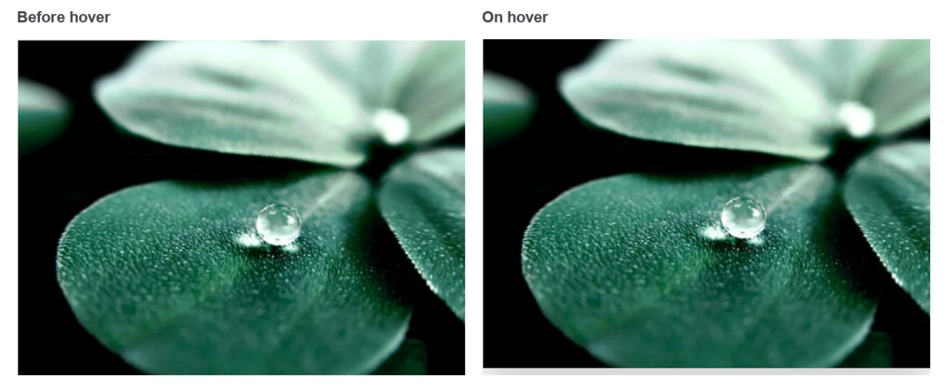
4. Dark overlay
A dark layer fades in over the image. It is built with a pseudo-element, so no extra markup is needed. Class name: hover-dim.
.hover-dim { position: relative; }
.hover-dim::after { content: ""; position: absolute; inset: 0; background: rgba(0, 0, 0, 0.45); opacity: 0; transition: opacity 0.3s ease; pointer-events: none; }
.hover-dim:hover::after { opacity: 1; }
5. Caption that slides up
The image’s own caption hides below the bottom edge and slides up on hover. In the Image widget, set Caption to Custom Caption and type the text first. Class name: hover-caption.
.hover-caption figure { position: relative; overflow: hidden; margin: 0; }
.hover-caption figcaption { position: absolute; left: 0; right: 0; bottom: 0; margin: 0; padding: 14px 18px; background: rgba(0, 0, 0, 0.6); color: #fff; transform: translateY(100%); transition: transform 0.35s ease; }
.hover-caption:hover figcaption { transform: translateY(0); }
This one depends on the caption being there. Without a caption, Elementor does not print the figure and figcaption, and the rule has nothing to move.
CSS or the built-in hover settings?
Check Elementor’s own controls before you write CSS, because two of these five effects exist as settings. The Image widget’s Style tab has a Hover tab with Opacity, CSS Filters and Hover Animation.
| Effect | Built into Elementor? | Why use CSS |
|---|---|---|
| Grayscale to colour | Yes, CSS Filters, Saturation | One class for many images |
| Zoom | Partly. Grow enlarges past the frame. | To keep the zoom inside the frame |
| Lift with shadow | No | Elementor has no setting for it |
| Dark overlay | No, on the Image widget | Needed unless you wrap the image in a container |
| Sliding caption | No | Needed unless you use a hover widget |
The built-in settings are covered step by step in how to add image hover effects in Elementor. The general technique is documented on MDN’s page for the :hover pseudo-class.
The no-code route
CSS suits simple effects on the picture itself. Once you want a title and a description that animate over the image, the CSS grows quickly, and you have to maintain it on every design change.
The Image Hover Effects widget in Master Addons replaces that with a dropdown. It has 30 effects, a title and description for each image, and Style tab controls for colours and type.

See them live. The Image Hover Effects widget page has eight cards to hover and a table of all 30 effects.
Frequently asked questions
How do I add CSS hover effects to an image in Elementor?
Select the Image widget, open the Advanced tab and type a class name in CSS Classes. Then add a CSS rule for that class with :hover, for example .hover-zoom:hover img { transform: scale(1.08); }. Paste the CSS in Elementor Pro’s Custom CSS or in Appearance, Customize, Additional CSS.
Where do I put custom CSS in Elementor without Pro?
Go to Appearance, Customize, Additional CSS in the WordPress dashboard and paste it there. The CSS loads on every page, so any widget with the matching class picks it up. A custom CSS extension from an addon is another option.
Why is my CSS hover effect not working in Elementor?
The usual causes are a dot typed in the CSS Classes field, a class name that does not match the CSS, or a cached stylesheet. Type the class without a dot, compare the spelling, then clear your cache plugin and Elementor’s files under Tools.
Can I make an image zoom on hover without it overflowing?
Yes. Set overflow to hidden on the widget that carries the class and scale the img inside it. The widget keeps its size and clips the enlarged image. The first snippet in this guide does this.
Do CSS hover effects work on mobile?
Phones have no hover state, so the effect either never shows or shows after a tap and stays until the visitor taps elsewhere. Treat hover effects as decoration on small screens and keep any important text visible without them.
Final thoughts
CSS image hover effects in Elementor need a class on the Image widget and a short rule. The five here cover zoom, colour, lift, overlay and a sliding caption, and each can be adjusted by changing one or two values.
When the effect you want includes text over the image, the Image Hover Effects widget gets you there without maintaining CSS.
Related reading
