

Key Takeaways
- All 20 Elementor flip box examples here are live demo pages built with the Master Addons Flipbox widget, one widget per card. Each screenshot caption links to its demo, so you can hover the real thing.
- Three settings decide how a Flipbox card looks and moves: Design Variation in the Style Preset section, Animation Style next to it, and Flip Box Height under Style, General.
- The Flipbox widget has 22 animation styles; Flip Horizontal, Flip Vertical, Fade, Flip Box, Flip Box Fade and Fade Up come with the widget, and the other 16, including the Cube, Rollover and 3D Flip animations, need Master Addons Pro.
- The Default and Front Icon design variations come with the Flipbox widget, while Front Image and Diagonal need Master Addons Pro.
- A Flipbox card flips on hover on desktop and on the first tap on a touch screen; the widget has no click trigger, and the back face button is its only link unless the Wrapper Link extension is added.
- Elementor without Pro has no flip box widget at all, and the Elementor Pro Flip Box has six effects. On Elementor without Pro, the Flipbox widget is how you get a flip card.
These Elementor flip box examples are 20 live demos built with the Master Addons Flipbox widget, and each one comes with the settings that produced it. A flip box is a card with two faces: an icon or image, a title and a line of text on the front, then a longer description and a button on the back once the visitor hovers. The widget runs on Elementor without Pro, with 6 animations included and 22 with Master Addons Pro.
The demos are grouped by animation: Flip Vertical, Flip Horizontal, Fade, Flip Box and Cube, 3D Flip and slides, and then the Rollover, Diagonal and Fade In Out set. For each one you get a screenshot, a note on where the design fits, and its Design Variation, Animation Style, card count and one styling tip, which is enough to rebuild it from the panel.
Table of Contents
How to read these examples
Every card in every demo below is one Flipbox widget. A row of three cards is three widgets side by side in a container, a six-card grid is six widgets in two rows, and the wide rows in the chapter and runbook demos are widgets stretched to full width. Nothing is hand coded, and nothing in the demos depends on a theme.
Three settings do most of the work. Design Variation, in the Style Preset section of the Content tab, sets the front layout: Default shows an icon, a title and text; Front Icon shows only the icon on the front and moves the title and text to the back; Front Image swaps the icon for a photo; Diagonal cuts the card at an angle. Default and Front Icon come with the widget, and Front Image and Diagonal need Master Addons Pro. Animation Style, in the same section, sets how the card turns, and 16 of its 22 options carry a (Pro) label in the dropdown. Flip Box Height, under Style, General, fixes the size of both faces so the card does not resize mid turn. The Flipbox documentation lists every control in order.
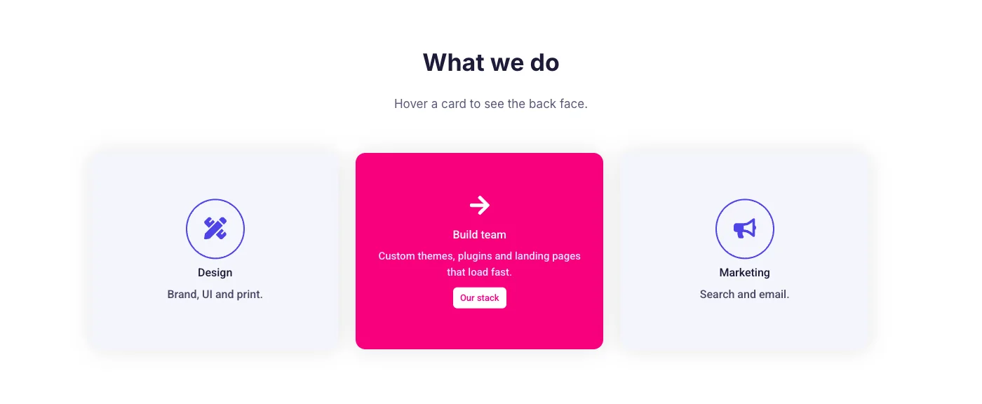
The flip is a CSS hover. Desktop visitors hover, and touch visitors tap once to flip and tap the back button to follow its link. There is no click option, so the front face has to carry anything the visitor must not miss. Where a demo uses a Pro design or a Pro animation, the settings list says so.
1. SaaS analytics cards
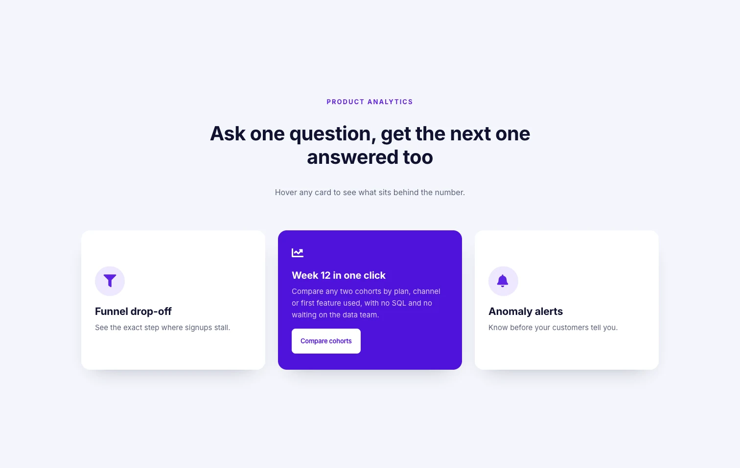
Three white cards sit under a product headline, each with a round brand-color icon, a short feature name and one line of text. Hovering turns a card to a solid brand-color back with a longer explanation and a white button. The design suits a SaaS feature row where each feature has a one-line hook and a paragraph of detail that would crowd the page if it were visible all the time.
- Design Variation: Default
- Animation Style: Flip Vertical
- Layout: three cards in one row
- Styling tip: keep the front white and give the back face the brand color in Style, Back Box, so the flip reads as a change of state and the button stands out against it.
2. Equipment card grid
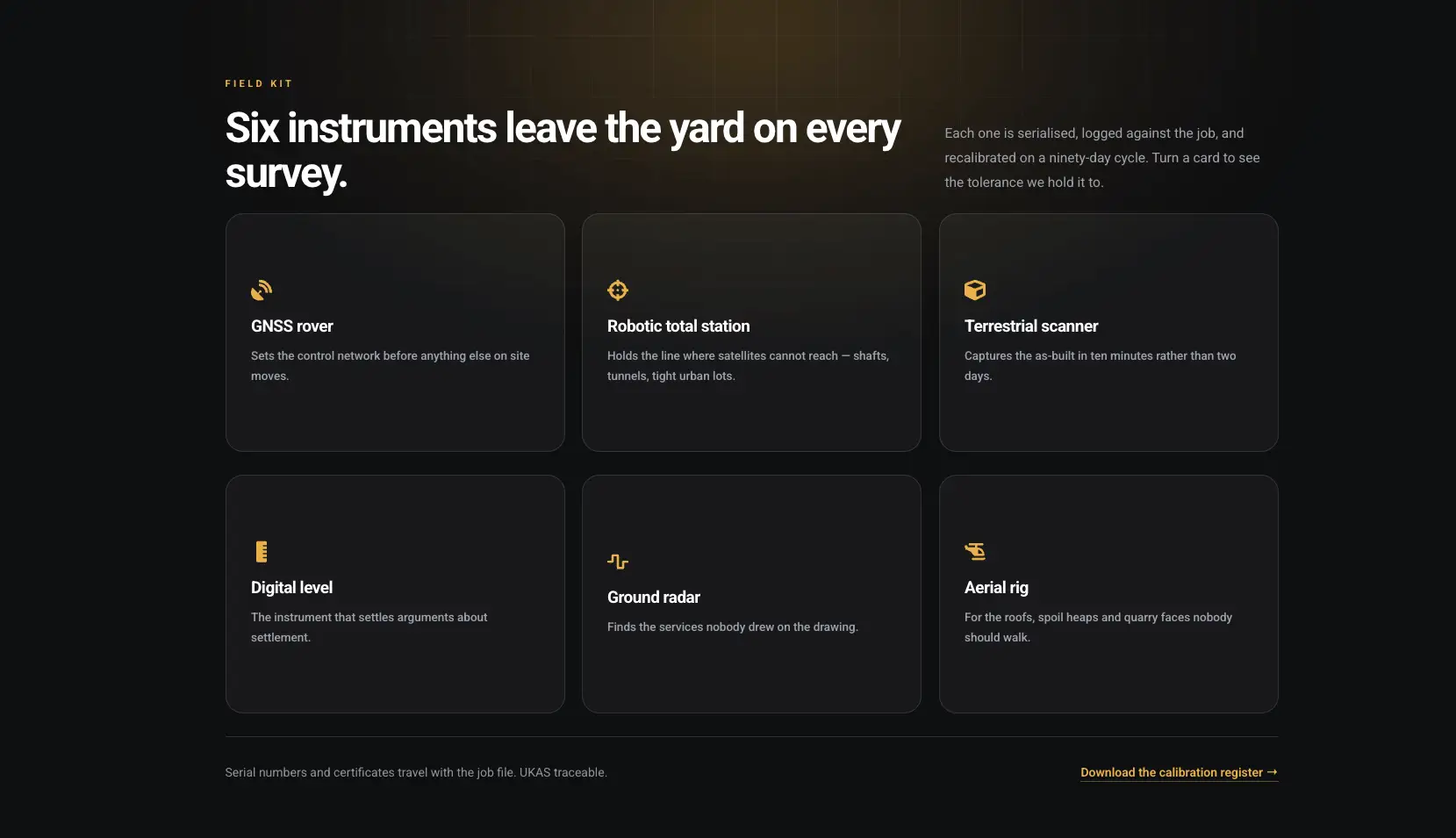
Here you have six dark tiles in two rows of three, each with a small gold icon, an equipment name and a line of plain text. Because the page is dark, a thin lighter border separates the tiles where a shadow would normally go. Reach for this layout for a catalog of six to nine items where every item has a spec that belongs on the back, such as a tolerance or a price.
- Design Variation: Default
- Animation Style: Flip Vertical
- Layout: six cards, two rows of three
- Styling tip: set the same Flip Box Height on all six widgets, since one taller back face would push its row out of line.
3. Stat and species grid
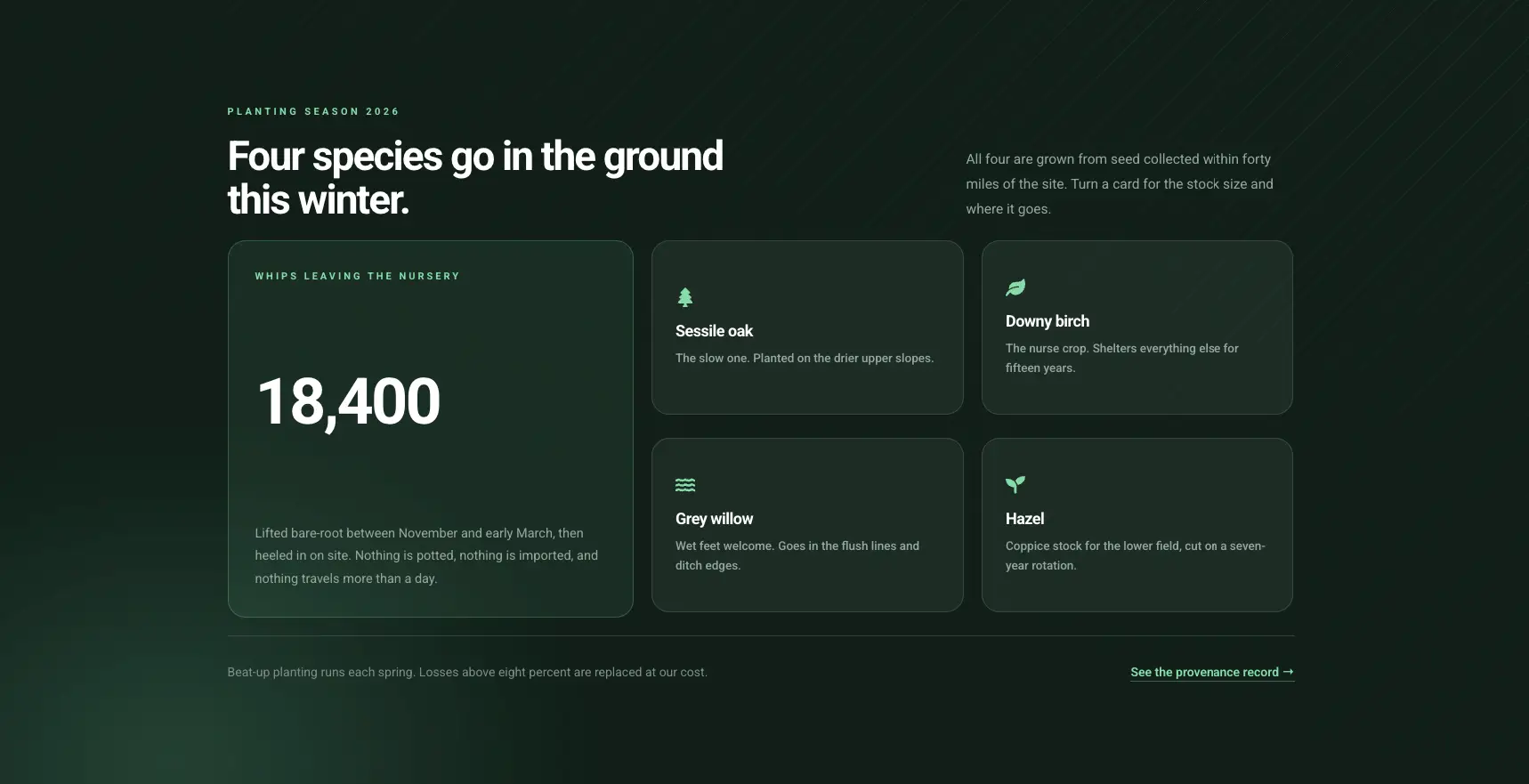
This dark green section has a large panel carrying one big number at the left and four smaller cards in a two-by-two grid at the right. Each small card names a species with a light green icon and a sentence, and the back explains what the number means for it. Use this where one headline figure needs four supporting items, such as a planting season or a fundraising total.
- Design Variation: Default
- Animation Style: Flip Vertical
- Layout: four cards in a two-by-two grid beside a wide stat panel
- Styling tip: put the number in the Title field with a large size in Style, Front Box, Title typography, and keep the explanation in the back Description.
4. Arch product cards
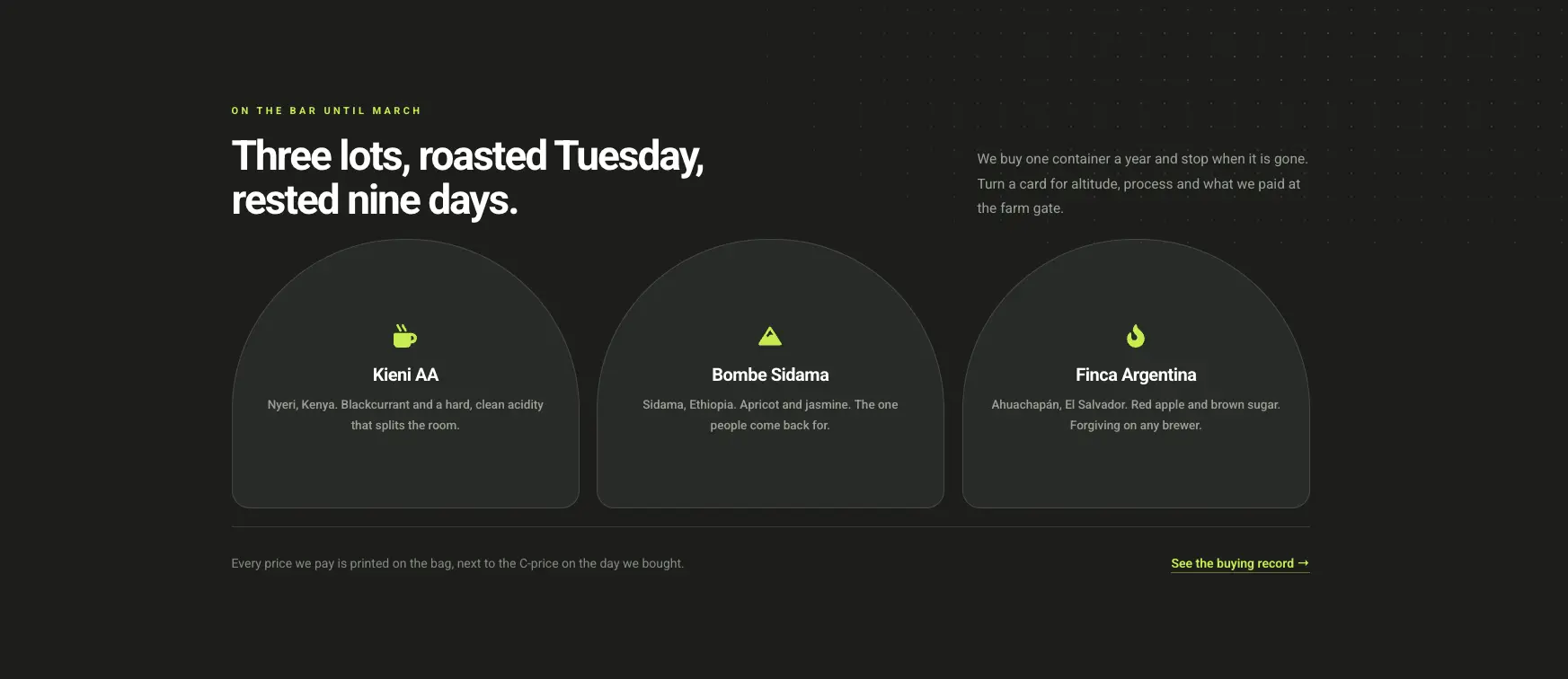
Three cards with a rounded arch top and a flat bottom, centered icon, name and tasting notes, on a near-black page with a lime accent. Take away the arch and the content is the same icon, title and text as the first example. It works for a short product line, three coffees here, where each card needs a little theater.
- Design Variation: Default
- Animation Style: Flip Vertical
- Layout: three cards in one row
- Styling tip: the arch is the Border Radius control in Style, General, with large top-left and top-right values and zero at the bottom; set Alignment to center on both faces.
5. Icon-only service tiles
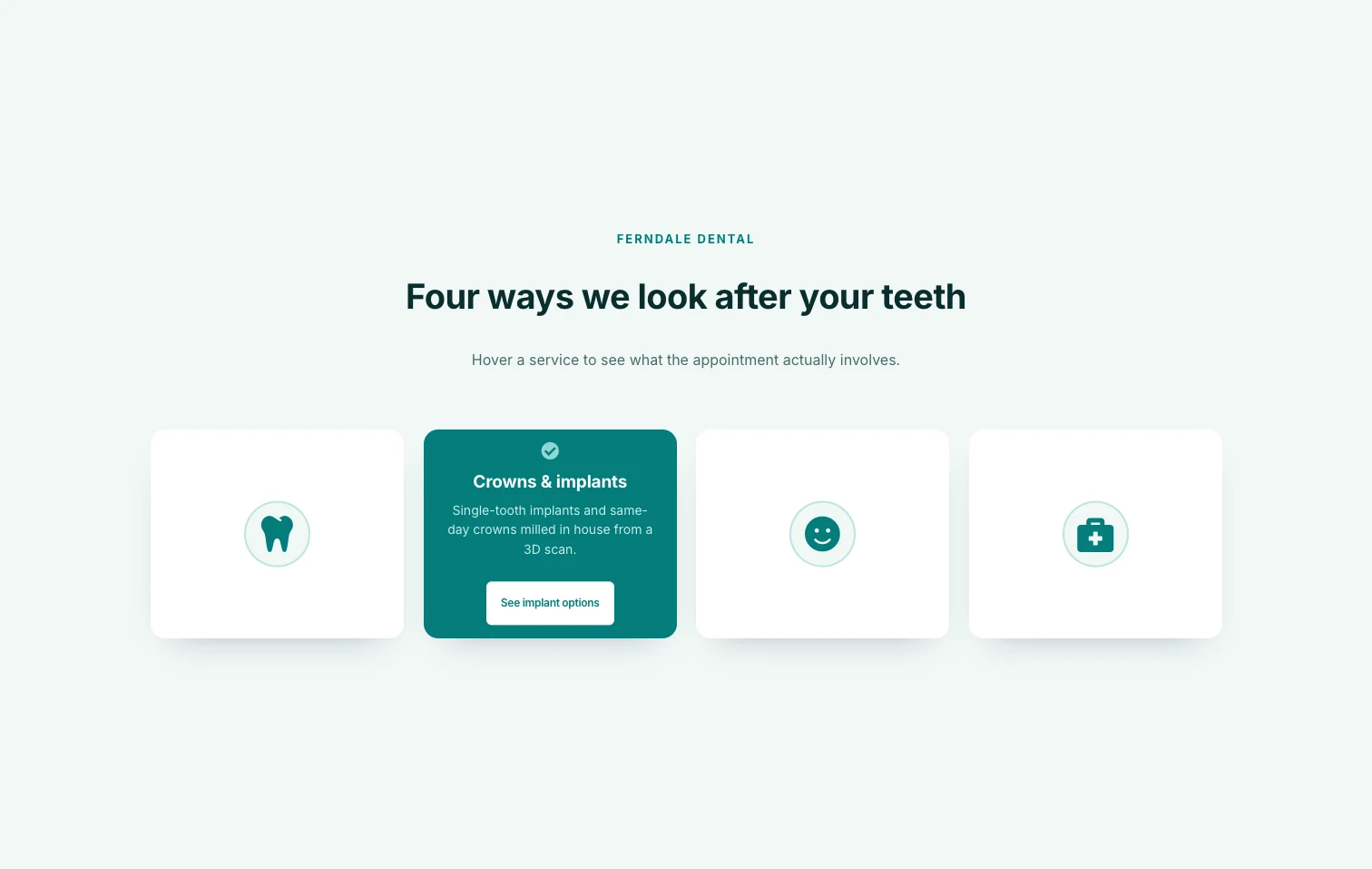
The front of each of these four white tiles holds nothing but a framed round icon in the brand teal. The service name, the sentence and the button all live on the back, which is the teal face in the screenshot. This is the Front Icon design in its plain form, and it fits a clinic or agency page where the icons are self-explanatory and the section should look calm until someone hovers.
- Design Variation: Front Icon
- Animation Style: Flip Horizontal
- Layout: four cards in one row
- Styling tip: Front Icon hides the title on the front, so write the back title as the service name and pick icons a visitor can read without a label.
6. Bento service tiles
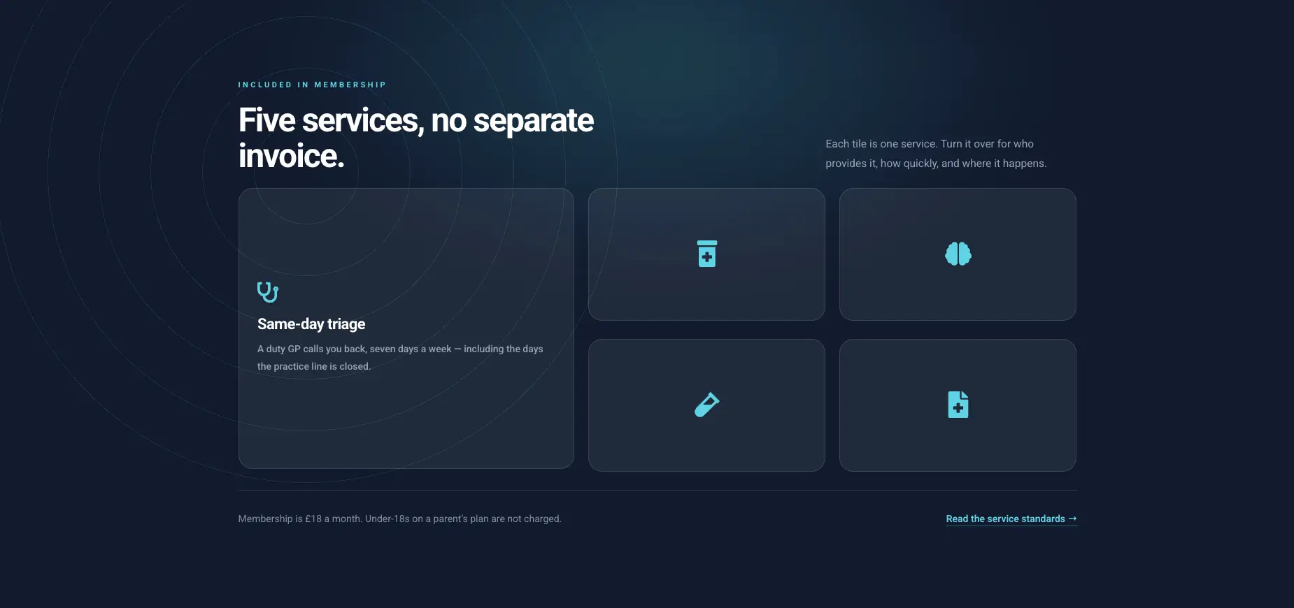
On a dark navy ground with cyan icons, one large card with an icon, a title and a sentence sits at the left, and four small icon-only tiles fill a two-by-two block at the right. The large card uses the Default design and the four small ones use Front Icon, which is how the mixed look is built with one widget type. It suits a membership or services page with one headline service and four supporting ones.
- Design Variation: Default on the large card, Front Icon on the four small tiles
- Animation Style: Flip Horizontal
- Layout: five cards, one large and four small
- Styling tip: the large card needs a bigger Flip Box Height than the small tiles; set the small tiles to half the large value minus the gap so the block lines up.
Want to try these designs before you rebuild one? The Flipbox widget page has every demo in a live viewer plus the full list of designs and animations.
7. Staggered discipline cards
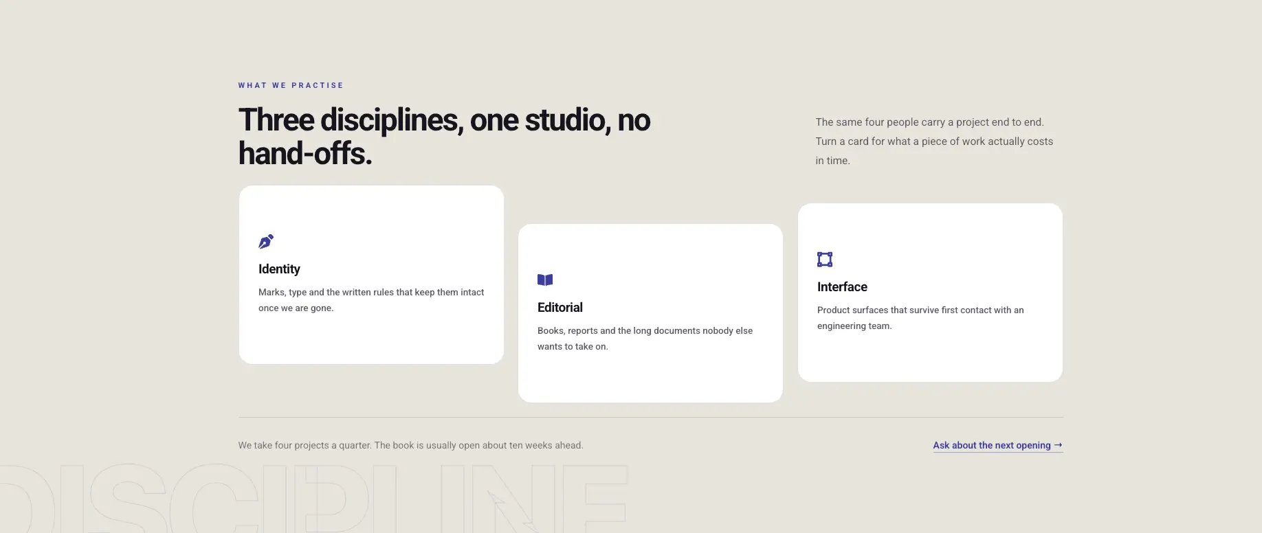
Three white cards on a cream page each carry an indigo icon, a discipline name and a sentence, and the middle card is pushed down so the three sit at different heights. That stagger is the only trick, yet it makes a plain three-card row look designed. Good for a studio or consultancy page where the three services carry equal weight.
- Design Variation: Default
- Animation Style: Flip Horizontal
- Layout: three cards in one row, each at a different vertical offset
- Styling tip: the offset is a top margin on each widget’s Advanced tab, so keep Flip Box Height identical on all three and let the margin do the stagger.
8. Minimal icon tiles
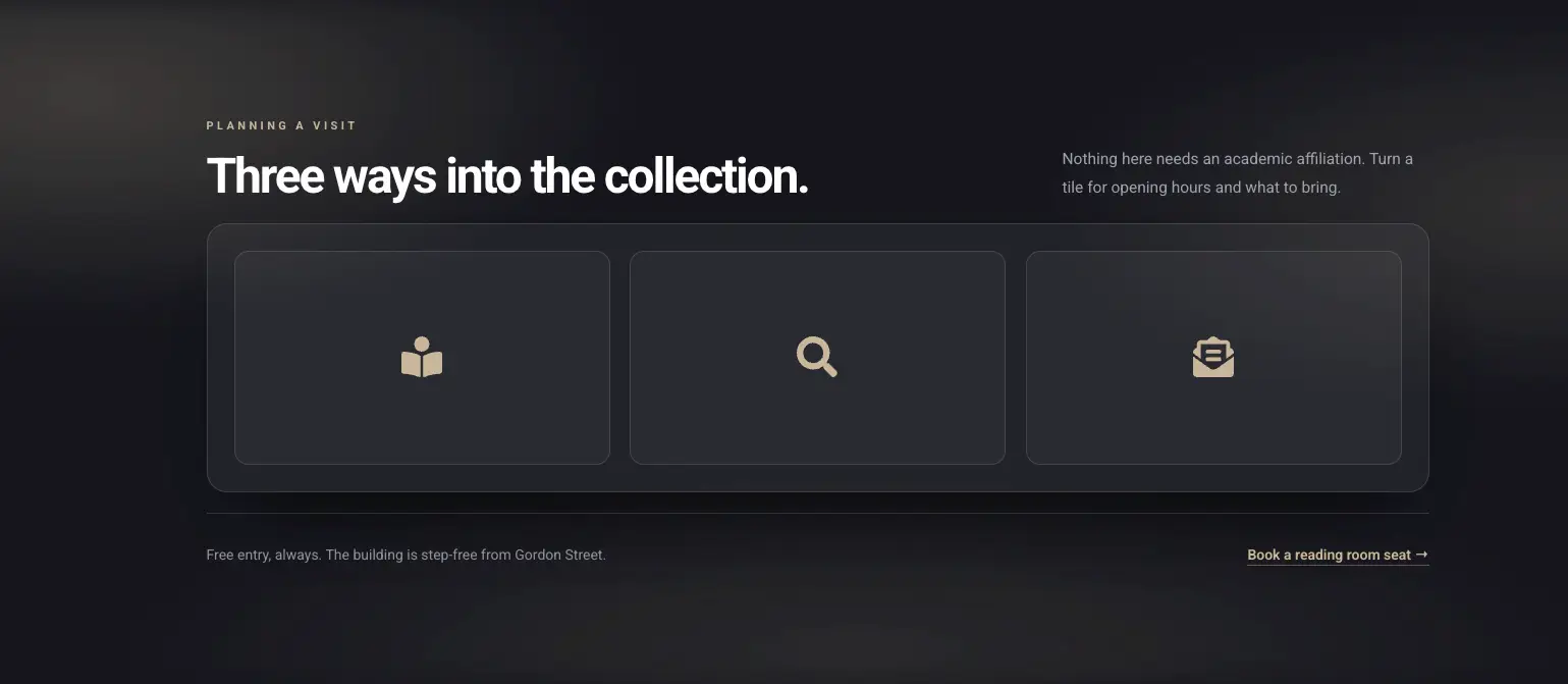
Three dark tiles sit inside a slightly lighter dark panel, each holding one sand-colored icon and nothing else. Opening hours and what to bring go on the back. It’s the quietest design in the set, and it fits a museum or library page where the section should not compete with the headline.
- Design Variation: Front Icon
- Animation Style: Flip Horizontal
- Layout: three cards in one row inside a bordered container
- Styling tip: with no title on the front, pick literal icons (a reader, a magnifier, a letter) and size them up in Style, Front Box, Icon so they read from a distance.
9. Front image travel cards
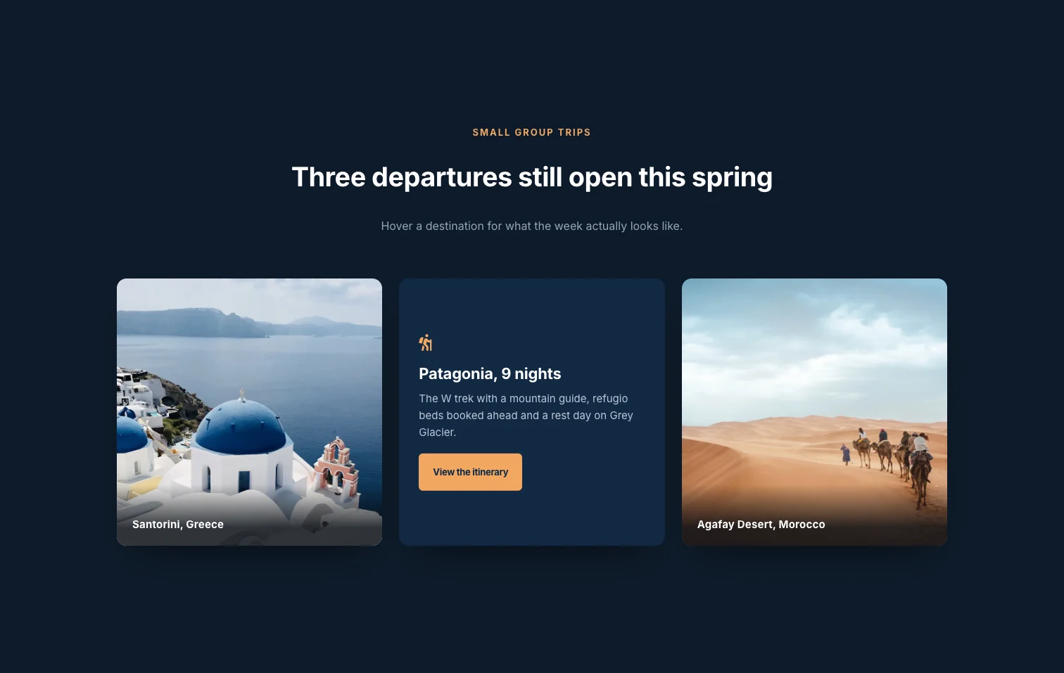
Each of the three cards has a photo edge to edge on the front, with the destination name in a strip at the bottom, and a dark navy back with an icon, the trip name, a sentence and an orange button. The front photo comes from the Front Image design variation, which needs Master Addons Pro. Fade is the right animation here because a photo that rotates looks warped halfway through, while a fade keeps it whole until it is gone. If you only need a caption to appear over a photo and no second face, the Image Hover Effects widget does that with less setup.
- Design Variation: Front Image (Pro)
- Animation Style: Fade
- Layout: three cards in one row
- Styling tip: pick photos with a quiet bottom edge so the destination strip stays readable, and keep the back button one solid color that appears nowhere on the front.
10. Numbered chapter rows
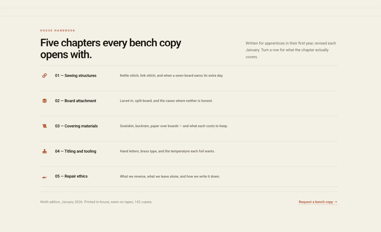
Five rows run the full width of the content area, each with a small rust icon at the left, a numbered chapter title and a one-line summary, divided by thin rules. Each row is a Flipbox widget with a low height, and the back face fades in with the chapter summary. This layout suits a handbook or a syllabus where the items are read in order and a grid would scramble that order.
- Design Variation: Default
- Animation Style: Fade
- Layout: five full-width rows
- Styling tip: set Flip Box Height to around 100 and Alignment to left on both faces, then use a bottom border in Style, General instead of a box shadow to draw the rules.
11. Timeline runbook rows
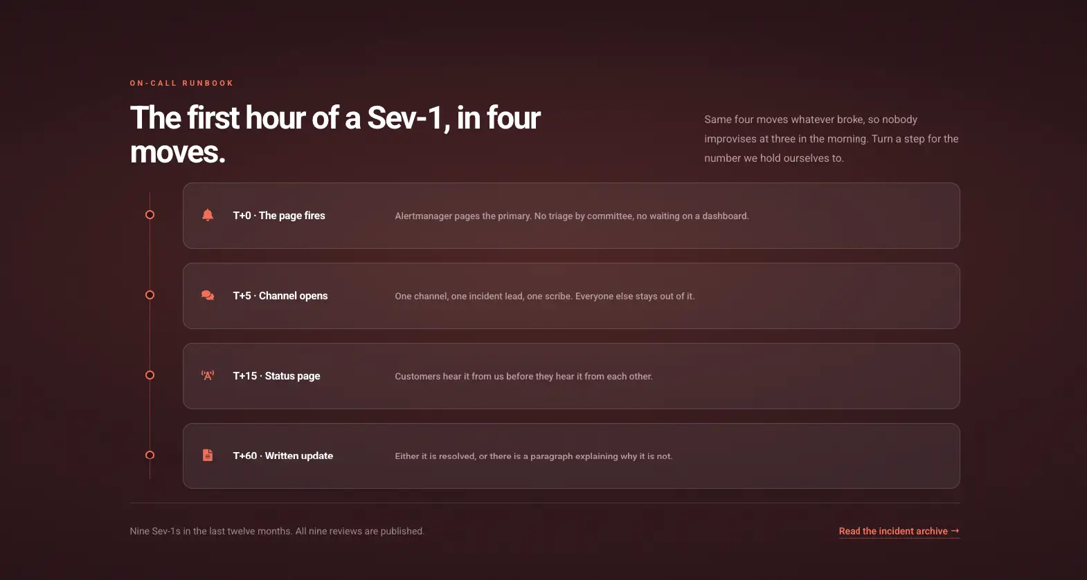
Four rounded rows sit on a dark maroon ground, each with a coral icon, a time-stamped step label and a sentence, with a vertical line and a dot beside each row. The line and dots are a bordered container next to the widgets; the rows themselves are plain Flipbox cards. The back face holds the number the team holds itself to at that step. Use it for an on-call runbook or any other four-step process with a hidden detail per step.
- Design Variation: Default
- Animation Style: Fade
- Layout: four full-width rows beside a vertical line
- Styling tip: give each row a one-pixel border in a lighter shade of the page color and a Border Radius of about 12 so the rows look lifted without a shadow.
12. Circular brand showcase
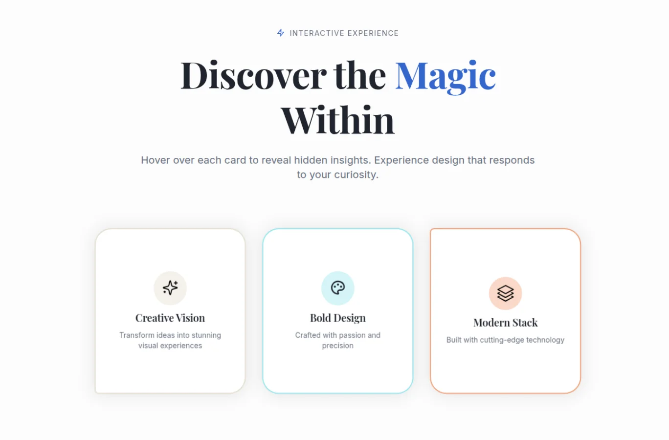
Three white cards sit on a white page, each with a soft round icon badge in a different pastel, a serif title and one line, and a thin border in a color that matches the badge. The rounded corners are uneven on purpose, larger on one side than the other. This is the demo to copy for a brand or portfolio page that leans on typography and a soft palette; the Flip Box animation turns the card like a playing card.
- Design Variation: Default
- Animation Style: Flip Box
- Layout: three cards in one row
- Styling tip: set a different Box Border color on each widget in Style, General and match it to the icon badge background in Style, Front Box.
13. Diagonal tiles
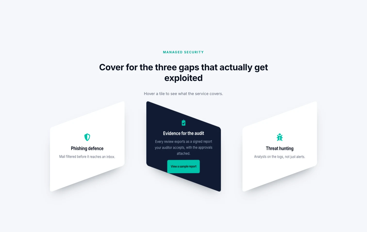
These three tiles have their top and bottom edges cut at an angle, white on the front with a green icon, and dark navy on the back with a green button. The slanted shape is the Diagonal design variation, and the card turns with a cube motion, so the back face appears to roll in from the side. Both are Master Addons Pro options. It fits a security or engineering page that wants a sharper look than rounded cards.
- Design Variation: Diagonal (Pro)
- Animation Style: Cube Left Right (Pro)
- Layout: three cards in one row
- Styling tip: the diagonal cut takes space from the corners, so keep the back Description to two short lines and center both faces.
14. Advanced transform effects
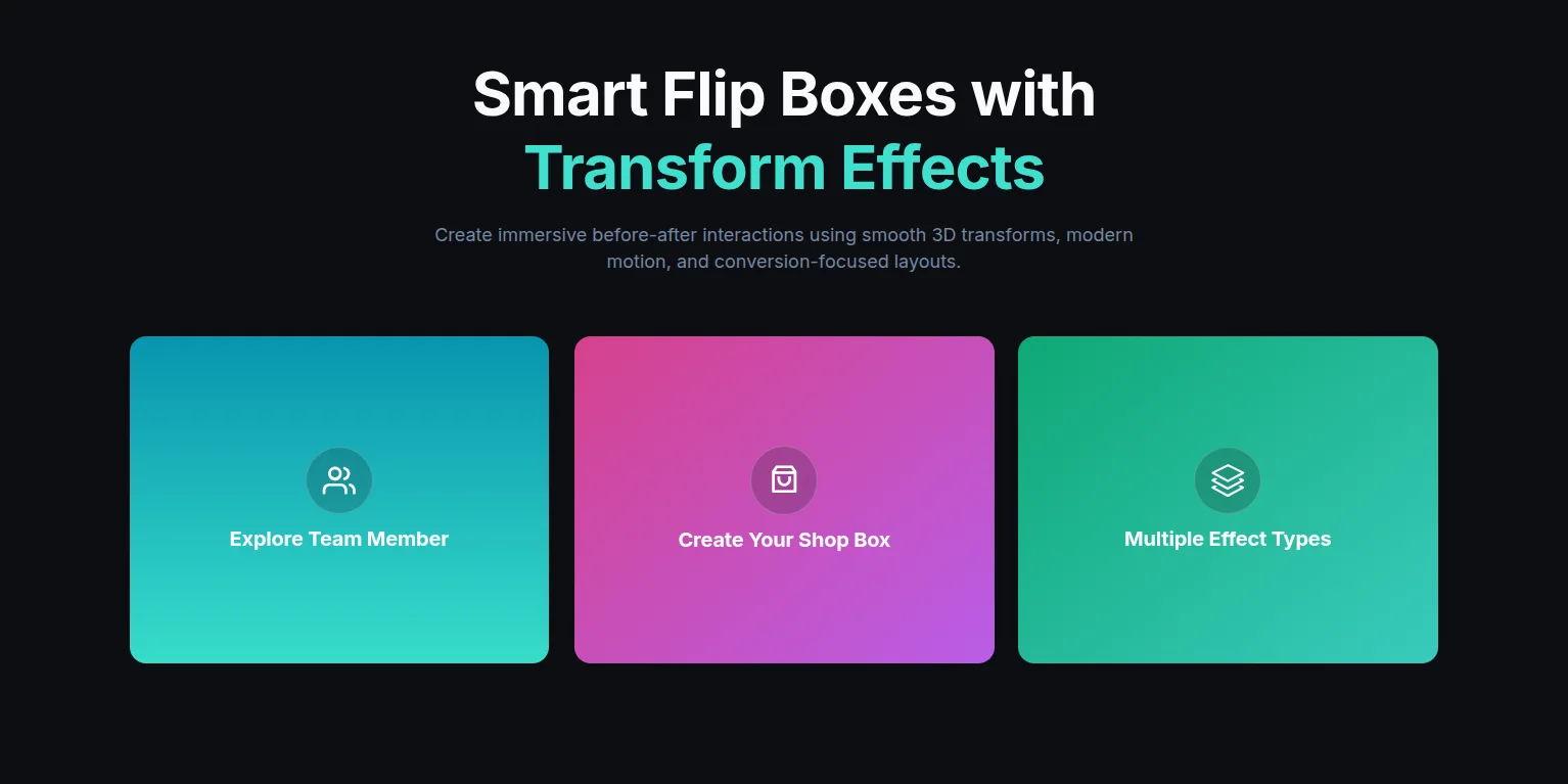
Three cards on a black page are filled with gradients (teal to cyan, pink to purple, green to teal), each with a round icon badge and a white title. Each card uses a different Cube direction (Top Down, Left Right and Down Top), and the Transforms extension adds movement to the whole widget on top of the flip. Use it for a feature or launch section where the cards are decoration as much as content.
- Design Variation: Default
- Animation Style: Cube Top Down, Cube Left Right and Cube Down Top (Pro), one per card
- Layout: three cards in one row
- Styling tip: set the gradient as the background of each face in Style, Front Box and Style, Back Box, and keep the icon badge semi-transparent white so it sits on any gradient.
15. Coffee product cards
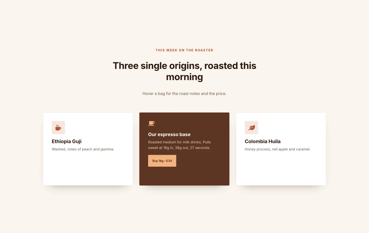
Three cards sit on a cream page, white on the front with a small square icon tile, a left-aligned coffee name and tasting notes, and dark brown on the back with the roast notes and a peach buy button. The animation is 3D Flip, which has its own 3d Flip Style control with four directions; this demo uses Slide Right to Left. The 3D flip box guide goes through the four directions one by one. This is the layout for a small shop with a price and a buy link on the back of each product.
- Design Variation: Default
- Animation Style: 3D Flip (Pro), 3d Flip Style set to Slide Right to Left
- Layout: three cards in one row
- Styling tip: 3D Flip uses the Flip Box Height value to work out the pivot point, so set a height before judging the animation; a card with no height set turns around the wrong axis.
16. Interactive media showcase
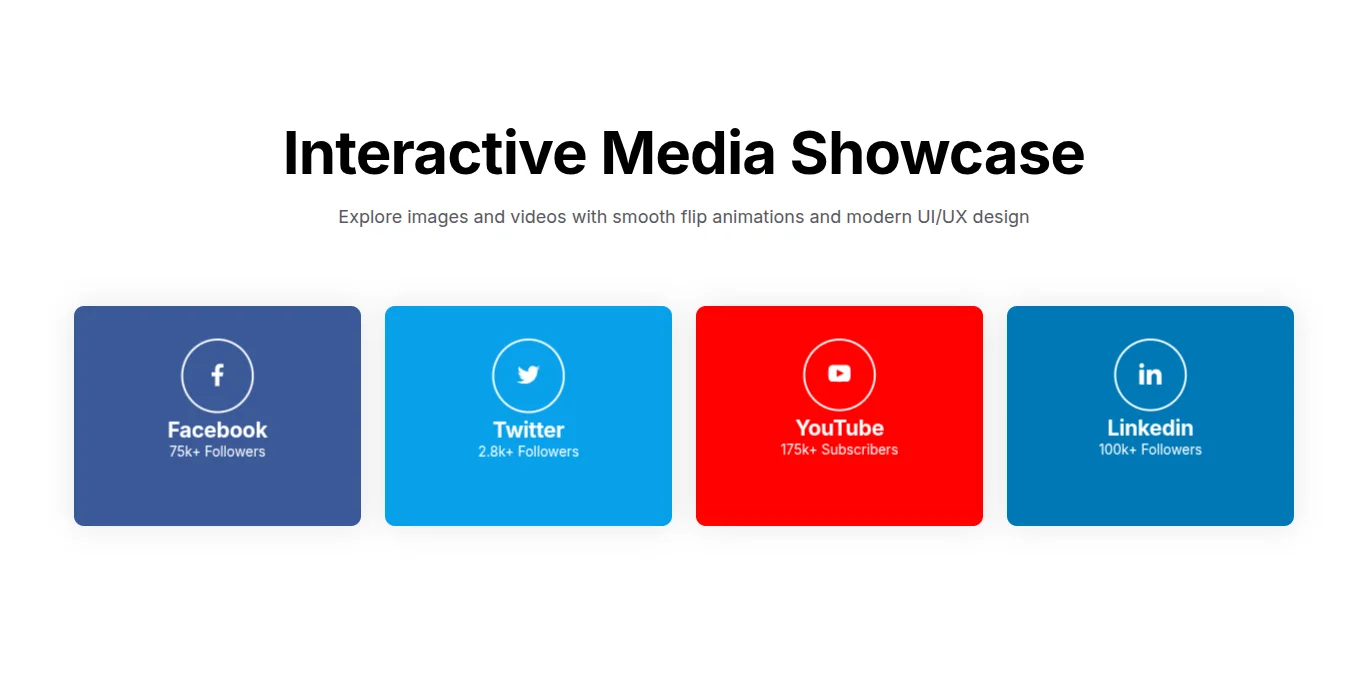
Four flat cards come in each network’s color (dark blue, light blue, red and mid blue), with an outlined round icon, the network name and a follower count. Each card turns in a different 3D Flip direction, one from the bottom, one from the right, one from the top. That breaks the one-animation-per-row rule from the end of this post on purpose, since the row is a showpiece, and the counts the visitor cares about are on the front where they can be read without hovering.
- Design Variation: Default
- Animation Style: 3D Flip (Pro), with a different 3d Flip Style on each card
- Layout: four cards in one row
- Styling tip: set the whole card color in Style, Front Box background and keep the icon white with a one-pixel white border in Framed style, Circle shape.
17. Multi-icon cards
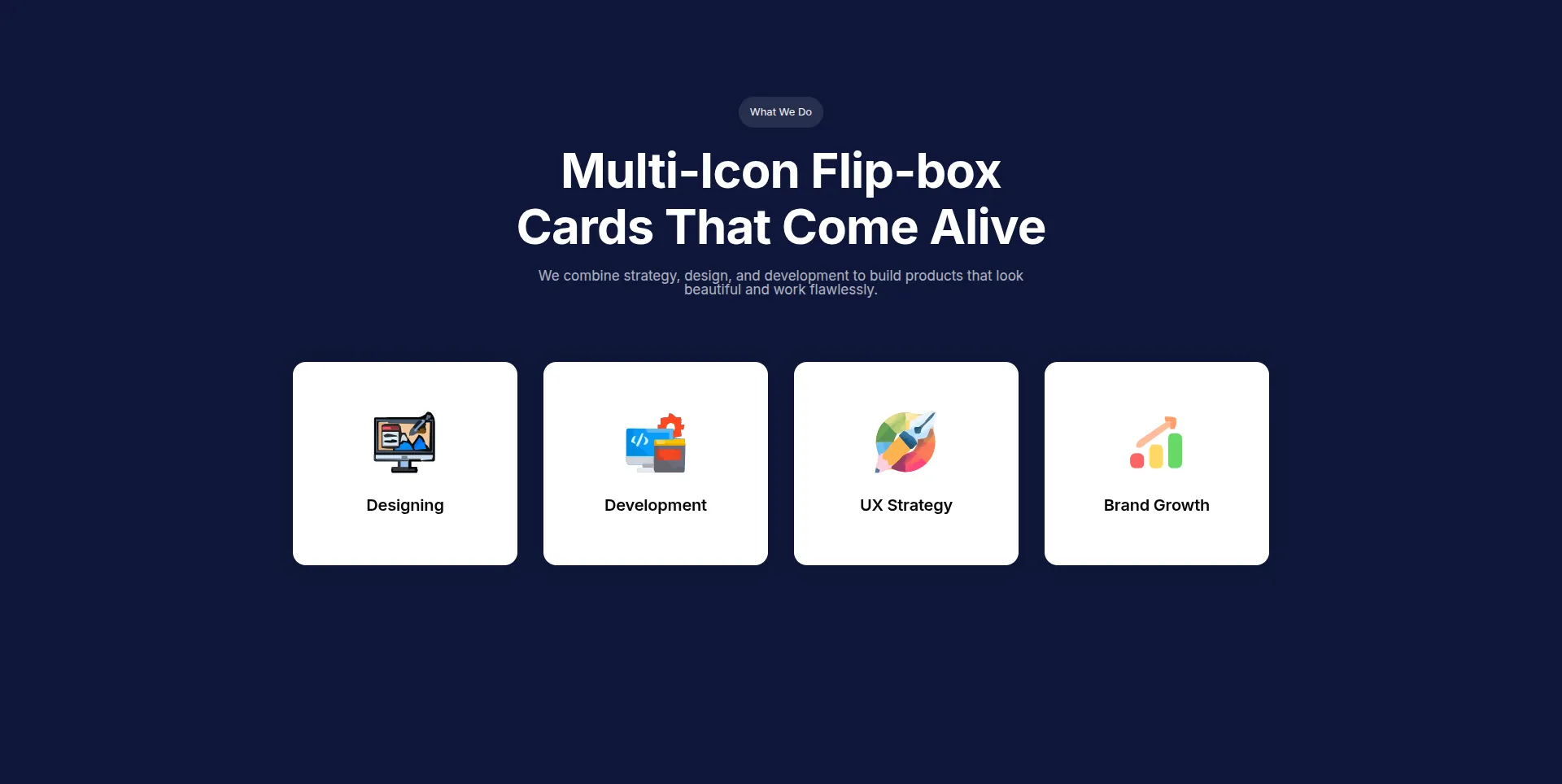
Four white cards on a dark navy page, each with a full-color illustrated icon and a one-word title. The icons are image files, picked with the Icon or Image control in the Front Box section. Three slide animations share the row, so the back faces slide in from the left, from the right and from the top. Use it for an agency services row where the illustrations are the brand.
- Design Variation: Default
- Animation Style: Left to Right, Right to Left and Top to Bottom (all Pro), one per card
- Layout: four cards in one row
- Styling tip: upload the illustrations at the same pixel size and set one Icon size value in Style, Front Box so the four icons sit on the same baseline.
18. Dark gym class cards
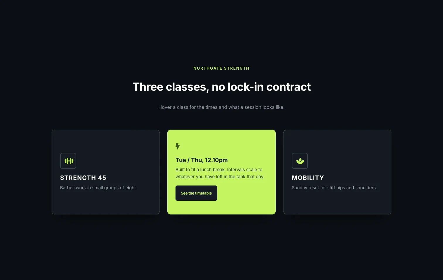
Three dark cards on a near-black page show a framed lime icon, an uppercase class name and a sentence, and the back face is bright lime with dark text and a dark button. The design depends on the contrast between those two faces, and the Rollover animation rolls the lime face over the dark one. It fits a gym page where the back holds the class times.
- Design Variation: Default
- Animation Style: Rollover (Pro)
- Layout: three cards in one row
- Styling tip: set the title to uppercase with letter spacing in Style, Front Box, Title typography, and use Icon Style Framed with the Square shape for the outlined icon box.
19. Pastel icon tiles
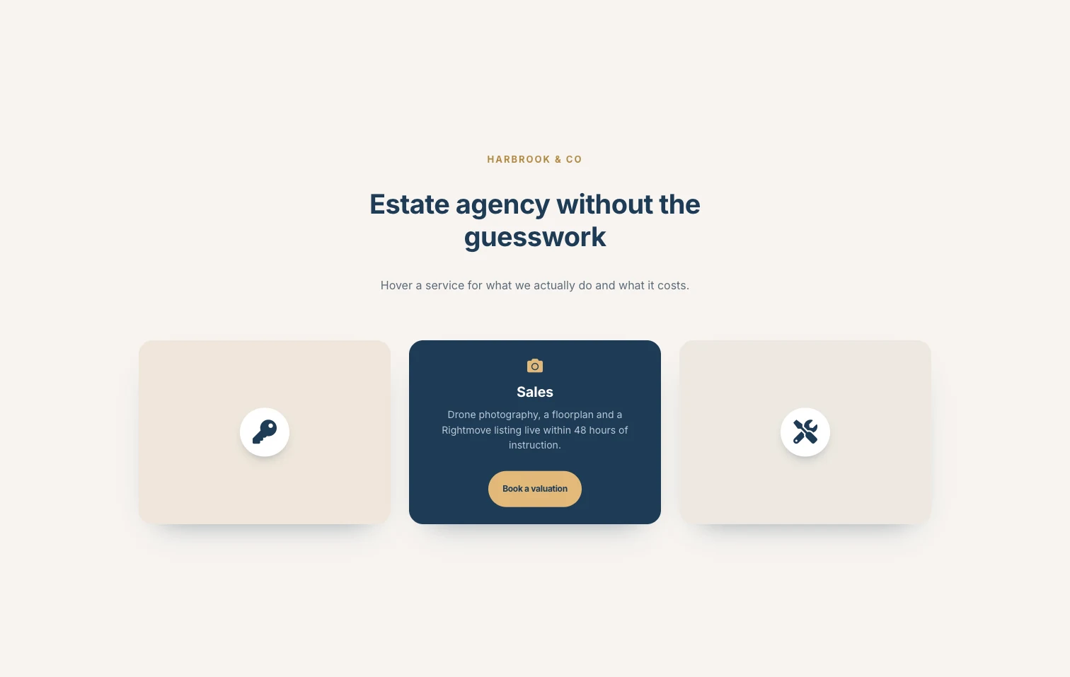
Three pale beige tiles have one navy icon in a white disc and nothing else on the front, and a navy back with a gold icon, the service name, a sentence and a gold pill button. The icon-only front comes from the Front Icon design, and the card turns along a diagonal from the bottom corner. This is a good fit for an estate agency or a law firm that wants a warm palette and a tidy front.
- Design Variation: Front Icon
- Animation Style: Diagonal (Bottom to Top) (Pro)
- Layout: three cards in one row
- Styling tip: Icon Style Stacked with the Circle shape gives the white disc behind the icon; set the disc to white and the icon to the back face color so the two faces share a palette.
20. Gradient back cards
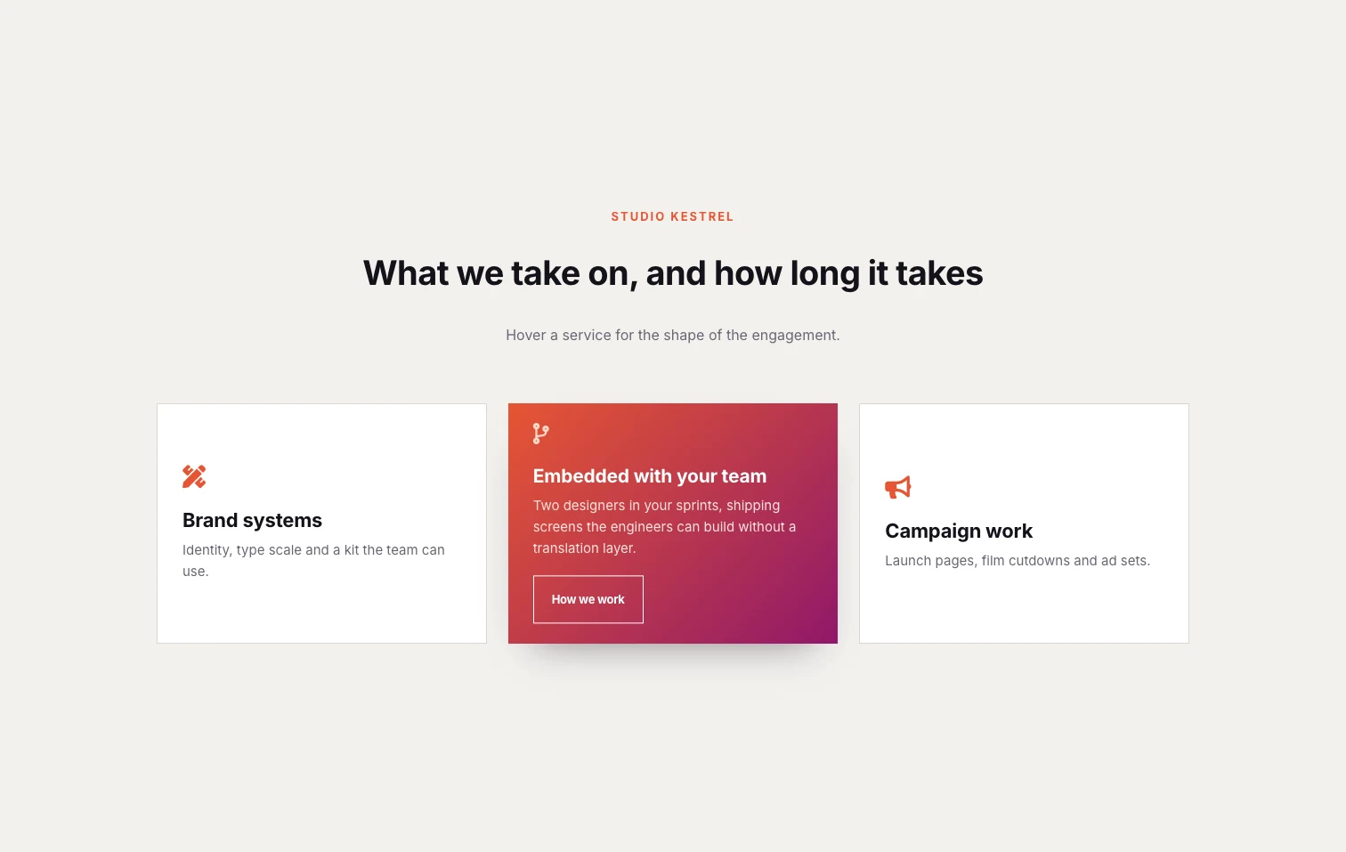
Three white cards have a thin border, an orange-red icon, a title and one line, and a back face that fades in as an orange-to-magenta gradient with a white outlined button. The front is deliberately flat so the gradient on the back is the reward for hovering. Use it on a studio or agency page where the three services each have a paragraph of detail.
- Design Variation: Default
- Animation Style: Fade In Out (Pro)
- Layout: three cards in one row
- Styling tip: set the gradient in Style, Back Box background and give the button a transparent background with a white border in Button, Normal so it does not fight the gradient.
Settings that every example shares
Four habits run through all 20 demos. The first is Flip Box Height, in Style, General, with a placeholder of 250. Set it on every card. Without a fixed height the two faces take their own natural size, and a back face with a paragraph and a button is taller than a front face with a title, so the card jumps mid flip. The equal-height rows in the equipment grid and the bento block both rely on it.
The second is the link. The Action Button on the back face is the only link inside the widget. If the whole card should be clickable, which most product and service cards should be, turn on the Wrapper Link extension on the widget and add the URL there. The button can stay for visual weight or be left empty.
The third is one animation per row. The 20 demos use twelve different animation styles between them, and 18 of them use one style across every card in the section. The two that mix directions, the media showcase and the multi-icon row, are meant as showpieces. For a services row that has to be read, pick one Animation Style and apply it to every widget in the row.
The fourth is what goes on the front. The flip is a CSS hover, and MDN’s note on the :hover pseudo-class warns that on touch screens hover may never match or may match only for a moment. The widget handles the first tap as the flip, but some visitors will never see the back. Put the name, the price and anything else that must be seen on the front, and treat the back as extra detail with a button. The walkthrough below shows the widget being set up in the editor, including the Style Preset and the two faces.
Flip box or flip card: same thing
A flip card and a flip box are the same effect: a front face that turns to reveal a back face. “Flip card” is the name CSS tutorials use, and “flip box” is the name Elementor and its addons use. The W3Schools flip card is about 45 lines of CSS plus a dozen lines of HTML, built on perspective, transform-style: preserve-3d and backface-visibility: hidden, and you can paste it into an Elementor HTML widget with the CSS in the Custom CSS extension. That route works for one card on a page you control, and a separate post on this site goes into the CSS version in detail.
The hand-written card needs a tap handler for touch screens, a fixed height on both faces and a code edit for every change of color or text. The Flipbox widget does those three from the panel and adds the back face button and the 22 animations. Elementor itself only has a flip box in Elementor Pro, and Elementor’s Flip Box help page lists six effects, Flip, Slide, Push, Zoom In, Zoom Out and Fade, with a direction on Flip and Slide and a 3D Depth toggle. For a card that never flips, the Info Box widget is the simpler choice.
Frequently asked questions
Can I download these flip box designs?
No. The 20 examples are live demo pages, not downloadable templates, but each one can be rebuilt from the panel. Add the Flipbox widget, set the Design Variation and Animation Style listed under the screenshot, set the Flip Box Height, then match the colors in the Style tab. A three-card row takes about ten minutes.
Does the flip box flip on click?
No. The Flipbox widget flips on hover on desktop, and on touch screens the first tap flips the card and a second tap follows the back button. There is no click trigger setting. For a panel that opens on click, use the Toggle Content widget instead.
How many animations come with the widget?
Six come with the Flipbox widget: Flip Horizontal, Flip Vertical, Fade, Flip Box, Flip Box Fade and Fade Up. Master Addons Pro adds 16 more, including four Cube directions, four slides, two Diagonal slides, Rollover and 3D Flip with its own direction control, for 22 in total. The Pro ones carry a (Pro) label in the dropdown.
Can I put a flip box in a carousel?
Not with a built-in setting, since the widget has no carousel mode. Save a flip box section as a template and show it in the Image Carousel widget or a loop grid, or lay the cards out in a container that wraps so they stack on small screens.
Final thoughts
All twenty Elementor flip box examples come from the same three controls: a Design Variation (Default and Front Icon with the widget, Front Image and Diagonal with Master Addons Pro), an Animation Style (6 with the widget, 22 with Pro) and a Flip Box Height that keeps both faces the same size. Eleven of the demos use only designs and animations that come with the widget, so a three-card services row, a six-card grid or a set of full-width rows is possible on Elementor without Pro. The hover-only trigger and the button-only link are the two limits to plan around, and the Wrapper Link extension covers the second. The Flipbox widget page has all 20 demos in a viewer if you want to hover each one before picking a starting point.
Related reading
