

Key Takeaways
- Tabs are for a handful of parallel sections a visitor picks between. An accordion is for a list where most items get skipped.
- Tabs cap out around four or five titles because the strip runs out of width. An accordion takes twenty without complaint.
- An accordion can have several panels open at once, and can compare them on screen. Tabs show exactly one.
- Accordions were built for narrow screens. Elementor’s tabs handle phones by switching to an accordion below a breakpoint you set, which is a hint about which pattern wins there.
- Neither hides content from Google. Both widgets put every panel in the page HTML and hide the closed ones with CSS.
Both patterns do the same job: collapse a long page so a visitor reads the part they came for. The difference is what the collapsed items are to each other.
Tabs say “pick one of these”. An accordion says “here is a list, open what you need”. Get that backwards and the page fights the visitor, which is what makes this worth two minutes of thought.
Table of Contents
The actual difference
| Tabs | Accordion | |
|---|---|---|
| Titles sit | In a row or side column | Stacked, each above its own panel |
| Open at once | One | One or several, your choice |
| Comfortable item count | Three to five | Five to twenty |
| All titles visible | Yes | Yes |
| Page height when closed | Fixed by the tallest panel | Grows as panels open |
| Reads as | “Pick one” | “Scan the list” |
| Narrow screens | Needs a fallback | Works as built |
The row that drives most decisions is item count. A tab strip is limited by horizontal space, and an accordion is limited only by patience.
When tabs are right
Tabs fit when the sections are peers and the visitor will read one of them. Three signals:
- Three to five sections, few enough to fit a strip.
- Parallel content, like Description, Specification, Reviews and Shipping on a product page: the same kind of thing, different slice.
- Each visitor wants one of them. Nobody reads all four, everyone reads one.

Tabs also keep the page a predictable height, which matters when something sits directly below and you do not want it jumping down the screen.
When an accordion is right
An accordion fits when the items are a list rather than a set of choices:
- Six or more items. An FAQ with twelve questions has no tab layout that works.
- Most items get skipped, because a visitor opens the two questions that apply to them.
- Items of very different length, where one answer is a sentence and another is five paragraphs. Tabs would size to the longest.
- Panels a visitor wants open at the same time, to read two policies side by side.
FAQs are the clearest case, which is why most FAQ sections you meet are accordions. Pricing policies, troubleshooting steps and documentation sections behave the same way.
Elementor has an Accordion widget in the free plugin. The Master Addons Advanced Accordion adds a few things on top: an Accordion Type control that switches between accordion behaviour (one panel at a time) and toggle behaviour (each panel independent), custom expand and collapse icons, Active as Default per item, a Toggle Speed in milliseconds, and the title’s HTML tag.
What phones decide
An accordion is already a vertical stack of full-width rows, so a 390px screen changes nothing about it. Tabs are the pattern that has to adapt.
Elementor’s Tabs widget switches to a vertical accordion layout below a breakpoint you choose, with mobile as the default. Addon tabs stack their titles into a full-width column with the panel below the list.
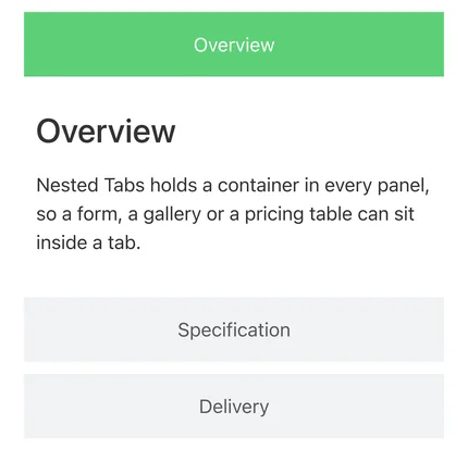
The fix for tabs on a phone, in other words, is to become an accordion. If most of your traffic is mobile, building the accordion from the start skips a layout that only ever exists on desktop.
The SEO question
Collapsed content is indexed. Both widgets put every panel in the page HTML and hide the inactive ones with CSS, so Google’s crawler reads all of it. You can confirm this on your own page by viewing source and searching for text from a closed panel.
Two things are genuinely worth caring about:
- Do not hide what the page is about. If a visitor has to click to find out what you sell, that content does not belong in tab three, whatever the crawler can read.
- FAQ structured data comes from your SEO plugin rather than from either widget. Rank Math and Yoast build FAQPage markup from their own block or schema field, so the accordion is the presentation and the schema is set separately.
Where Toggle fits
Toggle comes up in this comparison because Elementor used to have a Toggle widget, and because “toggle” means two different things.
Elementor’s old Toggle widget was an accordion by another name: a stack of expandable rows. It has been deprecated since version 3.15, and editing one now shows a notice telling you to drag in the Accordion widget instead. So on a current install, the tabs versus accordion question has already absorbed it.
The other meaning is a two-state switch, where one control flips the page between two versions of the same content. That is what the Master Addons Toggle Content widget does: two labels, a switch between them, and a block of content behind each. Monthly against yearly pricing is the obvious case, and metric against imperial units is another.
That is a third pattern rather than a variation on the first two. Use it when there are exactly two states and the visitor is switching between them. Three or more options means tabs, and a list to scan means an accordion. If what you want is an accordion whose panels open and close independently, that is the Accordion Type control set to Toggle.
Using both together
They combine well, because they answer different questions.
A plan comparison page might use tabs for Monthly and Yearly, with an accordion of feature details inside each tab. Outer level is a choice between two peers; inner level is a list to scan. Nested Tabs makes this straightforward, since each panel is a container that accepts an accordion widget.
Tabs inside tabs is the combination that does not work, because it asks a visitor to remember which pair of titles they picked.
What Elementor gives you for each
Both widgets are in the free plugin, and both are nested widgets, so panels hold containers.
Tabs add Direction for horizontal or vertical, Horizontal Scroll for a long title row, and the Breakpoint that switches to an accordion. The Accordion widget has Max Items Expanded, which decides whether opening one panel closes the others. The Master Addons widget does that job with its Accordion Type control.
Addon widgets extend both. On the tabs side you get style presets, image titles and hover switching, covered in the advanced tabs post. On the accordion side you get the icon controls, the toggle mode and the per item default state.
Frequently asked questions
Is an accordion better than tabs?
For six or more items, for FAQs, and for mobile-heavy pages, yes. For three to five parallel sections on a desktop page, tabs read better.
Does Google index content inside tabs and accordions?
Yes. The panels are in the HTML whether open or closed, so the crawler reads them.
Can I put an accordion inside a tab?
Yes. Each Nested Tabs panel is a container, so an accordion widget drops straight in.
How many tabs is too many?
Five is the practical ceiling, and fewer if the titles are long or carry icons. Past that the strip wraps and an accordion is the better pattern.
What about the Toggle widget?
Elementor’s Toggle widget is deprecated since 3.15 and points at the Accordion widget. A toggle in the switch sense, flipping between two versions of the same content, is a separate pattern and needs a widget built for it.
Which one should I use for an FAQ?
An accordion. The questions are a list to scan rather than a set of choices, and the layout stays readable at twelve questions, which no tab strip manages.
Final thoughts
Count the items, then ask what they are to each other. A short set of peers where everyone reads one is tabs. A long list where most items get skipped is an accordion. Mobile settles any remaining doubt, since tabs on a phone turn into an accordion anyway.
Related reading
