

Table of Contents
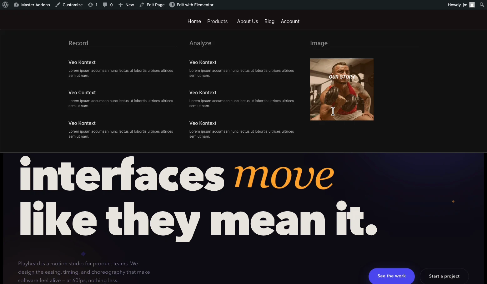
You can build a full mega menu in Elementor without buying Elementor Pro. A mega menu is a wide, multi-column dropdown that shows an entire section of your site at once: links, images, icons, even a contact form, instead of a thin vertical list. Elementor’s free version has no mega menu widget, but the free Master Addons Mega Menu adds one, and you design each panel with the normal Elementor editor.
This guide covers the whole build: enabling the extension, attaching a mega menu to a menu item, designing the dropdown panel, and getting it right on mobile, the step most tutorials skip.
Do You Need Elementor Pro for a Mega Menu?
No. There are three routes to a mega menu in Elementor, and only one of them costs money:
| Route | Cost | Trade-off |
|---|---|---|
| Elementor Pro Mega Menu widget | Paid annual license | Requires Pro on every site you build |
| Custom CSS / hand-coded menu | Free | Fragile, hard to edit later, no visual editing |
| Master Addons Mega Menu | Free | Adds one plugin; panels built visually in Elementor |
If a mega menu is the only reason you were about to upgrade, the free route does the same job. Master Addons runs alongside Elementor Pro without conflict too, so an existing Pro license is not wasted. Elementor documents its own Pro mega menu workflow here if you want to compare the two approaches side by side; it requires turning on several experimental features before you can start.
What You Need Before You Start
- Elementor (free version is fine) installed and active
- Master Addons for Elementor installed and active
- A WordPress menu already created under Appearance → Menus (even a rough one, you can edit it later)
Step 1: Enable the Mega Menu Extension
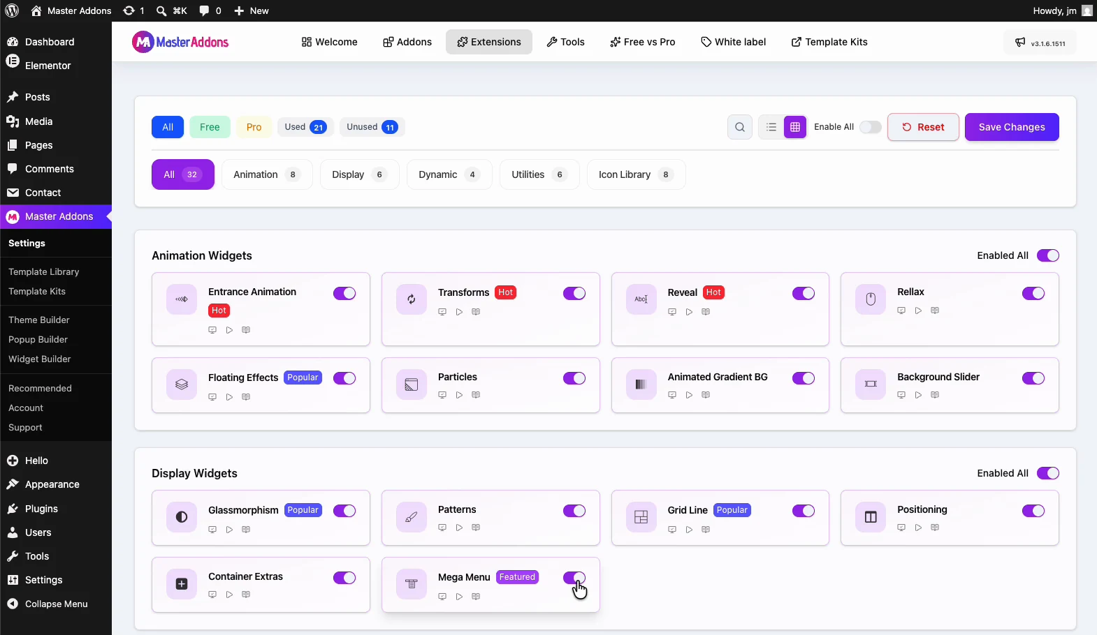
Go to Master Addons → Addons & Extensions in your WordPress dashboard, find Mega Menu in the extensions list, and toggle it on. Save.
Master Addons ships with everything switched off by default so you only load what you use. That is why this step exists at all. If you do not see the option immediately, hard-refresh the admin page (Cmd/Ctrl + Shift + R); caching plugins hold onto the old admin menu for a minute.
Step 2: Turn a Menu Item Into a Mega Menu
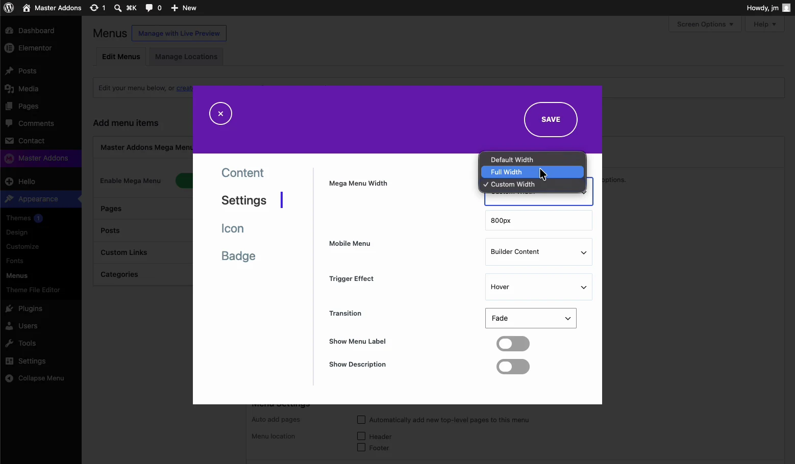
Open Appearance → Menus and expand the top-level item you want the mega panel to drop from, typically something broad like “Products”, “Services”, or “Shop”.
- Tick the Enable Mega Menu option on that menu item.
- Choose the panel width. Full-width stretches edge to edge, container-width aligns to your content.
- Save the menu.
Only enable it on items that genuinely need the space. A mega menu on a single “Contact” link is worse than a plain link: it makes people work harder for one destination.
Step 3: Design the Dropdown Panel in Elementor
The panel content is an Elementor template, which is what makes this approach flexible: anything you can build on a page, you can put inside the menu.
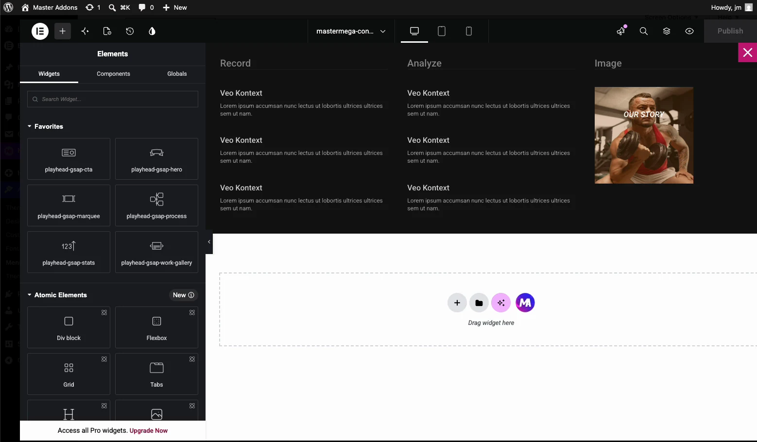
- Click Edit Mega Menu Content on the menu item to open the Elementor editor.
- Build a multi-column layout. Three or four columns suits most navigation.
- Fill the columns: heading widgets as category labels, icon lists as link groups, an image or two for visual anchoring.
- Publish the template.
A few things that make mega menus work rather than just look busy:
- Group by how customers think, not your org chart. Column headings should match the words visitors use.
- Cap it at roughly five to seven links per column. Past that, scanning collapses and the menu becomes a wall.
- Give one column a job. A featured product, a promo, or a call to action earns its space more than a fourth list of links.
- Keep images light. Menu images load on every page. Compress them and serve WebP: a heavy mega menu drags your whole site’s load time, not just one page.
Step 4: Add the Menu to Your Header
If your theme already renders the WordPress menu in its header, the mega menu works immediately. No further step is needed.
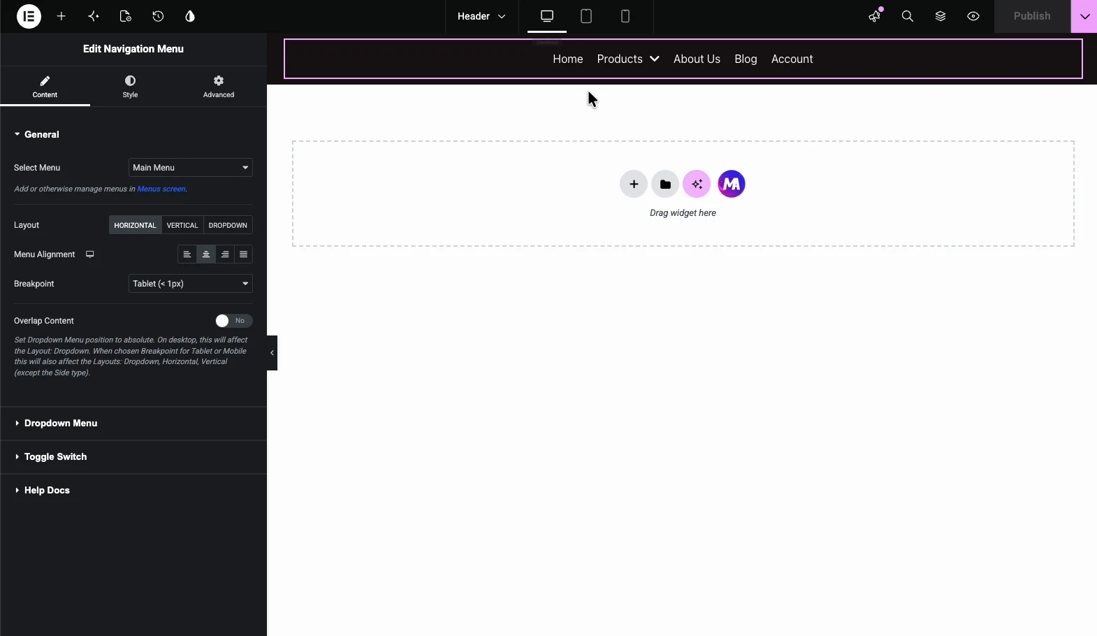
For full control over the header itself, build one with the free Master Addons Theme Builder: create a header template, drop in the Nav Menu widget, select the menu carrying your mega menu, and set the display condition to your entire site. That pairing, free theme builder plus free mega menu, replaces the two features people most often buy Pro for.
Step 5: Fix the Mobile Experience
This is where most mega menus fall apart. A four-column panel that looks sharp on a 1440px screen becomes an endless scroll on a phone.
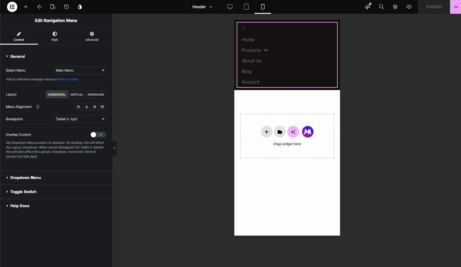
- Switch to the mobile view in Elementor and check the panel’s real height. If it runs past two screens, cut content for mobile.
- Hide decorative images on mobile using Elementor’s responsive visibility controls; keep the links, drop the ornament.
- Stack columns vertically and confirm tap targets are comfortably large.
- Test on a real phone, not just the editor preview. The preview approximates; it does not reproduce touch behaviour.
If your breakpoints do not line up with your design, the free Custom Breakpoints extension lets you set your own. That is useful when the default tablet breakpoint cuts your menu at an awkward width.
Troubleshooting
- Mega menu does not appear. Confirm the extension is toggled on, the menu item has Enable Mega Menu ticked, and the panel template is published, not left as a draft. Then clear your cache.
- Panel appears but is unstyled. Usually a cached stylesheet. Purge your page cache and any CDN, then hard-reload.
- Panel is cut off or hidden behind content. A parent container has
overflow: hiddenor a low z-index. Raise the header’s z-index and check the header container’s overflow setting. - Works on desktop, broken on mobile. Almost always the toggle/hamburger area. Verify the menu widget’s mobile settings and confirm nothing overlays the tap target.
Frequently Asked Questions
How do I create a mega menu in Elementor without Pro?
Install the free Master Addons for Elementor plugin, enable the Mega Menu extension under Master Addons > Addons & Extensions, then open Appearance > Menus and tick Enable Mega Menu on the item you want. Click Edit Mega Menu Content to design the dropdown panel in the normal Elementor editor and publish it.
How can I create a menu in Elementor for free?
Elementor’s free version lets you build a standard WordPress menu through Appearance > Menus and display it with the free Nav Menu widget. For a mega style dropdown, free Elementor alone does not include that widget, so you need a free extension such as Master Addons Mega Menu to add multi-column panels.
How can I create a mega menu in WordPress without using plugins?
You can hand-code a dropdown with custom CSS and HTML, but it is fragile. It breaks on theme updates, needs a developer for every change, and gives you no visual editing. Most site owners get a faster, more maintainable result from a free plugin such as Master Addons instead.
Is Max Mega Menu free?
Max Mega Menu has a free version in the WordPress plugin repository, plus a paid Pro add-on for extra styling options, and it works independently of your page builder. Master Addons Mega Menu is built specifically for Elementor, so panels are designed with the same drag and drop editor you already use for pages.
What is the best mega menu plugin for Elementor?
It depends on what you already run. If you use Elementor and want panels designed visually without learning a new interface, Master Addons Mega Menu is a solid free option. If you need advanced multilevel menus with dynamic conditions, a paid tool may be worth the cost. Test with your own content before committing to either.
How do I make an Elementor mega menu responsive on mobile?
Switch to Elementor’s mobile view and check the panel’s real height. Stack columns vertically, hide decorative images with the responsive visibility controls, keep tap targets large, and test on an actual phone rather than the editor preview. If default breakpoints cut the menu awkwardly, set your own with the Custom Breakpoints extension.
Why is my Elementor mega menu not showing up?
Check four things in order: the Mega Menu extension is enabled, the menu item has Enable Mega Menu ticked, the panel template is published rather than saved as a draft, and your cache is cleared. If the panel appears but is clipped, a parent container’s overflow: hidden or a low z-index is hiding it.
Related Reading
