

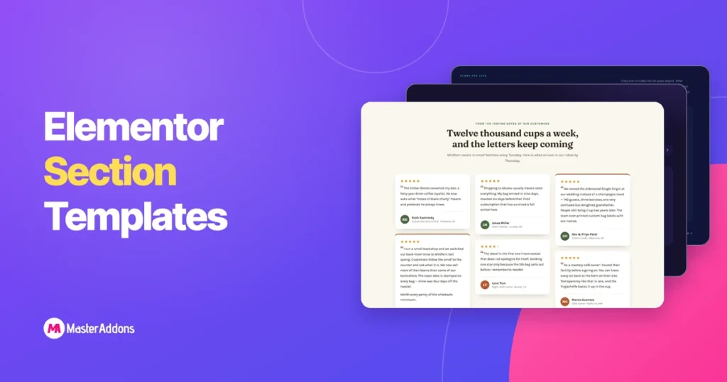
Un modèle de section est une bande d'une page : la table de tarification, la FAQ, la rangée de logos, enregistrée afin que vous puissiez la déposer dans une mise en page au lieu de la reconstruire.
Cette page a deux ensembles La première est 32 sections que nous avons construites à la main et emballées sous forme de fichiers JSON que vous pouvez télécharger ici, importer via le constructeur de widgets Master Addons et modifier à partir de champs étiquetés au lieu de conteneurs imbriqués La seconde est la bibliothèque de sections Master Addons : 583 sections Elementor qui installent depuis l'intérieur de l'éditeur Elementor, 93 d'entre elles sur le plugin gratuit.
Sautez à ce que vous êtes venu chercher :
- 32 modèles de sections à télécharger sous le nom de JSON: fichiers gratuits, importés avec le Widget Builder
- Parcourir la bibliothèque de 583 sections par type: héros, fonctionnalités, prix, FAQ, équipe, contact et plus encore
- Comment importer un modèle de section: les deux itinéraires, étape par étape
- Modèles de pages de destination des éléments construits à partir de ces sections
Comment importer un modèle de section Elementor
Deux itinéraires, deux systèmes distincts Les 32 téléchargements sur cette page sont livrés sous forme de widgets via le Widget Builder Les sections de la bibliothèque s'installent depuis l'intérieur de l'éditeur Elementor Les deux se terminent par le design sur votre page et tout est encore modifiable.
Route 1 : importer un fichier de modèle JSON avec le Widget Builder
- Téléchargez le zip pour le modèle que vous souhaitez et décompressez-le À l'intérieur se trouve le widget JSON, une image d'aperçu et la pochette de démonstration où le design en utilise.
- Aller à Modules complémentaires principaux → Widget Builder → Importer un widget dans votre administrateur WordPress et téléchargez le
widget-*.jsonfichier. - Ouvrez Elementor, recherchez le nom du widget dans le panneau et faites-le glisser sur la page.
- Remplissez l'onglet Contenu. Les couleurs se trouvent dans l'onglet Style, généralement quatre à six sélecteurs qui rethèmes toute la section.
Le Constructeur de widgets fait partie de Master Addons Pro. Les fichiers JSON eux-mêmes ne coûtent rien et restent les vôtres une fois téléchargés.
Plusieurs zips expédient des illustrations SVG, et WordPress bloque les téléchargements SVG par défaut Convertissez-les d'abord en PNG ou WebP, ou activez les téléchargements SVG. Les widgets s'affichent également sans images, car les emplacements d'images vides se cachent.
Route 2 : installez une section depuis la bibliothèque de modèles
- Installer et activer Additions maîtres(en), puis ouvrez n'importe quelle page avec Elementor.
- Cliquez sur l'icône du modèle Master Addons dans la barre d'outils de l'éditeur et passez au Sections onglet.
- Filtrez par catégorie, puis passez un design pour le prévisualiser en taille réelle.
- Cliquez Insérer. La section tombe à votre position de curseur avec ses images, espacement et paramètres de widget intacts.
- Modifiez-le comme tout ce que vous avez construit : cliquez sur un titre pour le retaper, ouvrez l'onglet Style pour changer de couleur.
Les sections gratuites s'insèrent tout de suite Les sections pro montrent un verrou et nécessitent une clé de licence activée sur le site Rien ne se télécharge sur votre ordinateur sur cet itinéraire.
32 modèles de section Élémenteur que vous pouvez télécharger sous le nom de JSON
Ceux-ci ont été construits pour ce post : HTML, CSS et JavaScript manuscrits, puis convertis en widgets Widget Builder Ils ne sont pas dans la bibliothèque du plugin, ils téléchargent à partir d'ici.
Les importer sous forme de widgets a une conséquence pratique : les choses reproductibles sont des répéteurs Les plans de tarification, les entrées FAQ, les témoignages, les membres de l'équipe et les logos sont tous des champs de répéteurs, donc l'ajout d'un quatrième plan ou d'une dixième question ajuste la mise en page, le décalage d'animation et la numérotation par elle-même Les couleurs passent par quatre à six sélecteurs de base Les animations respectent les paramètres de mouvement réduit Rien n'est soudé à un chemin de conteneur qui se brise lorsque vous le déplacez.
Modèles de sections de fonctionnalités et de services
Quatre façons de présenter ce que vous vendez : une grille de cartes, des lignes alternées, un processus numéroté et des cartes vitrines dirigées par des images.
1. Grille de cartes d'icônes : modèle de section de fonctionnalités de l'élémenteur

Une grille sombre à trois colonnes de six cartes de caractéristiques, construite autour d'une lueur de suivi de curseur : déplacez votre souris et une lumière radiale douce la traîne à travers les cartes Les cartes sont un répéteur : icône (collez n'importe quel SVG), titre, texte, et un lien de flèche optionnel par carte Six cartes d'un SaaS d'analytique fictif sont pré-remplies, et l'entrée décalée anime n'importe quel nombre de cartes que vous vous retrouvez.
2. Lignes d'image alternées : modèle de lignes de fonctionnalités de l'élémenteur
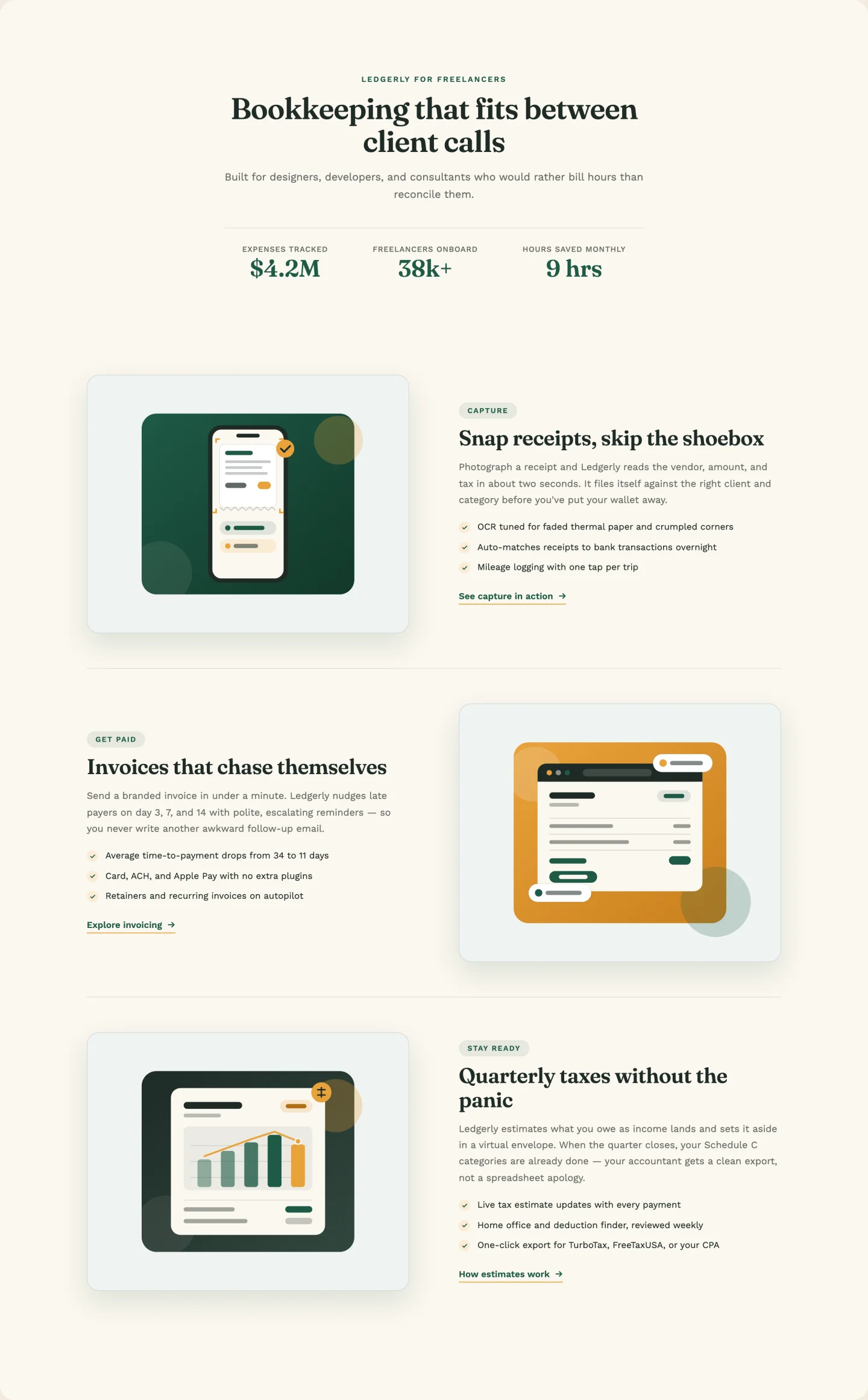
Classique image-gauche /image-droite lignes avec une bande de statistiques de décompte sous l'en-tête L'alternance est automatique Lignes flip sides en fonction de la position, donc l'ajout d'une quatrième ou cinquième ligne à travers le répéteur garde le zigzag intact Chaque ligne porte un badge de kicker, trois balles de contrôle, et son propre contrôle de lien Démo art pour les trois lignes de bookkeep-app est dans le zip.
3. Liste de processus numérotée : modèle d'étapes de processus de l'élémenteur
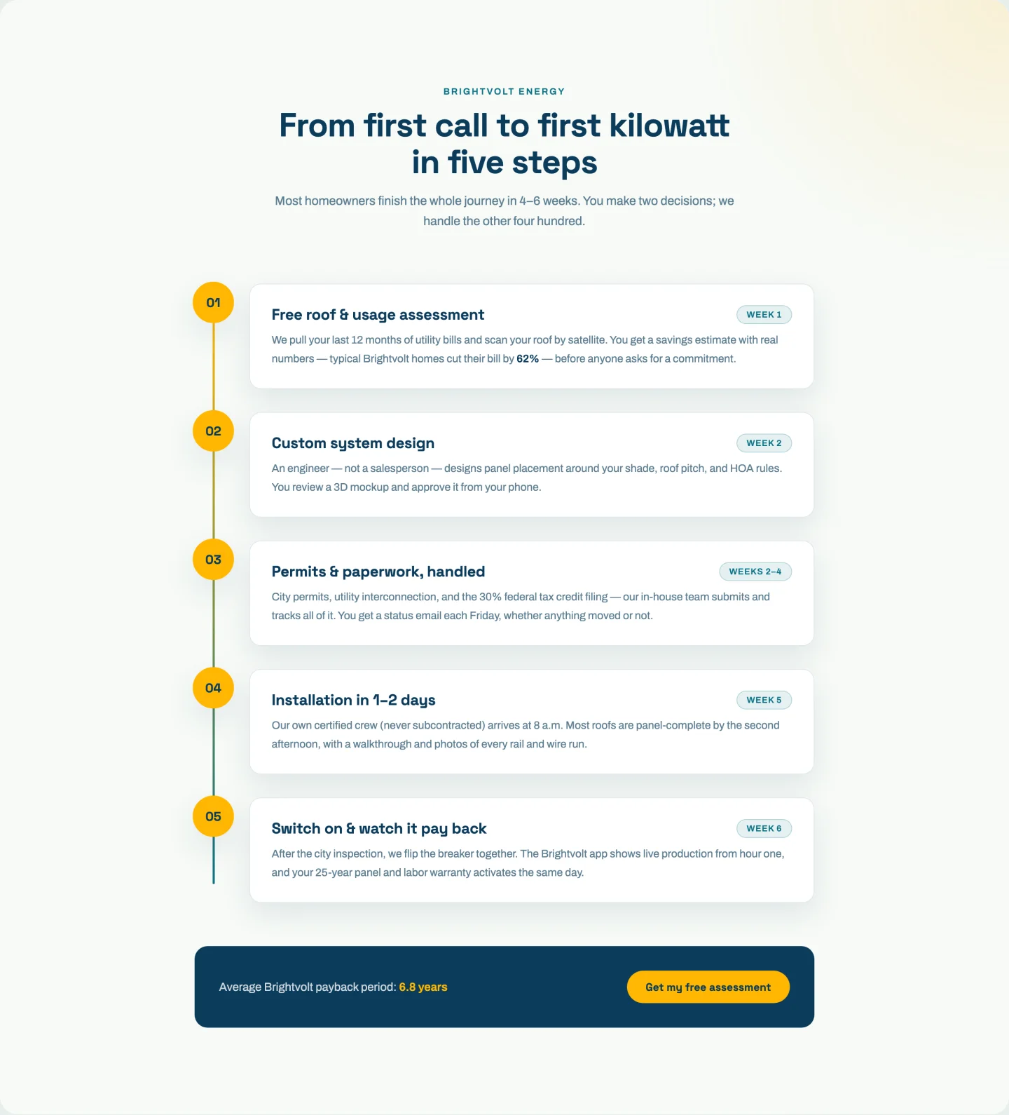
Cinq pas numérotés sur une piste verticale, avec une ligne de progression qui se dessine au fur et à mesure que vous faites défiler et des points qui s'allument lorsque leur pas entre dans la fenêtre d'affichage Les pas sont en direct dans un répéteur (numéro, titre, étiquette de puce, texte) et le calcul de progression lit le nombre de pas au moment de l'exécution Trois pas ou huit, la ligne atterrit toujours sur le dernier point Il y a un pied de page CTA basculable avec une statistique en surbrillance intégrée.
4. Cartes de présentation d'images : modèle de cartes de fonctionnalités d'élémenteur
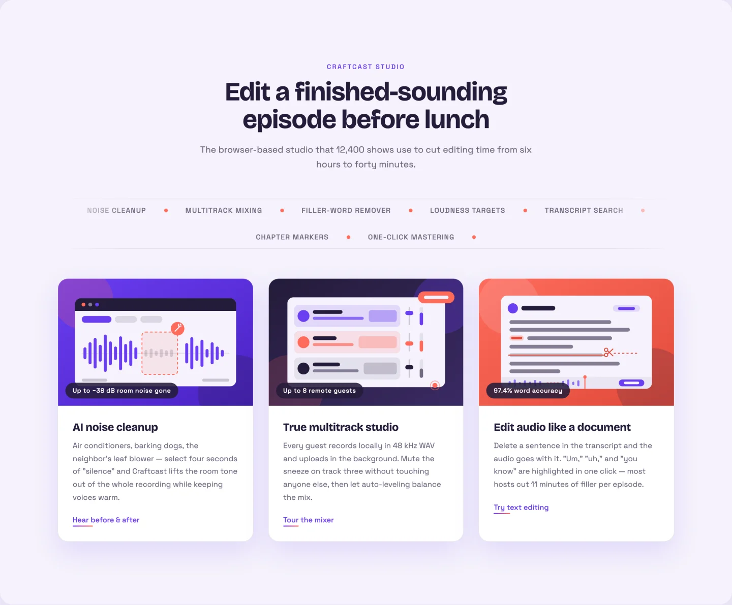
Trois grandes cartes image avec une inclinaison 3 D qui suit le curseur, plus un chapiteau de mot clé défilant entre l'en-tête et la grille Vous ajoutez chaque mot-clé ticker une fois La duplication de boucle transparente se produit en JavaScript, donc le chapiteau ne montre jamais de couture Les cartes prennent une image, un badge, un titre, du texte, et un lien chacun ; les trois illustrations de démonstration podcast-outil sont livrées dans le zip.
À propos de nous modèles de section
Image à gauche, image à droite avec un badge flottant et un énoncé de mission avec des cartes de valeur.
5. Image laissée avec l'histoire : Modèle de section Élémenteur à propos de nous
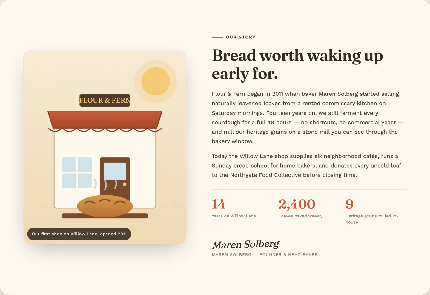
Photo à gauche avec une inclinaison de vol stationnaire de style polaroïd, une copie d'histoire à droite, trois statistiques de décompte et un bloc de signature Le répéteur de statistiques gère les préfixes, les décimales et les milliers de virgules La démo compte jusqu'à 2 400 partenaires grossistes sans que vous touchiez au code Scène de démonstration de boulangerie incluse comme SVG.
6. Image droite avec badge flottant : Élémenteur sur le modèle de section
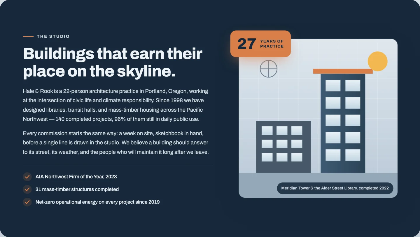
La disposition miroir : texte à gauche, image à droite, avec un badge de” flottant de “27 ans qui compte lorsqu'il défile dans la vue La liste de contrôle des informations d'identification est un répéteur, le badge est basculable et les deux lignes de badge sont modifiables. Utilisez-le pendant des années d'activité, projets expédiés, quel que soit votre meilleur numéro.
7. Mission et valeurs : Section mission et valeurs des éléments
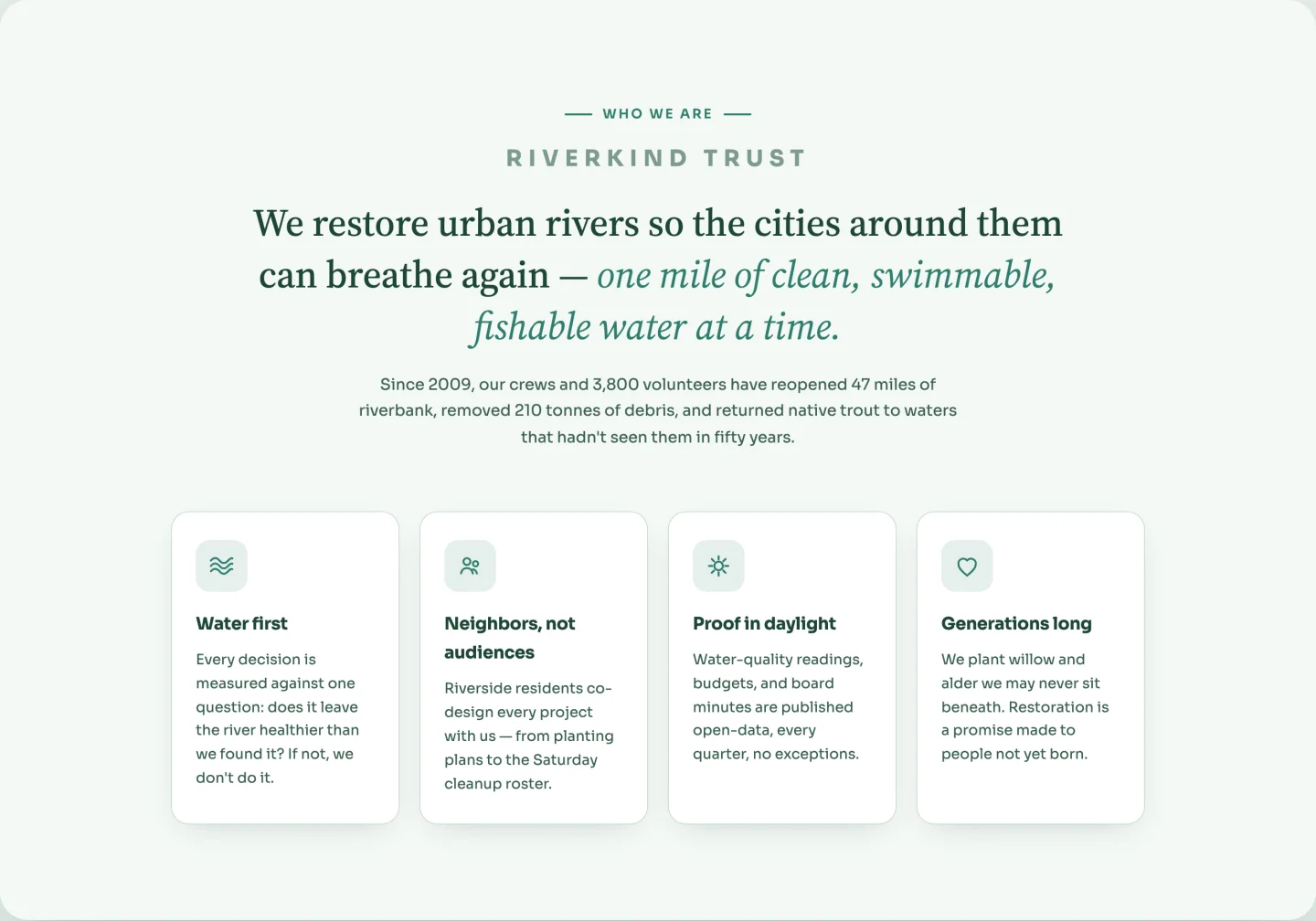
Aucune photo nécessaire Un grand énoncé de mission avec une phrase de couleur accent, puis quatre cartes de valeur avec des icônes de ligne qui tournent légèrement sur le vol stationnaire Les cartes sont un répéteur avec un champ d'icônes basé sur des mots clés (vagues, communauté, soleil, cœur).Les icônes sont des masques CSS qui héritent de la couleur de votre accent, donc elles se recolorent avec la palette au lieu de s'affronter avec elle.
Statistiques et modèles de bandes de compteurs
Deux bandes de décompte, une claire et une sombre, pour les nombres qui prouvent l'échelle.
8. bande de statistiques légères : modèle de section de compteur d'éléments
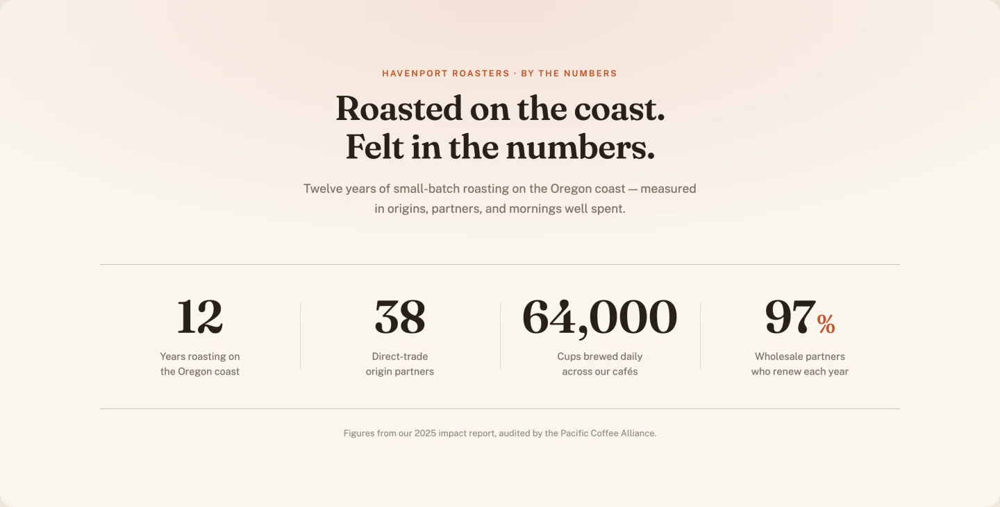
Quatre compteurs sur papier-blanc, chiffres sérif, lignes de diviseur qui dessinent à mesure que les chiffres grimpent Un curseur de colonnes reconfigure la grille de bureau si vous exécutez trois ou cinq statistiques au lieu de quatre, et un seul contrôle de durée syntonise la vitesse à laquelle tout compte.
9. Bande de statistiques sombres : modèle de bande de statistiques d'élémenteur
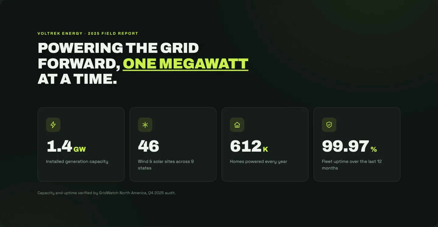
La version à contraste élevé : fond presque noir, accent de chaux, une icône au-dessus de chaque compteur avec une impulsion de lueur Les icônes se cyclent automatiquement par carte (boulon, turbine, maison, bouclier) et chaque statistique définit sa propre durée de décompte, de sorte que les nombres atterrissent en séquence plutôt que tous en une seule fois Le titre se divise en trois champs de sorte que le mot d'accent se trouve où vous le souhaitez.
Modèles de section de témoignage
Un carrousel, une grille en maçonnerie, une grande citation et des cartes de révision avec une note globale.
10. Carrousel de témoignage : Modèle de carrousel de témoignage d'élémenteur
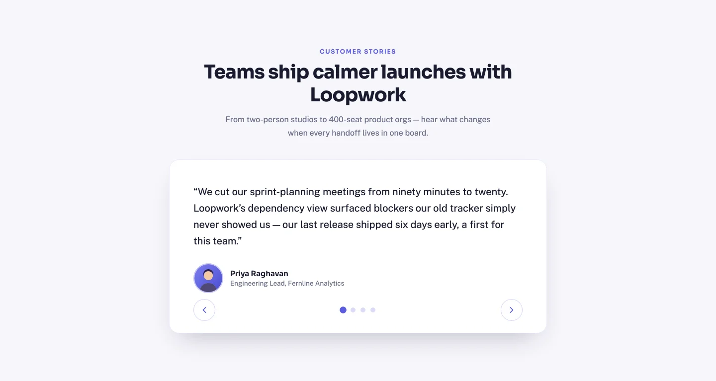
Un curseur approprié : boutons fléchés, points cliquables, navigation au clavier et hauteur automatique afin que les guillemets courts ne laissent pas de carte vide haute Les diapositives sont un répéteur (citation, nom, rôle, avatar), et les points et les “N des étiquettes de total” se reconstruisent à partir du nombre que vous ajoutez Quatre avatars de démonstration sont expédiés dans le zip.
11. Grille de maçonnerie : modèle de grille de témoignage d'élémenteur
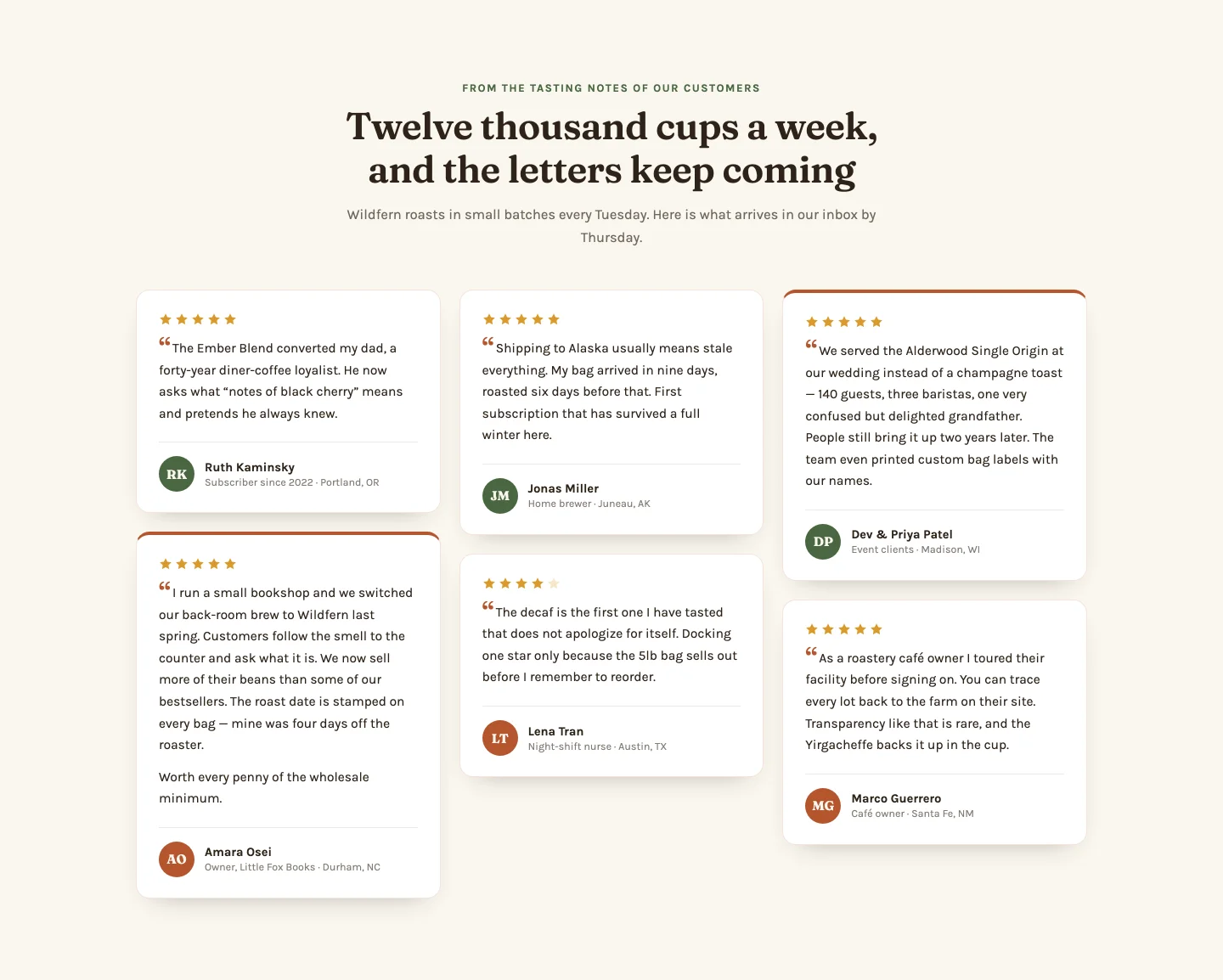
Six cartes en maçonnerie de colonnes CSS avec révélations décalées Chaque rangée de répéteurs prend un devis (plus le deuxième paragraphe en option pour les cartes hautes), une note de 1 étoile, des initiales pour le cercle d'avatar et une bascule de” en caractéristiques qui donne à une carte le traitement d'accentuation. Les étoiles restituent à partir de la valeur de notation, donc une critique de 4 étoiles montre quatre étoiles remplies, pas ce qui a été codé en dur.
12. Citation unique et volumineuse : modèle de section de témoignage d'élémentateur
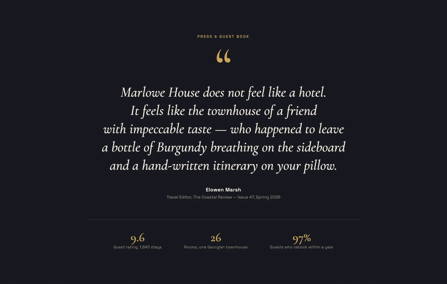
Une citation, énorme type serif, révélé ligne par ligne avec une animation masquée Vous collez la citation comme un seul paragraphe ; le JavaScript la divise en lignes équilibrées et fois la révélation, donc une citation de 15 mots et une citation de 40 mots s'animent toutes deux correctement Une petite bande méta en dessous (chambres, note, année) est un répéteur que vous pouvez vider entièrement.
13. Cartes de notation avec résumé : Modèle de cartes de révision des éléments

Le look review-agregator : un gros score de compte à rebours, des barres de distribution animées (cinq étoiles : 84 %, quatre : 11 %...), puis quatre cartes de révision taggées par plateforme avec des couleurs de badge par carte Les notes fractionnaires peignent des étoiles partielles Celui-ci a le plus de contrôles du groupe de témoignage, 24, car tout, des pourcentages de barres à la légende sous le score est modifiable.
Modèles de sections de tableaux de prix
Plan à trois niveaux et mis en évidence, une matrice de comparaison et un basculement mensuel/annuel.
14. Modèle de tableau de prix classique à trois niveaux : élémentor

Trois cartes, entrée décalée, prix qui comptent sur le défilement Les plans sont un répéteur Les fonctionnalités entrent comme une ligne par fonctionnalité dans une zone de texte, de sorte que les plans peuvent avoir cinq fonctionnalités ou neuf sans emplacements vides Un par plan “popular” bascule le bouton de cette carte de fantôme à accent solide.
15. Plan souligné : Modèle de section de tarification des éléments

Les mêmes os à trois colonnes, mais le plan populaire s'élève physiquement au-dessus de ses voisins avec une impulsion de lueur et un ruban La surbrillance suit une bascule dans chaque rangée de répéteurs, donc promouvoir un plan différent au trimestre suivant est un interrupteur, pas un restyle Une rangée de statistiques de pied de page (uptime, datacenters, support) peut être désactivée.
16. Liste des fonctionnalités de comparaison : Tableau comparatif des prix des éléments
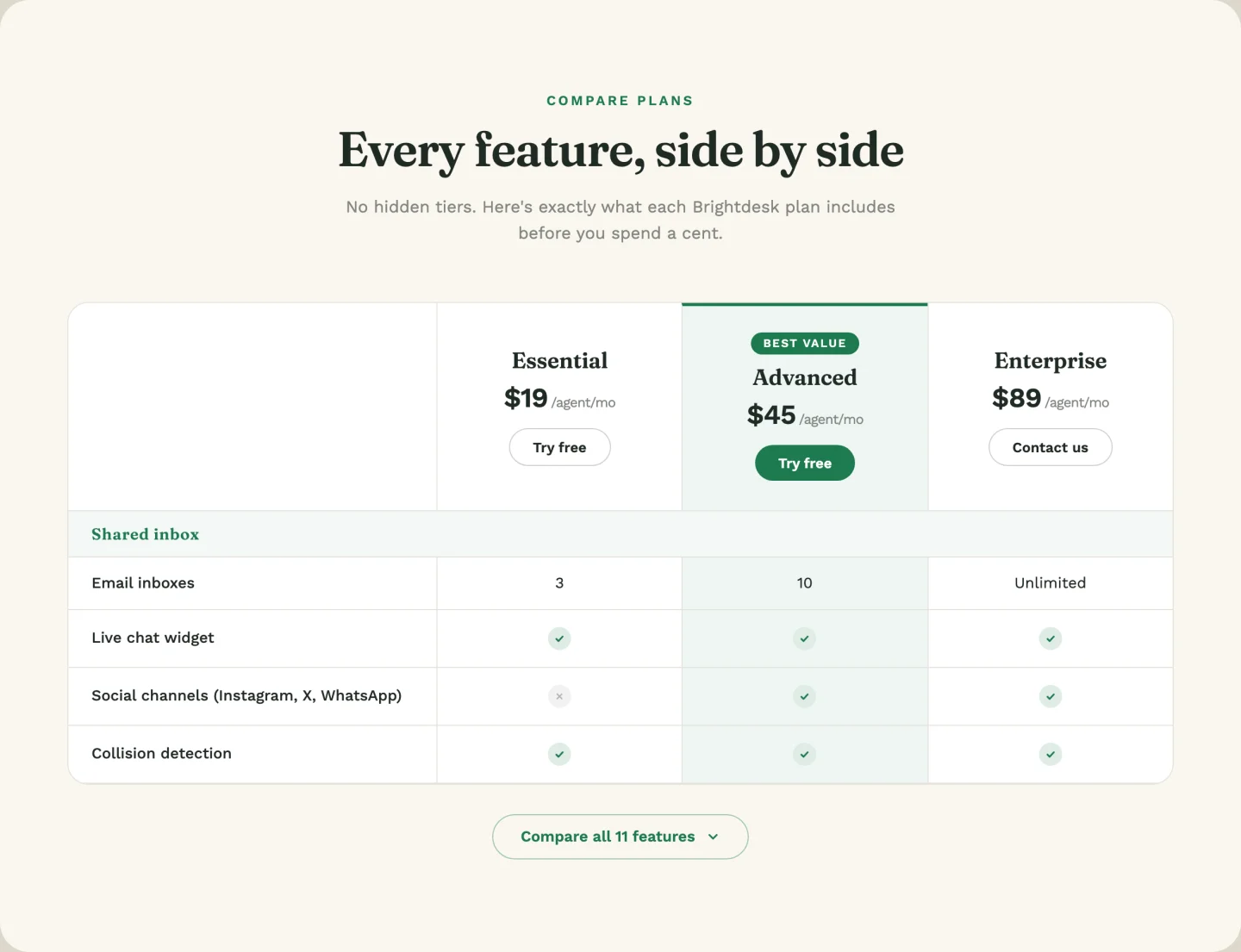
Une véritable matrice de fonctionnalités : trois colonnes de plan, des lignes de fonctionnalités avec des valeurs oui/non/personnalisées (“5 users”, “Unlimited”), et un bloc extensible qui révèle six lignes supplémentaires avec une animation de hauteur lisse Tapez oui ou non dans une cellule et il rend comme un chèque ou une croix ; tapez n'importe quoi d'autre et il imprime comme texte Quel plan obtient la valeur de colonne de “Best une liste déroulante À 38 contrôles c'est le modèle le plus profond du pack.
17. bascule mensuelle/annuelle : tableau de prix des éléments avec bascule de facturation
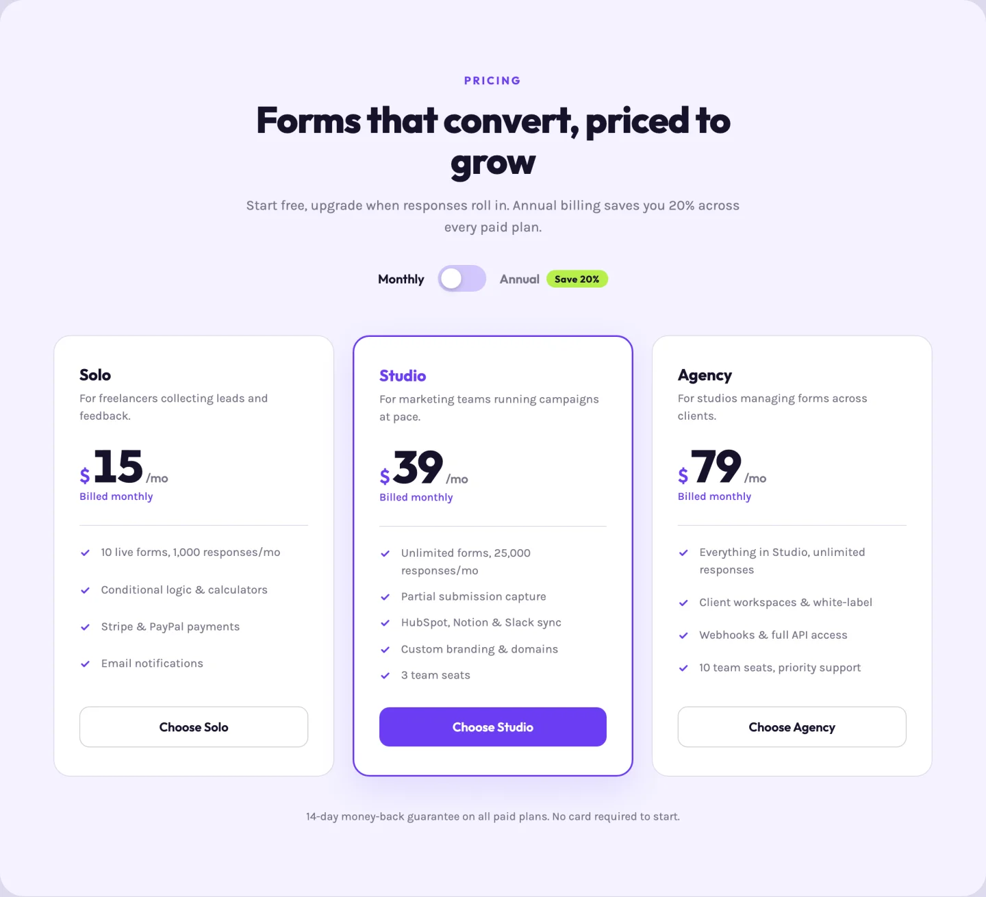
La norme SaaS. Un commutateur accessible retourne chaque carte entre les prix mensuels et annuels avec un peu d'animation de retournement de prix ; chaque plan transporte les deux prix plus les deux“billets de” dans sa rangée répéteur Le texte du badge de “Save 20 %” est un champ, donc changer les mathématiques change le badge.
Modèles de sections d'équipe
Une grille photo, un bios de survol-révélation et un curseur avec un panneau bio. Pour ajouter un effet de survol à une seule photo en dehors de ces modèles, utilisez le Widget Effets de survol d'image.
18. Grille de cartes photo : modèle de section d'équipe d'élémenteurs
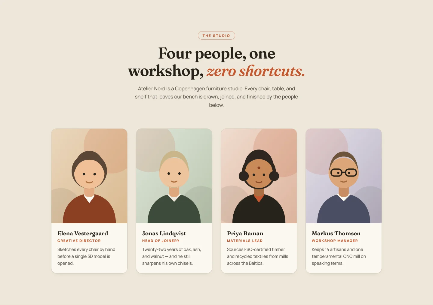
Quatre cartes portrait avec un survol par zoom et balayage de bordure Nom, rôle, et une bio d'une ligne par membre ; le décalage d'entrée recalcule pour n'importe quel nombre de membres Quatre illustrations de portrait démo viennent dans le zip si vous avez besoin d'espaces réservés tout en collectant de véritables photos de tête.
19. Biographies de révélation de vol stationnaire : modèle de cartes de membre de l'équipe d'éléments

Portraits qui glissent vers le haut d'un panneau bio sur le survol, la mise au point ou le robinet, de sorte qu'il fonctionne avec un clavier et sur les téléphones ainsi qu'une souris Chaque ligne de membre porte les contrôles LinkedIn, Instagram et les liens de messagerie, et toute la ligne sociale peut être désactivée si votre équipe préfère ne pas.
20. curseur d'équipe : modèle de curseur d'équipe Elementor
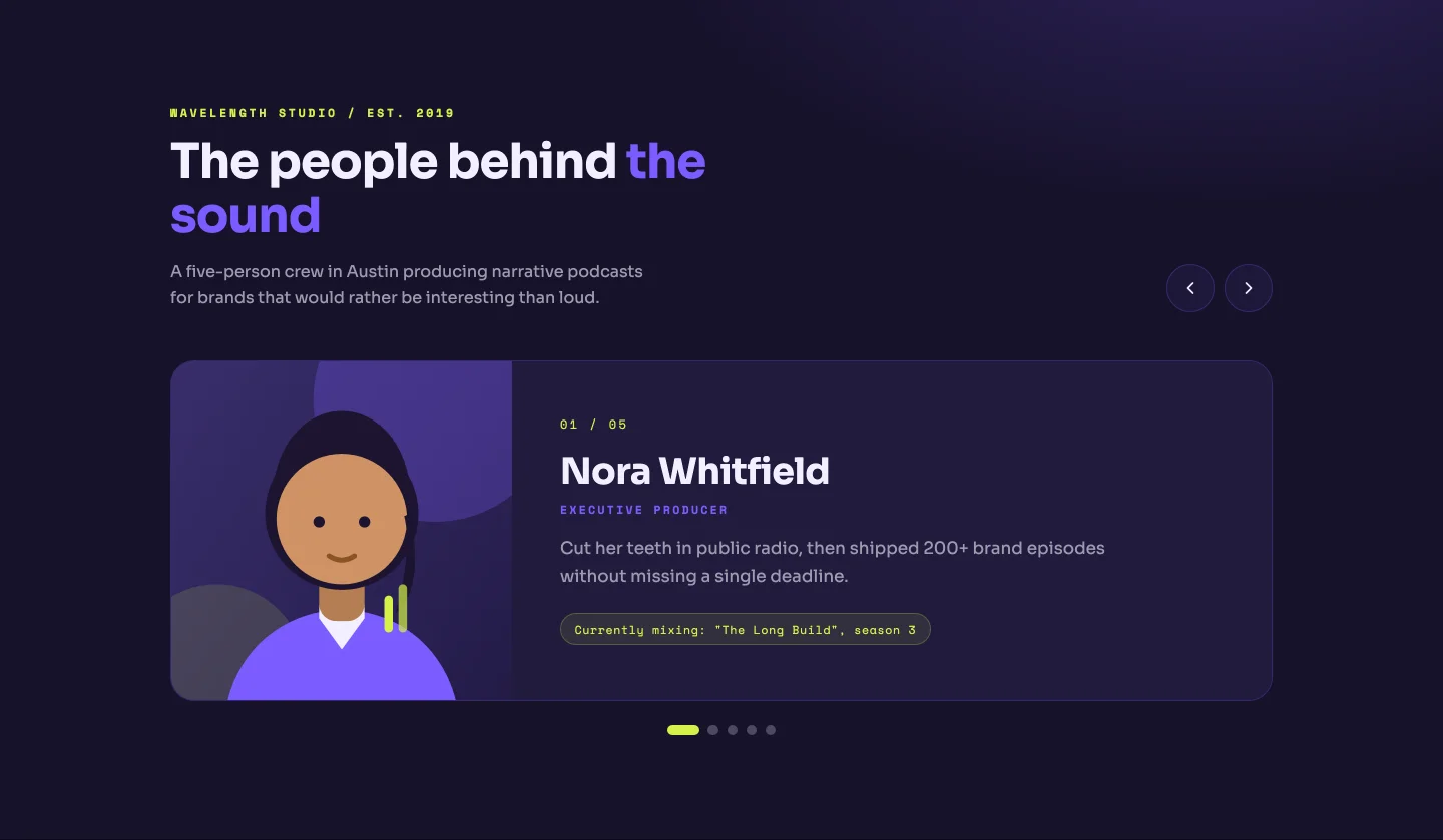
Un membre à la fois : grande photo, balise de rôle, une bio plus complète, et un compteur de “001 /05” qui reconstruit à partir de votre nombre réel de membres, comme les points Les touches fléchées fonctionnent Bon pour les petites équipes où chaque personne mérite plus qu'une carte de visite.
Modèles de sections FAQ
Un accordéon, une séance de questions-réponses à deux colonnes, des onglets de catégorie et un accordéon à côté d'une carte de support.
21. Accordéon : Modèle d'accordéon FAQ Elementor
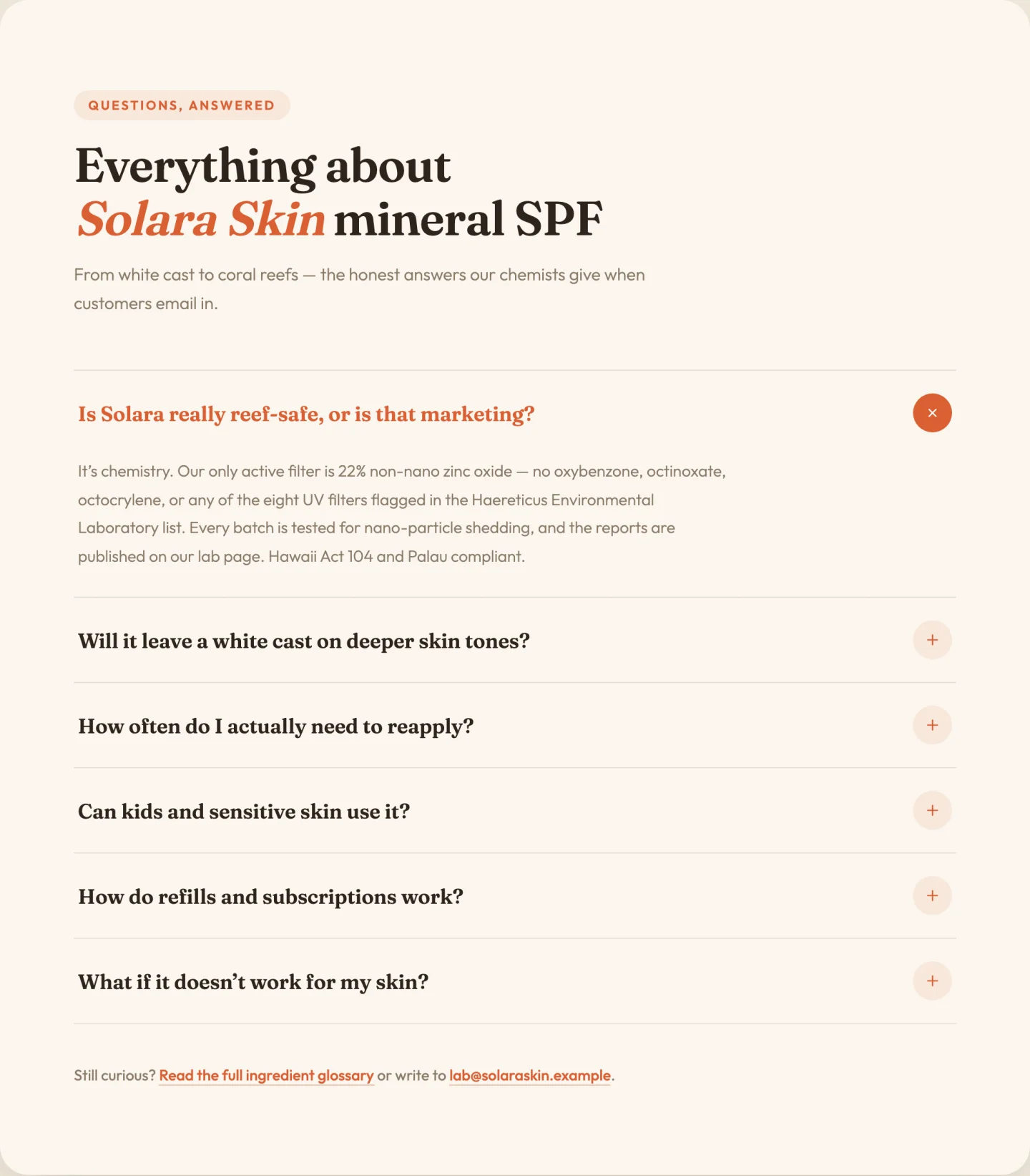
Accordéon simple ouvert avec animation de hauteur lisse et icônes plus rotatives Les questions et réponses sont un répéteur ; si le premier élément commence ouvert est une bascule La ligne de pied de page (“Still coincée ? Write to us”) a ses propres champs de lien et de courriel, parce que cette ligne finit toujours par être codée en dur et oubliée autrement.
22. questions-réponses à deux colonnes : Modèle de section FAQ sur les éléments
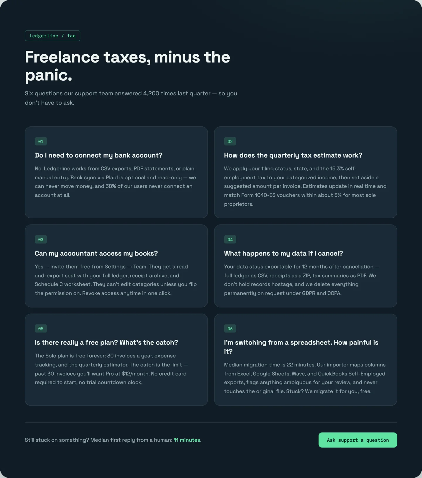
Pas de clic Les six réponses restent visibles dans une grille numérotée à deux colonnes avec des révélations décalées La numérotation 0106 est constituée de compteurs CSS, donc les éléments se renumérotent quand vous ajoutez un septième Mieux qu'un accordéon quand vos réponses sont courtes et que vous préférez que les visiteurs les lisent réellement.
23. onglets de catégorie : Modèle d'onglets FAQ Elementor
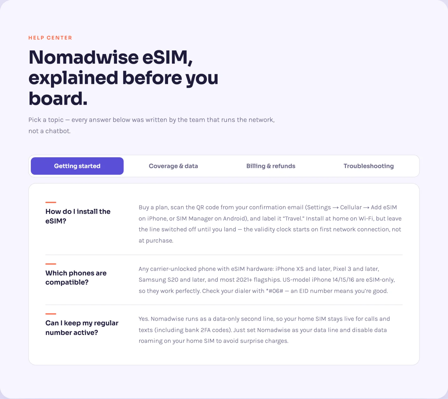
Douze questions réparties dans quatre catégories avec une barre d'onglets coulissante pour pilules Vous ne gérez pas du tout les onglets Chaque question du répéteur a un champ de catégorie, et le widget construit les boutons d'onglets à partir des catégories uniques qu'il trouve Renommer une catégorie sur trois questions et l'onglet se renomme toute la navigation par onglets flèche-clé incluse.
24. FAQ avec carte d'assistance : section FAQ Elementor avec carte d'assistance
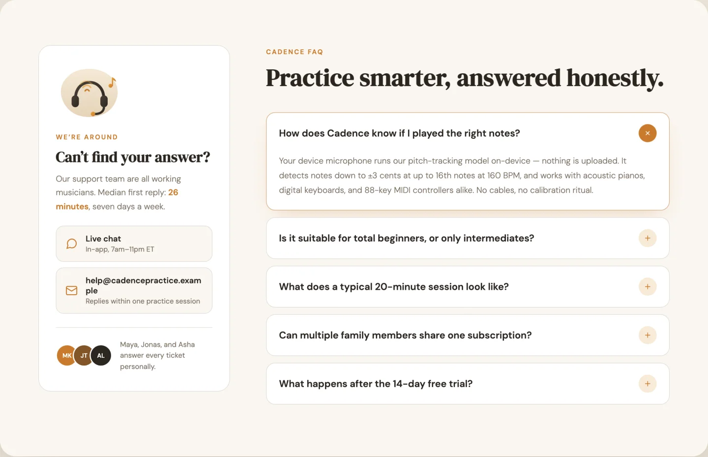
Accordéon à gauche (multi-ouvert cette fois), une carte support collante à droite avec une illustration, des canaux de contact, et une note d'équipe avec trois emplacements d'avatar Les canaux de contact sont un répéteur avec un chat/email/phone/clock icon picker par rangée Le décalage collant de la carte est un curseur, pour quand votre site a un gros en-tête fixe.
Modèles de bandes d'appel à l'action
Un dégradé audacieux, un split avec une image produit et une bande centrée minimale.
25. Gradient gras : modèle d'appel à l'action de l'élémenteur
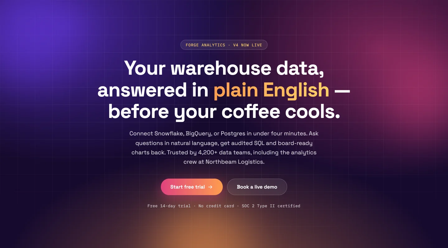
Un lavage dégradé animé en trois couleurs avec des blobs flottants qui dérivent vers votre pointeur Les trois couleurs dégradées sont des cueilleurs séparés, donc déplacer toute l'ambiance du violet à l'orange de marque prend trois clics Les boutons primaires et fantômes ont chacun des commandes de lien complètes ; les blobs s'éteignent pour les minimalistes (et s'éteignent pour les visiteurs à mouvement réduit).
26. Diviser avec l'image du produit : Modèle de section CTA d'élément
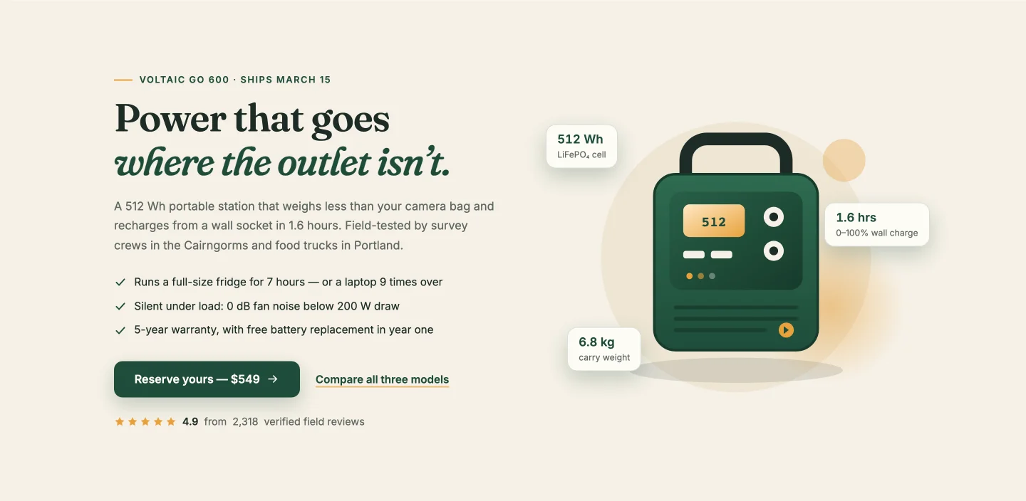
Copie et liste de contrôle à gauche, produit tourné à droite avec des badges de spécifications flottantes (capacité, temps de charge, poids) qui se repositionnent quel que soit le nombre que vous ajoutez La note des étoiles compte jusqu'à 4,8 sur 2 318 avis dans la démo, et les deux chiffres sont des champs Construit pour un produit physique mais fonctionne pour tout avec des spécifications qui valent la peine de se vanter.
27. Centré minimal : bande d'appel à l'action de l'élémenteur
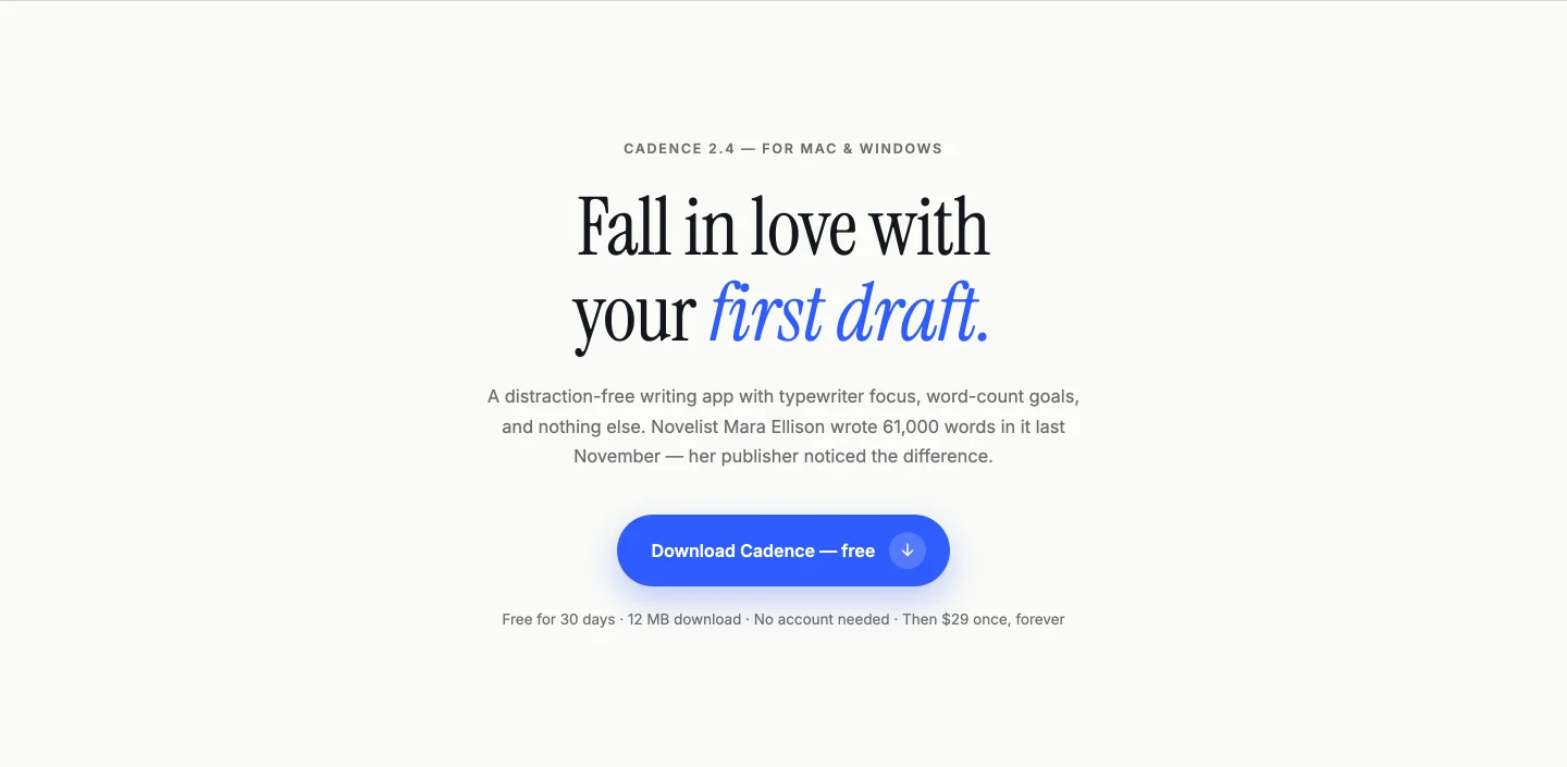
Fond de crème, un titre, un bouton, règles fines au-dessus et en dessous Le titre révèle mot par mot, et comme la division se produit au moment de l'exécution, votre titre réécrit anime exactement la même chose Quand une section sur deux de la page crie, celle-ci conclut l'affaire en baissant la voix.
Modèles de sections de formulaire de contact
Formulaire avec coordonnées, formulaire avec une carte animée et une carte centrée.
28. Formulaire avec coordonnées : Modèle de formulaire de contact Elementor
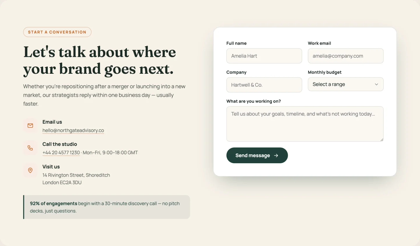
Colonne d'informations (e-mail, téléphone, bureau, comme répéteur avec icônes cyclistes) à côté d'un formulaire avec nom, e-mail, entreprise, une liste déroulante budgétaire, et un champ de message Les plages budgétaires sont leur propre répéteur Chaque étiquette et chaque espace réservé est modifiable, ce qui compte le jour où vous traduisez le site.
29. Formulaire avec carte : Formulaire de contact Elementor avec carte
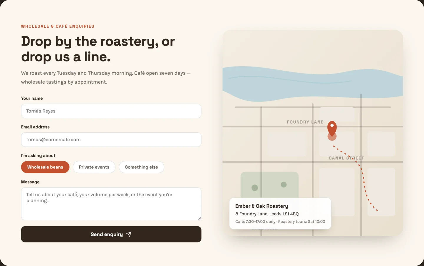
Un formulaire avec des puces de sélection de sujet à côté d'une carte SVG illustrée : itinéraire en pointillés animés, épingle à impulsions, détails du parc et du canal Pas d'intégration Google Maps, pas de clé API, pas d'implications de bannière de cookies Les étiquettes de rue sur la carte sont des champs de texte, alors mettez vos rues réelles dessus.
30. Carte centrée : section Formulaire de contact de l'élémenteur
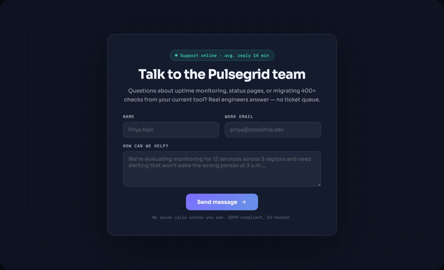
Une carte centrée sur un fond sombre avec un projecteur qui suit votre curseur et une“ clignotanteRépond dans un badge d'état de” d'un jour ouvrable Le texte du badge est un champ et l'ensemble du badge est basculable Au plus petit encombrement des trois Déposez-le à la fin de toute page qui a besoin d'une option de contact sans page de contact dédiée.
Modèles de bandes de logo
Une grille en niveaux de gris qui se colore en vol stationnaire et un chapiteau infini.
31. Grille en niveaux de gris statiques : modèle de grille de logo Elementor
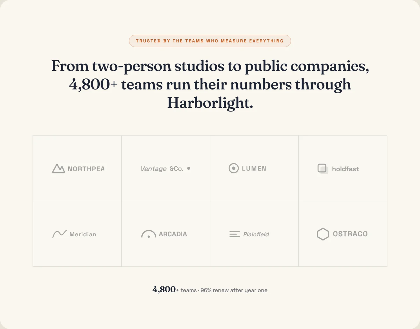
Huit logos dans une grille, en niveaux de gris jusqu'à ce qu'ils soient survolés, avec une statistique de décompte en dessous (“Powering reporting for 1 400+ teams”). Les colonnes sont un curseur, la ligne de statistiques est basculable et le survol en niveaux de gris fonctionne sur les logos PNG ou SVG que vous téléchargez.
32. chapiteau défilant : modèle de carrousel à logo Elementor
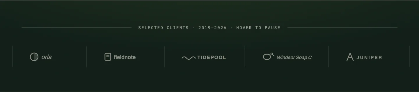
Un chapiteau infini avec des fondus de bord qui s'arrête en vol stationnaire et s'arrête pour les visiteurs à mouvement réduit Vous ajoutez chaque logo une fois ; le clone de boucle sans couture est géré en JavaScript La vitesse de défilement est un curseur ; la démo exécute une boucle de 28 secondes, qui se lit comme confiante plutôt que frénétique.
Parcourir la bibliothèque de 583 sections par type
La bibliothèque est l'autre moitié : 583 designs installés à partir de l'éditeur Elementor au lieu d'être téléchargés. Vous trouverez ci-dessous trois choix de chacune des catégories principales, chacun avec une démo en direct sur laquelle vous pouvez faire défiler et cliquer, et un bouton pour chaque design de cette catégorie.
| Type de section | Dessins | Où |
|---|---|---|
| section héros | 47 | Sauter |
| section caractéristiques | 64 | Sauter |
| section à propos de nous | 40 | Sauter |
| statistiques et section de comptoir | 40 | Sauter |
| section témoignage | 41 | Sauter |
| tableau tarifaire | 19 | Sauter |
| section équipe | 36 | Sauter |
| Section FAQ | 21 | Sauter |
| section appel à l'action | 27 | Sauter |
| section du formulaire de contact | 46 | Sauter |
| section blog et article | 28 | Sauter |
| section de menu méga | 6 | Sauter |
| Sections services | 41 | Parcourir |
| Sections processus, étapes et calendrier | 29 | Parcourir |
| Onglets, sections contenu et médias | 31 | Parcourir |
| Sections boutique, produits et menus | 23 | Parcourir |
| Section des études de cas et du portefeuille | 19 | Parcourir |
| Sections logo, marque et client | 13 | Parcourir |
| 404 sections d'erreur | 7 | Parcourir |
| Sections Carrières et emplois | 5 | Parcourir |
Les décomptes proviennent de la bibliothèque le 23 septembre 2026. Les nouvelles sections atterrissent avec la plupart des versions, votre plugin peut donc afficher plus que cela.
Modèles de sections héros d'élémentor
47 conceptions de héros dans la bibliothèque Ils diffèrent pour la plupart par ce qui se trouve à côté du titre : une capture d'écran du tableau de bord, un bouton de réservation, un badge de révision ou une rangée de comptoirs Si vous voulez des héros, vous pouvez télécharger en tant que JSON à la place, il y a un pack séparé de modèles de section héros.

Héros SaaS du signal de bord
Héros SaaS sombre avec un titre de latence et le tableau de bord du produit posé en dessous.

Héros nettoyeur
Photo héros pour une entreprise de services, avec un nombre d'étoiles et un numéro de téléphone à côté du bouton.

Héros de Craftova
Héros illustré avec une carte de résultats flottante à côté du titre.
Chaque héros est une pile de conteneurs, donc le titre, l'image et le bouton restent des éléments séparés que vous pouvez faire glisser.
Modèles de sections de fonctionnalités d'élémentor
La plus grande catégorie à 64 sections La plupart courent sur la Boîte d'informations widget, qui conserve l'icône, le titre, le texte et le lien comme contrôles séparés au lieu d'un bloc de texte formaté.
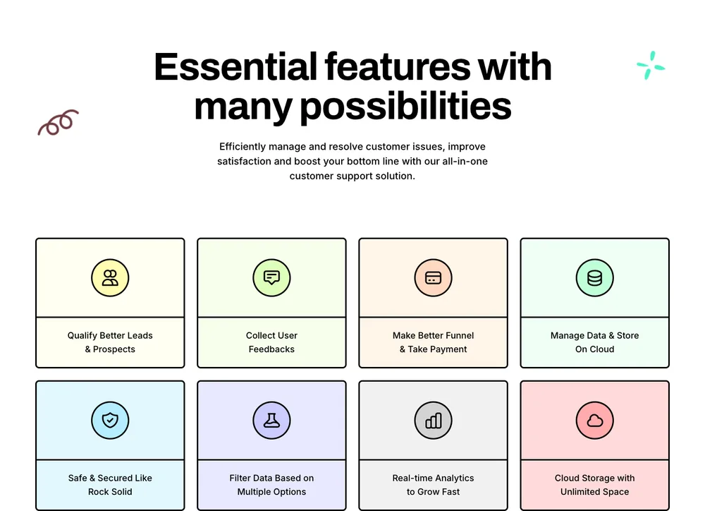
Grille de fonctionnalités de levage de plomb
Huit pastels comportent des carreaux sous un titre en empattement, deux rangées de quatre.

Cartes de fiabilité sombres
Quatre cartes sombres avec icônes numérotées, construites pour les garanties et les SLA.

Fonctionnalités de l'application mobile Clowdify
Section divisée violette avec une maquette de téléphone et une liste de contrôle des fonctionnalités de l'application.
Échanger les icônes du contrôle Info Box et l'espacement tient Le texte est du texte réel, donc il traduit et il indexe.
Modèles de section Elementor about us
40 sections à propos et histoire La mise en page qui répète le plus est une image d'un côté avec l'histoire, une liste de contrôle et une rangée de statistiques de l'autre.
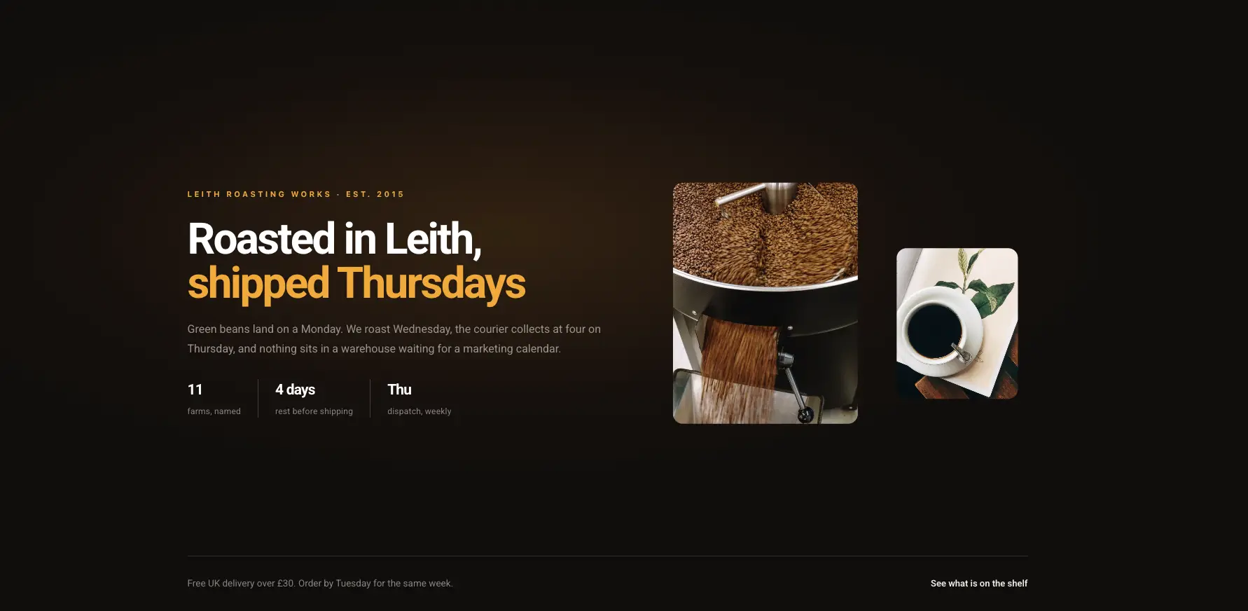
Histoire d'artisanat sombre
Groupe d'histoire éditoriale sombre avec une photo de produit et une ligne de date.

Nettoyage À propos de nous
Collage photo avec une ligne de promesse en surbrillance et un bouton de numéro de téléphone.
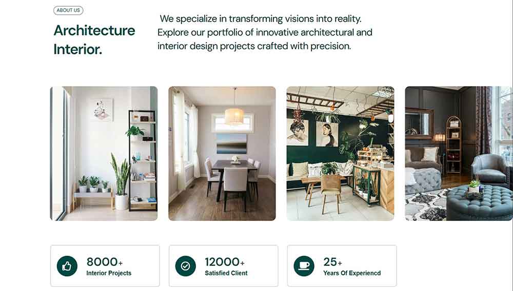
VibeSpace À propos
Conception intérieure d'un bloc avec une grille de quatre images et trois compteurs en dessous.
Ceux-ci conservent leur forme lorsque l’histoire est longue, c’est là que la plupart des sections s’effondrent.
Statistiques des éléments et modèles de sections de compteurs
40 sections pour les nombres : contre rangées, barres de progression, tableaux métriques bento et tableaux de bord Les compteurs s'exécutent sur le Compter widget et animer sur le défilement sans configuration.
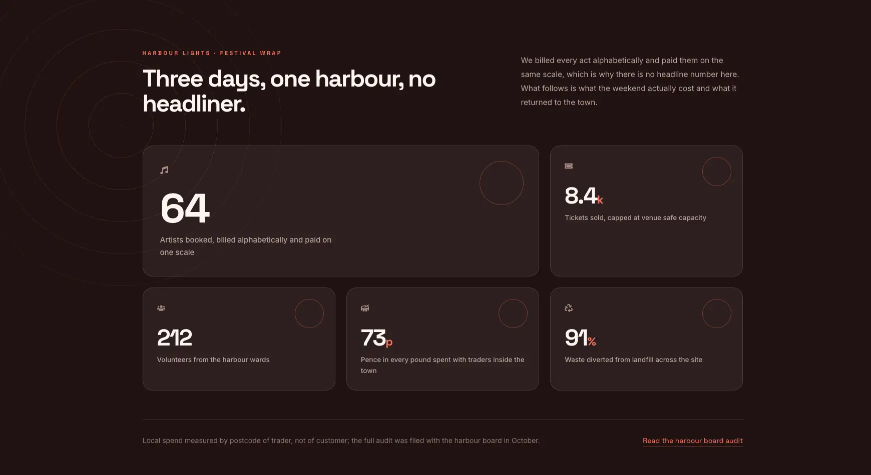
Emballage du festival Bento
Planche bento de cinq carreaux métriques de différentes tailles, foncée et chaude.

Métriques clés Zaplyte
Bande violette audacieuse avec trois grands compteurs et des étiquettes courtes.
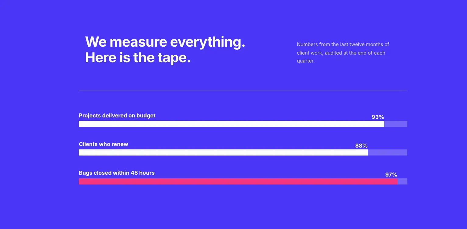
Barres de progression de couleur audacieuses
Bloc bleu avec trois barres de progression étiquetées pour les numéros de livraison ou de capacité.
Les compteurs prennent un préfixe et un suffixe, donc 12 k+, 99,9 % et 4,2 M$ rendent tous sans toucher au champ des nombres.
Modèles de section de témoignage d'élémentateur
41 sections de témoignages et de critiques : curseurs, grilles de cartes, citations uniques et mises en page de plateformes de critiques Il y a aussi un procédure pas à pas pour construire un carrousel de témoignages si vous préférez en construire un vous-même.

Histoires de clients Craftova
Blocs d'histoires de clients illustrés avec un comptoir client heureux au milieu.
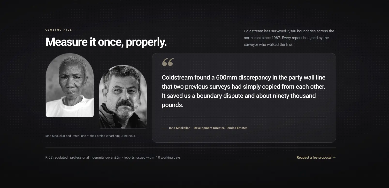
Portrait Histoire du client
Citation éditoriale sombre avec deux photos de portrait et une longue citation tirée.

Craftova Témoignages
Examinez les cartes avec des étoiles au-dessus d’une bande d’évaluation de la plateforme d’évaluation.
Les avis sont des éléments répétiteurs dans la plupart d'entre eux, donc un cinquième est un clic et la ligne se réespace.
Modèles de tableaux de prix des éléments
19 sections de tarification construites sur le Tableau des prix widget. Le nom du plan, le prix, la liste des fonctionnalités, le ruban et le bouton sont des contrôles distincts, ce qui maintient les lignes alignées lorsque les plans comportent des fonctionnalités différentes.
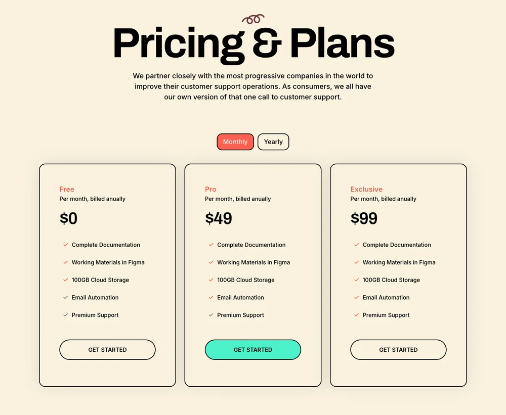
Prix du Lead Lift
Disposition crème à trois niveaux avec un titre serif et un commutateur mensuel ou annuel.
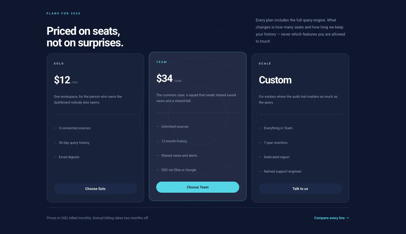
Tableau des prix sombre
Table sombre à trois colonnes avec un plan surligné et une tarification par siège.
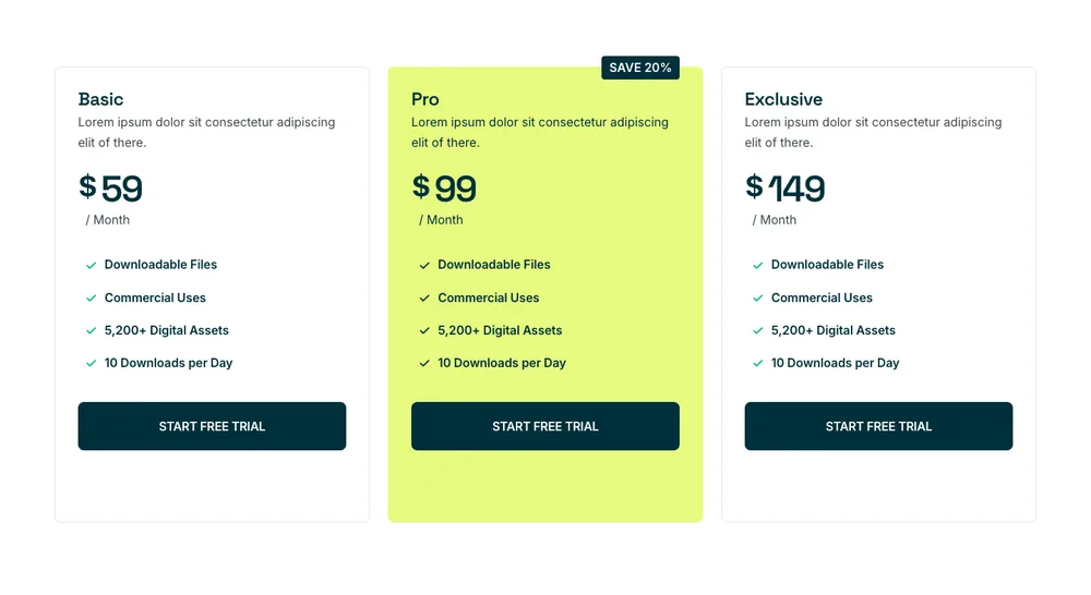
Prix Craftova
Trois forfaits avec une carte centrale lime et un badge de sauvegarde sur l'option annuelle.
Pour un changement mensuel et annuel dans un widget, le modèle de bascule de facturation plus haut sur cette page le gère.
Modèles de section d'équipe d'élémentateurs
36 sections d'équipe fonctionnant sur le Membre de l'équipe widget, donc photo, rôle, bio et liens sociaux sont des champs plutôt que des zones de texte empilées.

Mosaïque de portraits Bento
Mosaïque bento sombre de quatre portraits aux cadres dépareillés.

Équipe Clowdify
Bande orange avec cinq cartes portrait et des rôles en dessous.
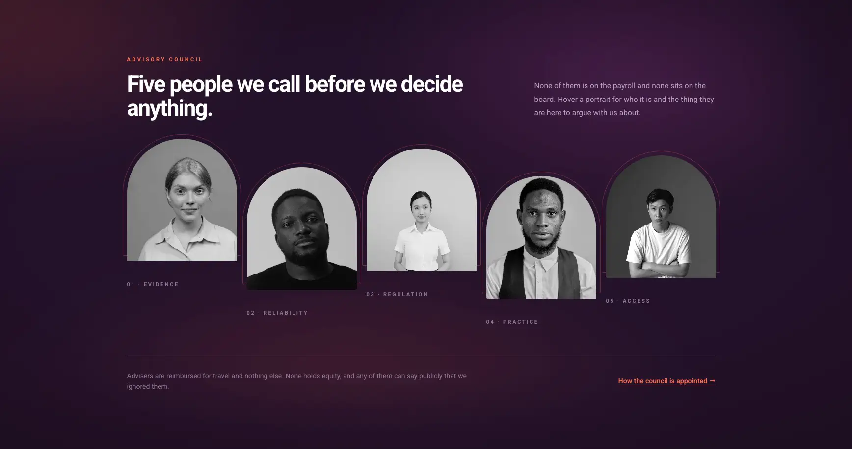
Rangée de portraits échelonnés
Rangée violette dégradée de portraits arqués qui révèlent une note en vol stationnaire.
Les icônes sociales sont par membre, donc une personne peut avoir LinkedIn uniquement et la ligne reste toujours en équilibre.
Modèles de section FAQ sur les éléments
21 sections FAQ. Les accordéons utilisent le Accordéon avancé widget, qui transporte le comportement à ouverture unique et le paramètre de schéma FAQ.
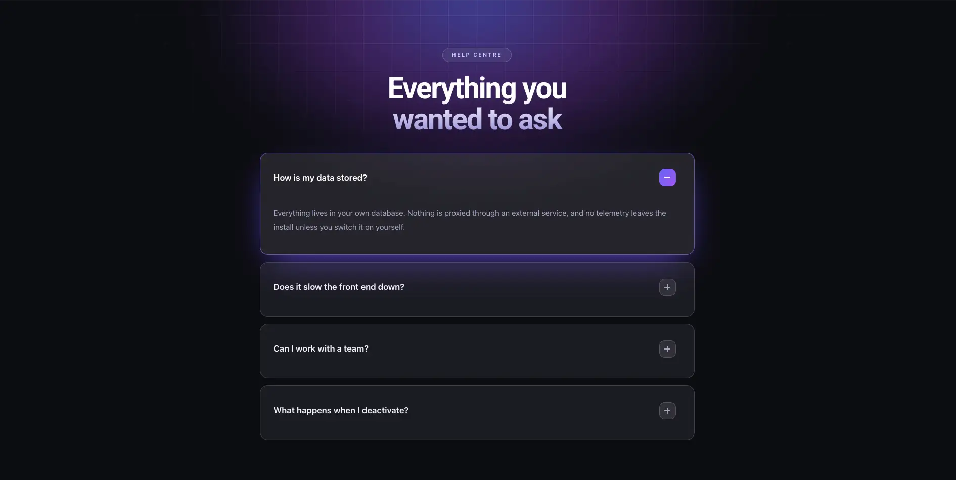
FAQ sur la lueur sombre
Accordéon foncé avec une lueur violette derrière le cap.
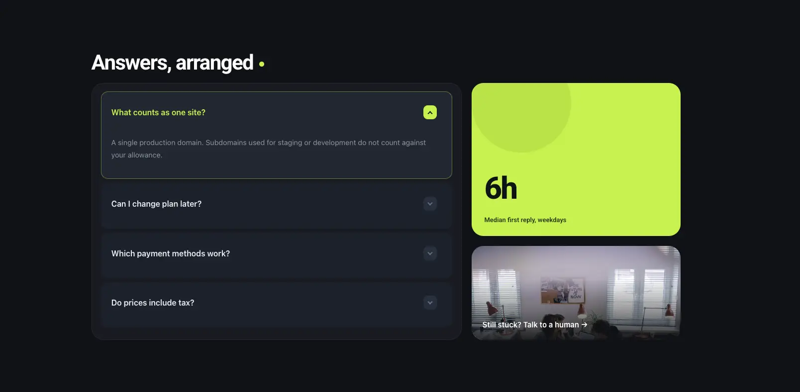
Panneau FAQ Bento
Accordéon à gauche avec un carreau de citron vert et un carreau photo à droite.
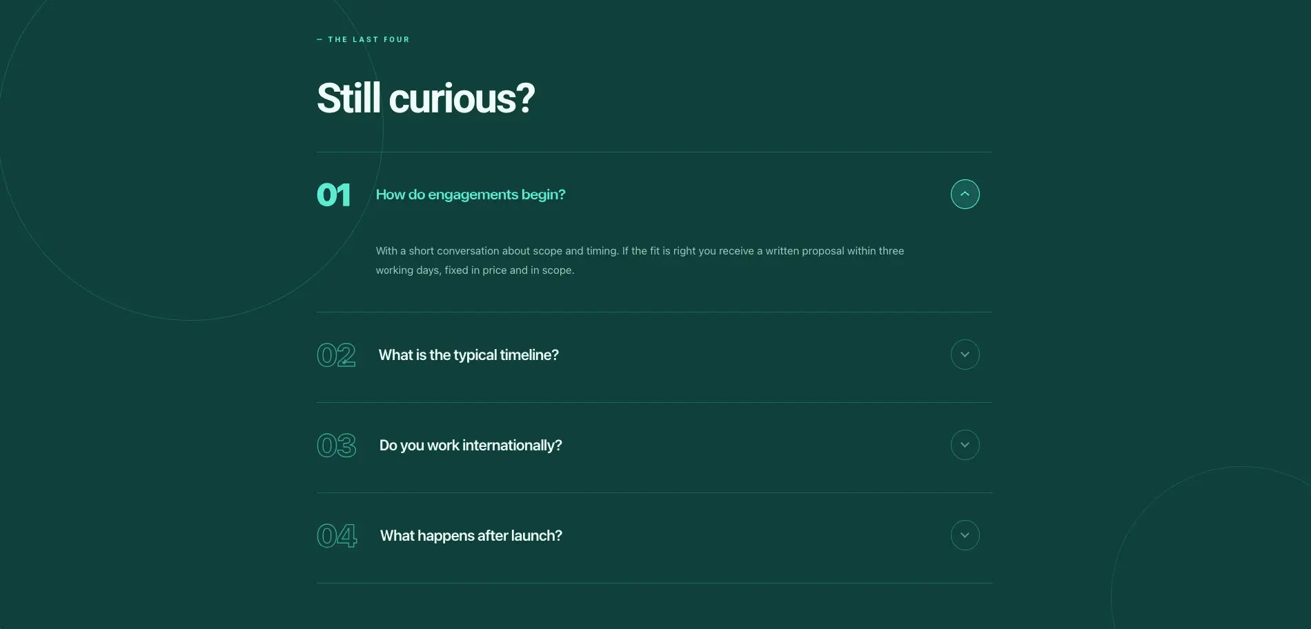
FAQ éditoriale numérotée
FAQ numérotée vert foncé avec un titre toujours curieux.
Activez le schéma dans le widget accordéon avant de publier si vous souhaitez que les questions soient éligibles à des résultats riches.
Modèles de section d'appel à l'action de l'élémentateur
27 bandes CTA, les sections qui se trouvent au-dessus du pied de page et demandent le clic Construit sur le Appel à l'action et Bouton Créatif Widgets.
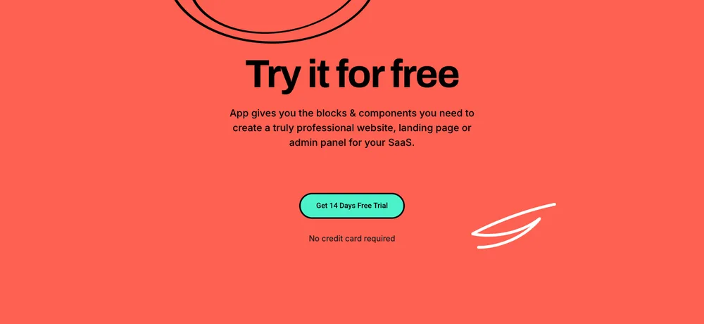
Levage de plomb CTA
Bande pleine largeur de corail avec un titre d'essai gratuit et une ligne sans carte de crédit.

Tecpart CTA
Bande de mise à l'échelle sombre avec un globe filaire derrière la copie.

Zaplyte CTA
La promo de l'application est divisée avec des badges de magasin, une maquette de téléphone et une ligne de notation.
Les styles de survol de bouton vivent dans l'onglet Style du widget, les couleurs de la marque sont donc un sélecteur plutôt qu'une modification de feuille de style.
Modèles de sections de formulaire de contact d'élémenteur
46 rubriques contact, réservation et heures d'ouverture. Les formulaires proviennent du formulaire de contact 7 via le Styleur CF71, donc les champs restent les vôtres et seul le style vient de la section.
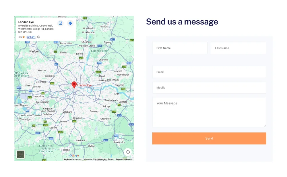
Formulaire de contact Balanciq
Carte à gauche, formulaire de message à droite.
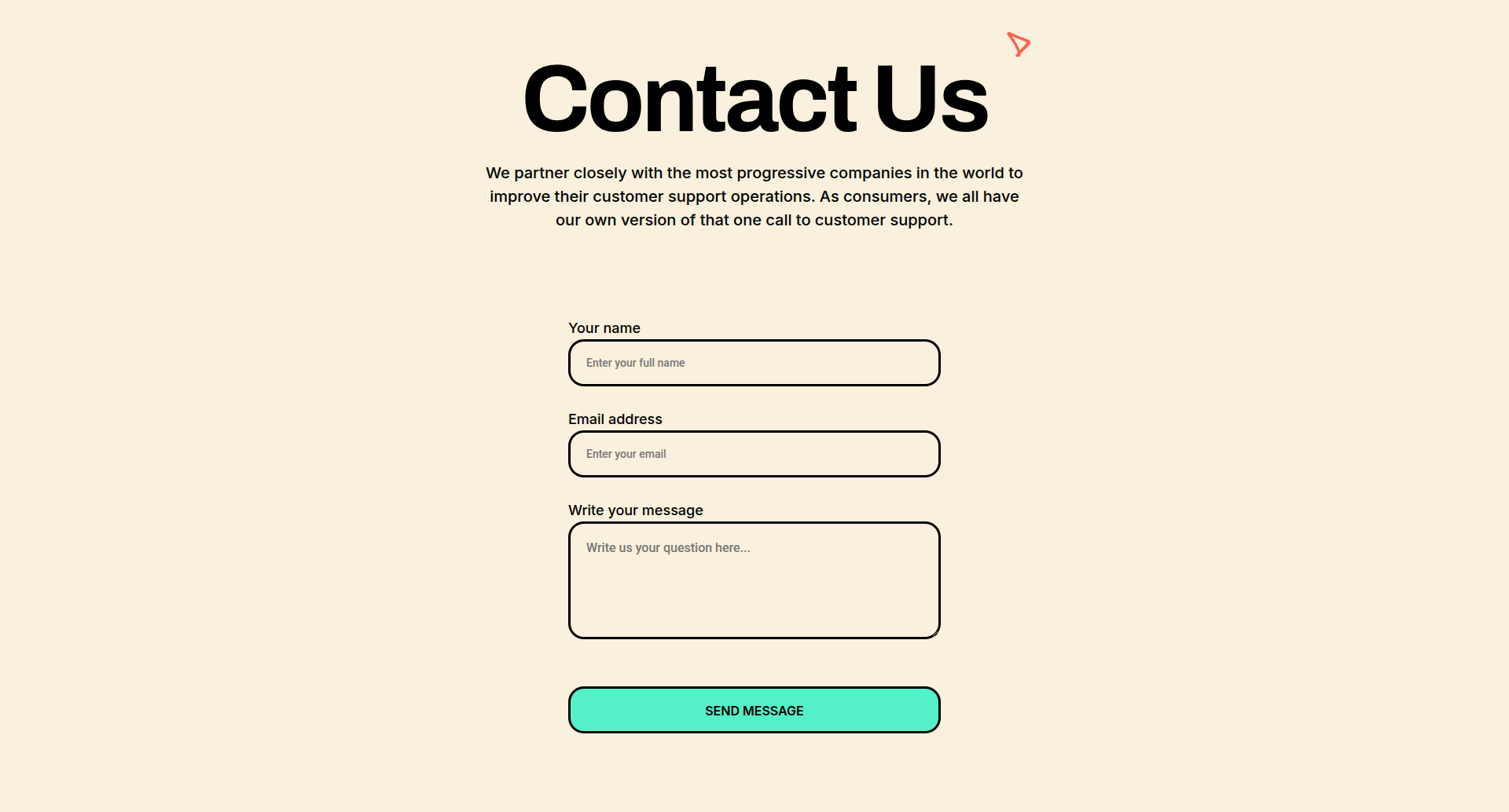
Formulaire de contact pour le levage de plomb
Forme centrée sur la crème avec un cap en empattement et des champs arrondis.
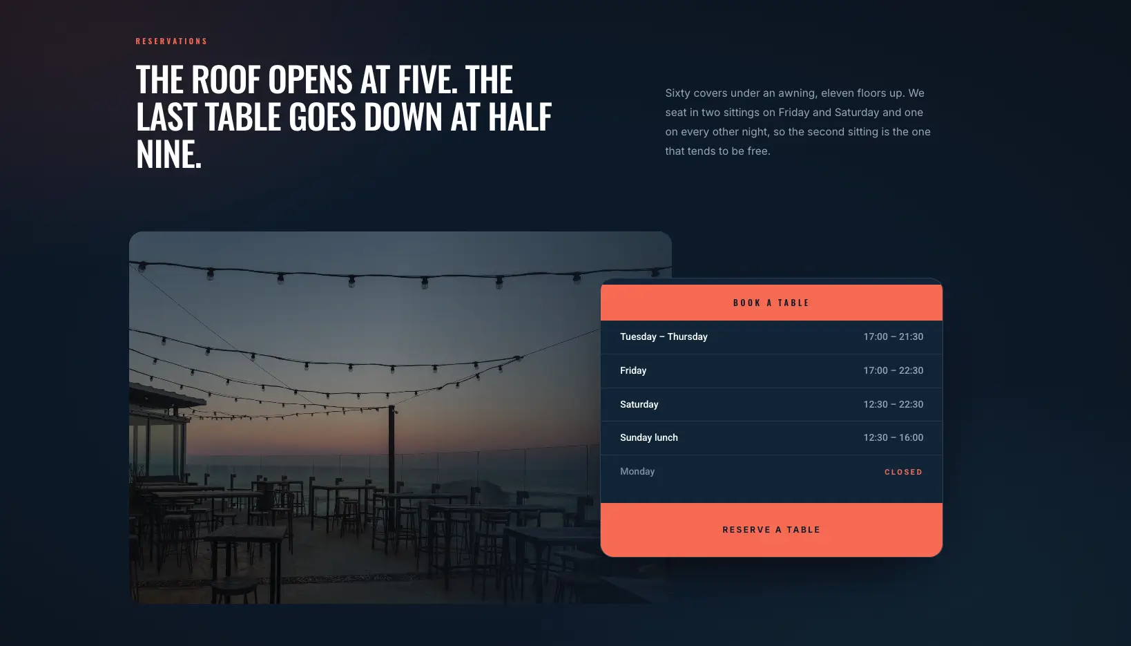
Carte de Réservation Overlap
Photo du soir avec une carte des heures d'ouverture la chevauchant et un bouton de réservation.
Installez d'abord le formulaire de contact 7, puis choisissez votre formulaire dans le widget. La section se vide jusqu'à ce qu'un formulaire soit sélectionné.
Modèles de blogs et de sections d'articles Elementor
28 sections de blog plus des mises en page à un seul article, construites sur le Articles de blog widget. pour les modèles de page entière plutôt que pour les sections, voir le Modèles de blogs Elementor poste.
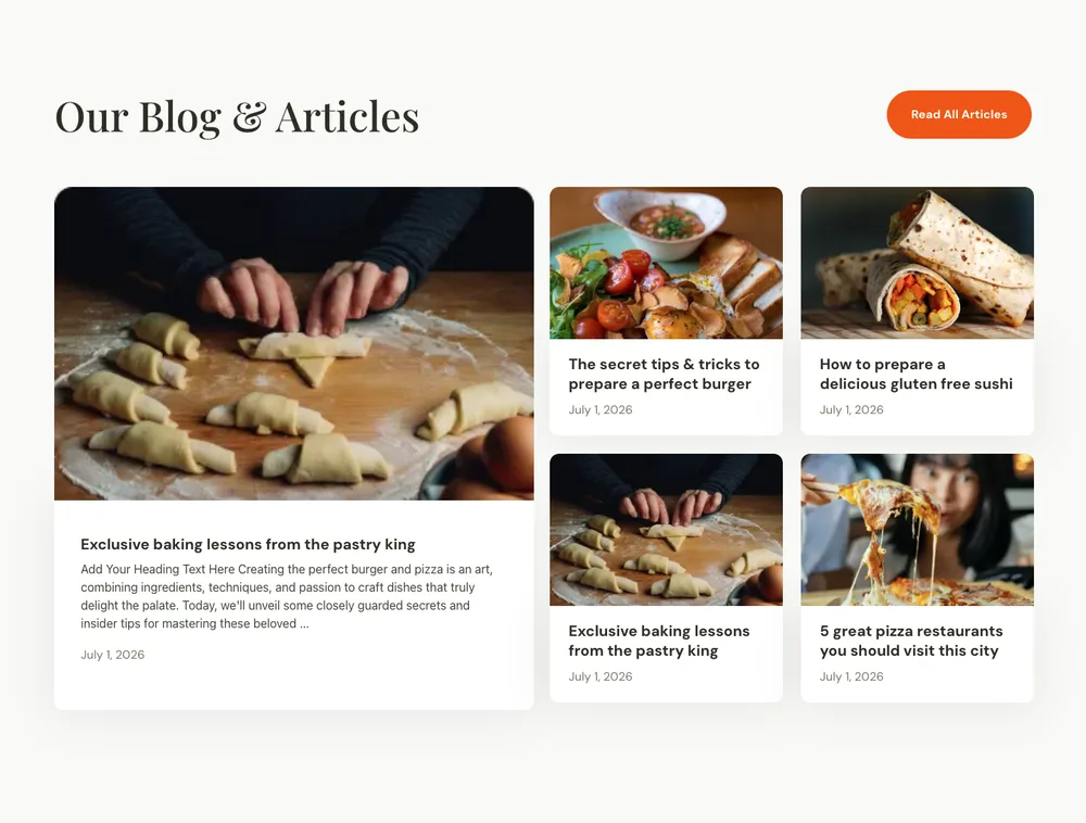
Article de blog culinaire
Disposition du magazine avec un grand article de fond et quatre cartes plus petites.
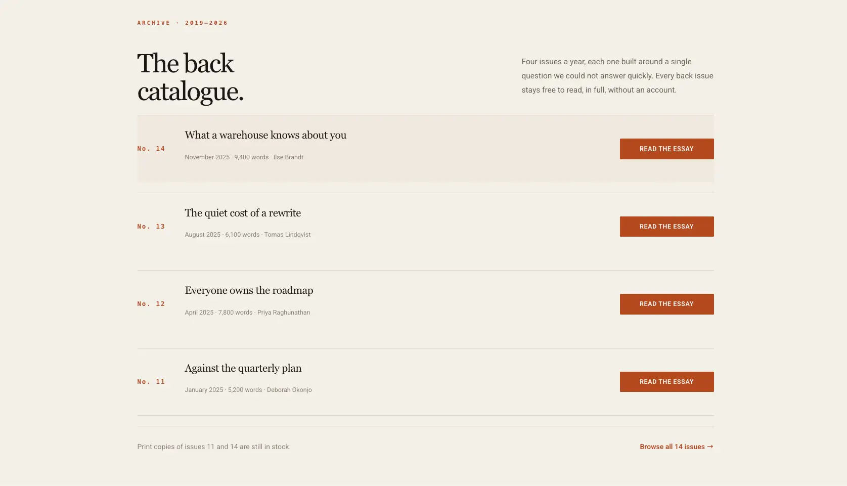
Liste d'archives éditoriales
Liste d'archives Cream avec un bouton de lecture sur chaque ligne.

Article de blog Balanciq
Ligne de poste à trois cartes avec dates et une intro de section à gauche.
La grille tire les messages en direct, elle se remplit donc une fois la section sur votre site.
Modèles de section de menu Elementor mega
Six méga panneaux de menu : colonnes de liens, répertoires d'icônes et blocs promotionnels qui sortent d'un élément de navigation plutôt que de se trouver dans la page.
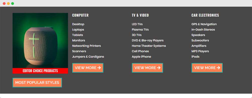
Méga menu du magasin d'électronique
Panneau de catégorie de produit avec une tuile de produit vedette et trois colonnes de lien.
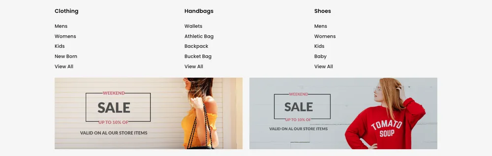
Méga Menu Magasin de Mode
Trois colonnes de lien au-dessus de deux bannières de vente.
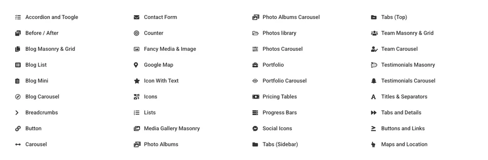
Répertoire de widgets Mega Menu
Répertoire à quatre colonnes de liens d'icônes pour une grande liste de fonctionnalités.
Construisez d'abord le panneau sous forme de section, puis pointez-y le widget Mega Menu depuis votre navigation.
Soit 36 sur 583. Le bibliothèque des sections complètes a le reste, et les mêmes conceptions sont à l'intérieur du plugin sous les mêmes filtres de catégorie Si vous voulez une page entière plutôt qu'un seul groupe, les mises en page pleine page vivent sur le Modèles de pages d'éléments page, avec des conceptions complètes du site sur le kits de modèles page. Les en-têtes, les pieds de page et les popups ont leurs propres pages : Modèles d'en-tête d'élémentor, Modèles de pied de page d'élémenteur et Modèles contextuels d'élémenteur.
Blocs d'éléments, sections, modèles de pages et kits
Ces quatre mots sont utilisés pour la même chose et signifient des quantités de pages différentes.
- Sections sont une bande horizontale : une table de prix, une FAQ, un héros De quoi parle cette page Vous les empilez pour faire une page.
- Blocs sont la même chose sous un nom différent Certaines bibliothèques d'addon disent des blocs où nous disons des sections Quelques-uns utilisent le mot pour l'éditeur de bloc WordPress, qui n'a aucun rapport.
- Modèles de pages sont une page complète : accueil, à propos, contact, tarification Lorsque les gens recherchent des modèles de site Web Elementor, c'est généralement ce qu'ils veulent dire Master Addons en a 211 sur le site Web modèles de page Page.
- Kits modèles sont un site entier dans un style : en-tête, pied de page et chaque page, conçu pour correspondre Il y en a plus de 30 sur le kits de modèles Page.
Les sections sont l'unité utile lorsque vous avez déjà un site et qu'une partie d'une page est fausse Un kit a plus de sens lorsque vous partez de rien et que vous souhaitez que la typographie soit d'accord avec elle-même.
Le propre système de conteneurs d'Elementor a remplacé l'ancienne structure de section et de colonne Tout ici est construit avec des conteneurs, c'est pourquoi les sections refluent correctement sur mobile au lieu de s'effondrer en colonnes écrasées.
Modèles de pages de destination des éléments : construisez-en un à partir de ces sections
Une page de destination est de quatre à huit sections dans un ordre délibéré Trois combinaisons qui fonctionnent, chacune assemblée à partir de sections sur cette page :
SaaS ou produit logiciel
Héros avec une photo de produit, bande de logo pour la preuve sociale, grille de caractéristiques, bande de statistiques, table de prix avec une bascule mensuelle, accordéon FAQ, puis la bande CTA. Sept sections La bande de statistiques directement sous les fonctionnalités fait le travail d'une étude de cas que vous n'avez pas encore écrite.
Entreprise de services locaux
Héros avec un bouton de réservation, grille de services, à propos avec la photo du propriétaire, cartes de révision, FAQ, puis un formulaire de contact avec une carte La carte compte plus qu'elle n'en a l'air : pour un homme d'affaires conduit à, elle répond à la question qui décide de l'appel.
Agence ou studio
Héros, chapiteau du logo du client, lignes de caractéristiques alternées, grille d'équipe, cartes d'étude de cas, un grand témoignage, puis le CTA. Dirigez avec les logos Pour le travail d'agence, avec qui vous avez travaillé dépasse ce que vous dites de vous-mêmes.
Les sections sont basées sur des conteneurs, vous pouvez donc les réorganiser en faisant glisser le navigateur, et l'espacement entre elles reste cohérent car le remplissage vit sur la section plutôt que sur les widgets qu'elle contient.
De quelles sections une page a-t-elle réellement besoin ?
La plupart des pages qui convertissent utilisent le même dos, dans à peu près cet ordre :
- Héros: qu'est-ce que c'est et que cliquer Chaque page.
- Logo ou bande client: crédibilité empruntée, bon marché à ajouter.
- Caractéristiques ou services: ce que vous obtenez réellement.
- À propos: pourquoi toi, avec un visage si tu en as un.
- Statistiques: preuve d'échelle où les chiffres sont bons.
- Témoignages: preuve de quelqu'un qui n'est pas vous.
- Tarification: pour tout ce qui a des projets.
- Équipe: agences, cliniques, entreprises locales.
- FAQ: les objections qui arrêtent le clic.
- Bande CTA: la dernière demande avant le pied de page.
- contacter: le formulaire et la carte si l'emplacement est important.
Coupez ce que vous ne pouvez pas remplir honnêtement Une section de témoignage vide avec trois citations inventées fait plus de dégâts qu'aucune section de témoignage.
Questions fréquemment posées
Ces modèles de section Elementor sont-ils gratuits ?
Les 32 fichiers JSON de cette page sont téléchargeables gratuitement, et leur importation utilise le Widget Builder, qui est une fonctionnalité Master Addons Pro. Dans la bibliothèque, 93 des 583 sections importent sur le plugin gratuit La répartition est inégale par catégorie : chaque section de tarification est Pro, tandis que FAQ a les conceptions les plus gratuites de toutes les catégories L'écran de la bibliothèque de modèles marque les verrouillées.
Où puis-je trouver des modèles Elementor gratuits ?
La propre bibliothèque d'Elementor dispose d'un niveau gratuit à l'intérieur de l'éditeur Master Addons ajoute 93 sections gratuites plus des modèles de page et des kits gratuits, le tout à partir du même écran de la bibliothèque de modèles une fois le plugin actif.
Comment puis-je importer un modèle de section dans Elementor ?
Pour les téléchargements JSON sur cette page : Additions maîtres → Widget Builder → Importer le widget, téléchargez le fichier, puis faites glisser le nouveau widget sur votre page Pour les sections de bibliothèque : ouvrez une page dans Elementor, cliquez sur l'icône du modèle Additions maîtres, passez aux sections, choisissez une catégorie et cliquez sur Insérer.
Comment créer une section dans Elementor ?
Utilisez un conteneur Dans l'éditeur, cliquez sur l'icône plus, choisissez une structure, puis faites glisser des widgets dedans Définissez le remplissage et l'arrière-plan sur le conteneur lui-même plutôt que sur les widgets C'est ce qui maintient l'espacement cohérent lorsque vous le dupliquez plus tard Une fois qu'une section est comme vous le souhaitez, cliquez dessus avec le bouton droit et choisissez Enregistrer comme modèle pour le réutiliser.
Puis-je modifier les modèles après l'importation ?
Oui, tout cela. Les modèles JSON sont disponibles sous forme de widgets uniques où chaque chaîne, lien, image et couleur de base est un contrôle dans l'onglet Contenu ou Style. Les sections de bibliothèque sont disponibles sous forme de conteneurs et de widgets ordinaires.
Est-ce que ceux-ci fonctionnent avec n'importe quel thème WordPress ?
Ils travaillent avec n'importe quel thème qui supporte Elementor, qui est presque tous Les sections portent leur propre espacement et leurs couleurs, donc les styles d'un thème saignent rarement Si un titre regarde en arrière, c'est généralement la typographie du thème Définissez la police sur le widget et elle remplace.
Existe-t-il une alternative gratuite à Elementor ?
La version gratuite d'Elementor est l'alternative que la plupart des gens veulent dire, et chaque section ici y travaille Master Addons Pro est une licence distincte d'Elementor Pro.
Quelle est la différence entre une section et un modèle de page ?
Une section est une bande d'une page Un modèle de page est la page entière Les sections sont ce que vous atteignez quand un site existe et une partie de celui-ci doit être remplacée.
Pourquoi certains téléchargements sont-ils livrés avec des fichiers SVG ?
L'illustration de la démo est vectorielle afin qu'elle reste nette à n'importe quelle largeur WordPress bloque les téléchargements SVG par défaut pour des raisons de sécurité Convertissez-les en PNG ou WebP avant de télécharger, ou activez les téléchargements SVG si vous faites confiance à la source.
Commencez par une section
Choisissez la section de votre site que vous aimez le moins, trouvez-la ci-dessus et remplacez-la. C'est un travail de dix minutes et il détermine si cette bibliothèque correspond à votre fonctionnement.
