

কী টেকঅ্যাওয়ে
- এই পৃষ্ঠায় JSON ফাইল হিসাবে হাতে তৈরি 32টি এলিমেন্টর সেকশন টেমপ্লেট রয়েছে, বৈশিষ্ট্যগুলিকে গোষ্ঠীভুক্ত করা হয়েছে, সম্পর্কে, পরিসংখ্যান, প্রশংসাপত্র, মূল্য, দল, FAQ, কল টু অ্যাকশন, যোগাযোগ এবং লোগো স্ট্রিপ বিভাগ, প্রতিটি ডাউনলোডযোগ্য এবং মাস্টার অ্যাডনস উইজেট বিল্ডারের মাধ্যমে আমদানি করা হয়েছে।।
- মাস্টার অ্যাডনস টেমপ্লেট লাইব্রেরি আরও 583টি বিভাগ যুক্ত করে যা এলিমেন্টর সম্পাদকের ভিতরে থেকে ইনস্টল করা হয়, হিরো থেকে মেগা মেনুতে 12 প্রকারে সাজানো হয়।
- একটি উইজেট বিল্ডার JSON ফাইল একটি উইজেট সংজ্ঞা, একটি এলিমেন্টর পৃষ্ঠা টেমপ্লেট নয়, তাই এটি এলিমেন্টরের টেমপ্লেট → আমদানি টেমপ্লেট স্ক্রীনের পরিবর্তে মাস্টার অ্যাডঅন → উইজেট বিল্ডার → আমদানি উইজেটের মাধ্যমে যায়।
- প্রতিটি আমদানি করা বিভাগ সম্পাদনাযোগ্য থাকে: উইজেটের বিষয়বস্তু ট্যাবে পাঠ্য, লিঙ্ক এবং চিত্রগুলি লেবেলযুক্ত ক্ষেত্র, পুনরাবৃত্তিযোগ্য আইটেম যেমন মূল্য পরিকল্পনা এবং প্রায়শই জিজ্ঞাসিত প্রশ্ন এন্ট্রিগুলি পুনরাবৃত্তিকারী ক্ষেত্র এবং স্টাইল ট্যাবে রঙগুলি চার থেকে ছয়টি বাছাইকারী৷।
- শেষে ল্যান্ডিং পৃষ্ঠা বিভাগটি দেখায় কিভাবে এই বিভাগগুলিকে SaaS, স্থানীয় পরিষেবা এবং এজেন্সি পৃষ্ঠাগুলিতে স্ট্যাক করা যায় এবং সহচর পোস্টটি একইভাবে নির্মিত 11টি এলিমেন্টর হিরো সেকশন টেমপ্লেট কভার করে৷।
একটি বিভাগ টেমপ্লেট হল একটি পৃষ্ঠার একটি ব্যান্ড: মূল্য সারণী, প্রায়শই জিজ্ঞাসিত প্রশ্নাবলী, লোগোর সারি, সংরক্ষিত যাতে আপনি এটিকে আবার তৈরি করার পরিবর্তে একটি লেআউটে ফেলে দিতে পারেন৷।
এই পৃষ্ঠায় দুটি সেট আছে। প্রথমটি হল 32টি বিভাগ যা আমরা হাতে তৈরি করেছি এবং JSON ফাইল হিসাবে প্যাকেজ করেছি আপনি এখানে ডাউনলোড করতে পারেন, মাস্টার অ্যাডনস উইজেট বিল্ডারের মাধ্যমে আমদানি করতে পারেন এবং নেস্টেড কন্টেইনারের পরিবর্তে লেবেলযুক্ত ক্ষেত্রগুলি থেকে সম্পাদনা করতে পারেন৷ দ্বিতীয়টি হল মাস্টার অ্যাডনস সেকশন লাইব্রেরি: 583টি এলিমেন্টর বিভাগ যা এলিমেন্টর এডিটরের ভিতর থেকে ইনস্টল করা হয়, যার মধ্যে 93টি ফ্রি প্লাগইনে।
আপনি যা জন্য এসেছেন তাতে ঝাঁপ দিন:
- 32 বিভাগের টেমপ্লেট JSON ফাইল ডাউনলোড করুন: বিনামূল্যে ফাইল, উইজেট নির্মাতার সাথে আমদানি করা
- টাইপ অনুসারে 583-বিভাগের লাইব্রেরি ব্রাউজ করুন: নায়ক, বৈশিষ্ট্য, মূল্য, FAQ, দল, যোগাযোগ এবং আরও অনেক কিছু
- কিভাবে একটি বিভাগ টেমপ্লেট আমদানি করতে হয়: উভয় রুট, ধাপে ধাপে
- এলিমেন্টর ল্যান্ডিং পেজ টেমপ্লেট এই বিভাগগুলি থেকে তৈরি
কিভাবে একটি Elementor বিভাগ টেমপ্লেট আমদানি করতে হয়
দুটি রুট, দুটি পৃথক সিস্টেম। এই পৃষ্ঠায় 32টি ডাউনলোড উইজেট বিল্ডারের মাধ্যমে উইজেট হিসাবে আসে। লাইব্রেরি বিভাগগুলি এলিমেন্টর সম্পাদকের ভিতরে থেকে ইনস্টল করুন। উভয়ই আপনার পৃষ্ঠার নকশা দিয়ে শেষ হয় এবং সবকিছু এখনও সম্পাদনাযোগ্য।
রুট 1: উইজেট বিল্ডারের সাথে একটি JSON টেমপ্লেট ফাইল আমদানি করুন
- আপনি যে টেমপ্লেটটি চান তার জন্য জিপটি ডাউনলোড করুন এবং এটি আনজিপ করুন। ভিতরে রয়েছে উইজেট JSON, একটি প্রিভিউ ইমেজ এবং ডেমো আর্টওয়ার্ক যেখানে ডিজাইন ব্যবহার করে।
- যাও মাস্টার অ্যাডঅন → উইজেট নির্মাতা → উইজেট আমদানি করুন আপনার ওয়ার্ডপ্রেস অ্যাডমিন এবং আপলোড
widget-*.jsonফাইল। - এলিমেন্টর খুলুন, প্যানেলে উইজেটের নাম অনুসন্ধান করুন এবং পৃষ্ঠায় টেনে আনুন।
- বিষয়বস্তু ট্যাব পূরণ করুন। রঙগুলি স্টাইল ট্যাবে থাকে, সাধারণত চার থেকে ছয়টি পিকার যা পুরো বিভাগটিকে পুনরায় থিম করে।
দ্য উইজেট নির্মাতা মাস্টার অ্যাডনস প্রো এর অংশ। JSON ফাইলগুলির নিজের কোন খরচ নেই এবং একবার ডাউনলোড হয়ে গেলে আপনারই থাকবে।
বেশ কিছু জিপ SVG আর্টওয়ার্ক পাঠায়, এবং ওয়ার্ডপ্রেস ডিফল্টরূপে SVG আপলোড ব্লক করে। প্রথমে সেগুলিকে PNG বা WebP-এ রূপান্তর করুন বা SVG আপলোডগুলি সক্ষম করুন৷ উইজেটগুলি ছবি ছাড়াই রেন্ডার করে, কারণ খালি ছবির স্লটগুলি নিজেদের লুকিয়ে রাখে।
রুট 2: টেমপ্লেট লাইব্রেরি থেকে একটি বিভাগ ইনস্টল করুন
- ইনস্টল করুন এবং সক্রিয় করুন মাস্টার অ্যাডনস, তারপর Elementor দিয়ে যেকোনো পৃষ্ঠা খুলুন।
- এডিটর টুলবারে মাস্টার অ্যাডঅন টেমপ্লেট আইকনে ক্লিক করুন এবং স্যুইচ করুন বিভাগ ট্যাব।
- বিভাগ অনুসারে ফিল্টার করুন, তারপরে এটির পূর্ণ আকারের পূর্বরূপ দেখতে একটি নকশা ঘোরান।
- ক্লিক করুন ঢোকান। বিভাগটি আপনার কার্সার অবস্থানে এর চিত্র, ব্যবধান এবং উইজেট সেটিংস অক্ষত রেখে ড্রপ করে।
- আপনার তৈরি করা অন্য যেকোনো কিছুর মতো এটি সম্পাদনা করুন: এটি পুনরায় টাইপ করতে একটি শিরোনামে ক্লিক করুন, রঙ পরিবর্তন করতে স্টাইল ট্যাব খুলুন।
বিনামূল্যে বিভাগ সরাসরি সন্নিবেশ। প্রো বিভাগগুলি একটি লক দেখায় এবং সাইটে সক্রিয় একটি লাইসেন্স কী প্রয়োজন৷ এই রুটে আপনার কম্পিউটারে কিছুই ডাউনলোড হয় না।
32 এলিমেন্টর সেকশন টেমপ্লেট JSON ফাইল ডাউনলোড করুন
এগুলি এই পোস্টের জন্য তৈরি করা হয়েছিল: হাতে লেখা HTML, CSS এবং JavaScript, তারপর উইজেট বিল্ডার উইজেটে রূপান্তরিত হয়েছে৷ তারা প্লাগইনের লাইব্রেরিতে নেই, তারা এখান থেকে ডাউনলোড করে।
উইজেট হিসাবে তাদের আমদানি করার একটি ব্যবহারিক পরিণতি রয়েছে: পুনরাবৃত্তিযোগ্য জিনিসগুলি পুনরাবৃত্তিকারী। মূল্য নির্ধারণের পরিকল্পনা, প্রায়শই জিজ্ঞাসিত প্রশ্নাবলী এন্ট্রি, প্রশংসাপত্র, দলের সদস্য এবং লোগো সবই রিপিটার ক্ষেত্র, তাই একটি চতুর্থ প্ল্যান বা দশম প্রশ্ন যোগ করলে লেআউট, অ্যানিমেশন স্ট্যাগার এবং নম্বরিং নিজেই সামঞ্জস্য করে। রং চার থেকে ছয় বেস পিকার মাধ্যমে সঞ্চালিত হয়। অ্যানিমেশন হ্রাস-মোশন সেটিংস সম্মান। কোন কিছুই একটি ধারক পথে ঢালাই করা হয় না যা আপনি এটি সরানোর সময় ভেঙে যায়।
আপনি যদি একটি Elementor টেমপ্লেট JSON ফাইল ডাউনলোডের অনুসন্ধান থেকে এখানে আসেন, আপনি ক্লিক করার আগে একটি বিন্যাস নোট করুন: এগুলি উইজেট বিল্ডার ফাইল। প্রতিটি জিপে একটি JSON থাকে যা একটি উইজেটকে সংজ্ঞায়িত করে, সাথে যেকোনো ডেমো ইমেজ, এবং এটি মাস্টার অ্যাডঅন → উইজেট বিল্ডার → আমদানি উইজেটের মাধ্যমে আমদানি করে উপরে গাইড দেখায়। এলিমেন্টরের নিজস্ব টেমপ্লেট → সংরক্ষিত টেমপ্লেট → আমদানি টেমপ্লেট স্ক্রীন এলিমেন্টর পৃষ্ঠা এবং বিভাগ টেমপ্লেটের জন্য তৈরি করা হয়েছে, উইজেট ফাইল নয়, তাই এই ডাউনলোডগুলির জন্য এটি এড়িয়ে যান।
বৈশিষ্ট্য এবং পরিষেবা বিভাগ টেমপ্লেট
আপনি যা বিক্রি করেন তা নির্ধারণ করার চারটি উপায়: একটি কার্ড গ্রিড, বিকল্প সারি, একটি সংখ্যাযুক্ত প্রক্রিয়া এবং চিত্র-নেতৃত্বাধীন শোকেস কার্ড৷।
1। আইকন কার্ড গ্রিড: এলিমেন্টর বৈশিষ্ট্য বিভাগ টেমপ্লেট
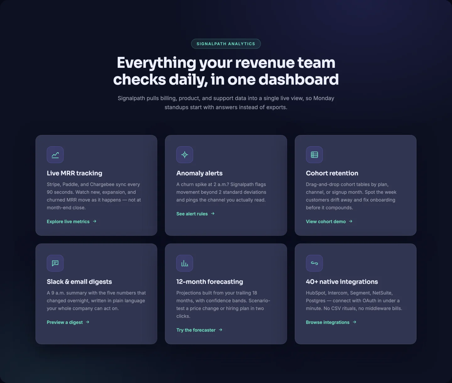
ছয়টি ফিচার কার্ডের একটি গাঢ় তিন-কলামের গ্রিড, একটি কার্সার-ফলো গ্লোর চারপাশে নির্মিত: আপনার মাউস সরান এবং একটি নরম রেডিয়াল আলো কার্ড জুড়ে এটিকে অনুসরণ করে। কার্ডগুলি হল একটি রিপিটার: আইকন (যেকোন SVG পেস্ট করুন), শিরোনাম, পাঠ্য এবং কার্ড প্রতি একটি ঐচ্ছিক তীর লিঙ্ক৷ একটি কাল্পনিক বিশ্লেষণ SaaS থেকে ছয়টি কার্ড আগে থেকে পূর্ণ হয়, এবং স্তব্ধ প্রবেশদ্বারটি আপনি যে সংখ্যক কার্ডের সাথে শেষ করেন তা অ্যানিমেট করে।
2। বিকল্প চিত্র সারি: এলিমেন্টর বৈশিষ্ট্য সারি টেমপ্লেট
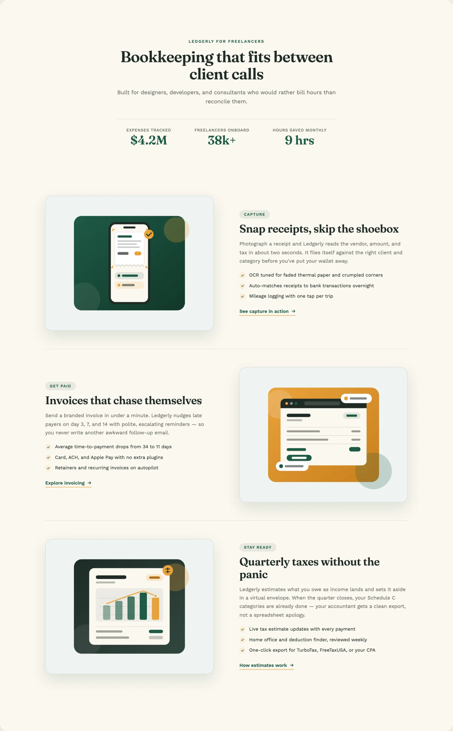
শিরোনামের নীচে একটি কাউন্ট-আপ পরিসংখ্যান স্ট্রিপ সহ ক্লাসিক চিত্র-বাম /চিত্র-ডান সারি। বিকল্প স্বয়ংক্রিয়। অবস্থানের উপর ভিত্তি করে সারিগুলি ফ্লিপ করে, তাই রিপিটারের মাধ্যমে একটি চতুর্থ বা পঞ্চম সারি যোগ করলে জিগজ্যাগ অক্ষত থাকে। প্রতিটি সারি একটি কিকার ব্যাজ, তিনটি চেক বুলেট এবং নিজস্ব লিঙ্ক নিয়ন্ত্রণ বহন করে। তিনটি বুককিপিং-অ্যাপ সারির ডেমো আর্ট জিপে রয়েছে।
3। সংখ্যাযুক্ত প্রক্রিয়া তালিকা: এলিমেন্টর প্রক্রিয়া পদক্ষেপ টেমপ্লেট
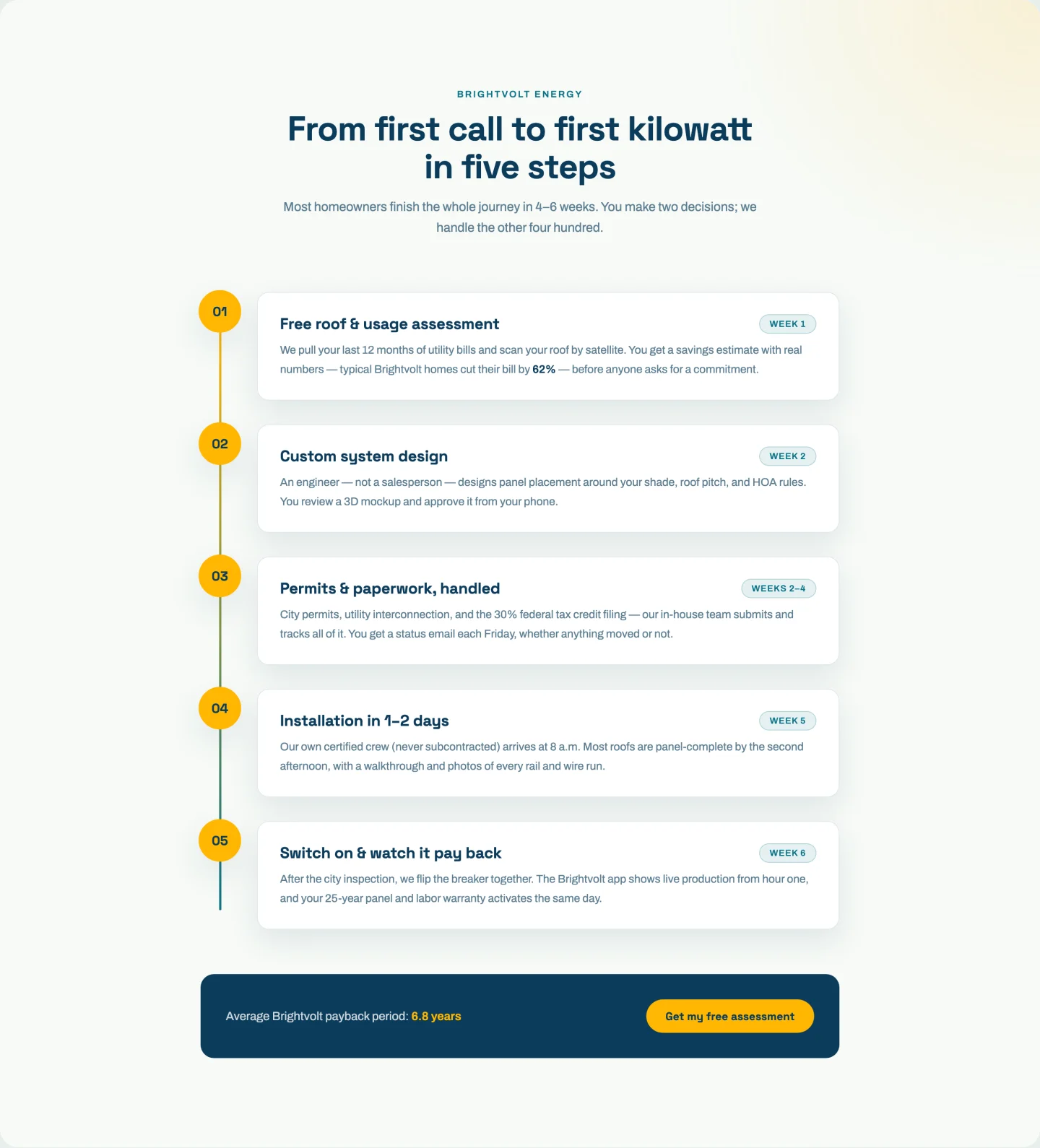
একটি উল্লম্ব ট্র্যাকে পাঁচটি সংখ্যাযুক্ত ধাপ, একটি অগ্রগতি রেখা সহ যা আপনি স্ক্রোল করার সাথে সাথে নিজেকে আঁকে এবং বিন্দুগুলি যখন তাদের ধাপ ভিউপোর্টে প্রবেশ করে তখন আলোকিত হয়। ধাপগুলি একটি রিপিটারে থাকে (সংখ্যা, শিরোনাম, চিপ লেবেল, পাঠ্য) এবং অগ্রগতি গণিত রানটাইমে ধাপ গণনা পড়ে। তিন ধাপ বা আট, লাইনটি এখনও শেষ বিন্দুতে অবতরণ করে। একটি হাইলাইট করা স্ট্যাট বেক করা সহ একটি টগলযোগ্য CTA ফুটার আছে।
4। ইমেজ শোকেস কার্ড: এলিমেন্টর ফিচার কার্ড টেমপ্লেট
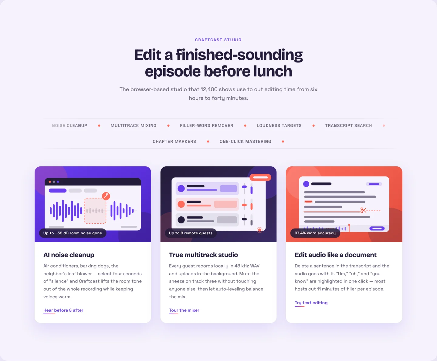
একটি 3D টিল্ট সহ তিনটি বড় ইমেজ কার্ড যা কার্সারকে অনুসরণ করে, এছাড়াও হেডার এবং গ্রিডের মধ্যে একটি স্ক্রলিং কীওয়ার্ড মার্কি। আপনি প্রতিটি টিকার কীওয়ার্ড একবার যোগ করুন। জাভাস্ক্রিপ্টে বিজোড় লুপ ডুপ্লিকেশন ঘটে, তাই মার্কি কখনই একটি সীম দেখায় না। কার্ডগুলি একটি ছবি, ব্যাজ, শিরোনাম, পাঠ্য এবং প্রতিটি লিঙ্ক নেয়; তিনটি পডকাস্ট-টুল ডেমো ইলাস্ট্রেশন জিপে পাঠানো হয়।
আমাদের সম্পর্কে বিভাগ টেমপ্লেট
বাম দিকে ছবি, ভাসমান ব্যাজ সহ ডানদিকে ছবি এবং মান কার্ড সহ একটি মিশন স্টেটমেন্ট৷।
5। গল্পের সাথে ছবি বাকি: আমাদের সম্পর্কে এলিমেন্টর বিভাগ টেমপ্লেট
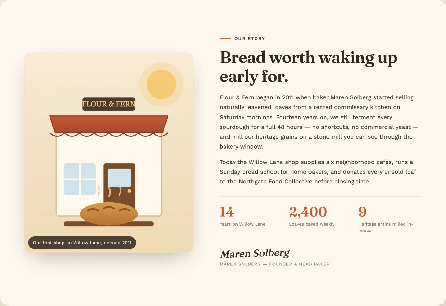
একটি পোলারয়েড-স্টাইল হোভার টিল্ট সহ বাম দিকের ছবি, ডানদিকে গল্পের অনুলিপি, তিনটি গণনা-আপ পরিসংখ্যান এবং একটি স্বাক্ষর ব্লক। পরিসংখ্যান রিপিটার উপসর্গ, দশমিক এবং হাজার হাজার কমা পরিচালনা করে। ডেমো আপনি কোড স্পর্শ ছাড়া 2,400 পাইকারি অংশীদার পর্যন্ত গণনা। বেকারি ডেমো দৃশ্য SVG হিসাবে অন্তর্ভুক্ত।
6। ফ্লোটিং ব্যাজ সহ ছবি: বিভাগ টেমপ্লেট সম্পর্কে এলিমেন্টর
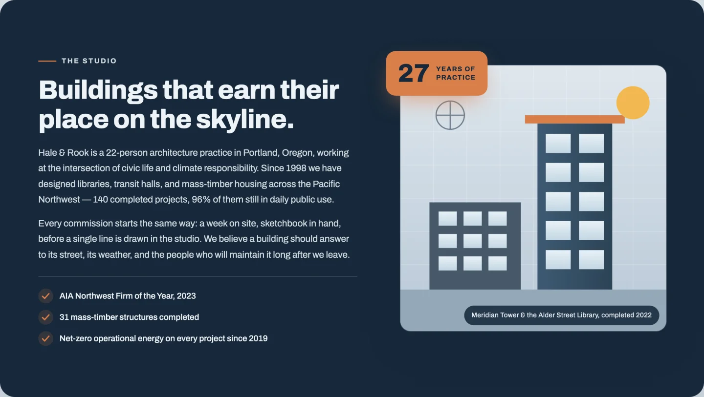
মিরর লেআউট: টেক্সট বাম, ছবি ডান, একটি ভাসমান “27 বছর" ব্যাজ সহ যা দৃশ্যে স্ক্রোল করলে গণনা করা হয়। শংসাপত্রের চেকলিস্টটি একটি রিপিটার, ব্যাজ টগলযোগ্য এবং উভয় ব্যাজ লাইন সম্পাদনাযোগ্য। ব্যবসায় বছরের পর বছর ধরে এটি ব্যবহার করুন, প্রজেক্ট পাঠানো হয়েছে, আপনার সেরা নম্বর যাই হোক না কেন।
7। মিশন এবং মান: এলিমেন্টর মিশন এবং মান বিভাগ
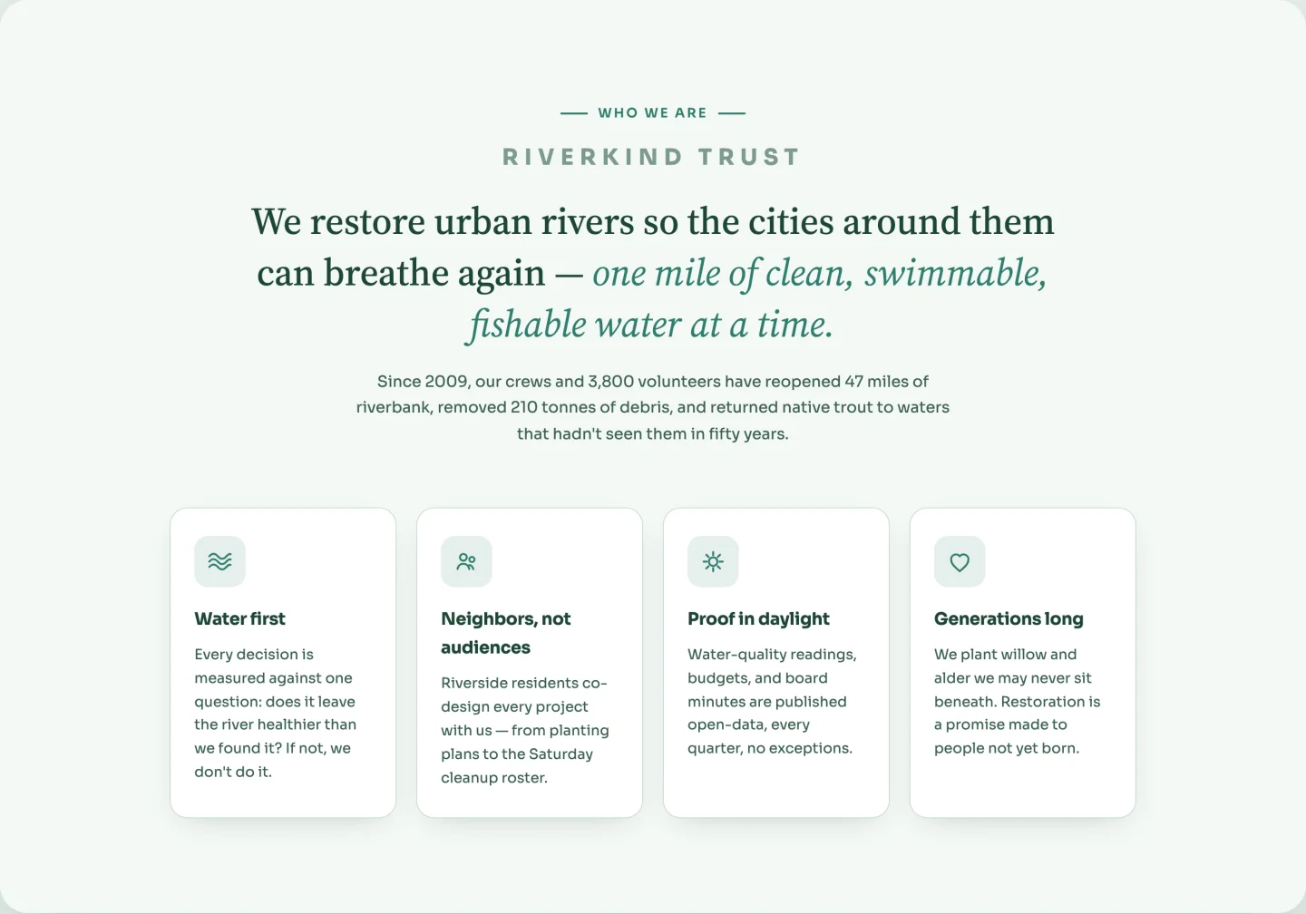
কোন ছবির প্রয়োজন নেই। একটি উচ্চারণ-রঙের বাক্যাংশ সহ একটি বড় মিশন বিবৃতি, তারপর লাইন আইকন সহ চারটি মান কার্ড যা হোভারে সামান্য ঘোরে। কার্ডগুলি হল একটি কীওয়ার্ড-ভিত্তিক আইকন ক্ষেত্র (তরঙ্গ, সম্প্রদায়, সূর্য, হৃদয়) সহ একটি পুনরাবৃত্তিকারী। আইকনগুলি হল CSS মাস্ক যা আপনার উচ্চারণ রঙের উত্তরাধিকারী, তাই তারা প্যালেটের সাথে সংঘর্ষের পরিবর্তে পুনরায় রঙ করে।
পরিসংখ্যান এবং কাউন্টার ব্যান্ড টেমপ্লেট
দুটি কাউন্ট-আপ ব্যান্ড, একটি আলো এবং একটি অন্ধকার, সংখ্যার জন্য যা স্কেল প্রমাণ করে।
8। হালকা পরিসংখ্যান ব্যান্ড: এলিমেন্টর কাউন্টার সেকশন টেমপ্লেট
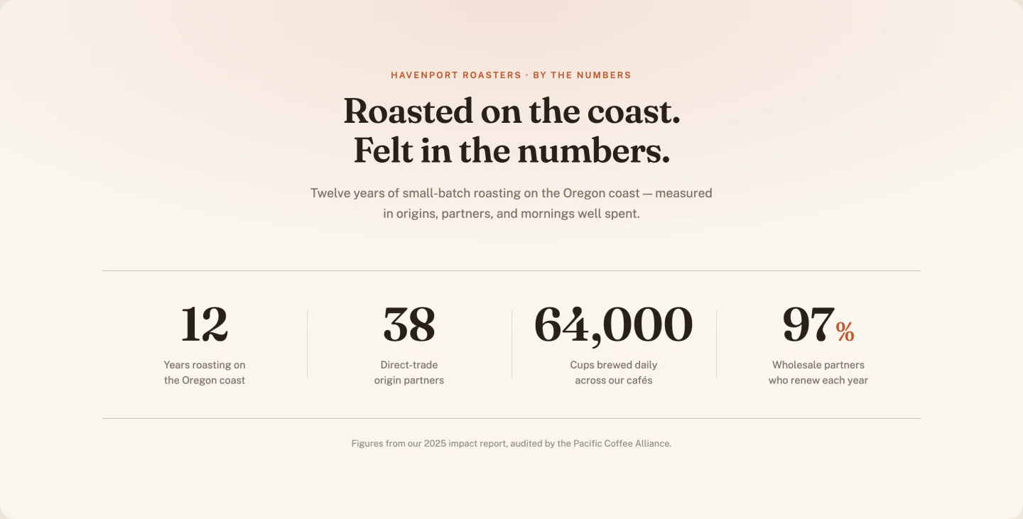
কাগজ-সাদা চারটি কাউন্টার, সেরিফ সংখ্যা, বিভাজক লাইন যা সংখ্যা বৃদ্ধির সাথে সাথে আঁকতে থাকে। একটি কলাম স্লাইডার ডেস্কটপ গ্রিড পুনরায় কনফিগার করে যদি আপনি চারটির পরিবর্তে তিন বা পাঁচটি পরিসংখ্যান চালান এবং একটি একক সময়কাল নিয়ন্ত্রণ সুর করে যে সবকিছু কত দ্রুত গণনা করা হয়।
9। ডার্ক পরিসংখ্যান ব্যান্ড: এলিমেন্টর পরিসংখ্যান ব্যান্ড টেমপ্লেট
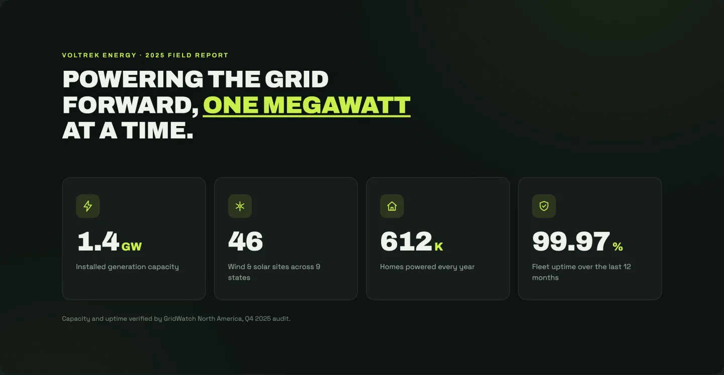
উচ্চ-কনট্রাস্ট সংস্করণ: কাছাকাছি-কালো পটভূমি, চুনের উচ্চারণ, একটি গ্লো পালস সহ প্রতিটি কাউন্টারের উপরে একটি আইকন। আইকন চক্র স্বয়ংক্রিয়ভাবে প্রতি কার্ড (বোল্ট, টারবাইন, হোম, শিল্ড) এবং প্রতিটি স্ট্যাট তার নিজস্ব গণনা-আপ সময়কাল সেট করে, তাই সংখ্যাগুলি একবারে না হয়ে ক্রমানুসারে অবতরণ করে। শিরোনাম তিনটি ক্ষেত্রে বিভক্ত হয় যাতে উচ্চারণ শব্দটি আপনি যেখানে চান সেখানে বসে।
প্রশংসাপত্র বিভাগ টেমপ্লেট
একটি ক্যারোজেল, একটি রাজমিস্ত্রির গ্রিড, একটি বড় উদ্ধৃতি এবং একটি সামগ্রিক স্কোর সহ পর্যালোচনা কার্ড৷।
10। প্রশংসাপত্র ক্যারোজেল: এলিমেন্টর প্রশংসাপত্র ক্যারোজেল টেমপ্লেট
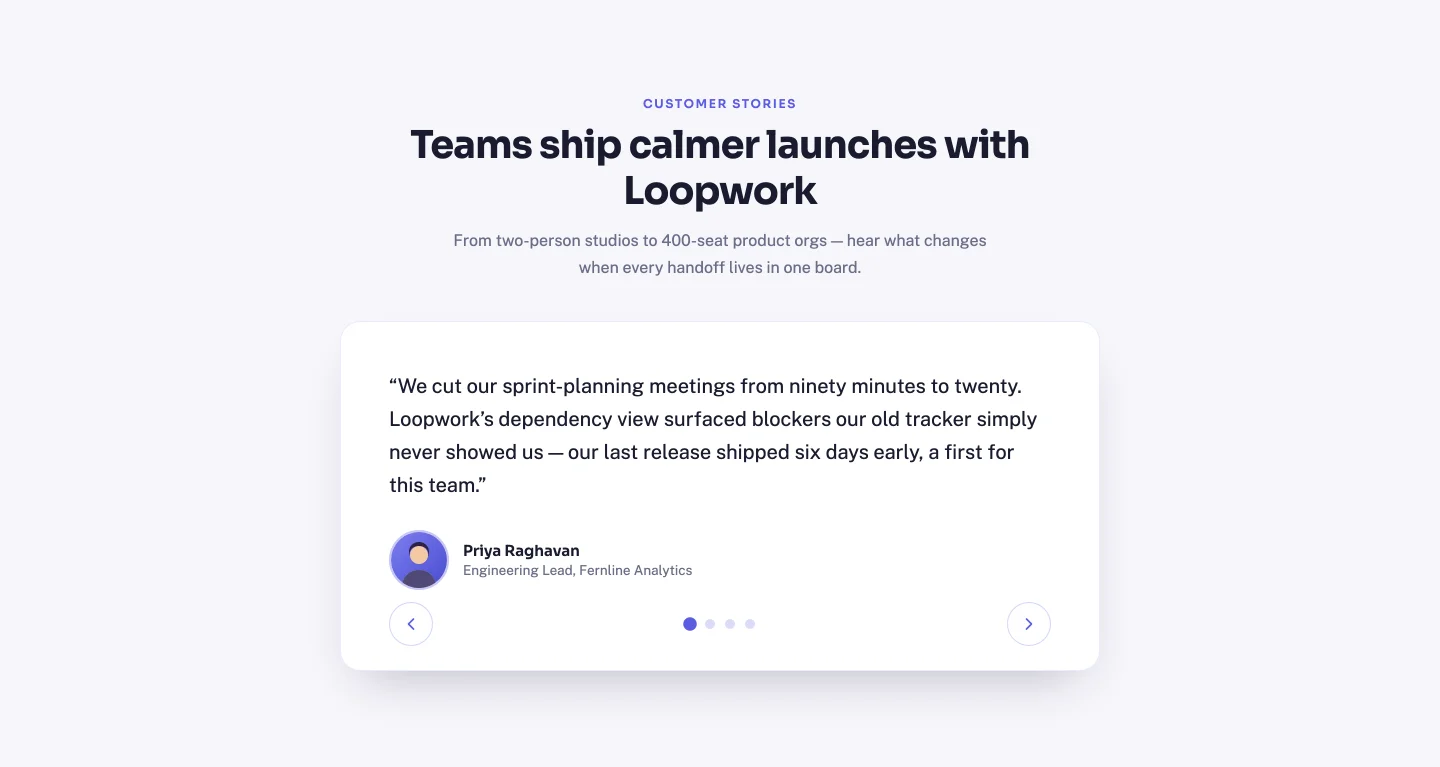
একটি সঠিক স্লাইডার: তীর বোতাম, ক্লিকযোগ্য বিন্দু, কীবোর্ড নেভিগেশন এবং স্বয়ংক্রিয় উচ্চতা তাই ছোট উদ্ধৃতিগুলি একটি লম্বা খালি কার্ড ছেড়ে যায় না। স্লাইডগুলি হল একটি রিপিটার (উদ্ধৃতি, নাম, ভূমিকা, অবতার), এবং বিন্দু এবং "মোট" লেবেলের "N আপনি যতগুলি যোগ করুন না কেন নিজেদের পুনর্নির্মাণ করে৷ জিপে চারটি ডেমো অবতার পাঠানো হয়।
11। রাজমিস্ত্রি গ্রিড: এলিমেন্টর প্রশংসাসূচক গ্রিড টেমপ্লেট
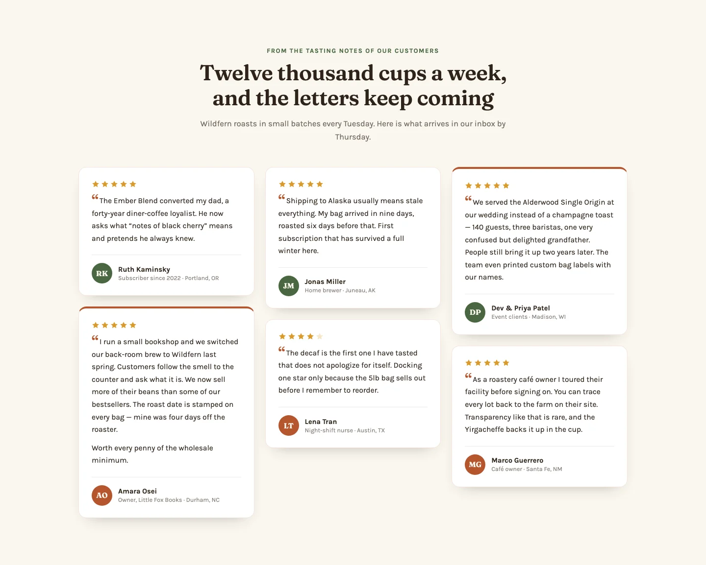
সিএসএস-কলামের রাজমিস্ত্রির ছয়টি কার্ড স্তব্ধ প্রকাশ করে। প্রতিটি রিপিটার সারি একটি উদ্ধৃতি নেয় (এছাড়া লম্বা কার্ডের জন্য ঐচ্ছিক দ্বিতীয় অনুচ্ছেদ), একটি 1-5 স্টার রেটিং, অবতার বৃত্তের আদ্যক্ষর এবং একটি "বৈশিষ্ট্যযুক্ত" টগল যা একটি কার্ডকে উচ্চারণ চিকিত্সা দেয়। তারা রেটিং মান থেকে রেন্ডার করে, তাই একটি 4-স্টার পর্যালোচনা চারটি ভরা তারা দেখায়, যা হার্ডকোড করা হয়েছে তা নয়।
12। একক বড় উদ্ধৃতি: এলিমেন্টর প্রশংসাপত্র বিভাগ টেমপ্লেট
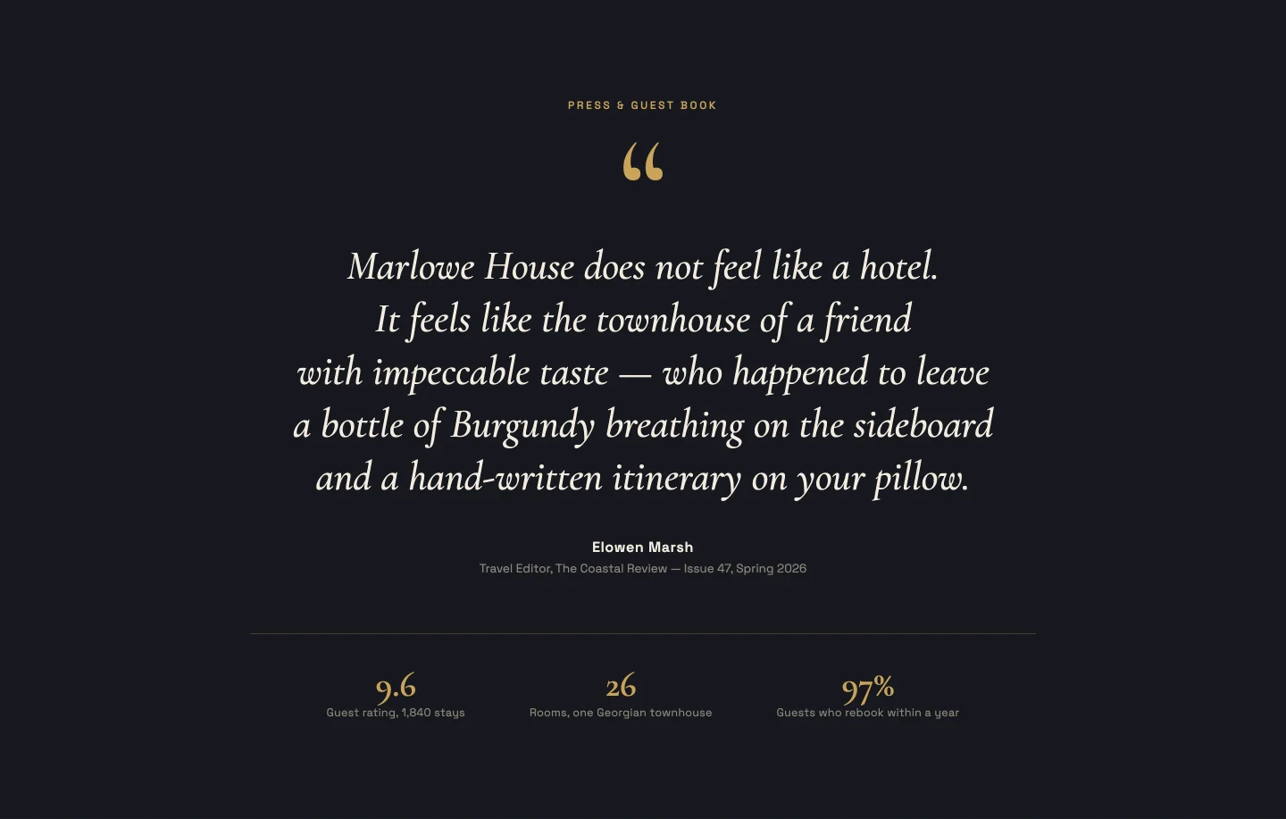
একটি উদ্ধৃতি, বিশাল সেরিফ টাইপ, একটি মুখোশযুক্ত অ্যানিমেশনের সাথে লাইন দ্বারা প্রকাশিত লাইন। আপনি একটি অনুচ্ছেদ হিসাবে উদ্ধৃতি পেস্ট; জাভাস্ক্রিপ্ট এটিকে সুষম লাইনে বিভক্ত করে এবং প্রকাশের সময়, তাই একটি 15-শব্দের উদ্ধৃতি এবং একটি 40-শব্দের উদ্ধৃতি উভয়ই সঠিকভাবে অ্যানিমেট করে। নীচে একটি ছোট মেটা স্ট্রিপ (রুম, রেটিং, বছর) একটি রিপিটার যা আপনি সম্পূর্ণ খালি করতে পারেন।
13। সারাংশ সহ রেটিং কার্ড: এলিমেন্টর রিভিউ কার্ড টেমপ্লেট
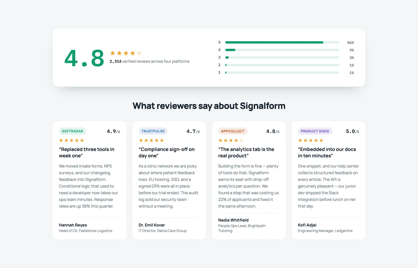
রিভিউ-এগ্রিগেটর লুক: একটি বড় কাউন্ট-আপ স্কোর, অ্যানিমেটেড ডিস্ট্রিবিউশন বার (পাঁচটি তারা: 84%, চার: 11%...), তারপর প্রতি-কার্ড ব্যাজ রঙের সাথে প্ল্যাটফর্ম দ্বারা ট্যাগ করা চারটি পর্যালোচনা কার্ড। ভগ্নাংশ রেটিং আংশিক তারা আঁকা। এটির প্রশংসাপত্র গোষ্ঠীর সর্বাধিক নিয়ন্ত্রণ রয়েছে, 24, কারণ বার শতাংশ থেকে স্কোরের নীচে ক্যাপশন পর্যন্ত সবকিছুই সম্পাদনাযোগ্য।
মূল্য সারণী বিভাগ টেমপ্লেট
তিন-স্তর, হাইলাইট করা পরিকল্পনা, একটি তুলনা ম্যাট্রিক্স এবং একটি মাসিক/বার্ষিক টগল।
14। ক্লাসিক তিন স্তর: এলিমেন্টর মূল্য নির্ধারণ টেবিল টেমপ্লেট
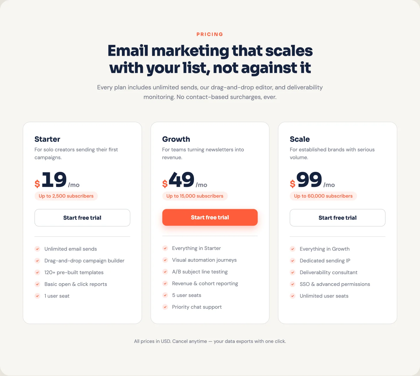
তিনটি কার্ড, স্তব্ধ প্রবেশদ্বার, স্ক্রলে গণনা করা দাম। পরিকল্পনা একটি পুনরাবৃত্তিকারী। বৈশিষ্ট্যগুলি একটি টেক্সটেরিয়াতে বৈশিষ্ট্য প্রতি এক লাইন হিসাবে যায়, তাই পরিকল্পনাগুলিতে খালি স্লট ছাড়াই পাঁচটি বা নয়টি বৈশিষ্ট্য থাকতে পারে। একটি প্রতি-প্ল্যান "জনপ্রিয়" টগল সেই কার্ডের বোতামটিকে ভূত থেকে কঠিন উচ্চারণে পরিবর্তন করে।
15। হাইলাইট করা পরিকল্পনা: এলিমেন্টর প্রাইসিং সেকশন টেমপ্লেট
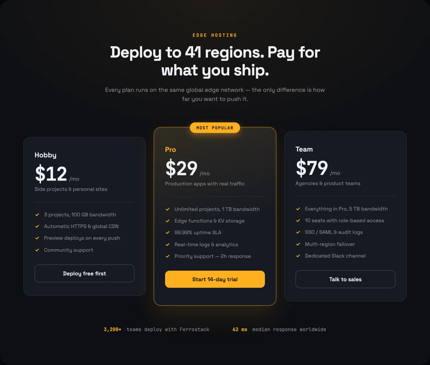
একই তিন-কলামের হাড়, কিন্তু জনপ্রিয় পরিকল্পনা শারীরিকভাবে তার প্রতিবেশীদের উপরে একটি গ্লো পালস এবং একটি ফিতা দিয়ে উঠে যায়। হাইলাইট প্রতিটি রিপিটার সারিতে একটি টগল অনুসরণ করে, তাই পরবর্তী ত্রৈমাসিকে একটি ভিন্ন পরিকল্পনা প্রচার করা হল একটি সুইচ, রিস্টাইল নয়। একটি ফুটার পরিসংখ্যান সারি (আপটাইম, ডেটা সেন্টার, সমর্থন) বন্ধ করা যেতে পারে।
16। তুলনা বৈশিষ্ট্য তালিকা: উপাদান মূল্য তুলনা টেবিল
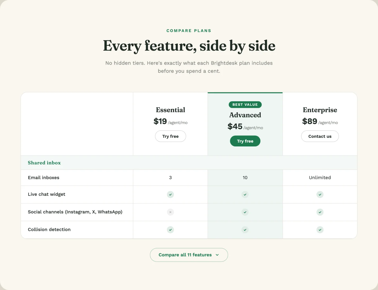
একটি বাস্তব বৈশিষ্ট্য ম্যাট্রিক্স: তিনটি প্ল্যান কলাম, হ্যাঁ/না/কাস্টম মান সহ বৈশিষ্ট্য সারি (“5 ব্যবহারকারী", “Unlimited”), এবং একটি প্রসারণযোগ্য ব্লক যা একটি মসৃণ উচ্চতা অ্যানিমেশন সহ আরও ছয়টি সারি প্রকাশ করে। একটি কক্ষে হ্যাঁ বা না টাইপ করুন এবং এটি একটি চেক বা ক্রস হিসাবে রেন্ডার করে; অন্য কিছু টাইপ করুন এবং এটি পাঠ্য হিসাবে প্রিন্ট করে। কোন প্ল্যানটি "সেরা মান" কলাম হাইলাইট পায় তা হল একটি ড্রপডাউন। 38 এ এটি প্যাকের গভীরতম টেমপ্লেট নিয়ন্ত্রণ করে।
17। মাসিক /বার্ষিক টগল: বিলিং টগল সহ এলিমেন্টর প্রাইসিং টেবিল
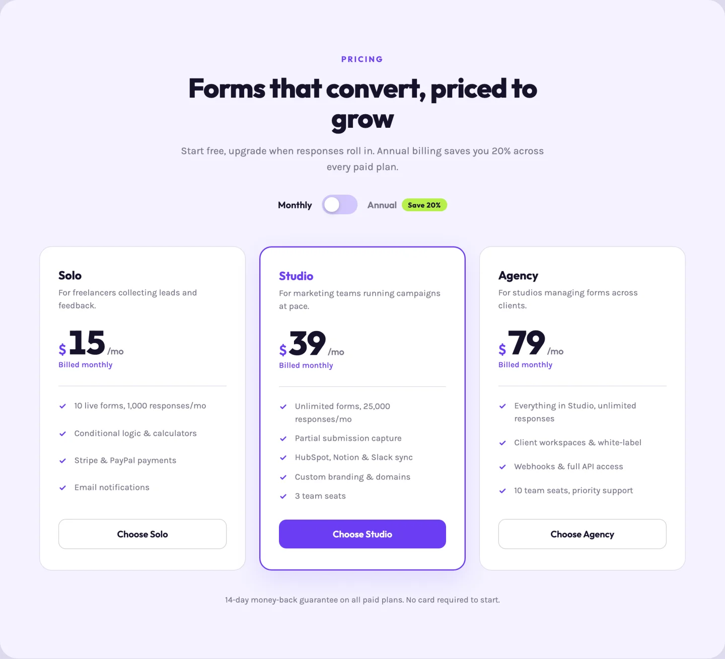
SaaS মান। একটি অ্যাক্সেসযোগ্য সুইচ সামান্য মূল্য-ফ্লিপ অ্যানিমেশন সহ মাসিক এবং বার্ষিক মূল্যের মধ্যে প্রতিটি কার্ড ফ্লিপ করে; প্রতিটি প্ল্যান তার রিপিটার সারিতে উভয় মূল্য এবং উভয় “ as” নোট বহন করে। "সেভ 20%” ব্যাজ টেক্সট একটি ক্ষেত্র, তাই গণিত পরিবর্তন করলে ব্যাজ পরিবর্তন হয়।
টিম বিভাগের টেমপ্লেট
একটি ফটো গ্রিড, হোভার-রিভিল বায়োস, এবং একটি বায়ো প্যানেল সহ একটি স্লাইডার৷ এই টেমপ্লেটগুলির বাইরে একটি একক ফটোতে একটি হোভার প্রভাব যোগ করতে, ব্যবহার করুন ইমেজ হোভার ইফেক্ট উইজেট.
18। ফটো কার্ড গ্রিড: এলিমেন্টর টিম সেকশন টেমপ্লেট
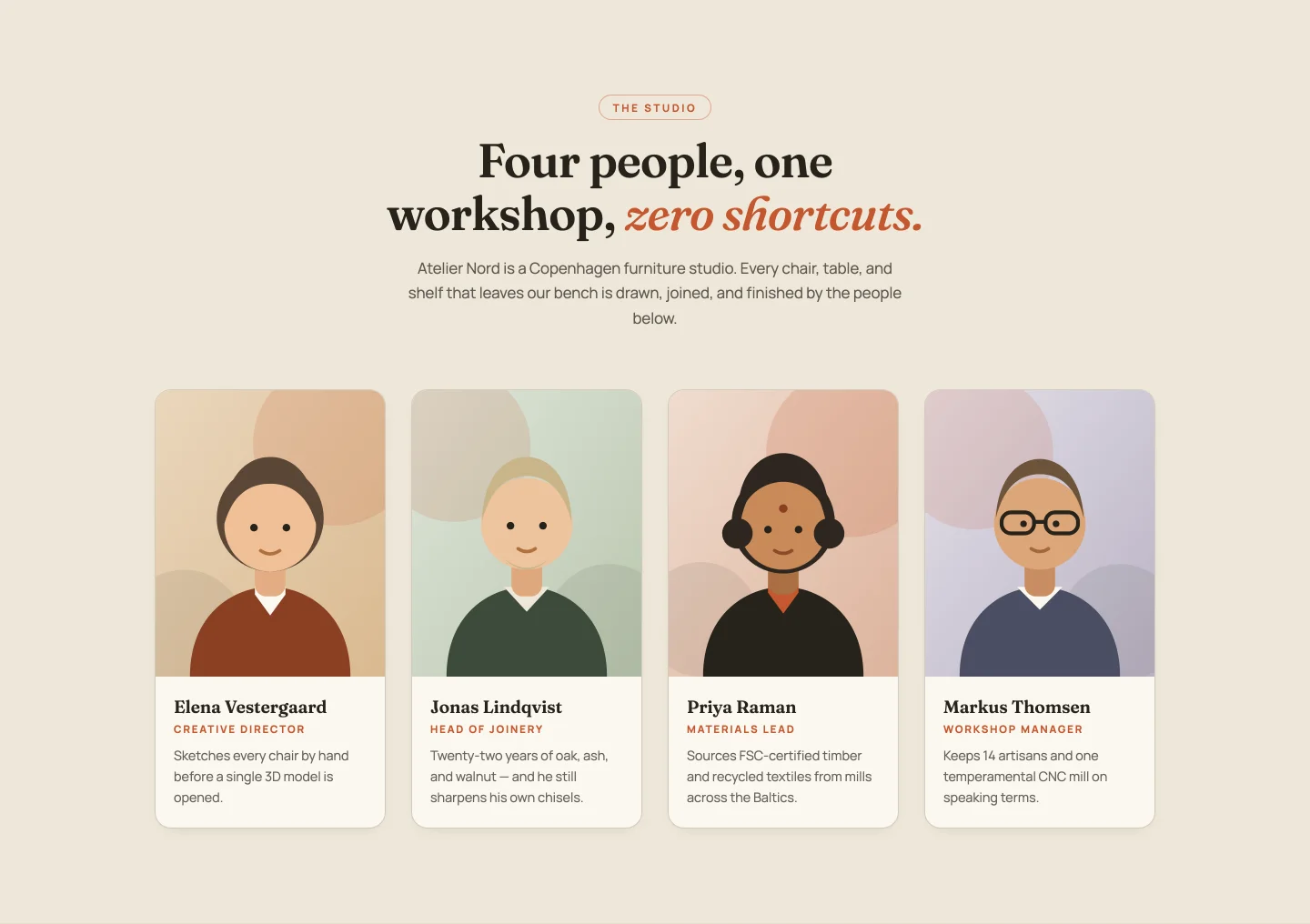
একটি জুম-এন্ড-বর্ডার-সুইপ হোভার সহ চারটি প্রতিকৃতি কার্ড। সদস্য প্রতি নাম, ভূমিকা এবং একটি এক-লাইন বায়ো; প্রবেশদ্বার স্তব্ধ যে কোনো সদস্য গণনার জন্য recalculates। আসল হেডশট সংগ্রহ করার সময় আপনার যদি স্থানধারকের প্রয়োজন হয় তবে জিপে চারটি ডেমো পোর্ট্রেট চিত্র আসে।
19। হোভার-রিভিল বায়োস: এলিমেন্টর টিম মেম্বার কার্ড টেমপ্লেট
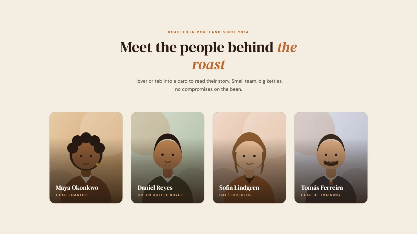
পোর্ট্রেট যা হোভার, ফোকাস বা ট্যাপে একটি বায়ো প্যানেল স্লাইড করে, তাই এটি একটি কীবোর্ড এবং ফোনের পাশাপাশি একটি মাউসের সাথে কাজ করে৷ প্রতিটি সদস্য সারি লিঙ্কডইন, ইনস্টাগ্রাম এবং ইমেল লিঙ্ক নিয়ন্ত্রণ বহন করে এবং আপনার দল যদি না চায় তবে পুরো সামাজিক সারিটি বন্ধ করা যেতে পারে।
20। টিম স্লাইডার: এলিমেন্টর টিম স্লাইডার টেমপ্লেট
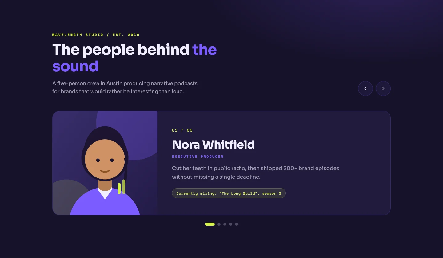
একবারে একজন সদস্য: বড় ফটো, রোল ট্যাগ, একটি পূর্ণাঙ্গ বায়ো, এবং একটি “01 / 05” কাউন্টার যা আপনার প্রকৃত সদস্য সংখ্যা থেকে পুনঃনির্মাণ করে, বিন্দুর মতোই৷ তীর কী কাজ করে। ছোট দলগুলির জন্য ভাল যেখানে প্রতিটি ব্যক্তি একটি ব্যবসায়িক কার্ডের চেয়ে বেশি প্রাপ্য।
FAQ বিভাগের টেমপ্লেট
একটি অ্যাকর্ডিয়ন, একটি দুই-কলামের প্রশ্নোত্তর, বিভাগ ট্যাব এবং একটি সমর্থন কার্ডের পাশে একটি অ্যাকর্ডিয়ন।
21। অ্যাকর্ডিয়ন: এলিমেন্টর FAQ অ্যাকর্ডিয়ন টেমপ্লেট
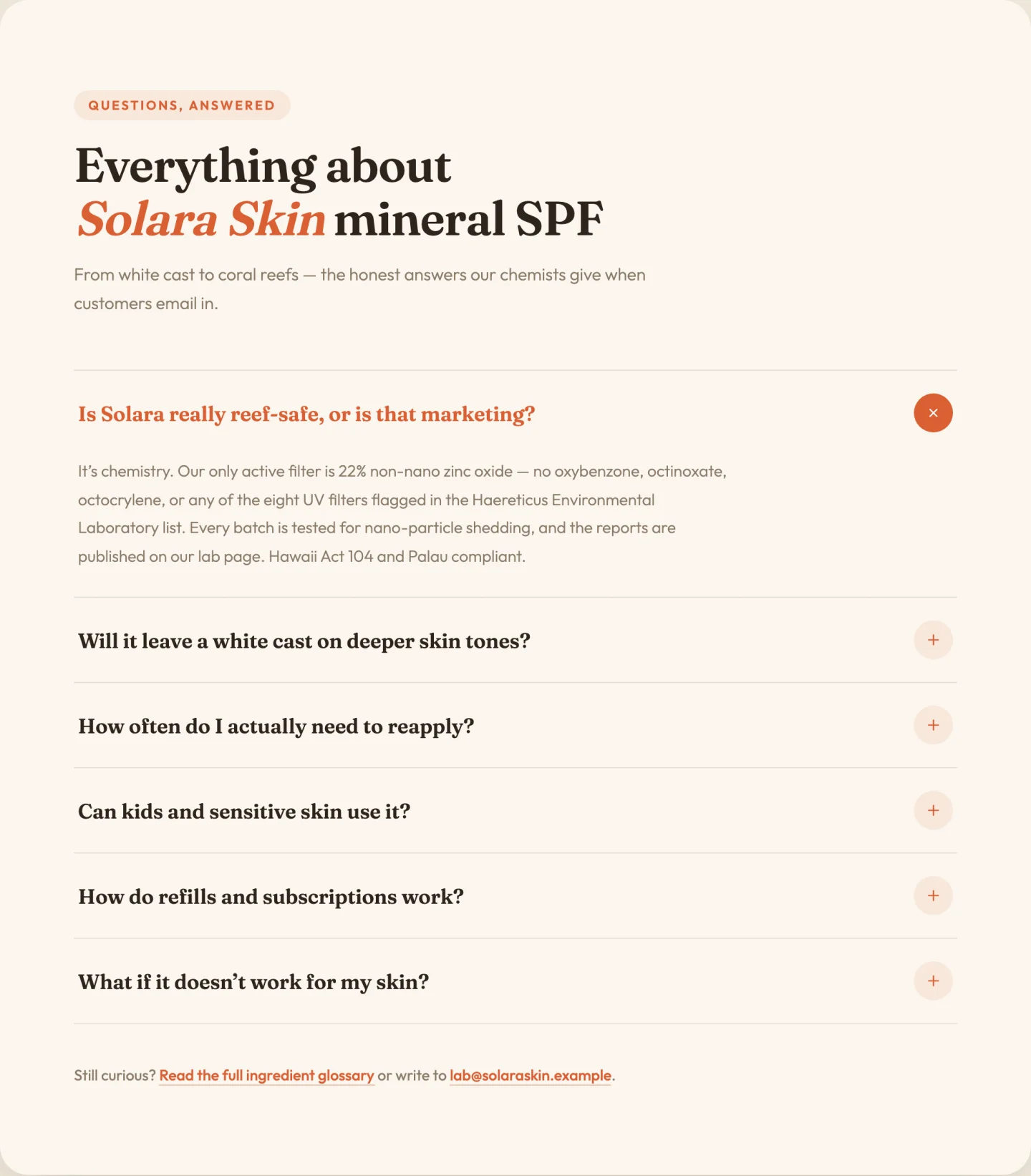
মসৃণ উচ্চতা অ্যানিমেশন এবং ঘূর্ণায়মান প্লাস আইকন সহ একক-খোলা অ্যাকর্ডিয়ন। প্রশ্ন এবং উত্তর একটি পুনরাবৃত্তিকারী; প্রথম আইটেমটি খোলা শুরু হয় কিনা তা একটি টগল। ফুটার লাইন ("এখনও আটকে আছে? আমাদের লিখুন") এর নিজস্ব লিঙ্ক এবং ইমেল ক্ষেত্র রয়েছে, কারণ সেই লাইনটি সর্বদা হার্ডকোড করা হয় এবং অন্যথায় ভুলে যায়।
22। দুই-কলামের প্রশ্নোত্তর: এলিমেন্টর FAQ বিভাগের টেমপ্লেট
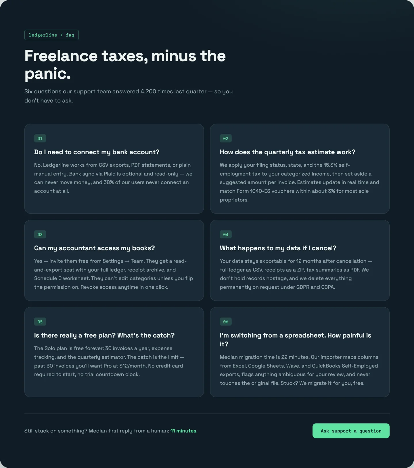
কোন ক্লিক নেই। সমস্ত ছয়টি উত্তর একটি সংখ্যাযুক্ত দুই-কলামের গ্রিডে দৃশ্যমান থাকে এবং স্তব্ধ প্রকাশ করে। 01-06 নম্বরিং হল CSS কাউন্টার, তাই আপনি যখন সপ্তম যোগ করেন তখন আইটেমগুলি নিজেদের পুনঃসংখ্যা করে। আপনার উত্তর ছোট হলে অ্যাকর্ডিয়নের চেয়ে ভাল এবং আপনি বরং দর্শকরা আসলে সেগুলি পড়তে চান।
23। বিভাগ ট্যাব: এলিমেন্টর FAQ ট্যাব টেমপ্লেট
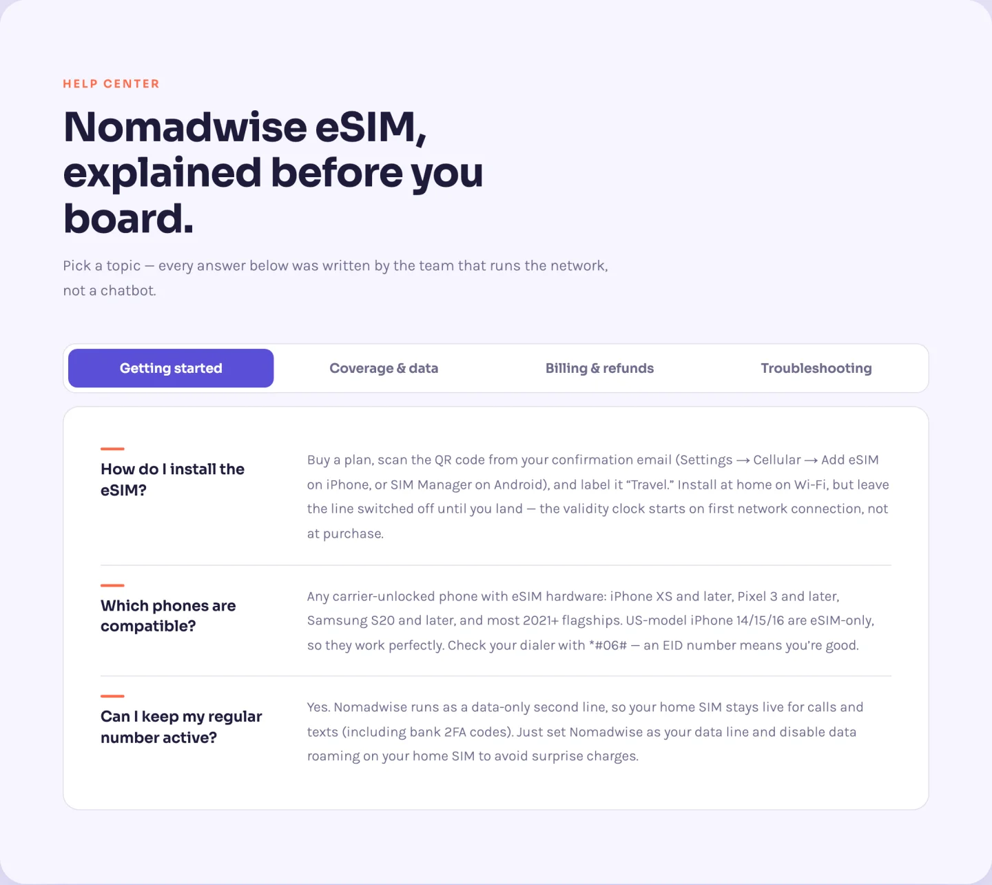
একটি স্লাইডিং পিল ট্যাব বার সহ চারটি বিভাগে বারোটি প্রশ্ন। আপনি ট্যাবগুলি মোটেও পরিচালনা করবেন না। রিপিটারের প্রতিটি প্রশ্নের একটি বিভাগ ক্ষেত্র রয়েছে এবং উইজেটটি খুঁজে পাওয়া অনন্য বিভাগগুলি থেকে ট্যাব বোতামগুলি তৈরি করে। তিনটি প্রশ্নে একটি বিভাগের নাম পরিবর্তন করুন এবং ট্যাবটি নিজেই নাম পরিবর্তন করুন। সম্পূর্ণ তীর-কী ট্যাব নেভিগেশন অন্তর্ভুক্ত।
24। সমর্থন কার্ড সহ প্রায়শই জিজ্ঞাসিত প্রশ্নাবলী: সমর্থন কার্ড সহ এলিমেন্টর প্রায়শই জিজ্ঞাসিত প্রশ্ন বিভাগ
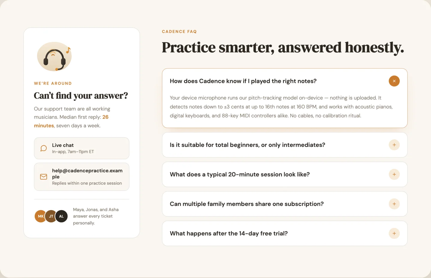
বাম দিকে অ্যাকর্ডিয়ন (এবার মাল্টি-ওপেন), ডানদিকে একটি স্টিকি সাপোর্ট কার্ড একটি চিত্র, যোগাযোগের চ্যানেল এবং তিনটি অবতার স্লট সহ একটি টিম নোট। যোগাযোগের চ্যানেলগুলি প্রতি সারিতে একটি চ্যাট/ইমেল/ফোন/ঘড়ি আইকন পিকার সহ একটি রিপিটার। কার্ডের স্টিকি অফসেট হল একটি স্লাইডার, যখন আপনার সাইটে একটি ফ্যাট ফিক্সড হেডার থাকে।
কল-টু-অ্যাকশন ব্যান্ড টেমপ্লেট
একটি সাহসী গ্রেডিয়েন্ট, একটি পণ্য চিত্র সহ একটি বিভক্ত এবং একটি ন্যূনতম কেন্দ্রীভূত ব্যান্ড৷।
25। বোল্ড গ্রেডিয়েন্ট: এলিমেন্টর কল টু অ্যাকশন টেমপ্লেট
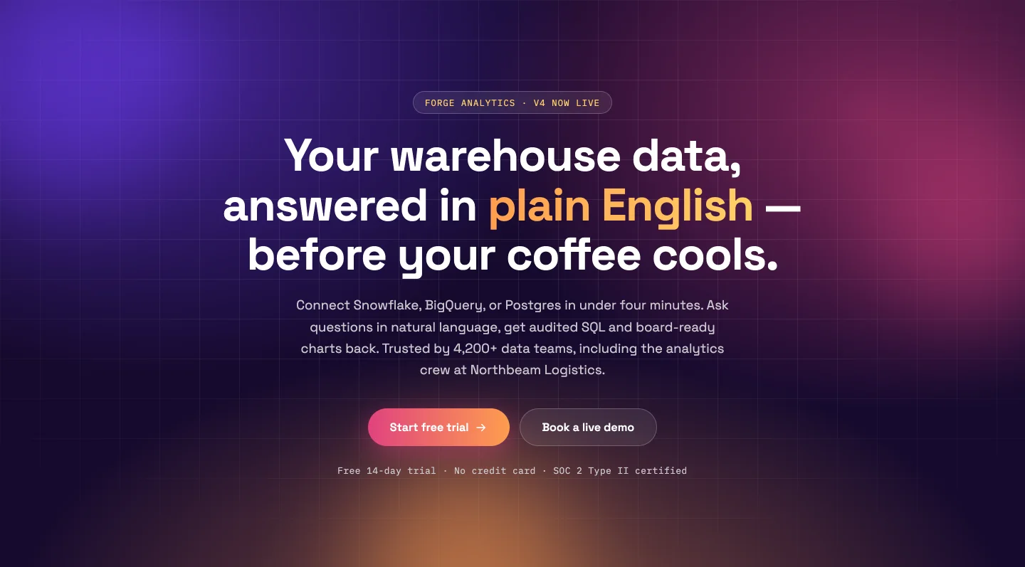
ভাসমান ব্লব সহ একটি অ্যানিমেটেড তিন রঙের গ্রেডিয়েন্ট ওয়াশ যা আপনার পয়েন্টারের দিকে চলে যায়। তিনটি গ্রেডিয়েন্ট রঙ আলাদা বাছাইকারী, তাই পুরো মেজাজকে ভায়োলেট থেকে ব্র্যান্ড-কমলায় স্থানান্তর করতে তিনটি ক্লিক লাগে। প্রাথমিক এবং ভূত বোতাম প্রতিটি সম্পূর্ণ লিঙ্ক নিয়ন্ত্রণ আছে; ব্লবগুলি মিনিমালিস্টদের জন্য বন্ধ হয়ে যায় (এবং হ্রাস-মোশন দর্শকদের জন্য নিজেকে বন্ধ করে দেয়)।
26। পণ্য চিত্রের সাথে বিভক্ত করুন: এলিমেন্টর CTA বিভাগ টেমপ্লেট
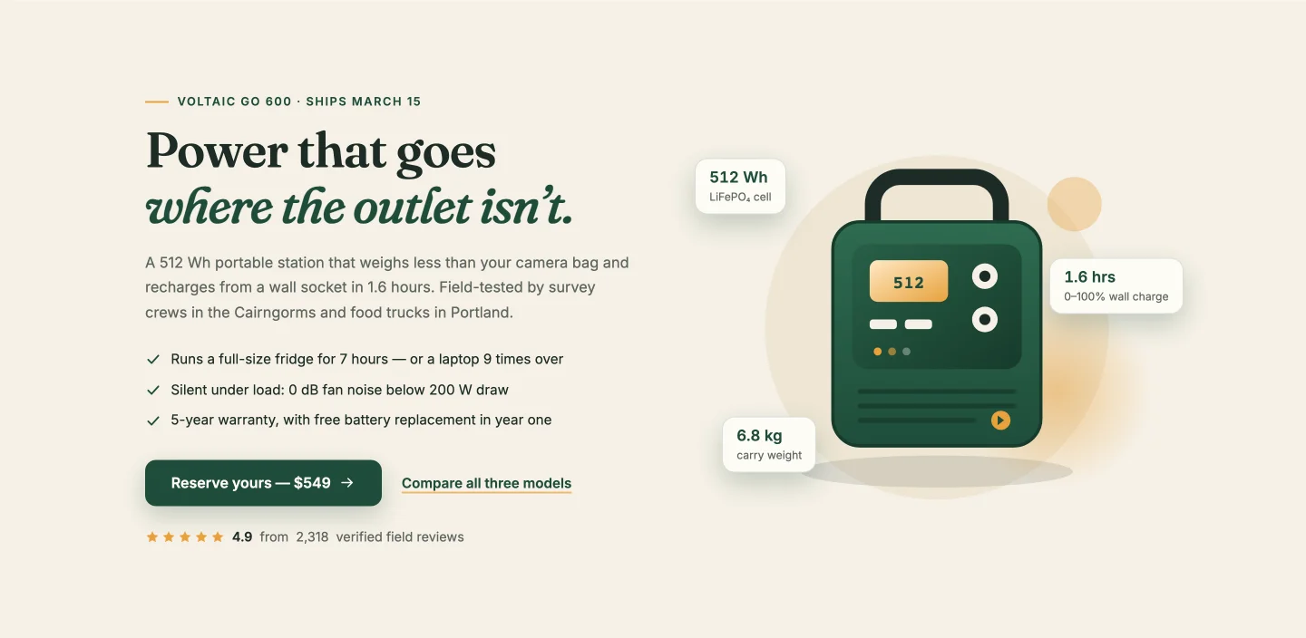
বাম দিকে অনুলিপি এবং চেকলিস্ট করুন, ফ্লোটিং স্পেক ব্যাজ (ক্ষমতা, চার্জের সময়, ওজন) সহ ডানদিকে শট করা পণ্য যা আপনি যত বেশি যোগ করুন না কেন নিজেদেরকে পুনঃস্থাপন করুন। ডেমোতে 2,318টি পর্যালোচনা থেকে স্টার রেটিং 4.8 পর্যন্ত গণনা করা হয় এবং উভয় সংখ্যাই ক্ষেত্র। একটি ভৌত পণ্যের জন্য নির্মিত কিন্তু বড়াই করার মতো চশমা সহ যেকোনো কিছুর জন্য কাজ করে।
27। ন্যূনতম কেন্দ্রীভূত: এলিমেন্টর কল টু অ্যাকশন ব্যান্ড
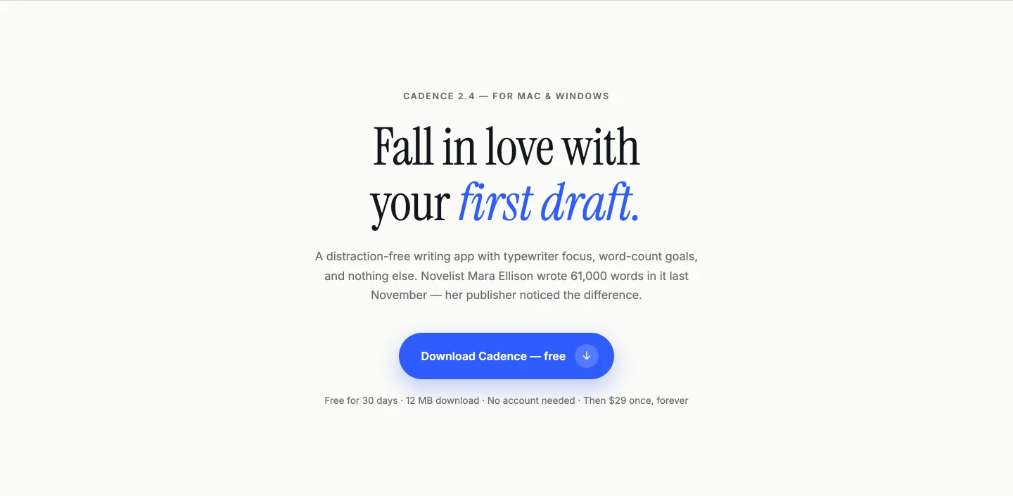
ক্রিম ব্যাকগ্রাউন্ড, একটি শিরোনাম, একটি বোতাম, উপরে এবং নীচে পাতলা নিয়ম। শিরোনামটি শব্দ দ্বারা শব্দ প্রকাশ করে, এবং যেহেতু বিভাজন রানটাইমে ঘটে, আপনার পুনর্লিখিত শিরোনামটি ঠিক একইভাবে অ্যানিমেট করে। যখন পৃষ্ঠার প্রতিটি অন্য বিভাগ চিৎকার করে, তখন এটি তার ভয়েস কমিয়ে চুক্তিটি বন্ধ করে দেয়।
যোগাযোগ ফর্ম বিভাগ টেমপ্লেট
যোগাযোগের বিবরণ সহ ফর্ম, একটি অ্যানিমেটেড মানচিত্র সহ ফর্ম এবং একটি কেন্দ্রীভূত কার্ড৷।
28। যোগাযোগের তথ্য সহ ফর্ম: এলিমেন্টর যোগাযোগ ফর্ম টেমপ্লেট
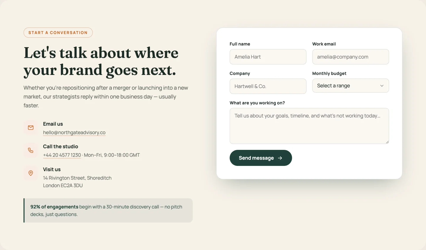
নাম, ইমেল, কোম্পানি, একটি বাজেট ড্রপডাউন এবং একটি বার্তা ক্ষেত্র সহ একটি ফর্মের পাশে তথ্য কলাম (ইমেল, ফোন, অফিস, সাইক্লিং আইকন সহ একটি রিপিটার হিসাবে)৷ বাজেট রেঞ্জ তাদের নিজস্ব রিপিটার। প্রতিটি লেবেল এবং স্থানধারক সম্পাদনাযোগ্য, যা আপনি যেদিন সাইটটি অনুবাদ করবেন তা গুরুত্বপূর্ণ।
29। মানচিত্র সহ ফর্ম: মানচিত্রের সাথে এলিমেন্টর যোগাযোগ ফর্ম
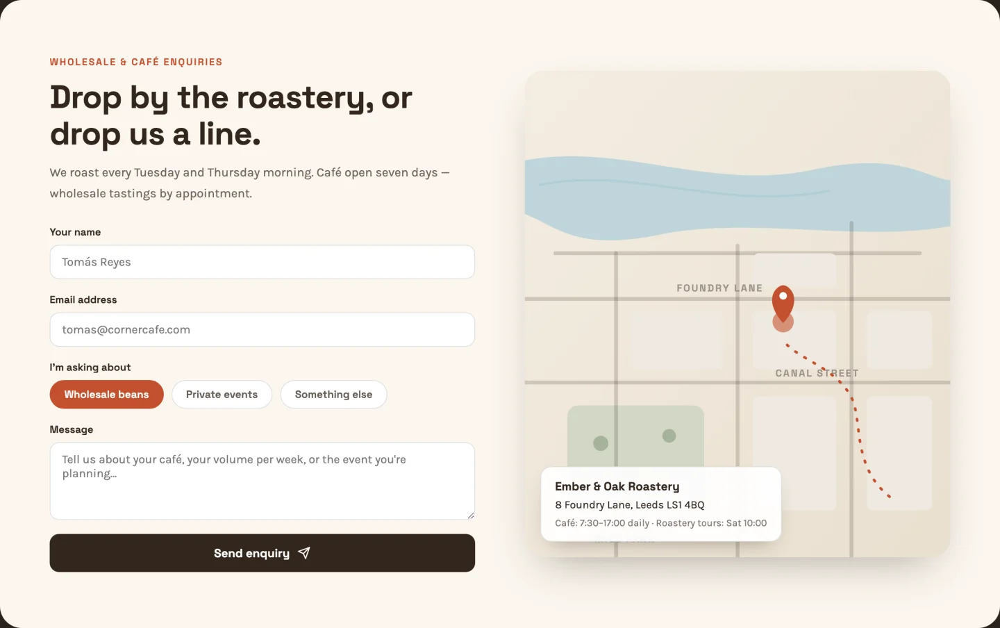
একটি চিত্রিত SVG মানচিত্রের পাশে বিষয়-নির্বাচন চিপ সহ একটি ফর্ম: অ্যানিমেটেড ড্যাশড রুট, পালসিং পিন, পার্ক এবং খালের বিবরণ৷ কোন Google মানচিত্র এম্বেড নেই, কোন API কী নেই, কোন কুকি ব্যানারের প্রভাব নেই৷ মানচিত্রের রাস্তার লেবেলগুলি পাঠ্য ক্ষেত্র, তাই এটিতে আপনার প্রকৃত রাস্তাগুলি রাখুন৷।
30। কেন্দ্রীভূত কার্ড: এলিমেন্টর যোগাযোগ ফর্ম বিভাগ
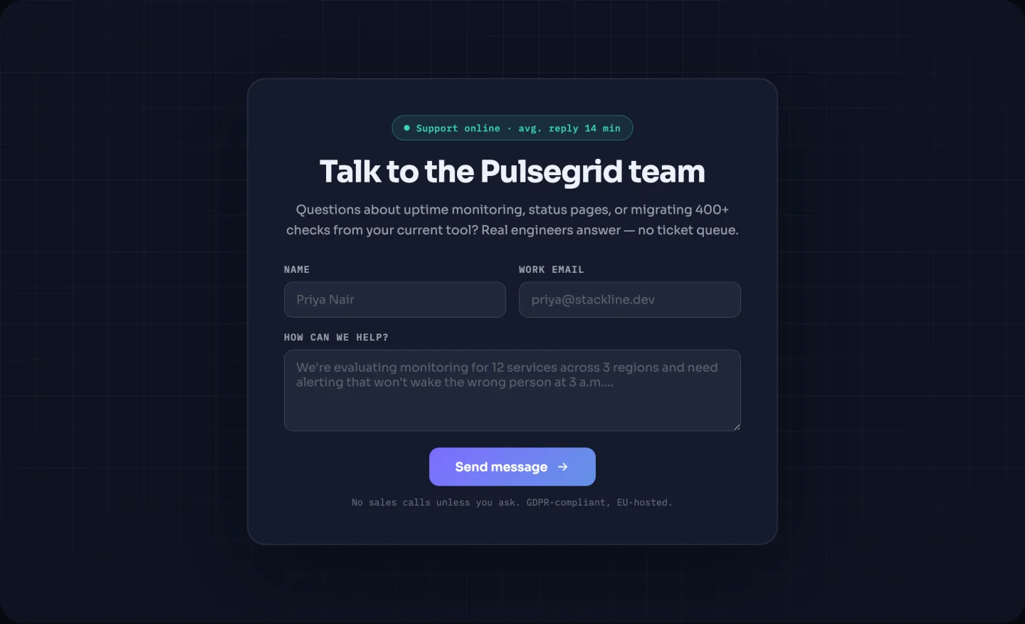
একটি অন্ধকার পটভূমিতে একটি কেন্দ্রীভূত কার্ড একটি স্পটলাইট সহ যা আপনার কার্সারকে অনুসরণ করে এবং একটি জ্বলজ্বলে "এক ব্যবসায়িক দিনের মধ্যে উত্তর দেয়" স্ট্যাটাস ব্যাজ৷ ব্যাজ টেক্সট একটি ক্ষেত্র এবং পুরো ব্যাজ টগলযোগ্য। তিনটির মধ্যে সবচেয়ে ছোট পদচিহ্ন। ডেডিকেটেড কন্টাক্ট পেজ ছাড়াই যোগাযোগের বিকল্পের প্রয়োজন এমন যেকোনো পৃষ্ঠার শেষে এটি ফেলে দিন।
লোগো স্ট্রিপ টেমপ্লেট
একটি গ্রেস্কেল গ্রিড যা হোভারে রঙ করে এবং একটি অসীম মার্কি।
31। স্ট্যাটিক গ্রেস্কেল গ্রিড: এলিমেন্টর লোগো গ্রিড টেমপ্লেট
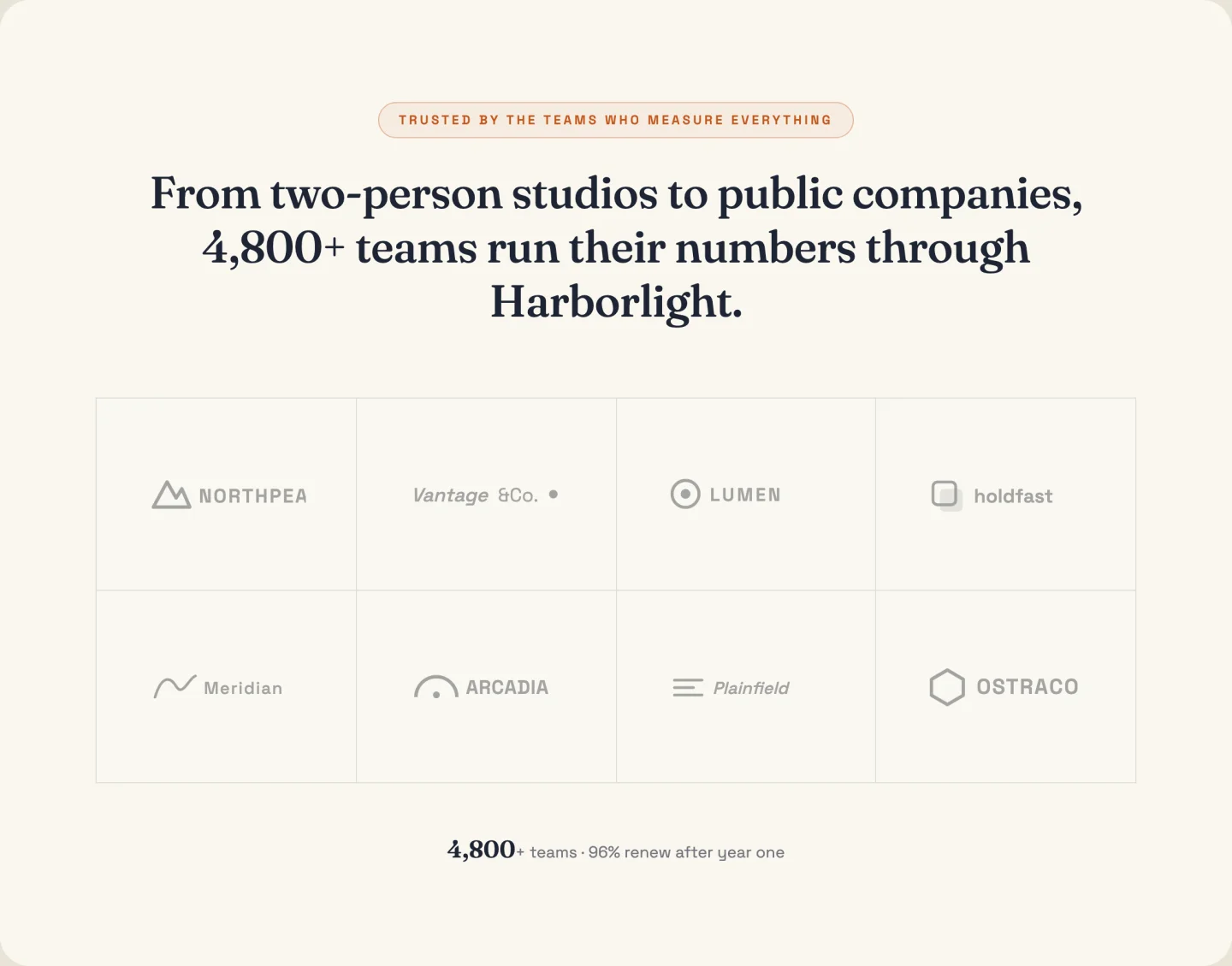
একটি গ্রিডে আটটি লোগো, ঘোরা না হওয়া পর্যন্ত গ্রেস্কেল, নীচে একটি কাউন্ট-আপ স্ট্যাট সহ ("1,400+ টিমের জন্য রিপোর্টিং পাওয়ারিং")। কলামগুলি একটি স্লাইডার, স্ট্যাট সারিটি টগলযোগ্য, এবং গ্রেস্কেল-টু-কালার হোভার আপনি যে PNG বা SVG লোগো আপলোড করেন তাতে কাজ করে৷।
32। স্ক্রোলিং মার্কি: এলিমেন্টর লোগো ক্যারোজেল টেমপ্লেট
প্রান্ত বিবর্ণ সহ একটি অসীম মার্কি যা হোভারে বিরতি দেয় এবং হ্রাস-মোশন দর্শকদের জন্য থামে। আপনি একবার প্রতিটি লোগো যোগ করুন; বিজোড় লুপ ক্লোন জাভাস্ক্রিপ্টে পরিচালনা করা হয়। স্ক্রোল গতি একটি স্লাইডার; ডেমো একটি 28-সেকেন্ডের লুপ চালায়, যা উন্মত্তের পরিবর্তে আত্মবিশ্বাসী হিসাবে পড়ে।
টাইপ অনুসারে 583-বিভাগের লাইব্রেরি ব্রাউজ করুন
লাইব্রেরিটি বাকি অর্ধেক: ডাউনলোডের পরিবর্তে এলিমেন্টর এডিটরের ভিতর থেকে 583টি ডিজাইন ইনস্টল করা হয়েছে। নীচে প্রতিটি প্রধান বিভাগ থেকে তিনটি বাছাই করা হয়েছে, প্রতিটিতে একটি লাইভ ডেমো সহ আপনি স্ক্রোল এবং ক্লিক করতে পারেন এবং সেই বিভাগের প্রতিটি ডিজাইনে একটি বোতাম রয়েছে৷।
| বিভাগের ধরন | ডিজাইন | যেখানে |
|---|---|---|
| হিরো সেকশন | 47 | লাফ |
| বৈশিষ্ট্য বিভাগ | 64 | লাফ |
| আমাদের সম্পর্কে বিভাগ | 40 | লাফ |
| পরিসংখ্যান এবং কাউন্টার বিভাগ | 40 | লাফ |
| প্রশংসাপত্র বিভাগ | 41 | লাফ |
| মূল্য সারণী | 19 | লাফ |
| দল বিভাগ | 36 | লাফ |
| FAQ বিভাগ | 21 | লাফ |
| অ্যাকশন বিভাগে কল করুন | 27 | লাফ |
| যোগাযোগ ফর্ম বিভাগ | 46 | লাফ |
| ব্লগ এবং নিবন্ধ বিভাগ | 28 | লাফ |
| মেগা মেনু বিভাগ | 6 | লাফ |
| পরিষেবা বিভাগ | 41 | ব্রাউজ করুন |
| প্রক্রিয়া, পদক্ষেপ এবং সময়রেখা বিভাগ | 29 | ব্রাউজ করুন |
| ট্যাব, বিষয়বস্তু এবং মিডিয়া বিভাগ | 31 | ব্রাউজ করুন |
| দোকান, পণ্য এবং মেনু বিভাগ | 23 | ব্রাউজ করুন |
| কেস স্টাডি এবং পোর্টফোলিও বিভাগ | 19 | ব্রাউজ করুন |
| লোগো, ব্র্যান্ড এবং ক্লায়েন্ট বিভাগ | 13 | ব্রাউজ করুন |
| 404 ত্রুটি বিভাগ | 7 | ব্রাউজ করুন |
| ক্যারিয়ার এবং চাকরি বিভাগ | 5 | ব্রাউজ করুন |
23 সেপ্টেম্বর 2026-এ লাইব্রেরি থেকে গণনা করা হয়েছে। নতুন বিভাগগুলি বেশিরভাগ রিলিজের সাথে ল্যান্ড করে, তাই আপনার প্লাগইন এর থেকে বেশি দেখাতে পারে।
এলিমেন্টর হিরো সেকশন টেমপ্লেট
লাইব্রেরিতে 47টি হিরো ডিজাইন। শিরোনামের পাশে যা বসে তা দ্বারা তারা বেশিরভাগই আলাদা: একটি ড্যাশবোর্ড স্ক্রিনশট, একটি বুকিং বোতাম, একটি পর্যালোচনা ব্যাজ বা একটি কাউন্টার সারি৷ আপনি যদি হিরো চান তবে আপনি পরিবর্তে JSON হিসাবে ডাউনলোড করতে পারেন, একটি আছে হিরো বিভাগের টেমপ্লেটের আলাদা প্যাক.
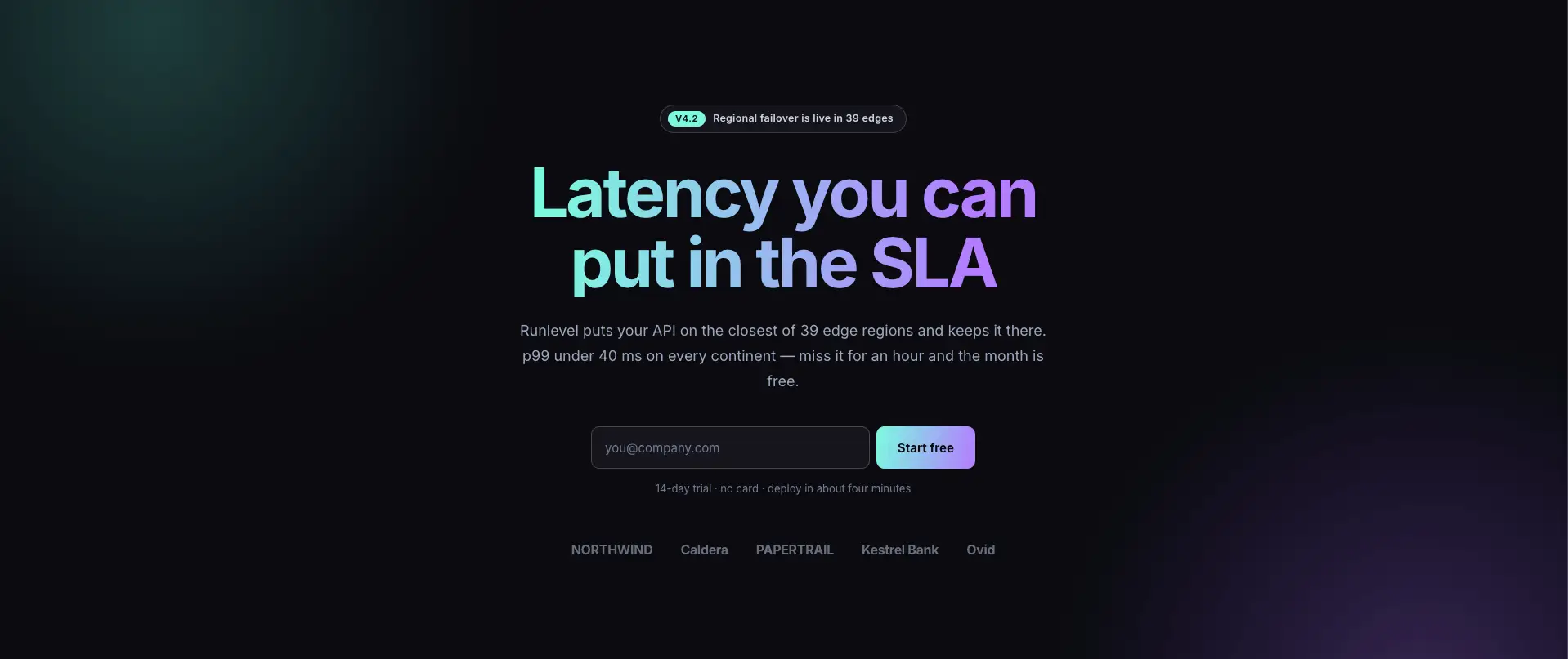
এজ সিগন্যাল সাস হিরো
একটি লেটেন্সি শিরোনাম এবং এটির নীচে বসে থাকা পণ্য ড্যাশবোর্ড সহ ডার্ক সাস হিরো৷।

ক্লিনার হিরো
একটি পরিষেবা ব্যবসার জন্য ফটো হিরো, একটি তারকা রেটিং এবং বোতামের পাশে একটি ফোন নম্বর সহ৷।
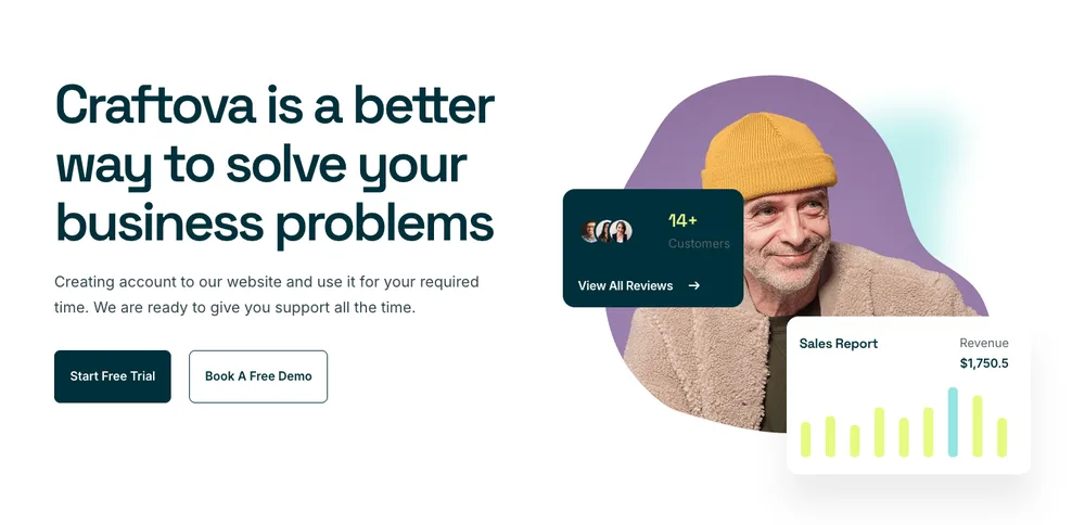
ক্র্যাফটোভা হিরো
শিরোনামের পাশে একটি ভাসমান ফলাফল কার্ড সহ সচিত্র নায়ক।
প্রতিটি নায়ক একটি ধারক স্ট্যাক, তাই শিরোনাম, চিত্র এবং বোতাম আলাদা উপাদান থাকে যা আপনি চারপাশে টেনে আনতে পারেন।
Elementor বৈশিষ্ট্য বিভাগ টেমপ্লেট
64টি বিভাগে সবচেয়ে বড় বিভাগ। সবচেয়ে বেশি চালানো হয় তথ্য বাক্স উইজেট, যা ফরম্যাট করা পাঠ্যের একটি ব্লকের পরিবর্তে আইকন, শিরোনাম, পাঠ্য এবং লিঙ্ককে পৃথক নিয়ন্ত্রণ হিসাবে রাখে।
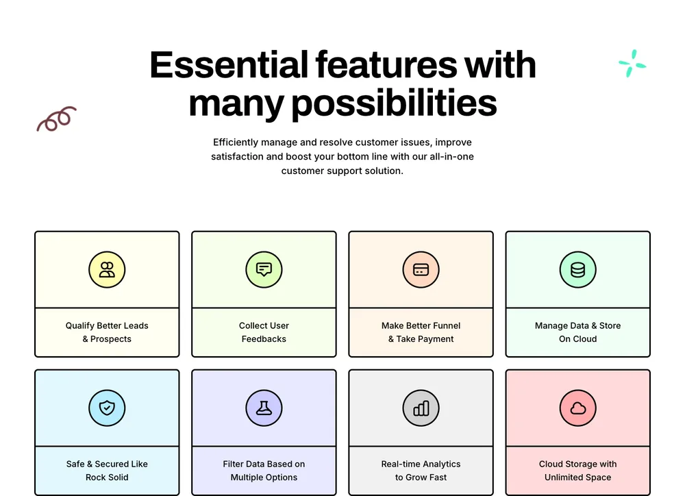
লিড লিফট বৈশিষ্ট্য গ্রিড
একটি সেরিফ শিরোনামের নীচে আটটি প্যাস্টেল বৈশিষ্ট্যযুক্ত টাইলস, চারটির দুটি সারি।
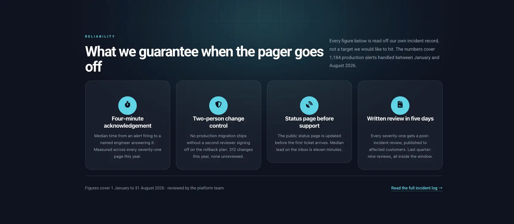
অন্ধকার নির্ভরযোগ্যতা কার্ড
সংখ্যাযুক্ত আইকন সহ চারটি অন্ধকার কার্ড, গ্যারান্টি এবং SLA-এর জন্য নির্মিত৷।
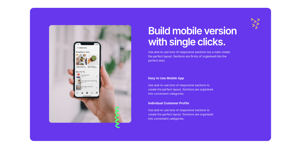
ক্লাউডিফাই মোবাইল অ্যাপ বৈশিষ্ট্য
একটি ফোন মকআপ এবং অ্যাপ বৈশিষ্ট্যগুলির একটি চেকলিস্ট সহ বেগুনি বিভক্ত বিভাগ।
ইনফো বক্স কন্ট্রোল এবং স্পেসিং হোল্ড থেকে আইকনগুলি অদলবদল করুন। পাঠ্যটি বাস্তব পাঠ্য, তাই এটি অনুবাদ করে এবং এটি সূচী করে।
আমাদের সম্পর্কে উপাদান বিভাগ টেমপ্লেট
40 সম্পর্কে এবং গল্প বিভাগ। যে লেআউটটি সবচেয়ে বেশি পুনরাবৃত্তি করে তা হল গল্পের সাথে একদিকে একটি চিত্র, একটি চেকলিস্ট এবং অন্য দিকে একটি স্ট্যাট সারি৷।
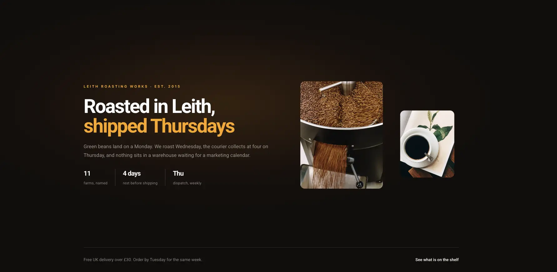
ডার্ক ক্রাফট স্টোরি
একটি পণ্য ফটো এবং একটি তারিখ লাইন সহ অন্ধকার সম্পাদকীয় গল্প ব্যান্ড।
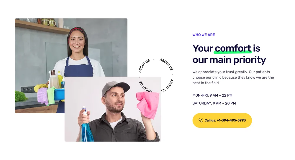
আমাদের সম্পর্কে পরিষ্কার-পরিচ্ছন্নতা
একটি হাইলাইট করা প্রতিশ্রুতি লাইন এবং একটি ফোন নম্বর বোতাম সহ ফটো কোলাজ৷।
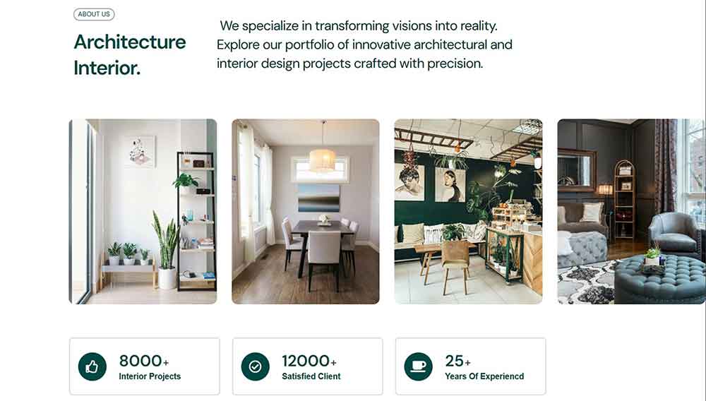
VibeSpace সম্পর্কে
একটি চার-ইমেজ গ্রিড এবং নীচে তিনটি কাউন্টার সহ ব্লক সম্পর্কে অভ্যন্তরীণ নকশা।
এগুলি তাদের আকৃতি ধরে রাখে যখন গল্পটি দীর্ঘ হয়, যেখানে বেশিরভাগ বিভাগগুলি আলাদা হয়ে যায়।
এলিমেন্টর পরিসংখ্যান এবং কাউন্টার সেকশন টেমপ্লেট
সংখ্যার জন্য 40টি বিভাগ: কাউন্টার সারি, অগ্রগতি বার, বেন্টো মেট্রিক বোর্ড এবং ড্যাশবোর্ড। কাউন্টার চালানো কাউন্টার আপ সেটআপ ছাড়াই স্ক্রলে উইজেট এবং অ্যানিমেট করুন।
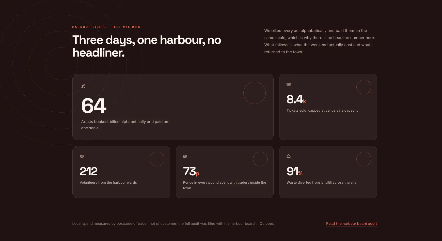
বেন্টো ফেস্টিভ্যাল র্যাপ
অন্ধকার এবং উষ্ণ বিভিন্ন আকারের পাঁচটি মেট্রিক টাইলের বেন্টো বোর্ড।

Zaplyte কী মেট্রিক্স
তিনটি বড় কাউন্টার এবং ছোট লেবেল সহ গাঢ় বেগুনি ব্যান্ড।
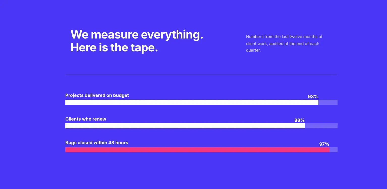
বোল্ড কালার প্রোগ্রেস বার
ডেলিভারি বা ক্ষমতা নম্বরের জন্য তিনটি লেবেলযুক্ত অগ্রগতি বার সহ নীল ব্লক।
কাউন্টারগুলি একটি উপসর্গ এবং একটি প্রত্যয় নেয়, তাই 12k+, 99.9% এবং $4.2M সবই সংখ্যা ক্ষেত্র স্পর্শ না করেই রেন্ডার করে।
এলিমেন্টর প্রশংসাপত্র বিভাগ টেমপ্লেট
41 প্রশংসাপত্র এবং পর্যালোচনা বিভাগ: স্লাইডার, কার্ড গ্রিড, একক উদ্ধৃতি এবং পর্যালোচনা-প্ল্যাটফর্ম লেআউট। এছাড়াও একটি আছে একটি প্রশংসাপত্র ক্যারোজেল নির্মাণের উপর ওয়াকথ্রু আপনি বরং একটি নিজেকে নির্মাণ করতে চান।
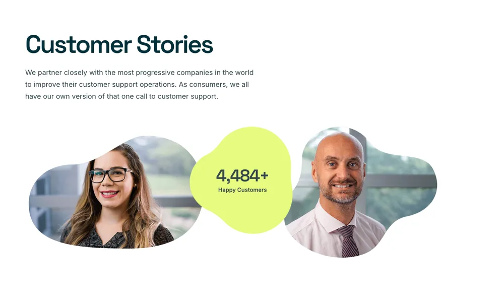
Craftova গ্রাহকের গল্প
মাঝখানে একটি সুখী-গ্রাহক কাউন্টার সহ সচিত্র গ্রাহক গল্প ব্লক।
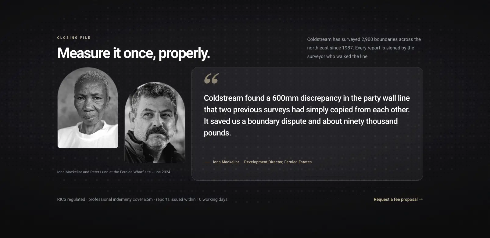
পোর্ট্রেট ক্লায়েন্ট গল্প
দুটি প্রতিকৃতি ফটো এবং একটি দীর্ঘ টান উদ্ধৃতি সহ অন্ধকার সম্পাদকীয় উদ্ধৃতি।

Craftova প্রশংসাপত্র
একটি পর্যালোচনা-প্ল্যাটফর্ম রেটিং স্ট্রিপের উপরে তারা সহ কার্ডগুলি পর্যালোচনা করুন৷।
রিভিউগুলি এইগুলির বেশিরভাগের মধ্যে রিপিটার আইটেম, তাই পঞ্চমটি একটি ক্লিক এবং সারিটি নিজেই পুনরায় স্পেস করে।
এলিমেন্টর প্রাইসিং টেবিল টেমপ্লেট
19 মূল্য বিভাগ উপর নির্মিত মূল্য সারণী উইজেট। প্ল্যানের নাম, মূল্য, বৈশিষ্ট্যের তালিকা, ফিতা এবং বোতাম হল আলাদা নিয়ন্ত্রণ, যা প্ল্যানের বিভিন্ন বৈশিষ্ট্যের সংখ্যা থাকলে সারিগুলিকে সারিবদ্ধ রাখে।
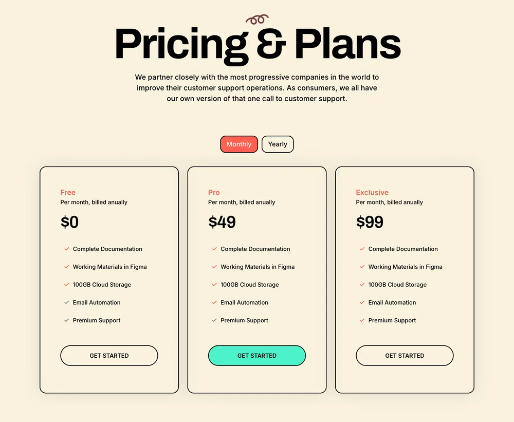
লিড লিফট মূল্য
একটি সেরিফ শিরোনাম এবং একটি মাসিক বা বার্ষিক সুইচ সহ ক্রিম তিন-স্তরের বিন্যাস।
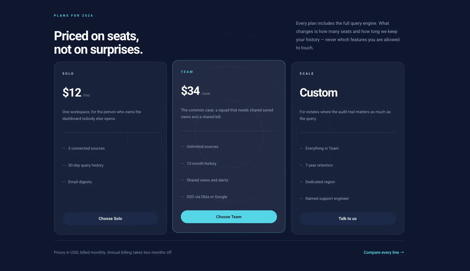
ডার্ক প্রাইসিং টেবিল
একটি হাইলাইট করা প্ল্যান এবং প্রতি-সিট মূল্য সহ গাঢ় তিন-কলামের টেবিল।
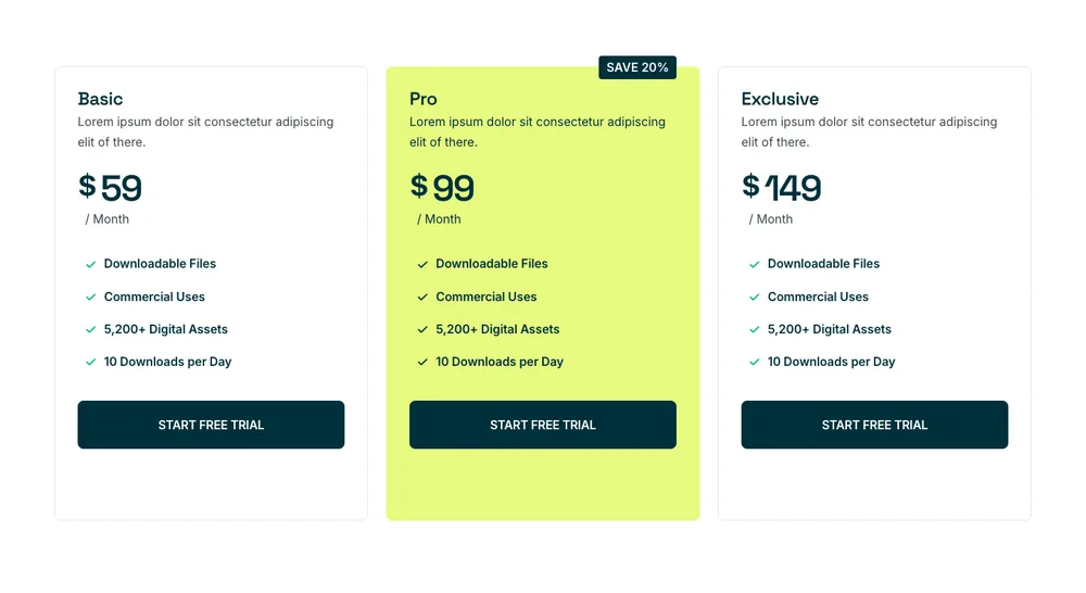
Craftova মূল্য
একটি লাইম মিডল কার্ড এবং বার্ষিক বিকল্পে একটি সেভ ব্যাজ সহ তিনটি পরিকল্পনা৷।
একটি উইজেটের ভিতরে একটি মাসিক এবং বার্ষিক সুইচের জন্য, এই পৃষ্ঠার উপরে বিলিং টগল টেমপ্লেট এটি পরিচালনা করে।
এলিমেন্টর টিম সেকশন টেমপ্লেট
36 টি দলের বিভাগ চলছে দলের সদস্য উইজেট, তাই ফটো, ভূমিকা, জৈব এবং সামাজিক লিঙ্কগুলি স্ট্যাক করা পাঠ্য বাক্সের পরিবর্তে ক্ষেত্র।
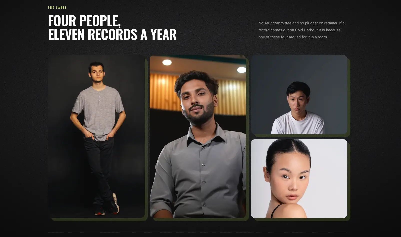
বেন্টো পোর্ট্রেট মোজাইক
অমিল ফ্রেমে চারটি প্রতিকৃতির গাঢ় বেন্টো মোজাইক।
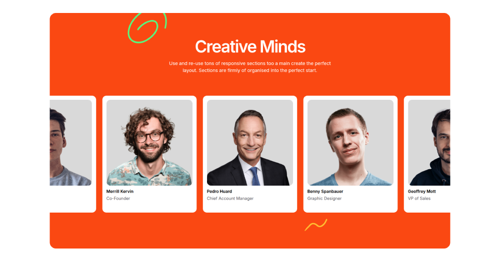
ক্লাউডিফাই টিম
পাঁচটি পোর্ট্রেট কার্ড এবং নীচে ভূমিকা সহ কমলা ব্যান্ড।
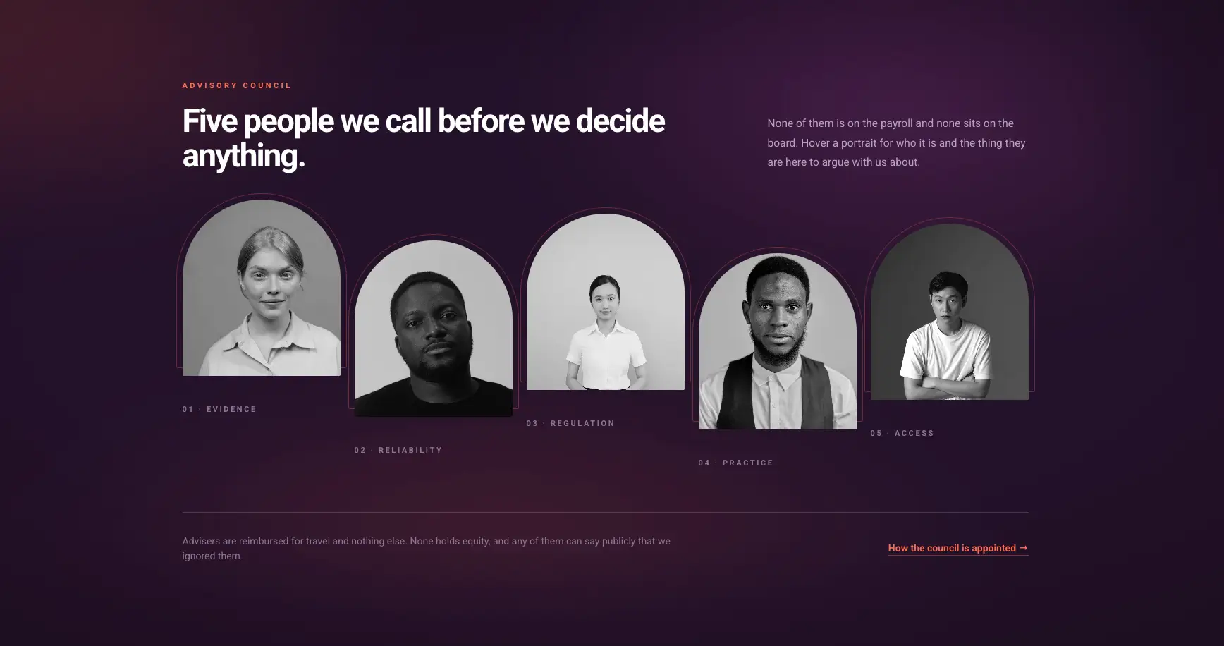
স্তব্ধ প্রতিকৃতি সারি
খিলানযুক্ত প্রতিকৃতির বেগুনি গ্রেডিয়েন্ট সারি যা হোভারে একটি নোট প্রকাশ করে।
সামাজিক আইকনগুলি সদস্য প্রতি, তাই একজন ব্যক্তির শুধুমাত্র লিঙ্কডইন থাকতে পারে এবং সারিটি এখনও ব্যালেন্স করে।
Elementor FAQ বিভাগের টেমপ্লেট
21 FAQ বিভাগ। অ্যাকর্ডিয়ন ব্যবহার করে উন্নত অ্যাকর্ডিয়ন উইজেট, যা একক-খোলা আচরণ এবং FAQ স্কিমা সেটিং বহন করে।
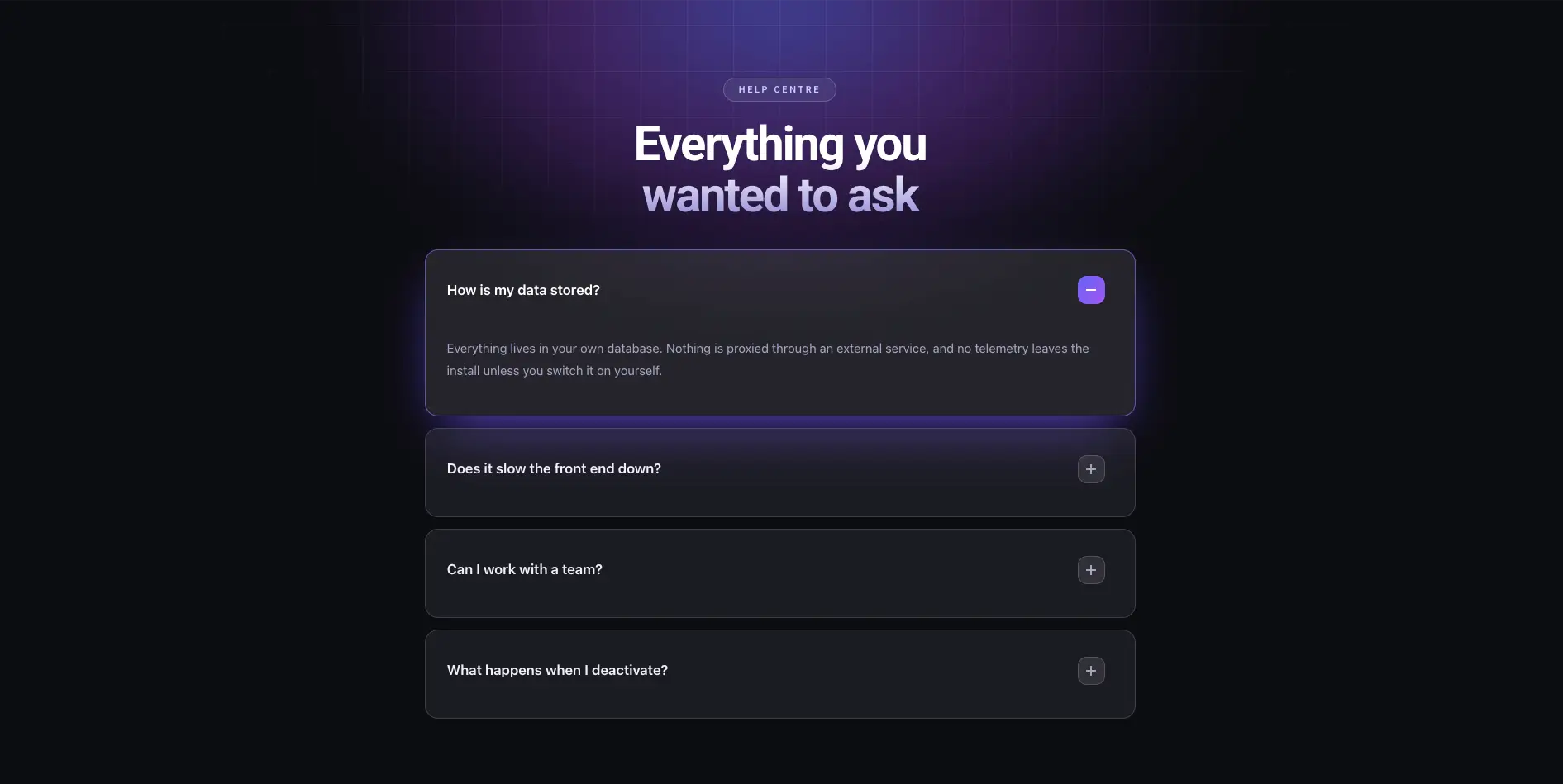
ডার্ক গ্লো FAQ
শিরোনামের পিছনে একটি বেগুনি আভা সহ গাঢ় অ্যাকর্ডিয়ন।
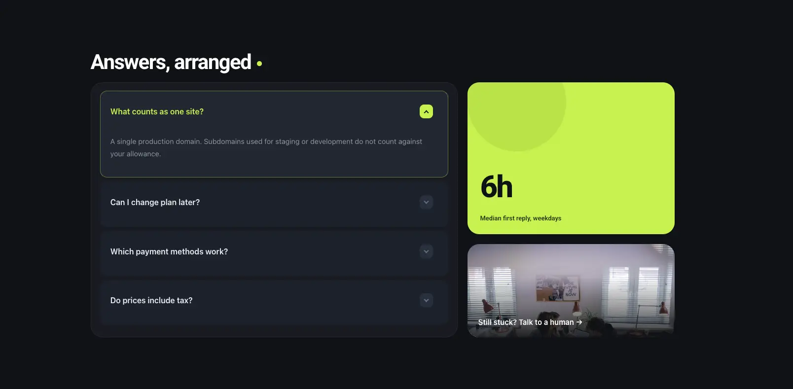
বেন্টো FAQ প্যানেল
বাম দিকে অ্যাকর্ডিয়ন একটি লাইম স্ট্যাট টাইল এবং ডানদিকে একটি ফটো টাইল।
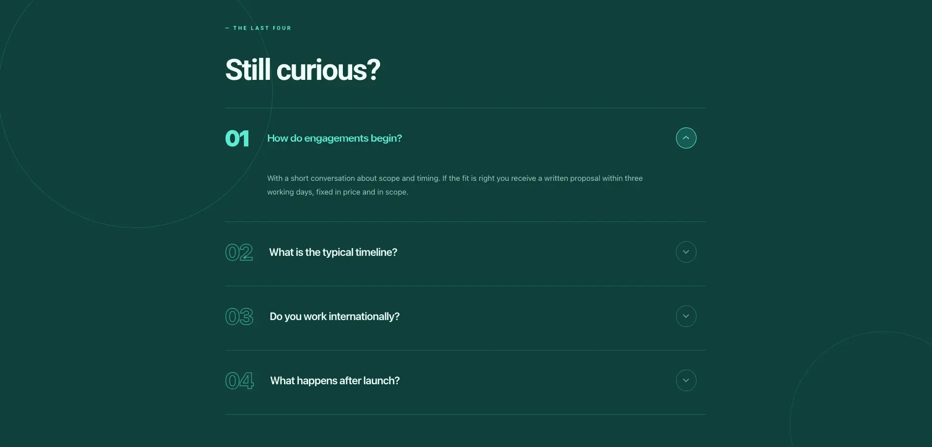
সংখ্যাযুক্ত সম্পাদকীয় FAQ
একটি স্থির-কৌতুহলী শিরোনাম সহ গভীর সবুজ সংখ্যাযুক্ত FAQ।
আপনি যদি সমৃদ্ধ ফলাফলের জন্য যোগ্য প্রশ্ন চান তবে প্রকাশ করার আগে অ্যাকর্ডিয়ন উইজেটে স্কিমা চালু করুন।
এলিমেন্টর কল টু অ্যাকশন সেকশন টেমপ্লেট
27 CTA ব্যান্ড, যে বিভাগগুলি ফুটারের উপরে বসে এবং ক্লিকের জন্য জিজ্ঞাসা করে। উপর নির্মিত কল টু অ্যাকশন এবং সৃজনশীল বোতাম উইজেট।
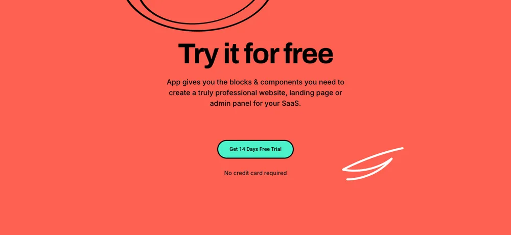
লিড লিফট CTA
একটি ফ্রি-ট্রায়াল শিরোনাম এবং একটি নো-ক্রেডিট-কার্ড লাইন সহ প্রবাল পূর্ণ-প্রস্থ ব্যান্ড।

টেকপার্ট সিটিএ
কপির পিছনে একটি ওয়্যারফ্রেম গ্লোব সহ ডার্ক স্কেল-আপ ব্যান্ড।
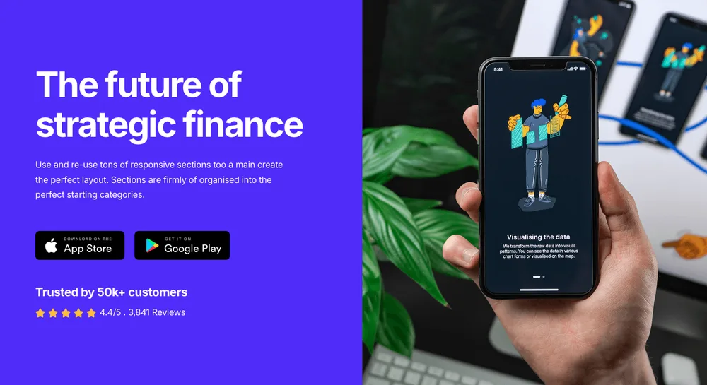
জ্যাপলাইট সিটিএ
স্টোর ব্যাজ, একটি ফোন মকআপ এবং একটি রেটিং লাইন সহ অ্যাপ প্রচার বিভক্ত।
বোতাম হোভার শৈলীগুলি উইজেটের স্টাইল ট্যাবে বাস করে, তাই ব্র্যান্ডের রঙগুলি স্টাইলশীট সম্পাদনার পরিবর্তে একটি বাছাইকারী।
এলিমেন্টর যোগাযোগ ফর্ম বিভাগ টেমপ্লেট
46 যোগাযোগ, বুকিং এবং খোলার সময় বিভাগ। ফর্মগুলি যোগাযোগ ফর্ম 7 থেকে আসে CF7 স্টাইলার, তাই ক্ষেত্রগুলি আপনার থাকে এবং শুধুমাত্র স্টাইলিং বিভাগ থেকে আসে।
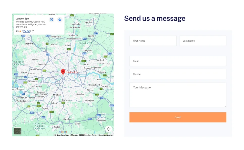
Balanciq যোগাযোগ ফর্ম
বাম দিকে মানচিত্র, ডানদিকে বার্তা ফর্ম।
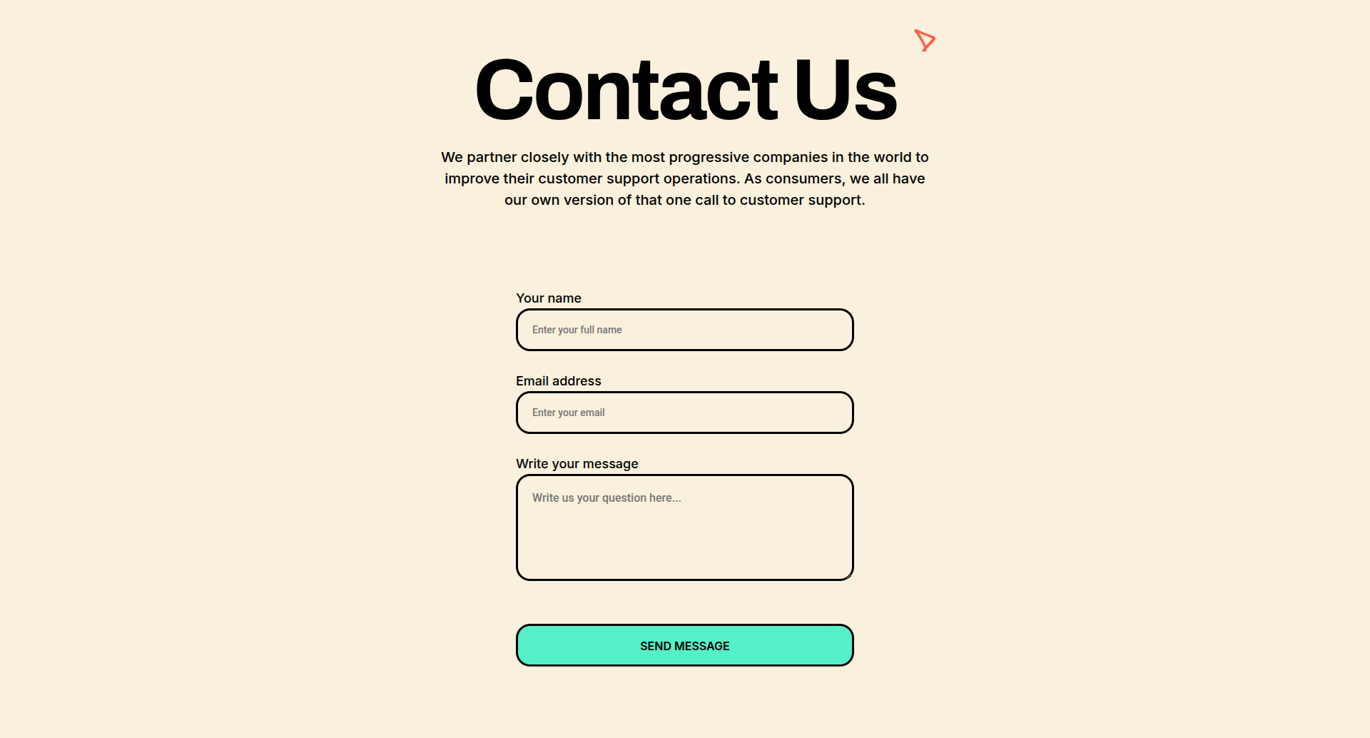
লিড লিফট যোগাযোগ ফর্ম
একটি সেরিফ শিরোনাম এবং বৃত্তাকার ক্ষেত্র সহ ক্রিম কেন্দ্রিক ফর্ম।
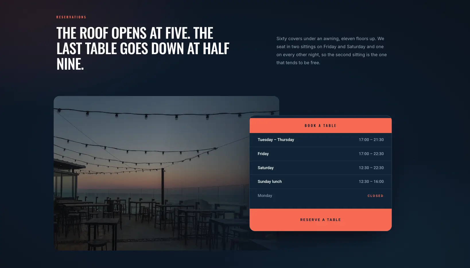
ওভারল্যাপ রিজার্ভেশন কার্ড
একটি খোলার সময় কার্ড ওভারল্যাপ করা এবং একটি বুকিং বোতাম সহ সন্ধ্যার ছবি৷।
প্রথমে যোগাযোগ ফর্ম 7 ইনস্টল করুন, তারপর উইজেটে আপনার ফর্ম চয়ন করুন। একটি ফর্ম নির্বাচন না হওয়া পর্যন্ত বিভাগটি খালি রেন্ডার করে।
এলিমেন্টর ব্লগ এবং নিবন্ধ বিভাগের টেমপ্লেট
28টি ব্লগ বিভাগ প্লাস একক-পোস্ট লেআউট, এর উপর নির্মিত ব্লগ পোস্ট উইজেট। বিভাগগুলির পরিবর্তে পুরো পৃষ্ঠার টেমপ্লেটগুলির জন্য, দেখুন এলিমেন্টর ব্লগ টেমপ্লেট পোস্ট।
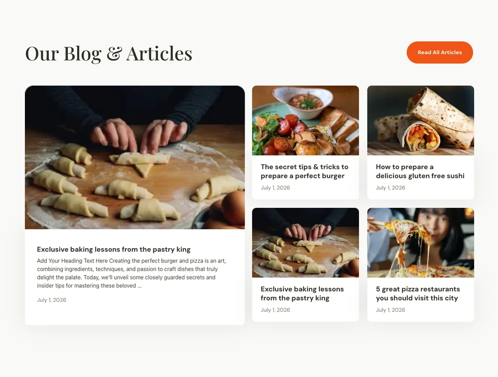
রন্ধনসম্পর্কীয় ব্লগ পোস্ট
একটি বড় ফিচার পোস্ট এবং চারটি ছোট কার্ড সহ ম্যাগাজিন লেআউট।
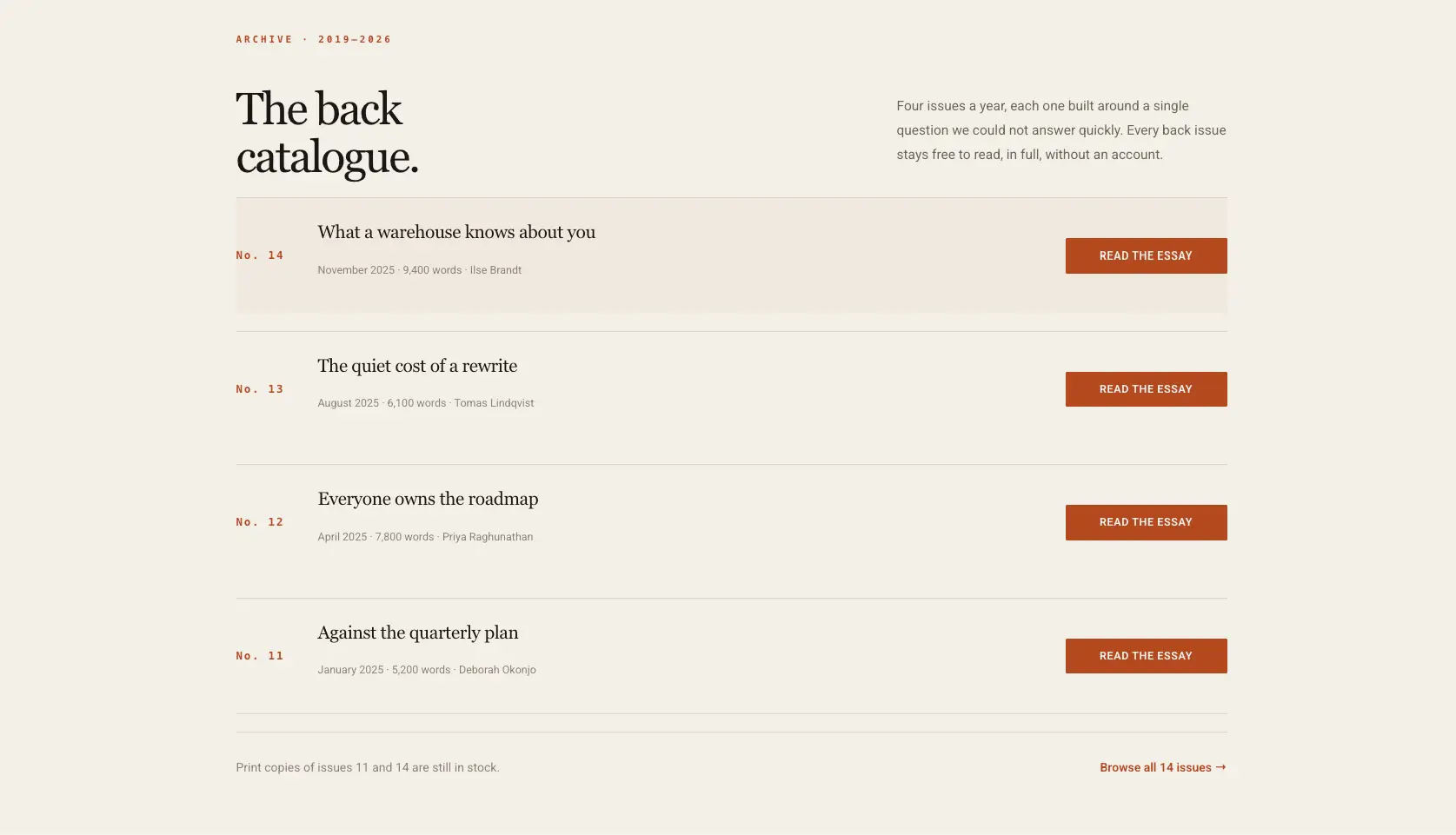
সম্পাদকীয় সংরক্ষণাগার তালিকা
প্রতিটি সারিতে একটি রিড বোতাম সহ ক্রিম সংরক্ষণাগার তালিকা।
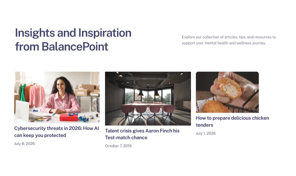
Balanciq ব্লগ পোস্ট
তারিখ সহ তিন-কার্ড পোস্ট সারি এবং বাম দিকে একটি বিভাগ ভূমিকা।
গ্রিড লাইভ পোস্ট টানে, তাই বিভাগটি আপনার সাইটে থাকলে এটি নিজেকে পূরণ করে।
এলিমেন্টর মেগা মেনু বিভাগের টেমপ্লেট
ছয়টি মেগা মেনু প্যানেল: লিঙ্ক কলাম, আইকন ডিরেক্টরি এবং প্রচার ব্লক যা পৃষ্ঠায় বসার পরিবর্তে একটি নেভিগেশন আইটেম থেকে বাদ পড়ে।
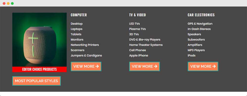
ইলেকট্রনিক্স স্টোর মেগা মেনু
একটি বৈশিষ্ট্যযুক্ত পণ্য টাইল এবং তিনটি লিঙ্ক কলাম সহ পণ্য-শ্রেণীর প্যানেল।
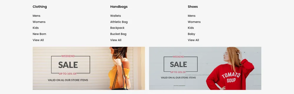
ফ্যাশন স্টোর মেগা মেনু
দুটি বিক্রয় ব্যানারের উপরে তিনটি লিঙ্ক কলাম।
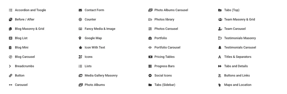
উইজেট ডিরেক্টরি মেগা মেনু
একটি বড় বৈশিষ্ট্য তালিকার জন্য আইকন লিঙ্কগুলির চার-কলামের ডিরেক্টরি।
প্রথমে একটি বিভাগ হিসাবে প্যানেলটি তৈরি করুন, তারপরে আপনার নেভিগেশন থেকে এটিতে মেগা মেনু উইজেটটি নির্দেশ করুন৷।
এটি 583 এর 36। সম্পূর্ণ বিভাগ লাইব্রেরি বাকি আছে, এবং একই ডিজাইন একই বিভাগের ফিল্টারের অধীনে প্লাগইনের ভিতরে রয়েছে। আপনি যদি একটি ব্যান্ডের পরিবর্তে একটি সম্পূর্ণ পৃষ্ঠা চান তবে পূর্ণ-পৃষ্ঠার লেআউটগুলি লাইভ এলিমেন্টর পেজ টেমপ্লেট পৃষ্ঠা, সম্পূর্ণ সাইট ডিজাইন সহ টেমপ্লেট কিট পৃষ্ঠা। হেডার, ফুটার এবং পপআপের নিজস্ব পৃষ্ঠা রয়েছে: এলিমেন্টর হেডার টেমপ্লেট, এলিমেন্টর ফুটার টেমপ্লেট এবং এলিমেন্টর পপআপ টেমপ্লেট.
এলিমেন্টর ব্লক, বিভাগ, পৃষ্ঠা টেমপ্লেট এবং কিট
এই চারটি শব্দ একই জিনিসের জন্য ব্যবহৃত হয় এবং এর অর্থ বিভিন্ন পরিমাণ পৃষ্ঠা।
- বিভাগ একটি অনুভূমিক ব্যান্ড: একটি মূল্য টেবিল, একটি FAQ, একটি নায়ক। এই পৃষ্ঠাটি সম্পর্কে কি। আপনি একটি পৃষ্ঠা তৈরি করতে তাদের স্ট্যাক।
- ব্লক ভিন্ন নামে একই জিনিস। কিছু অ্যাডন লাইব্রেরি ব্লক বলে যেখানে আমরা বিভাগ বলি। কয়েকজন ওয়ার্ডপ্রেস ব্লক সম্পাদকের জন্য শব্দটি ব্যবহার করে, যা সম্পর্কহীন।
- পৃষ্ঠা টেমপ্লেট একটি সম্পূর্ণ পৃষ্ঠা: হোম, সম্পর্কে, যোগাযোগ, মূল্য। যখন লোকেরা এলিমেন্টর ওয়েবসাইট টেমপ্লেটগুলি অনুসন্ধান করে তখন সাধারণত তারা যা বোঝায়। মাস্টার অ্যাডঅন-এ তাদের মধ্যে 211টি রয়েছে পৃষ্ঠা টেমপ্লেট পৃষ্ঠা।
- টেমপ্লেট কিট একটি সম্পূর্ণ সাইট একটি শৈলীতে: হেডার, ফুটার এবং প্রতিটি পৃষ্ঠা, মেলানোর জন্য ডিজাইন করা হয়েছে। 30 টিরও বেশি আছে টেমপ্লেট কিট পৃষ্ঠা।
বিভাগগুলি হল দরকারী ইউনিট যখন আপনার ইতিমধ্যে একটি সাইট থাকে এবং একটি পৃষ্ঠার একটি অংশ ভুল হয়। একটি কিট আরও বোধগম্য হয় যখন আপনি কিছুই থেকে শুরু করেন না এবং চান যে টাইপোগ্রাফি নিজের সাথে একমত হোক।
এলিমেন্টরের নিজস্ব কন্টেইনার সিস্টেম পুরানো বিভাগ-এবং-কলাম কাঠামো প্রতিস্থাপন করেছে। এখানে সবকিছুই কন্টেইনার দিয়ে তৈরি করা হয়েছে, যে কারণে বিভাগগুলি স্কোয়াশ করা কলামে ভেঙে পড়ার পরিবর্তে মোবাইলে সঠিকভাবে রিফ্লো করে।
এলিমেন্টর ল্যান্ডিং পেজ টেমপ্লেট:এই বিভাগগুলি থেকে একটি তৈরি করুন
একটি ল্যান্ডিং পৃষ্ঠা একটি ইচ্ছাকৃত ক্রমে চার থেকে আটটি বিভাগ। তিনটি সংমিশ্রণ যা কাজ করে, প্রতিটি এই পৃষ্ঠার বিভাগ থেকে একত্রিত হয়:
SaaS বা সফ্টওয়্যার পণ্য
একটি পণ্য শট সহ হিরো, সামাজিক প্রমাণের জন্য লোগো স্ট্রিপ, বৈশিষ্ট্য গ্রিড, পরিসংখ্যান ব্যান্ড, মাসিক টগল সহ মূল্য সারণী, FAQ অ্যাকর্ডিয়ন, তারপর CTA ব্যান্ড। সাতটি বিভাগ। বৈশিষ্ট্যগুলির অধীনে সরাসরি পরিসংখ্যান ব্যান্ডটি এমন একটি কেস স্টাডির কাজ করছে যা আপনি এখনও লেখেননি।
স্থানীয় সেবা ব্যবসা
একটি বুকিং বোতাম, পরিষেবা গ্রিড, মালিকের ছবি, পর্যালোচনা কার্ড, প্রায়শই জিজ্ঞাসিত প্রশ্নাবলী, তারপর একটি মানচিত্রের সাথে একটি যোগাযোগ ফর্ম সহ হিরো৷ মানচিত্রটি যতটা দেখায় তার চেয়ে বেশি গুরুত্বপূর্ণ: একজন ব্যবসায়িক লোকের জন্য এটি সেই প্রশ্নের উত্তর দেয় যা কলের সিদ্ধান্ত নেয়।
এজেন্সি বা স্টুডিও
হিরো, ক্লায়েন্ট লোগো মার্কি, বিকল্প বৈশিষ্ট্য সারি, টিম গ্রিড, কেস স্টাডি কার্ড, একটি বড় প্রশংসাপত্র, তারপর CTA। লোগো সঙ্গে নেতৃত্ব। এজেন্সি কাজের জন্য, আপনি কার সাথে কাজ করেছেন আপনি নিজের সম্পর্কে যা বলেন তা ছাড়িয়ে যায়।
বিভাগগুলি কন্টেইনার-ভিত্তিক, তাই আপনি ন্যাভিগেটরে টেনে এনে সেগুলিকে পুনরায় সাজাতে পারেন এবং তাদের মধ্যে ব্যবধান সামঞ্জস্যপূর্ণ থাকে কারণ প্যাডিংটি উইজেটগুলির পরিবর্তে বিভাগে থাকে৷।
একটি পৃষ্ঠা আসলে কোন বিভাগ প্রয়োজন?
রূপান্তরিত বেশিরভাগ পৃষ্ঠা একই মেরুদণ্ড ব্যবহার করে, মোটামুটি এই ক্রমে:
- বীর: এটা কি এবং কি ক্লিক করতে হবে। প্রতিটি পৃষ্ঠা।
- লোগো বা ক্লায়েন্ট স্ট্রিপ: ধার করা বিশ্বাসযোগ্যতা, যোগ করা সস্তা।
- বৈশিষ্ট্য বা পরিষেবা: আপনি আসলে কি পেতে।
- সম্পর্কে: কেন আপনি, একটি মুখ সঙ্গে যদি আপনি একটি আছে।
- পরিসংখ্যান: স্কেলের প্রমাণ যেখানে সংখ্যাগুলি ভাল।
- প্রশংসাপত্র: আপনি নন এমন কারো কাছ থেকে প্রমাণ।
- মূল্য নির্ধারণ: পরিকল্পনা সহ যেকোনো কিছুর জন্য।
- দল: সংস্থা, ক্লিনিক, স্থানীয় ব্যবসা।
- নর্থ: আপত্তি যে ক্লিক বন্ধ।
- CTA ব্যান্ড: ফুটারের আগে শেষ জিজ্ঞাসা।
- যোগাযোগ: ফর্ম, এবং মানচিত্র যদি অবস্থান গুরুত্বপূর্ণ।
আপনি সৎভাবে পূরণ করতে পারবেন না কি কাটা। তিনটি উদ্ভাবিত উদ্ধৃতি সহ একটি খালি প্রশংসাপত্র বিভাগ কোন প্রশংসাপত্র বিভাগের চেয়ে বেশি ক্ষতি করে।
প্রায়শই জিজ্ঞাসিত প্রশ্নাবলী
এই Elementor বিভাগ টেমপ্লেট বিনামূল্যে?
এই পৃষ্ঠার 32টি JSON ফাইল বিনামূল্যে ডাউনলোড করা যায়, এবং সেগুলি আমদানি করা উইজেট বিল্ডার ব্যবহার করে, যা একটি মাস্টার অ্যাডনস প্রো বৈশিষ্ট্য। লাইব্রেরিতে, 583টি বিভাগের মধ্যে 93টি বিনামূল্যে প্লাগইনে আমদানি করে। বিভাজনটি বিভাগ অনুসারে অসম: প্রতিটি মূল্য বিভাগ প্রো, যখন FAQ-তে যেকোনো বিভাগের সবচেয়ে বিনামূল্যের ডিজাইন রয়েছে। টেমপ্লেট লাইব্রেরি স্ক্রীন লক করাগুলিকে চিহ্নিত করে৷।
আমি বিনামূল্যে এলিমেন্টর টেমপ্লেট কোথায় পেতে পারি?
এলিমেন্টরের নিজস্ব লাইব্রেরির সম্পাদকের ভিতরে একটি বিনামূল্যের স্তর রয়েছে। প্লাগইন সক্রিয় হয়ে গেলে মাস্টার অ্যাডনস একই টেমপ্লেট লাইব্রেরি স্ক্রীন থেকে 93টি বিনামূল্যের বিভাগ এবং বিনামূল্যের পৃষ্ঠা টেমপ্লেট এবং কিট যোগ করে।
আমি কিভাবে Elementor এ একটি বিভাগ টেমপ্লেট আমদানি করব?
এই পৃষ্ঠায় JSON ডাউনলোডের জন্য: মাস্টার অ্যাডঅন → উইজেট বিল্ডার → উইজেট আমদানি করুন, ফাইলটি আপলোড করুন, তারপর আপনার পৃষ্ঠায় নতুন উইজেট টেনে আনুন। লাইব্রেরি বিভাগগুলির জন্য: এলিমেন্টরে একটি পৃষ্ঠা খুলুন, মাস্টার অ্যাডঅন টেমপ্লেট আইকনে ক্লিক করুন, বিভাগে স্যুইচ করুন, একটি বিভাগ চয়ন করুন এবং সন্নিবেশ ক্লিক করুন।
আমি কিভাবে Elementor এ একটি বিভাগ তৈরি করব?
একটি ধারক ব্যবহার করুন। এডিটরে, প্লাস আইকনে ক্লিক করুন, একটি কাঠামো চয়ন করুন, তারপরে উইজেটগুলিকে টেনে আনুন। উইজেটগুলির পরিবর্তে কন্টেইনারে প্যাডিং এবং ব্যাকগ্রাউন্ড সেট করুন। আপনি পরে এটি নকল করার সময় এটিই ব্যবধানকে সামঞ্জস্যপূর্ণ রাখে। একবার একটি বিভাগ যেভাবে আপনি এটি চান, এটিতে ডান-ক্লিক করুন এবং এটি পুনরায় ব্যবহার করতে টেমপ্লেট হিসাবে সংরক্ষণ করুন নির্বাচন করুন।
আমি কি আমদানি করার পরে টেমপ্লেটগুলি সম্পাদনা করতে পারি?
হ্যাঁ, এটা সব। JSON টেমপ্লেটগুলি একক উইজেট হিসাবে আসে যেখানে প্রতিটি স্ট্রিং, লিঙ্ক, চিত্র এবং বেস রঙ বিষয়বস্তু বা শৈলী ট্যাবে একটি নিয়ন্ত্রণ। লাইব্রেরি বিভাগগুলি সাধারণ পাত্রে এবং উইজেট হিসাবে আসে।
এগুলো কি কোন ওয়ার্ডপ্রেস থিমের সাথে কাজ করে?
তারা এলিমেন্টরকে সমর্থন করে এমন যেকোনো থিমের সাথে কাজ করে, যা তাদের প্রায় সবই। বিভাগগুলি তাদের নিজস্ব ব্যবধান এবং রঙ বহন করে, তাই একটি থিমের শৈলীতে খুব কমই রক্তপাত হয়। যদি একটি শিরোনাম বন্ধ দেখায় তবে এটি সাধারণত থিমের টাইপোগ্রাফি। উইজেটে ফন্ট সেট করুন এবং এটি ওভাররাইড করে।
Elementor একটি বিনামূল্যে বিকল্প আছে?
Elementor এর বিনামূল্যের সংস্করণ হল বিকল্প যা বেশিরভাগ লোক মানে, এবং এখানে প্রতিটি বিভাগ এটিতে কাজ করে। মাস্টার অ্যাডনস প্রো এলিমেন্টর প্রো থেকে একটি পৃথক লাইসেন্স।
একটি বিভাগ এবং একটি পৃষ্ঠা টেমপ্লেট মধ্যে পার্থক্য কি?
একটি বিভাগ একটি পৃষ্ঠার একটি ব্যান্ড। একটি পৃষ্ঠা টেমপ্লেট পুরো পৃষ্ঠা। একটি সাইট বিদ্যমান থাকলে এবং এর একটি অংশ প্রতিস্থাপনের প্রয়োজন হলে আপনি যে বিভাগে পৌঁছান তা হল।
কেন কিছু ডাউনলোড SVG ফাইলের সাথে আসে?
ডেমো আর্টওয়ার্ক ভেক্টর তাই এটি যেকোনো প্রস্থে তীক্ষ্ণ থাকে। ওয়ার্ডপ্রেস নিরাপত্তার কারণে ডিফল্টরূপে SVG আপলোড ব্লক করে। আপলোড করার আগে সেগুলিকে PNG বা WebP-এ রূপান্তর করুন, অথবা আপনি যদি উৎসে বিশ্বাস করেন তাহলে SVG আপলোডগুলি সক্ষম করুন৷।
একটি বিভাগ দিয়ে শুরু করুন
আপনার সাইটের বিভাগটি বেছে নিন যা আপনি সবচেয়ে কম পছন্দ করেন, উপরে এটি খুঁজুন এবং এটি প্রতিস্থাপন করুন। এটি একটি দশ মিনিটের কাজ, এবং এটি আপনার কাজের সাথে এই লাইব্রেরিটি মানানসই কিনা তা নির্ধারণ করে।
